Upgrade to Pro — share decks privately, control downloads, hide ads and more …

30 data visualisation stories

30 data visualisation stories

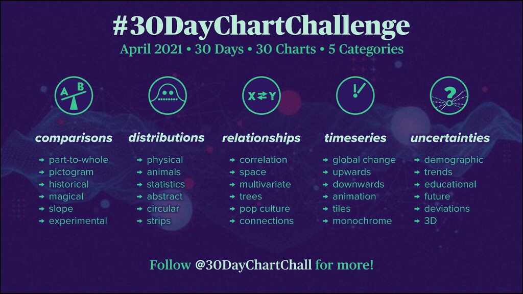
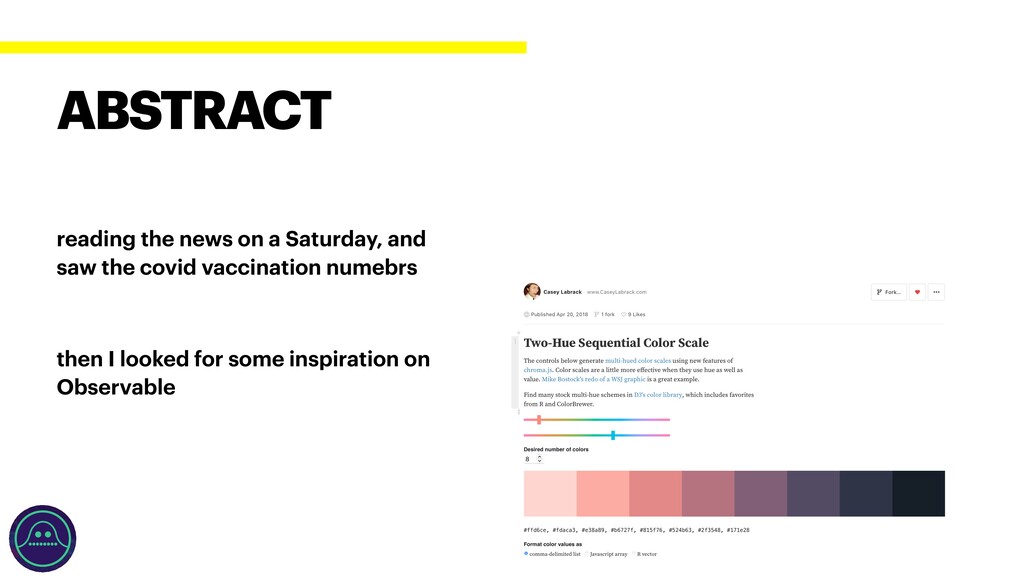
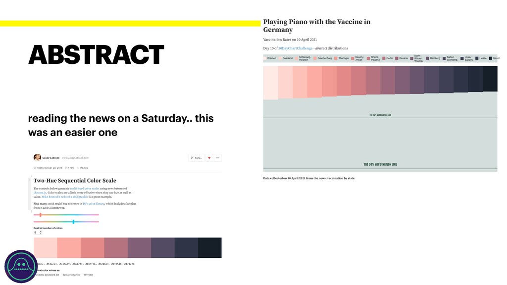
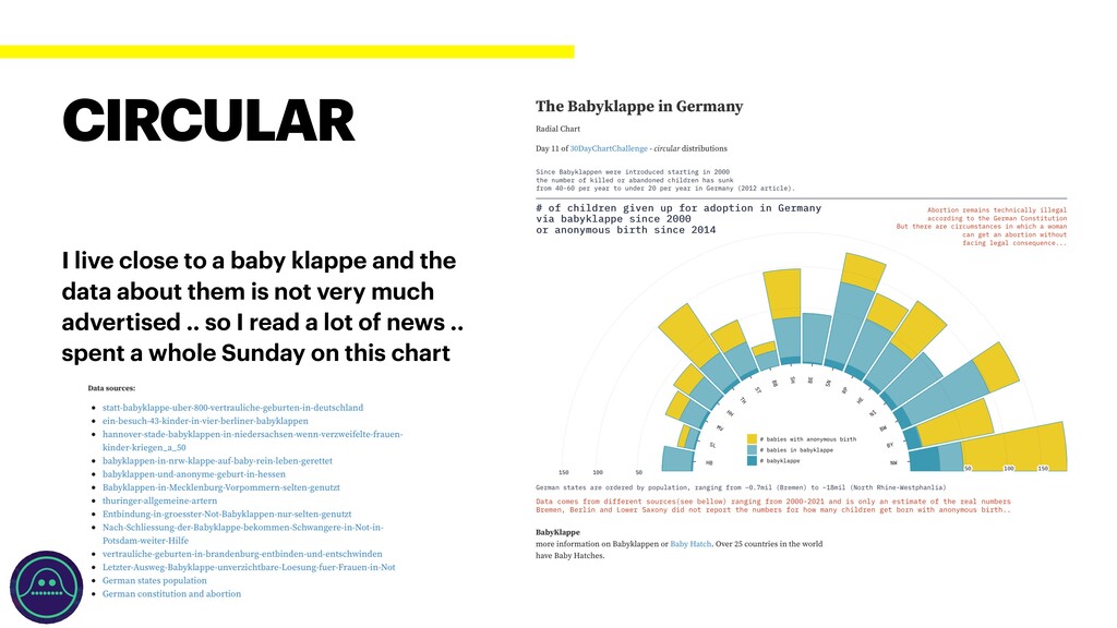
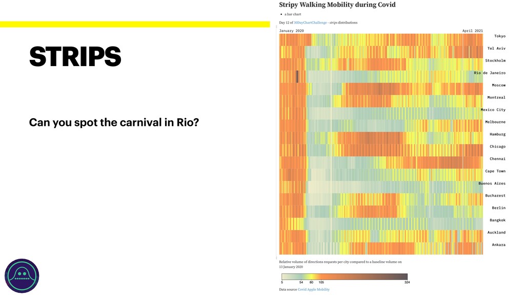
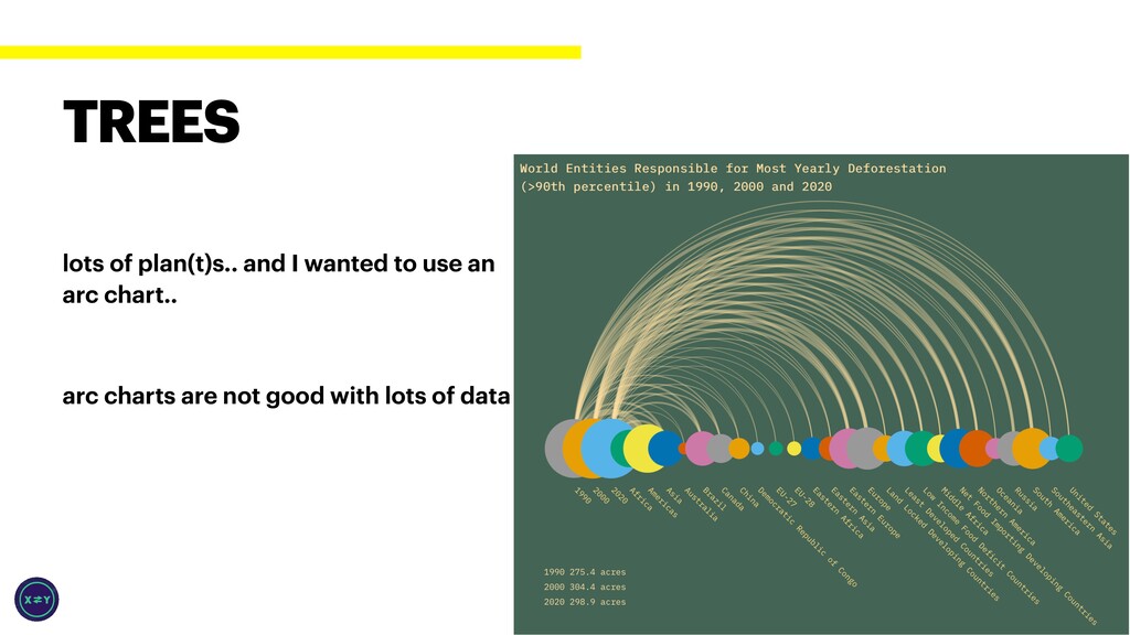
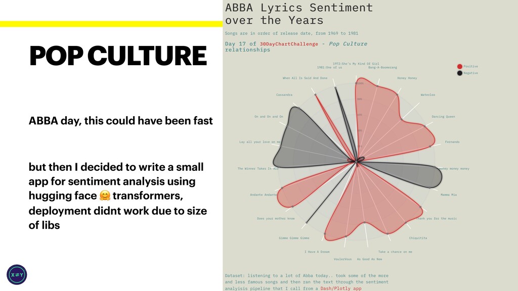
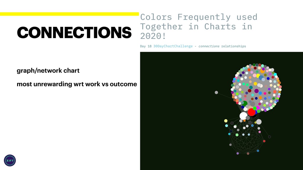
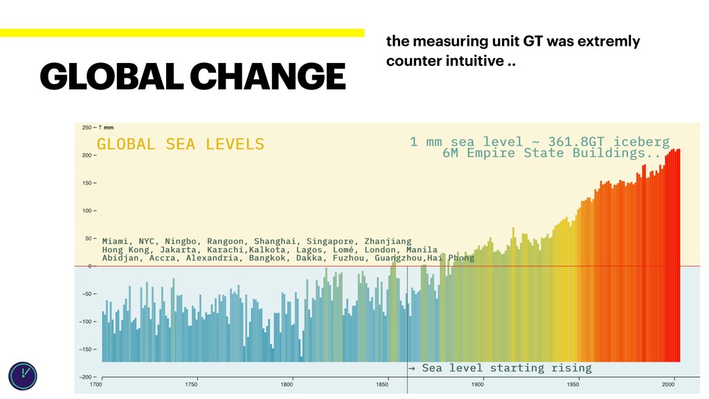
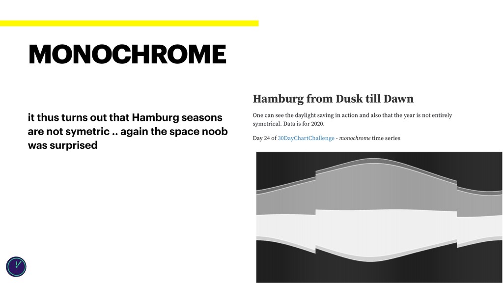
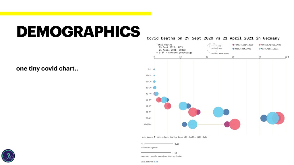
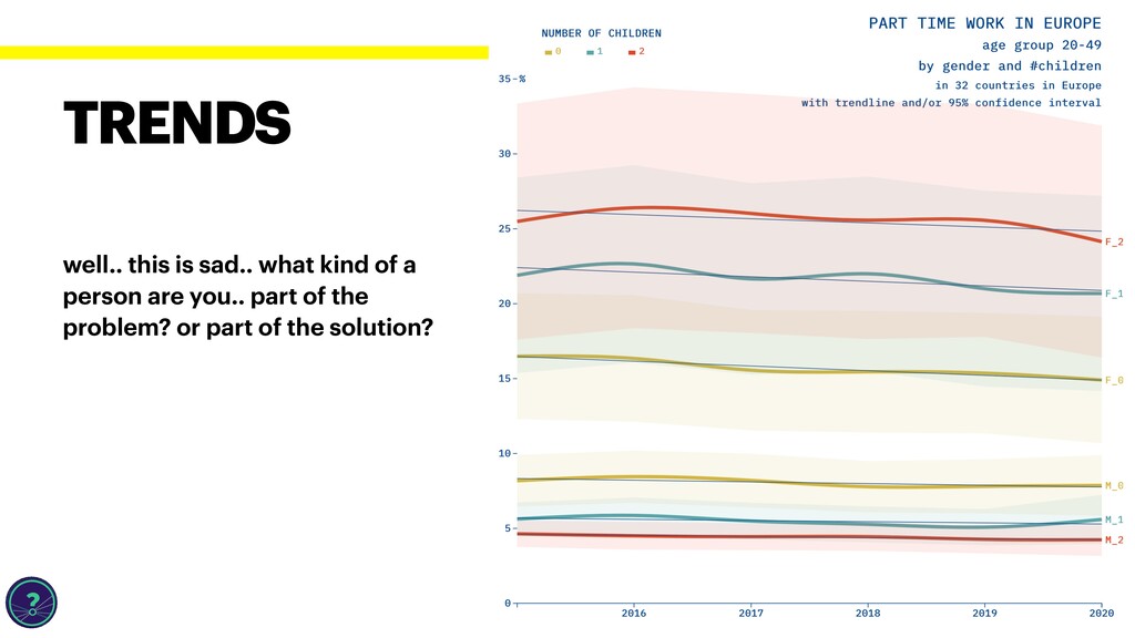
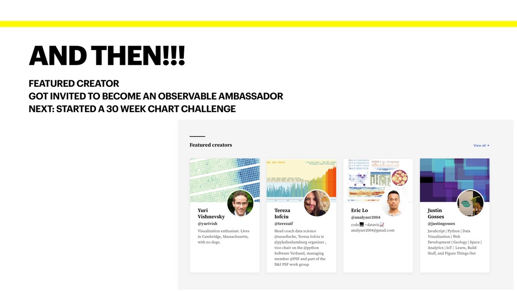
This April I participated in the 30DayChartChallenge and to make things interesting, after the first day, I've decided on combining this with my old dream of learning D3.js. This talk is about that journey, we will go through 30 data stories, how I found the data, sometimes collected it, charted it, and charted it again and again. Topics range from politics, to global warming and gender equality and ABBA.

Presented at ByteAdventures 2021

Tereza Iofciu

June 25, 2021
Tweet

More Decks by Tereza Iofciu

Other Decks in Technology

Transcript

  1. Co-organizator PyLadies Hamburg Vice chair @ Python Software Verband Diversity

    & Inclusion @ PSF Art: tiyepyep pronouns: she/her content warning ⚠ politics TEREZA IOFCIU HEAD COACH DATA SCIENCE @NEUEFISCHE
  2. data collection: getting data from the bundestag archives originally wanted

    to do a pyramid chart (with bars left and right..) but they are considered not to be easy to decode .. HISTORICAL
  3. how to make a pie chart acceptable and needed a

    faster/easy chart.. Others had really awesome contributions EXPERIMENTAL
  4. reading the news on a Saturday, and saw the covid

    vaccination numebrs then I looked for some inspiration on Observable ABSTRACT
  5. I live close to a baby klappe and the data

    about them is not very much advertised .. so I read a lot of news .. spent a whole Sunday on this chart CIRCULAR
  6. NASA data via Sky f ield python lib this was

    a total suprise as I am a total space noob SPACE
  7. needed an easy date, the radar chart I forked from

    had no legend.. so extended that to have a legend (do not underestimate the work of adding a legend in D3.js) MULTIVARIATE
  8. lots of plan(t)s.. and I wanted to use an arc

    chart.. arc charts are not good with lots of data TREES
  9. ABBA day, this could have been fast but then I

    decided to write a small app for sentiment analysis using hugging face 🤗 transformers, deployment didnt work due to size of libs POP CULTURE
  10. this day I misread and worked on the next day

    chart.. only to realise late that the topic was animation animations are quite fun.. one used time to change data /object properties ANIMATION
  11. it thus turns out that Hamburg seasons are not symetric

    .. again the space noob was surprised MONOCHROME
  12. well.. this is sad.. what kind of a person are

    you.. part of the problem? or part of the solution? TRENDS
  13. data: world bank the bars show the con f idence

    intervals around the averages EDUCATIONAL
  14. FEATURED CREATOR GOT INVITED TO BECOME AN OBSERVABLE AMBASSADOR NEXT:

    STARTED A 30 WEEK CHART CHALLENGE AND THEN!!!