Upgrade to Pro
— share decks privately, control downloads, hide ads and more …
Speaker Deck
Features
Speaker Deck
PRO
Sign in
Sign up for free
Search
Search
Can Media Queries Save Us All?
Search
Tim Kadlec
September 22, 2011
Programming
360
2
Share
Embed
Copy iframe code
Copy JS code
Copy link
Start on current slide
Can Media Queries Save Us All?
Presented May 27, 2011 at WebVisions in Portland, OR.
Tim Kadlec
September 22, 2011
More Decks by Tim Kadlec
See All by Tim Kadlec
The State of Node.js Security, at Node.js Interactive 2017
tkadlec
1
500
JavaScript Exposed at Midwest JS
tkadlec
3
330
Focusing On What Matters, at Fluent, 2017
tkadlec
0
180
Once More, With Feeling at Code 2016 in Sydney
tkadlec
1
730
Once More, With Feeling
tkadlec
9
1.8k
Mobile Image Processing at London Web Perf Meetup, 2016
tkadlec
1
250
Better By Proxy at Velocity NY 2015
tkadlec
3
720
Getting Started with Performance Budgets at HighEdWeb Technical Academy, 2015
tkadlec
9
1.3k
Reaching Everyone, Fast at From the Front, 2015
tkadlec
8
7.5k
Other Decks in Programming
See All in Programming
ADKを使って簡単にAIエージェントを作ってみよう
k1mu21
0
290
コーディングルールの鮮度を保ちたい for SRE NEXT 2026 / keep-fresh-go-internal-conventions-sre-next-2026
handlename
0
130
AI時代の仕事技芸論〜ソフトウェア開発で「遊ぶように働く」職人的熟達のすすめ(スクフェス仙台 2026バージョン)
kuranuki
0
540
TSKaigi Night Talks 2026_TypeScriptでサプライチェーンの整合性を型に閉じ込める
geekplus_tech
0
440
SLOをサービス品質の共通言語にするために 取り組んできたこと
wakana0222
0
440
ローカルLLMでどこまでコードが書けるか -拡張版 / How much code can be written on a local LLM Extended
kishida
12
4.7k
Even G2とAWSで推しのエージェントを召喚しよう!
har1101
1
140
AI 輔助遺留系統現代化的經驗分享
jame2408
1
1.2k
Vite+ Unified Toolchain for the Web
naokihaba
0
720
Signal Forms: Details & Live Coding @enterJS 2026 in Mannheim
manfredsteyer
PRO
0
220
act1-costs.pdf
sumedhbala
0
200
【SRE NEXT 2026 Lunch Session】一人目専任SREの立ち上げを加速する ― AIと進めたオンボーディングで2分を0.04秒にした話
pkshadeck
PRO
0
2.1k
Featured
See All Featured
Exploring the Power of Turbo Streams & Action Cable | RailsConf2023
kevinliebholz
37
6.5k
Money Talks: Using Revenue to Get Sh*t Done
nikkihalliwell
0
290
End of SEO as We Know It (SMX Advanced Version)
ipullrank
3
4.3k
Mozcon NYC 2025: Stop Losing SEO Traffic
samtorres
1
280
Distributed Sagas: A Protocol for Coordinating Microservices
caitiem20
333
23k
エンジニアに許された特別な時間の終わり
watany
107
250k
How to Build an AI Search Optimization Roadmap - Criteria and Steps to Take #SEOIRL
aleyda
1
2.1k
The Limits of Empathy - UXLibs8
cassininazir
1
410
The MySQL Ecosystem @ GitHub 2015
samlambert
251
13k
AI in Enterprises - Java and Open Source to the Rescue
ivargrimstad
0
1.4k
Design in an AI World
tapps
1
260
Ecommerce SEO: The Keys for Success Now & Beyond - #SERPConf2024
aleyda
1
2.1k
Transcript
http://flic.kr/p/6iMxyT Can Media Queries Save Us All? Presented by Tim
Kadlec - @tkadlec Friday, May 27, 2011
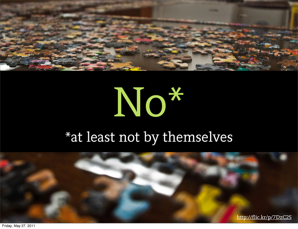
http://flic.kr/p/7DzC2S No* *at least not by themselves Friday, May 27,
2011
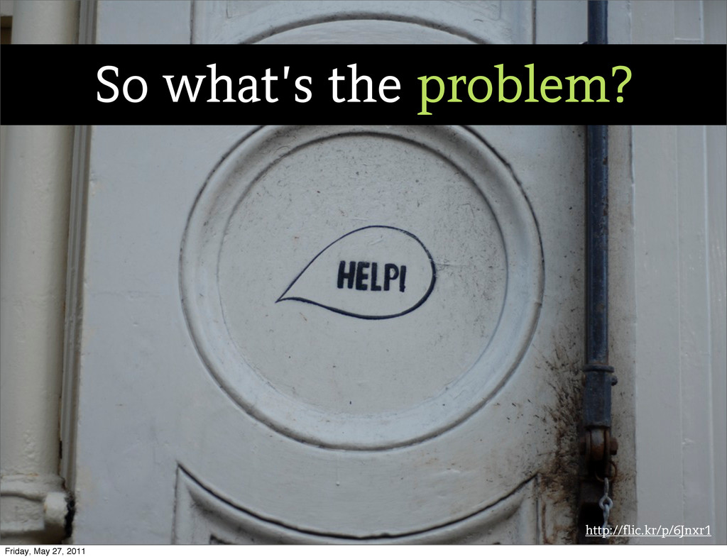
http://flic.kr/p/6Jnxr1 So what’s the problem? Friday, May 27, 2011
http://flic.kr/p/7c8Nkq She is. Friday, May 27, 2011
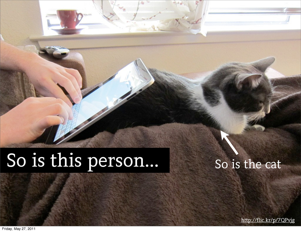
http://flic.kr/p/7QPvjg So is this person... So is the cat Friday,
May 27, 2011
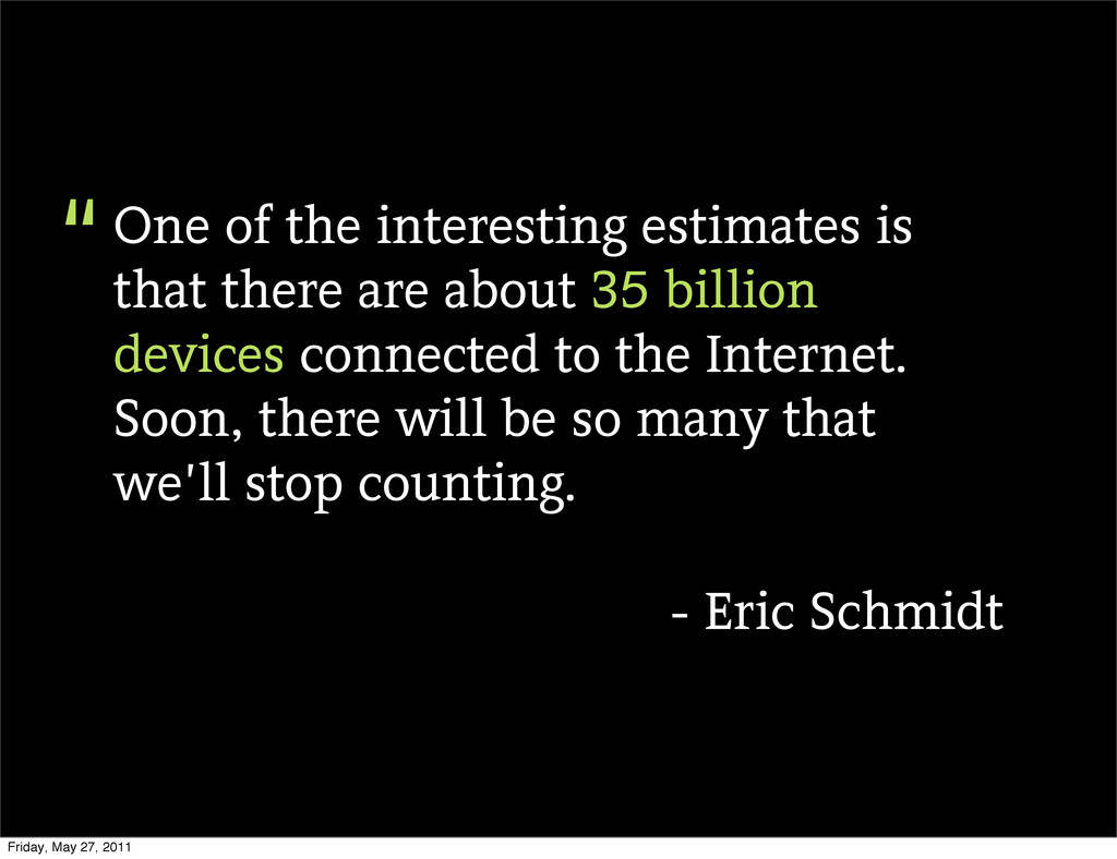
One of the interesting estimates is that there are about
35 billion devices connected to the Internet. Soon, there will be so many that we’ll stop counting. - Eric Schmidt “ Friday, May 27, 2011
http://flic.kr/p/8PGKvr Friday, May 27, 2011
http://flic.kr/p/coTdy Option #1: Ignore Friday, May 27, 2011
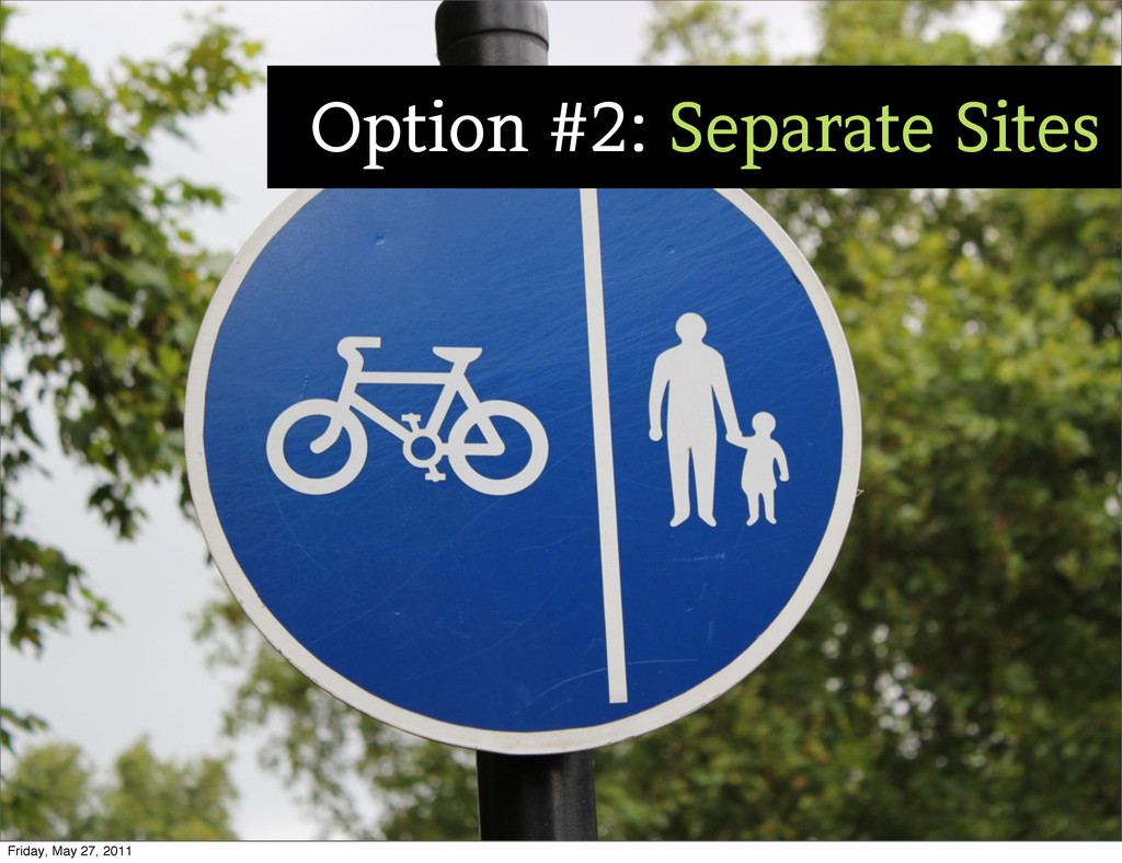
http://flic.kr/p/8rWoUd Option #2: Separate Sites Friday, May 27, 2011
http://flic.kr/p/9i3TMD Slight Detour... Friday, May 27, 2011
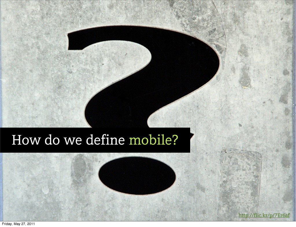
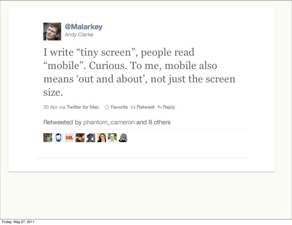
http://flic.kr/p/7Er6af How do we define mobile? Friday, May 27, 2011
Text Friday, May 27, 2011
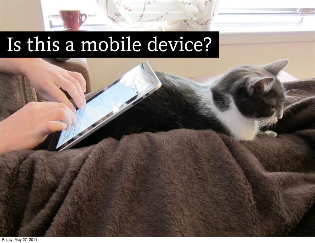
Is this a mobile device? Friday, May 27, 2011
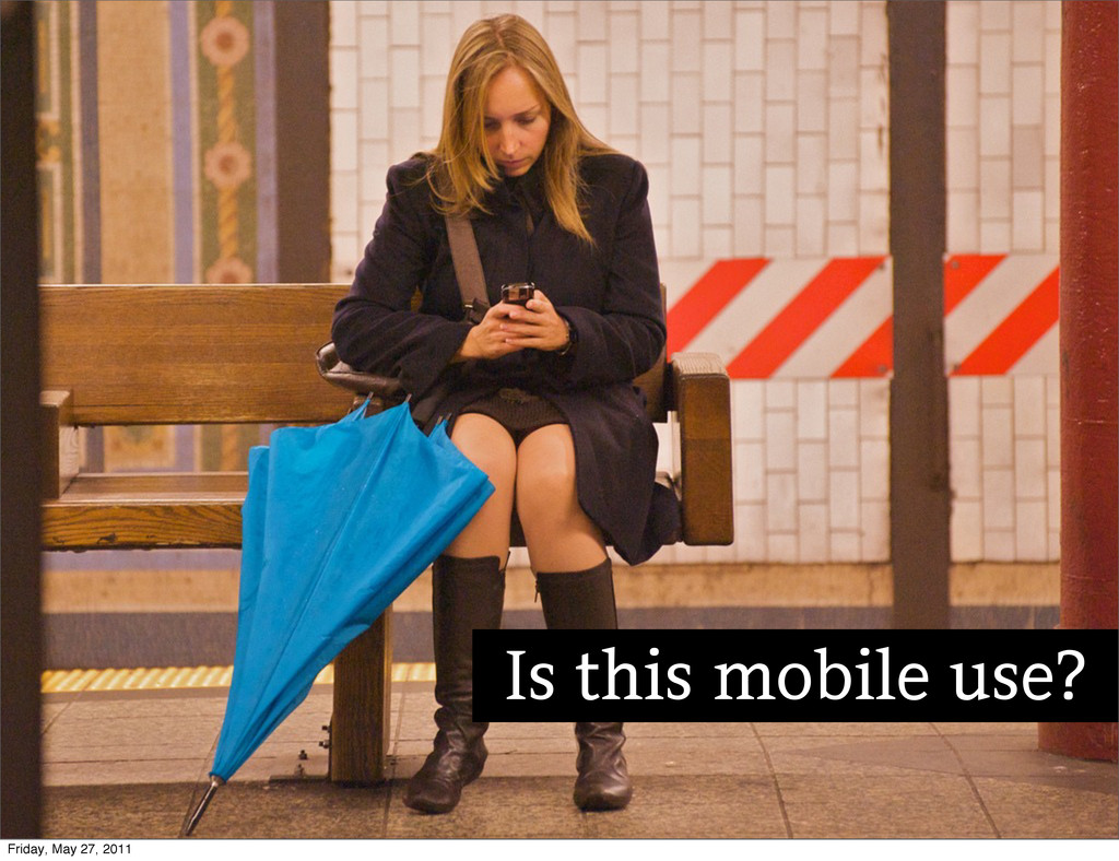
Is this mobile use? Friday, May 27, 2011
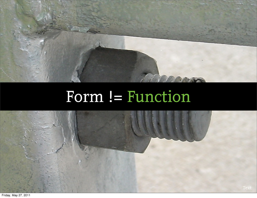
Text Form != Function Friday, May 27, 2011
Option #2: Separate Sites Friday, May 27, 2011
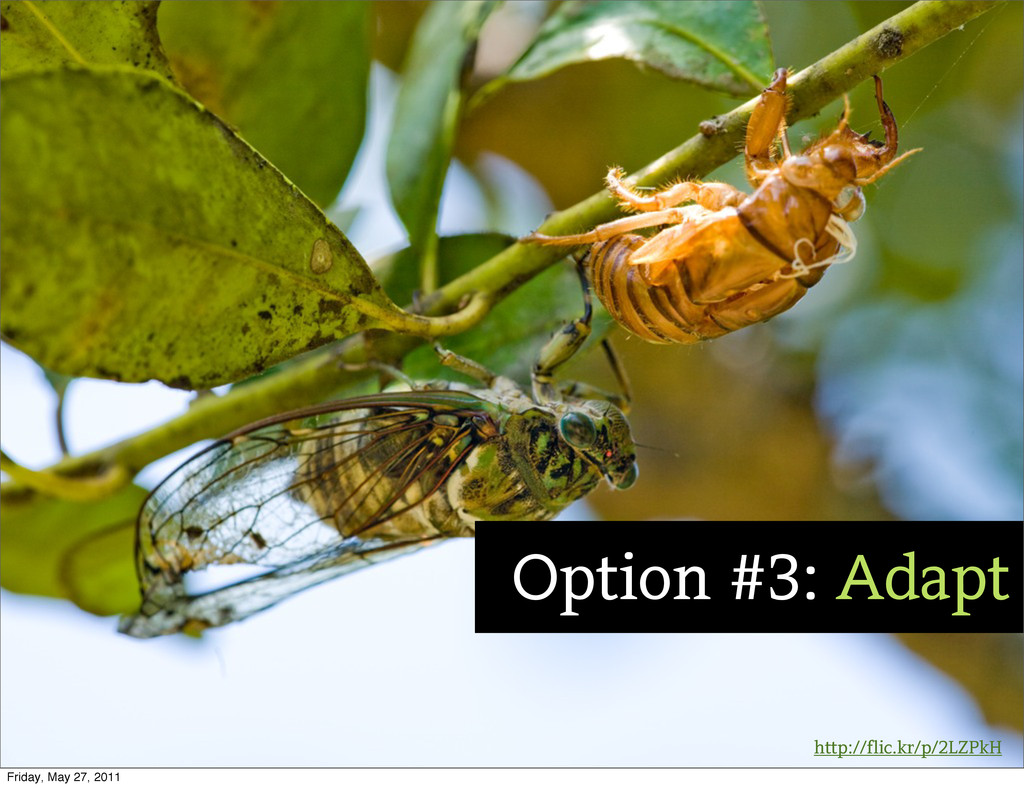
http://flic.kr/p/2LZPkH Option #3: Adapt Friday, May 27, 2011
Text http://www.alistapart.com/articles/responsive-web-design/ Friday, May 27, 2011
Friday, May 27, 2011
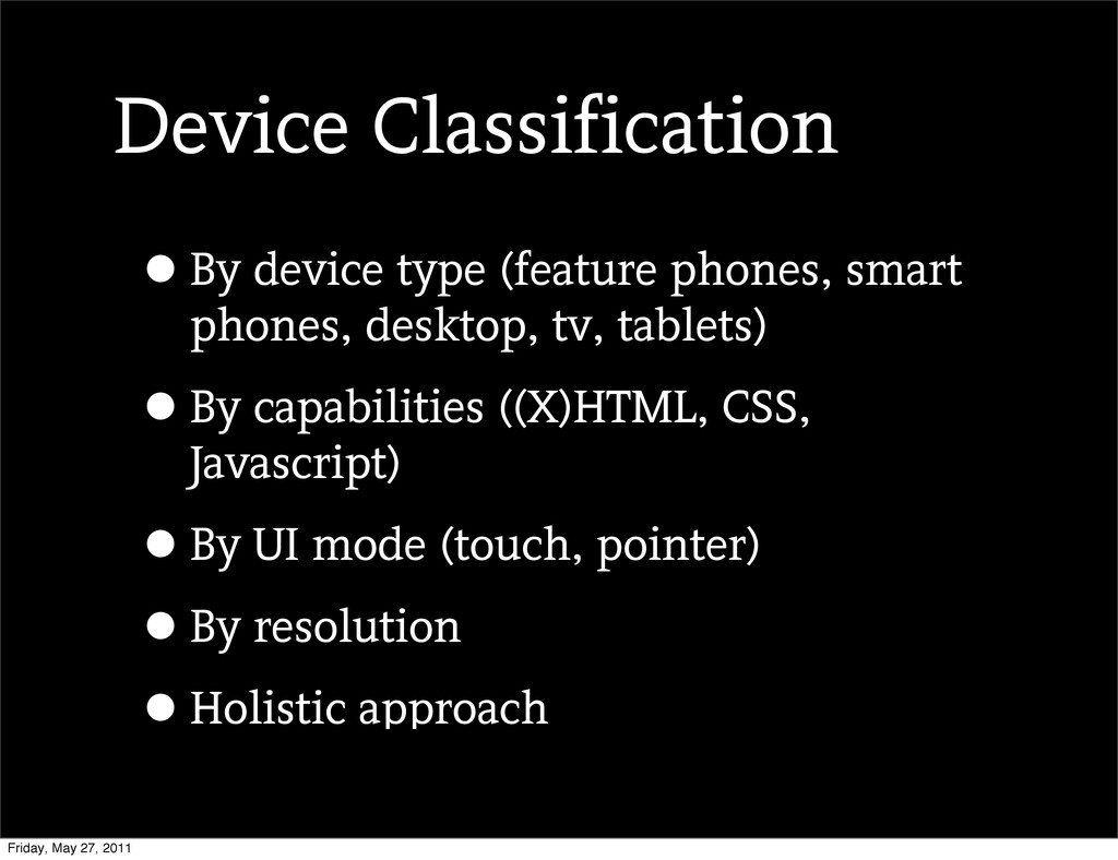
Device Classification •By device type (feature phones, smart phones, desktop,
tv, tablets) •By capabilities ((X)HTML, CSS, Javascript) •By UI mode (touch, pointer) •By resolution •Holistic approach Friday, May 27, 2011
http://flic.kr/p/99UEu4 Don’t Get Too Granular Friday, May 27, 2011
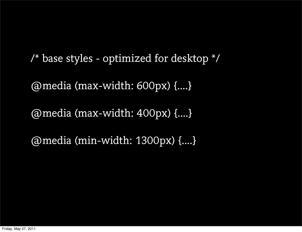
/* base styles - optimized for desktop */ @media (max-width:
600px) {....} @media (max-width: 400px) {....} @media (min-width: 1300px) {....} Friday, May 27, 2011
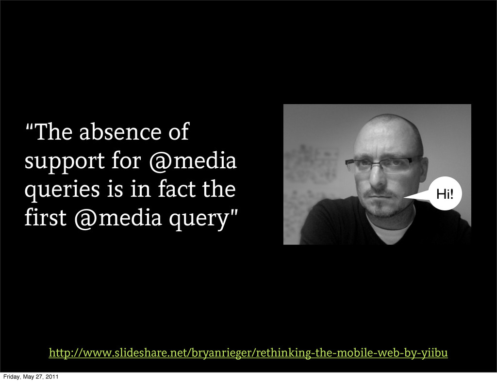
“The absence of support for @media queries is in fact
the first @media query” http://www.slideshare.net/bryanrieger/rethinking-the-mobile-web-by-yiibu Hi! Friday, May 27, 2011
Start with this Friday, May 27, 2011
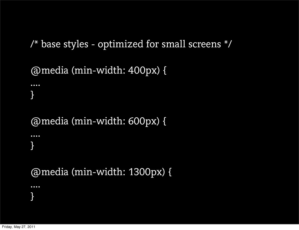
/* base styles - optimized for small screens */ @media
(min-width: 400px) { .... } @media (min-width: 600px) { .... } @media (min-width: 1300px) { .... } Friday, May 27, 2011
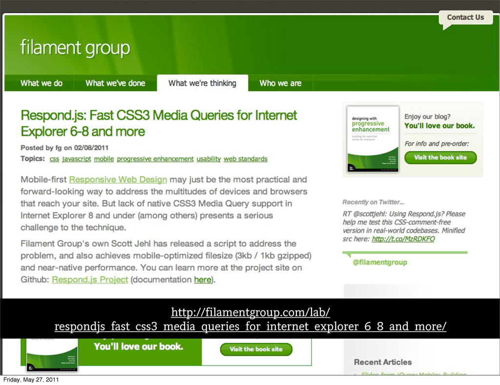
Text http://filamentgroup.com/lab/ respondjs_fast_css3_media_queries_for_internet_explorer_6_8_and_more/ Friday, May 27, 2011
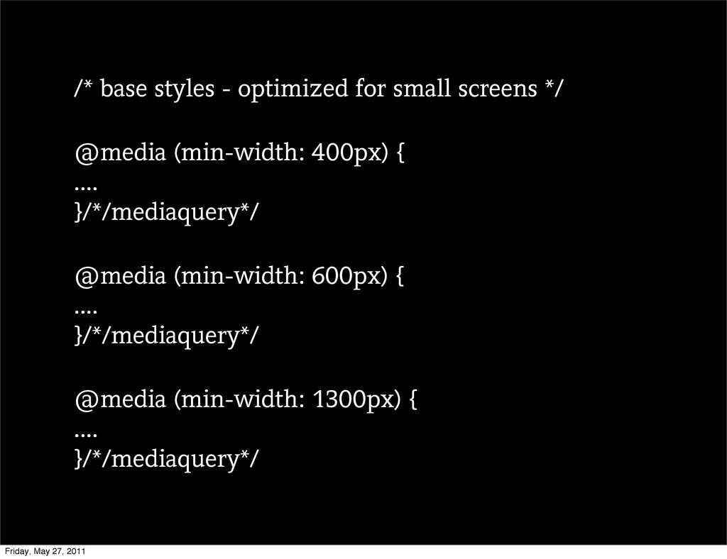
/* base styles - optimized for small screens */ @media
(min-width: 400px) { .... }/*/mediaquery*/ @media (min-width: 600px) { .... }/*/mediaquery*/ @media (min-width: 1300px) { .... }/*/mediaquery*/ Friday, May 27, 2011
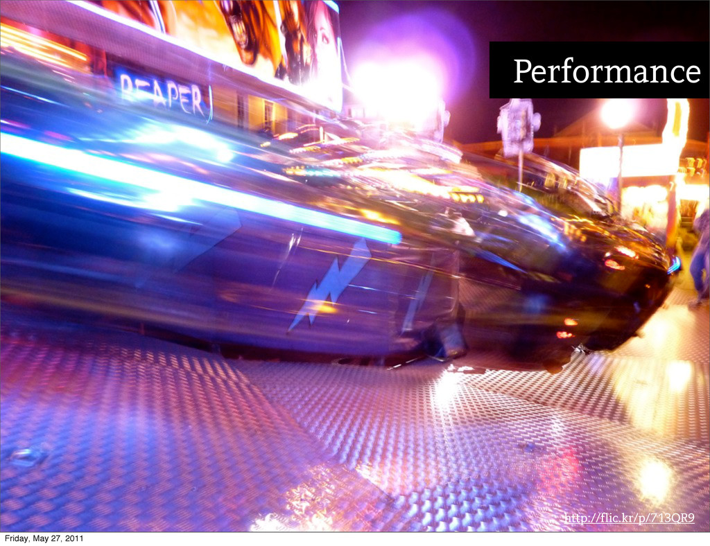
http://flic.kr/p/713QR9 Performance Friday, May 27, 2011
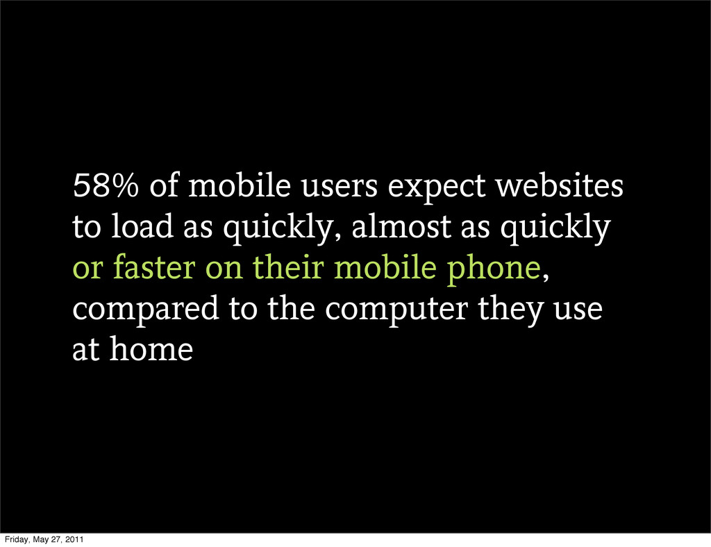
58% of mobile users expect websites to load as quickly,
almost as quickly or faster on their mobile phone, compared to the computer they use at home Friday, May 27, 2011
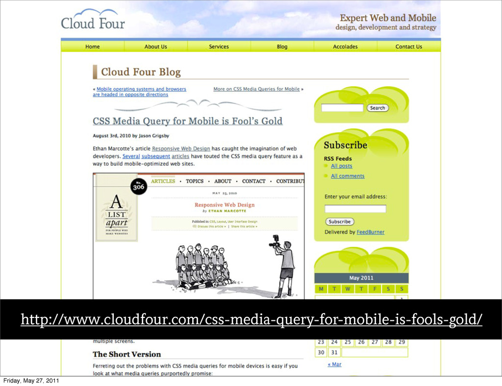
Text http://www.cloudfour.com/css-media-query-for-mobile-is-fools-gold/ Friday, May 27, 2011
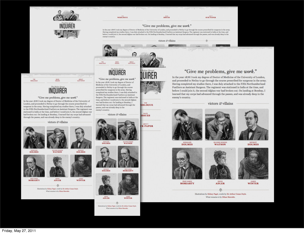
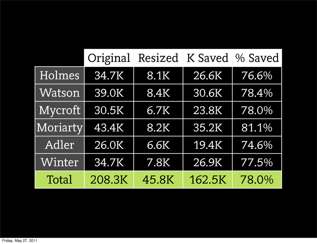
Original Resized K Saved % Saved Holmes Watson Mycroft Moriarty
Adler Winter 34.7K 8.1K 26.6K 76.6% 39.0K 8.4K 30.6K 78.4% 30.5K 6.7K 23.8K 78.0% 43.4K 8.2K 35.2K 81.1% 26.0K 6.6K 19.4K 74.6% 34.7K 7.8K 26.9K 77.5% Total 208.3K 45.8K 162.5K 78.0% Friday, May 27, 2011
Responsive Images Friday, May 27, 2011
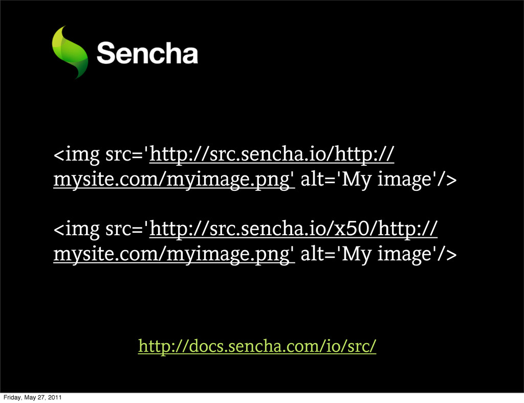
<img src='http://src.sencha.io/http:// mysite.com/myimage.png' alt='My image'/> <img src='http://src.sencha.io/x50/http:// mysite.com/myimage.png' alt='My image'/>
http://docs.sencha.com/io/src/ Friday, May 27, 2011
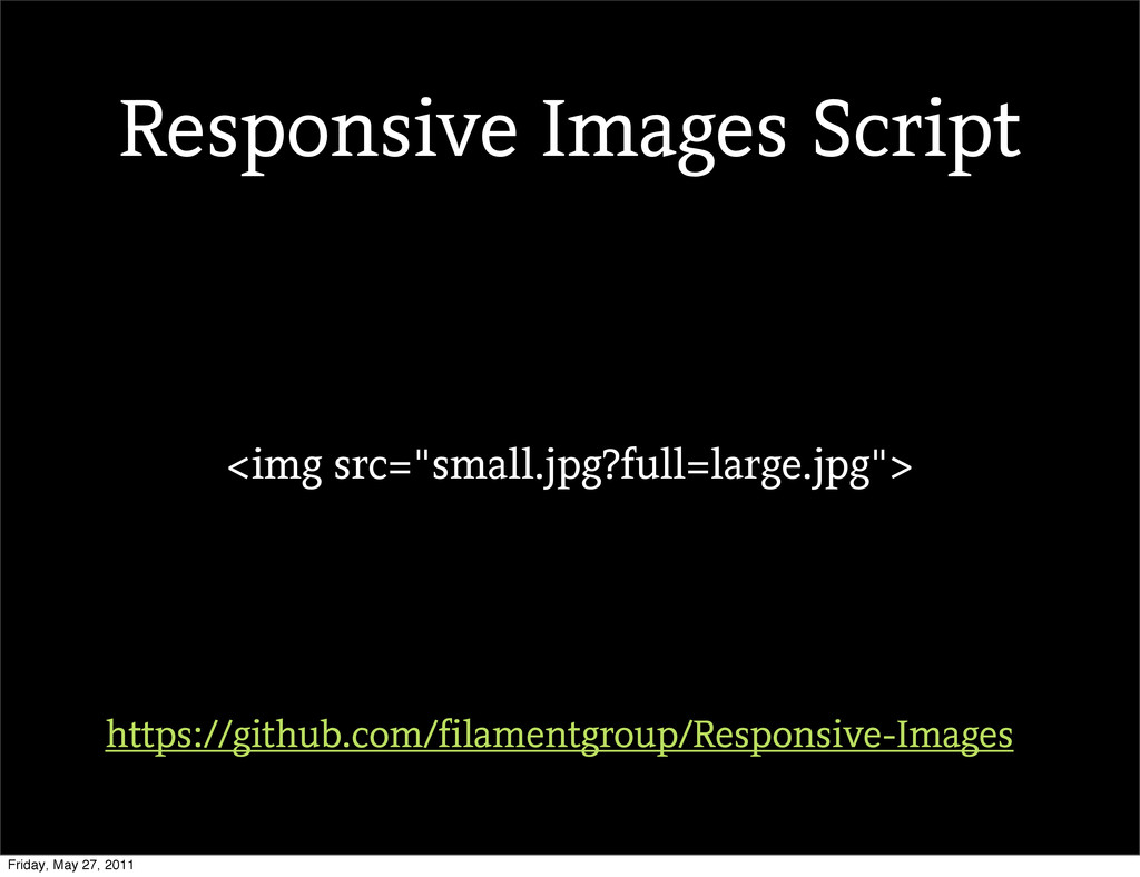
<img src="small.jpg?full=large.jpg"> https://github.com/filamentgroup/Responsive-Images Responsive Images Script Friday, May 27, 2011
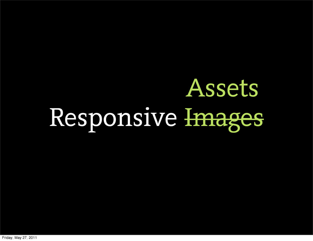
Responsive Images Assets Friday, May 27, 2011
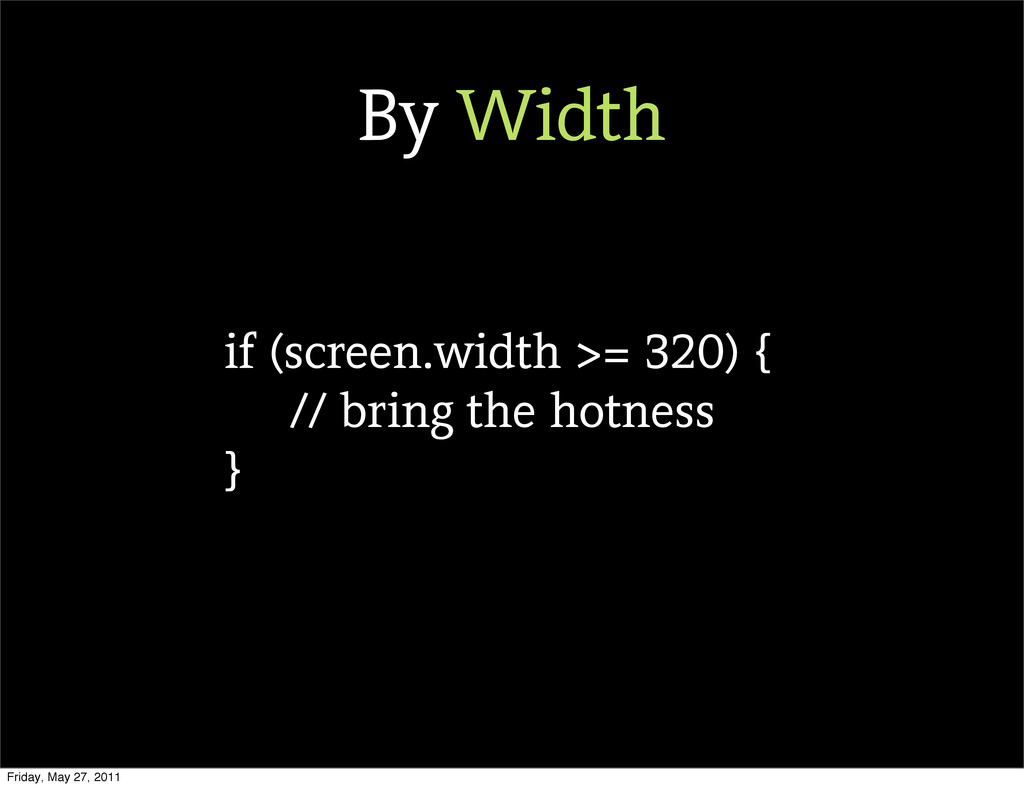
if (screen.width >= 320) { // bring the hotness }
By Width Friday, May 27, 2011
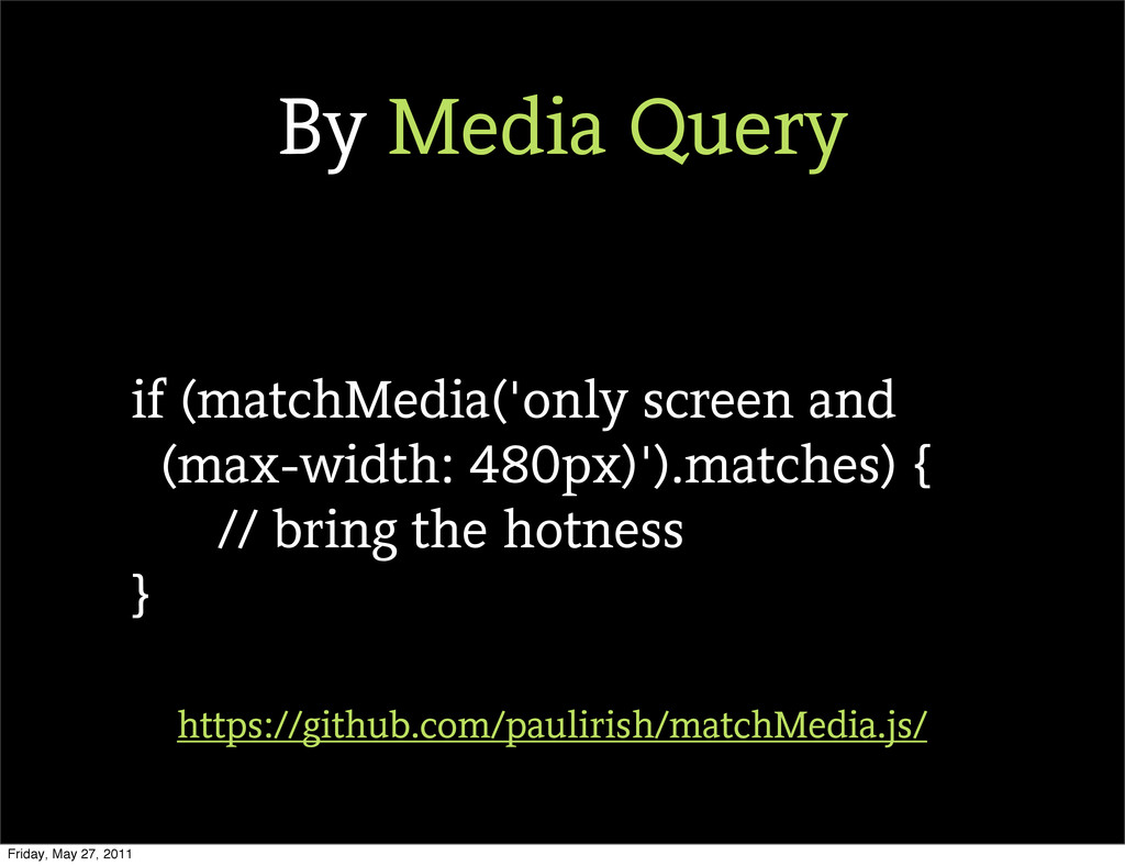
if (matchMedia('only screen and (max-width: 480px)').matches) { // bring the
hotness } https://github.com/paulirish/matchMedia.js/ By Media Query Friday, May 27, 2011
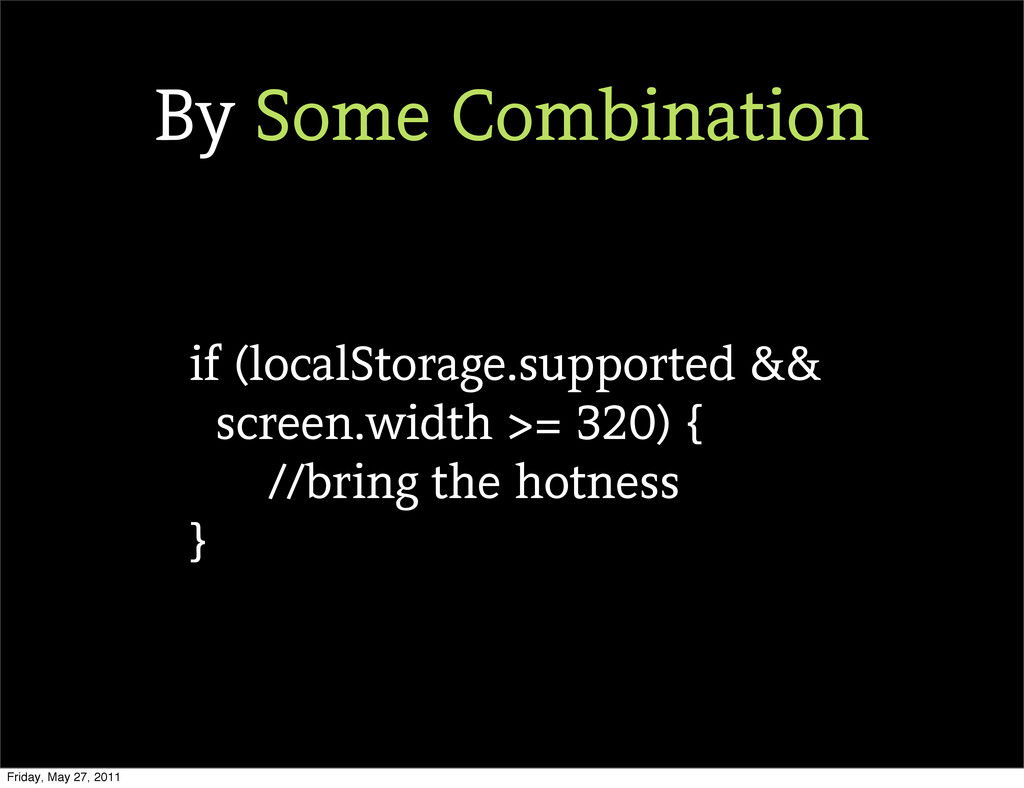
if (localStorage.supported && screen.width >= 320) { //bring the hotness
} By Some Combination Friday, May 27, 2011
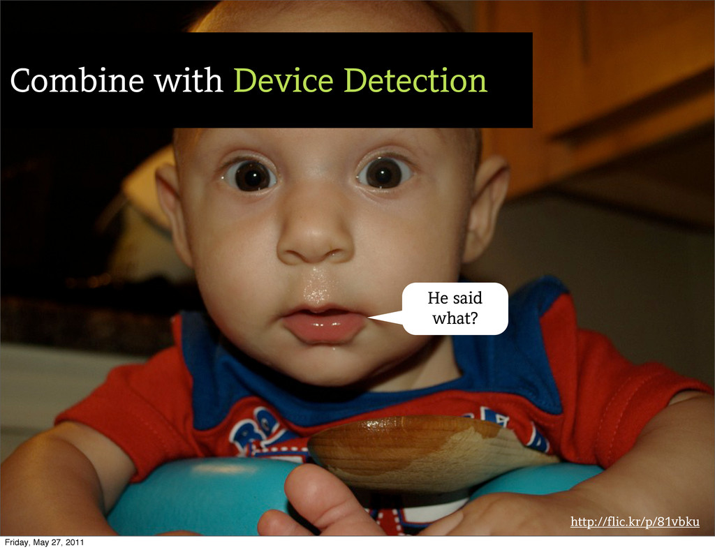
http://flic.kr/p/81vbku Combine with Device Detection He said what? Friday, May
27, 2011
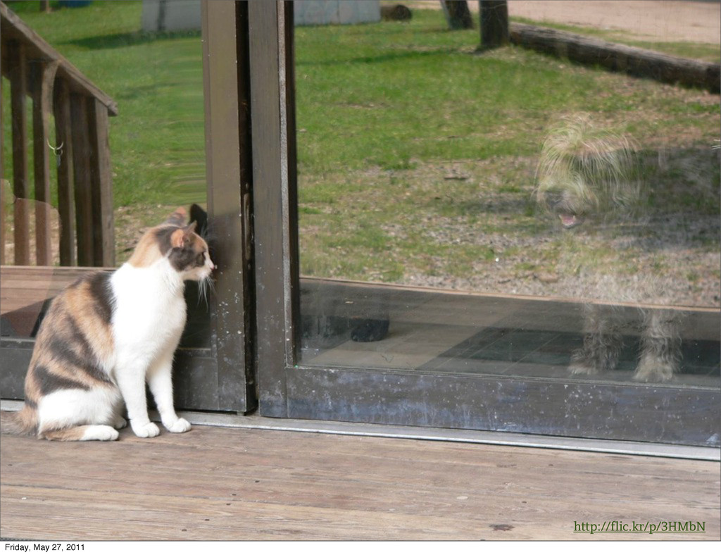
http://flic.kr/p/3HMbN Friday, May 27, 2011
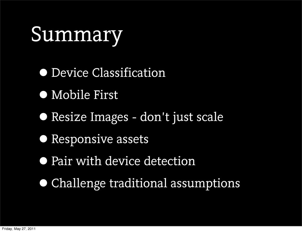
Summary •Device Classification •Mobile First •Resize Images - don’t just
scale •Responsive assets •Pair with device detection •Challenge traditional assumptions Friday, May 27, 2011
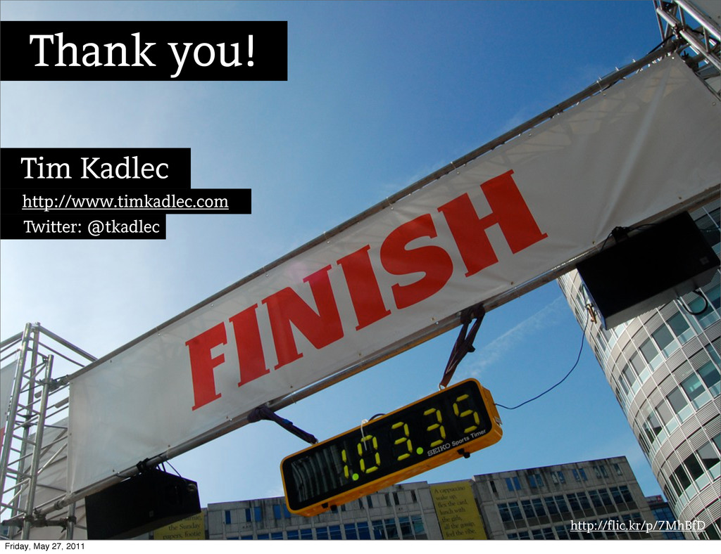
http://flic.kr/p/7MhBfD Thank you! Tim Kadlec http://www.timkadlec.com Twitter: @tkadlec Friday, May
27, 2011
• http://www.businessinsider.com/chart-of-the-day-pc-usage-2011-2 • http://www.slideshare.net/OnDevice/the-mobile-only-internet-generation • http://www.comscore.com/Press_Events/Press_Releases/2011/1/Web- based_Email_Shows_Signs_of_Decline_in_the_U.S._While_Mobile_Email_Usage_on_the_Ris e • http://internet2go.net/news/data-and-forecasts/pew-85-us-adults-have-mobile-phones-
one-ten-high-earners-own-tablets • http://www.bulletbits.com/slow-sites-and-bad-press/ • http://techcrunch.com/2011/01/25/eric-schmidt-at-dld11-google-will-add-1000-new- employees-in-europe/ • http://www.lukew.com/ff/entry.asp?1258 • http://www.slideshare.net/Gomez_Inc/gomez-mobile-web-experience-survey-why-the- mobile-web-is-disappointing-end-users Sources Friday, May 27, 2011
 tkadlec
 k1mu21
 handlename
 kuranuki
 geekplus_tech
 wakana0222
 kishida
 har1101
 jame2408
 naokihaba
 manfredsteyer
 sumedhbala
 pkshadeck
 kevinliebholz
 nikkihalliwell
 ipullrank
 samtorres
 caitiem20
 watany
 aleyda
 cassininazir
 samlambert
 ivargrimstad
 tapps
tapps