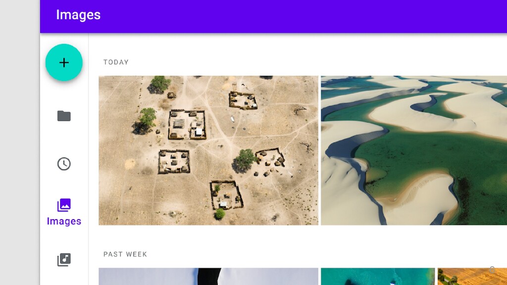
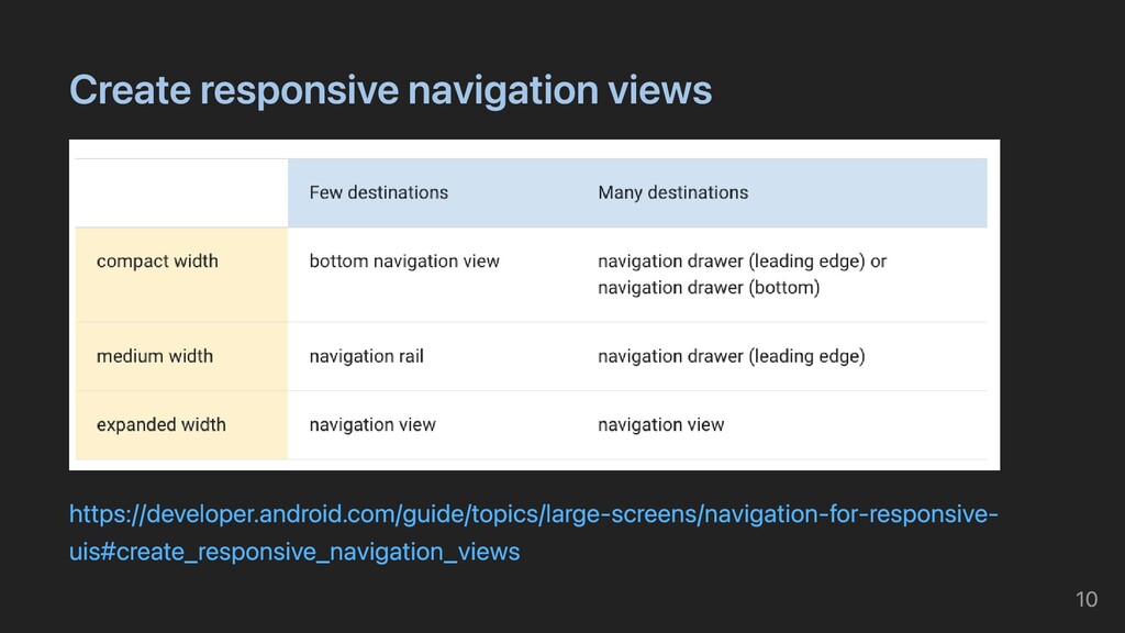
three to seven app destinations and, optionally, a Floating Action Button. Each destination is represented by an icon and a text label. The rail can function on its own at larger screen sizes, such as desktop and tablet. When users transition between screen sizes and devices, the rail can also complement other navigation components, such as bottom navigation. https://material.io/components/navigation-rail#usage 7
destinations that need to be accessible anywhere in an app Three to seven main destinations in a product Tablet or desktop layouts Navigation rails shouldn’t be used for: Small screen sizes Single tasks, such as viewing a single email Secondary navigation destinations https://material.io/components/navigation-rail#usage 8
 tomoya0x00
 pokohide
 uhyo
uhyo
 genda
genda
 bengo4com
 ming_ayami
 a_ono
a_ono
 kanny
kanny
 krrrr38
 doradora09
 nomizone
 ry0_ka
 lycorptech_jp
 seathinner
 addyosmani
 lara
lara
 matthewcrist
 csswizardry
 jnunemaker
 hatefulcrawdad
 vanstee
 emna__ayadi
 tmiket
 oripsolob