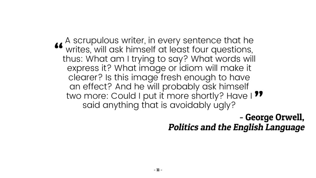
ask himself at least four questions, thus: What am I trying to say? What words will express it? What image or idiom will make it clearer? Is this image fresh enough to have an effect? And he will probably ask himself two more: Could I put it more shortly? Have I said anything that is avoidably ugly?
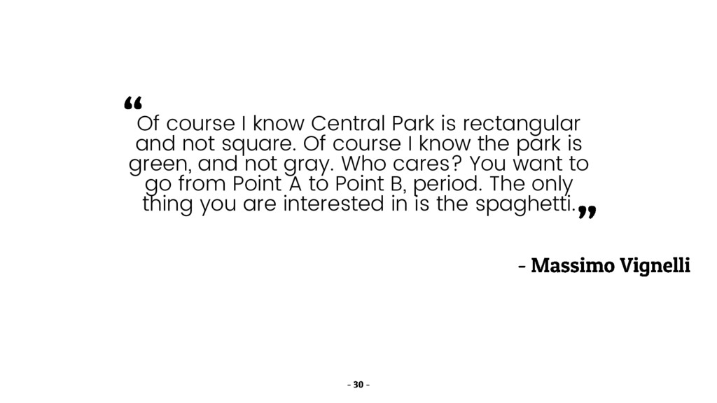
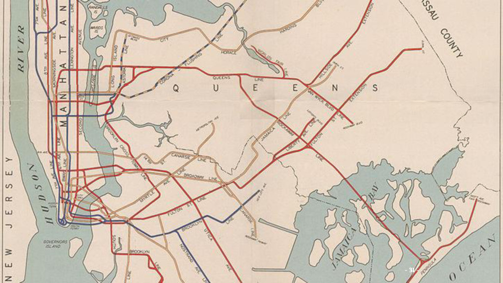
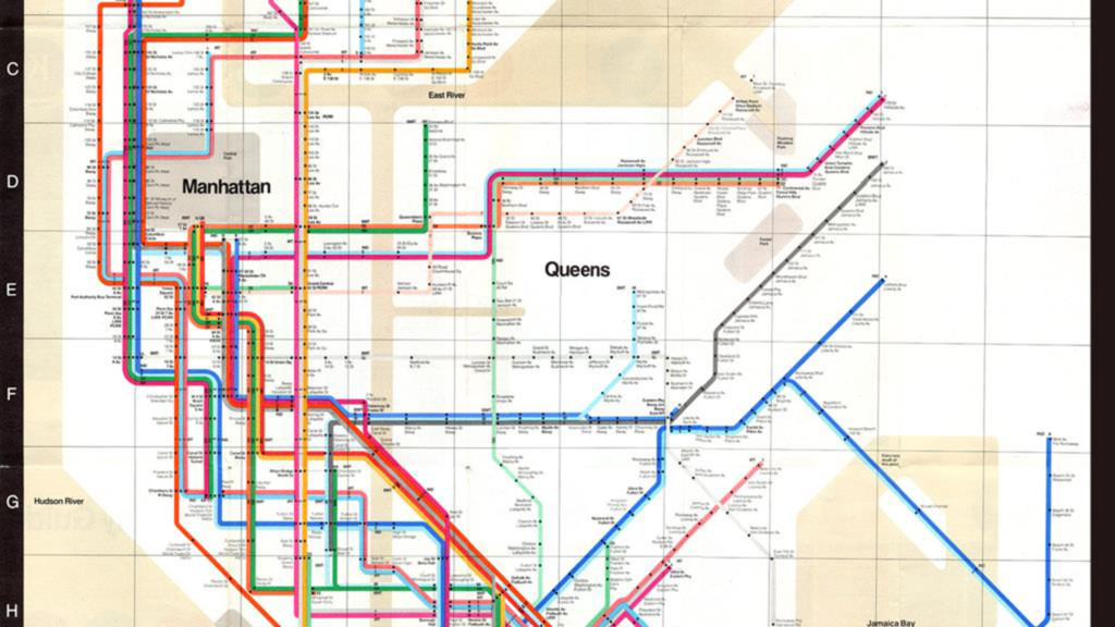
square. Of course I know the park is green, and not gray. Who cares? You want to go from Point A to Point B, period. The only thing you are interested in is the spaghetti.
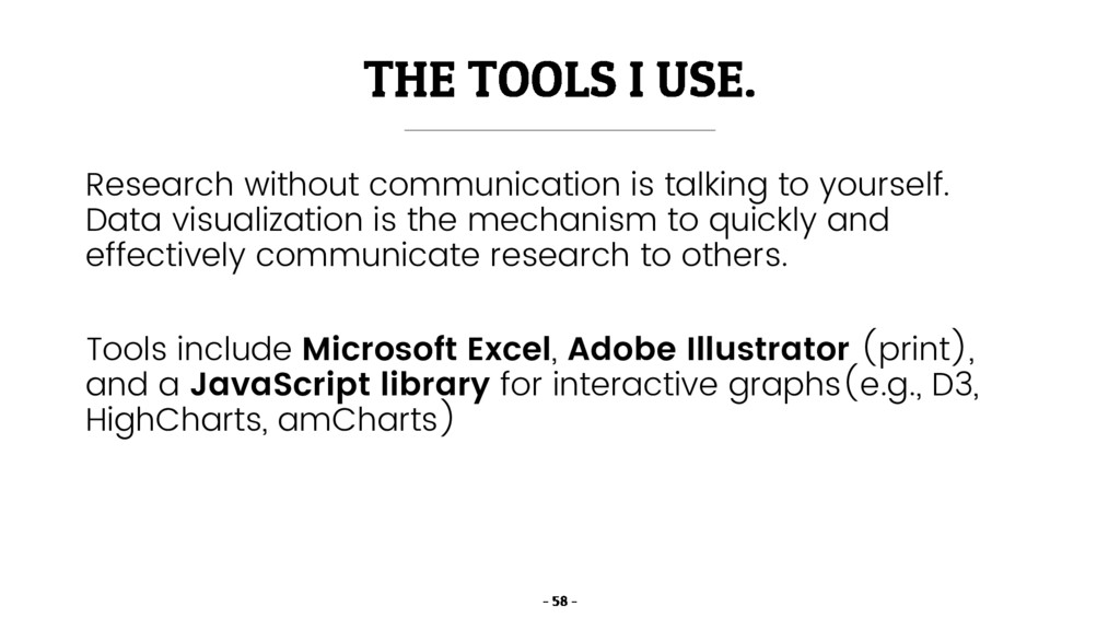
the mechanism to quickly and effectively communicate research to others. Tools include Microsoft Excel, Adobe Illustrator (print), and a JavaScript library for interactive graphs(e.g., D3, HighCharts, amCharts)
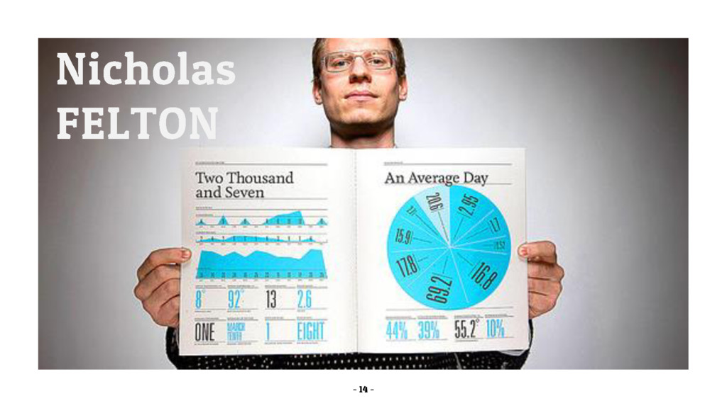
![[A] new kind of professional has emerged, the data scientist,](https://files.speakerdeck.com/presentations/5de9079a38f64d9db9dcef2998f0d51f/slide_2.jpg)