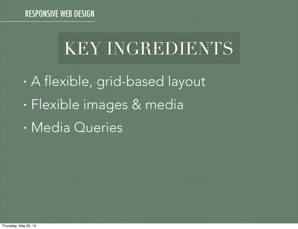
This is a talk I'm refining overtime that gives a good general overview of the responsive and mobile-first methodologies as well as the workflow involved.
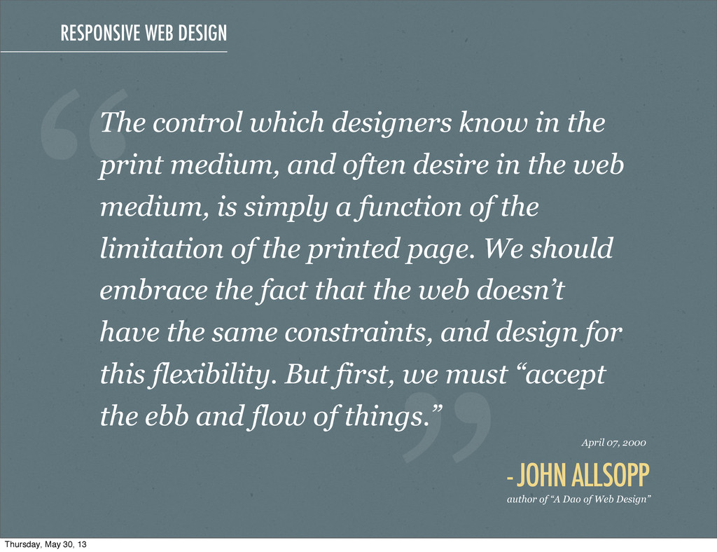
print medium, and often desire in the web medium, is simply a function of the limitation of the printed page. We should embrace the fact that the web doesn’t have the same constraints, and design for this flexibility. But first, we must “accept the ebb and flow of things.” “ - JOHN ALLSOPP author of “A Dao of Web Design” April 07, 2000 Thursday, May 30, 13
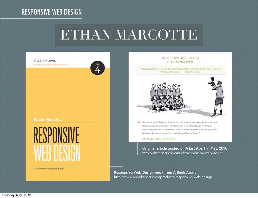
May, 2010 http://alistapart.com/article/responsive-web-design Responsive Web Design book from A Book Apart http://www.abookapart.com/products/responsive-web-design RESPONSIVE WEB DESIGN Thursday, May 30, 13
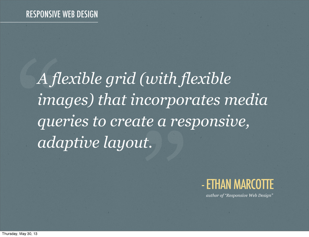
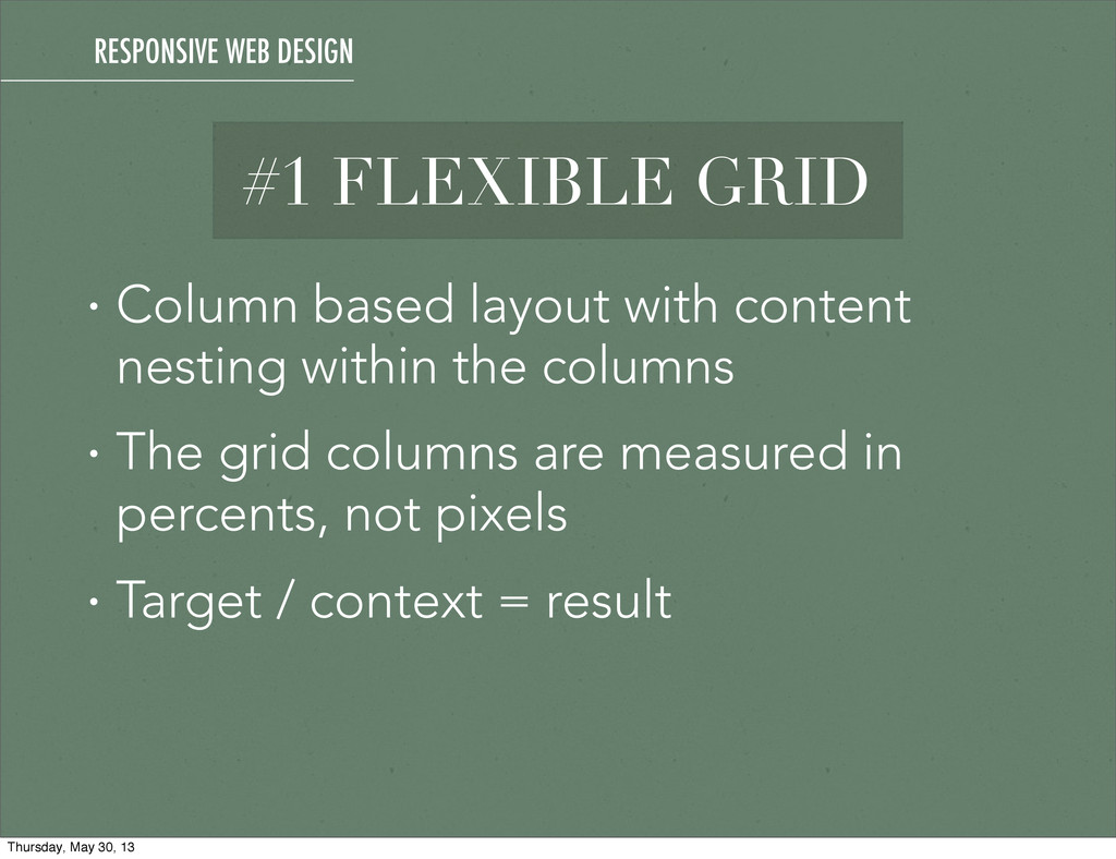
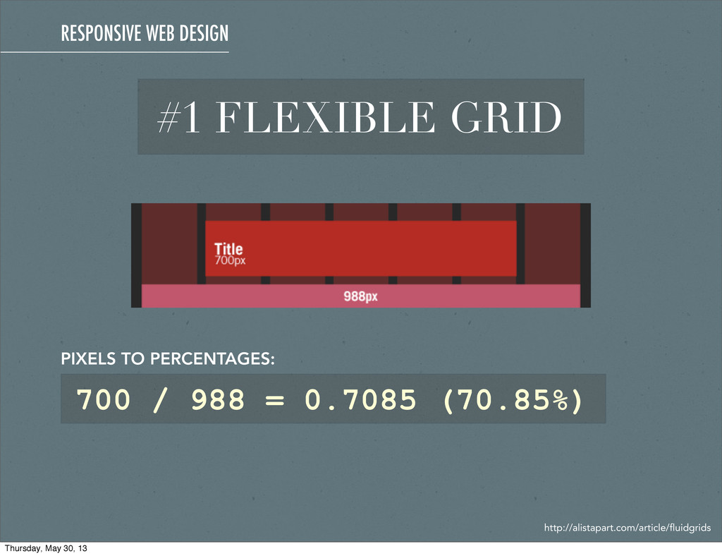
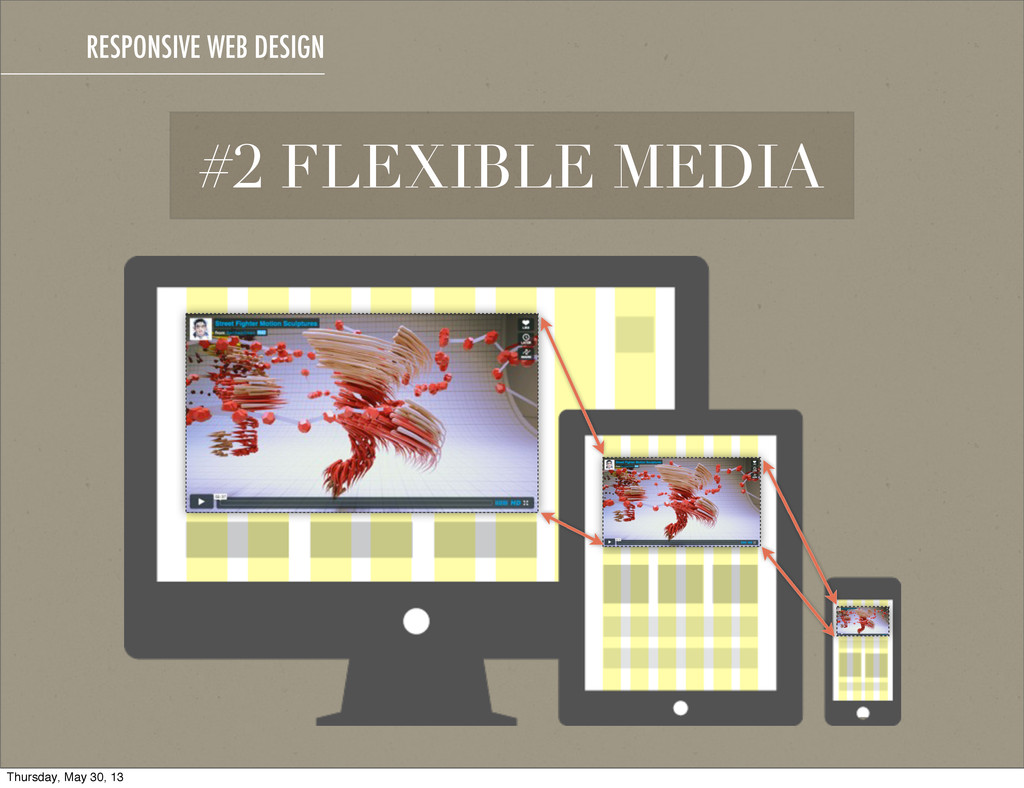
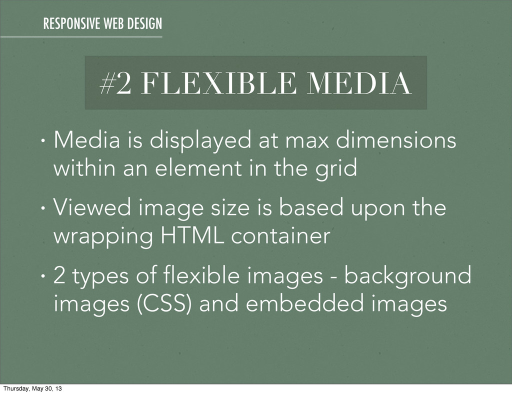
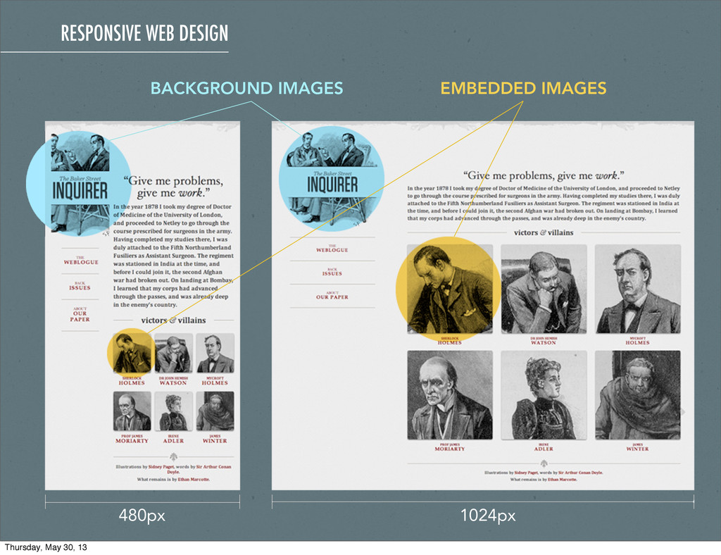
in the grid • Viewed image size is based upon the wrapping HTML container • 2 types of flexible images - background images (CSS) and embedded images #2 FLEXIBLE MEDIA RESPONSIVE WEB DESIGN Thursday, May 30, 13
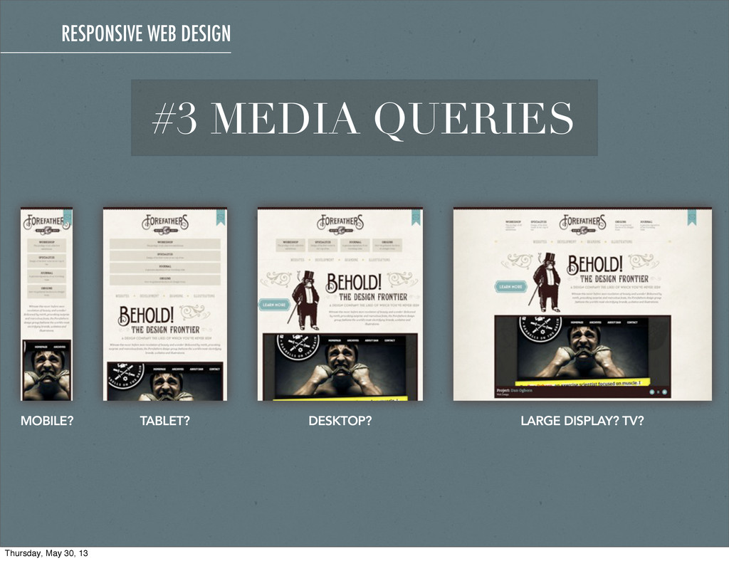
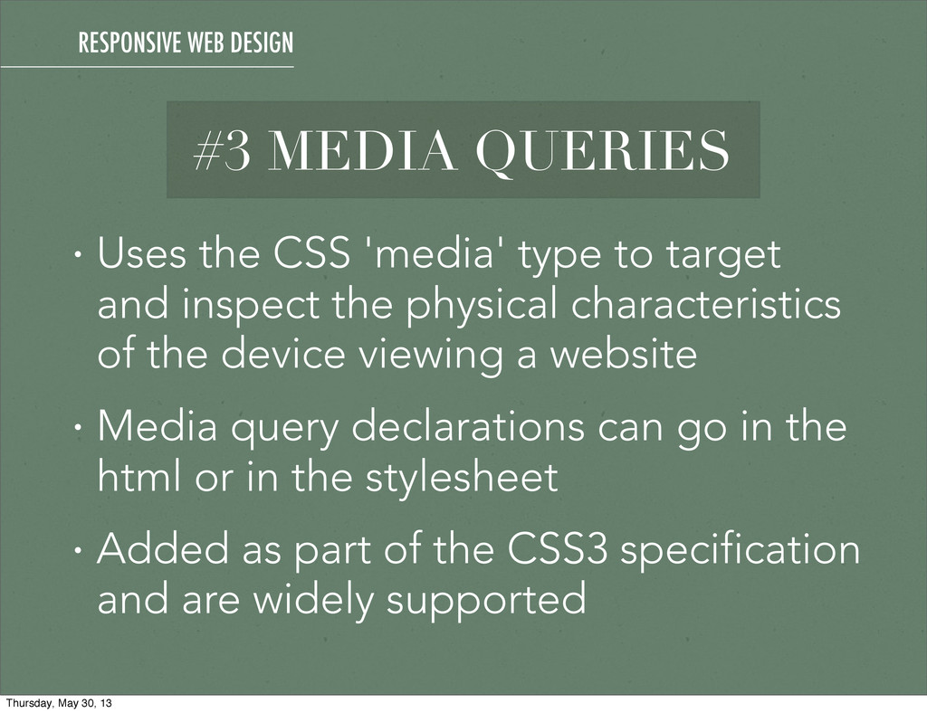
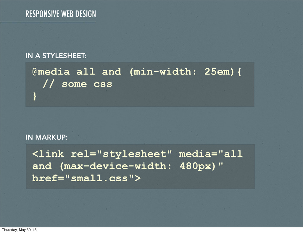
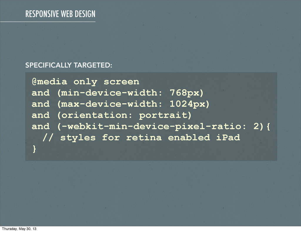
the physical characteristics of the device viewing a website • Media query declarations can go in the html or in the stylesheet • Added as part of the CSS3 specification and are widely supported #3 MEDIA QUERIES RESPONSIVE WEB DESIGN Thursday, May 30, 13
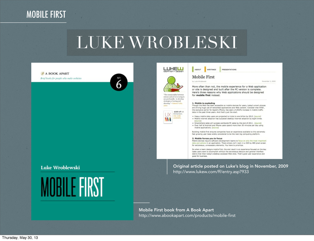
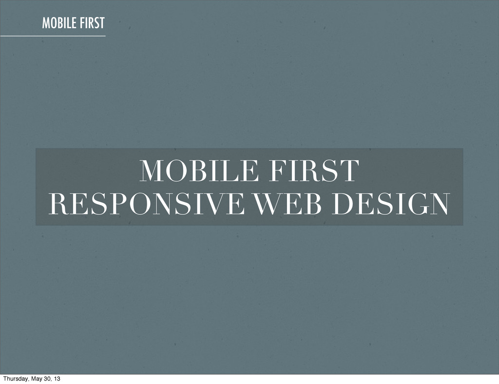
2009 http://www.lukew.com/ff/entry.asp?933 Mobile First book from A Book Apart http://www.abookapart.com/products/mobile-first MOBILE FIRST Thursday, May 30, 13
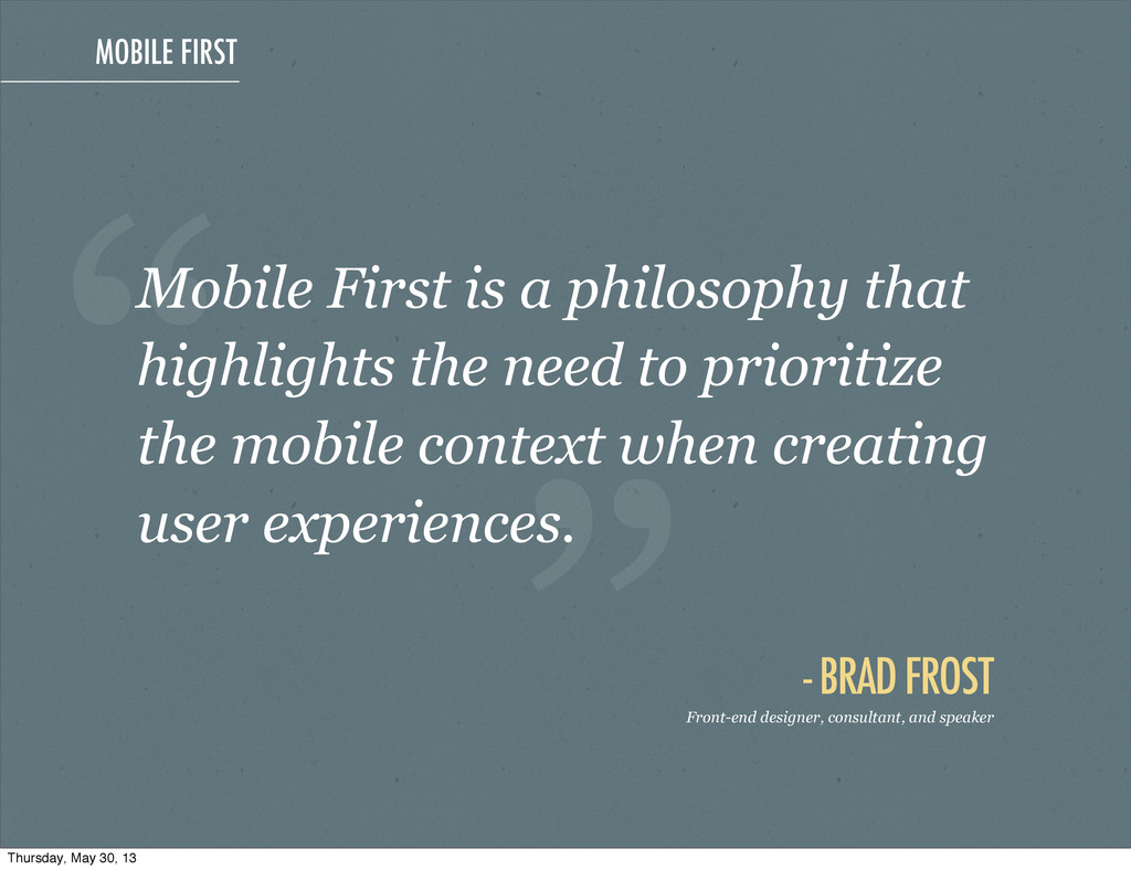
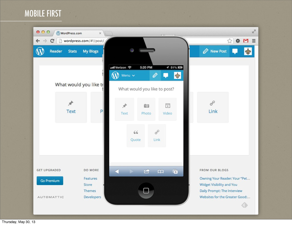
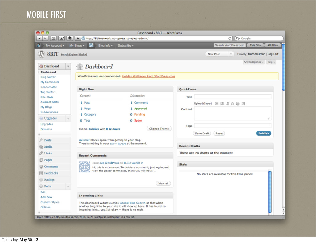
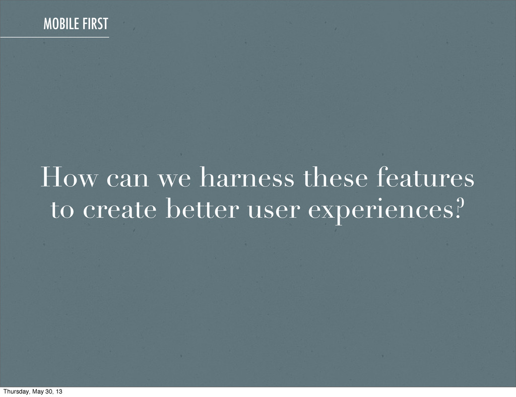
and speaker Mobile First is a philosophy that highlights the need to prioritize the mobile context when creating user experiences. Thursday, May 30, 13
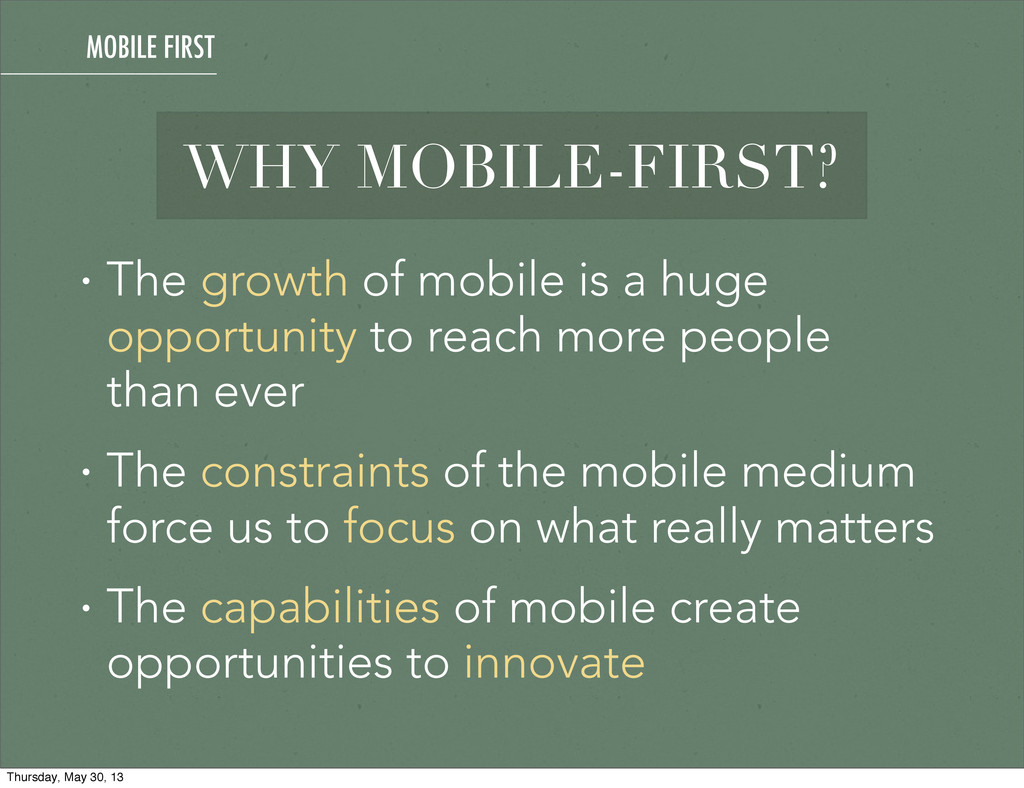
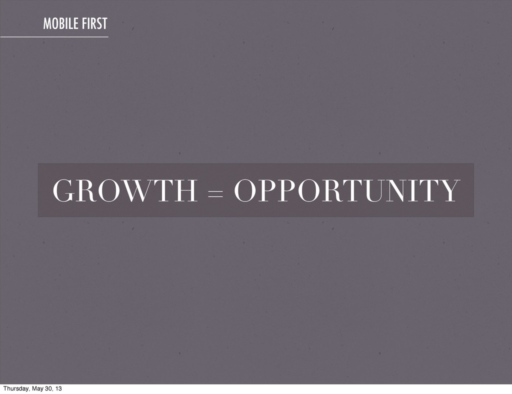
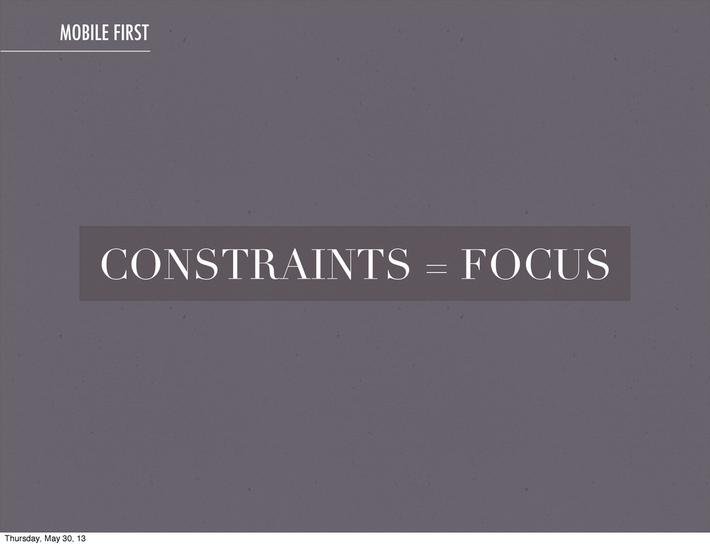
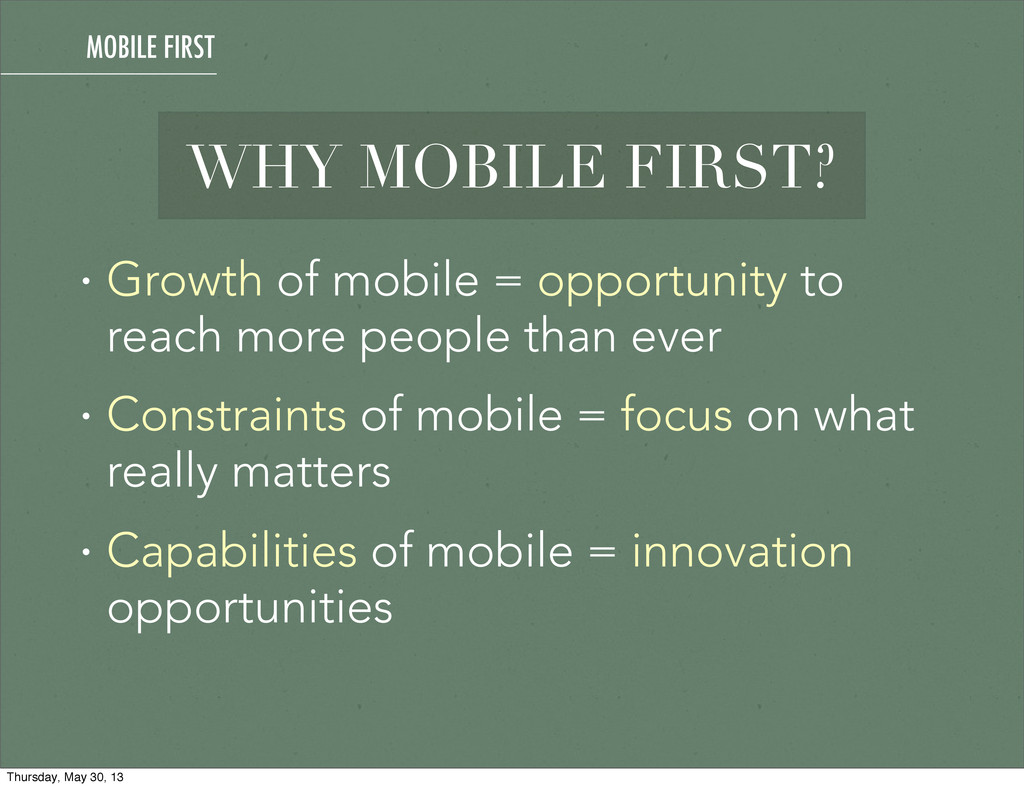
opportunity to reach more people than ever • The constraints of the mobile medium force us to focus on what really matters • The capabilities of mobile create opportunities to innovate MOBILE FIRST Thursday, May 30, 13
than ever • Constraints of mobile = focus on what really matters • Capabilities of mobile = innovation opportunities WHY MOBILE FIRST? MOBILE FIRST Thursday, May 30, 13
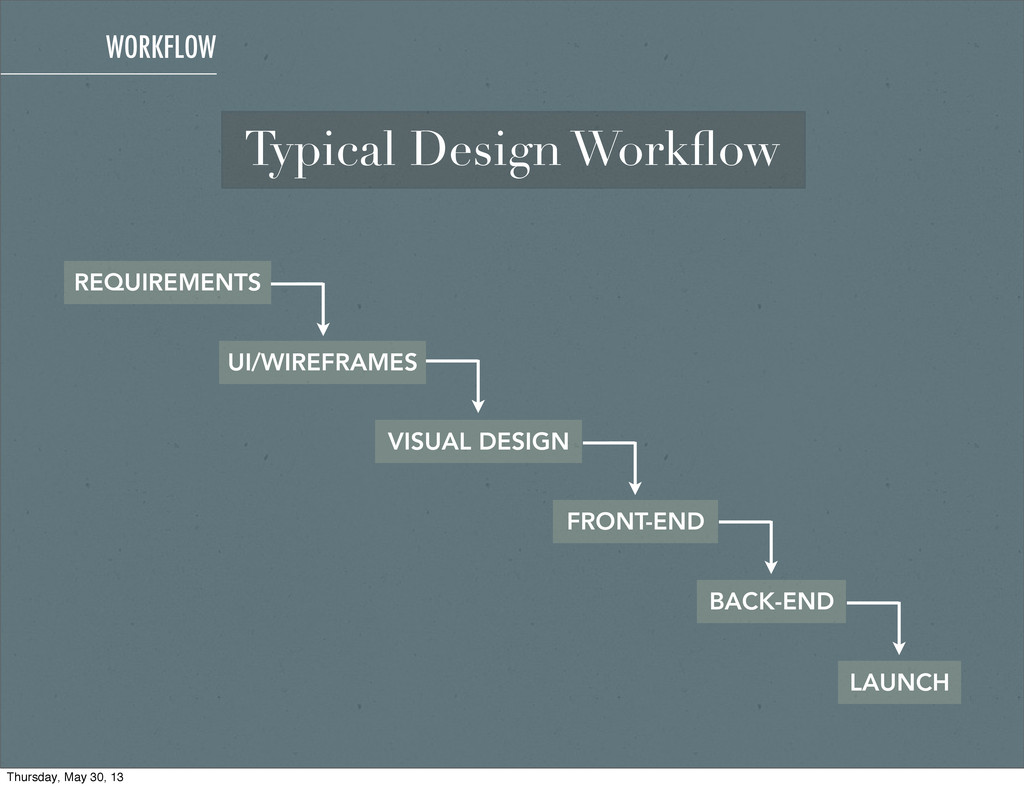
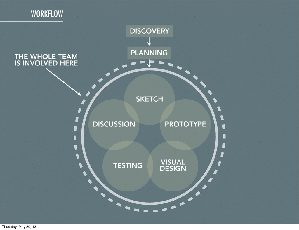
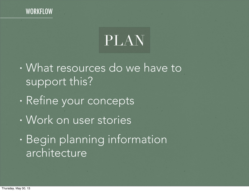
effective • Process is spelled out in linear, well- defined stages • Defined start and end points, progress is easily measured • Agreed and signed off comps WORKFLOW PROS Thursday, May 30, 13
• Less flexibility • Slow to start, lots of waiting • No product owner visibility until the end of the design/development process WORKFLOW CONS Thursday, May 30, 13
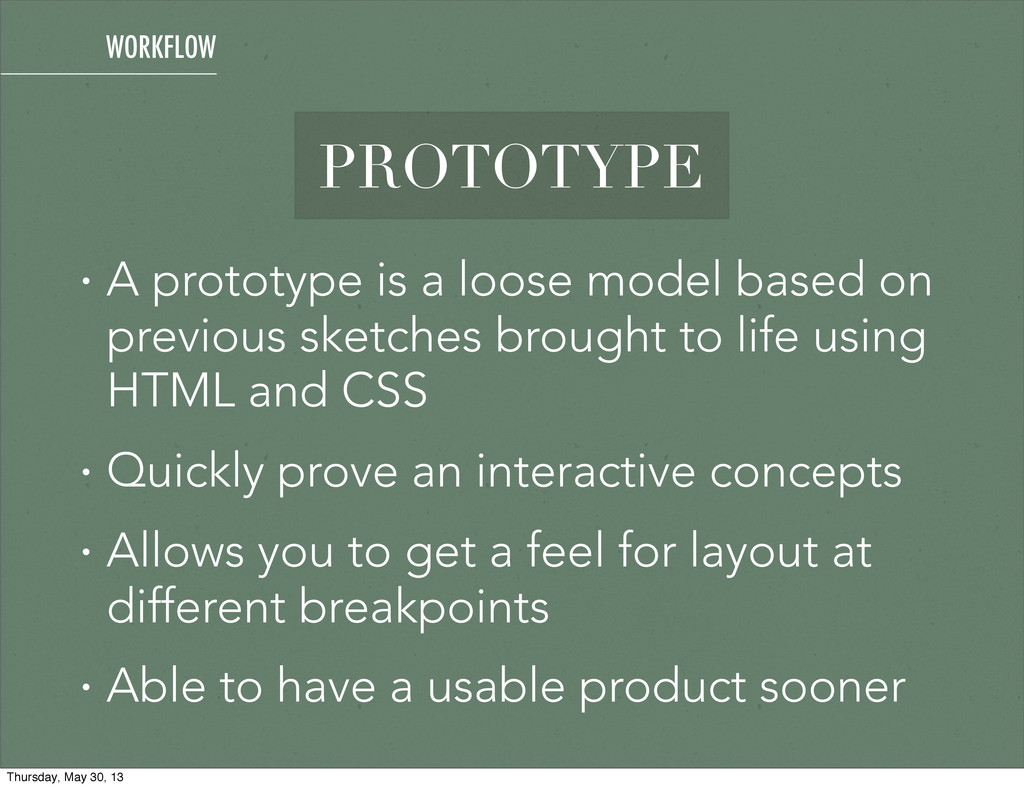
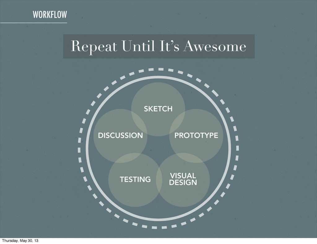
previous sketches brought to life using HTML and CSS • Quickly prove an interactive concepts • Allows you to get a feel for layout at different breakpoints • Able to have a usable product sooner WORKFLOW Thursday, May 30, 13
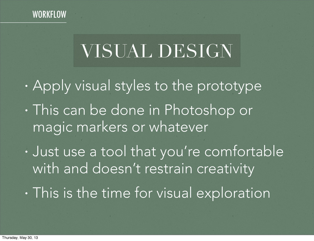
This can be done in Photoshop or magic markers or whatever • Just use a tool that you’re comfortable with and doesn’t restrain creativity • This is the time for visual exploration WORKFLOW Thursday, May 30, 13
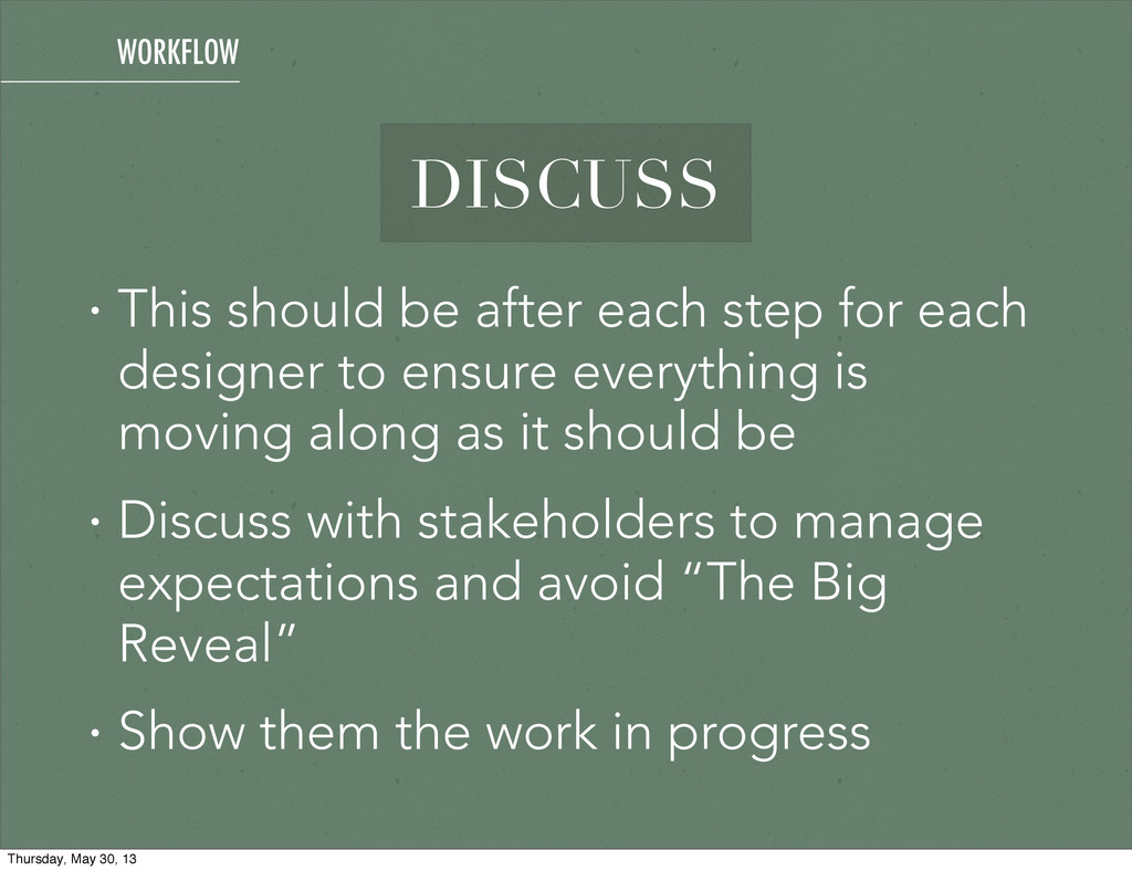
designer to ensure everything is moving along as it should be • Discuss with stakeholders to manage expectations and avoid “The Big Reveal” • Show them the work in progress WORKFLOW Thursday, May 30, 13
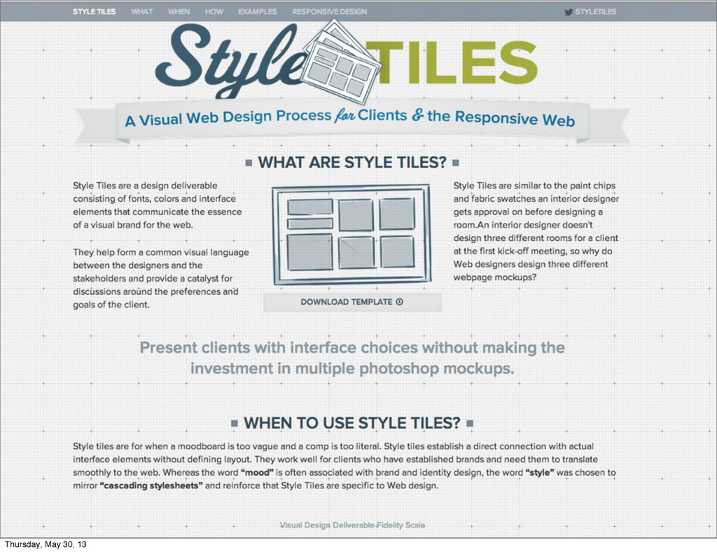
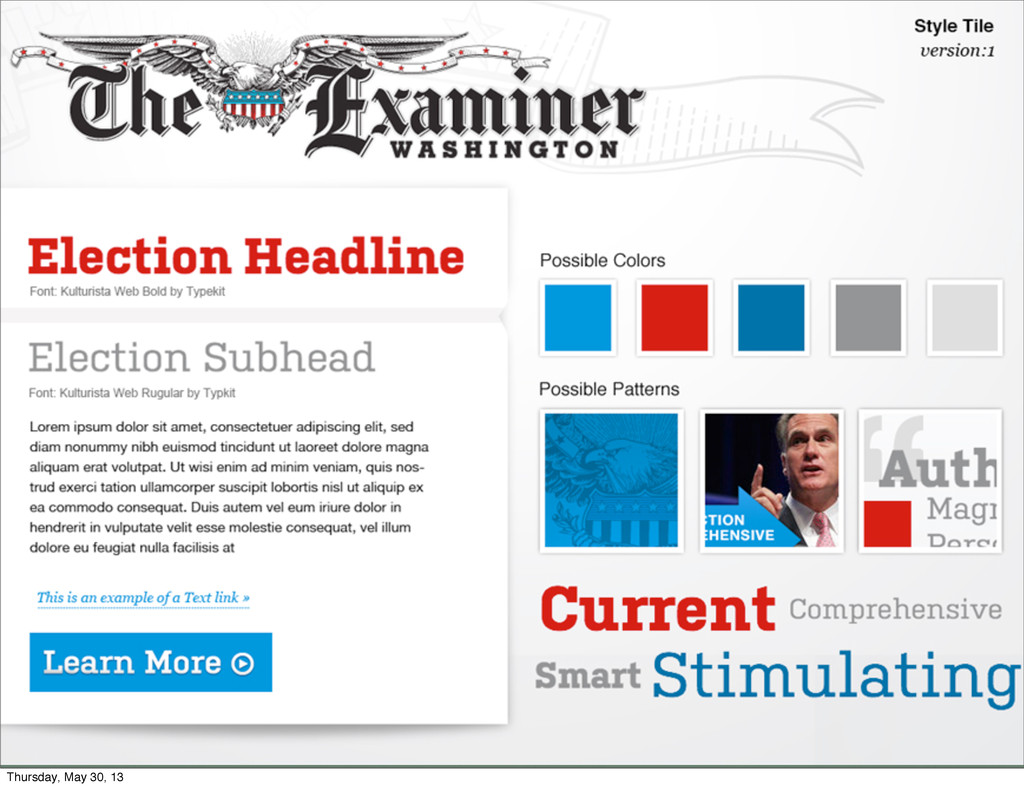
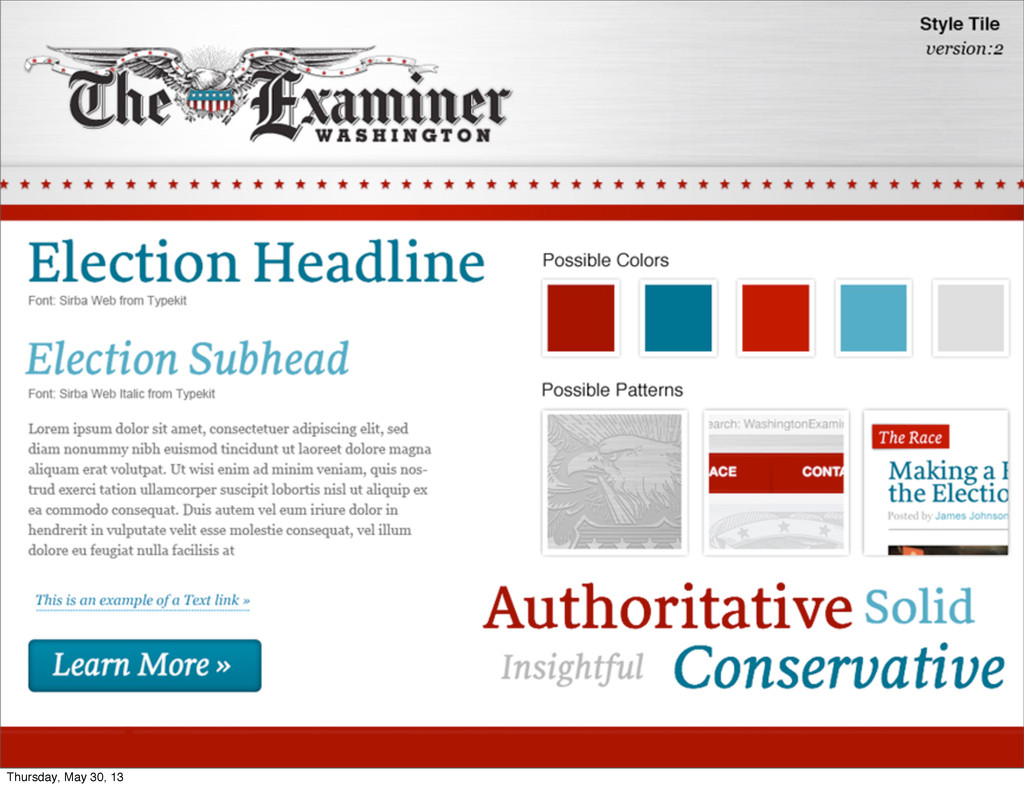
content priority order • Use StyleTiles for gathering visual language (colors and type) • Add breakpoints when stuff starts to look off - don’t let current device widths dictate your design BUILDING & MAINTAINING Thursday, May 30, 13
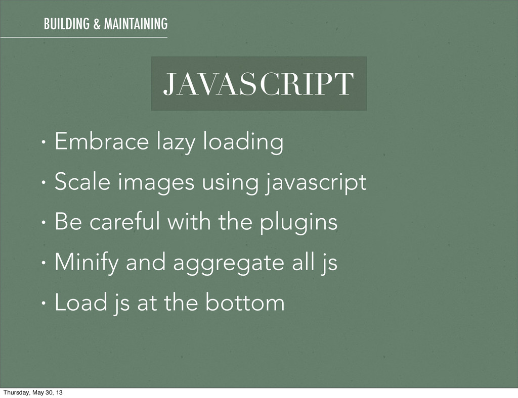
images • Use data uri’s or font icons when you can • Try not to increase or decrease an image past 20% of its size • Optimize images using lossless compression BUILDING & MAINTAINING Thursday, May 30, 13
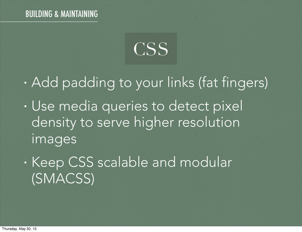
• Use em based media queries • Use a CSS preprocessor (SASS, LESS, Stylus) • Minify and combine your CSS into one stylesheet (for production) CSS BUILDING & MAINTAINING Thursday, May 30, 13
media queries to detect pixel density to serve higher resolution images • Keep CSS scalable and modular (SMACSS) CSS BUILDING & MAINTAINING Thursday, May 30, 13
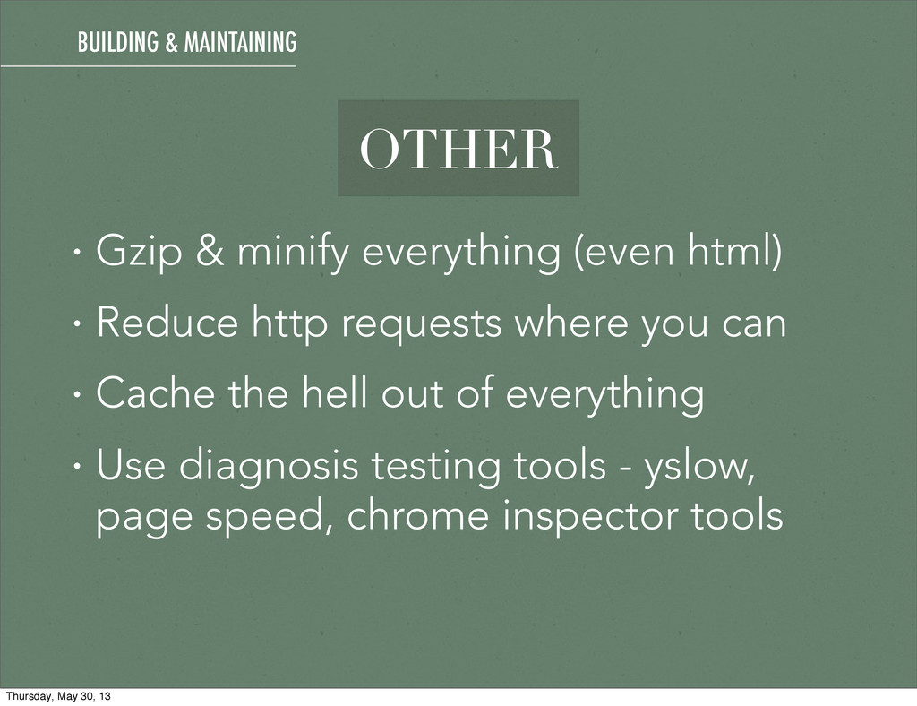
http requests where you can • Cache the hell out of everything • Use diagnosis testing tools - yslow, page speed, chrome inspector tools BUILDING & MAINTAINING Thursday, May 30, 13
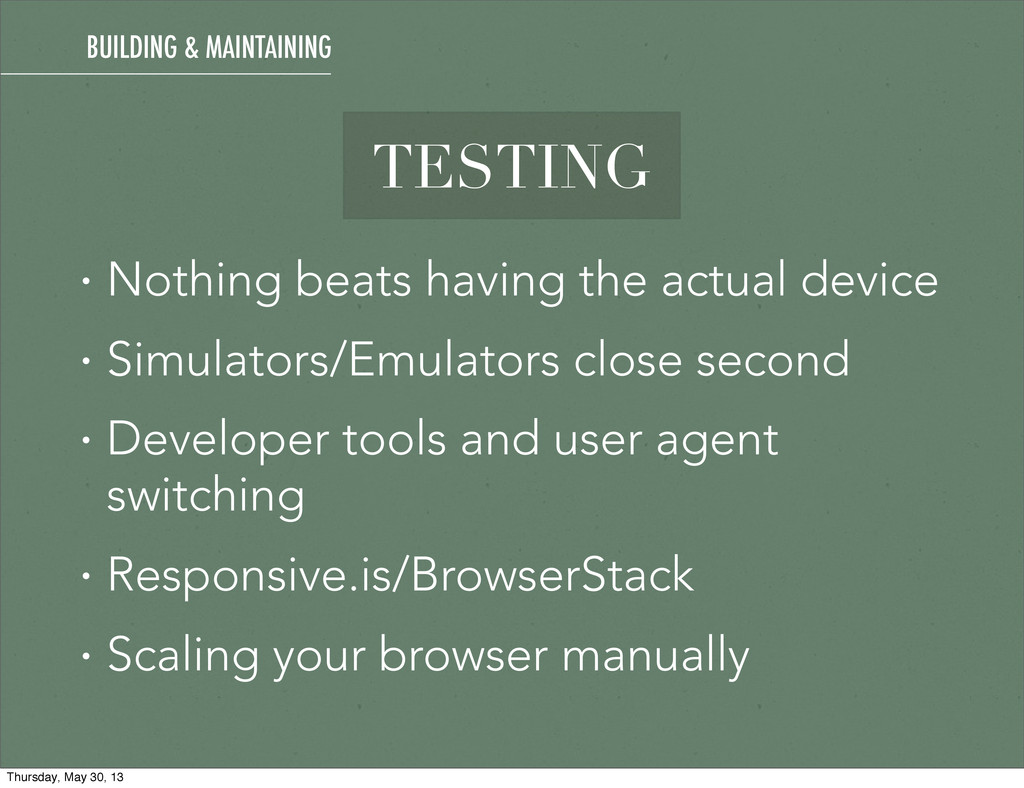
close second • Developer tools and user agent switching • Responsive.is/BrowserStack • Scaling your browser manually BUILDING & MAINTAINING Thursday, May 30, 13
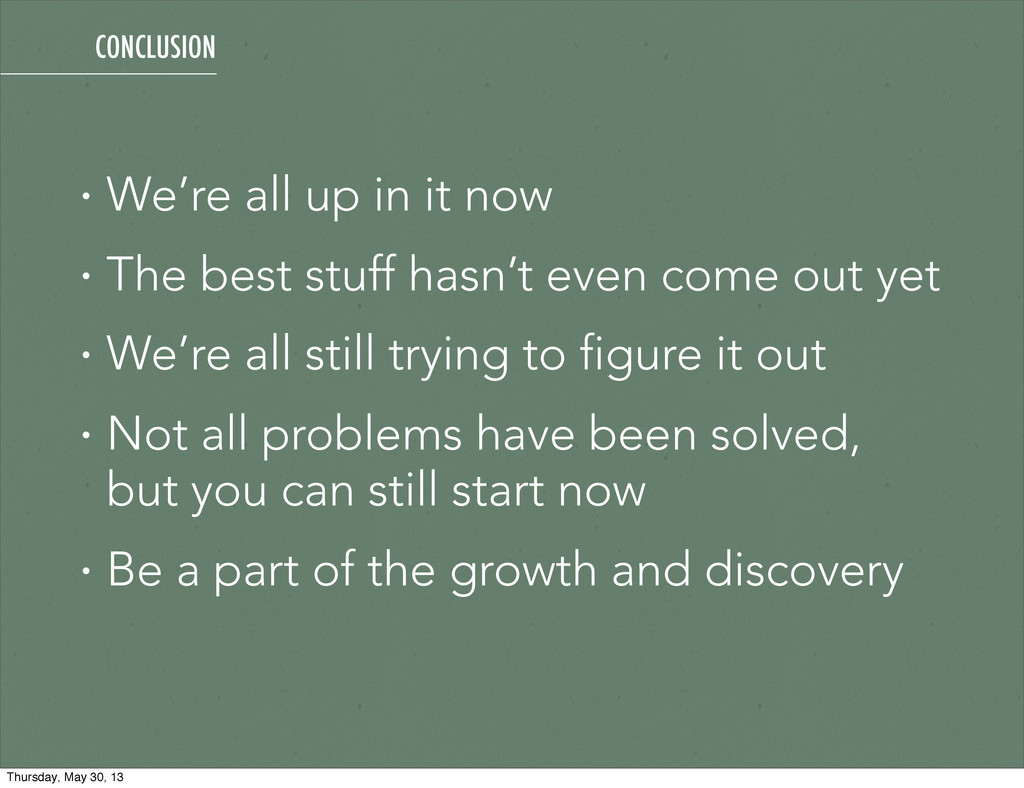
stuff hasn’t even come out yet • We’re all still trying to figure it out • Not all problems have been solved, but you can still start now • Be a part of the growth and discovery CONCLUSION Thursday, May 30, 13
 tpitre
 masasuzu
 sansan33
 kentapapa
 flatt_security
 kotaoue
 kyonmm
 panda_program
 sahou909
 lycorptech_jp
 tebiki
 ryuhei0000yamamoto
.jpg) shota_kusaba
shota_kusaba
 inesmontani
 csswizardry
 aleyda
 mayatellez
 reverentgeek
 morganepeng
 techseoconnect
 kimpetersen
 katarinadahlin
 gurzu
gurzu
 tapps
tapps
 swwweet