Upgrade to Pro — share decks privately, control downloads, hide ads and more …

Responsive Web Design Workshop for Refresh LX, 2012

Ben Callahan
September 20, 2012

Responsive Web Design Workshop for Refresh LX, 2012

Slides from my 3 hour workshop in Lisbon, Portugal on Responsive Web Design.

Ben Callahan

September 20, 2012
Tweet

More Decks by Ben Callahan

Other Decks in Design

Transcript

  1. Ben Callahan President, Sparkbox Refresh LX September 20 & 21,

    2012 Responsive Web Design @BENCALLAHAN http://bit.ly/LWLTEA RESPONSIVE WEB DESIGN Friday, September 21, 12
  2. @BENCALLAHAN The Necessary Intro RESPONSIVE WEB DESIGN My name is

    Ben @bencallahan http://seesparkbox.com Friday, September 21, 12
  3. @BENCALLAHAN The Necessary Intro RESPONSIVE WEB DESIGN Download the repo

    http://bit.ly/LWLTEA Friday, September 21, 12
  4. @BENCALLAHAN What We’ll Cover RESPONSIVE WEB DESIGN RWD 101 RWD

    Process RWD Patterns What’s Next in RWD Friday, September 21, 12
  5. @BENCALLAHAN RESPONSIVE WEB DESIGN 0 500 1000 1500 2000 2007

    2008 2009 2010 2011 2012 2013 2014 2015 Mobile Users Desktop Users RWD 101 Friday, September 21, 12
  6. @BENCALLAHAN RESPONSIVE WEB DESIGN People are trying to browse your

    sites on these devices. Today. RWD 101 Friday, September 21, 12
  7. @BENCALLAHAN RESPONSIVE WEB DESIGN Honor the proportions of the design

    by creating percentage-based grids instead of fixed-width, pixel-based grids. RWD 101: A Fluid Foundation Friday, September 21, 12
  8. @BENCALLAHAN RESPONSIVE WEB DESIGN <div class=”span-1”> <!-- one column -->

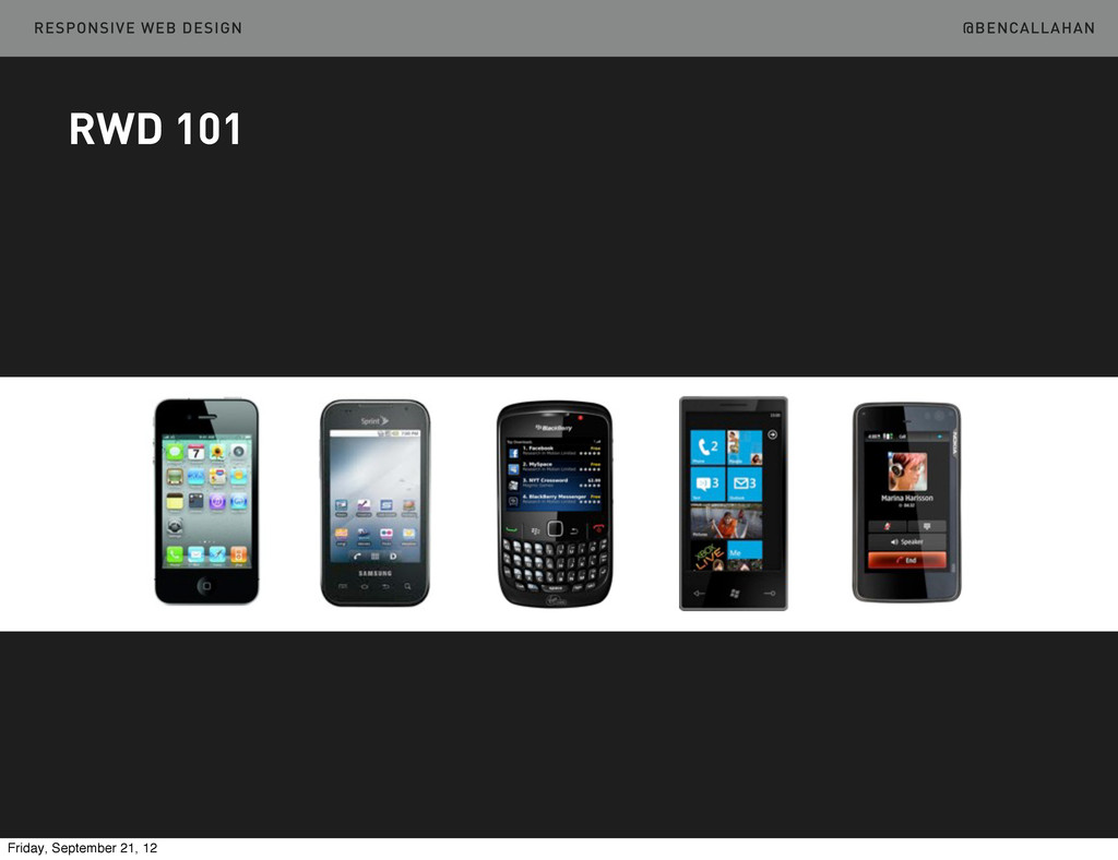
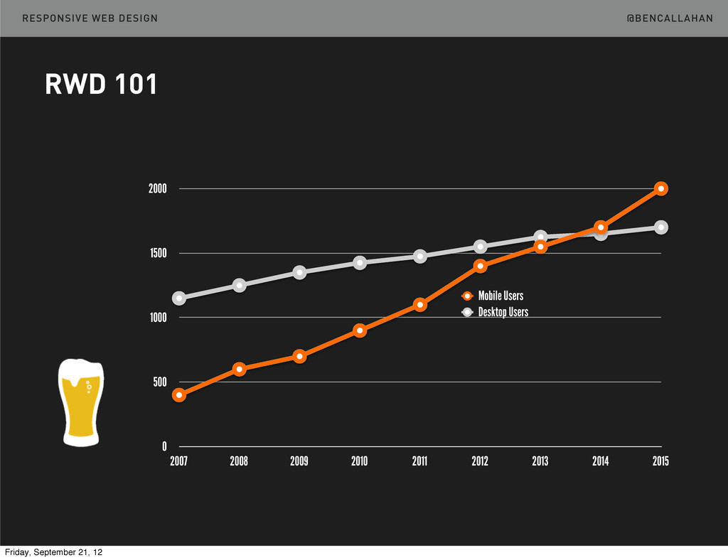
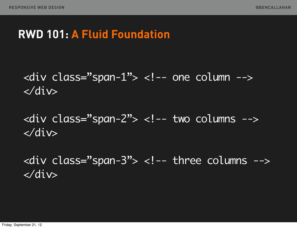
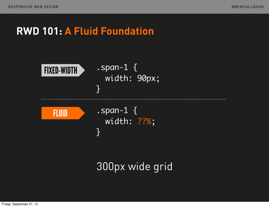
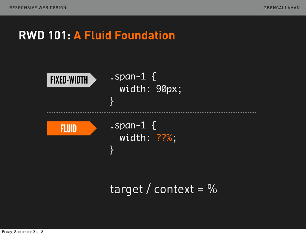
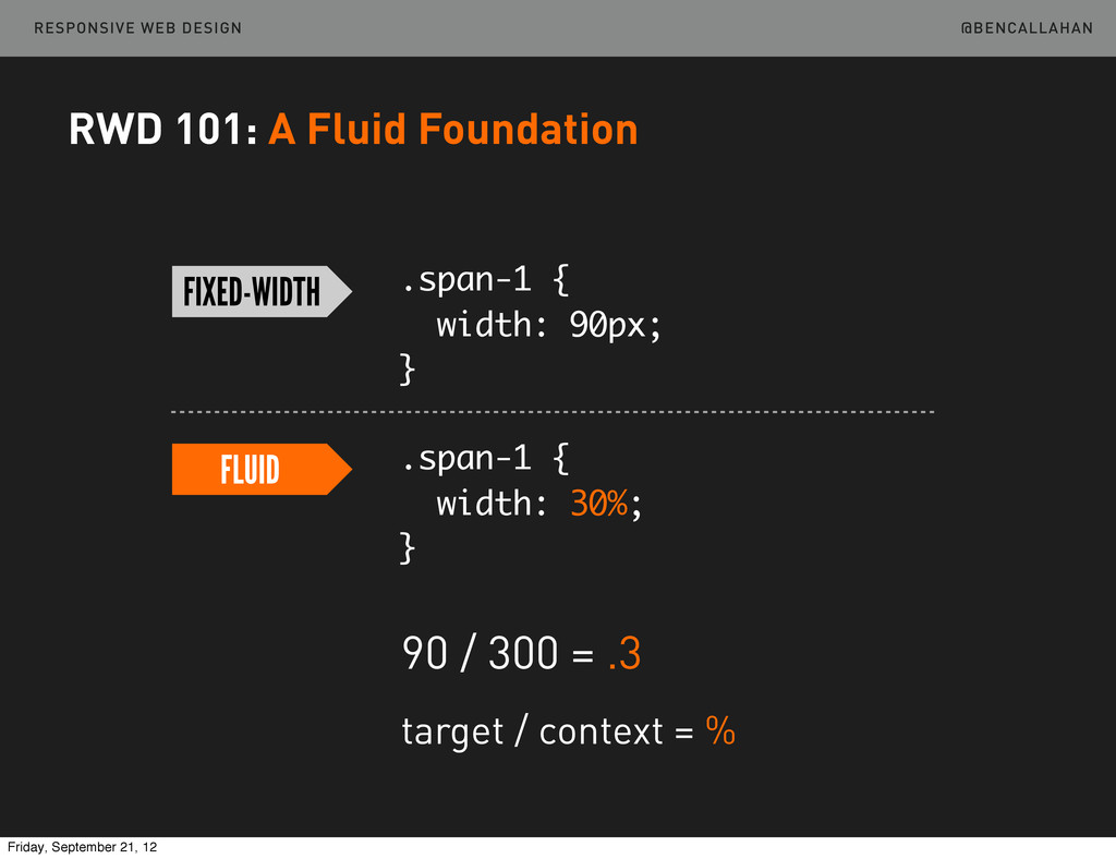
    </div> <div class=”span-2”> <!-- two columns --> </div> <div class=”span-3”> <!-- three columns --> </div> RWD 101: A Fluid Foundation Friday, September 21, 12
  9. @BENCALLAHAN RESPONSIVE WEB DESIGN .span-1 { width: 90px; } .span-1

    { width: ??%; } FIXED-WIDTH FLUID 300px wide grid RWD 101: A Fluid Foundation Friday, September 21, 12
  10. @BENCALLAHAN RESPONSIVE WEB DESIGN .span-1 { width: 90px; } .span-1

    { width: ??%; } FIXED-WIDTH FLUID target / context = % RWD 101: A Fluid Foundation Friday, September 21, 12
  11. @BENCALLAHAN RESPONSIVE WEB DESIGN .span-1 { width: 90px; } .span-1

    { width: 30%; } FIXED-WIDTH FLUID 90 / 300 = .3 target / context = % RWD 101: A Fluid Foundation Friday, September 21, 12
  12. @BENCALLAHAN RESPONSIVE WEB DESIGN Turn a 300px 3-column grid into

    a fluid grid. /01-RWD101/br-1.html RWD 101: A Fluid Foundation Your Turn http://bit.ly/LWLTEA Friday, September 21, 12
  13. @BENCALLAHAN RESPONSIVE WEB DESIGN IE & Rounding RWD 101: A

    Fluid Foundation Friday, September 21, 12
  14. @BENCALLAHAN RESPONSIVE WEB DESIGN RWD 101: A Fluid Foundation ➡Semantic

    Grid Systems ‣ http://semantic.gs ‣ http://susy.oddbird.net Friday, September 21, 12
  15. @BENCALLAHAN RESPONSIVE WEB DESIGN RWD 101: A Fluid Foundation @column-­‐width:

     60; @gutter-­‐width:  20; @columns:  12; @total-­‐width:  100%; header  {  .column(12);  } article  {  .column(12);  } aside  {  .column(12);  } @media  (min-­‐width:  38em)  {      article  {  .column(8);  }      aside  {  .column(4);  } } Friday, September 21, 12
  16. @BENCALLAHAN RESPONSIVE WEB DESIGN RWD 101: Flexible Content Once we

    have a grid which is based on proportions, the content we put in that grid must also respond. Friday, September 21, 12
  17. @BENCALLAHAN RESPONSIVE WEB DESIGN RWD 101: Flexible Content img {

    max-width: 100%; } Friday, September 21, 12
  18. @BENCALLAHAN RESPONSIVE WEB DESIGN Make the image flexible. /01-RWD101/br-3.html Your

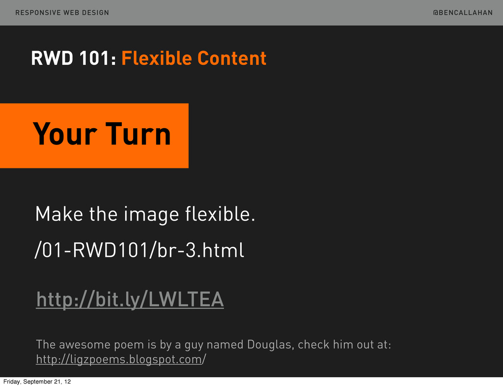
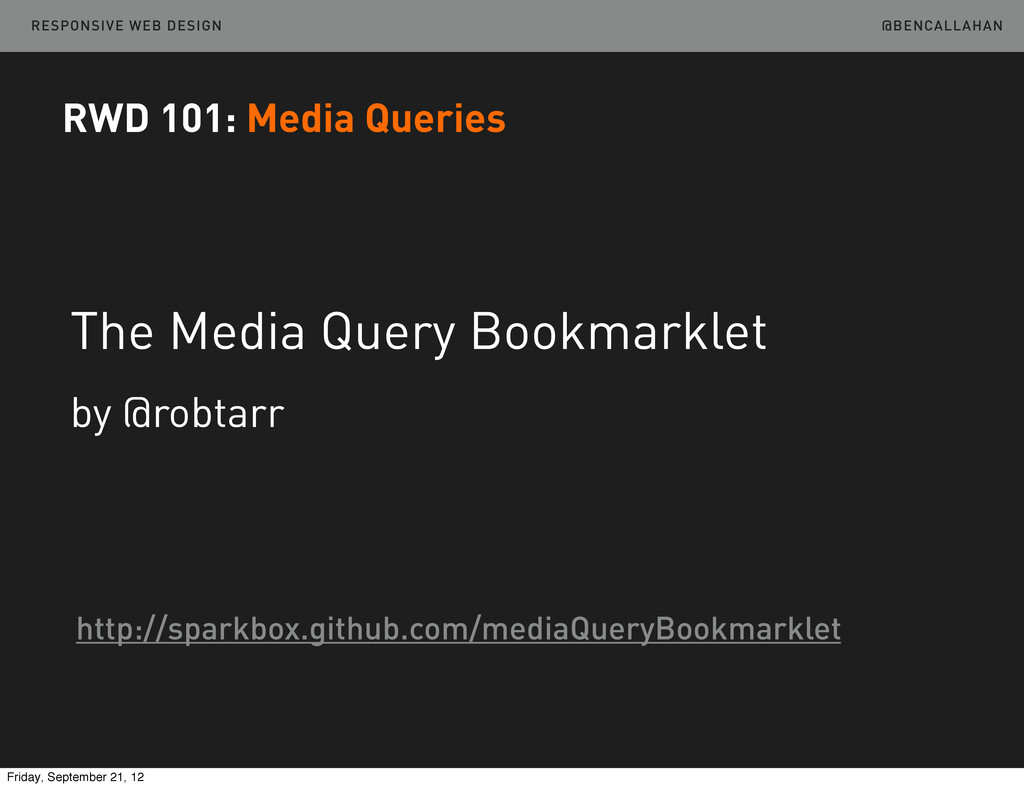
    Turn http://bit.ly/LWLTEA RWD 101: Flexible Content The awesome poem is by a guy named Douglas, check him out at: http://ligzpoems.blogspot.com/ Friday, September 21, 12
  19. @BENCALLAHAN RESPONSIVE WEB DESIGN RWD 101: Flexible Content Video embed/object

    works similarly. If you use iframe embeds, take a look at... /11-Ratios and /12-Ratios-Review http://bit.ly/LWLTEA Friday, September 21, 12
  20. @BENCALLAHAN RESPONSIVE WEB DESIGN RWD 101: Media Queries When our

    content and our design are no longer working in harmony, we need to make a larger shift in layout. Friday, September 21, 12
  21. @BENCALLAHAN RESPONSIVE WEB DESIGN RWD 101: Media Queries Viewport width,

    height Device width, height Orientation Aspect ratio (several others) http://www.w3.org/TR/css3-mediaqueries Friday, September 21, 12
  22. @BENCALLAHAN RESPONSIVE WEB DESIGN RWD 101: Media Queries @media (min-width:

    600px) { /* styles for 600px and up here */ } @media (max-width: 38em) { /* styles for 38em and down here */ } Friday, September 21, 12
  23. @BENCALLAHAN RESPONSIVE WEB DESIGN RWD 101: Media Queries /* Large

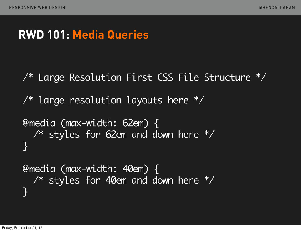
    Resolution First CSS File Structure */ /* large resolution layouts here */ @media (max-width: 62em) { /* styles for 62em and down here */ } @media (max-width: 40em) { /* styles for 40em and down here */ } Friday, September 21, 12
  24. @BENCALLAHAN RESPONSIVE WEB DESIGN RWD 101: Media Queries /* Small

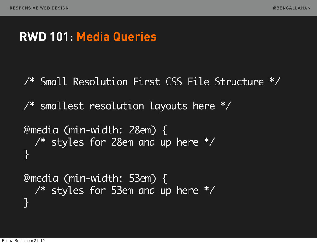
    Resolution First CSS File Structure */ /* smallest resolution layouts here */ @media (min-width: 28em) { /* styles for 28em and up here */ } @media (min-width: 53em) { /* styles for 53em and up here */ } Friday, September 21, 12
  25. @BENCALLAHAN RESPONSIVE WEB DESIGN RWD 101: Media Queries Large Rez

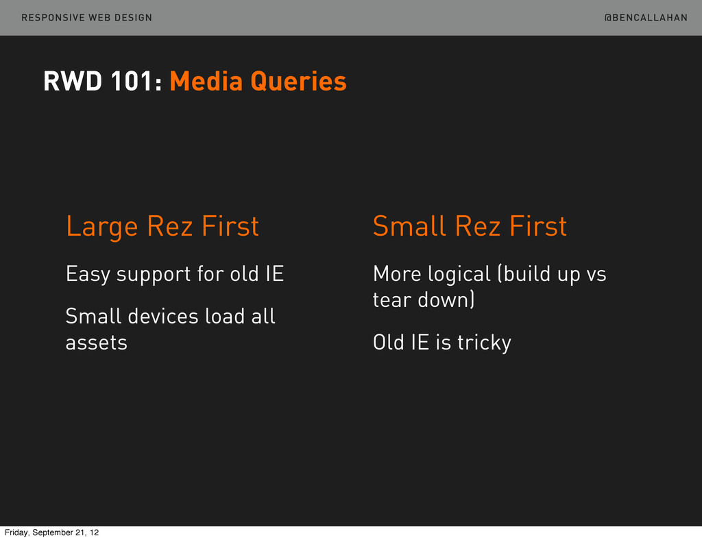
    First Easy support for old IE Small devices load all assets Small Rez First More logical (build up vs tear down) Old IE is tricky Friday, September 21, 12
  26. @BENCALLAHAN RESPONSIVE WEB DESIGN RWD 101: Media Queries The Media

    Query Bookmarklet by @robtarr http://sparkbox.github.com/mediaQueryBookmarklet Friday, September 21, 12
  27. @BENCALLAHAN RESPONSIVE WEB DESIGN Throw in a media query. /01-RWD101/br-4.html

    Your Turn http://bit.ly/LWLTEA RWD 101: Media Queries Friday, September 21, 12
  28. @BENCALLAHAN RESPONSIVE WEB DESIGN A Process Myth Each client deliverable

    needs to look more like a final, beautiful end- product than the previous one. RWD Process Friday, September 21, 12
  29. @BENCALLAHAN RESPONSIVE WEB DESIGN Which Results In Pushing toward nearly-designed

    wireframes quickly and completely designed comps soon after. RWD Process Friday, September 21, 12
  30. @BENCALLAHAN RESPONSIVE WEB DESIGN A Better Mindset Deliverables that best

    serve the organization and prioritization of content and function across multiple resolutions. RWD Process Friday, September 21, 12
  31. @BENCALLAHAN RESPONSIVE WEB DESIGN Our Deliverables RWD Process Research Deliverables

    Content Deliverables Priority Deliverables Style Deliverables Functional Deliverables Friday, September 21, 12
  32. @BENCALLAHAN RESPONSIVE WEB DESIGN Let’s Focus On RWD Process Research

    Deliverables Content Deliverables Priority Deliverables Style Deliverables Functional Deliverables Friday, September 21, 12
  33. @BENCALLAHAN RESPONSIVE WEB DESIGN Content Priority Prototype Takes the place

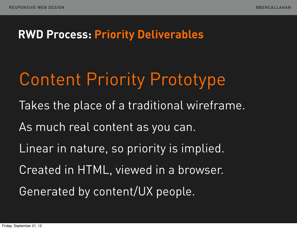
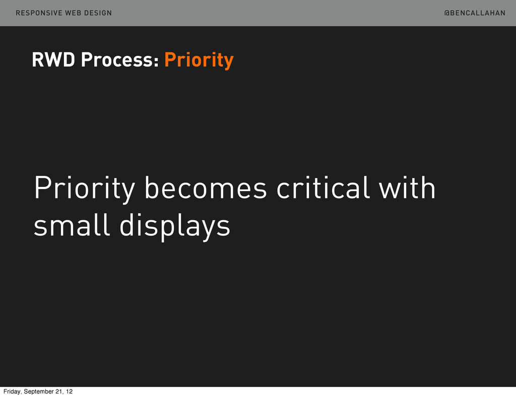
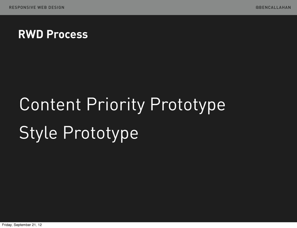
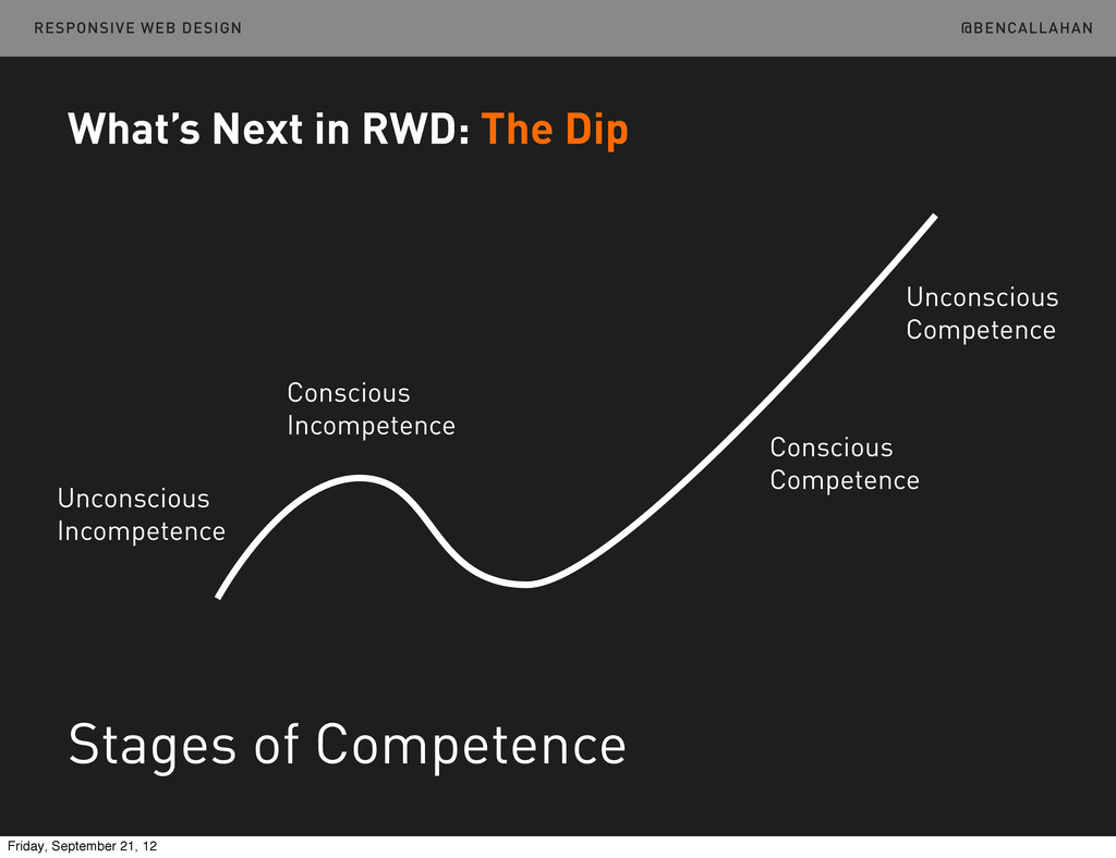
    of a traditional wireframe. As much real content as you can. Linear in nature, so priority is implied. Created in HTML, viewed in a browser. Generated by content/UX people. RWD Process: Priority Deliverables Friday, September 21, 12
  34. @BENCALLAHAN RESPONSIVE WEB DESIGN There is an example in the

    repository. /02-PlanDesign Take A Look http://bit.ly/LWLTEA RWD Process: Priority Deliverables Friday, September 21, 12
  35. @BENCALLAHAN RESPONSIVE WEB DESIGN Style Prototype Like Style Tiles, but

    in the browser. Very fast to build. Accurate web typography. Easy to show web interaction. Client reviews in their browser of preference. RWD Process: Style Deliverables Friday, September 21, 12
  36. @BENCALLAHAN RESPONSIVE WEB DESIGN There is an example on Github.

    Take A Look http://sparkbox.github.com/dr-style-prototype RWD Process: Style Deliverables http://bit.ly/Tb7HPr Friday, September 21, 12
  37. @BENCALLAHAN RESPONSIVE WEB DESIGN Can’t throw it over the wall

    RWD Process: Collaboration Friday, September 21, 12
  38. @BENCALLAHAN RESPONSIVE WEB DESIGN RWD Patterns: Navigation Top Nav Bottom

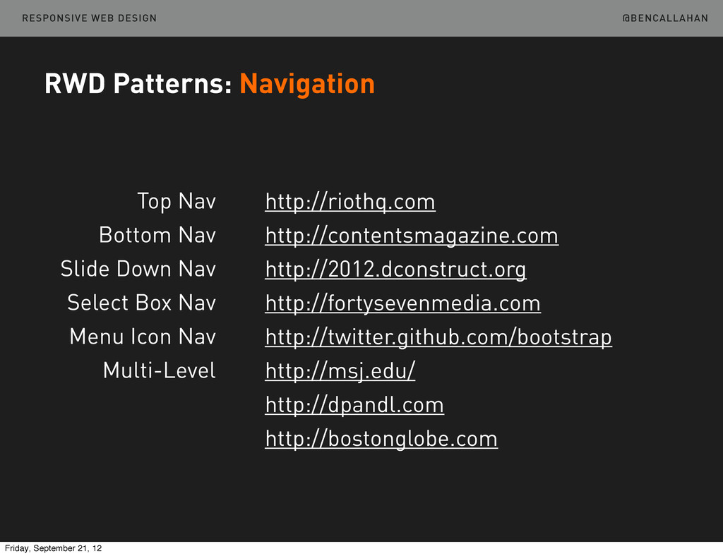
    Nav Slide Down Nav Select Box Nav Menu Icon Nav Multi-Level http://riothq.com http://contentsmagazine.com http://2012.dconstruct.org http://fortysevenmedia.com http://twitter.github.com/bootstrap http://msj.edu/ http://dpandl.com http://bostonglobe.com Friday, September 21, 12
  39. @BENCALLAHAN RESPONSIVE WEB DESIGN RWD Patterns: Tables Show the first

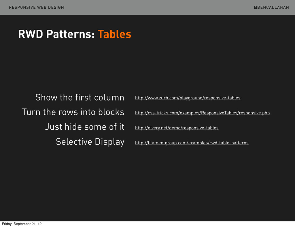
    column Turn the rows into blocks Just hide some of it Selective Display http://www.zurb.com/playground/responsive-tables http://css-tricks.com/examples/ResponsiveTables/responsive.php http://elvery.net/demo/responsive-tables http://filamentgroup.com/examples/rwd-table-patterns Friday, September 21, 12
  40. @BENCALLAHAN RESPONSIVE WEB DESIGN RWD Patterns: Images Picturefill Sencha.io Resrc.it

    Adaptive Images http://scottjehl.github.com/picturefill http://docs.sencha.io http://resrc.it http://adaptive-images.com and tons more... Friday, September 21, 12
  41. @BENCALLAHAN RESPONSIVE WEB DESIGN “...performance is important, but access is

    more important. Mobile later is better than mobile never.” RWD Patterns: Images K istofer Layon http://tiny.cc/vr24gw Friday, September 21, 12
  42. @BENCALLAHAN RESPONSIVE WEB DESIGN What’s Next in RWD: The Dip

    Stages of Competence Unconscious Incompetence Conscious Incompetence Conscious Competence Unconscious Competence Friday, September 21, 12
  43. @BENCALLAHAN RESPONSIVE WEB DESIGN What’s Next in RWD The Responsive

    Dip http://bit.ly/MasqBk Friday, September 21, 12
  44. @BENCALLAHAN RESPONSIVE WEB DESIGN What’s Next in RWD The Responsive

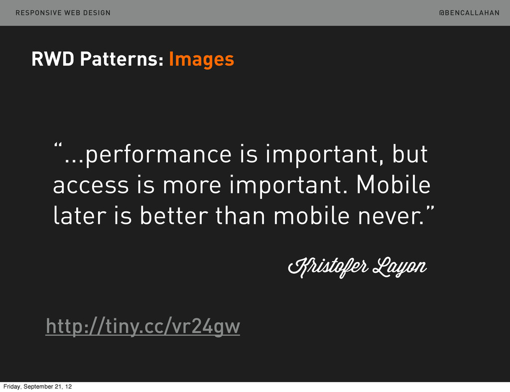
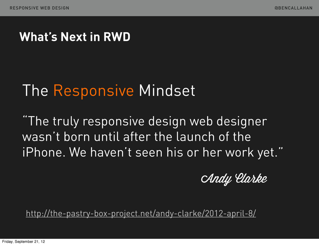
    Mindset “The truly responsive design web designer wasn’t born until after the launch of the iPhone. We haven’t seen his or her work yet.” Andy Clarke http://the-pastry-box-project.net/andy-clarke/2012-april-8/ Friday, September 21, 12
  45. @BENCALLAHAN RESPONSIVE WEB DESIGN What’s Next in RWD Move beyond

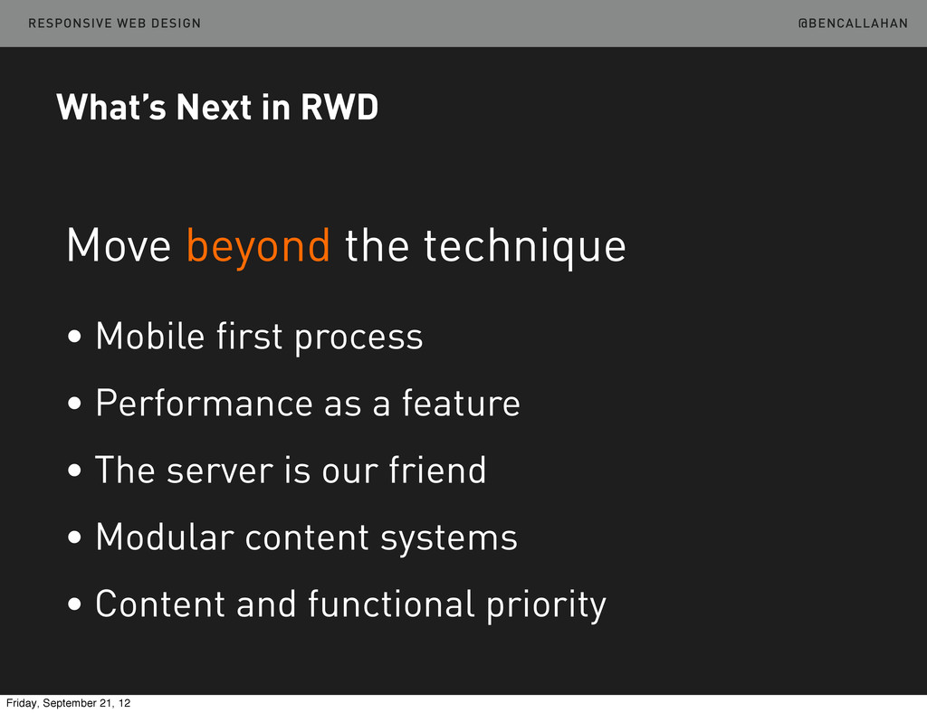
    the technique • Mobile first process • Performance as a feature • The server is our friend • Modular content systems • Content and functional priority Friday, September 21, 12
  46. Ben Callahan President, Sparkbox Refresh LX September 20 & 21,

    2012 Responsive Web Design @BENCALLAHAN RESPONSIVE WEB DESIGN Friday, September 21, 12