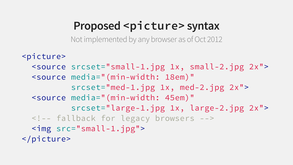
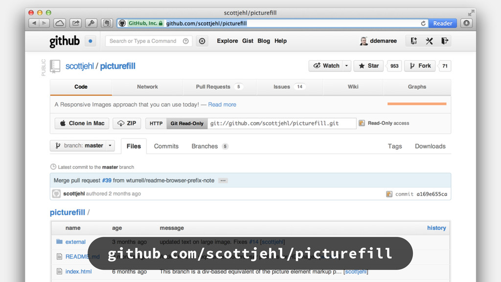
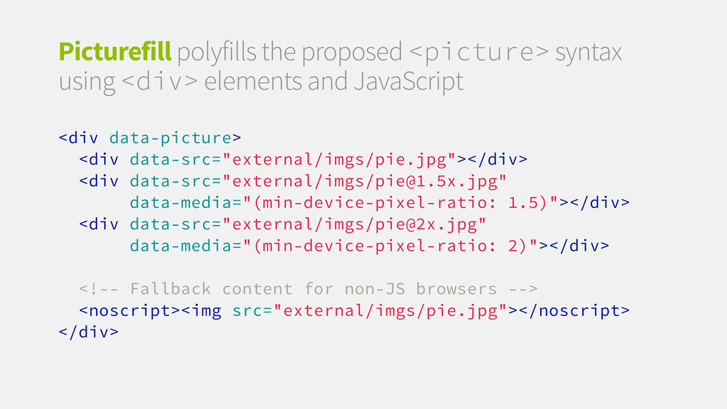
1x, med-2.jpg 2x"> <source media="(min-width: 45em)" srcset="large-1.jpg 1x, large-2.jpg 2x"> <!-- fallback for legacy browsers --> <img src="small-1.jpg"> </picture> Proposed <picture> syntax Not implemented by any browser as of Oct 2012
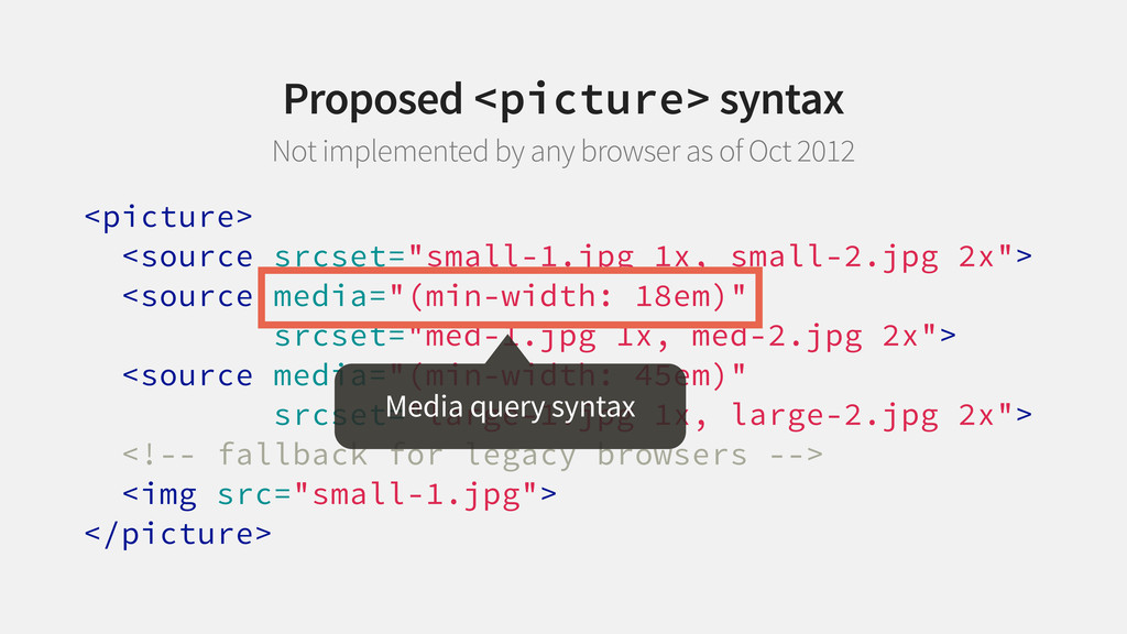
1x, med-2.jpg 2x"> <source media="(min-width: 45em)" srcset="large-1.jpg 1x, large-2.jpg 2x"> <!-- fallback for legacy browsers --> <img src="small-1.jpg"> </picture> Media query syntax Proposed <picture> syntax Not implemented by any browser as of Oct 2012
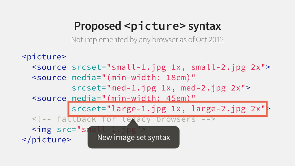
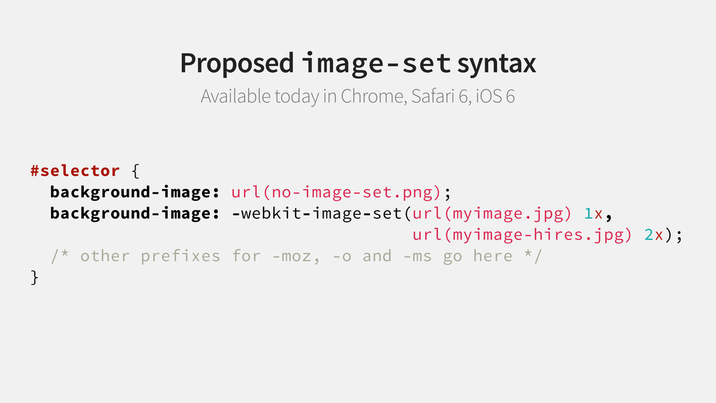
1x, med-2.jpg 2x"> <source media="(min-width: 45em)" srcset="large-1.jpg 1x, large-2.jpg 2x"> <!-- fallback for legacy browsers --> <img src="small-1.jpg"> </picture> New image set syntax Proposed <picture> syntax Not implemented by any browser as of Oct 2012
1x, med-2.jpg 2x"> <source media="(min-width: 45em)" srcset="large-1.jpg 1x, large-2.jpg 2x"> <!-- fallback for legacy browsers --> <img src="small-1.jpg"> </picture> Proposed <picture> syntax Not implemented by any browser as of Oct 2012
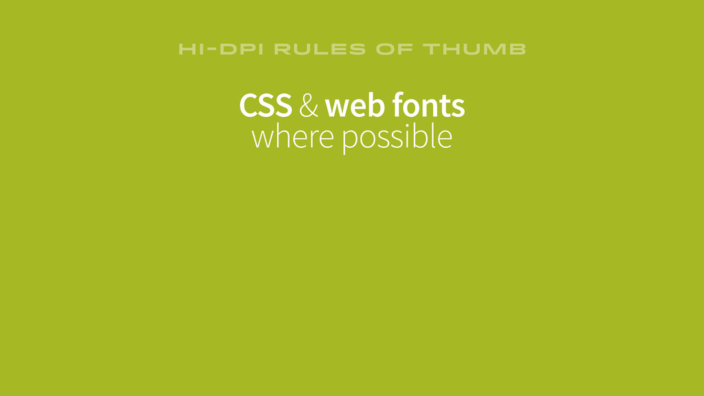
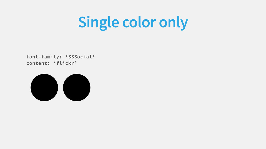
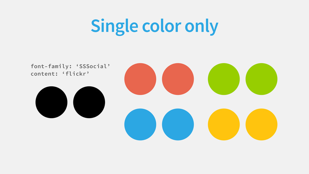
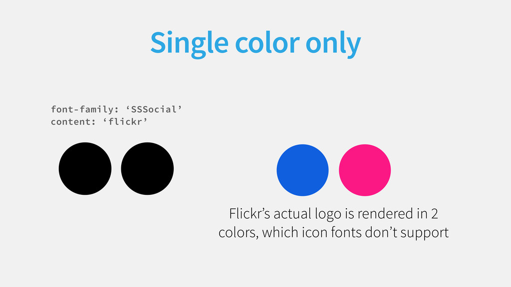
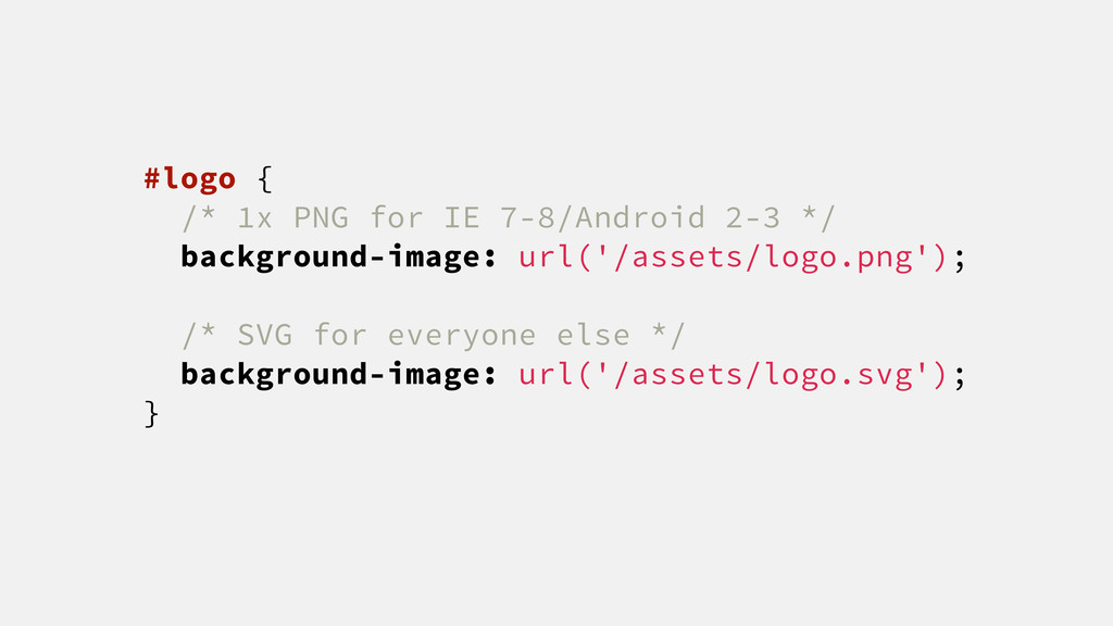
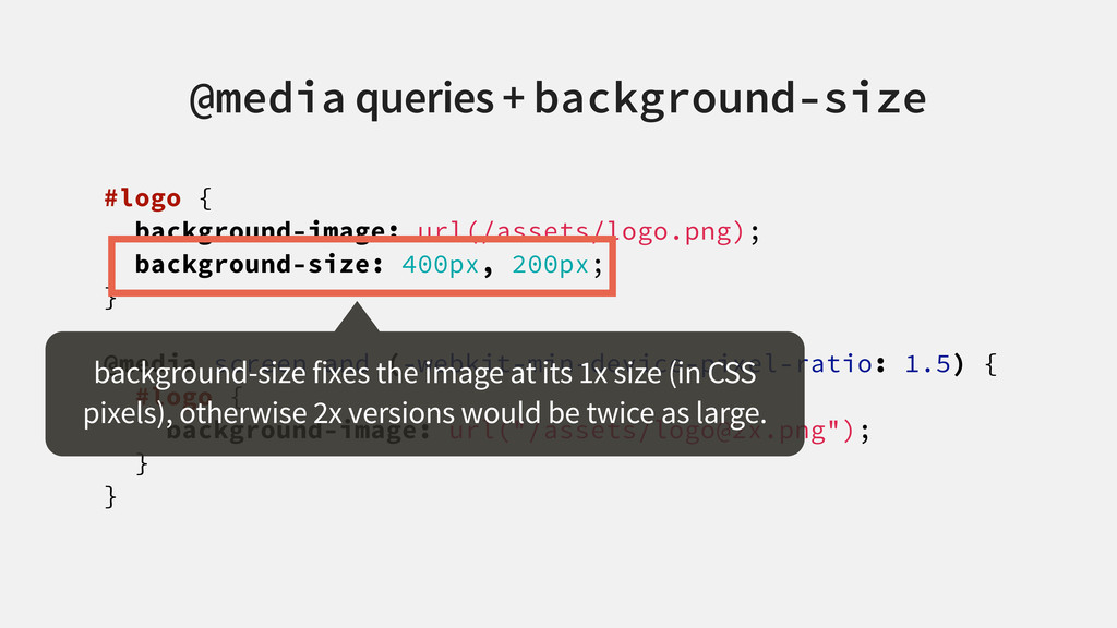
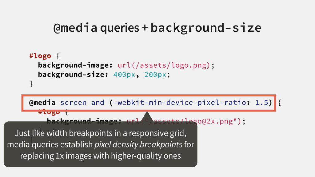
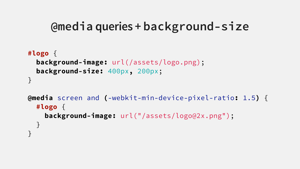
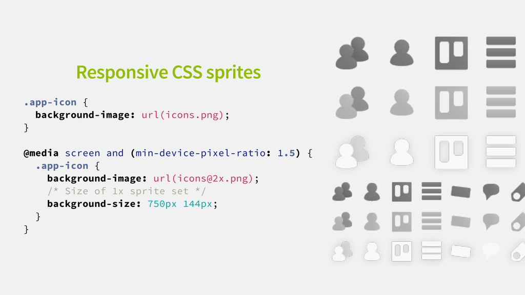
and (-webkit-min-device-pixel-ratio: 1.5) { #logo { background-image: url("/assets/[email protected]"); } } @media queries + background-size background-size fixes the image at its 1x size (in CSS pixels), otherwise 2x versions would be twice as large.
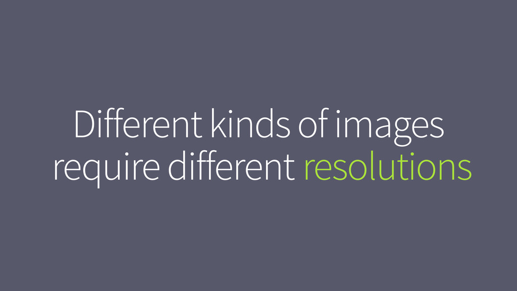
and (-webkit-min-device-pixel-ratio: 1.5) { #logo { background-image: url("/assets/[email protected]"); } } @media queries + background-size Just like width breakpoints in a responsive grid, media queries establish pixel density breakpoints for replacing 1x images with higher-quality ones
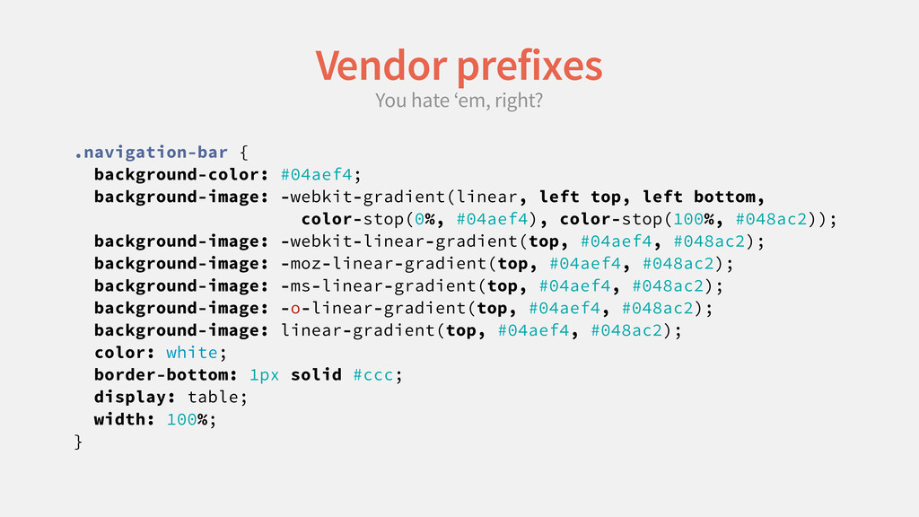
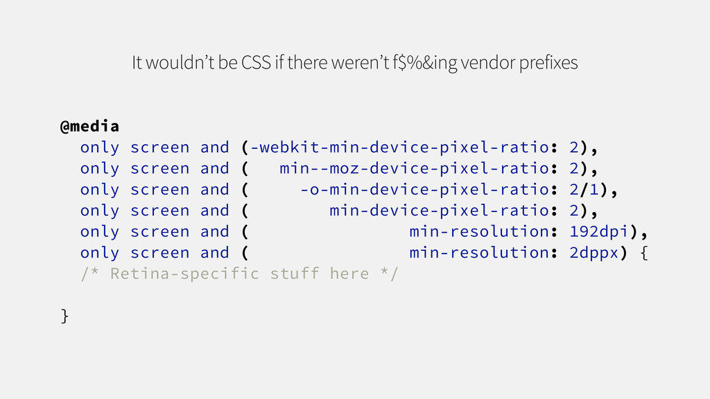
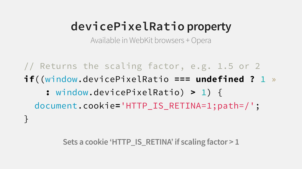
min--moz-device-pixel-ratio: 2), only screen and ( -o-min-device-pixel-ratio: 2/1), only screen and ( min-device-pixel-ratio: 2), only screen and ( min-resolution: 192dpi), only screen and ( min-resolution: 2dppx) { /* Retina-specific stuff here */ } It wouldn’t be CSS if there weren’t f$%&ing vendor prefixes
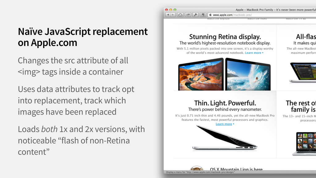
container Uses data attributes to track opt into replacement, track which images have been replaced Loads both 1x and 2x versions, with noticeable “flash of non-Retina content” Naïve JavaScript replacement on Apple.com
 ddemaree
 kenichiota0711
 sekiguchiy
 toshihidemurata
 mottox2
 a2k
a2k
 koyaman
 saki822
 nishame
 stmn
stmn
 payatsusan213
 happy_ferret153
 codingconduct
 tammyeverts
 axbom
axbom
 trishagee
 soudai
 keavy
keavy
 geoffreycrofte
 marktimemedia
 wjessup
 chriscoyier
 maggiecrowley
 cassininazir
![DAVID DEMAREE BYE my name WAs ✉ [email protected] @ddemaree](https://files.speakerdeck.com/presentations/506f5a08240f510002028728/slide_119.jpg)