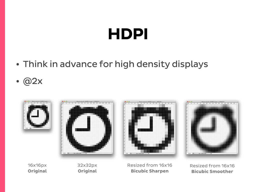
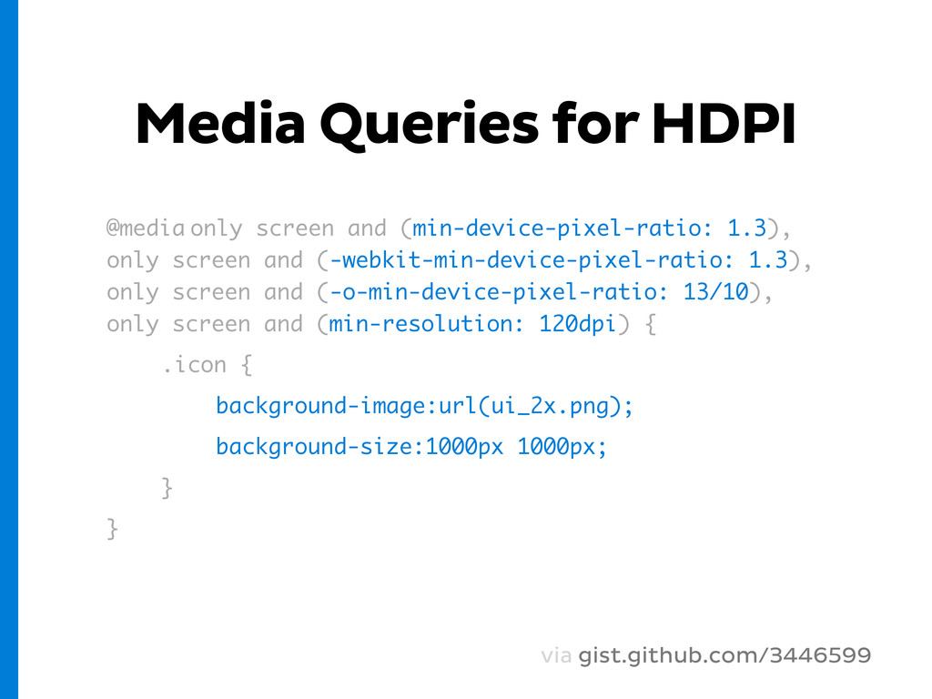
only screen and (-webkit-min-device-pixel-ratio: 1.3), only screen and (-o-min-device-pixel-ratio: 13/10), only screen and (min-resolution: 120dpi) { .icon { background-image:url(ui_2x.png); background-size:1000px 1000px; } } via gist.github.com/3446599
from scratch and test across browsers • Use available solutions like FlexSlider* (jQuery) or SwipeJS** (library agnostic) • Don’t forget, it’s a mobile site! * flexslider.woothemes.com ** swipejs.com
 lucijanblagonic
 cyberagent_creators
 poteboy
 mewmo
mewmo
 takumasaito
 ralphpenel
 loglass2019
 goodpatch
 kenichiota0711
 bitkey
%201.png) yoriss67
yoriss67
 chorkaichan
 techtekt
 ipullrank
 cromwellryan
 katarinadahlin
 skoyamalab
 davidcarrasco
 maggiecrowley
 tmiket
 nonsquared
 bethany
 inesmontani
 scottboms
 cassininazir
![Override inline style .element[style] { width:100%; }](https://files.speakerdeck.com/presentations/504c9fc5723cb7000204aa98/slide_24.jpg)
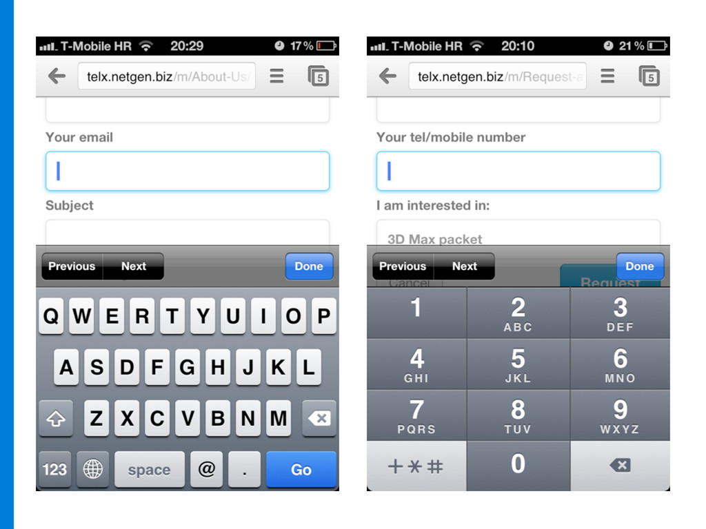
![Forms <input type="tel" required name=”Phone”> input[type="text"] input[type="password"] input[type="datetime"] input[type="datetime-local"] input[type="date"]](https://files.speakerdeck.com/presentations/504c9fc5723cb7000204aa98/slide_25.jpg)