Upgrade to Pro — share decks privately, control downloads, hide ads and more …

Analytics and UX: Research and design for people who use data

uxindia
October 25, 2019

Analytics and UX: Research and design for people who use data

UXINDIA2019: India's biggest international conference on User Experience Design which is being celebrated on Sep 9, 10 & 11 at Novotel HICC, Hyderabad.
www.ux-india.org/uxindia2019
#ux #uxindia #uxindia2019 #designthinking #uxi19 #uxconference #umodesign

uxindia

October 25, 2019
Tweet

More Decks by uxindia

Other Decks in Design

Transcript

  1. Analytics and UX Understanding and designing for people who use

    data Fadden, S. 2019. Analytics and UX: Understanding and designing for people who use data workshop. UX India, 10 September, Hyderabad.
  2. Steve Fadden, Ph.D. 2 Head of User Research, Measurement &

    Analytics, Google Lecturer, UC Berkeley School of Information @sfadden on Twitter https://www.linkedin.com/in/stevefadden/
  3. Who’s here? Experience: <2 years 2-5 years >5 years Role:

    Design Development Research Management Organization: Academia Business Consulting Government Nonprofit
  4. Current situation: Users, Contexts, Systems, Data “User-friendly data takes time,

    effort, and teamwork” Image: https://blogs.nasa.gov/spacestation/author/cewilli3/
  5. Scenario A ridesharing company wants a tool to monitor their

    operational, financial, and customer performance. They would like the tool to provide data to employees so everyone is aware of their metrics, and empowered to make decisions. Image: https://commons.wikimedia.org/wiki/File:India_-_Kolkata_rainy_street_-_3819.jpg
  6. Assignments At each table: • 1-2 “user representatives” • 1-2

    research • 1-2 design • Observer/note-takers A transportation company wants a tool to monitor operational and financial performance. They would like the tool to provide data to employees so everyone is aware of their metrics.
  7. User representative notes You are the Sr. Operations Manager, reporting

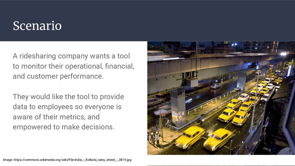
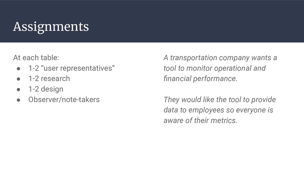
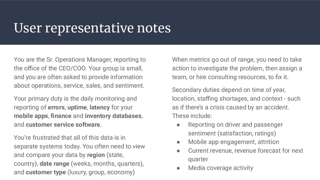
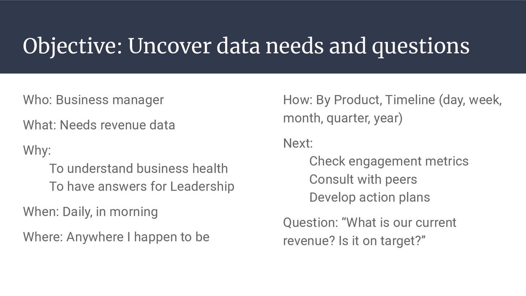
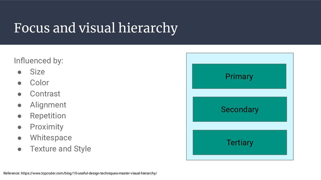
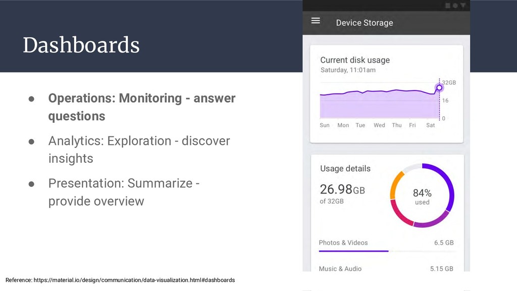
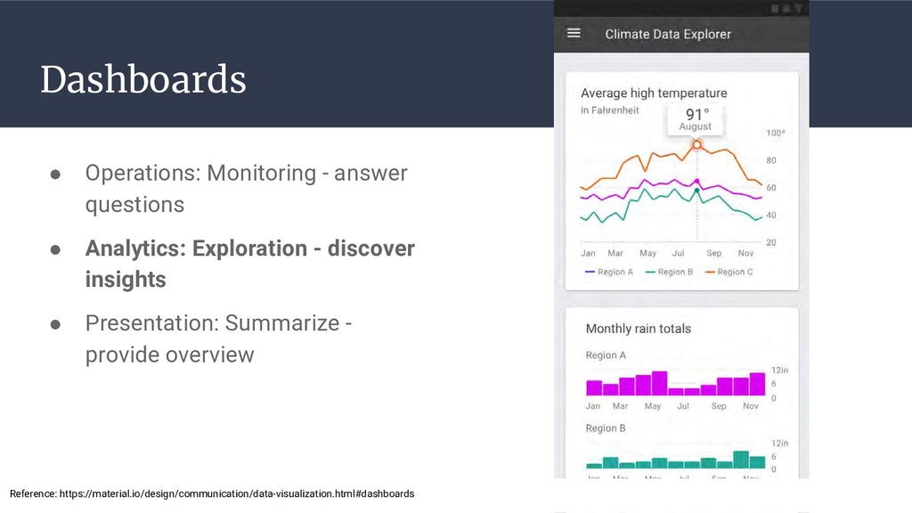
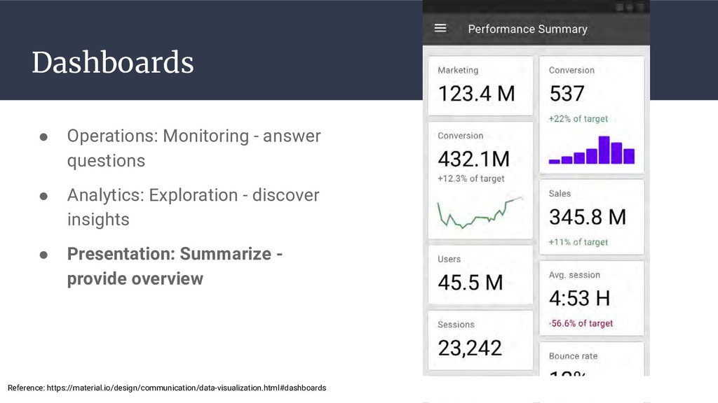
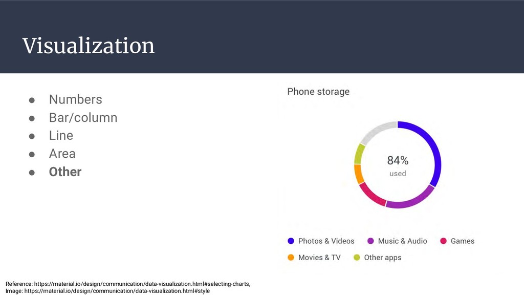
    to the office of the CEO/COO. Your group is small, and you are often asked to provide information about operations, service, sales, and sentiment. Your primary duty is the daily monitoring and reporting of errors, uptime, latency for your mobile apps, finance and inventory databases, and customer service software. You’re frustrated that all of this data is in separate systems today. You often need to view and compare your data by region (state, country), date range (weeks, months, quarters), and customer type (luxury, group, economy) When metrics go out of range, you need to take action to investigate the problem, then assign a team, or hire consulting resources, to fix it. Secondary duties depend on time of year, location, staffing shortages, and context - such as if there’s a crisis caused by an accident. These include: • Reporting on driver and passenger sentiment (satisfaction, ratings) • Mobile app engagement, attrition • Current revenue, revenue forecast for next quarter • Media coverage activity
  8. Work ecosystem • Different departments? • Hierarchy (org chart)? •

    Communications? • Greatest need? • Barriers? • Impacts? A transportation company wants a tool to monitor operational and financial performance. They would like the tool to provide data to employees so everyone is aware of their metrics.
  9. Target user • Job role or title • User goals

    • Information needs • Triggers • Actions • Open research questions A transportation company wants a tool to monitor operational and financial performance. They would like the tool to provide data to employees so everyone is aware of their metrics.
  10. Uncovering user needs • Interview • Observation • Survey •

    Diary study • Desk research Image: https://pxhere.com/en/photo/1447775
  11. Interview goals • In-depth understanding ◦ User goals and intentions

    ◦ Needs and frustrations ◦ Techniques and processes ◦ Relationships, dependencies, power ◦ Context of work 17
  12. Typical Structure 18 Set expectations Build trust Draw out the

    story Find useful details Debrief Closure Intro Warm-up Focus Deep focus Retrospective Wrap-up Image: http://pixabay.com/es/reloj-de-arena-reloj-temporizador-152090
  13. Critical incident questions clarify problems • Time since last experience

    • Gather details ◦ Description ◦ Actions taken ◦ Feelings ◦ Outcome ◦ Future actions/responses desired 19 Reference: http://www.usabilitynet.org/tools/criticalincidents.htm
  14. 20 “Consider the last time you needed to use a

    metric. How long ago was this? What metric did you use? Describe the steps you took, and highlight any surprises or problems (if any) that happened. What would you do differently, if you could?” Use critical incident for data needs and usage
  15. Use Grand Tour questions for overviews Guided: “Discuss the most

    important metrics you review.” Task-related: “Talk through the steps you take when you review your weekly metrics.” Typical: “Tell me how you typically respond when this metric goes out of range.” Reference: Larry Wood, 1997. Semi-structured interviewing for user-centered design, Interactions.
  16. Use Talkthroughs to understand processes Concurrent think-aloud: “Talk through your

    thoughts as you consider each of these metrics.” Aided recall: “Look through this spreadsheet and talk about the thoughts you had, and the actions you took.” Cross-examination: “How did you decide on taking this action vs. a different one?” Reference: Larry Wood, 1997. Semi-structured interviewing for user-centered design, Interactions.
  17. Objective: Uncover data needs and questions Who: Business manager What:

    Needs revenue data Why: To understand business health To have answers for Leadership When: Daily, in morning Where: Anywhere I happen to be How: By Product, Timeline (day, week, month, quarter, year) Next: Check engagement metrics Consult with peers Develop action plans Question: “What is our current revenue? Is it on target?”
  18. Create question flow 1. Compile questions by goal 2. Order

    questions 3. Identify metrics needed 4. Assign priorities to questions Question flow Question1 Is revenue on target? Answer1a [done] (Yes: $5M) Answer1b (No: $3M, $2M below) Question1.1 Which products are not selling? Answer1.1a (ABC, DEF, XYZ) Question1.2 Which regions are not selling? Answer1.2a (State1) Question1.3 Which segments are not selling? Answer1.3a (Small business) Question1.1.1 How can I best close the gap? Answer1.1.1a (Discount ABC by 10%) Answer1.1.1b (Increase sales team in State1) Question2 Is service on target? Answer2a [done] (Yes, 100% of P1 tickets resolved in <72 hours) Answer2b (No, 25% of P1 tickets resolved in >72 hours) Question2.1 Which products are associated with slow service? Answer2.1a (XYZ) Question 2.2 Which regions are associated with slow service? Answer2.2a (State1, State2) Answer2.2b Which segments are associated with slow service? Answer2.2c (Small business) Reference: https://medium.com/salesforce-ux/transforming-data-to-insights-773d25acd53f
  19. Assign metrics and priorities • Use goals and tasks to

    identify metrics ◦ Work with users ◦ Look at context of use • Create metric definitions • Prioritize metrics importance • Example: Is revenue on target? a. Revenue: Total amount of money earned b. Target definition: % revenue increase by quarter c. Priority: Highest (P1) • Example: Is service on target? a. Service: Total number of P1 tickets resolved b. Target definition: Resolution within 72 hours c. Priority: Second-highest (P2) Reference: https://medium.com/salesforce-ux/transforming-data-to-insights-773d25acd53f
  20. 28 Individual: Develop 3 interview questions 1. Critical incident 2.

    Grand tour a. Guided b. Task-related c. Typical 3. Talkthroughs a. Concurrent think-aloud b. Aided recall Cross-examination “Consider the last time you needed to use a metric. How long ago was this? What metric did you use? Describe the steps you took, and highlight any surprises or problems (if any) that happened. What would you do differently, if you could?” “Discuss the most important metrics you review.” “Talk through the steps you take when you review your weekly metrics.” “Tell me how you typically respond when this metric goes out of range.” “Talk through your thoughts as you consider each of these metrics.” “Look through this spreadsheet and talk about the thoughts you had, and the actions you took.” “How did you decide on taking this action vs. a different one?”
  21. 29 Table: Create interview script 1. Critical incident 2. Grand

    tour a. Guided b. Task-related c. Typical 3. Talkthroughs a. Concurrent think-aloud b. Aided recall c. Cross-examination • Consider follow-ups to clarify needs and goals ◦ “Why do you need this number?” ◦ “What other numbers do you need?” ◦ “How do you use it?” ◦ “When/where do you need it?” ◦ “What do you do after you know this number?”
  22. Table: Interview user representative(s) • Researcher(s): Conduct interview with your

    user representative(s) • Note-taker(s): Capture notes and observations • Everyone else: Listen, propose follow-up questions 1. Follow script 2. Ask 1 of each: ◦ Critical incident ◦ Grand tour ◦ Talkthrough 3. Identify ◦ Overall goals ◦ User’s data questions ◦ Order of questions ◦ Relative priority of each question
  23. Hierarchy of data needs Assess the state of your data

    1. Available & clean? ◦ Data Engineering 2. Calculated & combined? ◦ Business Intelligence/Analytics 3. Algorithms & models applied? ◦ Data Science, Machine Learning ? Prescription Prediction Description Collection https://blog.treasuredata.com/blog/2016/03/17/the-analytics-hierarchy-of-needs/
  24. What’s possible today vs. future? 1. Identify data readiness for

    goal-related data a. Available now b. Near-term investments c. Longer-term investments 2. Explore opportunities to develop new data a. Predictions, prescriptions, descriptions b. Collection needs ? Prescription Prediction Description Collection https://blog.treasuredata.com/blog/2016/03/17/the-analytics-hierarchy-of-needs/
  25. What’s the purpose of the data display? 3 dashboard categories

    • Operations: Answer questions ◦ Top down: High level indicators • Analytics: Explore data ◦ Bottom up: Granular details • Presentation: Curated snapshot ◦ KPI: Monitor important metrics Image: https://informationisbeautiful.net/visualizations/what-makes-a-good-data-visualization/
  26. What kind of data story is needed? Consider story structure,

    based on: • Persona? • Goals? • Contexts? • Priorities? Consider story flow: • 1s story • 10s story • 1 minute story • 10 minute story Reference: https://medium.com/salesforce-ux/transforming-data-to-insights-773d25acd53f
  27. Which patterns make sense? Typical elements • Alerts • “To

    do” items • Performance statistics • Current status • Search • Task starting points • Social components • Recent activity • News, events, announcements • Push content Reference: https://www.designforcontext.com/insights/designing-great-dashboards-saas-and-enterprise-applications, Image: https://medium.com/@yifei.liu/https-medium-com-yifei-liu-lets-talk-about-dashboard-design-c63cd1a45b3f
  28. Focus and visual hierarchy Influenced by: • Size • Color

    • Contrast • Alignment • Repetition • Proximity • Whitespace • Texture and Style Primary Secondary Tertiary Reference: https://www.topcoder.com/blog/10-useful-design-techniques-master-visual-hierarchy/
  29. Dashboards • Operations: Monitoring - answer questions • Analytics: Exploration

    - discover insights • Presentation: Summarize - provide overview Reference: https://material.io/design/communication/data-visualization.html#dashboards
  30. Dashboards • Operations: Monitoring - answer questions • Analytics: Exploration

    - discover insights • Presentation: Summarize - provide overview Reference: https://material.io/design/communication/data-visualization.html#dashboards
  31. Dashboards • Operations: Monitoring - answer questions • Analytics: Exploration

    - discover insights • Presentation: Summarize - provide overview Reference: https://material.io/design/communication/data-visualization.html#dashboards
  32. Example layouts Summary Content Actions Details Filters Summary Content Details

    / Actions Filters Summary Content Actions Filters Content Content Summary Details Reference: https://medium.com/salesforce-ux/transforming-data-to-insights-773d25acd53f
  33. Example layout: Operations When did the issue occur? Where did

    the issue occur? What else is affected? What issues need my attention? Reference: https://material.io/design/communication/data-visualization.html#dashboards
  34. Visualization • Numbers • Bar/column • Line • Area •

    Other Reference: https://material.io/design/communication/data-visualization.html#selecting-charts, Image: https://stats.wikimedia.org/v2/#/all-projects
  35. Visualization • Numbers • Bar/column • Line • Area •

    Other Reference: https://material.io/design/communication/data-visualization.html#selecting-charts, Image: https://stats.wikimedia.org/v2/#/all-projects/contributing/top-edited-pages/normal|table|last-month|~total|monthly
  36. Visualization • Numbers • Bar/column • Line • Area •

    Other Reference: https://material.io/design/communication/data-visualization.html#selecting-charts
  37. Visualization • Numbers • Bar/column • Line • Area •

    Other Reference: https://material.io/design/communication/data-visualization.html#selecting-charts
  38. Visualization • Numbers • Bar/column • Line • Area •

    Other Reference: https://material.io/design/communication/data-visualization.html#selecting-charts, Image: https://stats.wikimedia.org/v2/#/all-projects/reading/total-page-views/normal|bar|2-year|~total|monthly
  39. Visualization • Numbers • Bar/column • Line • Area •

    Other Reference: https://material.io/design/communication/data-visualization.html#selecting-charts, Image: https://material.io/design/communication/data-visualization.html#style
  40. Visualization • Numbers • Bar/column • Line • Area •

    Other Reference: https://material.io/design/communication/data-visualization.html#selecting-charts, Image: https://material.io/design/communication/data-visualization.html#style
  41. Visualization • Numbers • Bar/column • Line • Area •

    Other Reference: https://material.io/design/communication/data-visualization.html#selecting-charts, Image: https://stats.wikimedia.org/v2/#/all-projects/contributing/top-edited-pages/normal|table|last-month|~total|monthly
  42. Visualization • Numbers • Bar/column • Line • Area •

    Other Reference: https://material.io/design/communication/data-visualization.html#selecting-charts
  43. Visualization • Numbers • Bar/column • Line • Area •

    Other Reference: https://material.io/design/communication/data-visualization.html#selecting-charts, Image: https://stats.wikimedia.org/v2/#/en.wikipedia.org/reading/page-views-by-country/normal|map|last-month|~total|monthly
  44. Visualization • Numbers • Bar/column • Line • Area •

    Other Reference: https://material.io/design/communication/data-visualization.html#selecting-charts, Image: https://material.io/design/communication/data-visualization.html#style
  45. Visualization Types • Change over time • Comparison • Ranking

    • Part-to-whole • Correlation • Distribution • Flow • Relationship Reference: https://material.io/design/communication/data-visualization.html#types
  46. Visualization Types • Change over time • Comparison • Ranking

    • Part-to-whole • Correlation • Distribution • Flow • Relationship Reference: https://material.io/design/communication/data-visualization.html#types
  47. Visualization Types • Change over time • Comparison • Ranking

    • Part-to-whole • Correlation • Distribution • Flow • Relationship Reference: https://material.io/design/communication/data-visualization.html#types
  48. Visualization Types • Change over time • Comparison • Ranking

    • Part-to-whole • Correlation • Distribution • Flow • Relationship Reference: https://material.io/design/communication/data-visualization.html#types
  49. Visualization Types • Change over time • Comparison • Ranking

    • Part-to-whole • Correlation • Distribution • Flow • Relationship Reference: https://material.io/design/communication/data-visualization.html#types
  50. Visualization Types • Change over time • Comparison • Ranking

    • Part-to-whole • Correlation • Distribution • Flow • Relationship Reference: https://material.io/design/communication/data-visualization.html#types
  51. Visualization Types • Change over time • Comparison • Ranking

    • Part-to-whole • Correlation • Distribution • Flow • Relationship Reference: https://material.io/design/communication/data-visualization.html#types
  52. Visualization Types • Change over time • Comparison • Ranking

    • Part-to-whole • Correlation • Distribution • Flow • Relationship Reference: https://material.io/design/communication/data-visualization.html#types
  53. Group activity Determine purpose and story • What do your

    users need? • What is their context? Consider your approach • How to meet user needs • What data visualizations and why? • Usage scenario: How to support 1s, 10s, 1m, 10m? Each table 1. Review user goals, question flow 2. Ideate (crazy-8s?) and share 3. Discuss: Key visualizations to use 4. Discuss: How to support 1s, 10s, 1m, 10m 5. Write the scenario: Describe how your user will use this tool
  54. Review visualizations • Assess content • 24 guidelines ◦ Text

    ◦ Arrangement ◦ Color ◦ Lines ◦ Overall Reference: https://stephanieevergreen.com/interactive-data-visualization-checklist/
  55. Evaluate usability Evaluation • 5 participants (per user profile) •

    Ensure users can complete realistic tasks with no guidance • Use high-fidelity prototype or production tool • Think aloud protocol Image: https://www.flickr.com/photos/eekim/1819104307
  56. Gather feedback Embedded survey • 3 questions: ◦ Goal of

    visit ◦ Ease of use rating ◦ Reason for rating • Monitor over time • Review concerns Image: https://www.flickr.com/photos/64763706@N08/6850650385
  57. Monitor funnel Process: How a user is exposed to tool

    and ultimately engages with it 1. Awareness 2. Interest 3. Desire 4. Action / Conversion 5. Re-engagement Reference: https://www.bigcommerce.com/blog/conversion-rate-optimization-conversion-funnel/#what-is-a-conversion-funnel, Image: https://pixabay.com/vectors/infographic-funnel-chart-marketing-2944842/
  58. Funnel approach Establish metrics and ratios • Awareness:Desire: 50% visitors

    sign up for training or account • Conversions: 90% Leadership over 6 months; 50% employees over 6 months • Re-engagement: 90% Monthly Active Users Examples • Awareness: First-time site visits; Email opens • Interest: Repeat visits; Intro meeting attendance • Desire: Training sign-up; Account request • Conversion: Logins; Tool use • Re-engagement: Repeated tool use (daily, weekly, monthly) Reference: https://www.bigcommerce.com/blog/conversion-rate-optimization-conversion-funnel/#what-is-a-conversion-funnel
  59. Consider logic model Relationship between program resources, activities, and outcomes

    • Resources (inputs) • Activities • Outputs • Outcomes (attitude, behavior, knowledge, skills, status) • Impact (system change) Reference: http://toolkit.pellinstitute.org/evaluation-guide/plan-budget/using-a-logic-model/, Image: https://www.nicepik.com/person-drawing-flowchart-mark-marker-hand-leave-production-planning-control-organizational-structure-free-photo-959325
  60. Performance metrics tool for decision-making Resources Activities Outputs Outcomes (awareness)

    Leadership Management Analysts Line personnel Data engineering costs Training material costs Leadership training Employee training Data reviews and assessments Tool modification and extension # leaders trained # employees trained # hours committed # tool updates % leadership aware of tool (poll) % employees aware of tool (poll) # of meetings where tool is discussed # of requests for training Outcomes (behavior) % leadership decisions made with tool % employee decisions made with tool # tool feature requests # times tool used (daily, weekly, monthly) Impact Better decision- making by leadership Better decision- making by employees Greater employee cohesion, buy-in
  61. Further reading Understanding and displaying data: Evergreen, S. (2017). Effective

    Data Visualization: The Right Chart for the Right Data. Thousand Oaks, CA: SAGE Publications. Few, S. (2004). Show Me the Numbers: Designing Tables and Graphs to Enlighten. Oakland, CA: Analytics Press. Few, S. (2006). Information Dashboard Design: The Effective Visual Communication of Data, Sebastopol, CA: O’Reilly Media. McCandless, D. (2012). Information is Beautiful. London, UK: HarperCollins Publishers. Nussbaumer Knaflic, C. (2015). Storytelling with Data: A Data Visualization Guide for Business Professionals. Hoboken, NJ: Tufte, E. (2001). The Visual Display of Quantitative Information. Cheshire, CT: Graphics Press. Wong, D.M. (2010). The Wall Street Journal Guide to Information Graphics: The Dos and Don'ts of Presenting Data, Facts, and Figures. New York, NY: W.W. Norton & Company. Understanding user needs: Hackos, J.T., and Redish, J.C. (1998). User and Task Analysis for Interface Design. New York, NY: John Wiley & Sons. Portigal, S. (2013). Interviewing Users: How to Uncover Compelling Insights. Brooklyn, NY: Rosenfeld Media. John Wiley & Sons.