website where travelers would find places to stay which feel like their homes, local and welcoming Who is the user of Airbnb? - A traveler who is looking for a place to stay in a specific city at a specific date with a certain criteria - A traveler already booked and wants to look at the booking - Secondary user is a host who wants to rent out their place and earn some money (We're not going to discuss this user's goals and interactions) What are the primary and secondary goals of the user? - New user need to find affordable and nice locations for a specific date in a specific location while providing their criteria - Existing user wanting to continue previous search and/or review their past and current trips to get check-in information, amenities information, etc. - A user wanting to explore other destinations to travel What is more likely to make user happy? - Finding a place to stay as close as possible to their criteria (it should be affordable, within their desired location, let them feel like home, satisfy their specific criteria) - The information of a place should be clear and to the point and should have good quality pictures - Clear and to the point Trips sections with critical information readily available - Great recommendation for future travel plans (based on user's past experiences preferably) - The resulting search should lead to a welcoming and local feeling of the city
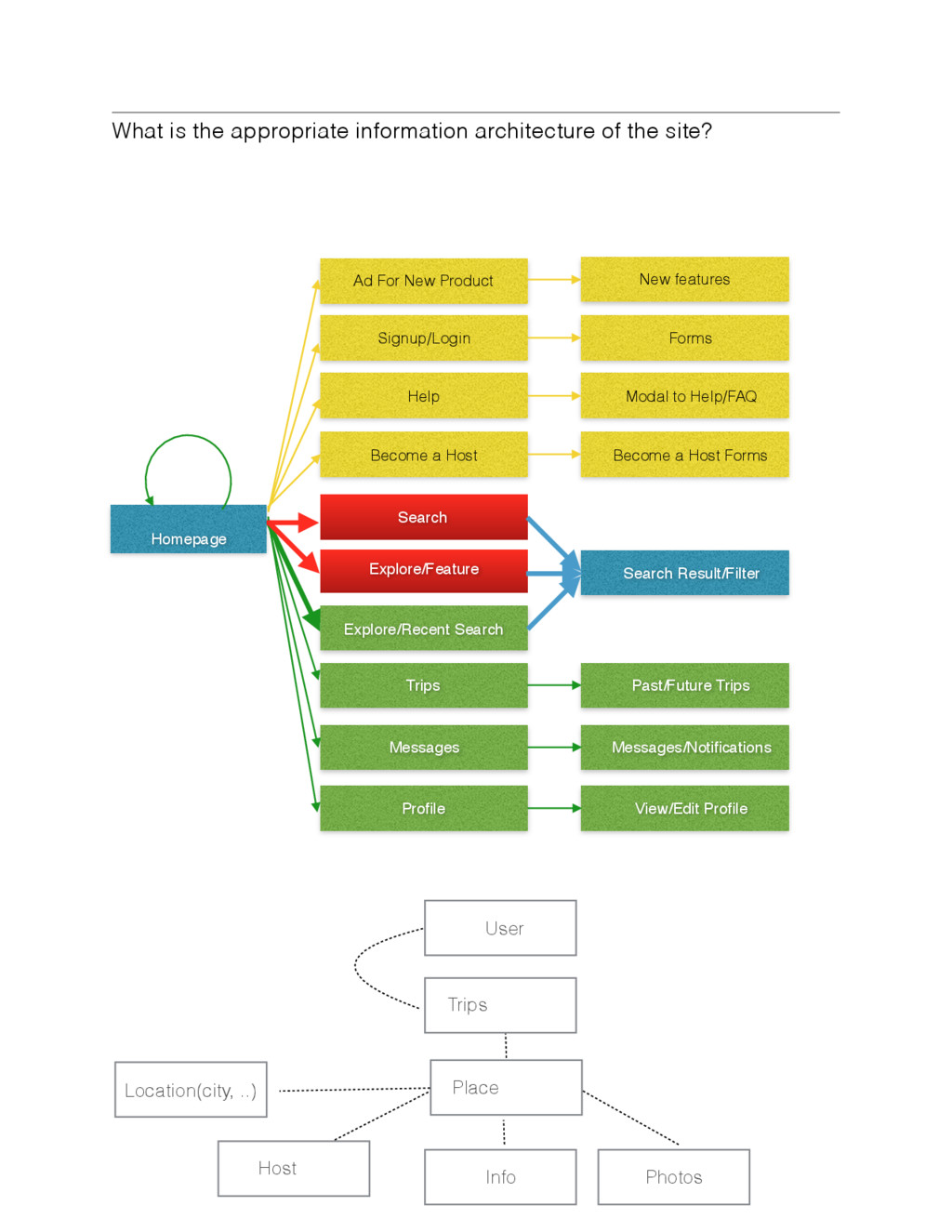
Messages Profile Ad For New Product Explore/Feature Search Explore/Recent Search Help Become a Host Signup/Login New features Past/Future Trips Messages/Notifications View/Edit Profile Become a Host Forms Modal to Help/FAQ Search Result/Filter Forms Homepage User Place Trips Host Info Photos Location(city, ..)
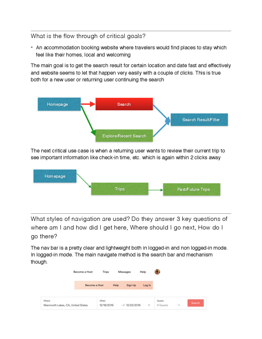
accommodation booking website where travelers would find places to stay which feel like their homes, local and welcoming The main goal is to get the search result for certain location and date fast and effectively and website seems to let that happen very easily with a couple of clicks. This is true both for a new user or returning user continuing the search The next critical use case is when a returning user wants to review their current trip to see important information like check-in time, etc. which is again within 2 clicks away What styles of navigation are used? Do they answer 3 key questions of where am I and how did I get here, Where should I go next, How do I go there? The nav bar is a pretty clear and lightweight both in logged-in and non logged-in mode. In logged-in mode. The main navigate method is the search bar and mechanism though. Search Search Result/Filter Homepage Explore/Recent Search Trips Past/Future Trips Homepage
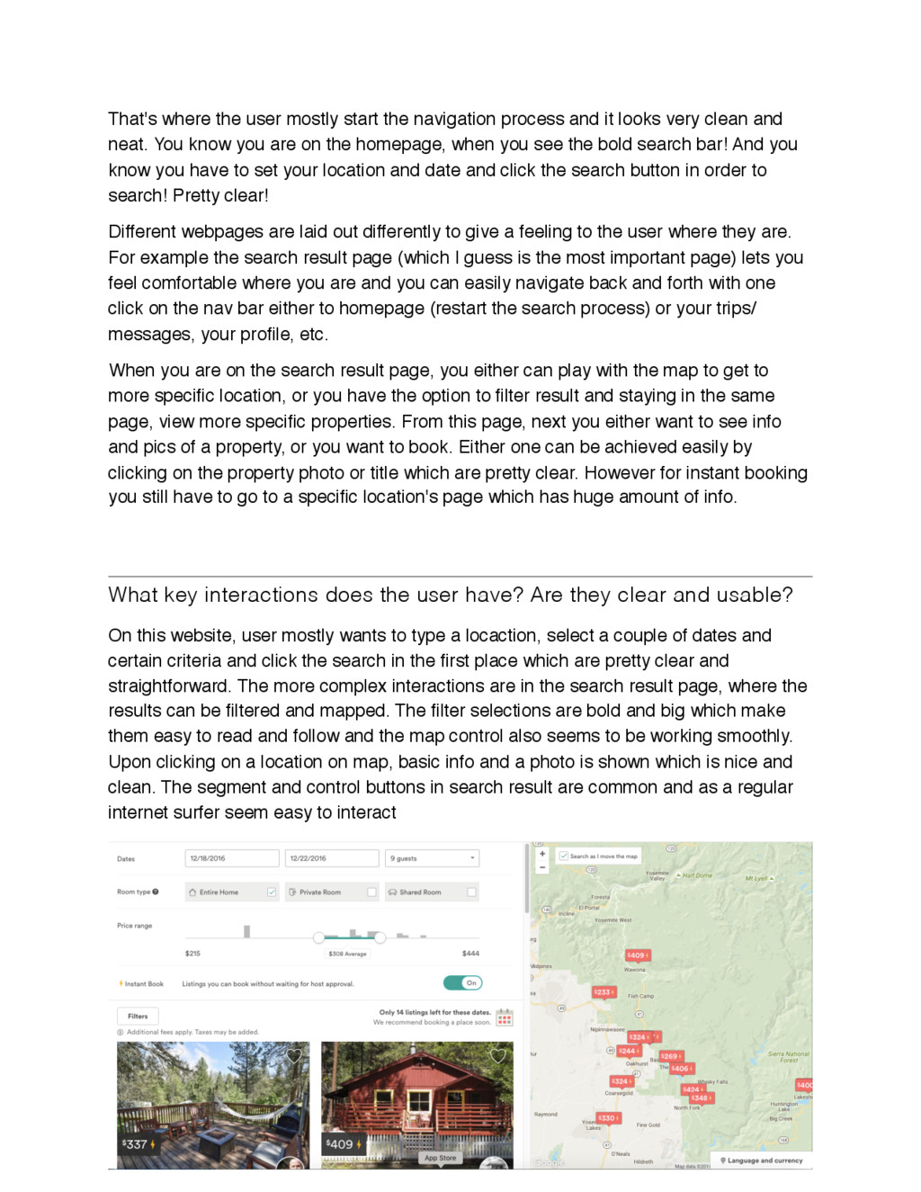
it looks very clean and neat. You know you are on the homepage, when you see the bold search bar! And you know you have to set your location and date and click the search button in order to search! Pretty clear! Different webpages are laid out differently to give a feeling to the user where they are. For example the search result page (which I guess is the most important page) lets you feel comfortable where you are and you can easily navigate back and forth with one click on the nav bar either to homepage (restart the search process) or your trips/ messages, your profile, etc. When you are on the search result page, you either can play with the map to get to more specific location, or you have the option to filter result and staying in the same page, view more specific properties. From this page, next you either want to see info and pics of a property, or you want to book. Either one can be achieved easily by clicking on the property photo or title which are pretty clear. However for instant booking you still have to go to a specific location's page which has huge amount of info. What key interactions does the user have? Are they clear and usable? On this website, user mostly wants to type a locaction, select a couple of dates and certain criteria and click the search in the first place which are pretty clear and straightforward. The more complex interactions are in the search result page, where the results can be filtered and mapped. The filter selections are bold and big which make them easy to read and follow and the map control also seems to be working smoothly. Upon clicking on a location on map, basic info and a photo is shown which is nice and clean. The segment and control buttons in search result are common and as a regular internet surfer seem easy to interact
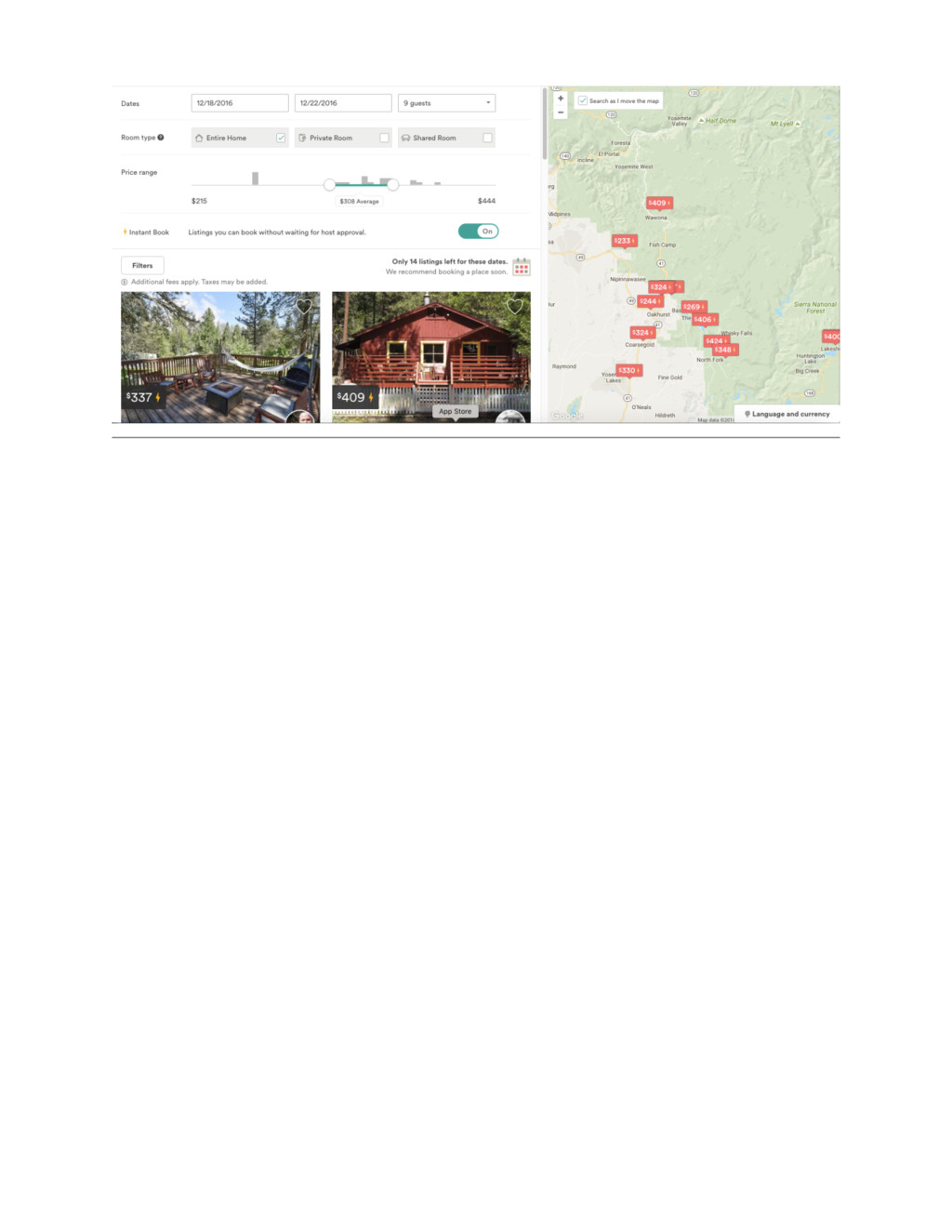
their goals effectively, efficiently and with good satisfaction? - Airbnb definitely is different than most of the hotel/accommodation booking websites in a way that lets you feel very welcome. That's accomplished by uniquely promoting each and every apartment in their own way with information about the host who are regular people. - The range of bookings are pretty wide from affordable small shared rooms to very fancy huge mansions that are well categorized and can be easily filtered so user would be able to target their destination more effectively - The website is very cool with nice and easy to read fonts and simple yet elegant animation. The information is very nicely organized and presented with good quality pictures. - The search results are quickly displayed with targeted criteria (Everything you see is available locations with your criteria, absolutely no false or incomplete info so you won't see falsely advertised properties, and you won't be surprised later) What did the site do poorly? - The search result page, even though it's very nicely laid out can be improved. First of all as you can see in the below picture, you see a dozen properties on the map while there are only a couple shown on the left side in a grid view. The most important info on this page is the actual listed properties. However, unfortunately because of too big of the filter/control section, we can only see 2 out of 10 options instantly. - The site provides no mechanism to actively and thoroughly compare for example 2 properties next to each other in place. This would be a very nice feature as user wants to further minimize their selection and eventually decide on booking. Truth is the wider the number of targeted property, the less chance for a user to book. If website provides a way to compare 2 properties and decide, that'll help the business side of website as well as user experience. - The site does not provide any mechanism to remove a property that a user does not like or decides not to go forward with, from a search result page. The workaround for this is to create a wish list of properties but that does not work either since as a user, I'd like to minimize the number of ideal options I have while maintaining the possibility to add a newly listed as I go.