Upgrade to Pro — share decks privately, control downloads, hide ads and more …

A Design Teardown of DN.se

A Design Teardown of DN.se

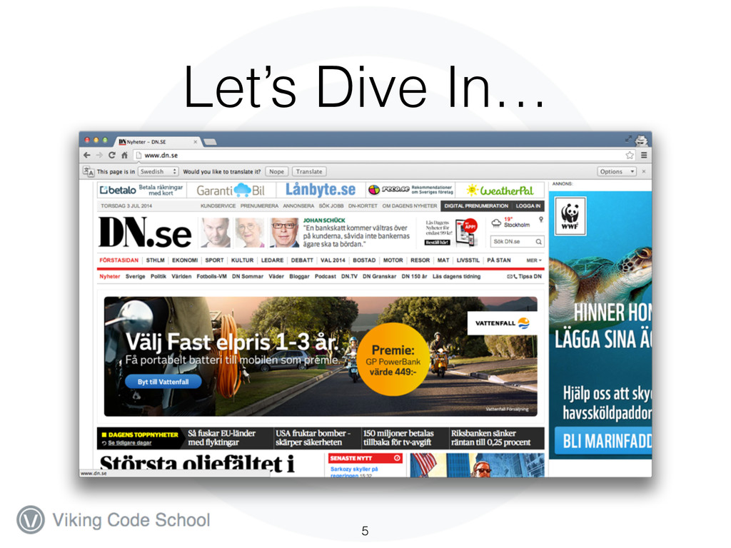
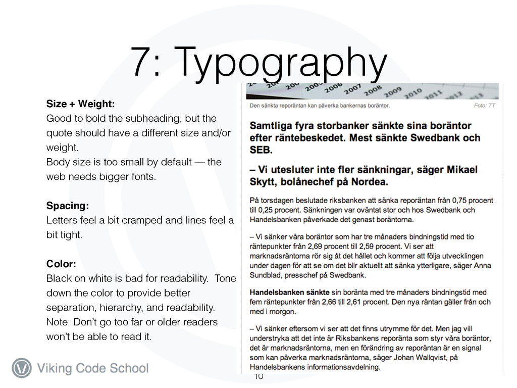
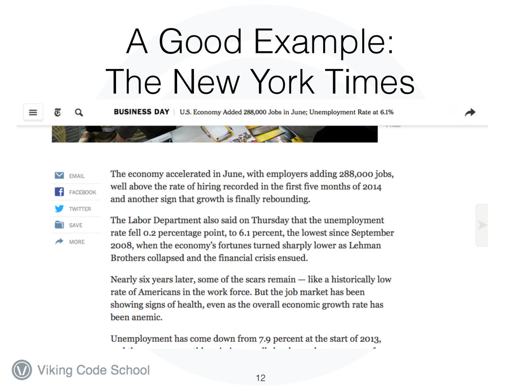
A Design Teardown of the website dn.se, a swedish news site with a whole lot going on. We’ll be thinking about the users and their goals and how those goals are (or are not) being served by the design elements of the website like the layout, composition, visual hierarchy, typography, and color.

To learn more about design and web development, check out the Viking Code School at http://vikingcodeschool.com.

Viking Education

July 17, 2014
Tweet

More Decks by Viking Education

Other Decks in Education

Transcript

  1. Our Goals 1. Demonstrate an approach for critiquing the design

    of a website and the vocabulary to do so. 2. Help you think more critically about the sites you visit. 3. Illustrate some best practices that aren’t done correctly on the DN sight. You aren’t expected to just know these things. 2
  2. Why dn.se? 1. It’s in Swedish! You won’t be distracted

    by the content. 2. It’s a content-based site so you’re expected to consume content and spend lots of time on it… they’d better have a good design. 3. It’s a case study in bad UX and design… 3
  3. Questions 1. Who is the user? 2. What is the

    user’s critical goal? 3. Sketch the approximate visual hierarchy of a key page. 4. Does the visual hierarchy lead to that goal? 5. What font families are most prominent on the site? 6. How do these font families contribute to or take away from the site's flow? 7. How do the line spacings, sizes, colors and weights contribute to or take away from the site's flow? 8. What would you improve to achieve a better hierarchy or flow? 4
  4. 1-2: Users and Goals 1. Who is the key user?

    1. A Swedish visitor curious about the news. 2. What is that user's number one critical goal when using the site? 1. Read the top news 2. Secondary — explore for other interesting news 6
  5. 5-6: Font Families 9 Headlines:! PublicoHeadline WebBlack, Georgia, sans- serif

    ! Body: Arial, Helvetica, sans-serif ! Ads: PublicoRoman, Georgia, sans- serif https://commercialtype.com/typefaces/publico/headline
  6. 7: Typography 10 Size + Weight: ! Good to bold

    the subheading, but the quote should have a different size and/or weight. Body size is too small by default — the web needs bigger fonts. ! Spacing:! Letters feel a bit cramped and lines feel a bit tight. ! Color:! Black on white is bad for readability. Tone down the color to provide better separation, hierarchy, and readability. Note: Don’t go too far or older readers won’t be able to read it.
  7. 8: Suggestions • Homepage is an absolute mess. The ad

    graphics lead to a completely confused hierarchy. De-emphasize ads. Make the headline image for the headline story! • Navigation elements, ad elements, and headlines are all on the same hierarchical level… use color and spacing to fade out the non-essential things and pop the headlines. • The 3-column grid is awkward to say the least. Stick with a 2- column or center the text. • Tweak the typography and spacing to breathe more and improve readability. Consider using a different body font in a dark gray with a larger size. 11