Upgrade to Pro — share decks privately, control downloads, hide ads and more …

vb_3_strategy_phase_slides_pdf.pdf

 vb_3_strategy_phase_slides_pdf.pdf

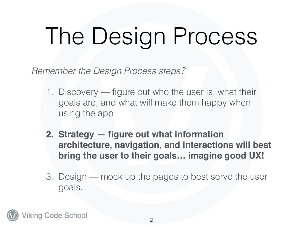
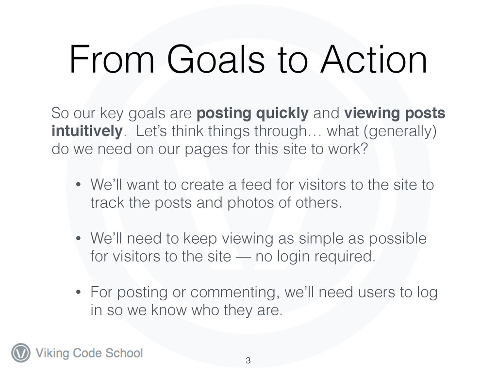
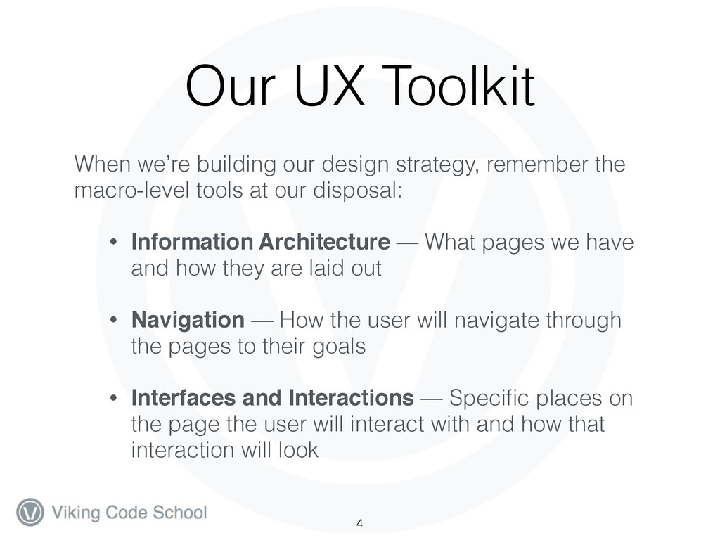
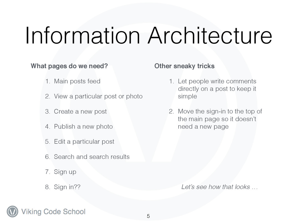
The Viking Blogger App is a demo application that we’ll be building during the prep work and over the course of our intensive program to show you an end-to-end design and production process for a real web application.

The prep videos will focus on the planning, design, user experience and mocking up of the application while our intensive course will cover its construction using Ruby on Rails, Javascript, HTML and CSS and its deployment to Heroku. Go to http://vikingcodeschool.com to learn more.

Viking Education

July 17, 2014
Tweet

More Decks by Viking Education

Other Decks in Education

Transcript

  1. The Viking Blogger: Strategy Phase The Strategy phase of the

    Design Process — where goals become action and good UX is born 1
  2. The Design Process Remember the Design Process steps? 1. Discovery

    — figure out who the user is, what their goals are, and what will make them happy when using the app 2. Strategy — figure out what information architecture, navigation, and interactions will best bring the user to their goals… imagine good UX!! 3. Design — mock up the pages to best serve the user goals. 2
  3. From Goals to Action So our key goals are posting

    quickly and viewing posts intuitively. Let’s think things through… what (generally) do we need on our pages for this site to work? • We’ll want to create a feed for visitors to the site to track the posts and photos of others. • We’ll need to keep viewing as simple as possible for visitors to the site — no login required. • For posting or commenting, we’ll need users to log in so we know who they are. 3
  4. Our UX Toolkit When we’re building our design strategy, remember

    the macro-level tools at our disposal: • Information Architecture — What pages we have and how they are laid out • Navigation — How the user will navigate through the pages to their goals • Interfaces and Interactions — Specific places on the page the user will interact with and how that interaction will look 4
  5. Information Architecture What pages do we need?! 1. Main posts

    feed 2. View a particular post or photo 3. Create a new post 4. Publish a new photo 5. Edit a particular post 6. Search and search results 7. Sign up 8. Sign in?? Other sneaky tricks! 1. Let people write comments directly on a post to keep it simple 2. Move the sign-in to the top of the main page so it doesn’t need a new page ! ! ! Let’s see how that looks … 5
  6. Information Architecture 6 Home (Posts Feed) Create Post Edit Post

    Publish Photo Sign Up Sign In Search Search Results View Post/Photo Signed In Users Only!
  7. Navigation Think it through before we actually design anything… •

    Our IA is pretty flat so navigation should be straightforward. Let’s just stick with a simple top placed navbar. • Our post authors need a quick and easy way to get to post creation/photo submission from the home page — make that the main CTA on each page. • We’ll just need to remember to always have an “eject” or “back” link when we get pulled into new flows 7
  8. Navigation Flows • Let’s do a rough mock up of

    the basic navigation flows for our pages… 8
  9. Navigation Flows (yikes!) 9 Home (Posts Feed) New Post/Photo Edit

    Post/Photo Sign Up Sign In Search Search Results View Post/Photo Signed In Users Only!
  10. Navigation Flows: Posting 11 Home (Posts Feed) Sign Up Sign

    In New Post/Photo View Post/Photo 1 2 3
  11. Interfaces + Interactions General thoughts:! • Our post creation and

    photo submission forms should be as bare bones as possible and we should have feedback for users if they mess something up. • Comments should be created right on the post itself and it should refresh automatically. • All forms can actually be modals (pop-ups)..? 12
  12. Interfaces + Interactions • Let’s check out mockups of the

    basic nav and other interaction elements of our pages in Balsamiq • You’d often just sketch this out on paper — it’s meant to be rough and focus more on the high level stuff than the specific element placements. 13
  13. Strategy Phase: Wrapping Up We just figured out the three

    macro-level components of our UX: 1. Information Architecture (good and shallow!) 2. Navigation (flows for viewing and posting, navbar type, CTA positionings + backlinks) 3. Interfaces and Interactions (navbar, post and comment forms, error handling) 14