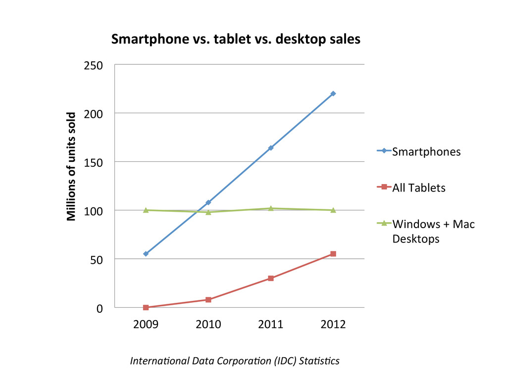
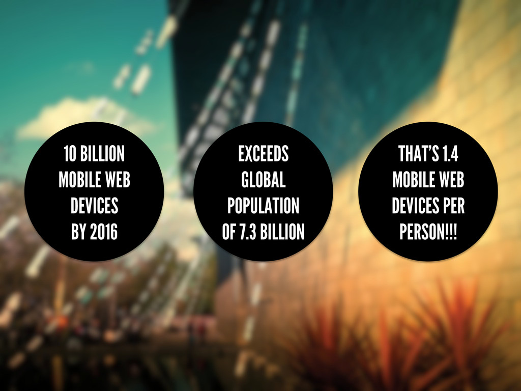
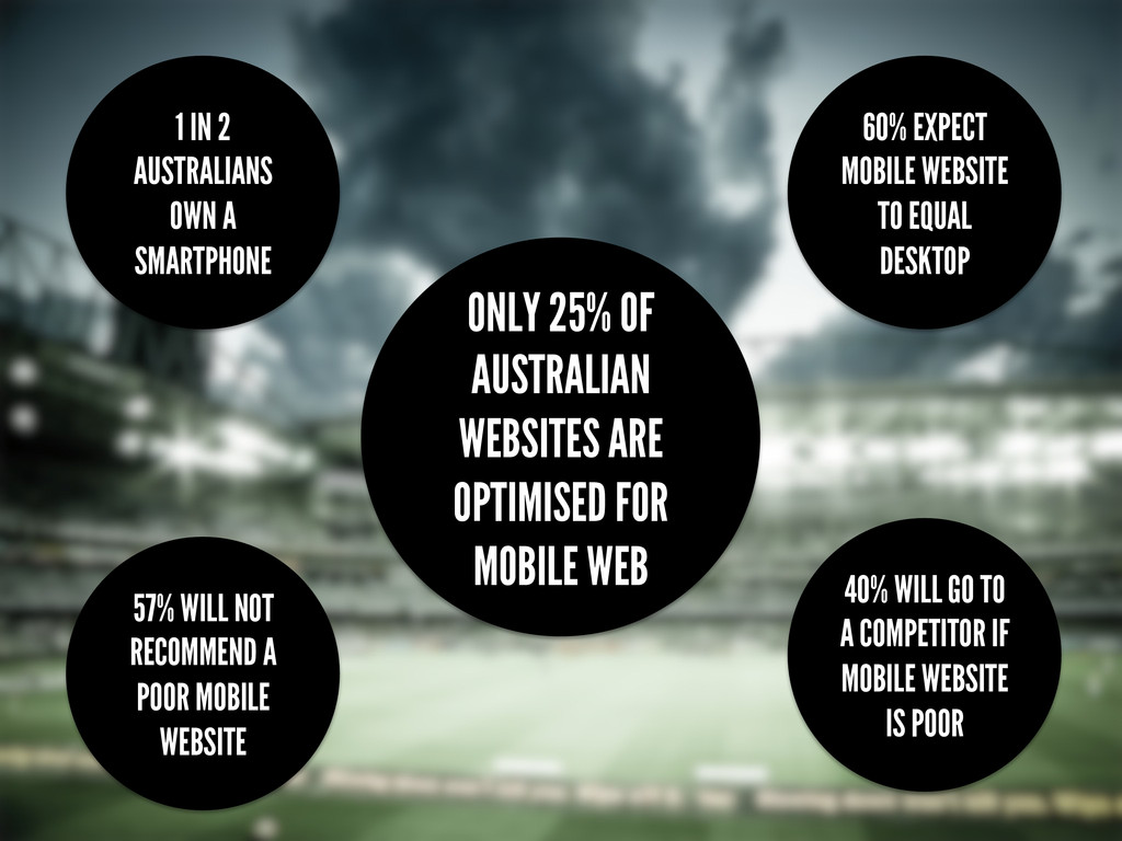
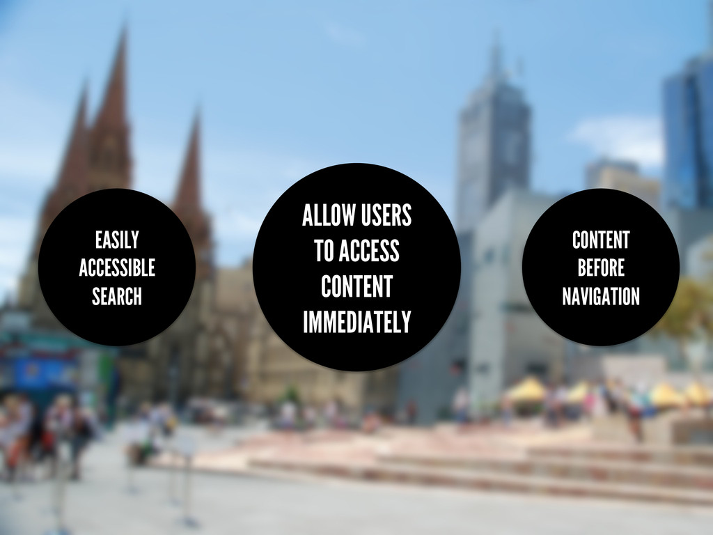
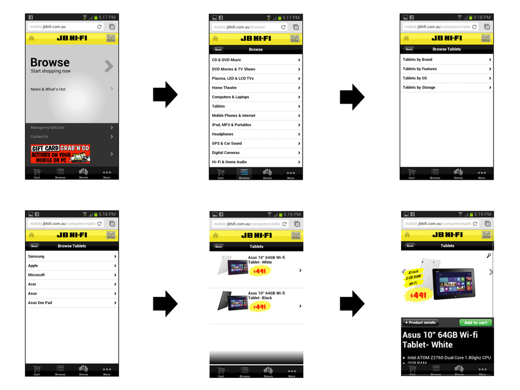
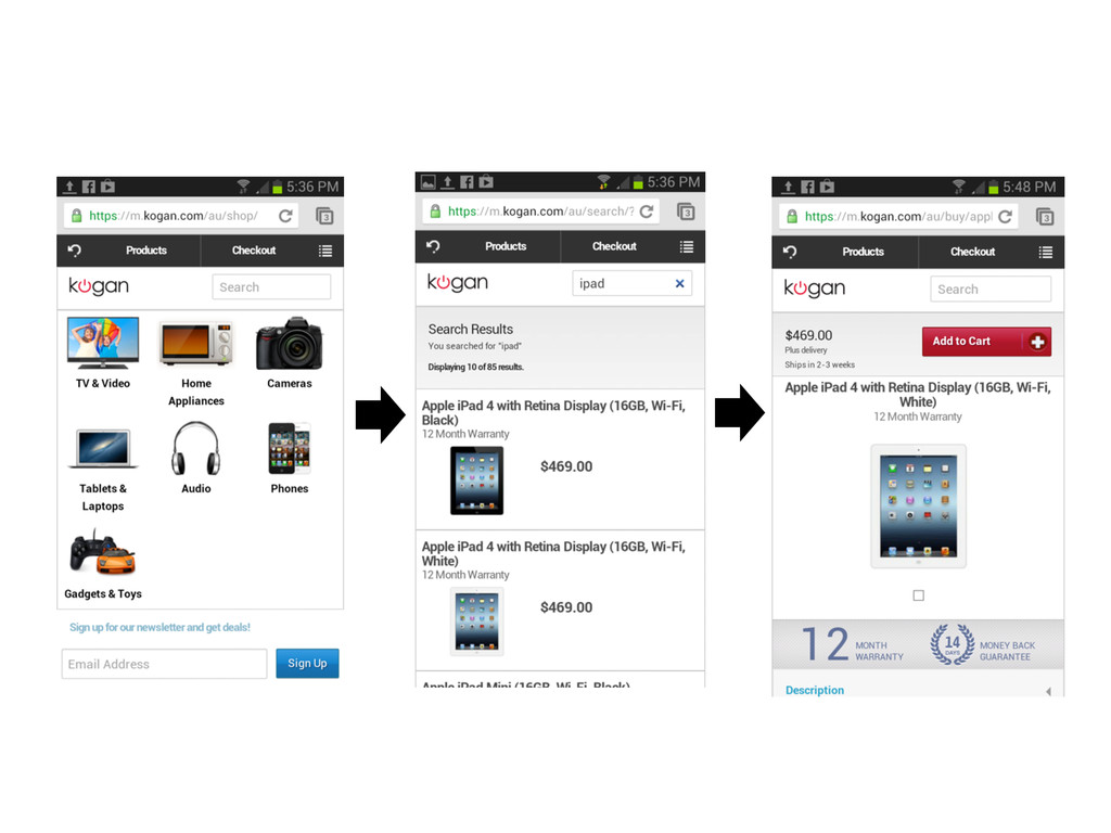
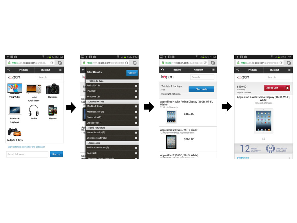
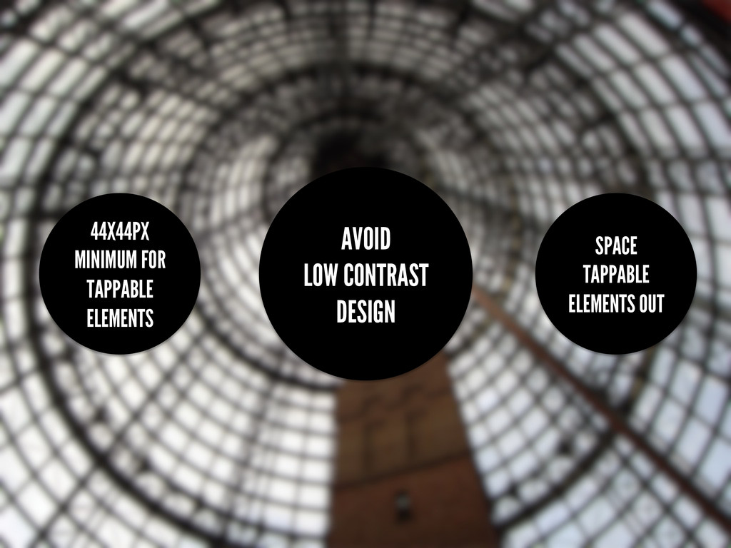
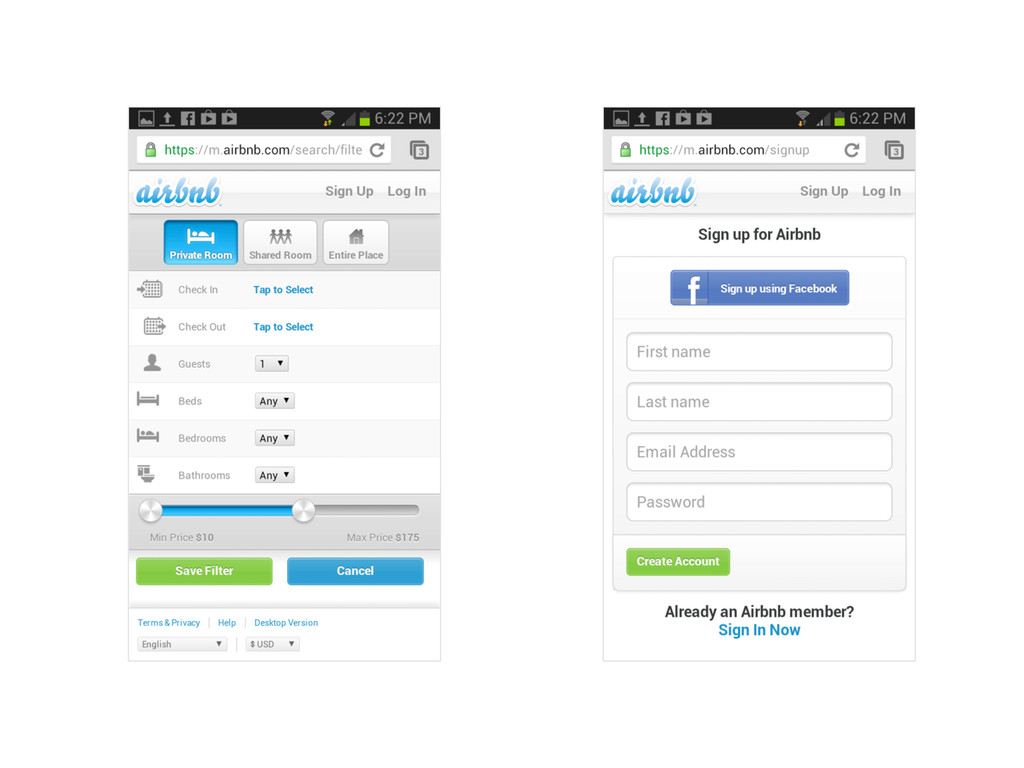
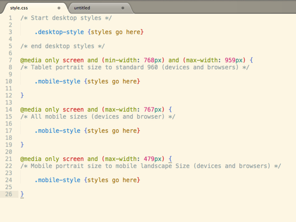
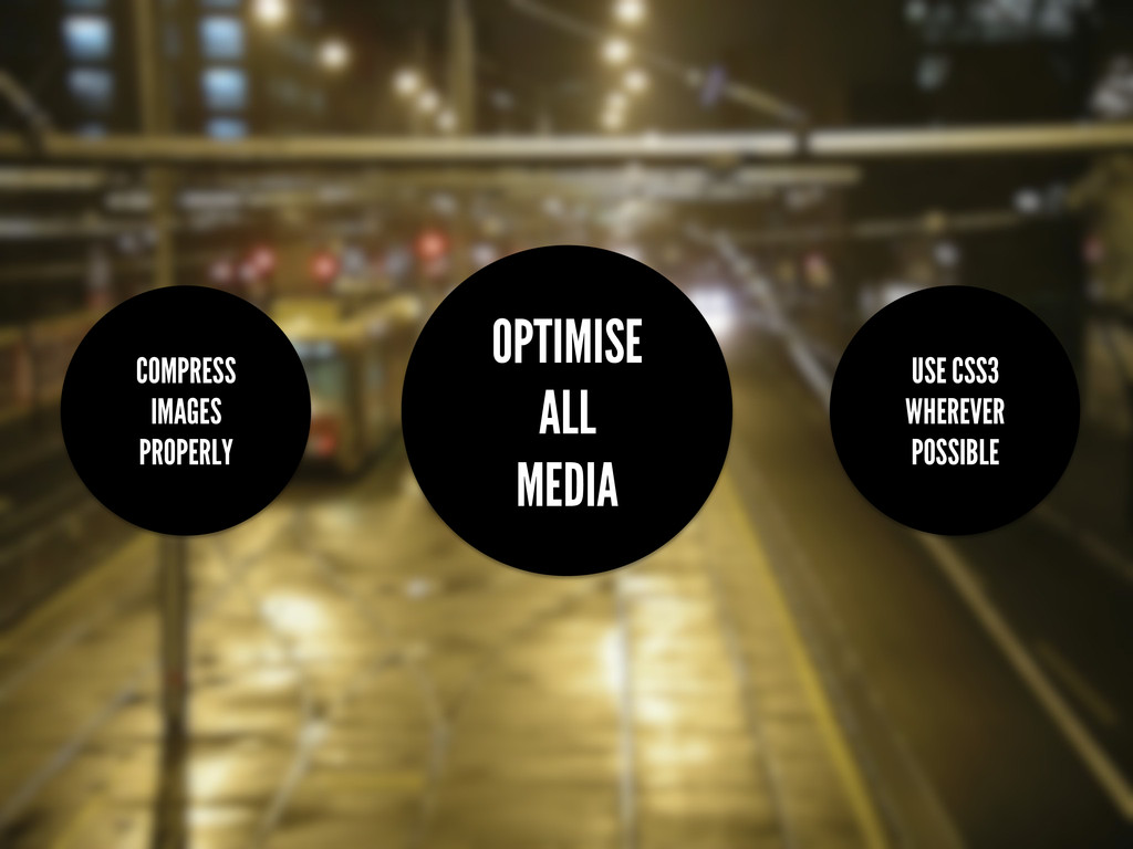
I have spent the last 12 months researching and developing responsive websites using WordPress based on my own responsive WordPress themes. During that time, there has been an explosion in smartphone and tablet adoption and huge usage growth for mobile web traffic. The trouble is that the majority of websites, particularly websites developed in Australia, are not optimised or designed to meet the demands of the ever-increasing mobile web audience. This is why I have spent the latter half of this year studying mobile-first development, and applying what I know through developing responsive, mobile-first WordPress themes. I’d like to share my experience and findings with the Australian WordPress community in hope that we can design and develop better websites for the ever-increasing mobile market.
 wpaustralia
 yamasaki696
 naitosatoshi
 sansantech
 oprstchn
 poropinai1966
 ueponx
 tooppoo
 nomizone
 murabayashi
 mu7889yoon
 jnchito
 shin1988
 brettharned
 lcolladotor
 chriscoyier
 lara
lara
 tammyeverts
 kastner
 sonatard
 nikkihalliwell
 katiecoart
 chikuwait
 apolaine
 jnunemaker