 SiteGround - Reliable hosting with speed, security, and support you can count on.
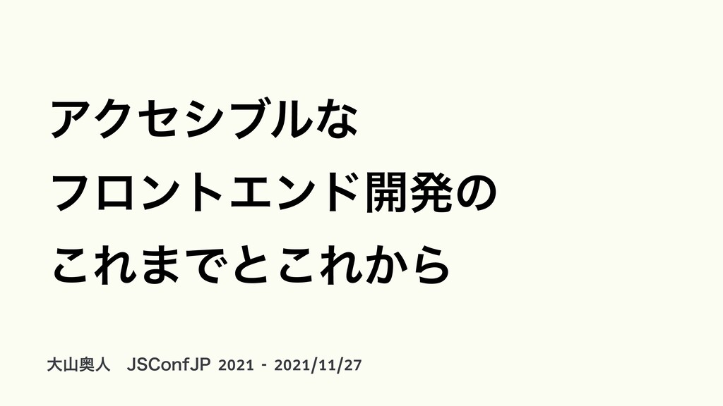
JSConfJP 2021 発表資料
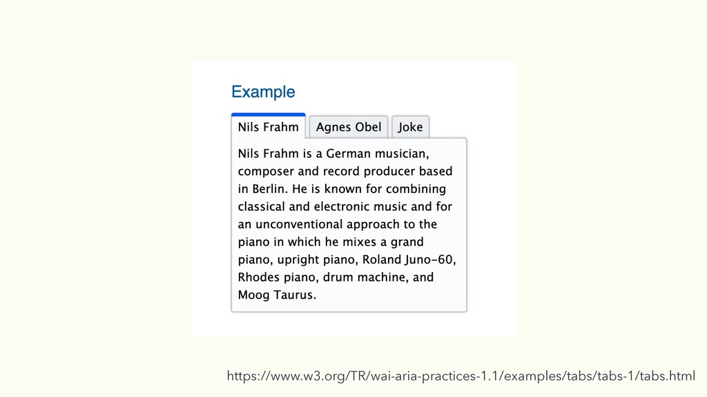
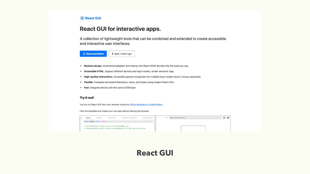
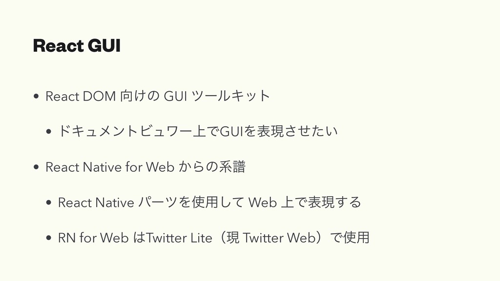
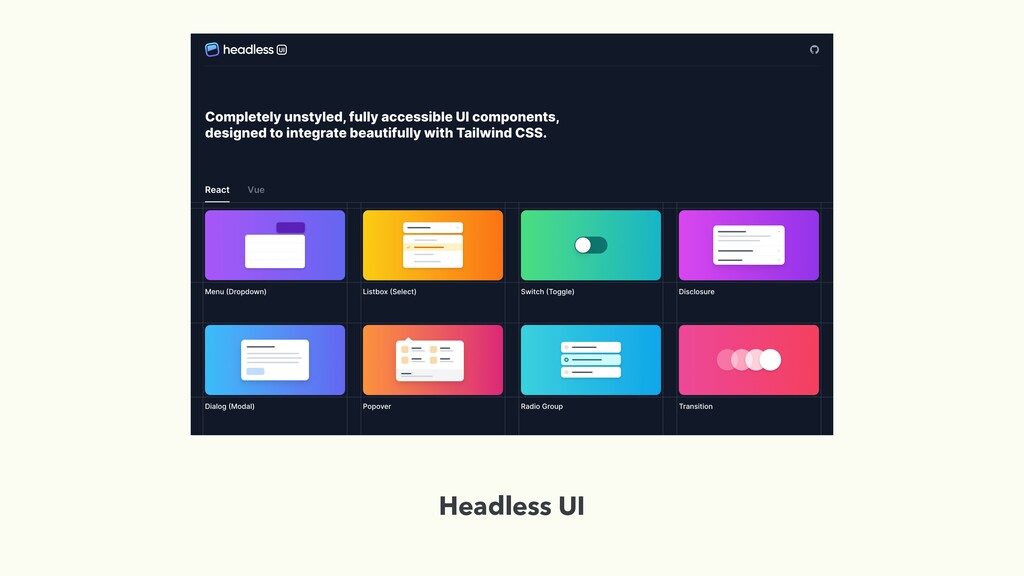
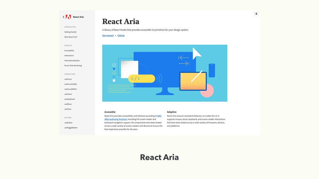
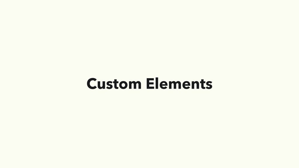
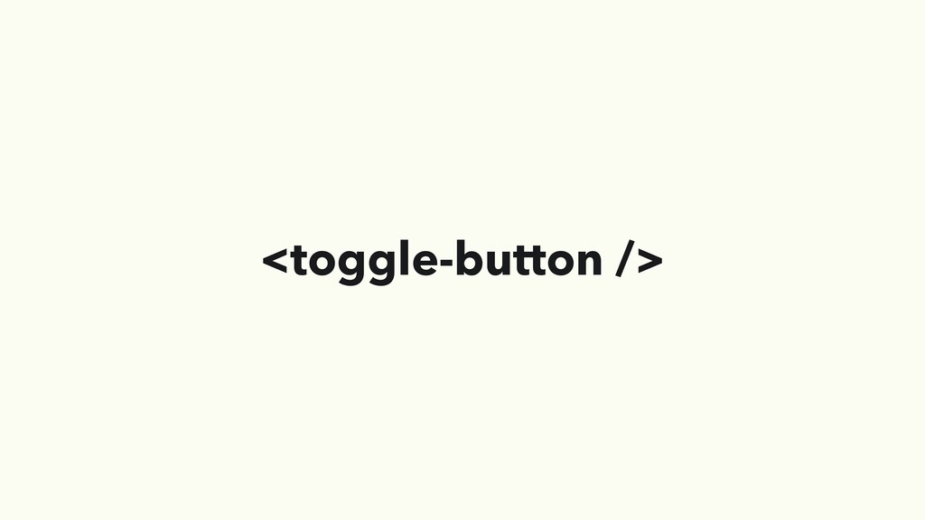
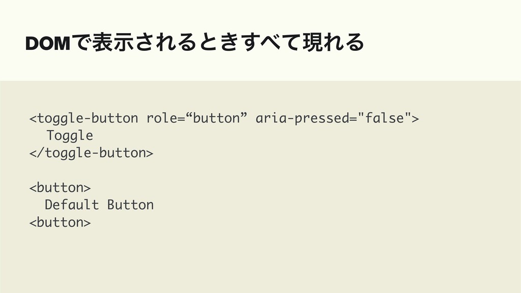
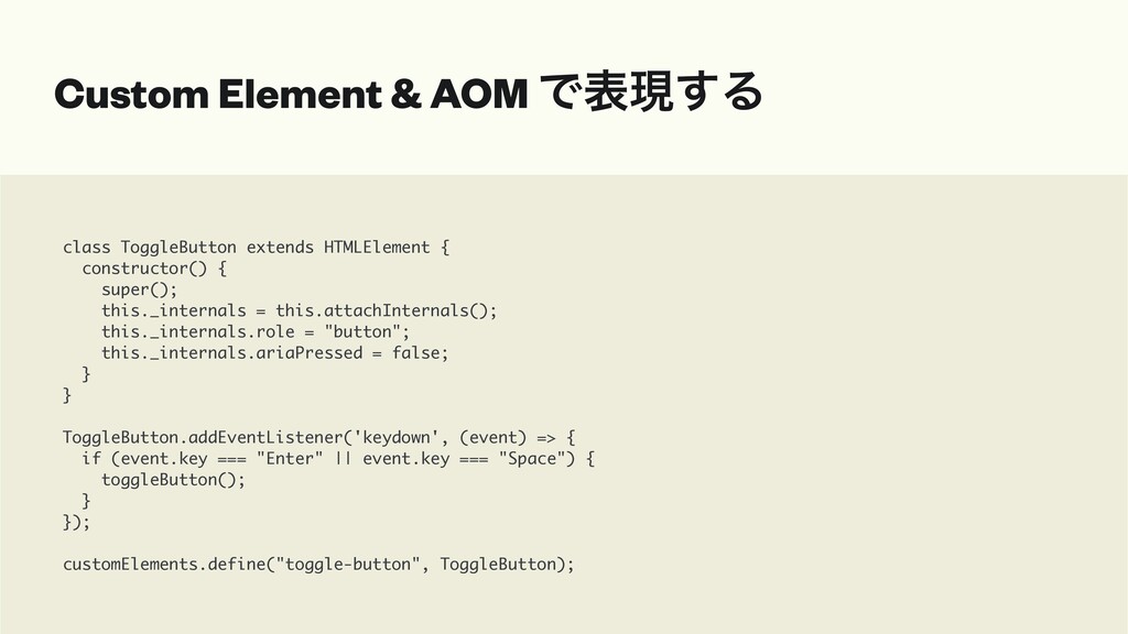
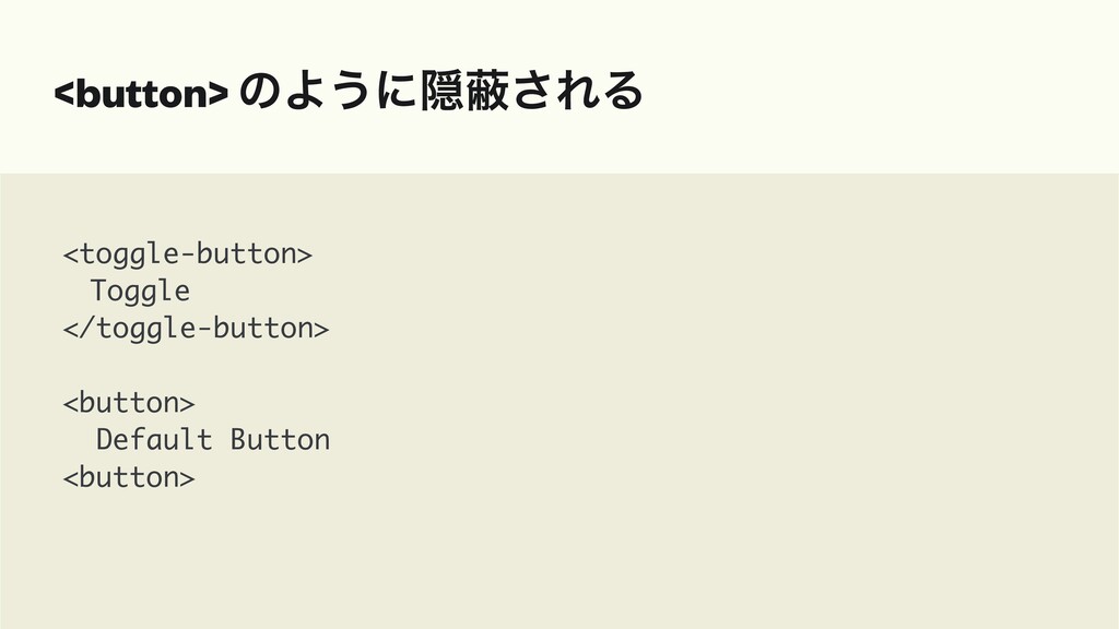
昨今アクセシビリティに関する興味関心が増えてきた中で、SPAといったWebアプリケーションにおけるアクセシビリティを考慮した実装についてはまだ認識が広まっていないように感じます。 フロントエンドフレームワークを使ってより良いアクセシビリティ実装をするにはどうすればいいかの方法、その結果どういう形で伝わっているかを紹介しようと思います。 またWebアプリケーションでHTMLを使ってUI実装することに限界を感じており、それを解消するためのReactGUIやHeadless UIといった新たなアプローチにおける期待についても紹介したいと思っております。
 yamanoku
 ymty
ymty
 sansantech
 bengo4com
 joooee0000
 smasato
 naokiakai
 yakumo
 kobayashiyorimitsu
 rryz09
 oracle4engineer
 y150saya
 lycorptech_jp
 marktimemedia
 mlcsv
mlcsv
 ryanjones
 inesmontani
 eileencodes
 lara
lara
 jdejongh
 zakiyama
 csswizardry
 katiecoart
 davidcarrasco
 sferik
![LiveAnnouncer @Component( { selector: "app-component " providers: [LiveAnnouncer ] }](https://files.speakerdeck.com/presentations/f14d34b703b24088917451478c73fc2f/slide_63.jpg)