customizé pour être plus respectueux des bons principes de visualisation des données (pas de camemberts à 15 tranches, labels non tronqués, affichage en carte des codes postaux, …) http://forms.perceptible.fr
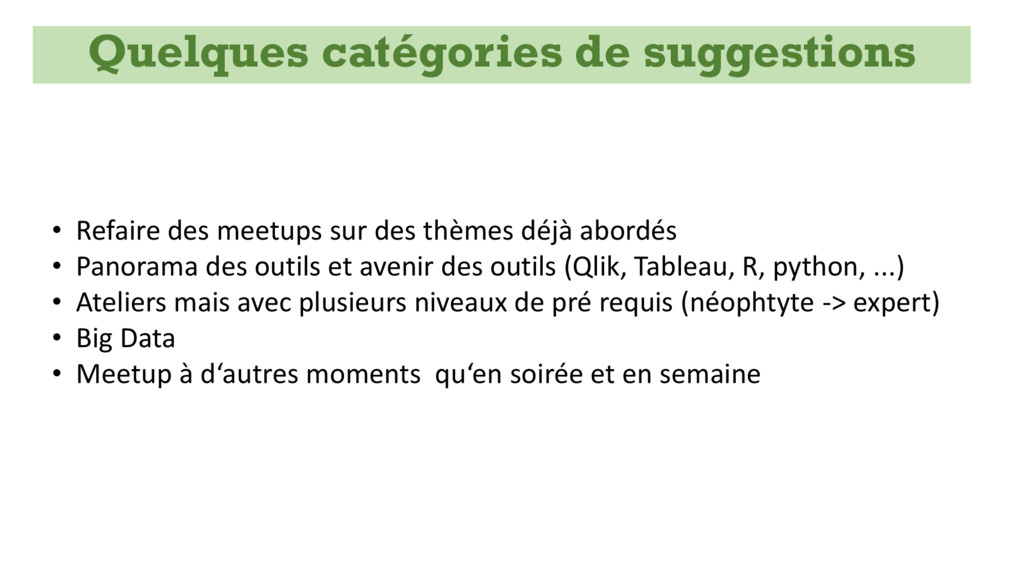
Panorama des outils et avenir des outils (Qlik, Tableau, R, python, ...) • Ateliers mais avec plusieurs niveaux de pré requis (néophtyte -> expert) • Big Data • Meetup à d‘autres moments qu‘en soirée et en semaine Quelques catégories de suggestions
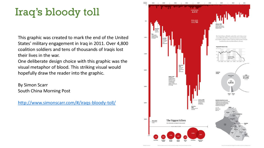
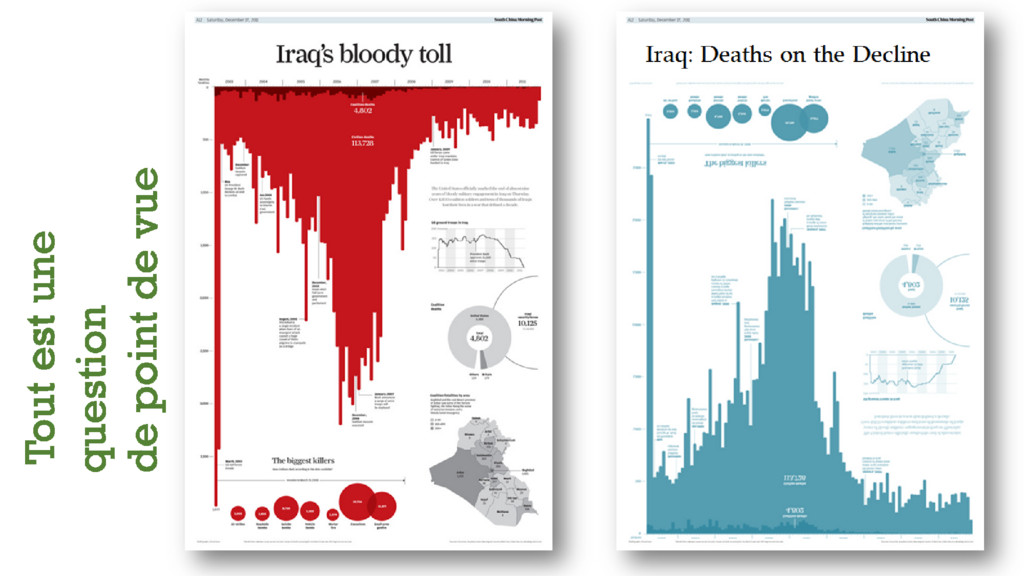
United States' military engagement in Iraq in 2011. Over 4,800 coalition soldiers and tens of thousands of Iraqis lost their lives in the war. One deliberate design choice with this graphic was the visual metaphor of blood. This striking visual would hopefully draw the reader into the graphic. By Simon Scarr South China Morning Post http://www.simonscarr.com/#/iraqs-bloody-toll/ Iraq’s bloody toll
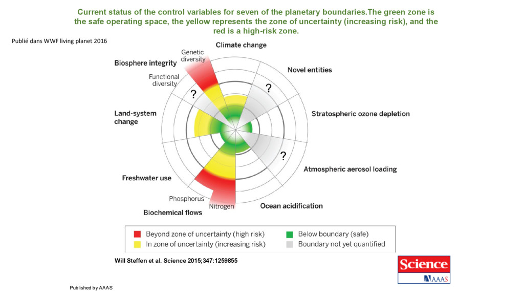
planetary boundaries.The green zone is the safe operating space, the yellow represents the zone of uncertainty (increasing risk), and the red is a high-risk zone. Will Steffen et al. Science 2015;347:1259855 Published by AAAS Publié dans WWF living planet 2016
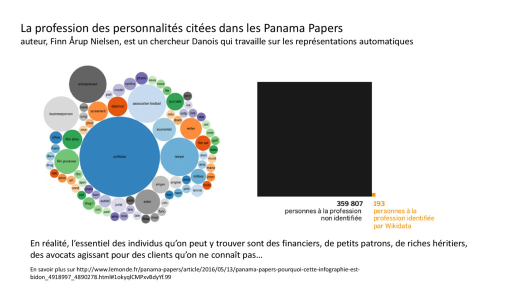
Finn Årup Nielsen, est un chercheur Danois qui travaille sur les représentations automatiques En savoir plus sur http://www.lemonde.fr/panama-papers/article/2016/05/13/panama-papers-pourquoi-cette-infographie-est- bidon_4918997_4890278.html#1okyqlCMPxvBdyYf.99 En réalité, l’essentiel des individus qu’on peut y trouver sont des financiers, de petits patrons, de riches héritiers, des avocats agissant pour des clients qu’on ne connaît pas…


 alaino
 kakehashi
 makocchi
 tetsuya28
 hiracky16
 tomokusaba
 yuuuuuuu168
 codmoninc
 gogutan
 tokuty
 ezaki
ezaki
 takahashim
 takanorip
 palkan
 paigeccino
 eileencodes
 kneath
 morganepeng
 jmmastey
 livdayseo
 colly
colly
 orderedlist
 uxyall
 427marketing
 marcoroth