Upgrade to Pro
— share decks privately, control downloads, hide ads and more …
Speaker Deck
Features
Speaker Deck
PRO
Sign in
Sign up for free
Search
Search
Responsive Design
Search
Andy Hume
November 13, 2011
Technology
1.4k
23
Share
Embed
Copy iframe code
Copy JS code
Copy link
Start on current slide
Responsive Design
Practical approaches to building responsive websites
Andy Hume
November 13, 2011
More Decks by Andy Hume
See All by Andy Hume
Architecting resilient front-ends, jQuery UK, 2015
andyhume
2
1.2k
Building for performance and resilience
andyhume
5
1.3k
Architecting resilient front ends
andyhume
3
930
Guardian Responsive Design, SmashingConf 2013
andyhume
6
720
Web Fonts as a Progressive Enhancement, Ampersand 2013
andyhume
2
830
Anatomy of a responsive page load, WhiskyWeb 2013
andyhume
10
2k
Breaking News & Breaking Software, SyncConf 2013
andyhume
0
350
Anatomy of a responsive page load, Responsive Day Out 2013
andyhume
23
3.4k
Responsive Guardian
andyhume
21
1.2k
Other Decks in Technology
See All in Technology
AIペネトレーションテスト・ セキュリティ検証「AgenticSec」紹介資料
laysakura
2
7.8k
Agentic AI 時代のテスト手法: Kiro とはじめるプロパティベーステスト (AWS Summit Japan 2026 | DEV212)
ymhiroki
0
150
WebGIS AI Agentの紹介
_shimizu
0
610
プライバシー保護の理論と実践
lycorptech_jp
PRO
1
200
「ビジネスがわかるエンジニア」とは何か?
ryooob
0
440
『AIに負けない』より『AIと遊ぶ』」〜ワクワクが最強のテスト・QA学習戦略_公開用
odan611
1
300
データレイクの「見えない問題」を可視化する
sansantech
PRO
1
260
ご挨拶「10周年を迎える共創ラボのこれまでとこれから」
iotcomjpadmin
0
170
はてなのサービス基盤を支える Kubernetes《足腰》
masayoshimaezawa
0
390
5分でわかる Amazon Connect_20260608
hwangbyeonghun
0
150
フルAIで個人開発して学んだあれこれ / yuruai vol.1
isaoshimizu
0
160
SRE歴2ヶ月でも開発6年の知見を活かして、チームで止まっていた環境改善を前に進めた話
a_ono
0
160
Featured
See All Featured
Data-driven link building: lessons from a $708K investment (BrightonSEO talk)
szymonslowik
1
1.1k
Navigating Weather and Climate Data
rabernat
0
260
The Spectacular Lies of Maps
axbom
PRO
1
840
[RailsConf 2023] Rails as a piece of cake
palkan
59
6.7k
職位にかかわらず全員がリーダーシップを発揮するチーム作り / Building a team where everyone can demonstrate leadership regardless of position
madoxten
62
55k
Why Mistakes Are the Best Teachers: Turning Failure into a Pathway for Growth
auna
0
170
Building Adaptive Systems
keathley
44
3.1k
The Language of Interfaces
destraynor
162
27k
Rails Girls Zürich Keynote
gr2m
96
14k
The Illustrated Children's Guide to Kubernetes
chrisshort
51
52k
Primal Persuasion: How to Engage the Brain for Learning That Lasts
tmiket
0
380
sira's awesome portfolio website redesign presentation
elsirapls
0
290
Transcript
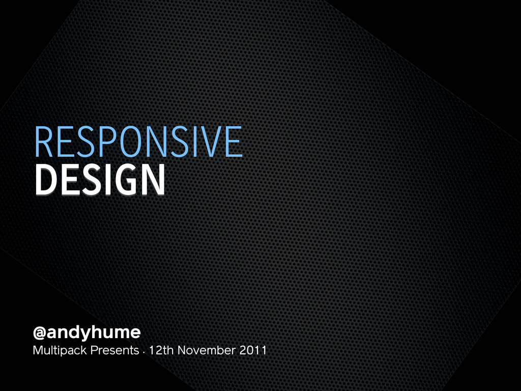
@andyhume Multipack Presents • 12th November 2011 DESIGN RESPONSIVE
@andyhume Multipack Presents • 12th November 2011 DESIGN RESPONSIVE
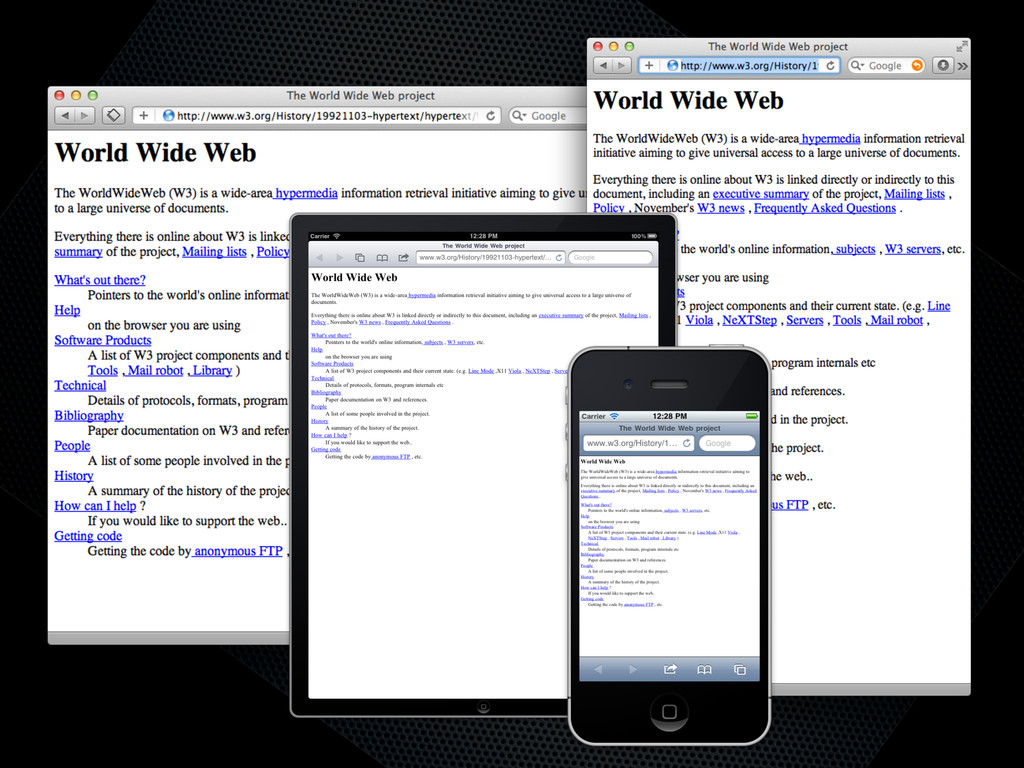
None
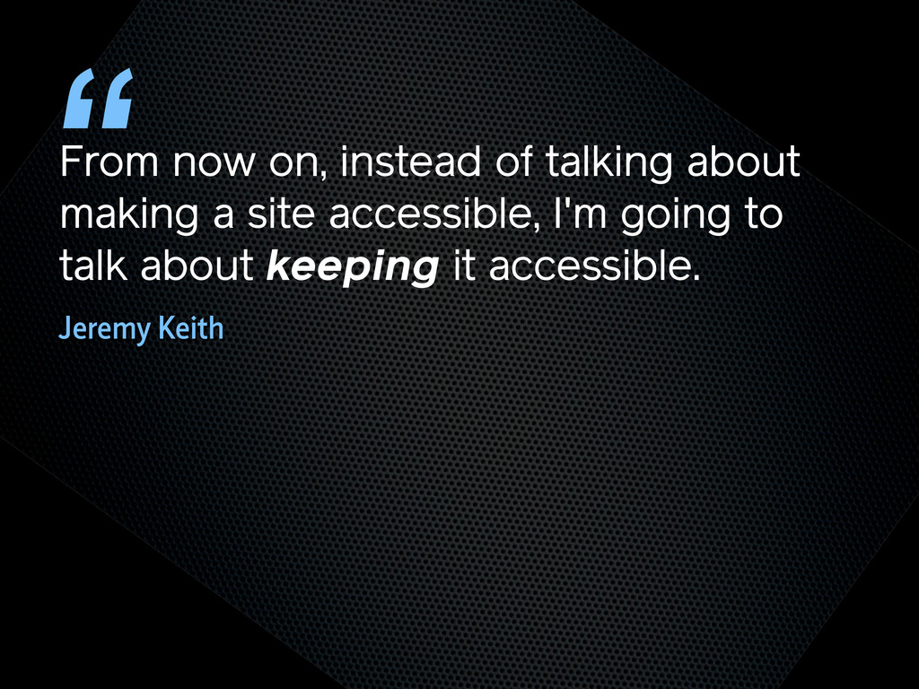
From now on, instead of talking about making a site
accessible, I'm going to talk about keeping it accessible. “ Jeremy Keith
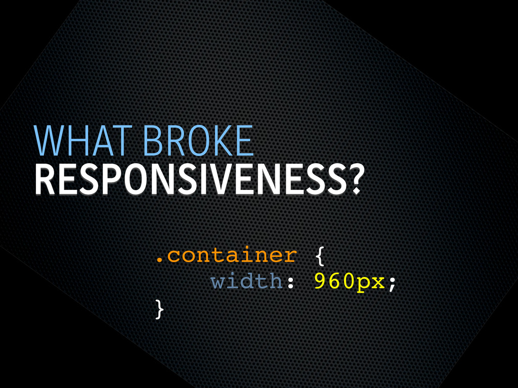
TRY NOT TO BREAK IT? THE WEB WORKS
RESPONSIVENESS? WHAT BROKE .container { width: 960px; }
SEMANTIC HTML STEPS[0]
OOCSS STEPS[1] Loosely couple content styling from layout styling <link
rel="stylesheet" href="core.css">
CORE.CSS STEPS[4] .product .title { font-size: 1em; } @media screen
and (min-width: 60em) { .product .title { font-size: 1.4em; } } Keep modules together
SELECTOR QUERIES? STEPS[4] <div class="product" data-squery="min-width: 400px=wide max-width:10em=small"> <p>Content here</p>
</div> Adapt content based on container width https://github.com/ahume/selector-queries
SELECTOR QUERIES? STEPS[4] .product img { max-width: 100%; } .product.wide
img { // greater than 400px float: left; margin-right: 1em; max-width: auto; } Adapt content based on container width https://github.com/ahume/selector-queries
NAVIGATION STEPS[2]
NAVIGATION STEPS[2]
ADDING LAYOUT STEPS[3] <link rel="stylesheet" href="core.css"> <link rel="stylesheet" href="layout.css" media="screen
and (min-width:40em)"> Loosely couple content styling from layout styling
IE <9 STEPS[5] Send full ‘desktop’ layout <link rel="stylesheet" href="core.css">
<link rel="stylesheet" href="layout.css" media="screen and (min-width:40em)"> <!--[if lt IE 9]> <link rel="stylesheet" href="layout.css" media="screen"> <![endif]-->
IE <9 STEPS[5] Send full ‘desktop’ layout - but not
to mobile <link rel="stylesheet" href="core.css"> <link rel="stylesheet" href="layout.css" media="screen and (min-width:40em)"> <!--[if lt IE 9] & !(IEMobile)]> <link rel="stylesheet" href="layout.css" media="screen"> <![endif]-->
IE <9 STEPS[5] Send full ‘desktop’ layout - or not
<link rel="stylesheet" href="core.css"> <link rel="stylesheet" href="layout.css" media="screen and (min-width:40em)"> <!--[if lt IE 9] & !(IEMobile) & (gt IE6)]> <link rel="stylesheet" href="layout.css" media="screen"> <![endif]-->
IE <9 STEPS[5] Polyfill media queries <script rel="respond.js"></script> https://github.com/scottjehl/Respond
VIEWPORT STEPS[6] Set layout viewport width to the device width
<meta name="viewport" content="width=device-width, initial-scale=1.0">
VIEWPORT STEPS[6] W3C Syntax: coming soon http://dev.w3.org/csswg/css-device-adapt/ @viewport { width:
device-width; zoom: 1.0; }
IMAGES STEPS[7] Shrinking img { max-width: 100%; }
RESPONSIVE IMAGES STEPS[7] Small image by default Don’t download both
RESPONSIVE IMAGES STEPS[7] Client-side solutions https://github.com/filamentgroup/Responsive-Images https://github.com/ahume/Responsive-Images https://github.com/allmarkedup/responsive-images-alt
RESPONSIVE IMAGES STEPS[7] Here and now? src.sencha.io <img src="http://src.sencha.io/http://andyhume.net/ u.jpg">
RESPONSIVE IMAGES STEPS[7] Here and now? Image replacement <div class="logo">
<img src="logo.png" alt="Company name"> </div> .logo { background-image: url(logo-large.png); } .logo img { position: absolute; left: -9999px; }
SVG STEPS[8] Same approaches to support as responsive images
ENHANCING CONTENT STEPS[9] What’s core content?
ENHANCING CONTENT STEPS[9]
ENHANCING CONTENT STEPS[9]
ENHANCING CONTENT STEPS[9] if ($(document).width() > 640) { ! $.get('path/to/html',
function(data) { ! ! $('[role="complementary"]').append(data); ! }); } What’s core content?
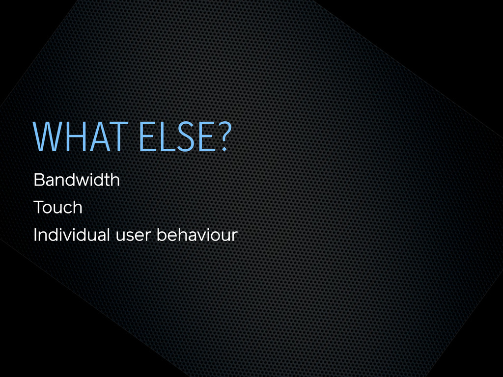
WHAT ELSE? Bandwidth Touch Individual user behaviour
THE END @andyhume Multipack Presents • 12th November 2011
 andyhume
 laysakura
 ymhiroki
 _shimizu
 lycorptech_jp
 ryooob
 odan611
 sansantech
 iotcomjpadmin
 masayoshimaezawa
 hwangbyeonghun
 isaoshimizu
 a_ono
a_ono
 szymonslowik
 rabernat
 axbom
axbom
 palkan
 madoxten
 auna
auna
 keathley
 destraynor
 gr2m
gr2m
 chrisshort
 tmiket
 elsirapls
![SEMANTIC HTML STEPS[0]](https://files.speakerdeck.com/presentations/4ec011cd70a8050051006edf/slide_6.jpg)
![OOCSS STEPS[1] Loosely couple content styling from layout styling <link](https://files.speakerdeck.com/presentations/4ec011cd70a8050051006edf/slide_7.jpg)
![CORE.CSS STEPS[4] .product .title { font-size: 1em; } @media screen](https://files.speakerdeck.com/presentations/4ec011cd70a8050051006edf/slide_8.jpg)
![SELECTOR QUERIES? STEPS[4] <div class="product" data-squery="min-width: 400px=wide max-width:10em=small"> <p>Content here</p>](https://files.speakerdeck.com/presentations/4ec011cd70a8050051006edf/slide_9.jpg)
![SELECTOR QUERIES? STEPS[4] .product img { max-width: 100%; } .product.wide](https://files.speakerdeck.com/presentations/4ec011cd70a8050051006edf/slide_10.jpg)
![NAVIGATION STEPS[2]](https://files.speakerdeck.com/presentations/4ec011cd70a8050051006edf/slide_11.jpg)
![NAVIGATION STEPS[2]](https://files.speakerdeck.com/presentations/4ec011cd70a8050051006edf/slide_12.jpg)
![ADDING LAYOUT STEPS[3] <link rel="stylesheet" href="core.css"> <link rel="stylesheet" href="layout.css" media="screen](https://files.speakerdeck.com/presentations/4ec011cd70a8050051006edf/slide_13.jpg)
![IE <9 STEPS[5] Send full ‘desktop’ layout <link rel="stylesheet" href="core.css">](https://files.speakerdeck.com/presentations/4ec011cd70a8050051006edf/slide_14.jpg)
![IE <9 STEPS[5] Send full ‘desktop’ layout - but not](https://files.speakerdeck.com/presentations/4ec011cd70a8050051006edf/slide_15.jpg)
![IE <9 STEPS[5] Send full ‘desktop’ layout - or not](https://files.speakerdeck.com/presentations/4ec011cd70a8050051006edf/slide_16.jpg)
![IE <9 STEPS[5] Polyfill media queries <script rel="respond.js"></script> https://github.com/scottjehl/Respond](https://files.speakerdeck.com/presentations/4ec011cd70a8050051006edf/slide_17.jpg)
![VIEWPORT STEPS[6] Set layout viewport width to the device width](https://files.speakerdeck.com/presentations/4ec011cd70a8050051006edf/slide_18.jpg)
![VIEWPORT STEPS[6] W3C Syntax: coming soon http://dev.w3.org/csswg/css-device-adapt/ @viewport { width:](https://files.speakerdeck.com/presentations/4ec011cd70a8050051006edf/slide_19.jpg)
![IMAGES STEPS[7] Shrinking img { max-width: 100%; }](https://files.speakerdeck.com/presentations/4ec011cd70a8050051006edf/slide_20.jpg)
![RESPONSIVE IMAGES STEPS[7] Small image by default Don’t download both](https://files.speakerdeck.com/presentations/4ec011cd70a8050051006edf/slide_21.jpg)
![RESPONSIVE IMAGES STEPS[7] Client-side solutions https://github.com/filamentgroup/Responsive-Images https://github.com/ahume/Responsive-Images https://github.com/allmarkedup/responsive-images-alt](https://files.speakerdeck.com/presentations/4ec011cd70a8050051006edf/slide_22.jpg)
![RESPONSIVE IMAGES STEPS[7] Here and now? src.sencha.io <img src="http://src.sencha.io/http://andyhume.net/ u.jpg">](https://files.speakerdeck.com/presentations/4ec011cd70a8050051006edf/slide_23.jpg)
![RESPONSIVE IMAGES STEPS[7] Here and now? Image replacement <div class="logo">](https://files.speakerdeck.com/presentations/4ec011cd70a8050051006edf/slide_24.jpg)
![SVG STEPS[8] Same approaches to support as responsive images](https://files.speakerdeck.com/presentations/4ec011cd70a8050051006edf/slide_25.jpg)
![ENHANCING CONTENT STEPS[9] What’s core content?](https://files.speakerdeck.com/presentations/4ec011cd70a8050051006edf/slide_26.jpg)
![ENHANCING CONTENT STEPS[9]](https://files.speakerdeck.com/presentations/4ec011cd70a8050051006edf/slide_27.jpg)
![ENHANCING CONTENT STEPS[9]](https://files.speakerdeck.com/presentations/4ec011cd70a8050051006edf/slide_28.jpg)
![ENHANCING CONTENT STEPS[9] if ($(document).width() > 640) { ! $.get('path/to/html',](https://files.speakerdeck.com/presentations/4ec011cd70a8050051006edf/slide_29.jpg)