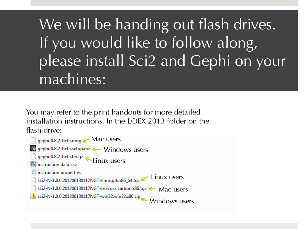
like to follow along, please install Sci2 and Gephi on your machines: You may refer to the print handouts for more detailed installation instructions. In the LOEX 2013 folder on the flash drive: Mac users Windows users Linux users Mac users Windows users Linux users
(ahem, spreadsheets) ¤ Helps the information you’ve been collecting tell a story ¤ Provides an even deeper analysis of your instruction—the big picture—that can shape: ¤ Assessment ¤ Departmental goals ¤ Use of human resources
Academic Libraries Summit: Connect, Collaborate, and Comm unicate, reiterated, calling for: “[M]ultiple replicable approaches for documenting and demonstrating library impact on student learning and success”
explain the terminology—but if you get confused, just reference the handout ¤ To keep it simple—though if this is brand new, it may be overwhelming. And that’s okay.
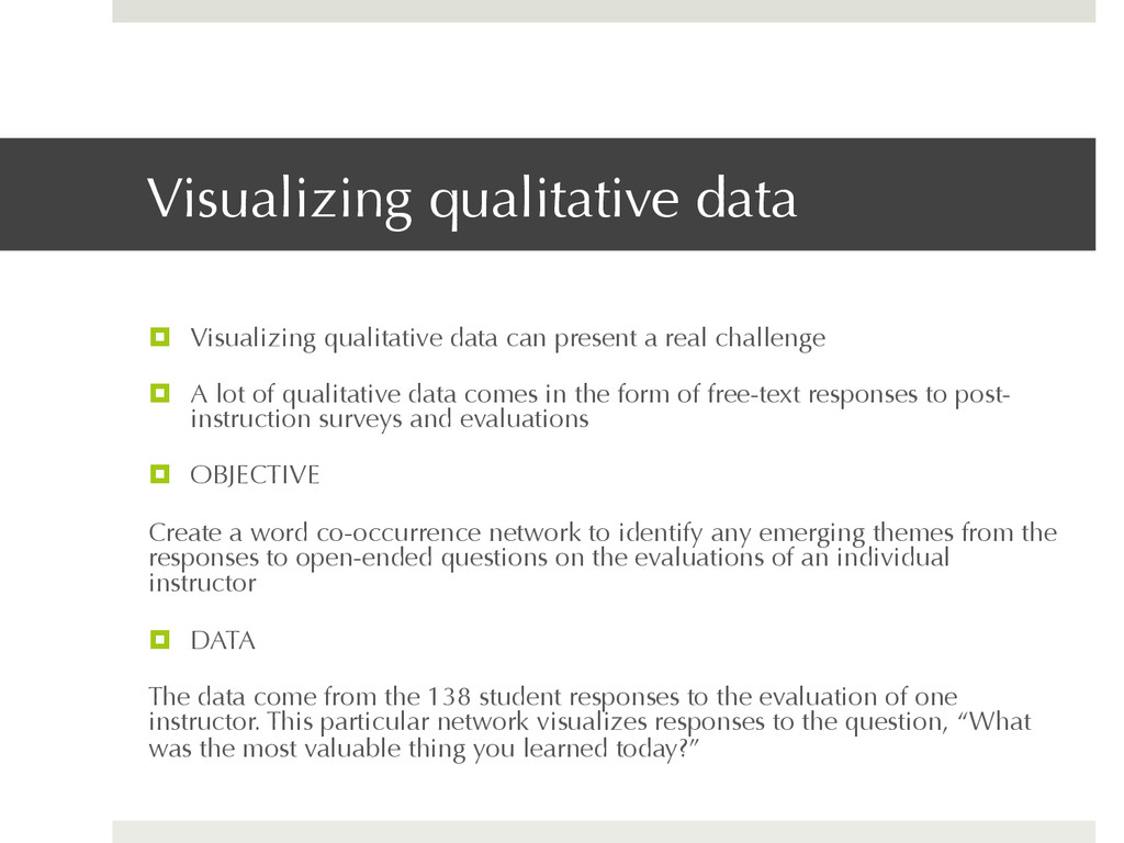
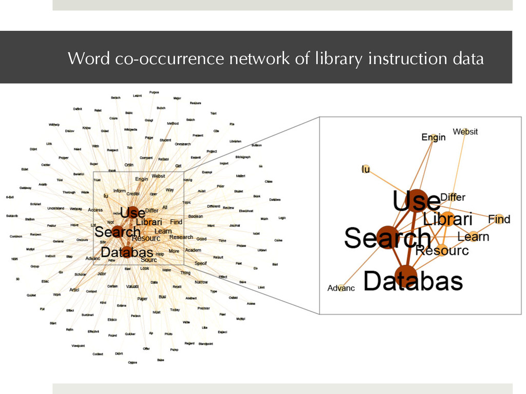
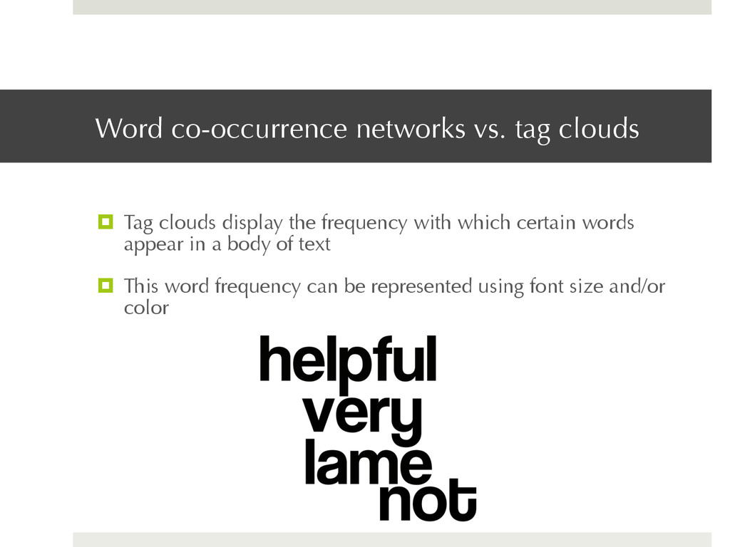
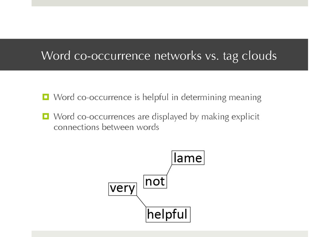
real challenge ¤ A lot of qualitative data comes in the form of free-text responses to post- instruction surveys and evaluations ¤ OBJECTIVE Create a word co-occurrence network to identify any emerging themes from the responses to open-ended questions on the evaluations of an individual instructor ¤ DATA The data come from the 138 student responses to the evaluation of one instructor. This particular network visualizes responses to the question, “What was the most valuable thing you learned today?”
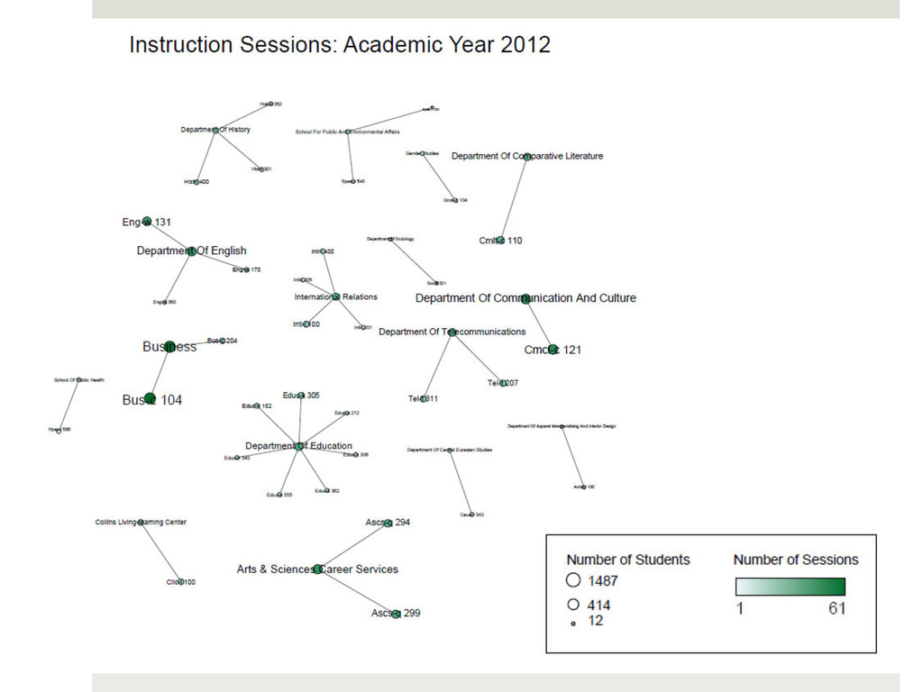
instruction sessions taught to courses (and departments) over a particular period of time. The number of students reached will also be shown. ¤ DATA Today, we’re using real data from the Indiana University Teaching & Learning Department (Thank you Carrie Donovan!)
instruction data 2. Load it into the Science of Science (Sci2) Tool 3. Create a network that connects the departments with the instruction session taught 4. Load the network into Gephi 5. Clean it up 6. Voila! Your visualization is complete
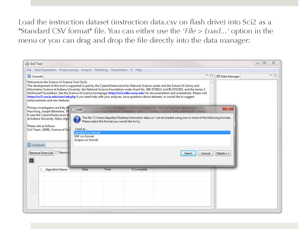
Sci2 as a "Standard CSV format" file. You can either use the 'File > Load...' option in the menu or you can drag and drop the file directly into the data manager:
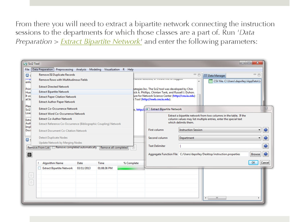
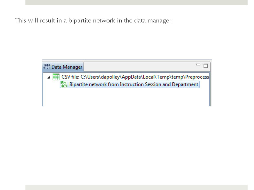
connecting the instruction sessions to the departments for which those classes are a part of. Run 'Data Preparation > Extract Bipartite Network' and enter the following parameters:
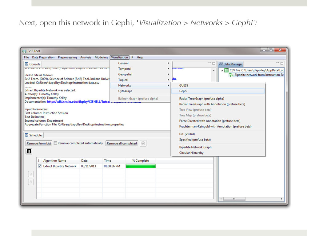
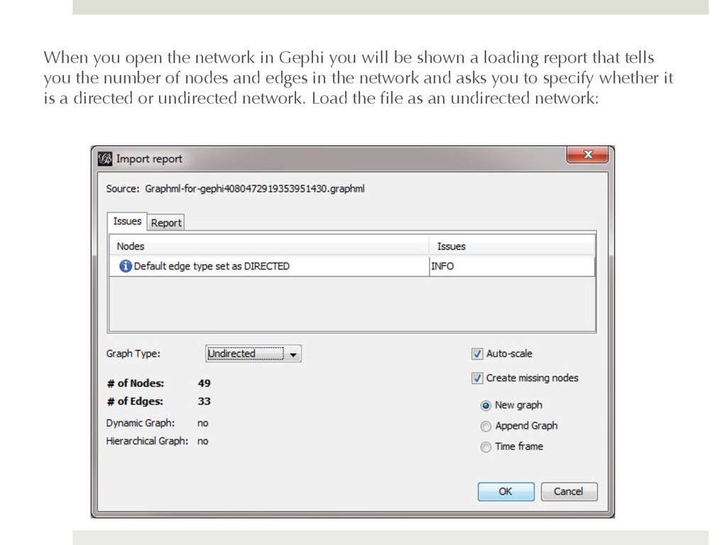
shown a loading report that tells you the number of nodes and edges in the network and asks you to specify whether it is a directed or undirected network. Load the file as an undirected network:
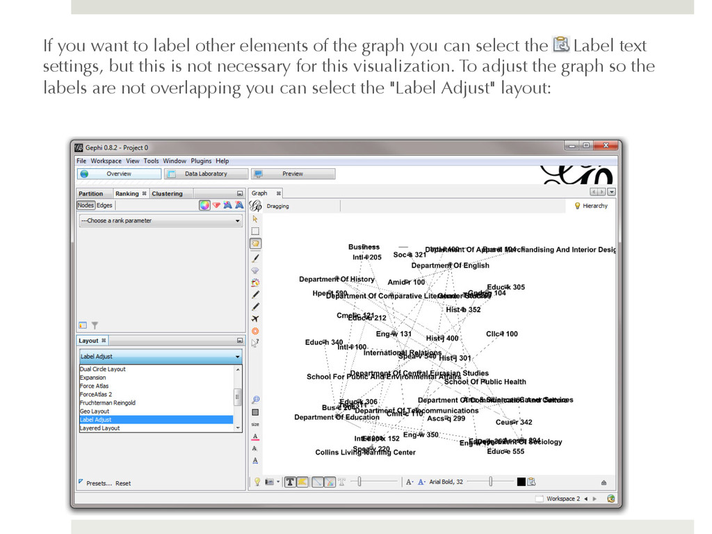
you can select the Label text settings, but this is not necessary for this visualization. To adjust the graph so the labels are not overlapping you can select the "Label Adjust" layout:
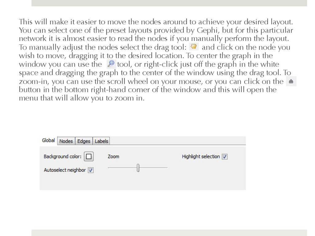
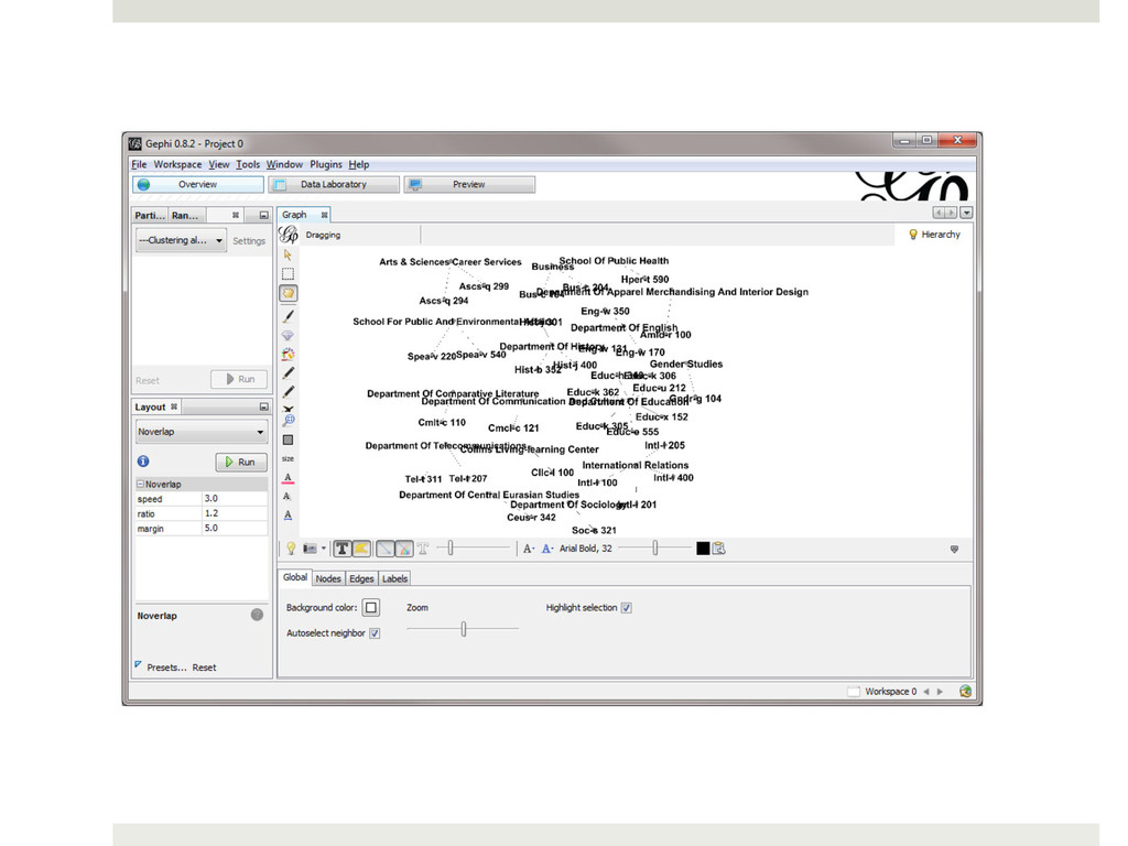
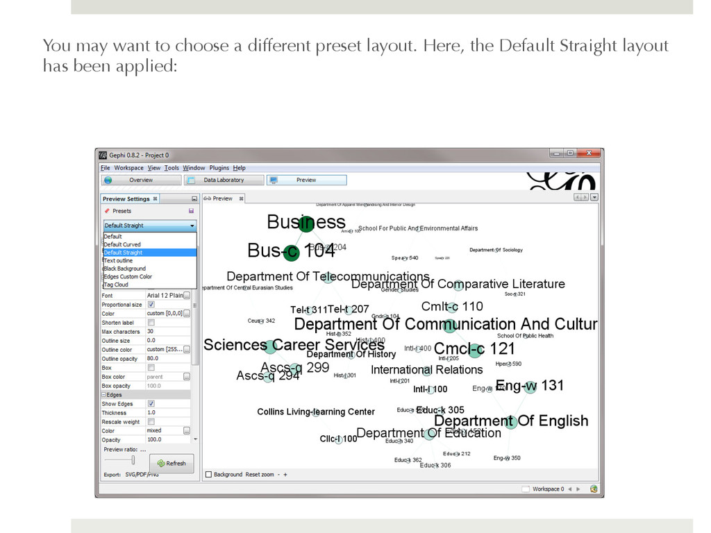
to achieve your desired layout. You can select one of the preset layouts provided by Gephi, but for this particular network it is almost easier to read the nodes if you manually perform the layout. To manually adjust the nodes select the drag tool: and click on the node you wish to move, dragging it to the desired location. To center the graph in the window you can use the tool, or right-click just off the graph in the white space and dragging the graph to the center of the window using the drag tool. To zoom-in, you can use the scroll wheel on your mouse, or you can click on the button in the bottom right-hand corner of the window and this will open the menu that will allow you to zoom in.
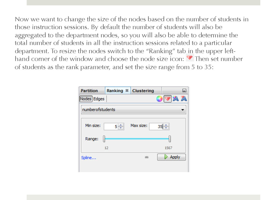
based on the number of students in those instruction sessions. By default the number of students will also be aggregated to the department nodes, so you will also be able to determine the total number of students in all the instruction sessions related to a particular department. To resize the nodes switch to the “Ranking” tab in the upper left- hand corner of the window and choose the node size icon: Then set number of students as the rank parameter, and set the size range from 5 to 35:
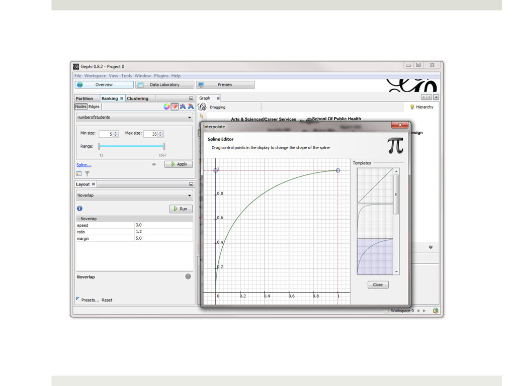
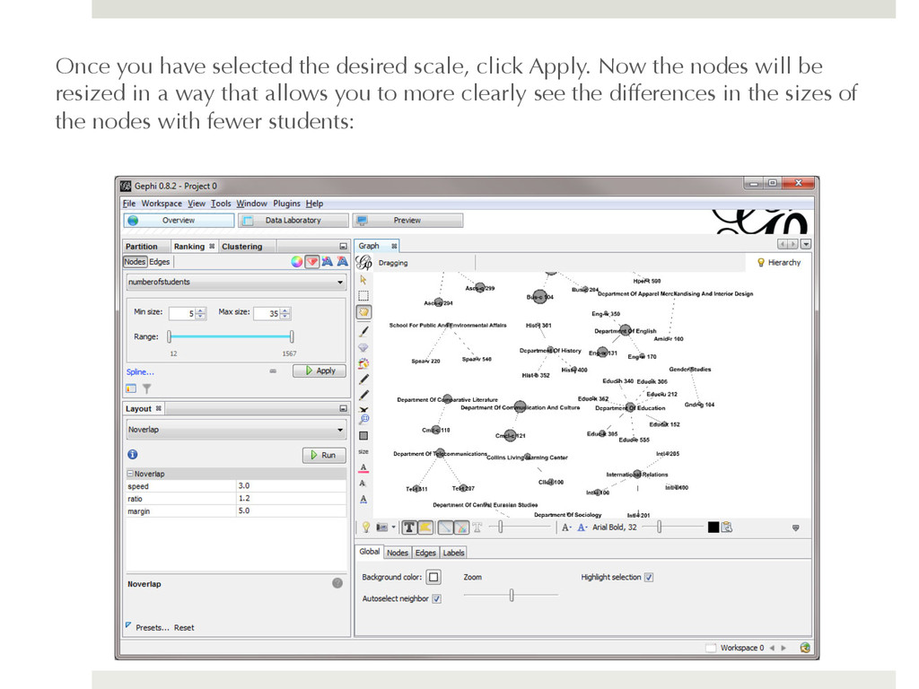
to 35 based on the number of students in the instruction sessions. By default Gephi will apply a linear scaling to the size of these nodes. This is fine if you data are normally distributed, but if your data are skewed to one end or the other, you might want to consider a different scale. For example, these data are skewed to the upper-end of the range. The largest node in terms of the number of students is BUS-104 with 1487 students and the next closest node is CMCL-121 with 636 students. The majority of the nodes have fewer than 50 students. This means that it will be more difficult to see the differences between the sizes of the nodes at the lower end of the range. We can apply a logarithmic scale to the sizes of our nodes that allows us to see the differences in the sizes of nodes with fewer students more clearly. To do so, click on the link the "Spline..." link below the size range and this will bring up the Interpolate window. You can see that the default scale is linear, but if you choose a logarithmic scale, such as the third option, you will be able to see the differences in nodes with fewer students more clearly:
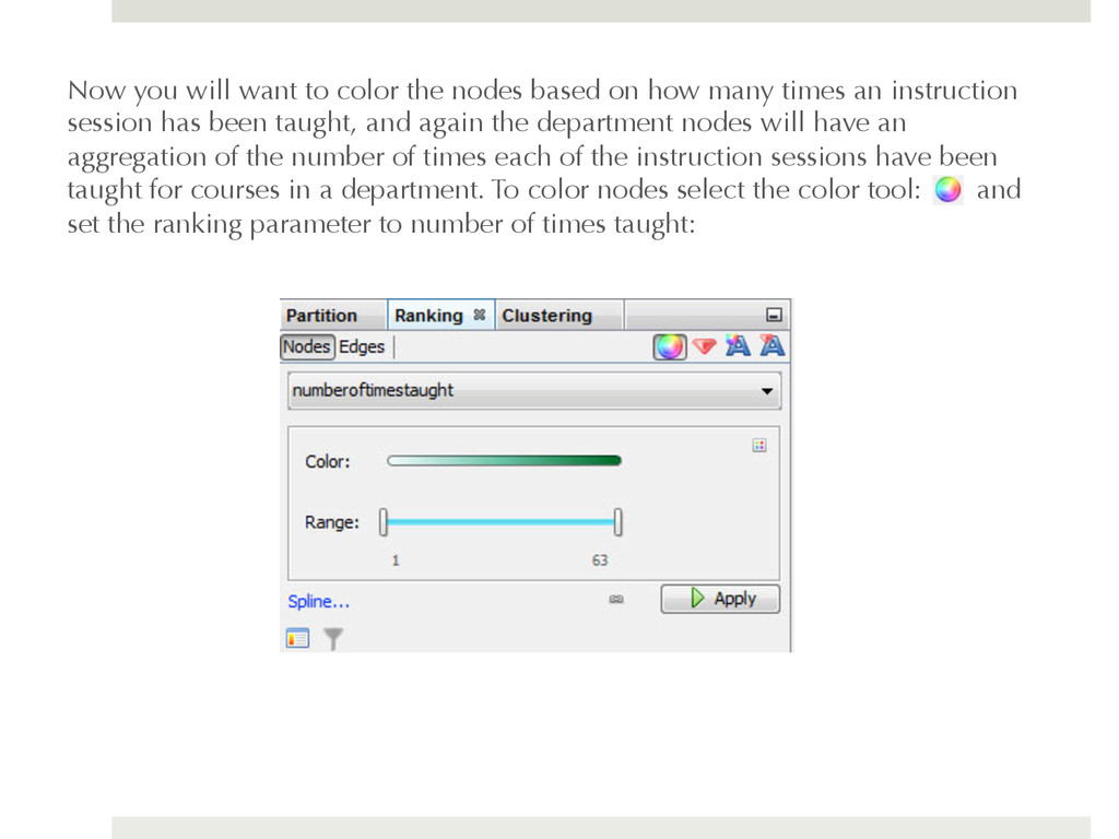
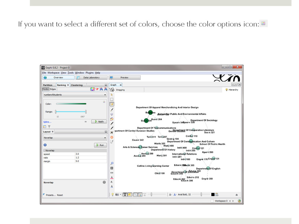
how many times an instruction session has been taught, and again the department nodes will have an aggregation of the number of times each of the instruction sessions have been taught for courses in a department. To color nodes select the color tool: and set the ranking parameter to number of times taught:
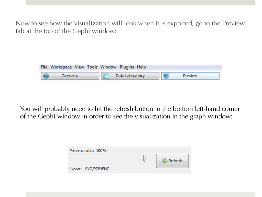
is exported, go to the Preview tab at the top of the Gephi window: You will probably need to hit the refresh button in the bottom left-hand corner of the Gephi window in order to see the visualization in the graph window:
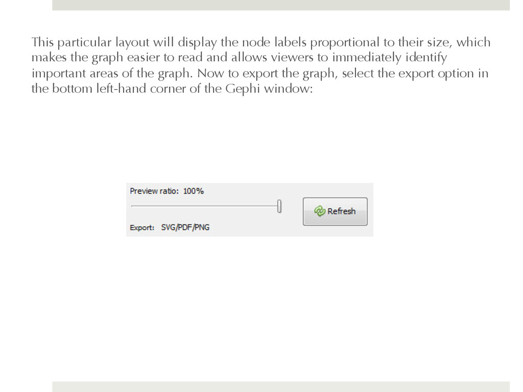
their size, which makes the graph easier to read and allows viewers to immediately identify important areas of the graph. Now to export the graph, select the export option in the bottom left-hand corner of the Gephi window:
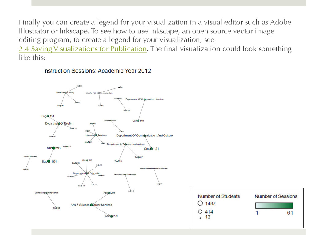
a visual editor such as Adobe Illustrator or Inkscape. To see how to use Inkscape, an open source vector image editing program, to create a legend for your visualization, see 2.4 Saving Visualizations for Publication. The final visualization could look something like this: