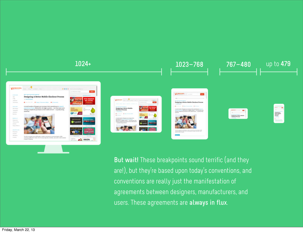
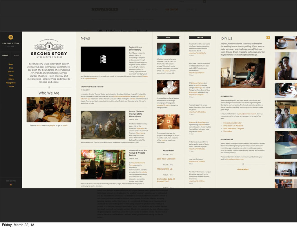
sound terrific (and they are!), but they’re based upon today’s conventions, and conventions are really just the manifestation of agreements between designers, manufacturers, and users. These agreements are always in flux. Friday, March 22, 13
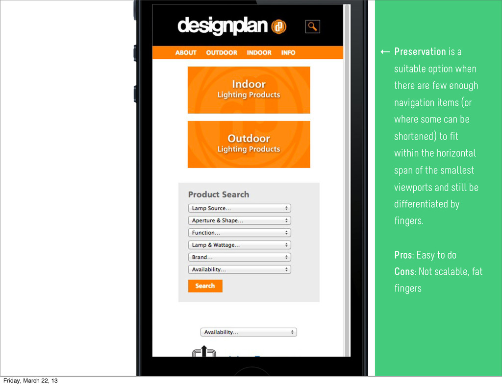
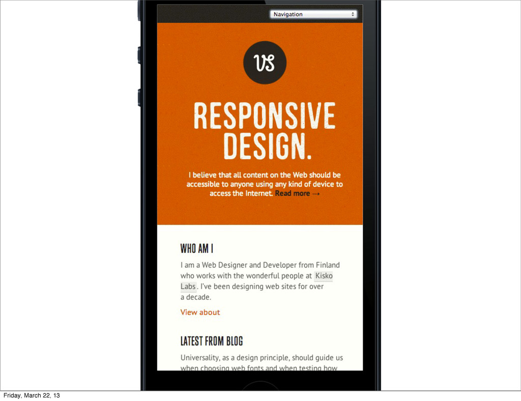
navigation items (or where some can be shortened) to fit within the horizontal span of the smallest viewports and still be differentiated by fingers. Pros: Easy to do Cons: Not scalable, fat fingers ← Friday, March 22, 13
navigation items (or where some can be shortened) to fit within the horizontal span of the smallest viewports and still be differentiated by fingers. Pros: Easy to do Cons: Not scalable, fat fingers ← Friday, March 22, 13
navigation items (or where some can be shortened) to fit within the horizontal span of the smallest viewports and still be differentiated by fingers. Pros: Easy to do Cons: Not scalable, fat fingers ← Friday, March 22, 13
navigation items (or where some can be shortened) to fit within the horizontal span of the smallest viewports and still be differentiated by fingers. Pros: Easy to do Cons: Not scalable, fat fingers ← Friday, March 22, 13
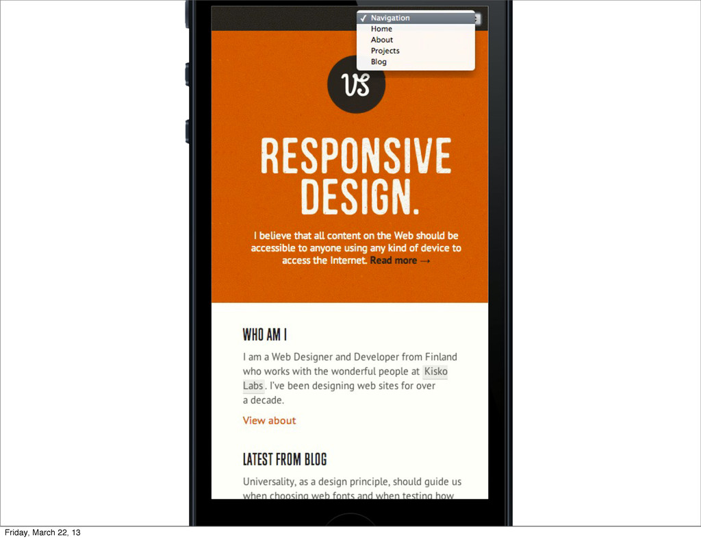
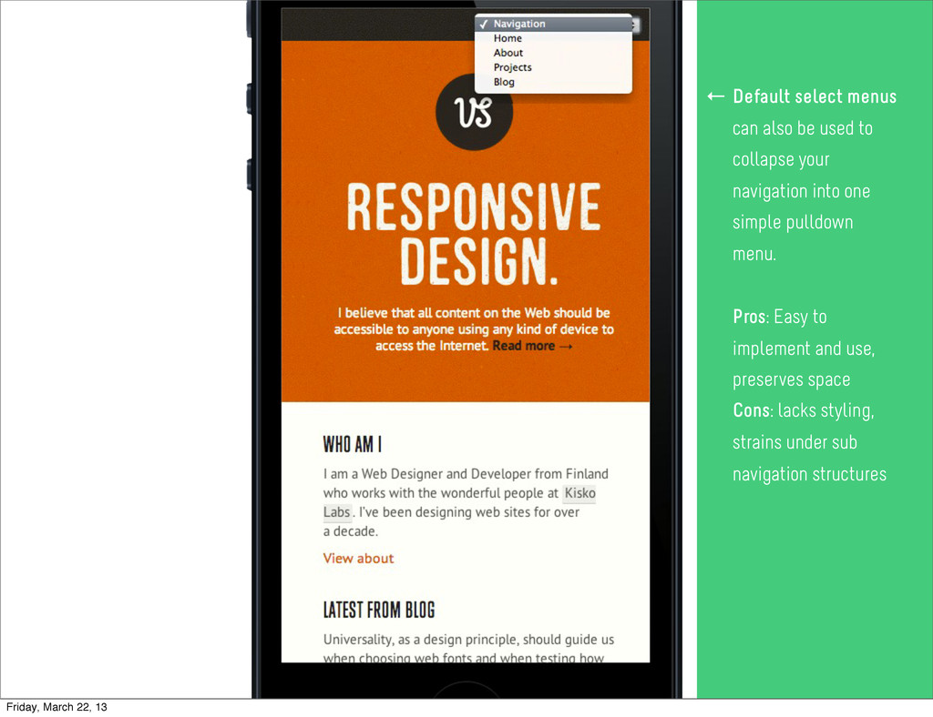
navigation items (or where some can be shortened) to fit within the horizontal span of the smallest viewports and still be differentiated by fingers. Pros: Easy to do Cons: Not scalable, fat fingers ← Default select menus can also be used to collapse your navigation into one simple pulldown menu. Pros: Easy to implement and use, preserves space Cons: lacks styling, strains under sub navigation structures ← Friday, March 22, 13
navigation items (or where some can be shortened) to fit within the horizontal span of the smallest viewports and still be differentiated by fingers. Pros: Easy to do Cons: Not scalable, fat fingers ← Default select menus can also be used to collapse your navigation into one simple pulldown menu. Pros: Easy to implement and use, preserves space Cons: lacks styling, strains under sub navigation structures ← Friday, March 22, 13
navigation items (or where some can be shortened) to fit within the horizontal span of the smallest viewports and still be differentiated by fingers. Pros: Easy to do Cons: Not scalable, fat fingers ← Default select menus can also be used to collapse your navigation into one simple pulldown menu. Pros: Easy to implement and use, preserves space Cons: lacks styling, strains under sub navigation structures ← Friday, March 22, 13
navigation items (or where some can be shortened) to fit within the horizontal span of the smallest viewports and still be differentiated by fingers. Pros: Easy to do Cons: Not scalable, fat fingers ← Default select menus can also be used to collapse your navigation into one simple pulldown menu. Pros: Easy to implement and use, preserves space Cons: lacks styling, strains under sub navigation structures ← Friday, March 22, 13
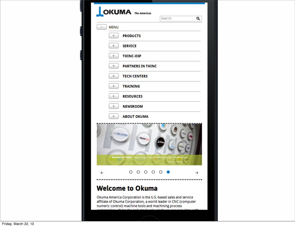
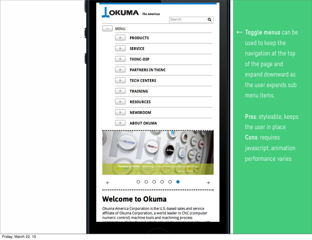
navigation items (or where some can be shortened) to fit within the horizontal span of the smallest viewports and still be differentiated by fingers. Pros: Easy to do Cons: Not scalable, fat fingers ← Default select menus can also be used to collapse your navigation into one simple pulldown menu. Pros: Easy to implement and use, preserves space Cons: lacks styling, strains under sub navigation structures ← Toggle menus can be used to keep the navigation at the top of the page and expand downward as the user expands sub menu items. Pros: styleable, keeps the user in place Cons: requires javascript, animation performance varies ← Friday, March 22, 13
navigation items (or where some can be shortened) to fit within the horizontal span of the smallest viewports and still be differentiated by fingers. Pros: Easy to do Cons: Not scalable, fat fingers ← Default select menus can also be used to collapse your navigation into one simple pulldown menu. Pros: Easy to implement and use, preserves space Cons: lacks styling, strains under sub navigation structures ← Toggle menus can be used to keep the navigation at the top of the page and expand downward as the user expands sub menu items. Pros: styleable, keeps the user in place Cons: requires javascript, animation performance varies ← Friday, March 22, 13
navigation items (or where some can be shortened) to fit within the horizontal span of the smallest viewports and still be differentiated by fingers. Pros: Easy to do Cons: Not scalable, fat fingers ← Default select menus can also be used to collapse your navigation into one simple pulldown menu. Pros: Easy to implement and use, preserves space Cons: lacks styling, strains under sub navigation structures ← Toggle menus can be used to keep the navigation at the top of the page and expand downward as the user expands sub menu items. Pros: styleable, keeps the user in place Cons: requires javascript, animation performance varies ← Friday, March 22, 13
navigation items (or where some can be shortened) to fit within the horizontal span of the smallest viewports and still be differentiated by fingers. Pros: Easy to do Cons: Not scalable, fat fingers ← Default select menus can also be used to collapse your navigation into one simple pulldown menu. Pros: Easy to implement and use, preserves space Cons: lacks styling, strains under sub navigation structures ← Toggle menus can be used to keep the navigation at the top of the page and expand downward as the user expands sub menu items. Pros: styleable, keeps the user in place Cons: requires javascript, animation performance varies ← Friday, March 22, 13
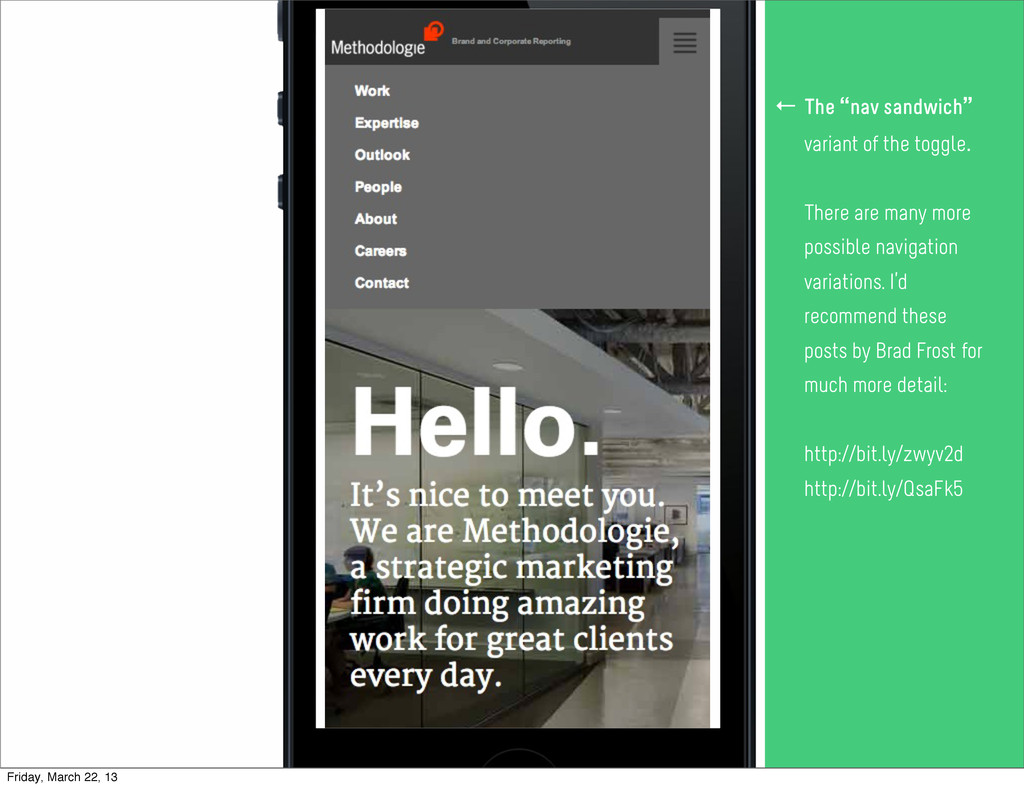
navigation items (or where some can be shortened) to fit within the horizontal span of the smallest viewports and still be differentiated by fingers. Pros: Easy to do Cons: Not scalable, fat fingers ← Default select menus can also be used to collapse your navigation into one simple pulldown menu. Pros: Easy to implement and use, preserves space Cons: lacks styling, strains under sub navigation structures ← Toggle menus can be used to keep the navigation at the top of the page and expand downward as the user expands sub menu items. Pros: styleable, keeps the user in place Cons: requires javascript, animation performance varies ← The “nav sandwich” variant of the toggle. There are many more possible navigation variations. I’d recommend these posts by Brad Frost for much more detail: http://bit.ly/zwyv2d http://bit.ly/QsaFk5 ← Friday, March 22, 13
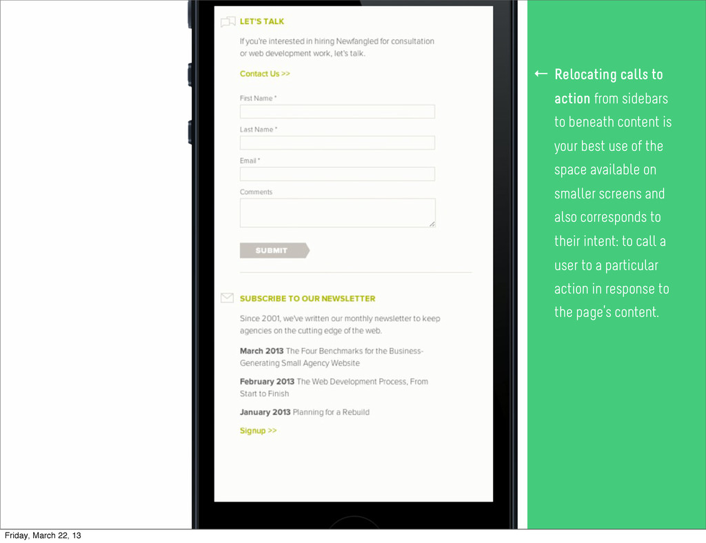
your best use of the space available on smaller screens and also corresponds to their intent: to call a user to a particular action in response to the page’s content. ← Friday, March 22, 13
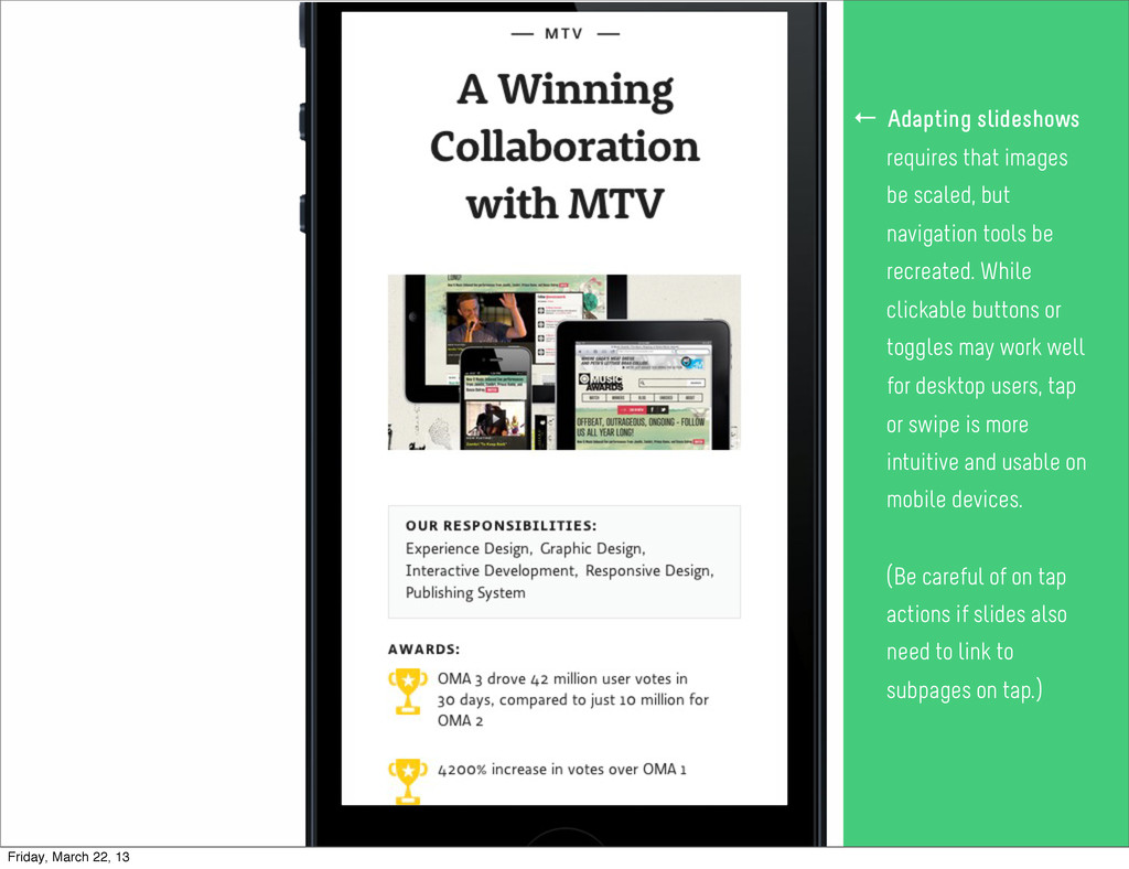
tools be recreated. While clickable buttons or toggles may work well for desktop users, tap or swipe is more intuitive and usable on mobile devices. (Be careful of on tap actions if slides also need to link to subpages on tap.) ← Friday, March 22, 13
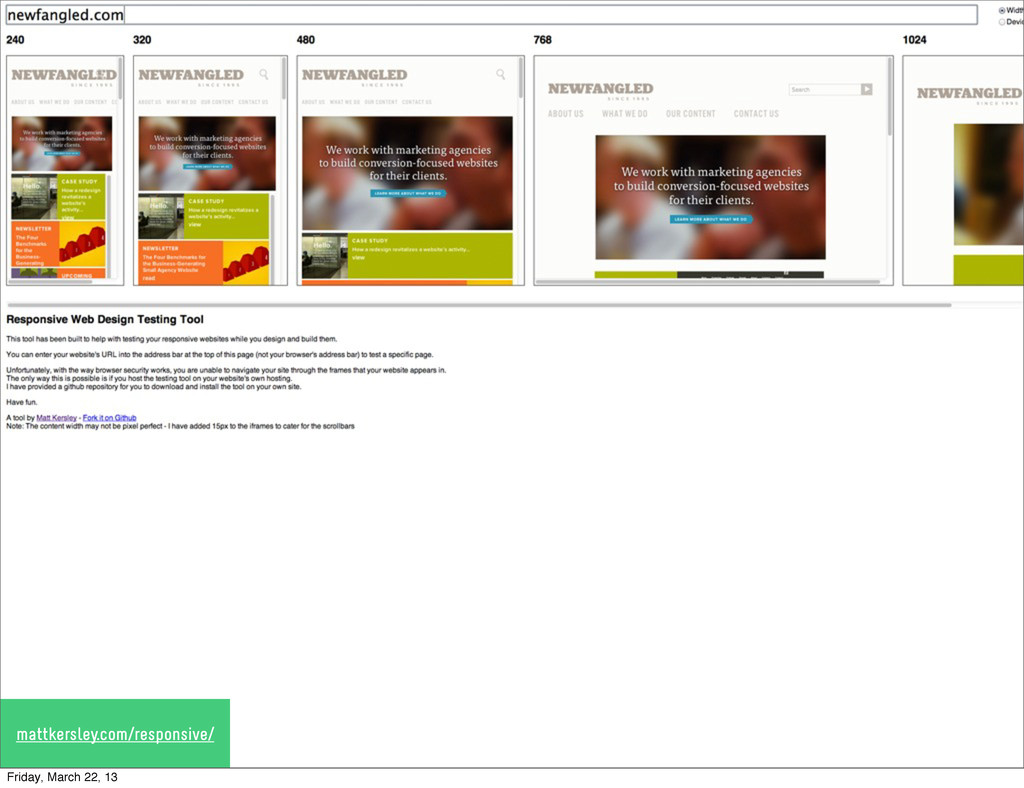
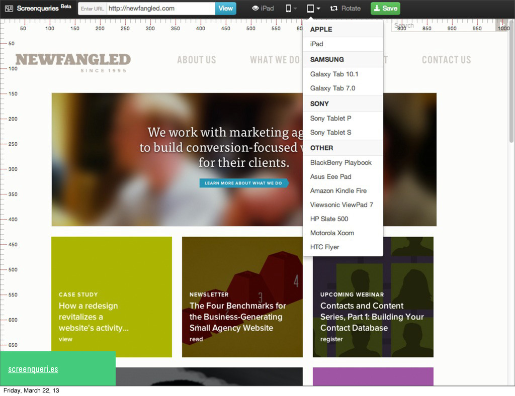
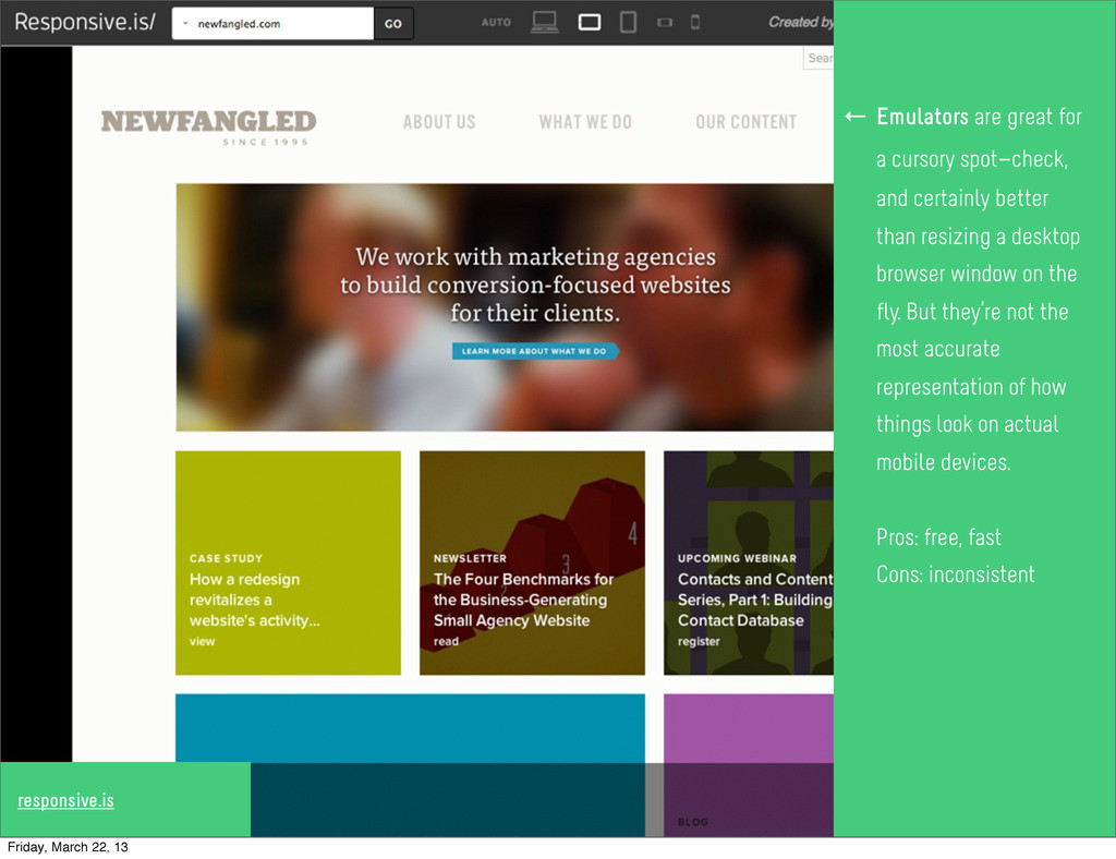
cursory spot-check, and certainly better than resizing a desktop browser window on the fly. But they’re not the most accurate representation of how things look on actual mobile devices. Pros: free, fast Cons: inconsistent ← Friday, March 22, 13
cursory spot-check, and certainly better than resizing a desktop browser window on the fly. But they’re not the most accurate representation of how things look on actual mobile devices. Pros: free, fast Cons: inconsistent ← Friday, March 22, 13
cursory spot-check, and certainly better than resizing a desktop browser window on the fly. But they’re not the most accurate representation of how things look on actual mobile devices. Pros: free, fast Cons: inconsistent ← Friday, March 22, 13
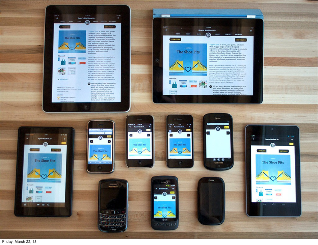
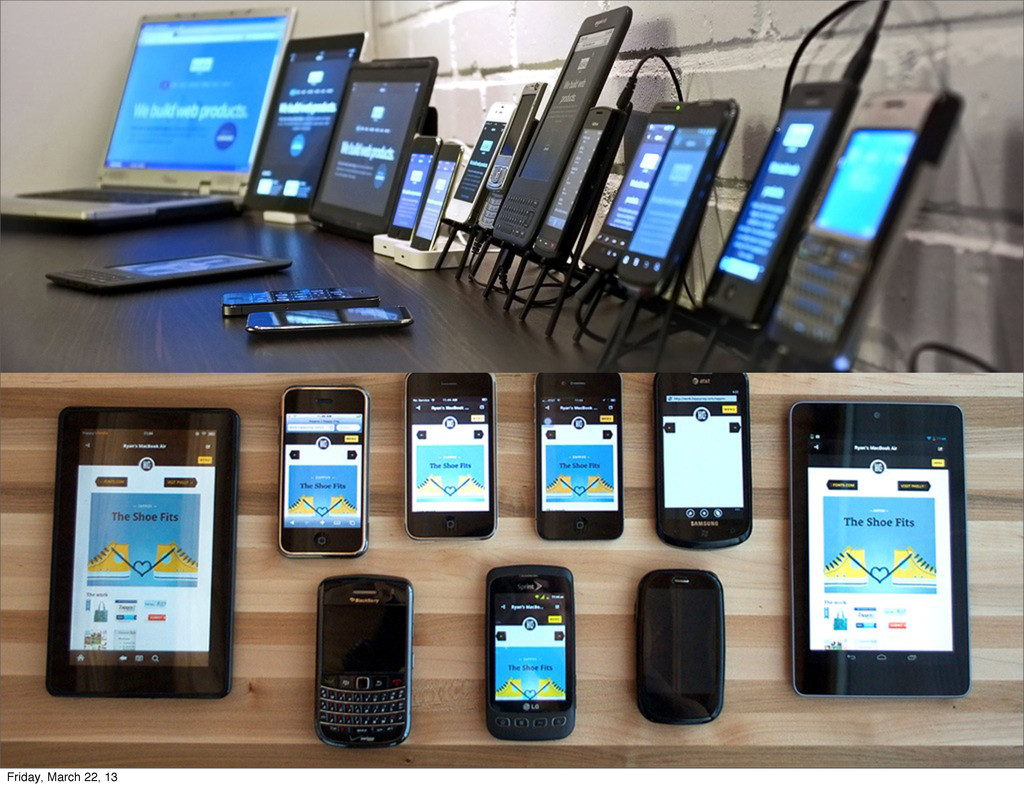
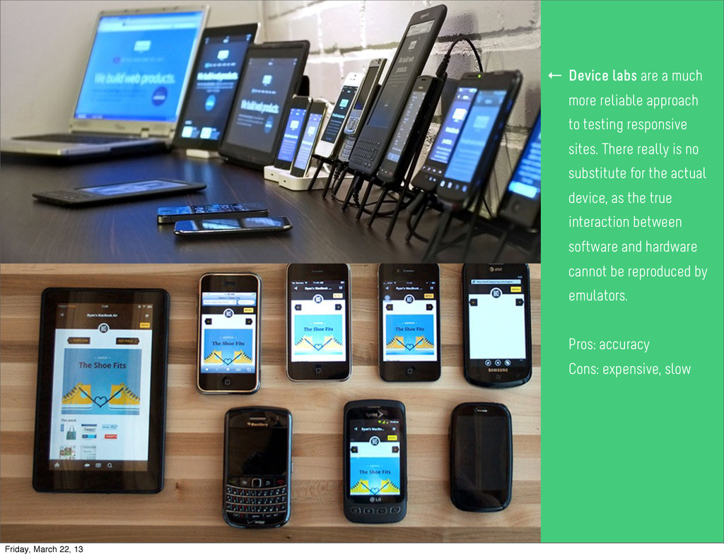
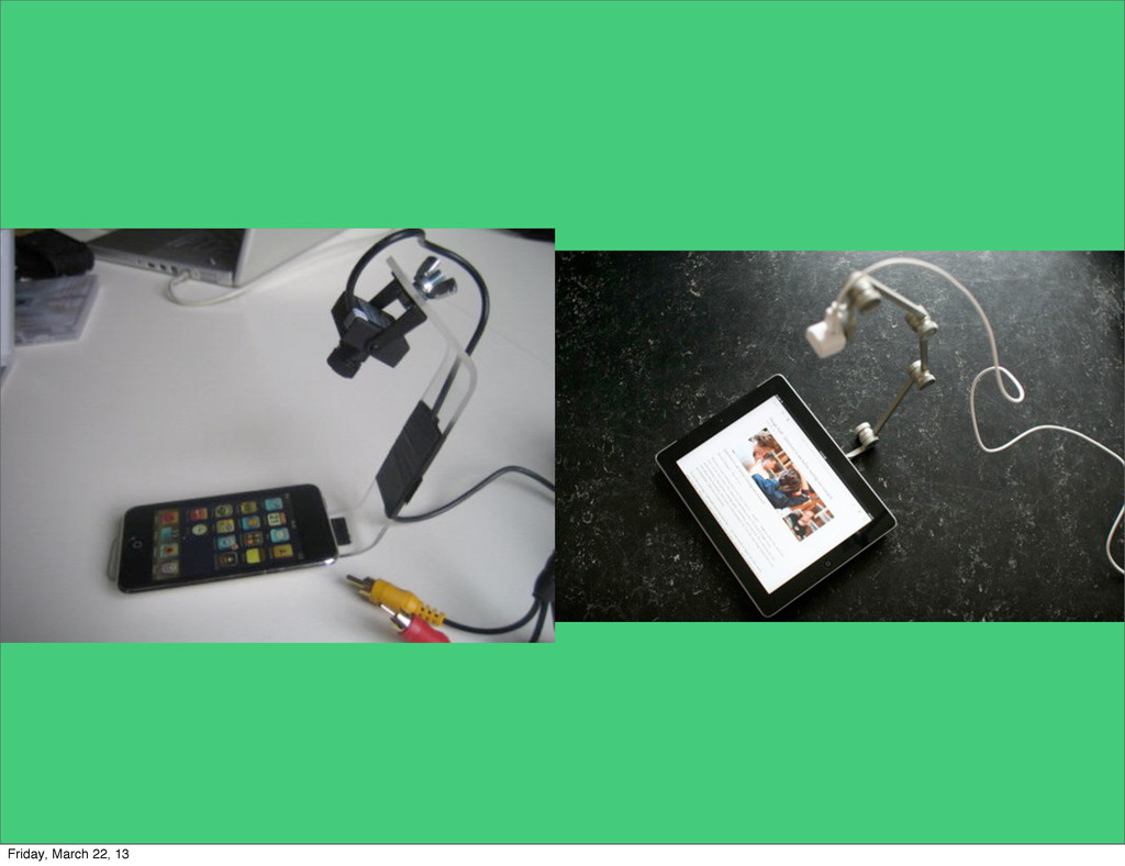
cursory spot-check, and certainly better than resizing a desktop browser window on the fly. But they’re not the most accurate representation of how things look on actual mobile devices. Pros: free, fast Cons: inconsistent ← Device labs are a much more reliable approach to testing responsive sites. There really is no substitute for the actual device, as the true interaction between software and hardware cannot be reproduced by emulators. Pros: accuracy Cons: expensive, slow ← Friday, March 22, 13
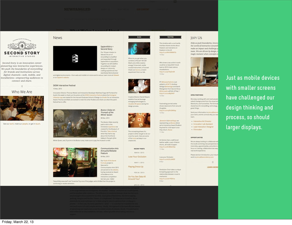
mobile devices with smaller screens have challenged our design thinking and process, so should larger displays. Thank You! Get in touch: [email protected] @chrbutler Friday, March 22, 13
 chrbutler
 hikarutakase
 shoko_seven11
 yuri_ohashi
 csswizardry
 a2k
a2k
 kakukoki
 tajima_kaho
 marzstarz
 yamasaku
 mhand01
 bebe
bebe
 kenichiota0711
 nwiizo
 baasie
 greggifford
 hatefulcrawdad
 addyosmani
 hannesfritz
 lfama
lfama
 productmarketing
 carmenintech
 iamctodd
 kimpetersen
 marktimemedia