Upgrade to Pro — share decks privately, control downloads, hide ads and more …

The Curious Case of Android Button - Yelp Engineering

The Curious Case of Android Button - Yelp Engineering

Slides for the talk "The Curious Case of Android Button" by Nicola Corti, Android Engineer @ Yelp (Hamburg).

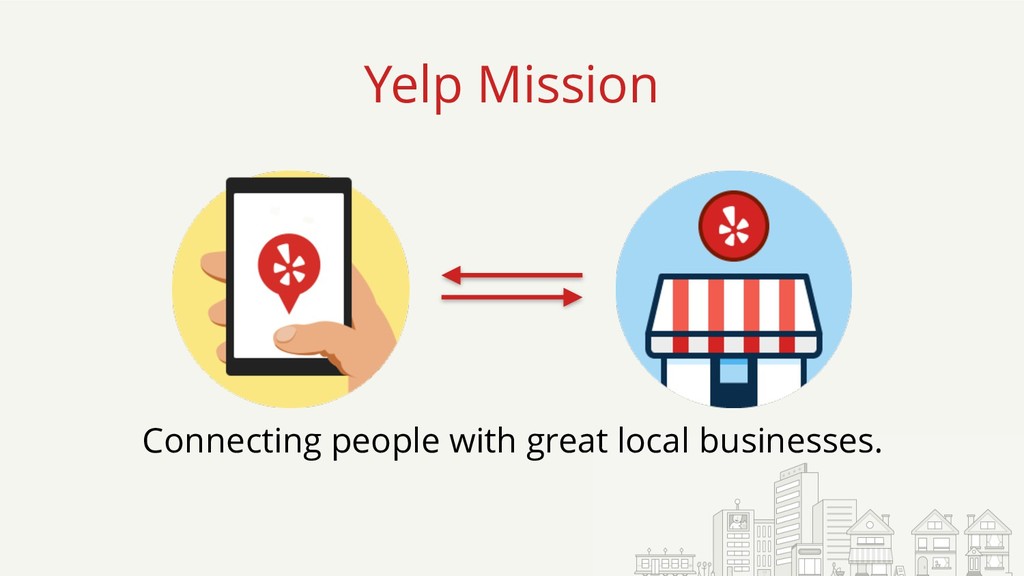
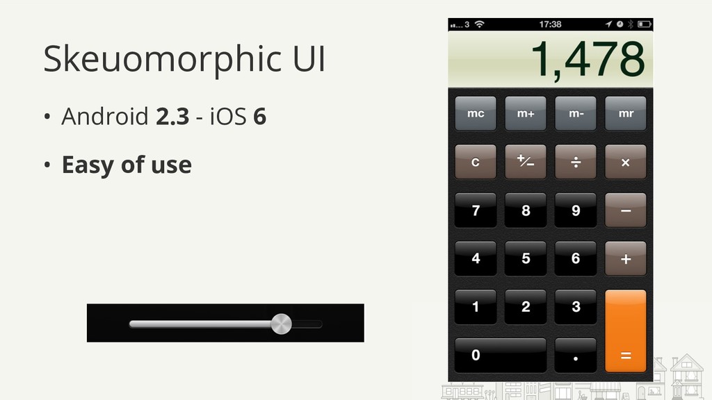
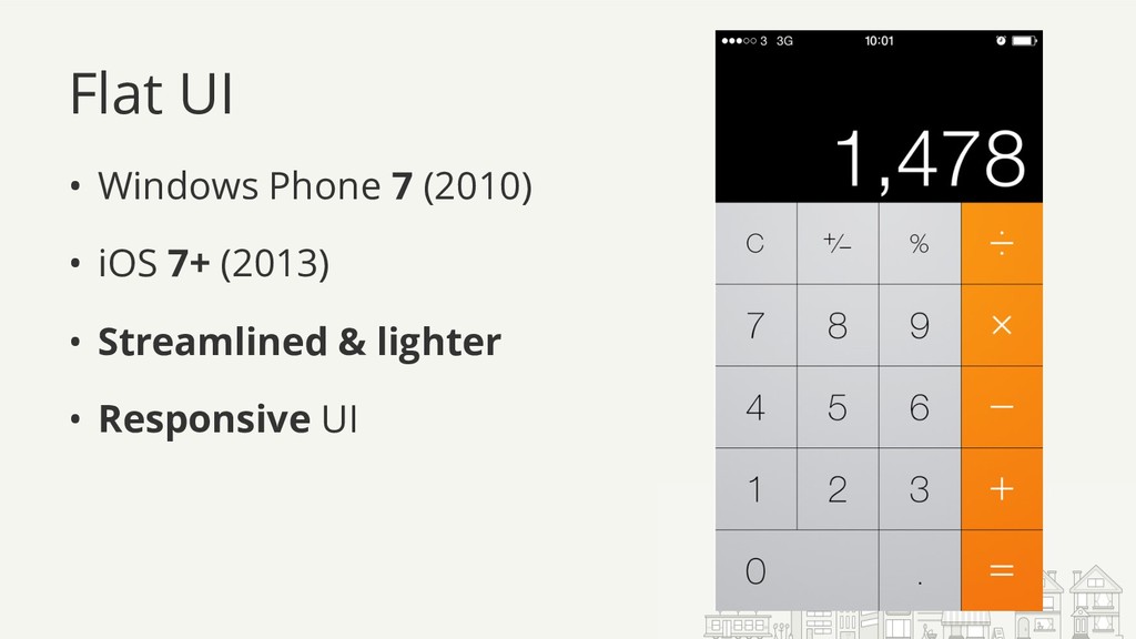
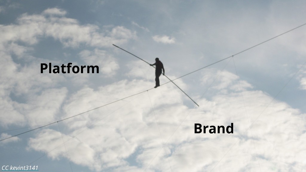
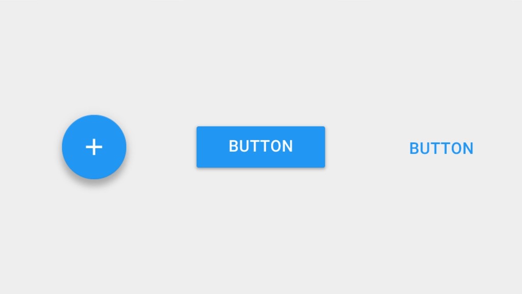
We interact with buttons every day to get coffee, order pizza, or start a new Gradle build. They may look simple and straightforward, but they have a fundamental role in our environment: create a sense of power.

We all love to feel empowered and we all hate being frustrated by bad design. Your users know this as well, they want to feel immediately rewarded when they interact with your UI, and they will quickly drop your app if they get annoyed.

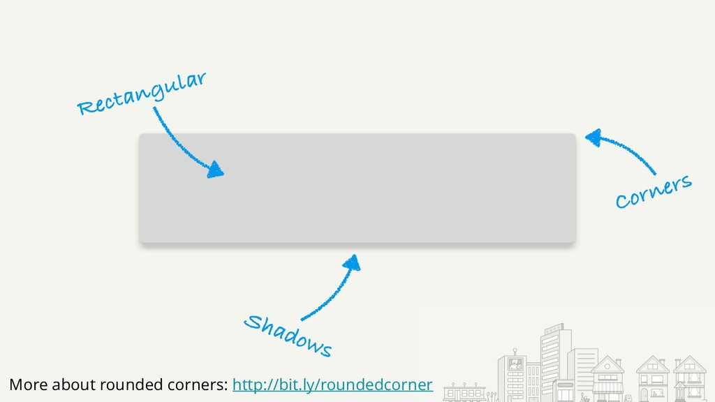
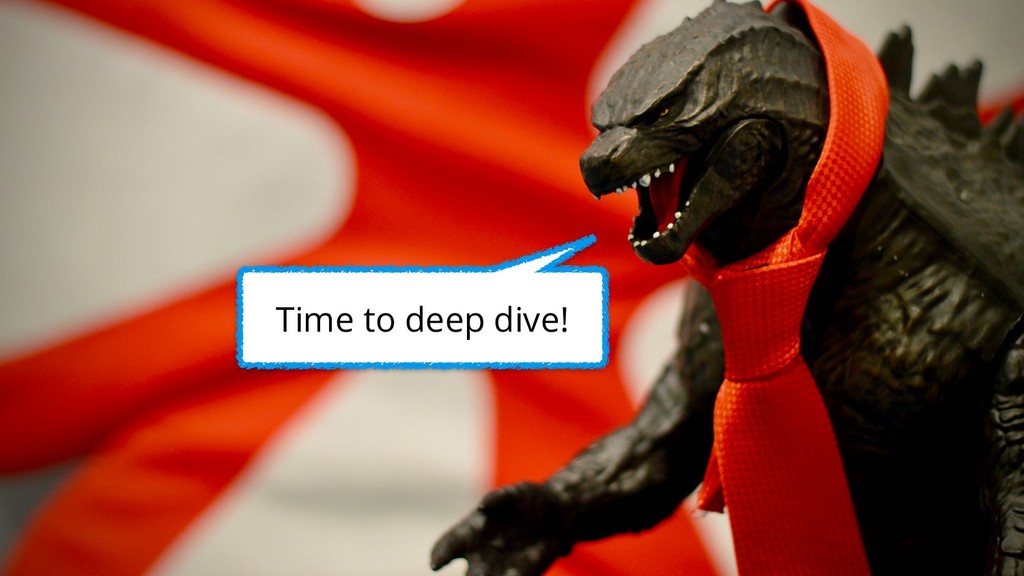
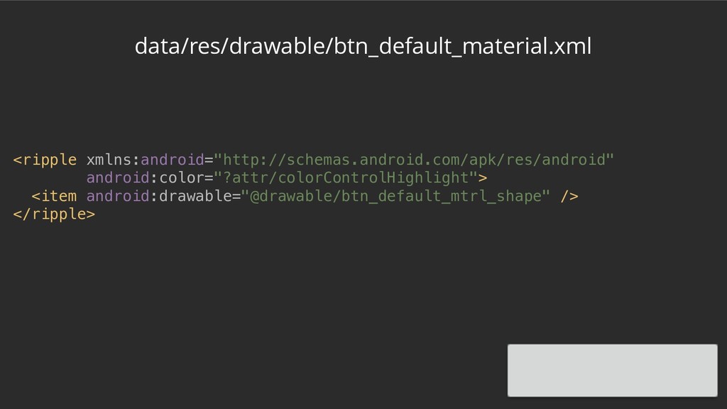
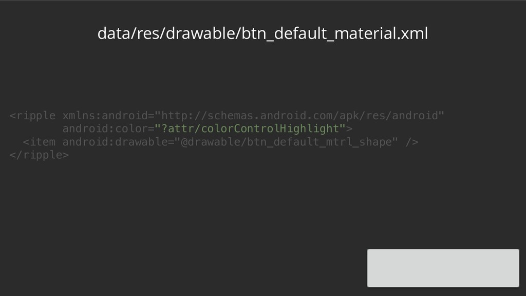
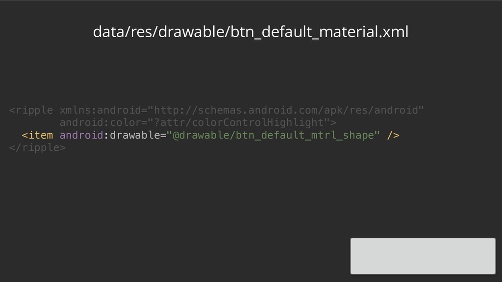
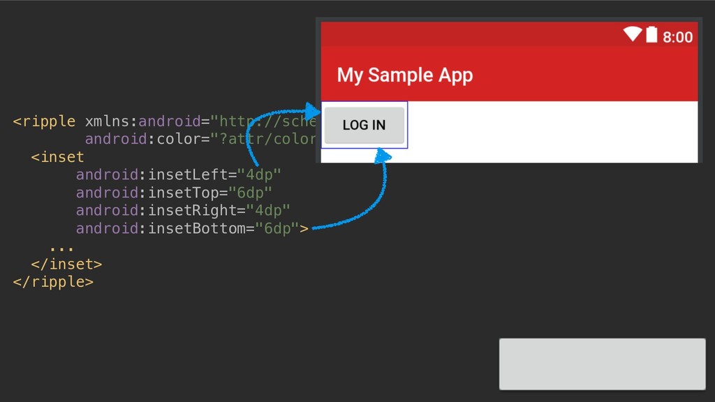
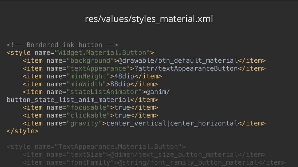
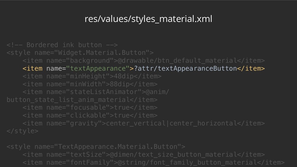
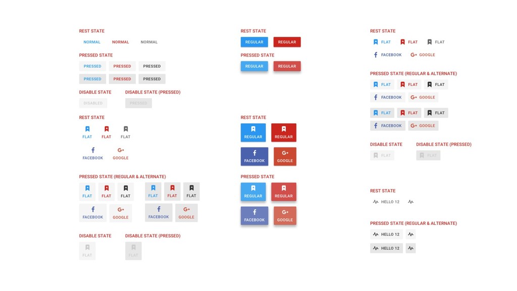
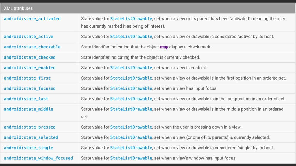
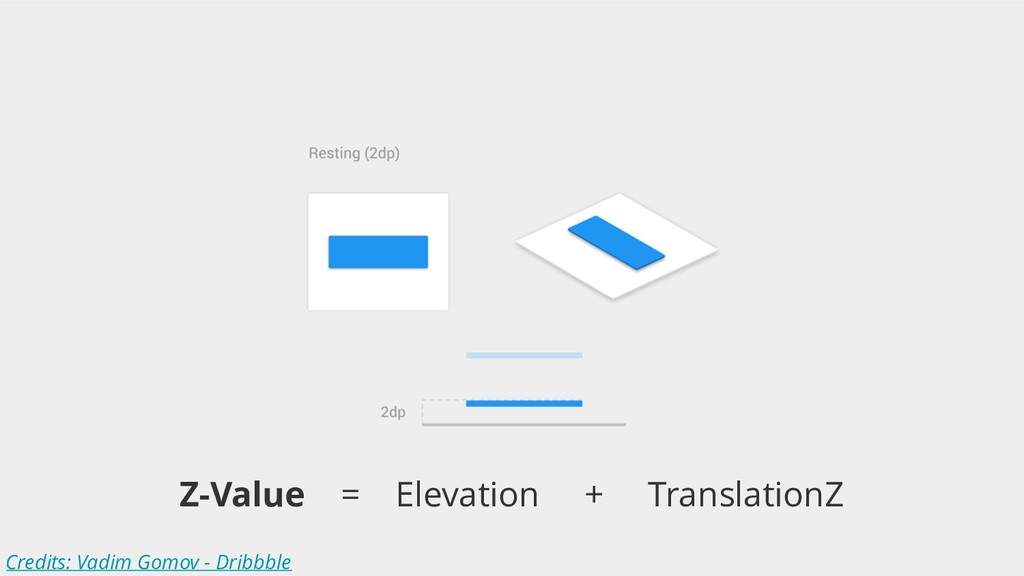
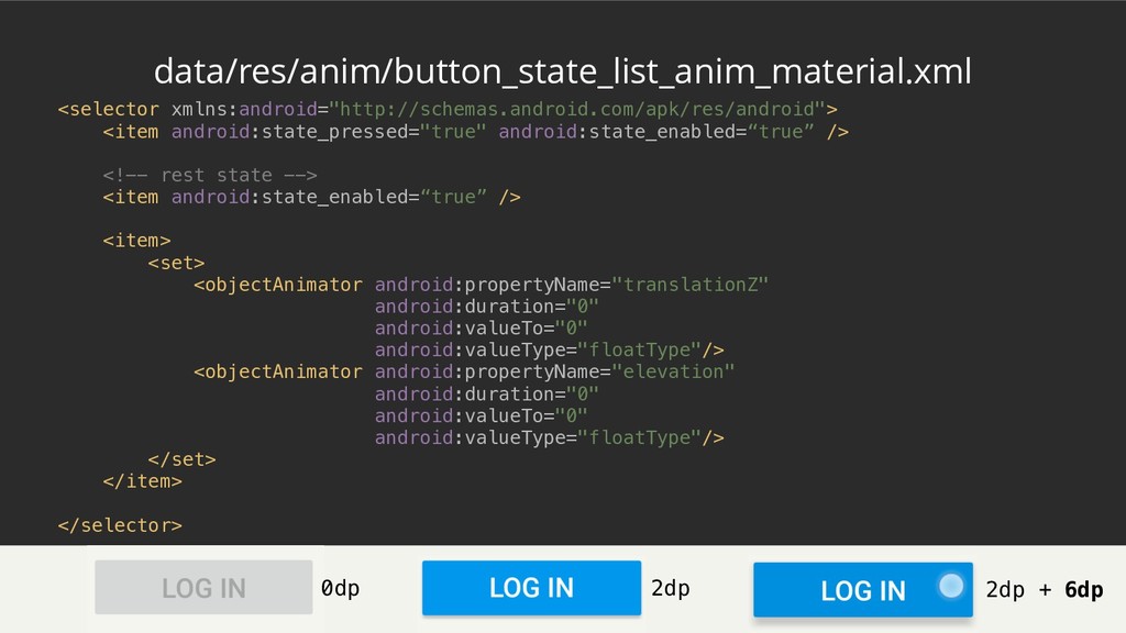
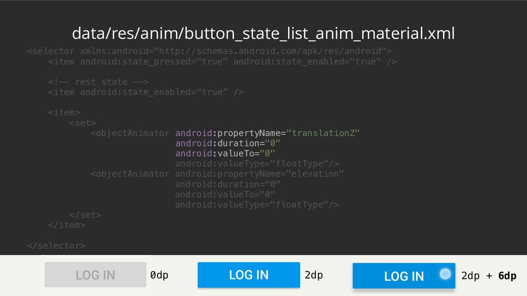
At Yelp, we get tens of millions button clicks a day. At that kind of scale, every pixel matters. We tune every single aspect of our buttons to make them simple and powerful, but adjusting every single shadow cast, click animation, or color layer can be tricky. In this talk, we will provide a deep dive into the Android framework and the Support Library to understand how buttons are rendered.

Nicola Corti

April 24, 2018
Tweet

More Decks by Nicola Corti

Other Decks in Technology

Transcript

  1. Flat UI • Windows Phone 7 (2010) • iOS 7+

    (2013) • Streamlined & lighter • Responsive UI
  2. What’s actually an Android Button? java.lang.Object ↳ android.view.View ↳ android.widget.TextView

    ↳ android.widget.Button ↳ android.support.v7.widget.AppCompatButton
  3. What’s actually an Android Button? java.lang.Object ↳ android.view.View ↳ android.widget.TextView

    ↳ android.widget.Button ↳ android.support.v7.widget.AppCompatButton
  4. What’s actually an Android Button? java.lang.Object ↳ android.view.View ↳ android.widget.TextView

    ↳ android.widget.Button ↳ android.support.v7.widget.AppCompatButton
  5. What’s actually an Android Button? java.lang.Object ↳ android.view.View ↳ android.widget.TextView

    ↳ android.widget.Button ↳ android.support.v7.widget.AppCompatButton
  6. What’s actually an Android Button? java.lang.Object ↳ android.view.View ↳ android.widget.TextView

    ↳ android.widget.Button ↳ android.support.v7.widget.AppCompatButton
  7. What’s actually an Android Button? java.lang.Object (554) ↳ android.view.View (26488)

    ↳ android.widget.TextView (11969) ↳ android.widget.Button (182) ↳ android.support.v7.widget.AppCompatButton (187)
  8. Just a Button /** * * <p>This will automatically be

    used when you use {@link Button} in your layouts */ public class AppCompatButton extends Button implements TintableBackgroundView, AutoSizeableTextView {
  9. Just a Button /** * * <p>This will automatically be

    used when you use {@link Button} in your layouts */ public class AppCompatButton extends Button implements TintableBackgroundView, AutoSizeableTextView {
  10. Just a Button /** * … * * <p>This will

    automatically be used when you use {@link Button} in your layouts * … */ public class AppCompatButton extends Button implements TintableBackgroundView, AutoSizeableTextView {
  11. 4 defaults styles for a Button <style name=“Widget.AppCompat.Button"/> <style name="Widget.AppCompat.Button.Colored"/>

    <style name="Widget.AppCompat.Button.Borderless"/> <style name="Widget.AppCompat.Button.Borderless.Colored"/>
  12. 4 defaults styles for a Button <style name=“Widget.AppCompat.Button"/> <style name="Widget.AppCompat.Button.Colored"/>

    <style name="Widget.AppCompat.Button.Borderless"/> <style name="Widget.AppCompat.Button.Borderless.Colored"/> API 21+
  13. 4 defaults styles for a Button <style name=“Widget.AppCompat.Button” parent="Base.Widget.AppCompat.Button"/> <style

    name="Widget.AppCompat.Button.Borderless"/> <style name="Widget.AppCompat.Button.Borderless.Colored"/> <style name="Widget.AppCompat.Button.Colored"/> <style name="Base.Widget.AppCompat.Button" parent="android:Widget.Material.Button"/> API 21+
  14. data/res/values/styles_material.xml <!-- Bordered ink button --> <style name="Widget.Material.Button"> <item name="background">@drawable/btn_default_material</item>

    <item name="textAppearance">?attr/textAppearanceButton</item> <item name="minHeight">48dip</item> <item name="minWidth">88dip</item> <item name="stateListAnimator">@anim/ button_state_list_anim_material</item> <item name="focusable">true</item> <item name="clickable">true</item> <item name="gravity">center_vertical|center_horizontal</item> </style>
  15. data/res/values/styles_material.xml <!-- Bordered ink button --> <style name="Widget.Material.Button"> <item name="background">@drawable/btn_default_material</item>

    <item name="textAppearance">?attr/textAppearanceButton</item> <item name="minHeight">48dip</item> <item name="minWidth">88dip</item> <item name="stateListAnimator">@anim/ button_state_list_anim_material</item> <item name="focusable">true</item> <item name="clickable">true</item> <item name="gravity">center_vertical|center_horizontal</item> </style>
  16. data/res/values/styles_material.xml <!-- Bordered ink button --> <style name="Widget.Material.Button"> <item name="background">@drawable/btn_default_material</item>

    <item name="textAppearance">?attr/textAppearanceButton</item> <item name="minHeight">48dip</item> <item name="minWidth">88dip</item> <item name="stateListAnimator">@anim/ button_state_list_anim_material</item> <item name="focusable">true</item> <item name="clickable">true</item> <item name="gravity">center_vertical|center_horizontal</item> </style>
  17. data/res/values/styles_material.xml <!-- Bordered ink button --> <style name="Widget.Material.Button"> <item name="background">@drawable/btn_default_material</item>

    <item name="textAppearance">?attr/textAppearanceButton</item> <item name="minHeight">48dip</item> <item name="minWidth">88dip</item> <item name="stateListAnimator">@anim/ button_state_list_anim_material</item> <item name="focusable">true</item> <item name="clickable">true</item> <item name="gravity">center_vertical|center_horizontal</item> </style>
  18. <ripple xmlns:android="http://schemas.android.com/apk/res/android" android:color="?attr/colorControlHighlight"> <inset android:insetLeft="4dp" android:insetTop="6dp" android:insetRight="4dp" android:insetBottom="6dp"> <shape android:shape="rectangle"

    android:tint="?attr/colorButtonNormal"> <corners android:radius="2dp" /> <solid android:color="@color/white" /> <padding android:left="8dp" android:top="4dp" android:right="8dp" android:bottom="4dp" /> </shape> </inset> </ripple>
  19. <ripple xmlns:android="http://schemas.android.com/apk/res/android" android:color="?attr/colorControlHighlight"> <inset android:insetLeft="@dimen/button_inset_horizontal_material" android:insetTop="@dimen/button_inset_vertical_material" android:insetRight="@dimen/button_inset_horizontal_material" android:insetBottom="@dimen/button_inset_vertical_material"> <shape android:shape="rectangle"

    android:tint="?attr/colorButtonNormal"> <corners android:radius="@dimen/control_corner_material" /> <solid android:color="@color/white" /> <padding android:left="@dimen/button_padding_horizontal_material" android:top="@dimen/button_padding_vertical_material" android:right="@dimen/button_padding_horizontal_material" android:bottom=“@dimen/button_padding_vertical_material" /> </shape> </inset> </ripple>
  20. Typography • Use a verb • On Android, buttons are

    ALL CAPS • Principle of Least astonishment
  21. res/values/styles_material.xml <!-- Bordered ink button --> <style name="Widget.Material.Button"> <item name="background">@drawable/btn_default_material</item>

    <item name="textAppearance">?attr/textAppearanceButton</item> <item name="minHeight">48dip</item> <item name="minWidth">88dip</item> <item name="stateListAnimator">@anim/ button_state_list_anim_material</item> <item name="focusable">true</item> <item name="clickable">true</item> <item name="gravity">center_vertical|center_horizontal</item> </style> <style name="TextAppearance.Material.Button"> <item name="textSize">@dimen/text_size_button_material</item> <item name="fontFamily">@string/font_family_button_material</item>
  22. res/values/styles_material.xml <!-- Bordered ink button --> <style name="Widget.Material.Button"> <item name="background">@drawable/btn_default_material</item>

    <item name="textAppearance">?attr/textAppearanceButton</item> <item name="minHeight">48dip</item> <item name="minWidth">88dip</item> <item name="stateListAnimator">@anim/ button_state_list_anim_material</item> <item name="focusable">true</item> <item name="clickable">true</item> <item name="gravity">center_vertical|center_horizontal</item> </style> <style name="TextAppearance.Material.Button"> <item name="textSize">@dimen/text_size_button_material</item> <item name="fontFamily">@string/font_family_button_material</item>
  23. <style name="Widget.Material.Button"> <item name="background">@drawable/btn_default_material</item> <item name="textAppearance">?attr/textAppearanceButton</item> <item name="minHeight">48dip</item> <item name="minWidth">88dip</item>

    <item name="stateListAnimator">@anim/ button_state_list_anim_material</item> <item name="focusable">true</item> <item name="clickable">true</item> <item name="gravity">center_vertical|center_horizontal</item> </style> <style name="TextAppearance.Material.Button"> <item name="textSize">@dimen/text_size_button_material</item> <item name="fontFamily">@string/font_family_button_material</item> <item name="textAllCaps">true</item> <item name=“textColor">?attr/textColorPrimary</item> </style>
  24. <style name="Widget.Material.Button"> <item name="background">@drawable/btn_default_material</item> <item name="textAppearance">?attr/textAppearanceButton</item> <item name="minHeight">48dip</item> <item name="minWidth">88dip</item>

    <item name="stateListAnimator">@anim/ button_state_list_anim_material</item> <item name="focusable">true</item> <item name="clickable">true</item> <item name="gravity">center_vertical|center_horizontal</item> </style> <style name="TextAppearance.Material.Button"> <item name="textSize">@dimen/text_size_button_material</item> <item name="fontFamily">@string/font_family_button_material</item> <item name="textAllCaps">true</item> <item name=“textColor">?attr/textColorPrimary</item> </style>
  25. Hierarchy • First, define your color palette • Use contrast

    to define hierarchy • Primary: high • Negative: medium • Secondary: low
  26. data/res/values/styles_material.xml <!-- Bordered ink button --> <style name="Widget.Material.Button"> </style> <!--

    Colored bordered ink button --> <style name="Widget.Material.Button.Colored"> </style>
  27. data/res/values/styles_material.xml <!-- Bordered ink button --> <style name="Widget.Material.Button"> </style> <!--

    Colored bordered ink button --> <style name="Widget.Material.Button.Colored"> <item name="background">@drawable/btn_colored_material</item> <item name="textAppearance">@style/ TextAppearance.Material.Widget.Button.Colored</item> </style>
  28. data/res/values/styles_material.xml <!-- Bordered ink button --> <style name="Widget.Material.Button"> </style> <!--

    Colored bordered ink button --> <style name="Widget.Material.Button.Colored"> <item name="background">@drawable/btn_colored_material</item> <item name="textAppearance">@style/ TextAppearance.Material.Widget.Button.Colored</item> </style>
  29. data/res/values/styles_material.xml <!-- Bordered ink button --> <style name="Widget.Material.Button"> </style> <!--

    Colored bordered ink button --> <style name="Widget.Material.Button.Colored"> <item name="background">@drawable/btn_colored_material</item> <item name="textAppearance">@style/ TextAppearance.Material.Widget.Button.Colored</item> </style>
  30. data/res/values/styles_material.xml <!-- Bordered ink button --> <style name="Widget.Material.Button"> </style> <!--

    Colored bordered ink button --> <style name="Widget.Material.Button.Colored"> <item name="background">@drawable/btn_colored_material</item> <item name="textAppearance">@style/ TextAppearance.Material.Widget.Button.Colored</item> </style>
  31. <inset xmlns:android="http://schemas.android.com/apk/res/android" android:insetLeft="@dimen/button_inset_horizontal_material" android:insetTop="@dimen/button_inset_vertical_material" android:insetRight="@dimen/button_inset_horizontal_material" android:insetBottom="@dimen/button_inset_vertical_material"> <ripple android:color="?attr/colorControlHighlight"> <item> <shape

    android:shape="rectangle" android:tint="@color/btn_colored_background_material"> <corners android:radius="@dimen/control_corner_material" /> <solid android:color="@color/white" /> <padding android:left="@dimen/button_padding_horizontal_material" android:top="@dimen/button_padding_vertical_material" android:right="@dimen/button_padding_horizontal_material" android:bottom="@dimen/button_padding_vertical_material" /> </shape> </item> </ripple> </inset> data/res/drawable/btn_colored_material.xml
  32. <inset xmlns:android="http://schemas.android.com/apk/res/android" android:insetLeft="@dimen/button_inset_horizontal_material" android:insetTop="@dimen/button_inset_vertical_material" android:insetRight="@dimen/button_inset_horizontal_material" android:insetBottom="@dimen/button_inset_vertical_material"> <ripple android:color="?attr/colorControlHighlight"> <item> <shape

    android:shape="rectangle" android:tint="@color/btn_colored_background_material"> <corners android:radius="@dimen/control_corner_material" /> <solid android:color="@color/white" /> <padding android:left="@dimen/button_padding_horizontal_material" android:top="@dimen/button_padding_vertical_material" android:right="@dimen/button_padding_horizontal_material" android:bottom="@dimen/button_padding_vertical_material" /> </shape> </item> </ripple> </inset> data/res/drawable/btn_colored_material.xml
  33. All works fine but…? .isEnabled = false with ThemeOverlay with

    backgroundTint with ThemeOverlay with backgroundTint
  34. All works fine but…? • You need a ColorStateList
 for

    the backgroundTint • Delegate creations of drawables/CSL
 to a UtilClass
  35. Feedback • Buttons are alive! • They have states (ColorStateList/StateListDrawable)

    • Use Ripples (they handle states) • Animate Shadows (StateListAnimator)
  36. res/values/styles_material.xml <!-- Bordered ink button --> <style name="Widget.Material.Button"> <item name="background">@drawable/btn_default_material</item>

    <item name="textAppearance">?attr/textAppearanceButton</item> <item name="minHeight">48dip</item> <item name="minWidth">88dip</item> <item name="stateListAnimator">@anim/ button_state_list_anim_material</item> <item name="focusable">true</item> <item name="clickable">true</item> <item name="gravity">center_vertical|center_horizontal</item> </style>
  37. res/values/styles_material.xml <!-- Bordered ink button --> <style name="Widget.Material.Button"> <item name="background">@drawable/btn_default_material</item>

    <item name="textAppearance">?attr/textAppearanceButton</item> <item name="minHeight">48dip</item> <item name="minWidth">88dip</item> <item name="stateListAnimator">@anim/ button_state_list_anim_material</item> <item name="focusable">true</item> <item name="clickable">true</item> <item name="gravity">center_vertical|center_horizontal</item> </style>
  38. <selector xmlns:android="http://schemas.android.com/apk/res/android"> <item android:state_pressed="true" android:state_enabled=“true” /> <!-- rest state -->

    <item android:state_enabled=“true” /> <item /> </selector> data/res/anim/button_state_list_anim_material.xml
  39. <selector xmlns:android="http://schemas.android.com/apk/res/android"> <item android:state_pressed="true" android:state_enabled="true"> <set> <objectAnimator android:propertyName="translationZ" android:duration="@integer/button_pressed_animation_duration" android:valueTo="@dimen/button_pressed_z_material"

    android:valueType="floatType"/> <objectAnimator android:propertyName="elevation" android:duration="0" android:valueTo="@dimen/button_elevation_material" android:valueType="floatType"/> </set> </item> <!-- rest state --> <item android:state_enabled=“true” /> <item /> </selector> data/res/anim/button_state_list_anim_material.xml 2dp + 6dp
  40. <selector xmlns:android="http://schemas.android.com/apk/res/android"> <item android:state_pressed="true" android:state_enabled="true"> <set> <objectAnimator android:propertyName="translationZ" android:duration="@integer/button_pressed_animation_duration" android:valueTo="@dimen/button_pressed_z_material"

    android:valueType="floatType"/> <objectAnimator android:propertyName="elevation" android:duration="0" android:valueTo="@dimen/button_elevation_material" android:valueType="floatType"/> </set> </item> <!-- rest state --> <item android:state_enabled=“true” /> <item /> </selector> data/res/anim/button_state_list_anim_material.xml 2dp + 6dp
  41. <selector xmlns:android="http://schemas.android.com/apk/res/android"> <item android:state_pressed="true" android:state_enabled="true"> <set> <objectAnimator android:propertyName="translationZ" android:duration="@integer/button_pressed_animation_duration" android:valueTo="@dimen/button_pressed_z_material"

    android:valueType="floatType"/> <objectAnimator android:propertyName="elevation" android:duration="0" android:valueTo="@dimen/button_elevation_material" android:valueType="floatType"/> </set> </item> <!-- rest state --> <item android:state_enabled=“true” /> <item /> </selector> data/res/anim/button_state_list_anim_material.xml 2dp + 6dp
  42. <selector xmlns:android="http://schemas.android.com/apk/res/android"> <item android:state_pressed="true" android:state_enabled=“true” /> <!-- rest state -->

    <item android:state_enabled="true" /> <item /> </selector> data/res/anim/button_state_list_anim_material.xml 2dp + 6dp
  43. <selector xmlns:android="http://schemas.android.com/apk/res/android"> <item android:state_pressed="true" android:state_enabled=“true” /> <!-- rest state -->

    <item android:state_enabled="true"> <set> <objectAnimator android:propertyName="translationZ" android:duration="@integer/button_pressed_animation_duration" android:valueTo="0" android:startDelay="@integer/button_pressed_animation_delay" android:valueType="floatType"/> <objectAnimator android:propertyName="elevation" android:duration="0" android:valueTo="@dimen/button_elevation_material" android:valueType="floatType" /> </set> </item> <item /> </selector> data/res/anim/button_state_list_anim_material.xml 2dp + 6dp 2dp
  44. <selector xmlns:android="http://schemas.android.com/apk/res/android"> <item android:state_pressed="true" android:state_enabled=“true” /> <!-- rest state -->

    <item android:state_enabled="true"> <set> <objectAnimator android:propertyName="translationZ" android:duration="@integer/button_pressed_animation_duration" android:valueTo="0" android:startDelay="@integer/button_pressed_animation_delay" android:valueType="floatType"/> <objectAnimator android:propertyName="elevation" android:duration="0" android:valueTo="@dimen/button_elevation_material" android:valueType="floatType" /> </set> </item> <item /> </selector> data/res/anim/button_state_list_anim_material.xml 2dp + 6dp 2dp
  45. <selector xmlns:android="http://schemas.android.com/apk/res/android"> <item android:state_pressed="true" android:state_enabled=“true” /> <!-- rest state -->

    <item android:state_enabled="true"> <set> <objectAnimator android:propertyName="translationZ" android:duration="@integer/button_pressed_animation_duration" android:valueTo="0" android:startDelay="@integer/button_pressed_animation_delay" android:valueType="floatType"/> <objectAnimator android:propertyName="elevation" android:duration="0" android:valueTo="@dimen/button_elevation_material" android:valueType="floatType" /> </set> </item> <item /> </selector> data/res/anim/button_state_list_anim_material.xml 2dp + 6dp 2dp
  46. <selector xmlns:android="http://schemas.android.com/apk/res/android"> <item android:state_pressed="true" android:state_enabled=“true” /> <!-- rest state -->

    <item android:state_enabled=“true” /> <item /> </selector> data/res/anim/button_state_list_anim_material.xml 2dp + 6dp 2dp
  47. <selector xmlns:android="http://schemas.android.com/apk/res/android"> <item android:state_pressed="true" android:state_enabled=“true” /> <!-- rest state -->

    <item android:state_enabled=“true” /> <item> <set> <objectAnimator android:propertyName="translationZ" android:duration="0" android:valueTo="0" android:valueType="floatType"/> <objectAnimator android:propertyName="elevation" android:duration="0" android:valueTo="0" android:valueType="floatType"/> </set> </item> </selector> data/res/anim/button_state_list_anim_material.xml 2dp + 6dp 2dp 0dp
  48. <selector xmlns:android="http://schemas.android.com/apk/res/android"> <item android:state_pressed="true" android:state_enabled=“true” /> <!-- rest state -->

    <item android:state_enabled=“true” /> <item> <set> <objectAnimator android:propertyName="translationZ" android:duration="0" android:valueTo="0" android:valueType="floatType"/> <objectAnimator android:propertyName="elevation" android:duration="0" android:valueTo="0" android:valueType="floatType"/> </set> </item> </selector> data/res/anim/button_state_list_anim_material.xml 2dp + 6dp 2dp 0dp
  49. <selector xmlns:android="http://schemas.android.com/apk/res/android"> <item android:state_pressed="true" android:state_enabled=“true” /> <!-- rest state -->

    <item android:state_enabled=“true” /> <item> <set> <objectAnimator android:propertyName="translationZ" android:duration="0" android:valueTo="0" android:valueType="floatType"/> <objectAnimator android:propertyName="elevation" android:duration="0" android:valueTo="0" android:valueType="floatType"/> </set> </item> </selector> data/res/anim/button_state_list_anim_material.xml 2dp + 6dp 2dp 0dp