This is the "Implementation" counter to Simon Collison's "Design" presentation. It's mildly tongue in cheek, so keep that in mind with some of the extreme views presented!
It's the address of the NeXT computer which ran the first ever web server. Of course, a presentation about the web is nothing if it doesn't start off by citing TBL. So, when Tim Berners Lee invented the web it was as a network of documents, joined together by hyperlinks. The purpose was so that these documents became accessible to anyone who wanted to access them. Documents were simple, communicated information clearly and were quick to load. Over the years designers have come along and tried their best to usurp this ideal, on the premise that it doesn't matter if something doesn't work well, as long as it looks nice. Perhaps that's a bit harsh, but it stands that every style, ornamentation and fluffy branding doohicky that we apply takes us a step further away from a document that is accessible to all. Each layer has to be peeled back in order to get to the core content. So! Perhaps it's time that we, The People of The Internets did something about this. It's time we embraced our medium for what it really IS, not what the turtleneck wearing, latte sipping designerati think it should be. After all the web is a fascinating a beautiful thing in its own standing, with a technical elegance that transcends anything that can be cooked up with the aid of a mood board.
implementers. It is our job to take content and publish it on the web in a way which is native to the fabric of the web. Each and every time we allow the frivolities of design to sway us, we are detracting from our goal and the web, as a whole, suffers. We must be resolute and unswerving in our mission to produce web pages of only the highest quality. And this means technical excellence, not pencil-twiddling guff.
and you will win a hundred battles.” - Sun Tzu Wu Therefore, we must know our enemies. There are many of them, and they come in all sorts of different guises. Enemies as enemies, and incognito enemies. However, all are serious, and if you let them sneak up on you, it'll leave your users suffering whilst the designers responsible are all off snowboarding.
fixed width layout. Designers like these, as they claim it gives them control of page layout. This is a theme we'll see recurring. Designers like to believe they have control - it helps them sleep a little better a night. However, we, The People of The Internets know that it is, in fact all an illusion. They have little more control over layout than they do over their badly driven Audi TTs.
we’ve long been denied, largely due to the fact that the way people access and use the Web is so variegated that no matter what we do design-wise, people are simply going to be looking at our designs using different resolutions, window sizing, and browsers.” - Molly E. Holzschlag, molly.com This is the archetypal case of failing to embrace the nature of the web and instead enforcing constraints from other media upon it. The quest for control of layout is at the expense of making efficient use of the display area available. In truth, the designer has no idea what sort of device, display or screen area is going to be at the user's disposal. Forcing a design to adopt an optimal layout for one such combination - even if that combination is statistically the most common - is both selfish and foolhardy.
appropriate and elegant method for a medium where the canvas is unknown.” - Richard Rutter, clagnut.com To fail to embrace this point is to fail to embrace the web. We, as responsible People of The Internets should never dare to be so reckless.
tool. Where HTML excels in providing a universal format for the delivery of text-base content, Flash does nearly the same job with media such as audio and video. The Flash Player is almost ubiquitous in places where the delivery of dynamic media makes sense. However, it is often abused. And no, I don't mean YouTube.
technology tends to discourage usability for three reasons: it makes bad design more likely, it breaks with the Web's fundamental interaction style, and it consumes resources that would be better spent enhancing a site's core value.” - The Fonz http://www.useit.com/alertbox/20001029.html We all know about the issues surrounding Flash when it comes to Search Engine Optimisation, basic usability and accessibility. Many of us are also aware of much of the good work that has been undertaken to overcome such limitations. (Even to a point where these need not be problems in and of themselves.) There are, however, two fundamental and inescapable truths that we cannot ignore.
it is used for anything other than as a player for graphical or audible content The first is that Flash breaks the basic nature of the web whenever it is used for anything other than as a player for graphical or audible content. Whenever regular content or functionality is locked up inside a Flash binary, it may appear to operate like the regular web to a casual observer, but at the base level it's a totally different beast. Try grabbing a Flash application with CURL and parsing it for instances of known microformats, for example, and you'll find that the data is inaccessible in a way totally foreign to the web. HTML is not like this. The source of the document is open and available to the browser to interpret in the best way for the circumstance it is in. Flash is a closed binary, which is delivered to a Flash player embedded in the browser. That Flash player, mostly ignorant of its surroundings, then renders the content. However, it has a monopoly on that content - there's no way for another kind of user agent to interpret that content. It's the Flash Player or nothing. This may look like the rest of the web to your average designer in their orange sunglasses, but sadly, it's not the same at all.
impact on the performance of a web browser The second problem is that every instance of the Flash Player has a tangible impact on the performance of a web browser. One player is usually fine, but as soon as you have multiple players on a page, or multiple players across tabs of the same browser, the browser can often become slow an unresponsive. The nature of the web is to be light on resources, which brings us onto the next point.
friends - and I use the term 'friends' loosely - there's a trend towards wanting to stray beyond the rich collection of fonts commonly available on the web and to start replacing perfectly good text with images or text - or worse, Flash, in order utilise some of the more garish typefaces they consider to be - shall we say - 'of the moment'. The responsibility for such behaviour, of course, lies firmly at the feet of Flash's more elderly bedmate, Adobe Photoshop. Photoshop, like a mistress at a brothel, parades a vast array of ropy, yet strangely enticing typefaces past the eyes of weak, lily-livered designers, who can't help but crumble to their curvy charms. Said designers then think it's a super idea to attempt, in a rather misguided way, to utilise these typefaces on the web by setting the type in an image, or even embedding the font inside a Flash movie, and embedding, in turn, this movie in the page. Of course, being creatures prone to excess, the designer will not be content with just one such instance, but will insist that multiple instances are used on a page. And we all know about the perils of multiple Flash players, don't we.
So, this aside, why is this practise so contemptible? Simply because HTML is already so good at dealing with text. Text in a page flows, scales, aligns and wraps beautifully on its own. It can be read, printed, restyled and adjusted by the user in any way it needs to be. It can be indexed and searched and requires no JavaScript or even CSS to communicate at its most fundamental level. Text in an HTML page is a beautiful and elegant thing, and most importantly is a SOLVED PROBLEM.
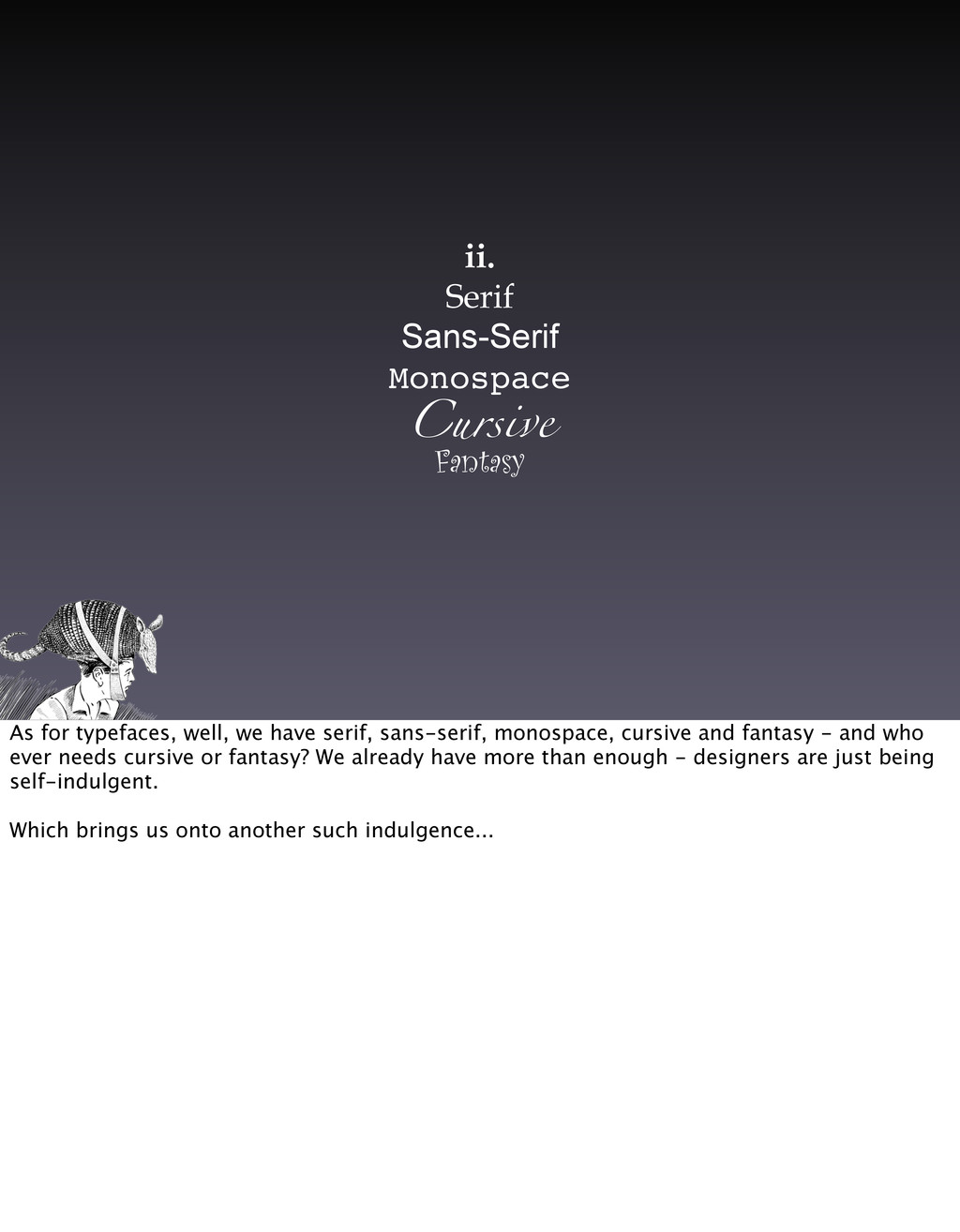
we have serif, sans-serif, monospace, cursive and fantasy - and who ever needs cursive or fantasy? We already have more than enough - designers are just being self-indulgent. Which brings us onto another such indulgence...
for interaction on the web. Any input from the user is captured via a form, in fact, they're the key element that takes the web from being just a network of documents to a place where genuine interactions can occur. We are now experiencing a web where user generated content is more important than ever. YouTube, MySpace and even Google - all pinnacles of modern, beautiful visual design, but they would be nothing without this innate ability for the user to input data via a form. So with forms being so important to the vitality of the modern web, the very last thing you'd want to do is start messing with them - to the point where they no longer perform their basic function as forms. Yet this is what designers ask us to do with alarming frequency.
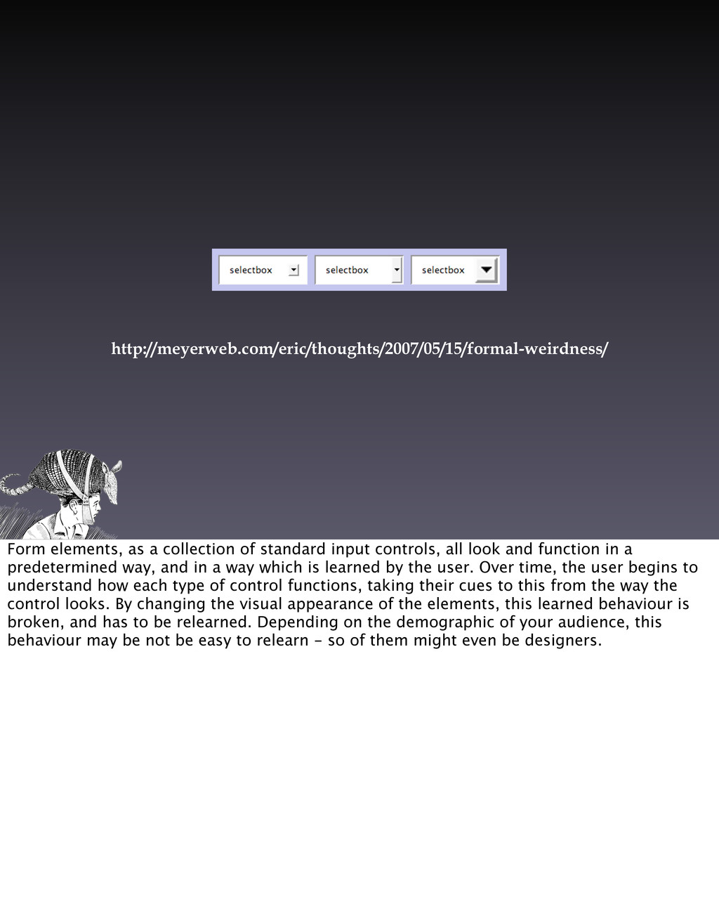
all look and function in a predetermined way, and in a way which is learned by the user. Over time, the user begins to understand how each type of control functions, taking their cues to this from the way the control looks. By changing the visual appearance of the elements, this learned behaviour is broken, and has to be relearned. Depending on the demographic of your audience, this behaviour may be not be easy to relearn - so of them might even be designers.
meaningful way, it will be necessary to invent a whole bunch of new properties and pseudo-classes and describe how they behave and interact. That's much more easily said than done. It's taken more than five years to not finish CSS 2.1, and that’s just a reduced and clarified version of CSS 2. Just imagine how much longer it could take to not finish inventing a whole new branch of CSS.” - Eric Meyer, CSS über-boffin What's more, different browsers implement their form elements in different ways at the technical level. Some browsers use the operating system to draw their controls from the OS's general pool. Some browsers implement their own, and some a mixture of the two. The result of which being that few browsers enable us to style the elements in the same way. This can lead to unpredictable results for the designer, and in more cases than you'd think, nearly unusable forms for the user. People of The Internets, we must stand firm, be resolute and ensure that this never happens.
things. The user fills out some information and clicks a button to submit that information to the server. There are two main ways in which that happens. The first is a GET. This is the sort of HTTP request that's used to retrieve information. A form that uses GET might do something like retrieve a set of search results, with the value of the form used as the search parameter. The second type is POST. This is used for sending information to the server, often for the purpose of submitting content, making edits and such. POSTs usually have the consequence of changing the state of something, somewhere.
methods SHOULD NOT have the significance of taking an action other than retrieval. These methods ought to be considered "safe". This allows user agents to represent other methods, such as POST, PUT and DELETE, in a special way, so that the user is made aware of the fact that a possibly unsafe action is being requested.” - http://www.w3.org/Protocols/rfc2616/rfc2616-sec9.html GETs, on the other hand, have no consequence or side effects. Or at least if they do have side effects, they're inconsequential side effects, and ones that the user cannot be held responsible for. You could request the same link a thousand times without causing anything bad to happen. That is, of course, until designers get involved. Once they've realised that there's no use trying to style form elements, they try to get rid of forms entirely.
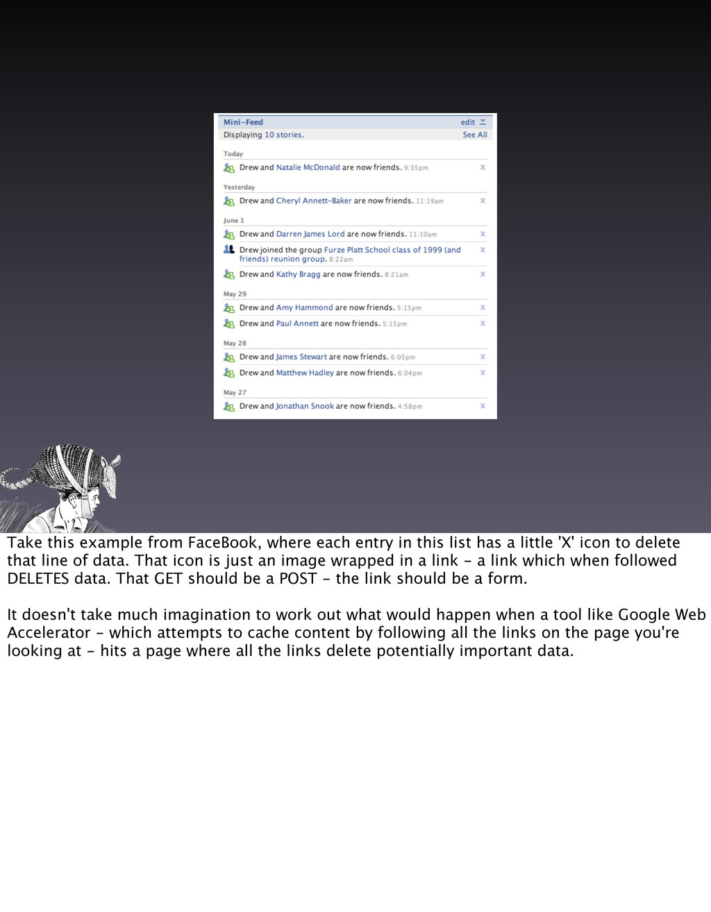
list has a little 'X' icon to delete that line of data. That icon is just an image wrapped in a link - a link which when followed DELETES data. That GET should be a POST - the link should be a form. It doesn't take much imagination to work out what would happen when a tool like Google Web Accelerator - which attempts to cache content by following all the links on the page you're looking at - hits a page where all the links delete potentially important data.
'visually oriented' counterparts get all dewy-eyed over the idea of controlling a layout by fixing its width, so they become taken with the idea of controlling, or more accurately ALIGNING the heights of elements on a page. Some will harp on about the heady days of table-based design - a period which left us fairly much buggered for everything BUT aligning the heights of elements on the page. This is, in fact, a tricky problem - and one which we don't have a good solid technical solution for with the current breed of browsers. However, don't let this throw you off the scent, and certainly do not lower your guard. Designers will try and convince you that heights can be wrestled with JavaScript, locked down with CSS at the expense of any overflowing content, or worse still, padded out with line breaks. Remember, if the visual effect cannot be faked using Faux Column-style backgrounds, then it's probably not a robust technical solution. Discard it. We shall not bend.
the size of text. The theme that emerges time and time again is the desire to control the uncontrollable. To obtain the unobtainable. You stand a good chance of influencing the sizes of text relative to one another, provider the user isn't just overwriting your styles. But much more than that is a mere pipedream. Things get really sticky when the site is being translated into multiple languages. With variations in character sets, word lengths and sentence structures, controlling the amount of space taken up by any piece of text really is unobtainable. People of The Internets, do not be swayed. Running a mockup through babelfish is usually enough.
up on designery guff will tell you about the importance of colour in visual design. Corporate branding guidelines (which are big expensive documents telling you that red is good in China) will often insist on very precise usage of colour, and very often make no account for the web. On the web, colours are a very funny thing indeed. Colours often look very different when applied on screen than they do in print.
surroundings. Some colors can appear lighter or darker based on what color they appear on or next to.” - Jason Santa Maria What's more, the colour as represented on your screen will likely look subtly different on the next person's (or typically your client's) screen. Even a change in ambient light will seriously affect the viewer's perception of a colour. So we must resist all this nonsense about rendering the logo in Pantone 68413 and accept that it's going to be a case of picking the colour by eye. The other area where designers will try and pull a fast one is with contrast. Designers *love* low contrast and subtle shades. Again, People of The Internets, if we don't keep designers in check, those low-contrast designs can quickly become totally illegible for users with poorer eyesight. Don't let them get away with it.
two. As implementers, we may thing of the browser as one of the tools of our trade. BUT BEWARE! As its name suggests, the user agent works for the user, not us, and therefore CANNOT BE TRUSTED. If you start trusting browsers, next you'll be trusting users, and then it's just a slippery slope to the bottom. For designers, this usual manifests in being asked to build the site for this target browser, or that target browser. AGAIN, BEWARE! No two browsers are the same, and by that I don't mean two brands or versions, but I mean sub-versions, toolbars, extenstions, plugins, operating systems, anti-virus and viruses, firewalls, spyware, preferences, configurations, you name it. Build using web standards, encourage the tools you use to use web standards, and go about addressing this issue THE RIGHT WAY. AND SO, we come on to our number 1 threat...
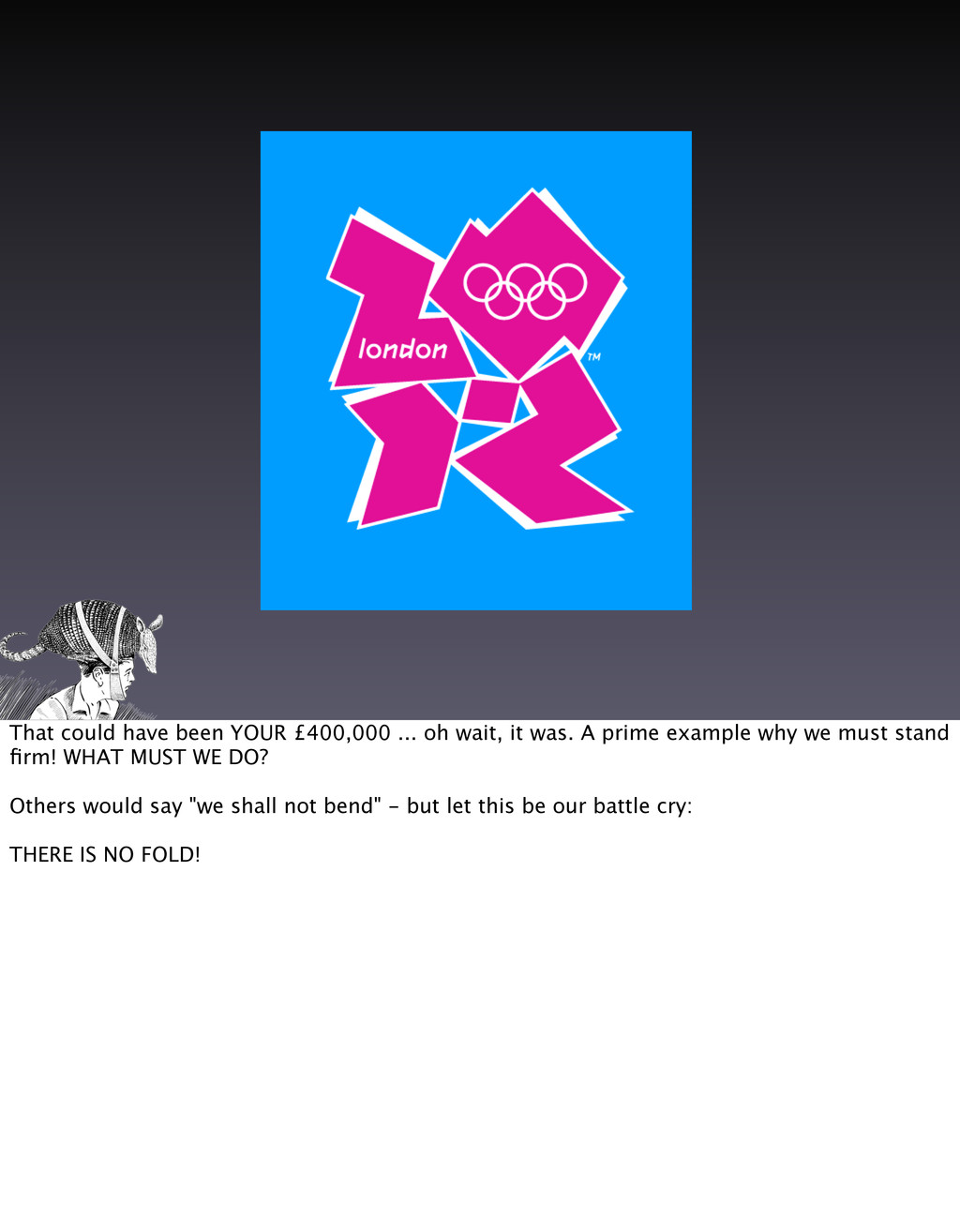
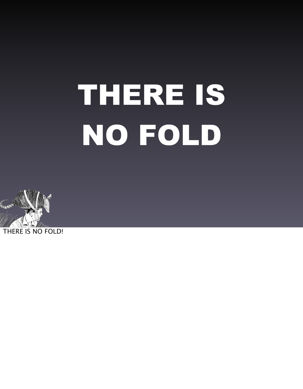
1 enemy is The Fold. The Fold is an imaginary horizontal line designers like to draw on a web page, symbolic of how a newspaper front page might be folded on an old fashioned news stand like you might see in a 40 year old hollywood flick. Well, I have news, papers aren't displayed like that any more, and neither are web pages. For all the reasons cited so far, YOU DON'T KNOW WHERE THIS LINE IS, and what's more, all browsers, since that first browser that TBL used to access that first web page, have provided a simple way to view the entire content of a web page. But no, The Fold is more than this. The Fold is symbolic of us implementers, The People of The Internets, folding to the will of designers. We must not crumble. I think we all know what happens if you let designers have their own way...