 SiteGround - Reliable hosting with speed, security, and support you can count on.
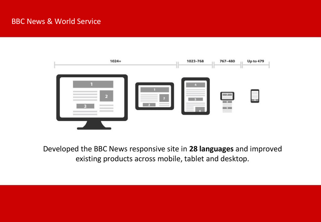
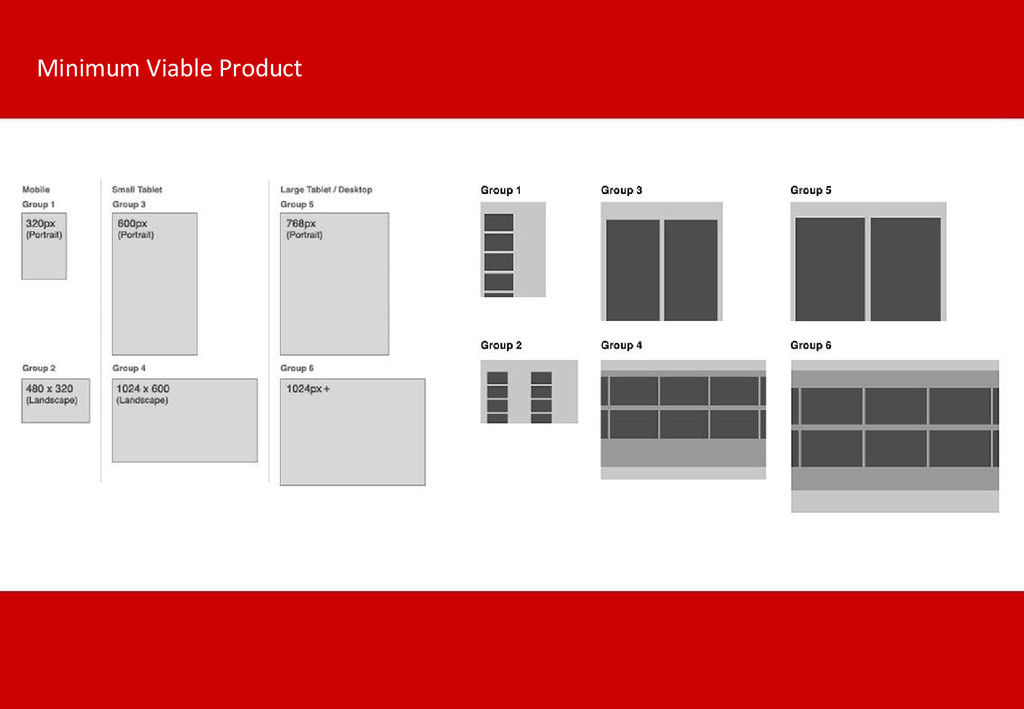
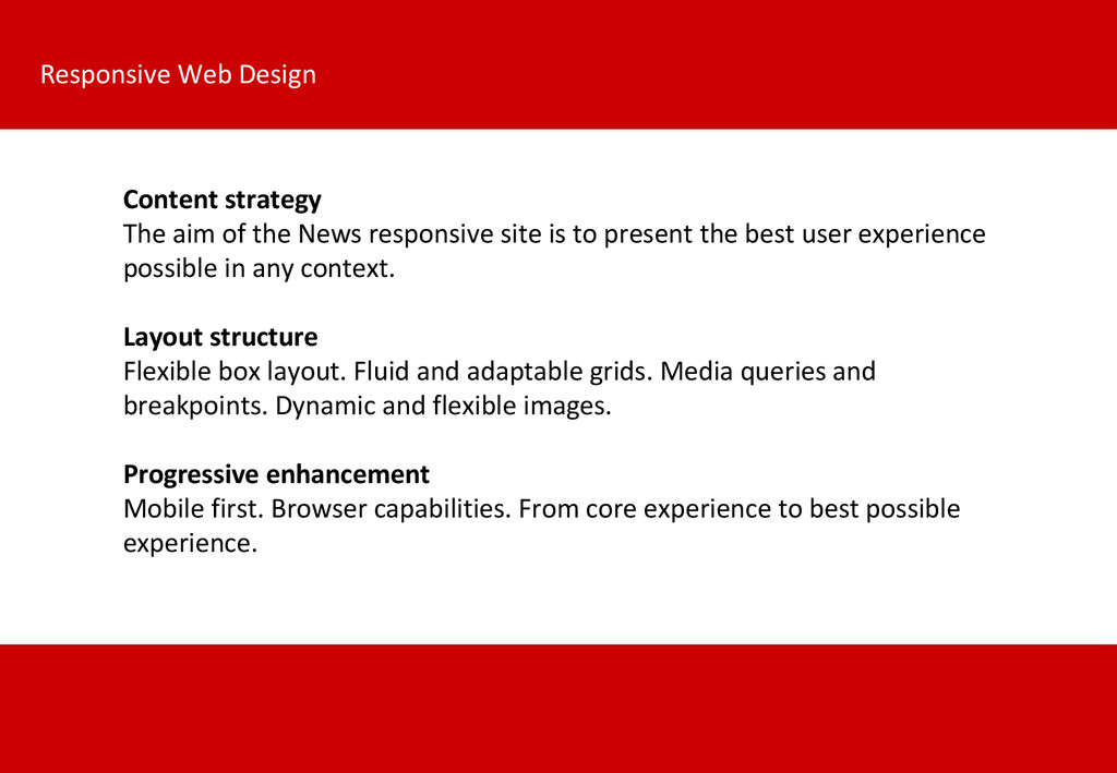
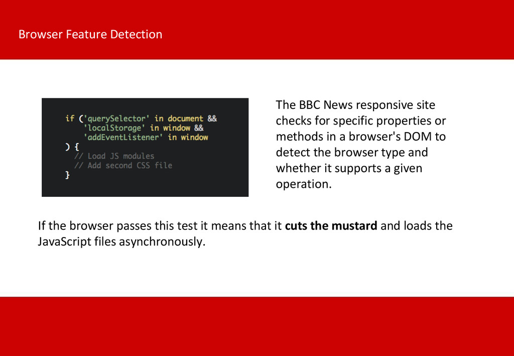
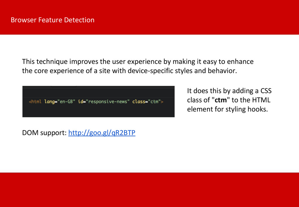
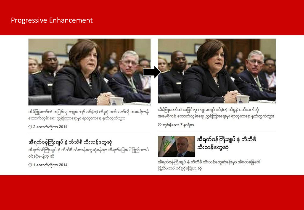
The aim of the News responsive site is to present the best user experience possible in any context. Keywords: mobile first, progressive enhancement, flexible box, fluid and adaptable grids, media queries, breakpoints, dynamic and flexible images.
 fedecarg
 nomizone
 murabayashi
 shinyasaita
 chmikata
 doradora09
 ekispert_api
 hageyahhoo
 pict3
pict3
 sakamoto_582
 kenta_hi
 kakehashi
 lycorptech_jp
 vanstee
 denniskardys
 shlominoach
.png) helenjbeal
helenjbeal
 mfonobong
 chikuwait
 marcoroth
 techseoconnect
 katiecoart
 gr2m
gr2m
 inesmontani
 axbom
axbom