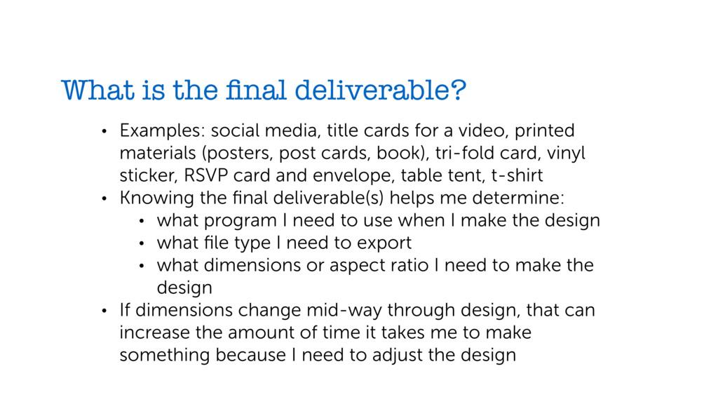
cards for a video, printed materials (posters, post cards, book), tri-fold card, vinyl sticker, RSVP card and envelope, table tent, t-shirt • Knowing the final deliverable(s) helps me determine: • what program I need to use when I make the design • what file type I need to export • what dimensions or aspect ratio I need to make the design • If dimensions change mid-way through design, that can increase the amount of time it takes me to make something because I need to adjust the design
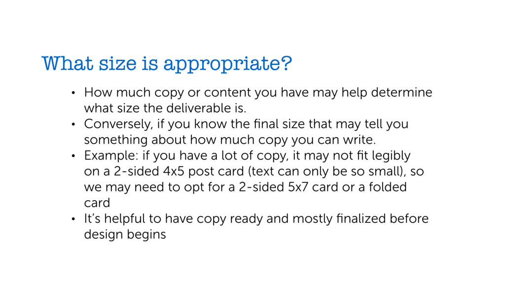
you have may help determine what size the deliverable is. • Conversely, if you know the final size that may tell you something about how much copy you can write. • Example: if you have a lot of copy, it may not fit legibly on a 2-sided 4x5 post card (text can only be so small), so we may need to opt for a 2-sided 5x7 card or a folded card • It’s helpful to have copy ready and mostly finalized before design begins
copy helps determine design. With more copy I may need to use a smaller type size, less decorative type faces, etc. • It’s ideal if copy is finalized before design begins. Starting a design without the content is kind of like constructing a building before you know how many rooms will be inside. • Copy can be tweaked and design can be revised, but the larger the tweaks the more I may need to modify the design, which will take time.
If you want to include a photo of a student, do we have a photo of the student you have in mind? Is it a photo taken in good lighting with a high enough resolution? • Photos used for print have to be higher quality (minimum 300dpi) so they don’t look blurry or pixelated when they print. • We can take photos or video of people or objects to fit your vision, just be aware that scheduling a photoshoot (especially a specific person or group of people) can add time to a project.
timeline, I can make a simpler/less custom design. For rush jobs, have your copy totally finalized and plan for fewer revision cycles. • The more notice you can give me for big events, special or unusual requests, or things that need a marketing campaign, the better. • Even if I’m recycling designs, different sizes, formats, and deliverables still take time to prepare. If I know all deliverables in advance, I can design something more flexible that will take less time to translate across mediums.
is usually only relevant for printed materials outside of our usual postcards, fliers, posters, and books. • Is this a special event or item that needs something extra? • We may need to order paper in advance. • We may need to research price or shop around and consider how large the print run will be.
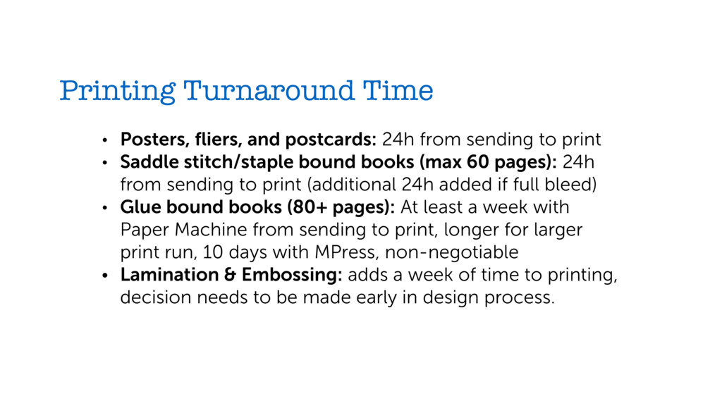
sending to print • Saddle stitch/staple bound books (max 60 pages): 24h from sending to print (additional 24h added if full bleed) • Glue bound books (80+ pages): At least a week with Paper Machine from sending to print, longer for larger print run, 10 days with MPress, non-negotiable • Lamination & Embossing: adds a week of time to printing, decision needs to be made early in design process.
always clear who needs to be involved in review. • Just you? You + Doug? All staff? The board? • Helps me know who to send proofs or keep updated on progress.
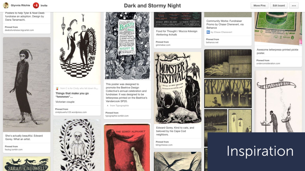
I can gather or share? • Sharing examples of books you like, invitations you’ve received, a social media post you saw, or anything else that you have in mind helps me understand your vision. • We can use dimensions of your example as a guide or to identify materials we need to order. • Your examples can help communicate your design and aesthetic preferences for a project quickly and concretely.
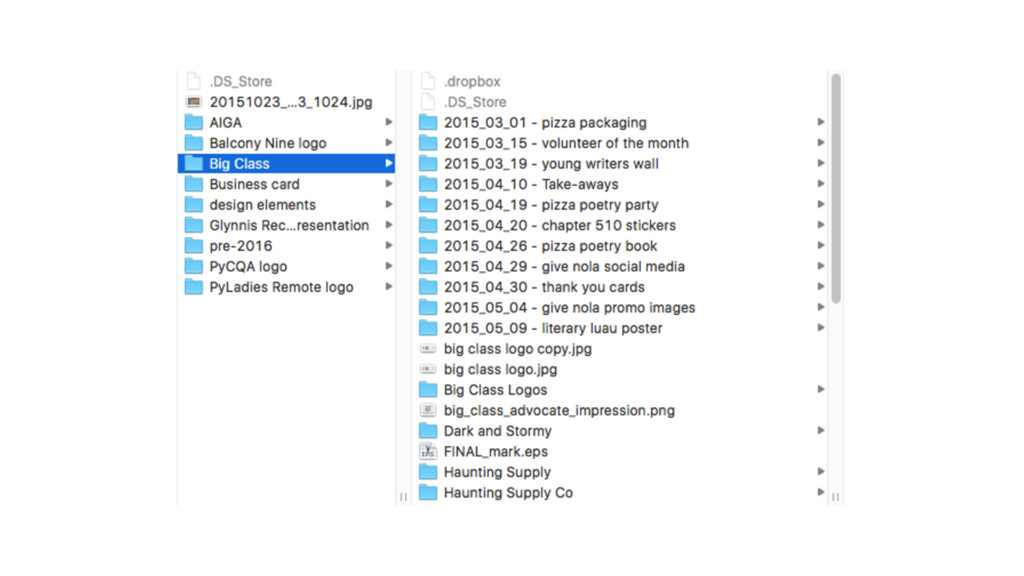
assets or images you’re incorporating into your design • Keep original design files (not just output) • Create a folder structure that helps you find old things (I start file names with dates) • Don’t be afraid to recycle work or elements • Be aware of software versions or file types depending on who you’re sharing with If you’re designing:
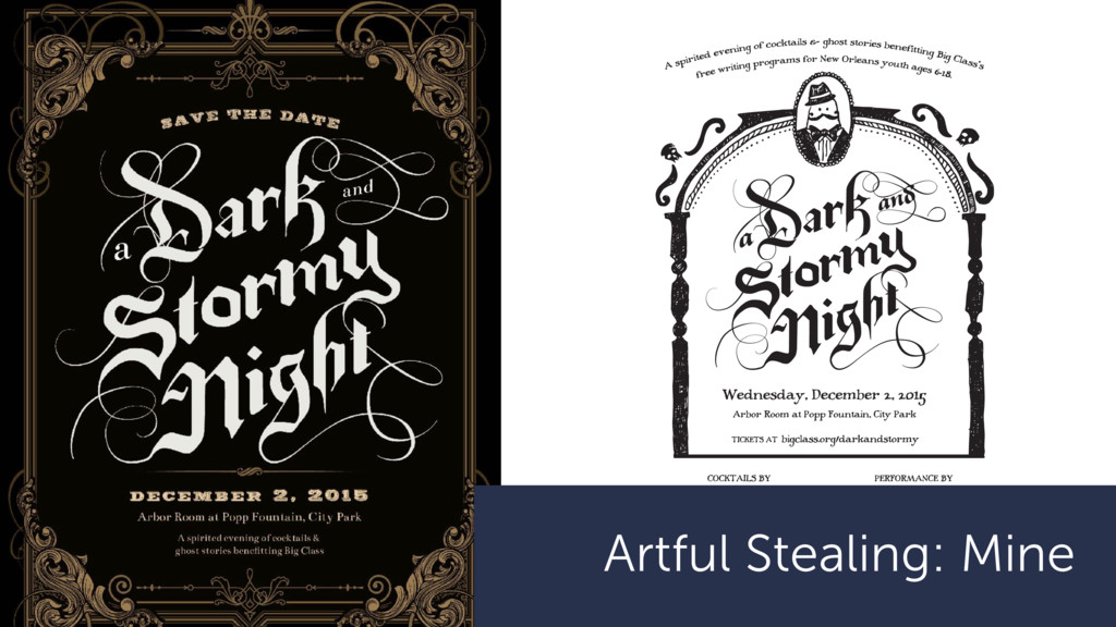
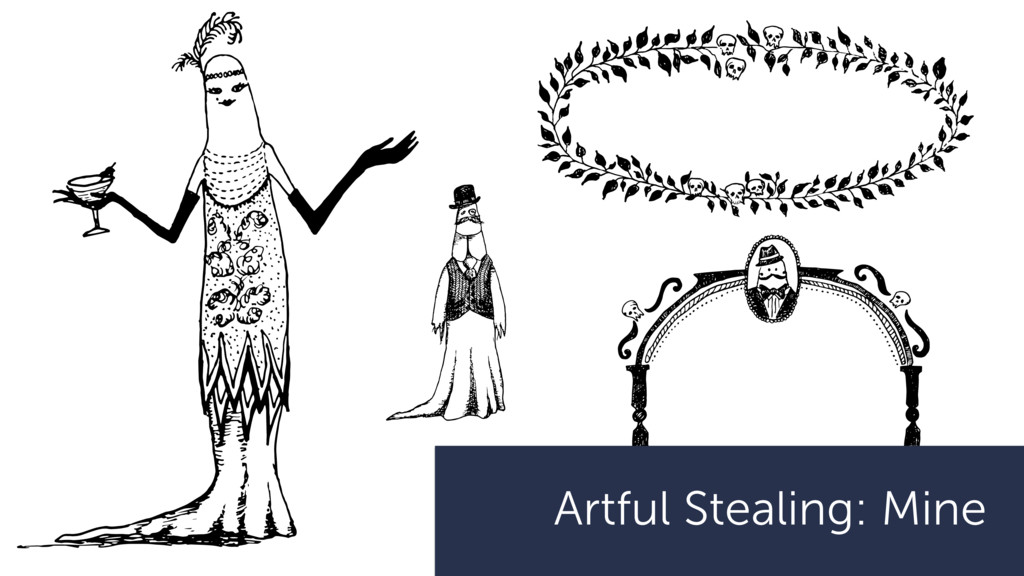
Class’s free writing programs for New Orleans youth ages 6-18. Big Class is a nonprofit organization dedicated to cultivating and supporting the voices of New Orleans’ writers ages 6-18 through creative collaborations with schools and communities. Learn more at bigclass.org. 532 Louisa St., New Orleans, LA 70117 504.308.1423 Jeremy Blum Mary Carlton Alvin David Jayeesha Dutta Natalie Girard Sarah Grainer José Guadarrama Kelly Harris-Deberry Nicole Hershey Jez Luckett Nora McConnell-Johnson Kurston Melton Heather Muntzer Sam Randolph Glynnis Ritchie Josie Scanlan Emma Schain Cherie Teamer Kathleen Whalen Emily Wilkerson Hosts & Ghostwriters Hosted by Wayne Amedee and Julie & Ted George Special thanks to our media sponsor The New Orleans Advocate and a A spirited evening of cocktails & ghost stories benefitting Big Class’s free writing programs for New Orleans youth ages 6-18. Big Class is a nonprofit organization dedicated to cultivating and supporting the voices of New Orleans’ writers ages 6-18 through creative collaborations with schools and communities. Learn more at bigclass.org. 532 Louisa St., New Orleans, LA 70117 504.308.1423 Jeremy Blum Mary Carlton Alvin David Jayeesha Dutta Natalie Girard Sarah Grainer José Guadarrama Kelly Harris-DeBerry Nicole Hershey Jez Luckett Nora McConnell-Johnson Kurston Melton Heather Muntzer Sam Randolph Glynnis Ritchie Josie Scanlan Emma Schain Cherie Teamer Kathleen Whalen Emily Wilkerson Hosts & Ghostwriters Hosted by Wayne Amedee and Julie & Ted George Special thanks to our media sponsor The New Orleans Advocate and a Revisions
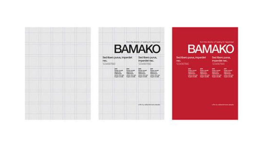
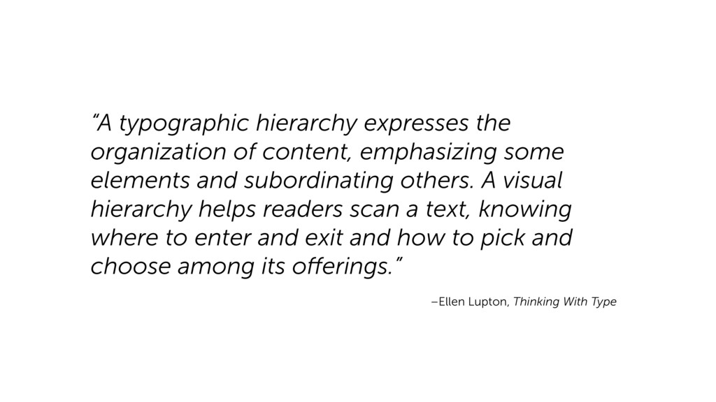
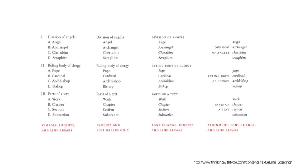
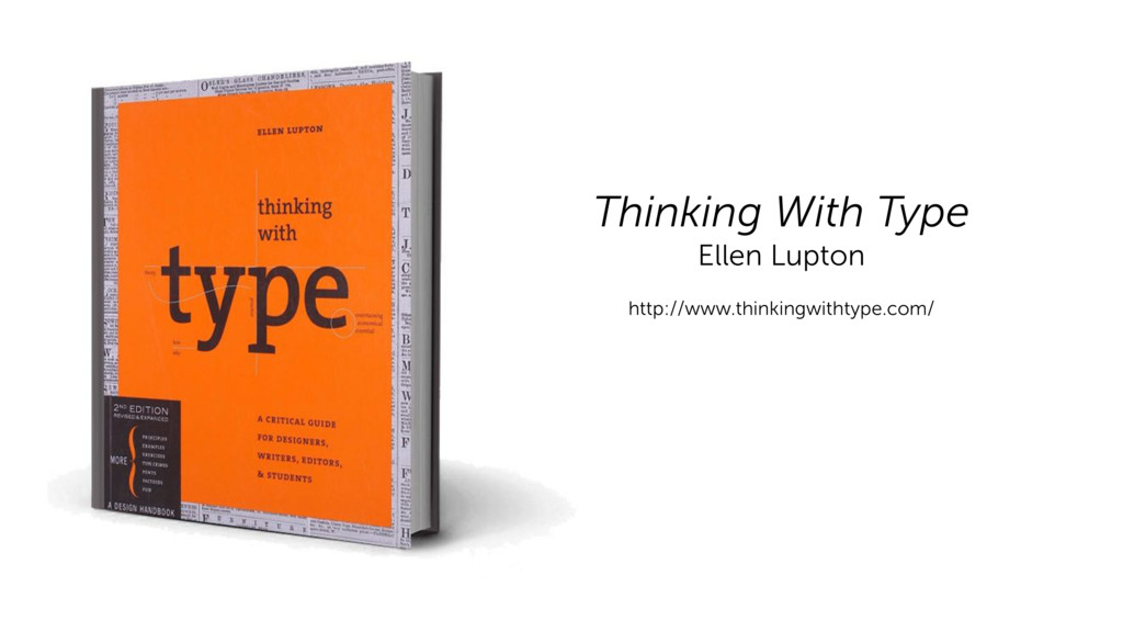
elements and subordinating others. A visual hierarchy helps readers scan a text, knowing where to enter and exit and how to pick and choose among its offerings.” –Ellen Lupton, Thinking With Type
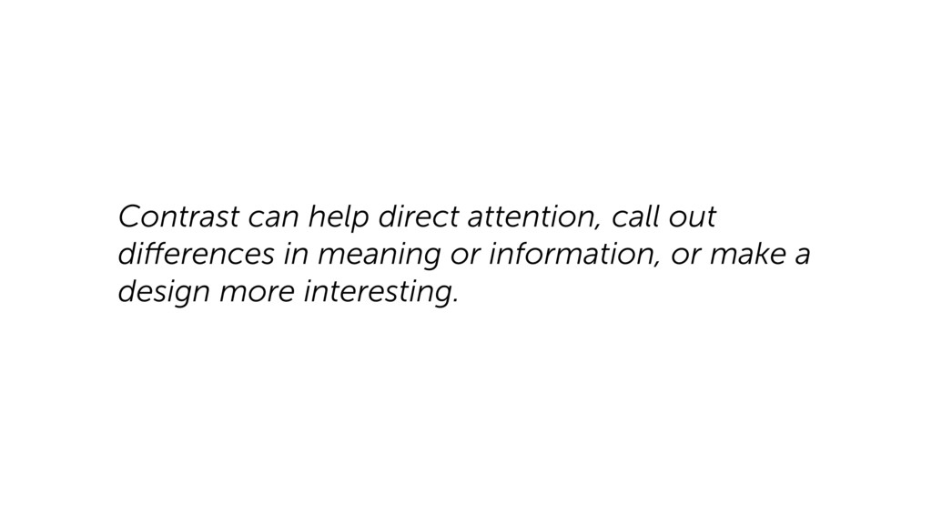
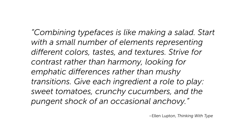
small number of elements representing different colors, tastes, and textures. Strive for contrast rather than harmony, looking for emphatic differences rather than mushy transitions. Give each ingredient a role to play: sweet tomatoes, crunchy cucumbers, and the pungent shock of an occasional anchovy.” –Ellen Lupton, Thinking With Type
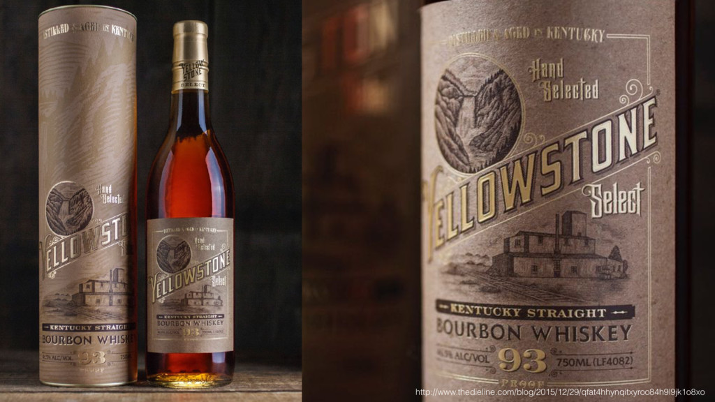
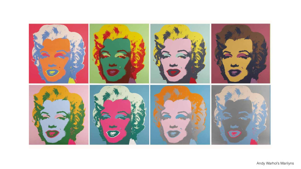
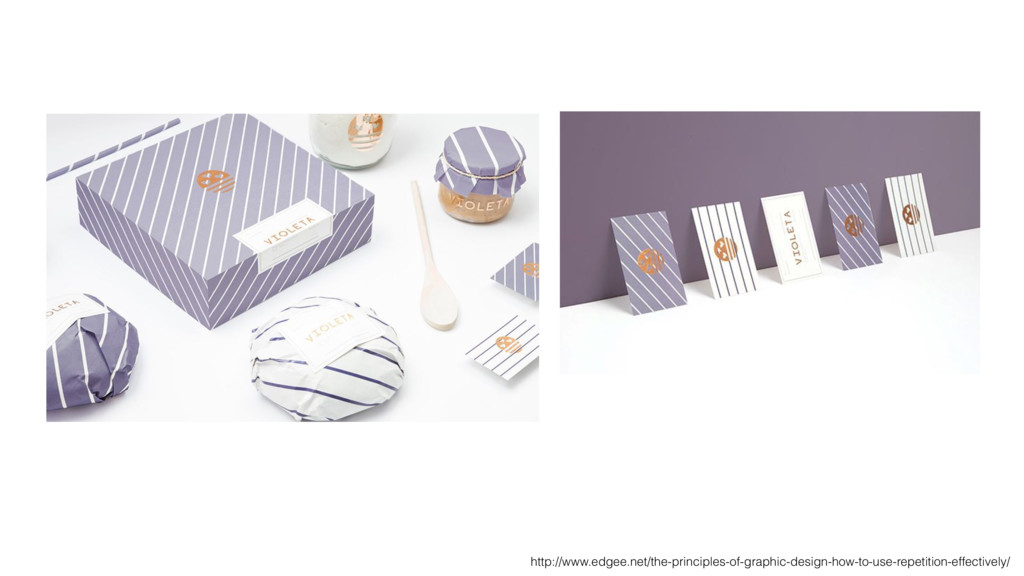
same or similar elements throughout your design. Repetition of elements in a design will bring a clear sense of unity, consistency, and cohesiveness. https://visscom.wordpress.com/2013/04/16/principle-of-repetition-pattern/
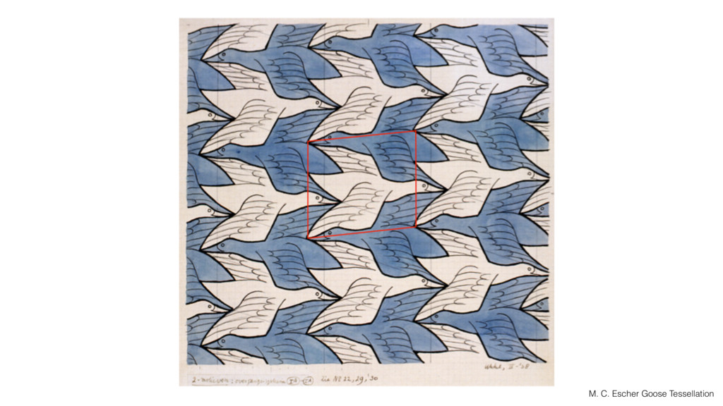
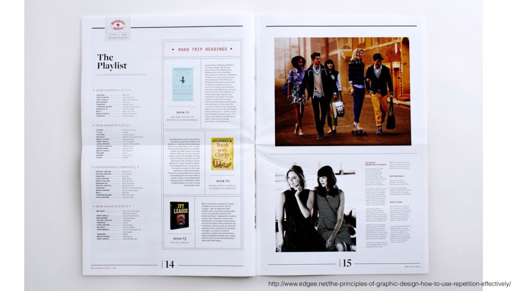
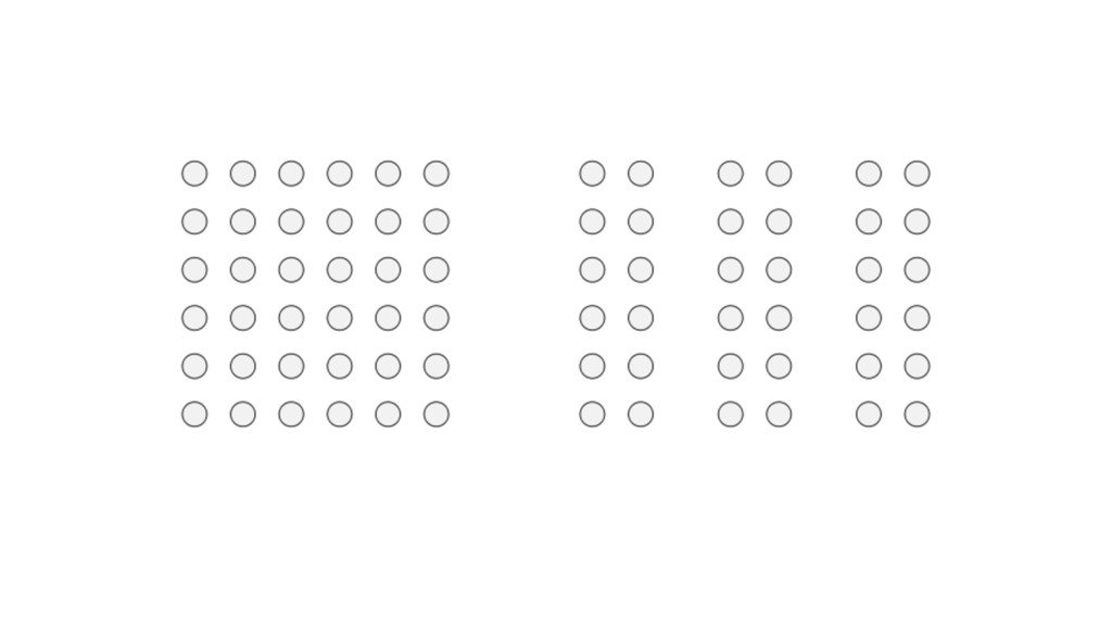
to form groups. Even if the shapes, sizes, and objects are radically different, they will appear as a group if they are close together. https://en.wikipedia.org/wiki/Principles_of_grouping
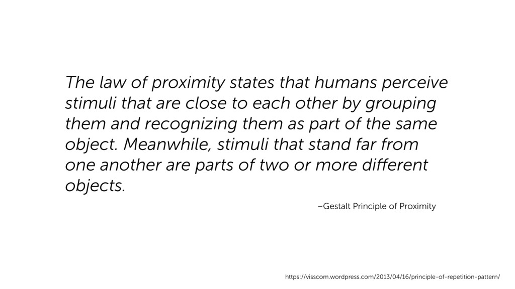
are close to each other by grouping them and recognizing them as part of the same object. Meanwhile, stimuli that stand far from one another are parts of two or more different objects. https://visscom.wordpress.com/2013/04/16/principle-of-repetition-pattern/ –Gestalt Principle of Proximity