Upgrade to Pro — share decks privately, control downloads, hide ads and more …

Photoshop Basics

Photoshop Basics

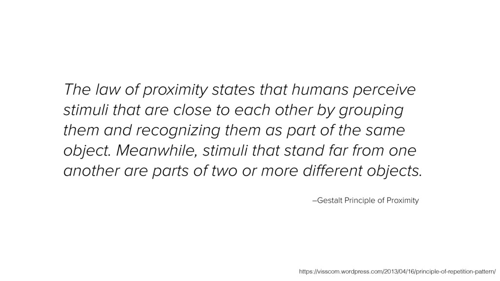
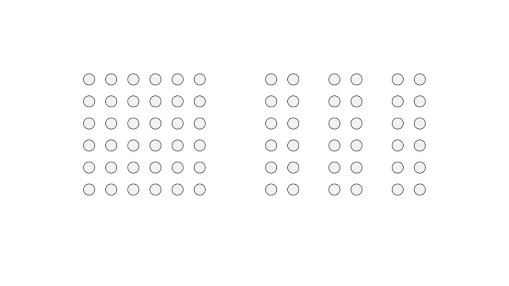
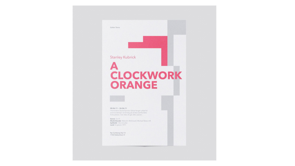
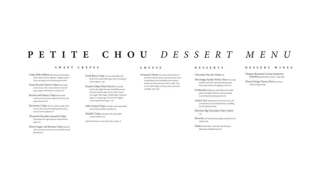
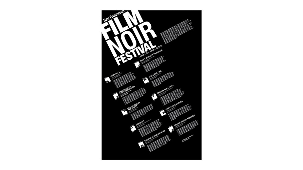
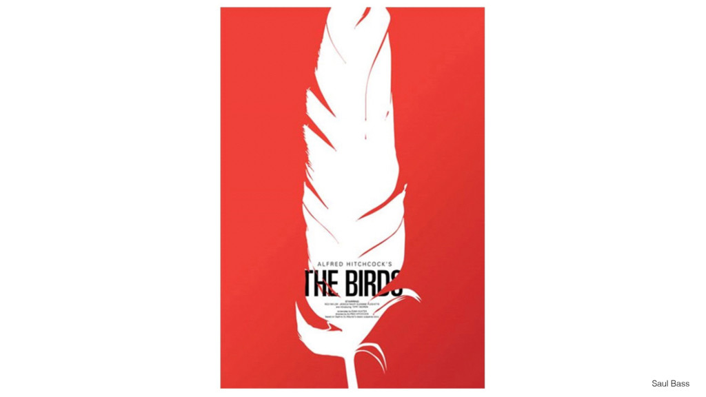
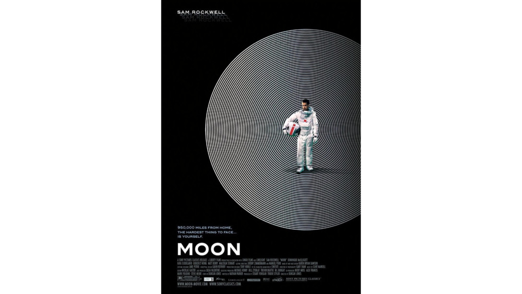
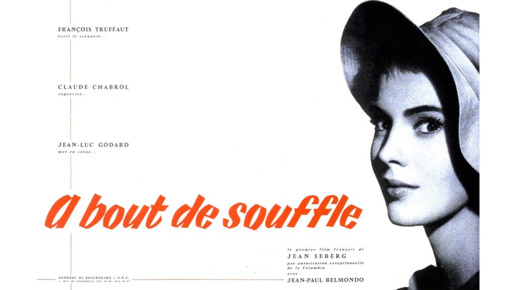
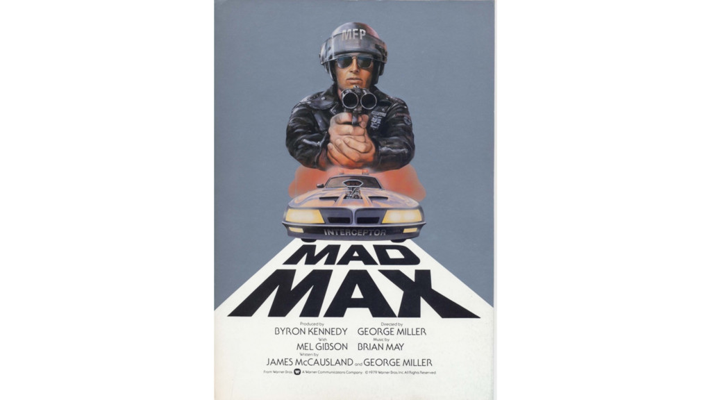
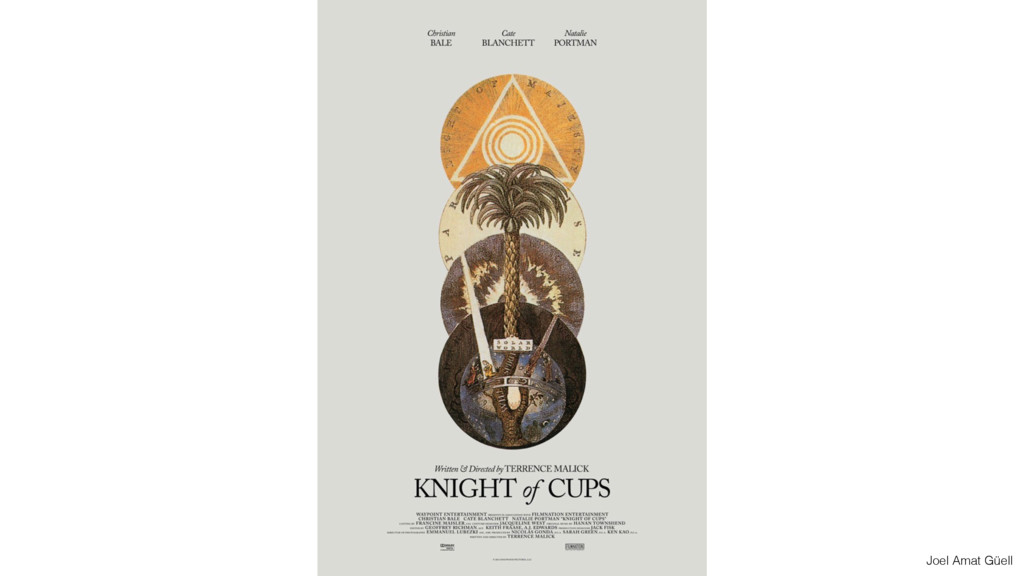
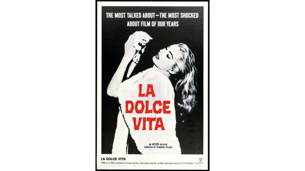
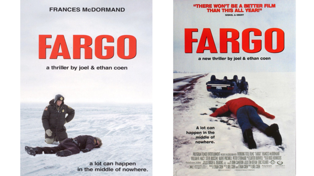
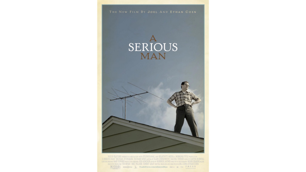
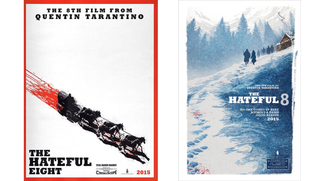
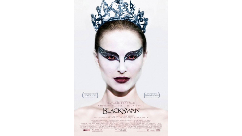
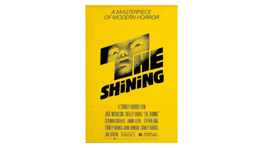
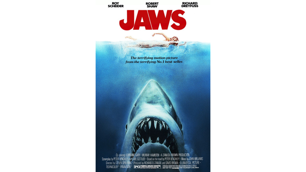
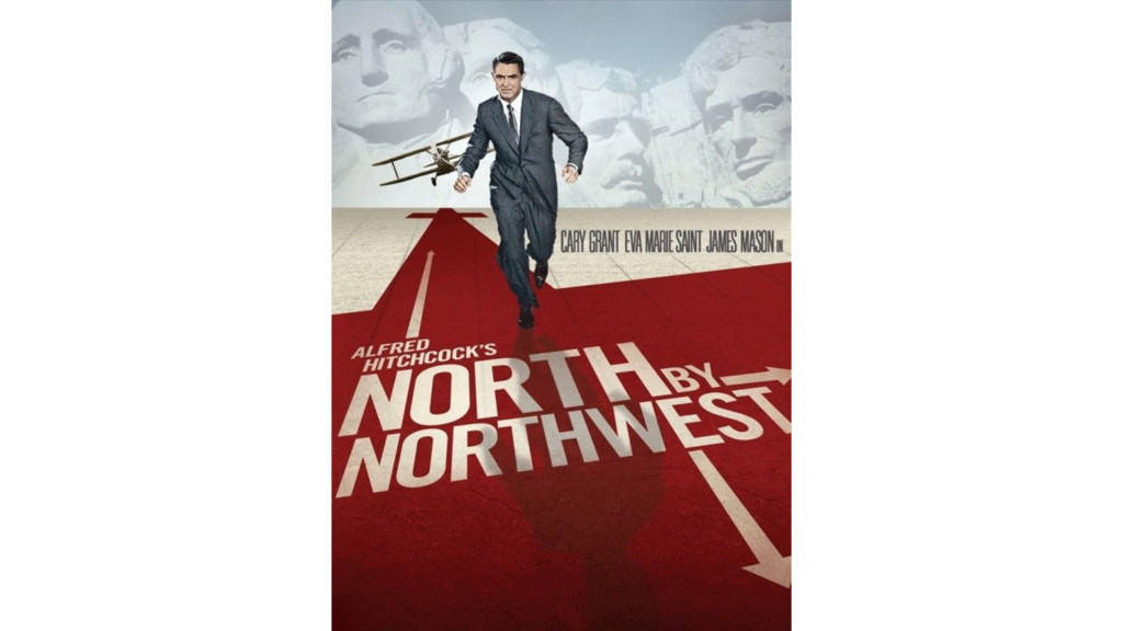
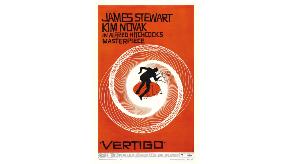
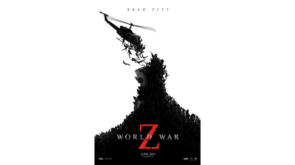
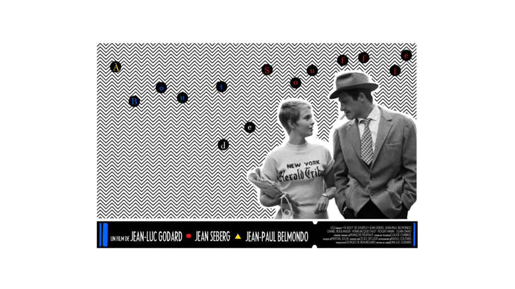
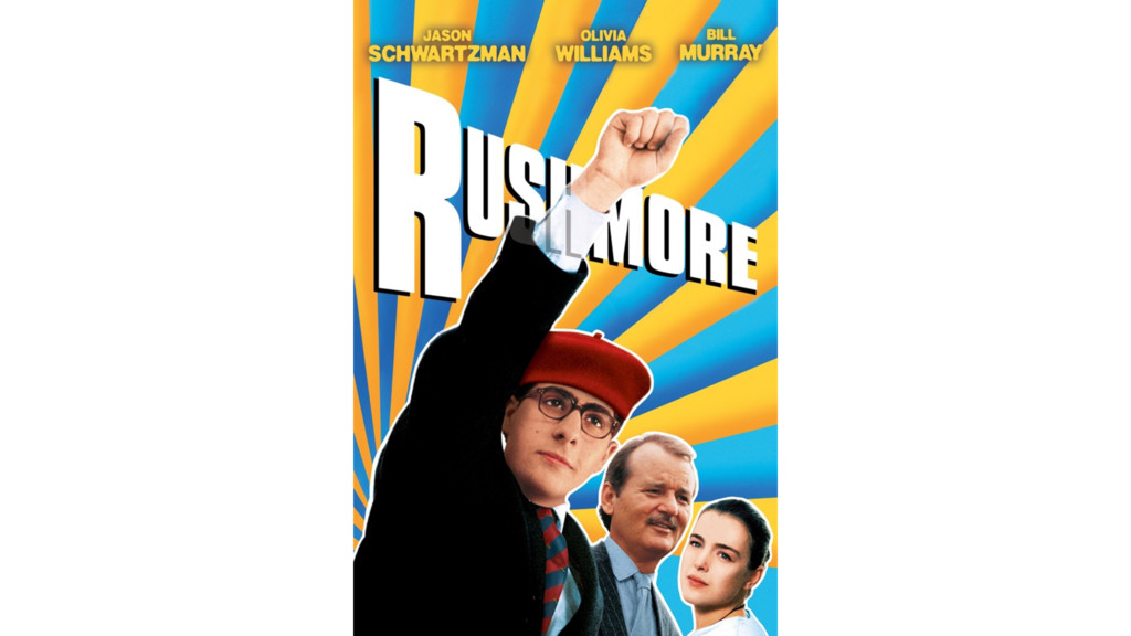
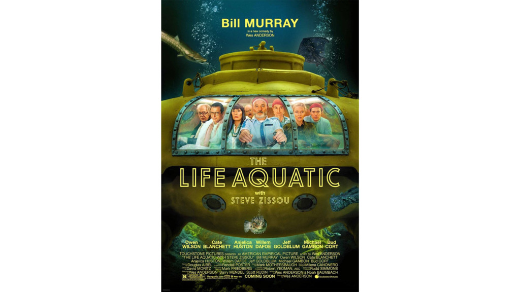
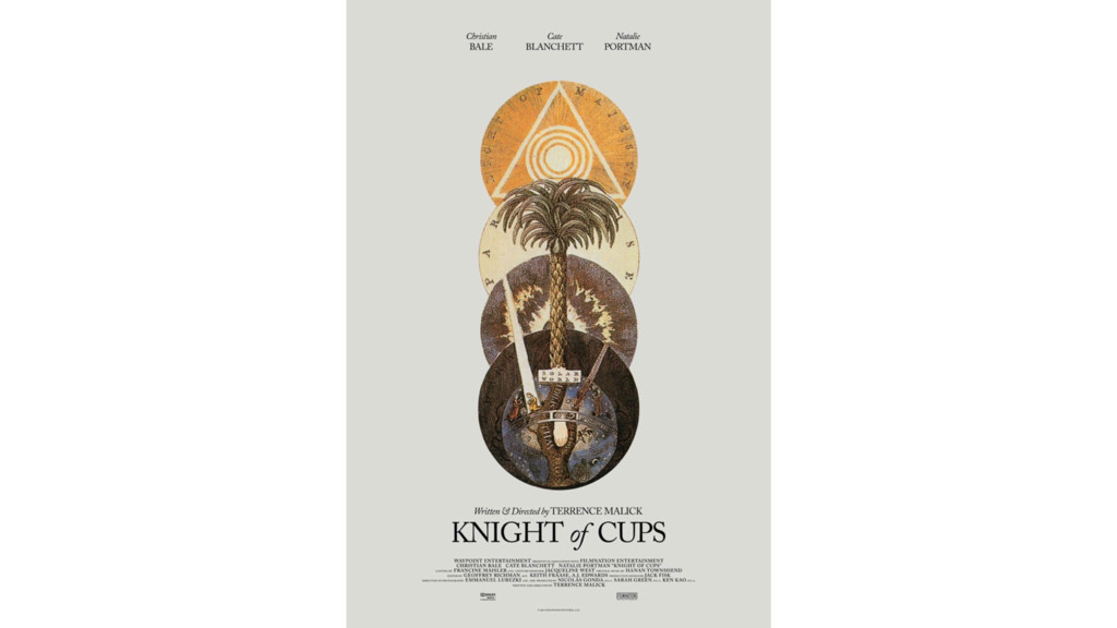
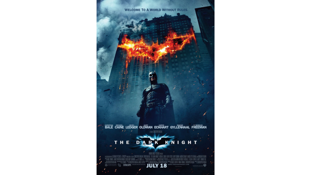
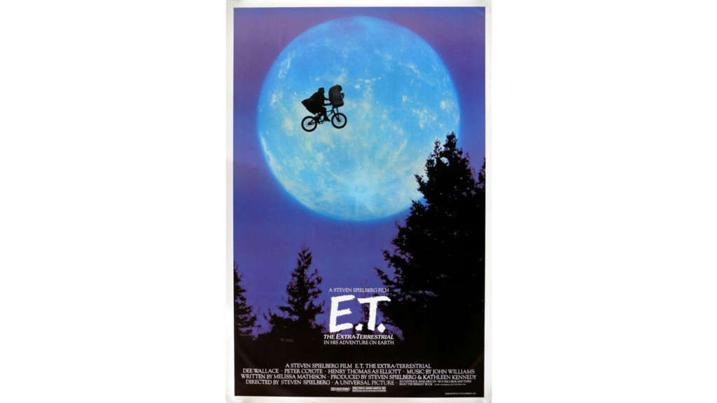
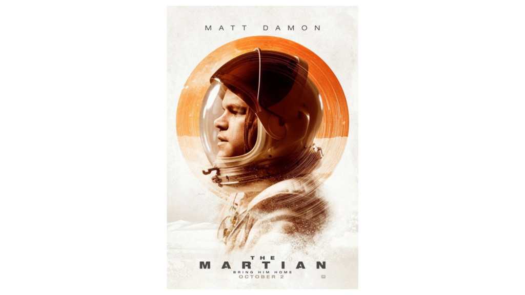
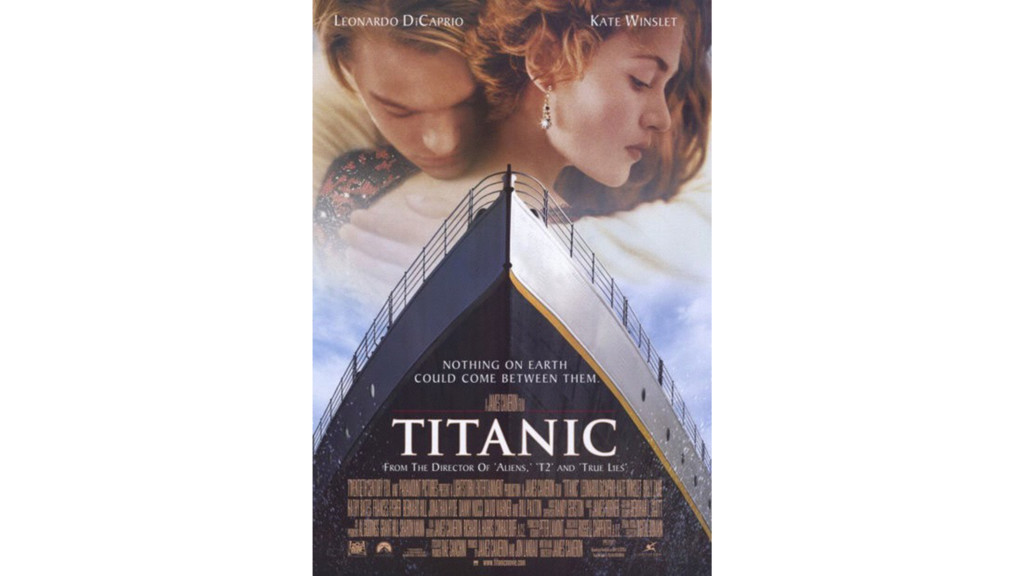
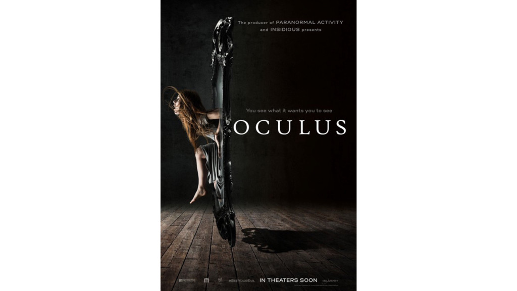
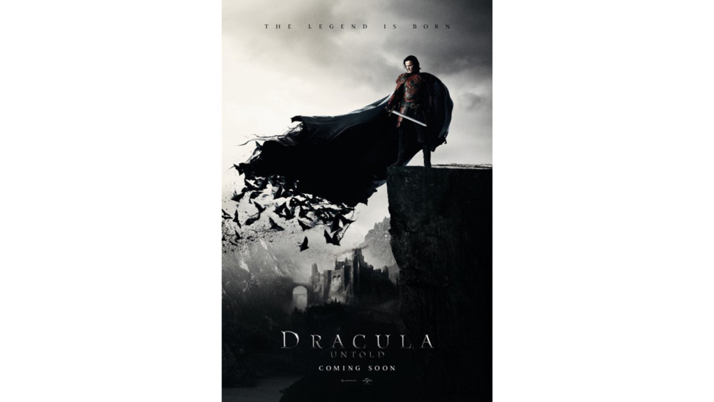
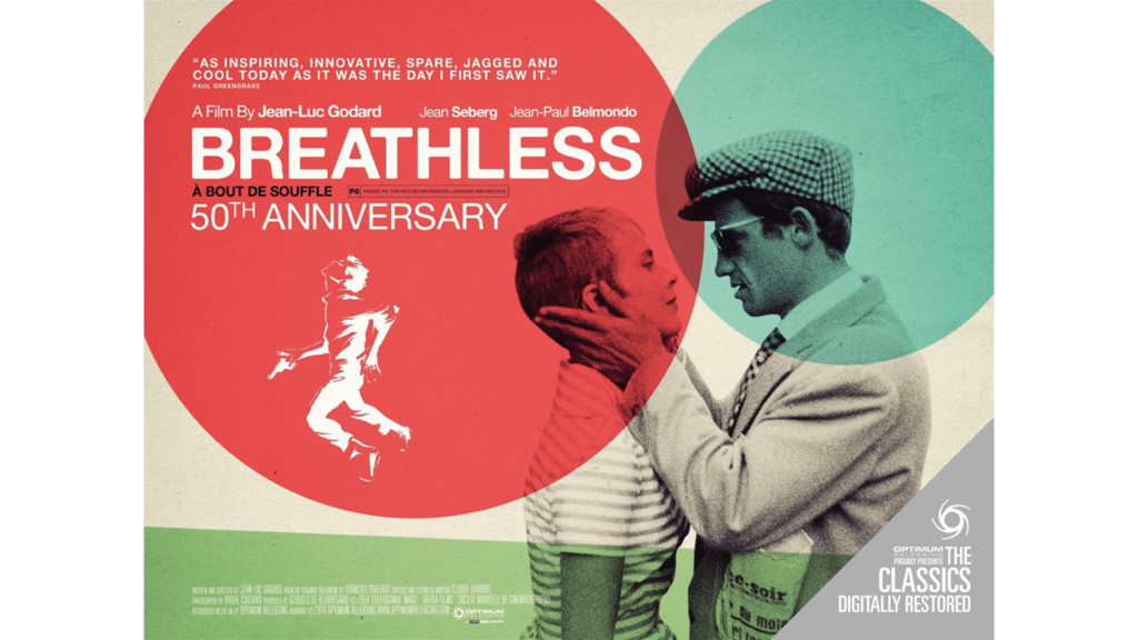
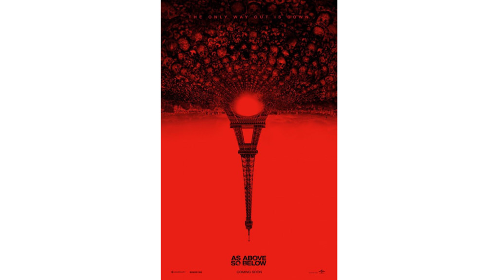
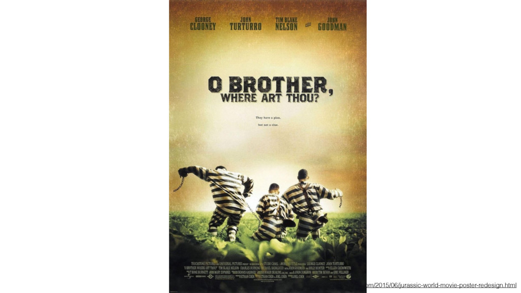
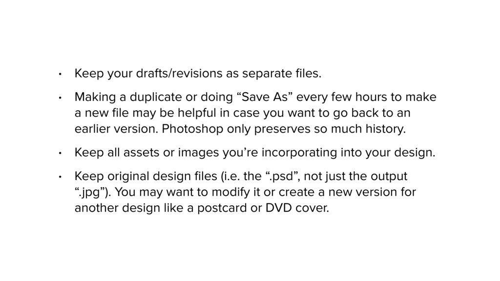
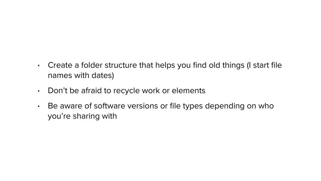
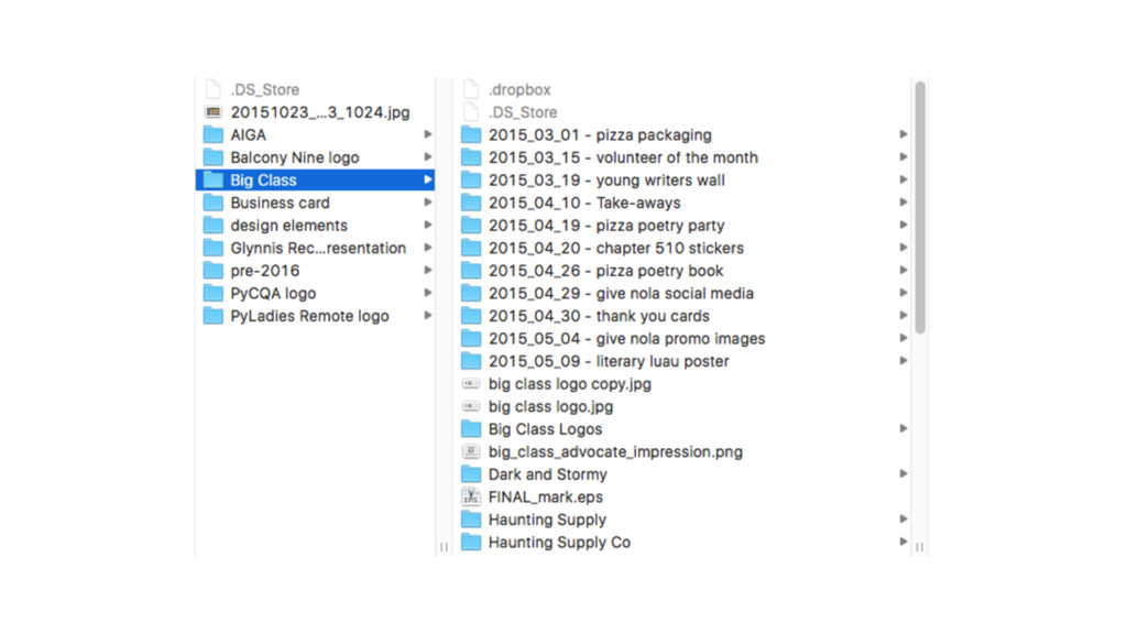
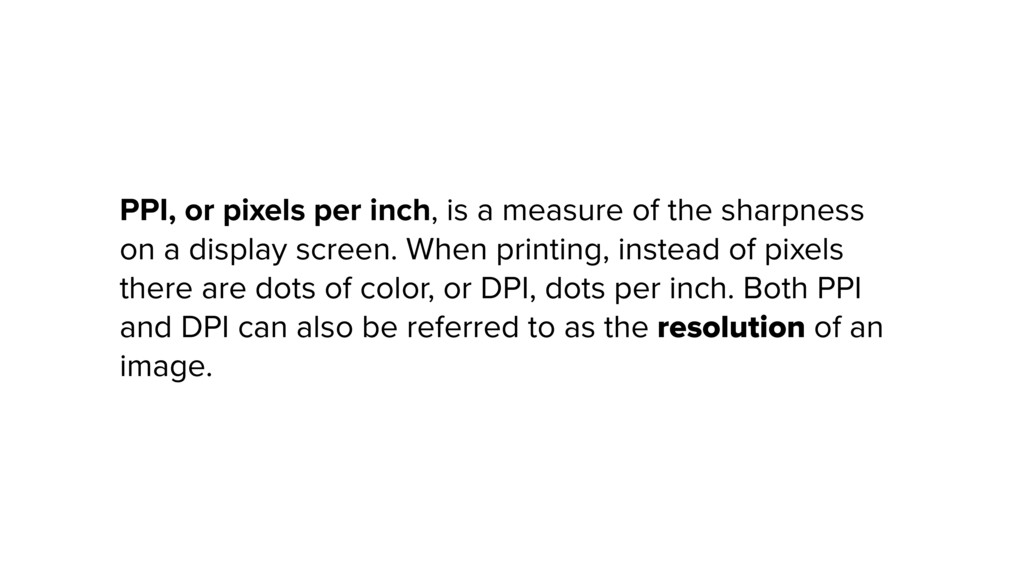
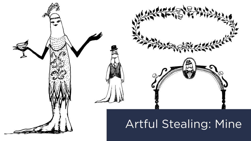
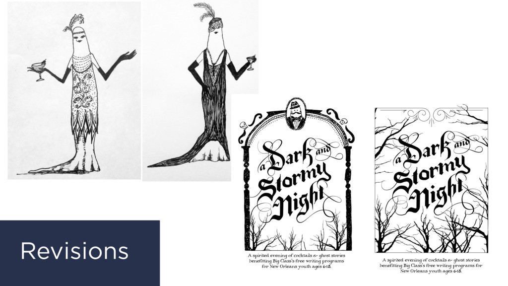
In June 2016 I taught a class for New Orleans Video Access Center in Baton Rouge and New Orleans, LA, to film makers who wanted to learn professional skills. Following an introduction to design principles, the class completed an exercise using some of the basic tools and workflows in Photoshop, before going on to create and design their own original movie poster design.

Glynnis Ritchie

June 24, 2016
Tweet

More Decks by Glynnis Ritchie

Other Decks in Design

Transcript

  1. Alignment creates order. Aligning elements allows them to create a

    visual connection with each other, and makes it easier for the eye to know where to look next.
  2. “A typographic hierarchy expresses the organization of content, emphasizing some

    elements and subordinating others. A visual hierarchy helps readers scan a text, knowing where to enter and exit and how to pick and choose among its offerings.” –Ellen Lupton, Thinking With Type
  3. Contrast can help direct attention, call out differences in meaning

    or information, or make a design more interesting.
  4. “Combining typefaces is like making a salad. Start with a

    small number of elements representing different colors, tastes, and textures. Strive for contrast rather than harmony, looking for emphatic differences rather than mushy transitions. Give each ingredient a role to play: sweet tomatoes, crunchy cucumbers, and the pungent shock of an occasional anchovy.” –Ellen Lupton, Thinking With Type
  5. The principle of repetition simply means the reusing of the

    same or similar elements throughout your design. Repetition of elements in a design will bring a clear sense of unity, consistency, and cohesiveness. https://visscom.wordpress.com/2013/04/16/principle-of-repetition-pattern/
  6. Objects or shapes that are close to one another appear

    to form groups. Even if the shapes, sizes, and objects are radically different, they will appear as a group if they are close together. https://en.wikipedia.org/wiki/Principles_of_grouping
  7. The law of proximity states that humans perceive stimuli that

    are close to each other by grouping them and recognizing them as part of the same object. Meanwhile, stimuli that stand far from one another are parts of two or more different objects. https://visscom.wordpress.com/2013/04/16/principle-of-repetition-pattern/ –Gestalt Principle of Proximity
  8. A movie poster (like its opening credits) can tell you

    something about a film’s content.
  9. • Raster images (don’t scale well) • Good for photo

    composites, including photographic elements • Harder to recycle work in the future because it doesn’t scale infinitely Common file outputs: .psd, .jpg, .png
  10. • Vector images (infinite scaling of mathematical points) • Great

    for illustration • Easy to recycle or resize work in the future because it scales infinitely Common file outputs: .ai, .svg, .pdf, .eps
  11. • Type-centric, perfect for multi-page documents • Easy to deal

    with “masters” or repeating elements and change lots of styles at once • Great for print projects with lots of text Common file outputs: .indd, .pdf
  12. • Keep your drafts/revisions as separate files. • Making a

    duplicate or doing “Save As” every few hours to make a new file may be helpful in case you want to go back to an earlier version. Photoshop only preserves so much history. • Keep all assets or images you’re incorporating into your design. • Keep original design files (i.e. the “.psd”, not just the output “.jpg”). You may want to modify it or create a new version for another design like a postcard or DVD cover.
  13. • Create a folder structure that helps you find old

    things (I start file names with dates) • Don’t be afraid to recycle work or elements • Be aware of software versions or file types depending on who you’re sharing with
  14. PPI, or pixels per inch, is a measure of the

    sharpness on a display screen. When printing, instead of pixels there are dots of color, or DPI, dots per inch. Both PPI and DPI can also be referred to as the resolution of an image.
  15. 72-150ppi is a common image resolution for the web, but

    300ppi or higher is needed for printed work to look sharp.
  16. 1. Understand requirements, size, budget, materials, etc. 2. Look at

    similar work, find inspiration 3. Decide what’s been overdone (exercise taste) 4. Gather inspiration in one place (Pinterest or mood board) 5. Artfully steal (colors, themes, typeface combos, materials) 6. Sketch ideas, thumbnails, make notes 7. Refine sketches and ideas 8. Photograph sketches or find assets 9. Create original work 10. Print prototype for approval/proofing
  17. Good questions to ask yourself or others: • What info

    needs to be included? • What info is the most important? • Can I cut anything? • What mood do I want to set? • Color? Black and white? • Format/deliverable? • How much time to work on this? (build in time for revisions) • What other formats of this work might be needed?
  18. A spirited evening of cocktails & ghost stories benefitting Big

    Class’s free writing programs for New Orleans youth ages 6-18. Big Class is a nonprofit organization dedicated to cultivating and supporting the voices of New Orleans’ writers ages 6-18 through creative collaborations with schools and communities. Learn more at bigclass.org. 532 Louisa St., New Orleans, LA 70117 504.308.1423 Jeremy Blum Mary Carlton Alvin David Jayeesha Dutta Natalie Girard Sarah Grainer José Guadarrama Kelly Harris-Deberry Nicole Hershey Jez Luckett Nora McConnell-Johnson Kurston Melton Heather Muntzer Sam Randolph Glynnis Ritchie Josie Scanlan Emma Schain Cherie Teamer Kathleen Whalen Emily Wilkerson Hosts & Ghostwriters Hosted by Wayne Amedee and Julie & Ted George Special thanks to our media sponsor The New Orleans Advocate and a A spirited evening of cocktails & ghost stories benefitting Big Class’s free writing programs for New Orleans youth ages 6-18. Big Class is a nonprofit organization dedicated to cultivating and supporting the voices of New Orleans’ writers ages 6-18 through creative collaborations with schools and communities. Learn more at bigclass.org. 532 Louisa St., New Orleans, LA 70117 504.308.1423 Jeremy Blum Mary Carlton Alvin David Jayeesha Dutta Natalie Girard Sarah Grainer José Guadarrama Kelly Harris-DeBerry Nicole Hershey Jez Luckett Nora McConnell-Johnson Kurston Melton Heather Muntzer Sam Randolph Glynnis Ritchie Josie Scanlan Emma Schain Cherie Teamer Kathleen Whalen Emily Wilkerson Hosts & Ghostwriters Hosted by Wayne Amedee and Julie & Ted George Special thanks to our media sponsor The New Orleans Advocate and a Revisions
  19. Make a list of major ideas, themes, and think about

    how you might represent them visually.
  20. For Gattaca: • Dystopia, drained colors • Genetics, double helix

    • The sea • Concealed identity • Cheating the system • Rocket ships • Space • Hope/dreams (clouds?) • Science, equations • Exceeding expectations • Imposter syndrome • Stolen identity • Purity/perfection vs. imperfection • Natural vs. designed • Climbing the social ladder, ascent • Education and social status • Class system based on genetics • Lack of opportunity • Predetermination • Controlled society
  21. Sketch some rough thumbnails to experiment quickly and explore big

    ideas about composition, and test alternative approaches.
  22. What are some effects or layers that you think you

    will need based on your design? Begin browsing tutorials for techniques you want to learn or include.
  23. Collect assets or source images for your design. Look for

    large images that all have the same PPI—300ppi or higher.
  24. Adjust PPI using Image > Image Size… Change the resolution

    number. Remember: you can’t add information where it doesn’t already exist.