Upgrade to Pro — share decks privately, control downloads, hide ads and more …

Statistical methods: CUSUM, VLAD, risk adjustment, funnel plot. Which one to choose?

Graeme Hickey
October 02, 2016
270

Statistical methods: CUSUM, VLAD, risk adjustment, funnel plot. Which one to choose?

Presented at the 30th Annual EACTS Meeting, Barcelona, Spain (1-5 October 2016)

Graeme Hickey

October 02, 2016
Tweet

More Decks by Graeme Hickey

Transcript

  1. Monitoring Quality in Your Unit: State of the Art
    Graeme L. Hickey*
    Department of Biostatistics, University of Liverpool
    * No conflicts of interest

    View Slide

  2. View Slide

  3. • Process monitoring control charts
    Source: Spiegelhalter DJ. Funnel plots for comparing institutional performance. Stat Med 2005;24:1185–202.

    View Slide

  4. Warning: Caution required with prolonged
    monitoring in cardiac surgery
    Source: Hickey GL et al. Dynamic trends in cardiac surgery: why the logistic EuroSCORE is no longer suitable for contemporary cardiac surgery and implications for
    future risk models. Eur J Cardio-Thoracic Surg 2013;43:1146–52.
    Logistic
    EuroSCORE

    View Slide

  5. 1190 D. J. SPIEGELHALTER
    NY Hospitals
    Volume of cases
    % mortality
    0 500 1000 1500 2000
    0
    2
    4
    6
    8
    99.8 % limits
    95 % limits
    NY Surgeons
    Volume of cases
    % mortality
    0 200 400 600 800 1000
    0
    2
    4
    6
    8
    10
    99.8 % limits
    95 % limits
    Figure 3. Risk-adjusted 30-day mortality rates following coronary artery bypass grafts
    in New York state, 1997–1999, for 33 hospitals and 175 surgeons who conducted at
    least 25 operations in a hospital (separate results are given for the same surgeon op-
    erating in di erent hospitals, and some comprise an ‘all other’ category). The target
    is the overall rate of 2.2 per cent.
    3.2. Change data
    A variety of measures of change in performance are possible. For example, changes in propor-
    Source: Spiegelhalter DJ. Funnel plots for comparing institutional performance. Stat Med 2005;24:1185–202.

    View Slide

  6. 1194 D. J. SPIEGELHALTER
    Emergency re-admission within 28 days of discharge
    % readmission
    0 20000 40000 60000 80000 100000 120000
    0
    2
    4
    6
    8
    10 99.8 % limits
    95 % limits
    Multiplicative over-dispersion
    % readmission
    0 20000 40000 60000 80000 100000 120000
    0
    2
    4
    6
    8
    10
    Over-dispersion factor 7.6 based on 10 % winsorised
    Additive over-dispersion
    Volume of cases
    % readmission
    0 20000 40000 60000 80000 100000 120000
    0
    2
    4
    6
    8
    10
    Random effects SD 0.0073 based on 10 % winsorised
    (a)
    (b)
    (c)
    Figure 6. Proportions of emergency re-admission within 28 days of discharge from 67 large
    acute or multi-service hospitals in England, 2000–2001. The target is the overall average
    rate of 5.9 per cent: (a) shows the over-dispersion around the unadjusted funnel plot; (b)
    is a multiplicative model in which the limits are expanded by an estimated over-disperion
    parameter , while (c) is an additive random-e ects model in which all the sample variances
    have an additional 2 term added.
    The current control limits can then be in ated by a factor ˆ around Â0
    . For example,
    based on the approximate normal control limits, over-dispersed control limits can then be
    Source: Spiegelhalter DJ. Funnel plots for comparing institutional performance. Stat Med 2005;24:1185–202.

    View Slide

  7. View Slide

  8. Available online http://ccforum.com/content/10/1/R28
    and independently verified. All patients were followed up until
    death or hospital discharge.
    Model fit was assessed with a calibration curve, and model
    discrimination was measured by the area under the receiver
    operating characteristic curve, approximated by the trapezoi-
    dal method and estimation of 95% confidence intervals
    [17,18].
    The cumulative E-O mortality chart uses patients indexed by
    order of admission to the ICU. A mathematical description is
    provided in Additional file 1. It has been described previously
    death) was recorded. The estimates of probability of death
    minus the observed outcomes were then accumulated for
    sequential admissions. The cumulative difference between the
    expected and observed number of deaths is displayed on the
    y-axis, for the sequence of patients. The x-axis displays
    sequential patient admissions, although the date of ICU admis-
    sion is used on the label for ease of interpretation.
    The risk-adjusted p chart [20] is a control chart plotting the
    observed mortality rate and expected mortality rate in groups
    of patients. It is presented in detail in Additional file 1. In this
    case we have chosen 2 units of the estimated SD above and
    Figure 1
    Risk-adjusted p chart by blocks of 30 patients
    Risk-adjusted p chart by blocks of 30 patients. Probability of death estimated with UK APACHE, Royal Berkshire Hospital, 1 January 2003 to 30
    June 2004.
    Source: Cockings JGL et al. Process monitoring in intensive care with the use of cumulative expected minus observed mortality and risk-adjusted P-charts.
    Crit Care 2006;10:R28.

    View Slide

  9. CUSUM curve ends at zero, indicating performance
    exactly as expected.
    patie
    vince
    surge
    these
    ness
    Virtu
    Now
    been
    comp
    theor
    can s
    lated
    desir
    apply
    the p
    fate
    deter
    her e
    “pseu
    pecte
    puter
    expec
    a p%
    on ch
    tion.
    serie
    Fig 1. Ten hypothetical patients with varying risks (Exp ϭ expected
    mortality), for a total risk of 2.0. The surgeon is operating exactly as
    expected, and 2 patients died (Obs ϭ observed mortality). Thus, the
    observed/expected (O/E) ratio is 1, and the cumulative sum (CUSUM)
    of the observed mortality minus expected mortality equals zero at
    the end.
    362 THE STATISTICIAN’S PAGE GRUNKEMEIER ET AL
    CUMULATIVE SUM CURVES
    Source: Grunkemeier GL et al. Cumulative sum curves and their prediction limits. Ann Thorac Surg 2009;87:361–4.

    View Slide

  10. 4,920 valve operations from 1997 to 2004 [9]. Subse-
    quently, the PHS cardiac programs have performed 3,216
    additional heart valve surgeries in which a predicted risk
    score could be obtained, allowing us to compare the
    observed mortality in this validation subset of subsequent
    patients to that expected from the PHS risk model. The
    CUSUM for these patients, constructed just as the exam-
    ple in Figure 1, using the PHS risk model for expected
    mortality, is shown in Figure 2. The horizontal axis is
    scaled by surgery number, and the operative years are
    given by vertical grid lines. (An alternative presentation
    would be to scale the horizontal axis by calendar time
    and depict the number of cases by vertical grid lines.)
    CUSUM Prediction Limits
    The O-E difference will almost never equal exactly zero,
    even when performance is as expected. Random varia-
    tion must be accounted for, before any clinical difference
    is attributed to performance, by constructing an interval
    estimate that contains the values that are consistent with
    the observed (point) estimate. A simple 95% confidence
    interval can be constructed using the normal (“bell-
    shaped”) approximation to the binomial distribution
    (Appendix). To produce prediction intervals for the
    CUSUM plot in Figure 2, we computed these 95% limits
    at each point (patient). As previously mentioned, it is not
    intuitively apparent why these prediction intervals
    should be expanding, or bullet-shaped, as the number of
    each point, we recruited 5,000 virtual surgeons, each of
    whom operated exactly as expected, with only random
    variability separating their results. The first 100 of these
    results are drawn in Figure 3 as light gray lines, and the
    quantiles for the middle 95% at each point (patient) for all
    5,000 are drawn as thicker black lines. Note that they
    Fig 2. The cumulative sum of observed minus expected operative
    deaths for 3,217 heart valve surgeries, with 95% point-wise predic-
    tion limits. The horizontal axis is scaled by patient number, and the
    operative years are given by vertical grid lines. The odds ratio (OR),
    with 95% confidence interval (CI), gives an overall assessment of
    performance.
    Source: Grunkemeier GL et al. Cumulative sum curves and their prediction limits. Ann Thorac Surg 2009;87:361–4.

    View Slide

  11. Xt
    = max(0, Xt-1
    + Wt
    )
    Xt
    ≥ h ‘signalled’

    View Slide

  12. View Slide

  13. Source: Steiner SH et al. Monitoring surgical performance using risk-adjusted cumulative sum charts. Biostatistics 2000;1:441–52.
    Unadjusted
    Adjusted
    To detect R1
    = 2
    To detect R1
    = ½
    To detect R1
    = 2
    To detect R1
    = ½

    View Slide

  14. of ␣ and ␤) and the longer the sequence of 
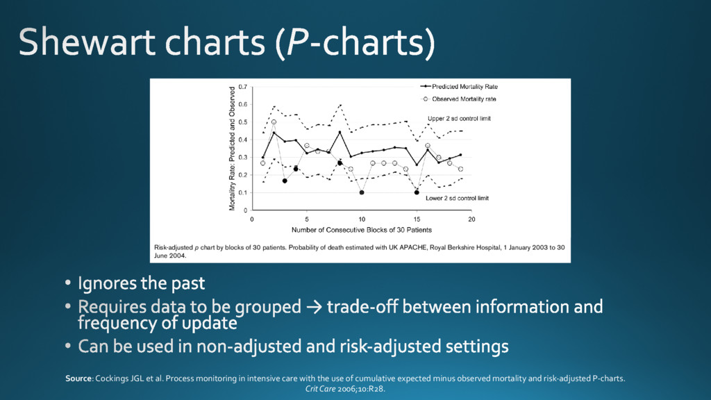
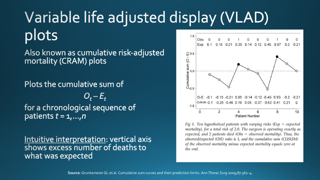
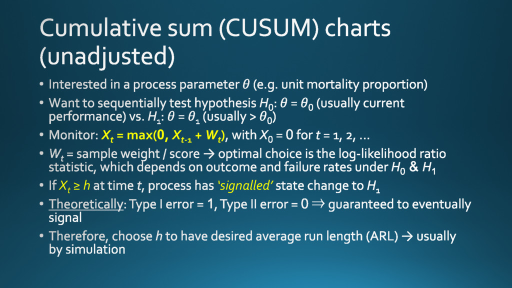
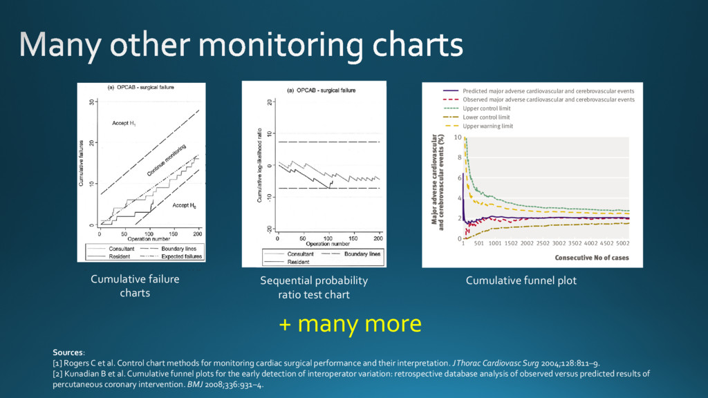
operations needed graph is more intuitive because it is easier to identify changes in
    Figure 1. Cumulative failure charts for (a) surgical failure after off-pump CABG (OPCAB) and (b) 30-day mortality
    after orthotopic heart transplantation in adults. Expected failure rates (p
    0
    ) were set at overall failure rates for the
    programs as a whole: (a) 8.5% for 1 consultant and 4 residents and (b) 12% for 8 centers. Boundary lines were
    constructed to detect a 50% increase in failures (odds ratio, 1.5): (a) 3.7% (p
    1
    ؍ 12.2%) and (b) 5.0% (p
    1
    ؍ 17.0%).
    False-positive (␣) and false-negative (␤) error rates are 5% for both charts. Lines representing expected cumulative
    failures (— · · ) are shown in both charts, although these are not usually included. In (a), which depicts the
    consultant and 1 of the 4 residents, the consultant’s failure rate is similar to the overall failure rate (closely follows
    the — · · line), but is less than expected for the resident. The resident’s performance was confirmed as acceptable
    (or better) after 100 operations, when the lower boundary line was reached. In (b), which depicts 2 of the 8
    transplant centers, performance at center A was consistently better than expected and was confirmed to be
    acceptable or better after 80 transplantations. Performance at center B was in line with overall mortality for the
    first 100 transplantations, but increased steadily thereafter. By transplantation 167, center B was close to the 5%
    upper boundary, having already crossed the 10% upper boundary (not shown).
    Rogers et al Statistics for the Rest of Us
    STATISTICS
    However, plotting boundary lines to detect deviations from accept-
    able performance is more intuitive with cumulative failures or
    cumulative log-likelihood ratio charts. Therefore, we consider the
    two types of chart to be complementary.
    A line with a gradient corresponding to the acceptable (ex-
    pected) failure rate could be added to cumulative failure charts, but
    VLAD or CRAM chart. The graph, which starts at 0, is incre-
    mented by 1 Ϫ p
    0i
    for a failure and is decremented by p
    0i
    for a
    success, where p
    0i
    denotes the predicted probability of failure for
    operation i, derived from the appropriate risk model (Figure 4).
    The graph has a natural interpretation: it moves upward if the
    failure rate increases above that predicted by the risk model, moves
    Figure 2. Cumulative log-likelihood ratio test charts for (a) surgical failure after off-pump CABG (OPCAB) and (b)
    30-day mortality after orthotopic heart transplantation in adults. Data and parameter settings for constructing
    boundary lines (p
    0
    , p
    1
    , ␣, and ␤) are the same as for Figure 1. Lines representing expected cumulative failures have
    not been included; note that such lines, if included, would not be horizontal through 0 but would slope downward
    from 0 toward the lower boundary, which denotes acceptance of H
    0
    . These figures provide an alternative
    representation of the data shown in Figure 1. Interpretation of the graphs in relation to the boundary lines is the
    same. The points at which the graphs for the resident and center A cross the lower acceptance boundary coincide
    with Figure 1.
    Statistics for the Rest of Us Rogers et al
    STATISTICS
    Cumulative failure
    charts
    Sequential probability
    ratio test chart
    tive data that will serve to improve the quality of health
    care. Although comparative performance of UK
    cardiac surgeons has been published in the public
    arena,15 operator specific data for percutaneous cor-
    onary intervention are not yet available.
    The task force of the American College of Cardio-
    logy and American Heart Association has recently
    published recommendations for standards to assess
    operator proficiency and institutional programme
    quality.16 We address these recommendations and
    provide a method to implement them in a UK setting.
    We used the north west quality improvement pro-
    gramme risk model and then used cumulative funnels
    and funnel plots to display the observed major adverse
    cardiovascular and cerebrovascular events against the
    predicted rate of these events. Comparative perfor-
    mance of UK cardiac surgeons has been disseminated
    using these plots.17 In cardiology, funnel plots have
    been used to interpret the dataset of the myocardial
    infarction national audit project (a UK cardiology
    dataset that provides specific performance tables).18
    Weaimedtoshowthatoperatorspecificoutcomesafter
    percutaneous coronary intervention can be monitored
    successfully using funnel plots and cumulative funnel
    plots.
    METHODS
    A detailed database of clinical, procedural, and
    angiographic variables has been maintained on all
    patients undergoing percutaneous coronary inter-
    vention in our unit since 1994. The dataset is based
    on the British Cardiovascular Intervention Society
    national dataset,19 with several additional data ele-
    ments. The prospective acquisition of data is accom-
    plished by immediate input from the operators after
    enzyme levels but is not required in the national
    dataset. We considered Q wave myocardial infarction
    occurring in the context of angioplasty therapy for
    acute ST elevation myocardial infarction to be an
    outcome of the original coronary event and not a
    complication of percutaneous coronary intervention.
    Consecutive No of cases
    Major adverse cardiovascular
    and cerebrovascular events (%)
    1 501 1001 1502 2002 2502 3002 3502 4002 4502 5002
    r adverse cardiovascular
    rebrovascular events (%)
    4
    6
    8
    10
    0
    2
    4
    6
    8
    10
    Predicted major adverse cardiovascular and cerebrovascular events
    Observed major adverse cardiovascular and cerebrovascular events
    Upper control limit
    Lower control limit
    Upper warning limit
    Predicted major adverse cardiovascular and cerebrovascular events
    Observed major adverse cardiovascular and cerebrovascular events
    Upper control limit
    Lower control limit
    Upper warning limit
    Cumulative funnel plot
    Sources:
    [1] Rogers C et al. Control chart methods for monitoring cardiac surgical performance and their interpretation. J Thorac Cardiovasc Surg 2004;128:811–9.
    [2] Kunadian B et al. Cumulative funnel plots for the early detection of interoperator variation: retrospective database analysis of observed versus predicted results of
    percutaneous coronary intervention. BMJ 2008;336:931–4.
    + many more

    View Slide

  15. always necessary
    model fit for purpose

    View Slide