Upgrade to Pro — share decks privately, control downloads, hide ads and more …

Mobile First Responsive Design

Mobile First Responsive Design

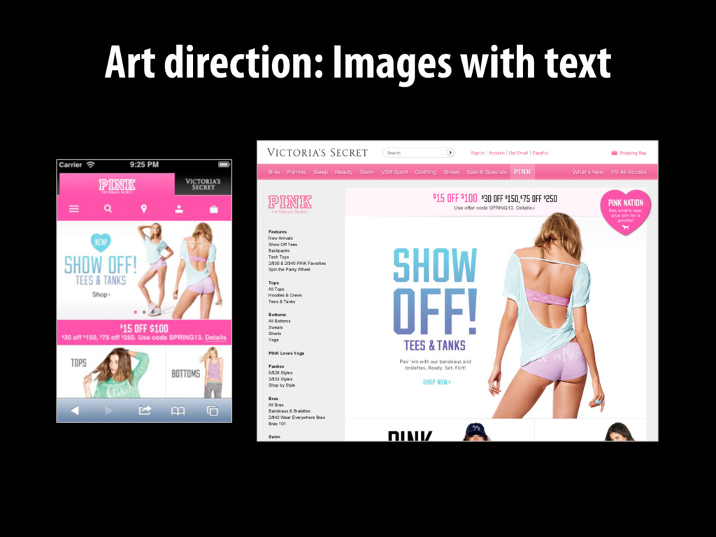
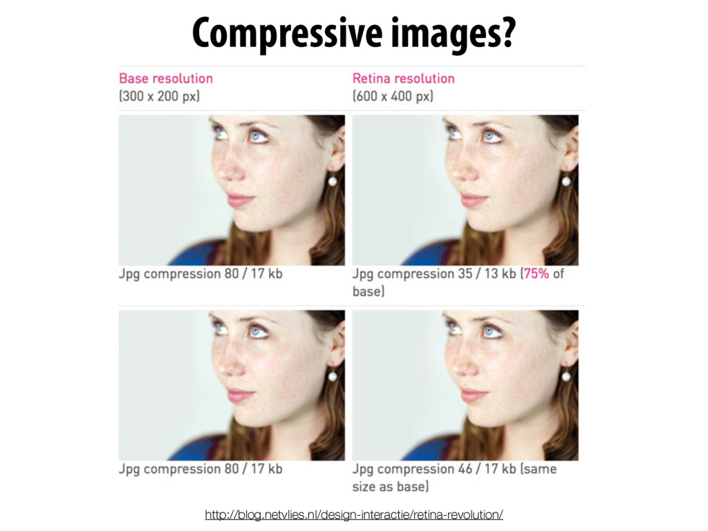
Mobile first and responsive web design aren’t simply two great tastes that go great together—they represent far more than that. Mobile first responsive web design is the responsible way to build responsive design—the best way to create something that is both responsive from a layout and a performance perspective. But if mobile first is the right way to approach responsive design, then why are so few people doing it? Dig into why mobile first responsive design matters, and the techniques needed to make it work.

Jason Grigsby

October 27, 2014
Tweet

More Decks by Jason Grigsby

Other Decks in Technology

Transcript

  1. And yet the one question I frequently ask myself is…

    http://www.flickr.com/photos/omcoc/6751047205
  2. 80% during misc downtime 76% while waiting in lines 86%

    while watching TV 69% for point of sale research http://www.flickr.com/photos/carbonnyc/5140154965
  3. TMI

  4. Log In Subscribe Basket Contact Us i am looking for...

    67% of consumers cite slow websites as the main cause of basket abandonment Daily Pulse Newsletter Get our free Daily Pulse Newsletter to keep informed about the latest news and insights in Digital Marketing. Register for our free Daily Pulse ADVERTISE HERE » by David Moth 06 December 2012 11:40 8 comments Print Tweet Tweet 236 3 Everyone hates slow loading websites, and a new survey highlights just how damaging a slow site can be to the user experience. The study by Brand Perfect found that two thirds of UK consumers (67%) cite slow loading times as the main reason they would abandon an online purchase. It’s a topic we’ve looked at in more detail in our post 'Site speed: case studies, tips and tools for improving your conversion rate', with stats showing that slow loading websites are losing businesses up to £1.73bn a year. Privacy and cookie policy Home / Blog Subscribe Reports Training Events Jobs Blog More Browse by topic Like 14 Share Share 20 Slow sites mean real dollars are lost.
  5. 34.7K 8.1K 26.6K 76.6% 39.0K 8.4K 30.6K 78.4% 30.5K 6.7K

    23.8K 78.0% Original Resized K Saved % Saved 43.4K 8.2K 35.2K 81.1% 26.0K 6.6K 19.4K 74.6% 34.7K 7.8K 26.9K 77.5% Original Resized K Saved % Saved
  6. 34.7K 8.1K 26.6K 76.6% 39.0K 8.4K 30.6K 78.4% 30.5K 6.7K

    23.8K 78.0% Original Resized K Saved % Saved 43.4K 8.2K 35.2K 81.1% 26.0K 6.6K 19.4K 74.6% 34.7K 7.8K 26.9K 77.5% Original Resized K Saved % Saved
  7. 34.7K 8.1K 26.6K 76.6% 39.0K 8.4K 30.6K 78.4% 30.5K 6.7K

    23.8K 78.0% Original Resized K Saved % Saved 43.4K 8.2K 35.2K 81.1% 26.0K 6.6K 19.4K 74.6% 34.7K 7.8K 26.9K 77.5% Original Resized K Saved % Saved Original Resized K Saved % Saved Total 208.3K 45.8K 162.5K 78.0%
  8. 9% 4% 21% 38% 4% 25% Mobile is Larger Same

    Size Less than 10% Savings 11 to 50% Savings 51% to 100% Savings Greater than 100% Savings Where are the Mobile First RWDs? 106 sites from mediaqueri.es tested http://blog.cloudfour.com/where-are-the-mobile-first-responsive-web-designs/
  9. Being Responsive from a layout perspective should not preclude us

    from being responsive from a performance and interaction perspective. —Scott Jehl “ https://twitter.com/scottjehl/status/243025352069349377
  10. Mobile First Design Principles Mobile First Responsive Design Forwarded by

    Luke Wroblewski Technical Approach for Responsive Design
  11. *

  12. Lines between device classes are blurring Model Type Size Size

    Display Resolution Resolution Viewport Viewport W H W H W H Samsung Galaxy Note 2 Phone 3.17” 5.95” 5.5” 720 1280 360 640 Motorola RAZR HD Phone 2.67” 5.19” 4.7” 720 1280 360 519 Motorola Atrix HD Phone 2.75” 5.26” 4.5” 720 1280 540 812 HTC Droid DNA Phone 2.78” 5.5” 5” 1080 1920 360 640 Nexus 7 Tablet 4.72” 7.81” 7” 800 1280 600 793 Kindle Fire Tablet 4.72” 7.44” 7” 600 1024 600 819 Kindle Fire HD Tablet 5.4” 7.6” 7” 800 1280 533 731
  13. 640 px 600 px 519 px 640 px 622 px

    533 px 812 px Which are phones and which are tablets?
  14. iPad, iPad Mini, iPad Air x 480 320 x 568

    320 x 667 375 x 736 414 x 768 1024 iPhone - iPhone 4s iPhone 5 iPhone 5c iPhone 5s iPhone 6 iPhone 6 Plus Even iOS is now a continuum.
  15. iPad, iPad Mini, iPad Air 480 320 568 320 667

    375 736 414 768 1024 iPhone - iPhone 4s iPhone 5 iPhone 5c iPhone 5s iPhone 6 iPhone 6 Plus Even iOS is now a continuum.
  16. iPad, iPad Mini, iPad Air 480 320 568 320 667

    375 736 414 768 1024 iPhone - iPhone 4s iPhone 5 iPhone 5c iPhone 5s iPhone 6 iPhone 6 Plus Even iOS is now a continuum.
  17. iPad, iPad Mini, iPad Air 480 320 568 320 667

    375 736 414 768 1024 iPhone - iPhone 4s iPhone 5 iPhone 5c iPhone 5s iPhone 6 iPhone 6 Plus Even iOS is now a continuum.
  18. iPad, iPad Mini, iPad Air 480 320 568 320 667

    375 736 414 768 1024 iPhone - iPhone 4s iPhone 5 iPhone 5c iPhone 5s iPhone 6 iPhone 6 Plus Even iOS is now a continuum.
  19. iPad, iPad Mini, iPad Air 480 320 568 320 667

    375 736 414 768 1024 iPhone - iPhone 4s iPhone 5 iPhone 5c iPhone 5s iPhone 6 iPhone 6 Plus Even iOS is now a continuum.
  20. iPad, iPad Mini, iPad Air 480 320 568 320 667

    375 736 414 768 1024 iPhone - iPhone 4s iPhone 5 iPhone 5c iPhone 5s iPhone 6 iPhone 6 Plus Even iOS is now a continuum.
  21. iPad, iPad Mini, iPad Air 480 320 568 667 375

    736 414 768 1024 iPhone - iPhone 4s iPhone 5 iPhone 5c iPhone 5s iPhone 6 iPhone 6 Plus Even iOS is now a continuum.
  22. iPad, iPad Mini, iPad Air 480 320 568 667 375

    736 414 768 1024 iPhone - iPhone 4s iPhone 5 iPhone 5c iPhone 5s iPhone 6 iPhone 6 Plus Even iOS is now a continuum.
  23. iPad, iPad Mini, iPad Air 480 320 568 667 375

    736 414 768 1024 iPhone - iPhone 4s iPhone 5 iPhone 5c iPhone 5s iPhone 6 iPhone 6 Plus Even iOS is now a continuum.
  24. iPad, iPad Mini, iPad Air 480 320 568 667 375

    736 414 768 1024 iPhone - iPhone 4s iPhone 5 iPhone 5c iPhone 5s iPhone 6 iPhone 6 Plus Even iOS is now a continuum.
  25. iPad, iPad Mini, iPad Air 480 320 568 667 375

    736 414 768 1024 iPhone - iPhone 4s iPhone 5 iPhone 5c iPhone 5s iPhone 6 iPhone 6 Plus Even iOS is now a continuum.
  26. iPad, iPad Mini, iPad Air 480 320 568 667 375

    736 414 768 1024 iPhone - iPhone 4s iPhone 5 iPhone 5c iPhone 5s iPhone 6 iPhone 6 Plus Even iOS is now a continuum.
  27. iPad, iPad Mini, iPad Air 480 320 568 667 375

    736 414 768 1024 iPhone - iPhone 4s iPhone 5 iPhone 5c iPhone 5s iPhone 6 iPhone 6 Plus Even iOS is now a continuum.
  28. iPad, iPad Mini, iPad Air 480 320 568 667 375

    736 414 768 1024 iPhone - iPhone 4s iPhone 5 iPhone 5c iPhone 5s iPhone 6 iPhone 6 Plus Even iOS is now a continuum.
  29. iPad, iPad Mini, iPad Air 480 320 568 667 375

    736 414 768 1024 iPhone - iPhone 4s iPhone 5 iPhone 5c iPhone 5s iPhone 6 iPhone 6 Plus Even iOS is now a continuum.
  30. iPad, iPad Mini, iPad Air 480 320 568 667 375

    736 414 768 1024 iPhone - iPhone 4s iPhone 5 iPhone 5c iPhone 5s iPhone 6 iPhone 6 Plus Even iOS is now a continuum.
  31. iPad, iPad Mini, iPad Air 480 320 568 667 375

    736 414 768 1024 iPhone - iPhone 4s iPhone 5 iPhone 5c iPhone 5s iPhone 6 iPhone 6 Plus Even iOS is now a continuum.
  32. iPad, iPad Mini, iPad Air 480 320 568 667 375

    736 414 768 1024 iPhone - iPhone 4s iPhone 5 iPhone 5c iPhone 5s iPhone 6 iPhone 6 Plus Even iOS is now a continuum.
  33. iPad, iPad Mini, iPad Air 480 320 568 667 375

    736 414 768 1024 iPhone - iPhone 4s iPhone 5 iPhone 5c iPhone 5s iPhone 6 iPhone 6 Plus Even iOS is now a continuum.
  34. iPad, iPad Mini, iPad Air 480 320 568 667 375

    736 414 768 1024 iPhone - iPhone 4s iPhone 5 iPhone 5c iPhone 5s iPhone 6 iPhone 6 Plus Even iOS is now a continuum.
  35. iPad, iPad Mini, iPad Air 480 320 568 667 375

    736 414 768 1024 iPhone - iPhone 4s iPhone 5 iPhone 5c iPhone 5s iPhone 6 iPhone 6 Plus Even iOS is now a continuum.
  36. iPad, iPad Mini, iPad Air 480 320 568 667 375

    736 414 768 1024 iPhone - iPhone 4s iPhone 5 iPhone 5c iPhone 5s iPhone 6 iPhone 6 Plus Even iOS is now a continuum. The Magic 32 pixels
  37. Frequent concern for this project: How something will scale to

    desktop. Actual times this has been a problem when mobile has been solid already: 0
  38. Small screen assets Large screen assets Progressive enhancement based on

    screen size Mobile First Responsive Web Design is a technical approach for responsive designs.
  39. /* Baseline styles (e.g., reset, typography, colors) */ [Baseline rules

    here] /* Desktop layout styles */ [Desktop rules here] /* Mobile (small screen) styles */ @media screen and (max-width: 480px) { [Mobile layout rules here] } Typical Desktop First Responsive CSS Likely the original CSS. Added for mobile.
  40. /* Baseline styles (e.g., reset, typography, colors) */ [Baseline rules

    here] /* Desktop layout styles */ [Desktop rules here] /* Mobile (small screen) styles */ @media screen and (max-width: 480px) { [Mobile layout rules here] }
  41. /* Baseline styles (e.g., reset, typography, colors) */ [Baseline rules

    here] /* Desktop layout styles */ [Desktop rules here] /* Mobile (small screen) styles */ @media screen and (max-width: 480px) { [Mobile layout rules here] }
  42. /* Baseline styles (e.g., reset, typography, colors) */ [Baseline rules

    here] /* Desktop layout styles */ [Desktop rules here] /* Mobile (small screen) styles */ @media screen and (max-width: 480px) { [Mobile layout rules here] } Reorder CSS to Make it Mobile First
  43. /* Mobile (small screen) styles */ @media screen and (max-width:

    480px) { [Mobile layout rules here] } /* Baseline styles (e.g., reset, typography, colors) */ [Baseline rules here] /* Desktop layout styles */ [Desktop rules here] Reorder CSS to Make it Mobile First
  44. /* Mobile (small screen) styles */ @media screen and (max-width:

    480px) { [Mobile layout rules here] } /* Baseline styles (e.g., reset, typography, colors) */ [Baseline rules here] /* Desktop layout styles */ [Desktop rules here]
  45. /* Mobile (small screen) styles */ @media screen and (max-width:

    480px) { [Mobile layout rules here] } /* Baseline styles (e.g., reset, typography, colors) */ [Baseline rules here] /* Desktop layout styles */ [Desktop rules here]
  46. /* Mobile (small screen) styles */ @media screen and (max-width:

    480px) { [Mobile layout rules here] } /* Baseline styles (e.g., reset, typography, colors) */ [Baseline rules here] /* Desktop layout styles */ Add wide screen media query [Desktop rules here]
  47. /* Desktop layout styles */ /* Mobile (small screen) styles

    */ @media screen and (max-width: 480px) { [Mobile layout rules here] } /* Baseline styles (e.g., reset, typography, colors) */ [Baseline rules here] Add wide screen media query [Desktop rules here]
  48. /* Desktop layout styles */ /* Mobile (small screen) styles

    */ @media screen and (max-width: 480px) { [Mobile layout rules here] } /* Baseline styles (e.g., reset, typography, colors) */ [Baseline rules here] Add wide screen media query [Desktop rules here] @media screen and (min-width: 481px) {
  49. /* Desktop layout styles */ /* Mobile (small screen) styles

    */ @media screen and (max-width: 480px) { [Mobile layout rules here] } /* Baseline styles (e.g., reset, typography, colors) */ [Baseline rules here] Add wide screen media query [Desktop rules here] @media screen and (min-width: 481px) {
  50. /* Desktop layout styles */ /* Mobile (small screen) styles

    */ @media screen and (max-width: 480px) { [Mobile layout rules here] } /* Baseline styles (e.g., reset, typography, colors) */ [Baseline rules here] Add wide screen media query [Desktop rules here] @media screen and (min-width: 481px) { } The cascade is working for us: small to large.
  51. /* Desktop layout styles */ /* Mobile (small screen) styles

    */ @media screen and (max-width: 480px) { [Mobile layout rules here] } /* Baseline styles (e.g., reset, typography, colors) */ [Baseline rules here] [Desktop rules here] @media screen and (min-width: 481px) { }
  52. /* Baseline styles (e.g., reset, typography, colors) */ [Baseline rules

    here] /* Desktop layout styles */ /* Mobile (small screen) styles */ @media screen and (max-width: 480px) { [Mobile layout rules here] } [Desktop rules here] @media screen and (min-width: 481px) { }
  53. /* Baseline styles (e.g., reset, typography, colors) */ [Baseline rules

    here] /* Desktop layout styles */ /* Mobile (small screen) styles */ @media screen and (max-width: 480px) { [Mobile layout rules here] } [Desktop rules here] @media screen and (min-width: 481px) { } /* Baseline styles (e.g., reset, typography, colors) */ [Baseline rules here] Important to keep basic styles outside of media queries.
  54. The absence of support for media queries is in fact

    the first media query. —Bryan Rieger, Yiibu “
  55. Mobile First RWD = Fallback for browsers w/o media queries

    Mobile Fallback (More accurately, a baseline fallback)
  56. IE conditional comments <link rel="stylesheet" type="text/css" href="styles.css"> <link rel="stylesheet" type="text/css"

    href="layout.css" media="all and (min-width: 481px)"> <!--[if (lt IE 9) & (!IEMobile)]> <link rel="stylesheet" type="text/css" href="layout.css" media="all"> <!--[endif]-->
  57. IE conditional comments <link rel="stylesheet" type="text/css" href="styles.css"> <link rel="stylesheet" type="text/css"

    href="layout.css" media="all and (min-width: 481px)"> <!--[if (lt IE 9) & (!IEMobile)]> <link rel="stylesheet" type="text/css" href="layout.css" media="all"> <!--[endif]--> or use Respond.js (a media query polyfill for IE)
  58. @media screen and (max-width: 550px) { #content .homepage_background { display:

    none; } } Images with display:none are still downloaded
  59. @media screen and (max-width: 550px) { #content .homepage_background { display:

    none; } } Images with display:none are still downloaded downloaded and never displayed! 185K
  60. <div id="test5"></div> @media all and (min-width: 601px) { #test5 {

    background-image:url('images/test5-desktop.png'); width:200px; height:75px; } } @media all and (max-width: 600px) { #test5 { background-image:url('images/test5-mobile.png'); width:200px; height:75px; } } #1: Images scoped within media queries http://timkadlec.com/2012/04/media-query-asset-downloading-results/ Only one rule can apply at any time.
  61. http://timkadlec.com/2012/04/media-query-asset-downloading-results/ <div id="test3"> <div></div> </div> #test3 div { background-image:url('images/test3.png'); width:200px;

    height:75px; } @media all and (max-width: 600px) { #test3 { display:none; } } #2: display:none on parent element
  62. http://timkadlec.com/2012/04/media-query-asset-downloading-results/ <div id="test3"> <div></div> </div> #test3 div { background-image:url('images/test3.png'); width:200px;

    height:75px; } @media all and (max-width: 600px) { #test3 { display:none; } } #2: display:none on parent element Why have extra markup in the DOM?
  63. http://timkadlec.com/2012/04/media-query-asset-downloading-results/ <div id="test4"></div> #test4 { background-image:url('images/test4-desktop.png'); width:200px; height:75px; } @media

    all and (max-width: 600px) { #test4 { background-image:url('images/test4-mobile.png'); } } #3: Image override with a media query
  64. http://timkadlec.com/2012/04/media-query-asset-downloading-results/ <div id="test4"></div> #test4 { background-image:url('images/test4-desktop.png'); width:200px; height:75px; } @media

    all and (max-width: 600px) { #test4 { background-image:url('images/test4-mobile.png'); } } #3: Image override with a media query
  65. <div id="map-holder"> <div id="map"></div> </div> @media all and (min-width: 768px)

    { #map-holder, #map-logo { display: block; } } <script type="text/javascript" src="http://maps.googleapis.com/maps/api/js…"> </script> <script> [Maps JavaScript here] </script>
  66. <div id="map-holder"> <div id="map"></div> </div> @media all and (min-width: 768px)

    { #map-holder, #map-logo { display: block; } } <script type="text/javascript" src="http://maps.googleapis.com/maps/api/js…"> </script> <script> [Maps JavaScript here] </script>
  67. <div id="map-holder"> <div id="map"></div> </div> @media all and (min-width: 768px)

    { #map-holder, #map-logo { display: block; } } <script type="text/javascript" src="http://maps.googleapis.com/maps/api/js…"> </script> <script> [Maps JavaScript here] </script> Hiding content with display:none does not prevent it from downloading.
  68. if (matchMedia('only screen and (max-width: 480px)').matches) { // small-screen related

    dom scripting } Use matchMedia() JS to test media query matchMedia() polyfill for older browsers: https://github.com/paulirish/matchMedia.js
  69. Behavioral Breakpoints <div id="menu-trigger">Menu</div> @media screen and (min-width: 40em) {

    #menu-trigger { display : none; } } switch (display) { case 'block': menu.on(); break; case 'none': menu.off(); break; }
  70. Behavioral Breakpoints <div id="menu-trigger">Menu</div> @media screen and (min-width: 40em) {

    #menu-trigger { display : none; } } switch (display) { case 'block': menu.on(); break; case 'none': menu.off(); break; }
  71. Behavioral Breakpoints <div id="menu-trigger">Menu</div> @media screen and (min-width: 40em) {

    #menu-trigger { display : none; } } switch (display) { case 'block': menu.on(); break; case 'none': menu.off(); break; } Breakpoints only in your CSS. Not repeated in JavaScript. http://cloudfour.github.io/offCanvasMenu/ http://blog.cloudfour.com/behavioral-breakpoints/
  72. Art direction: Images with text Sign In Account Get Email

    Español Shopping Bag Features New Arrivals Show Off Tees Backpacks Tech Toys 2/$30 & 2/$40 PINK Favorites Spin the Panty Wheel Tops All Tops Hoodies & Crews Tees & Tanks Bottoms All Bottoms Sweats Shorts Yoga PINK Loves Yoga Panties 5/$26 Styles 3/$33 Styles Shop by Style Bras All Bras Bandeaus & Bralettes 2/$42 Wear Everywhere Bras Bras 101 Swim Search
  73. <picture> <source media="(min-width: 45em)" srcset="large.jpg"> <source media="(min-width: 18em)" srcset="med.jpg"> <img

    src="small.jpg" alt="The president giving an award."> </picture> The picture element
  74. Srcset and Sizes This is what you should use 75%

    of the time! http://blog.cloudfour.com/dont-use-picture-most-of-the-time/
  75. Srcset and Sizes <img src="small.jpg" srcset="large.jpg 1024w, medium.jpg 640w, small.jpg

    320w" sizes="(min-width: 36em) 33.3%, 100%" alt="A rad wolf" /> Picture standard does not require you to use the picture element. This is what you should use 75% of the time! http://blog.cloudfour.com/dont-use-picture-most-of-the-time/
  76. Picturefill Picturefill A responsive image polyfill Download Getting Started Examples

    API Browser support Contributing The picture element and associated features are W3C standard HTML features that allow web developers to deliver an appropriate image to every user depending on a variety of conditions like screen size, viewport size, screen resolution, and more. Picturefill is a JavaScript file (or a polyfill to be more specific) that enables support for the picture element and associated features in browsers that do not yet support them, so you can start using them today! Picturefill is developed and maintained by , with help from the members of the Responsive Images Community Group and the developer community at large. For Picturefill version 2, a special thanks goes to Shawn Jansepar for all his work on polyfilling the new spec. Contributing, Bug Reports, and More information For more information on the development of Picturefill, and how you can file bugs or contribute fixes, check out the the code project site on Github : Picturefill on Github. Downloading Picturefill Downloading Picturefill Picturefill Version 2.0.0 http://scottjehl.github.io/picturefill/
  77. 0 500000 1000000 1500000 2000000 Blackberry Curve iPhone iPhone Retina

    Macbook Macbook Retina 1861632 465408 519360 130080 57920 320x181 480x271 960x541 909x512 1818x1024 Image Resolution
  78. 0 500000 1000000 1500000 2000000 Blackberry Curve iPhone iPhone Retina

    Macbook Macbook Retina 1861632 465408 519360 130080 57920 320x181 480x271 960x541 909x512 1818x1024 Image Resolution 32x bigger
  79. @media screen and (-webkit-device-pixel-ratio: 1) { /* Image for normal

    displays. */ #main { background-image: url(dog.jpg); } } @media screen and (-webkit-min-device-pixel-ratio: 2) { /* Image for high resolution displays. */ #main { background-image: (dog-hi-res.jpg); } } If possible, use CSS for now
  80. A Compendium of SVG Information Published*July*22,*2014*by*Chris*Coyier CSS-TRICKS Grow your CSS

    skills. * THE LODGE A*huge*pile*of*information*about SVG. How to Use SVG These*are*overview*articles covering*lots*of*stuff*relating*to SVG.*Why*to*use*it*and*the*basics of*how*to*use*it.*Mostly:* ,* ,* , <img> background-image <svg> ™ Learn*HTML,*CSS,*and*how*to*build iPhone*apps*at*Treehouse.*Their library*of*over*1,000*current*training FORUMS SNIPPETS ALMANAC VIDEOS BLOG http://css-tricks.com/mega-list-svg-information/
  81. /' // . // |\//7 /' " \ . |

    ( \ _ _ - -_ | '._ ' _ __ _- \_ _/ \'-' // \\_/ \\ | | || | / / | \ / |VV ||--\__________/-||-/| || || || || { } { } { }{ } . . Drag & Drop ur SVGs on the Grumpicon plz. What Is This Issues? Grumpicon.com based on Grunticon
  82. <svg xmlns="http://www.w3.org/2000/svg" xmlns:xlink="http://www.w3.org/1999/ xlink" width="400" height="400"> <g> <title>Simple SVG +

    mediaqueries</title> <defs> <style type="text/css"> #circle { fill: #fce57e; stroke: #fff; stroke-width: 100px; stroke-opacity: 0.5; fill-opacity: 1; } @media screen and (max-width: 350px) { #circle { fill: #879758; } } @media screen and (max-width: 200px) { #circle { fill: #3b9557; } } @media screen and (max-width: 100px) { #circle { fill: #d8f935; } } @media screen and (max-width: 50px) { #circle { fill: #a8c45f; } } @media screen and (max-width: 25px) { #circle { fill: #2c3c0c; } } </style> </defs> <circle cx="200" cy="200" r="150" id="circle" /> </g> </svg>
  83. Example from Sencha IO SRC. Define height, width or both.

    <img src="http://src.sencha.io/320/http://sencha.com/files/u.jpg" alt="My constrained image" /> #4 Images can be resized to any size with URL parameters
  84. Example from Sencha IO SRC. Define height, width or both.

    <img src="http://src.sencha.io/320/http://sencha.com/files/u.jpg" alt="My constrained image" /> #4 Images can be resized to any size with URL parameters Unique URLs are imperative to play nice with caching.
  85. #5 Provide automated output of Picture and PictureFill <picture> <source

    media="(min-width: 45em)" srcset="large.jpg"> <source media="(min-width: 18em)" srcset="med.jpg"> <img src="small.jpg" alt="The president giving an award."> </picture>
  86. { "source":"/source.jpg", "breakpoints": [ { "max-width":"30em","pixel-density":1,"width":360px }, { "max-width":"30em","pixel-density":2,"width":720px },

    { "max-width":"30em","pixel-density":1,"width":800px }, { "max-width":"30em","pixel-density":2,"width":1600px }, { "pixel-density":1,"width":800px }, { "pixel-density":2,"width":1600px }, ] } Responsive Images Markup Function Templates contain breakpoint info only.
  87. { "source":"/source.jpg", "breakpoints": [ { "max-width":"30em","pixel-density":1,"width":360px }, { "max-width":"30em","pixel-density":2,"width":720px },

    { "max-width":"30em","pixel-density":1,"width":800px }, { "max-width":"30em","pixel-density":2,"width":1600px }, { "pixel-density":1,"width":800px }, { "pixel-density":2,"width":1600px }, ] } Responsive Images Markup Function Responsive Images Markup Function Templates contain breakpoint info only. Markup for all images can be changed in one spot.
  88. { "source":"/source.jpg", "breakpoints": [ { "max-width":"30em","pixel-density":1,"width":360px }, { "max-width":"30em","pixel-density":2,"width":720px },

    { "max-width":"30em","pixel-density":1,"width":800px }, { "max-width":"30em","pixel-density":2,"width":1600px }, { "pixel-density":1,"width":800px }, { "pixel-density":2,"width":1600px }, ] } Responsive Images Markup Function Responsive Images Markup Function PictureFill Markup Templates contain breakpoint info only. Markup for all images can be changed in one spot.
  89. jpegtran or jpegoptim OptiPNG or PNGOUT far future expires headers

    learn from mod_pagespeed or use it #7 Integrate image compression best practices
  90. The average WebP file size is 25% - 34% smaller

    compared to JPEG file size. WebP compresses 34% better than libpng, and 26% better than pngout for loseless images. #8 Bonus: Detect support for WebP image format and use it
  91. Unlikely responsive design will ever be as fast as something

    crafted specifically for a device. http://www.flickr.com/photos/quarenta/3256329577
  92. Flickr: Uploaded February 11, 2007 by hawridger For most projects,

    responsive design can be fast enough to make sense…
  93. Thank You! Special thanks to Scott Jehl, Guy Podjarny, and

    all of the Flickr users sharing under creative commons.