67% of consumers cite slow websites as the main cause of basket abandonment Daily Pulse Newsletter Get our free Daily Pulse Newsletter to keep informed about the latest news and insights in Digital Marketing. Register for our free Daily Pulse ADVERTISE HERE » by David Moth 06 December 2012 11:40 8 comments Print Tweet Tweet 236 3 Everyone hates slow loading websites, and a new survey highlights just how damaging a slow site can be to the user experience. The study by Brand Perfect found that two thirds of UK consumers (67%) cite slow loading times as the main reason they would abandon an online purchase. It’s a topic we’ve looked at in more detail in our post 'Site speed: case studies, tips and tools for improving your conversion rate', with stats showing that slow loading websites are losing businesses up to £1.73bn a year. Privacy and cookie policy Home / Blog Subscribe Reports Training Events Jobs Blog More Browse by topic Like 14 Share Share 20 Slow sites mean real dollars are lost.
Size Less than 10% Savings 11 to 50% Savings 51% to 100% Savings Greater than 100% Savings Where are the Mobile First RWDs? 106 sites from mediaqueri.es tested http://blog.cloudfour.com/where-are-the-mobile-first-responsive-web-designs/
(min-width:481px) { [Desktop layout rules here] } /* Mobile/lower-resolution devices */ @media screen and (max-width:480px) { [Mobile layout rules here] } Move the mobile media query block above the desktop media query. By doing this, we’re making sure the cascading effect of CSS is consistent with our mobile first progressive enhancement approach. Reorder media queries so cascade goes from small to large screens Keep basic styles outside of media queries.
and (min-width: 481px)"> <!--[if (lt IE 9)&(!IEMobile)]> <link rel="stylesheet" type="text/css" href="layout.css" media="all" /> <![endif]--> The conditional comment repeats the line above it ensuring desktop IE sees our layout.css file. IE conditional comments or use Respond.js (a media query polyfill for IE)
width:200px; height:75px; } @media all and (max-‐width: 600px) { #test4 { background-‐image:url('images/ test4-‐mobile.png'); } } Image override with a media query
} There are many more rules in the css file. The iframe has an id of map. This rule hides the Google Maps iframe by setting the display to none. Hiding content with display:none does not prevent it from downloading. <iframe id="map" width="300" height="300" frameborder="0" scrolling="no" marginheight="0" marginwidth="0" src="http://maps.google.com..."></iframe> Extremely long URL abbreviated This single iframe causes 47 files to be downloaded!
data-‐media="(min-‐width: 30em)"> Latest Articles </a> AJAX Include Pattern https://github.com/filamentgroup/Ajax-Include-Pattern/ Use AJAX to bring more content into the page as the viewport width gets bigger
There are 16 beer labels on the On Tap Now page that use an img tag like this one for the Bensons Bubbler. Despite the need for multiple versions of this image depending on the screen size, HTML only allows one value for the src.
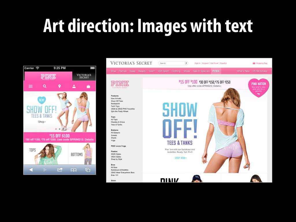
Español Shopping Bag Features New Arrivals Show Off Tees Backpacks Tech Toys 2/$30 & 2/$40 PINK Favorites Spin the Panty Wheel Tops All Tops Hoodies & Crews Tees & Tanks Bottoms All Bottoms Sweats Shorts Yoga PINK Loves Yoga Panties 5/$26 Styles 3/$33 Styles Shop by Style Bras All Bras Bandeaus & Bralettes 2/$42 Wear Everywhere Bras Bras 101 Swim Search
displays. */ #main { background-‐image: url(dog.jpg); } } @media screen and (-‐webkit-‐min-‐device-‐pixel-‐ratio: 2) { /* Image for high resolution displays. */ #main { background-‐image: (dog-‐hi-‐res.jpg); } } If possible, use CSS for now
Posted by Zach on 01/13/2014 Care must be taken when implementing icon fonts to ensure a great experience for all users. What happens when your font doesn’t load? What happens when @font-face isn’t supported in the browser? We’ll show you how to implement bulletproof font icons. In our never-ending quest to build sites more efficiently and effectively for our clients, the lowly font has been proposed many times as an option to easily implement vector icons. While we typically prefer (and recommend) using SVG for vector icons for some of the reasons Ian Feather of Lonelyplanet.com has documented in his blog post, we sometimes collaborate with other teams who have already implemented icon fonts. For those cases we decided to research how to best implement icon fonts in a universally accessible way. What we do What we've done What we're thinking Who we are
Icons Import Your Own Vectors to Make Fonts Generate Custom & Crisp Icon Fonts Generate CSS Sprites with any size or color Basic Glyph Editing 1200+ Vector Icons & Counting Handcrafted on a 16×16 grid Several Different Formats Optimized for Icon Fonts Free Updates Serve Custom-Built Fonts Powered by Amazon Web Services Easily Update Your Icon Fonts Production (Cached) Links Starting at $1.60/Month IcoMoon IcoMoon Custom Built and Crisp Icon Fonts, Done Right Home App Icon Packs Font CDN Demo Documentation Blog About
<img src="http://src.sencha.io/320/http:// sencha.com/files/u.jpg" alt="My constrained image" /> #4 Images can be resized to any size with URL parameters
in Angkor Thom, Cambodia"> <div data-‐src="small.jpg"></div> <div data-‐src="medium.jpg" data-‐media="(min-‐width: 400px)"></div> <div data-‐src="large.jpg" data-‐media="(min-‐width: 800px)"></div> <div data-‐src="extralarge.jpg" data-‐media="(min-‐width: 1000px)"></div> <!-‐-‐ Fallback content for non-‐JS browsers. -‐-‐> <noscript> <img src="small.jpg" alt="A giant stone face at The Bayon temple in Angkor Thom, Cambodia"> </noscript> </div> #5 Provide automated output of PictureFill or alternative
"max-‐width":"30em","pixel-‐density":1,"width":800px}, { "max-‐width":"30em","pixel-‐density":2,"width":1600px}, { "pixel-‐density":1,"width":800px}, { "pixel-‐density":2,"width":1600px}, ] } templates contain breakpoint information Responsive Images Markup Function Responsive Images Markup Function PictureFill Markup Sample syntax. Don’t get hung up on details. Markup for all images can be changed in one spot.
compared to JPEG file size. WebP compresses 34% better than libpng, and 26% better than pngout for loseless images. #8 Bonus: Detect support for WebP image format and use it
 grigs
grigs
 yanzm
yanzm
 fullkaiten
 ekispert_api
 jnchito
 lycorptech_jp
 yakumo
 jukishiya
 chmikata
 krrrr38
 ken6377
 jj1uzh
 murabayashi
 thoeni
 cassininazir
 greggifford
 twada
twada
 axbom
axbom
 addyosmani
 aleyda
 malarkey
 62gerente
 portentint
 eileencodes