Upgrade to Pro — share decks privately, control downloads, hide ads and more …

Responsive Web Design Process

Steve Fisher
September 29, 2012

Responsive Web Design Process

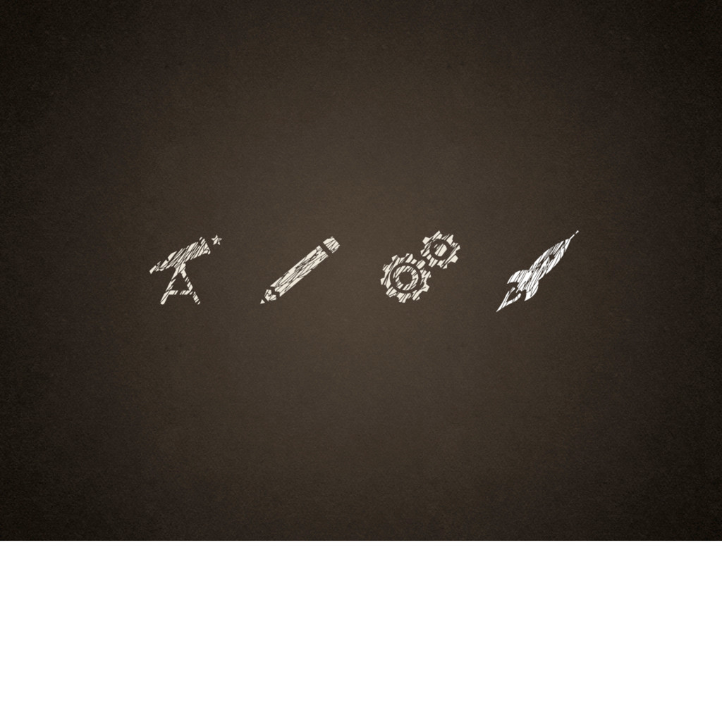
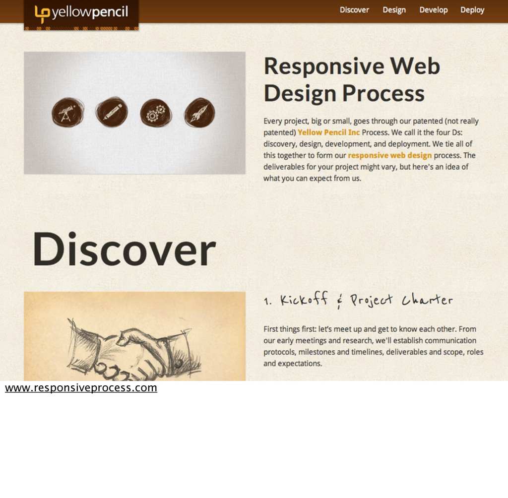
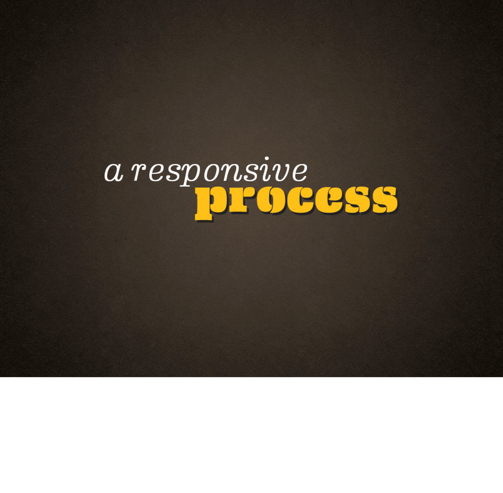
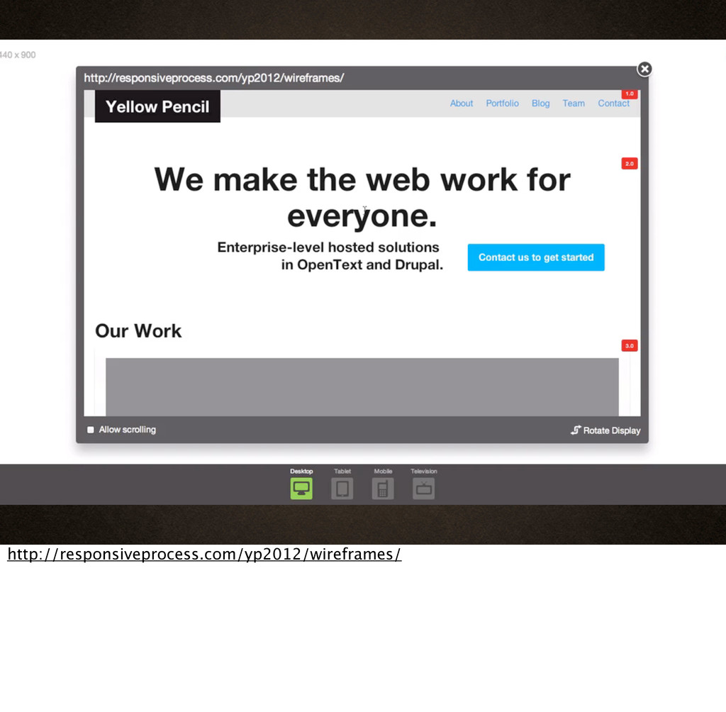
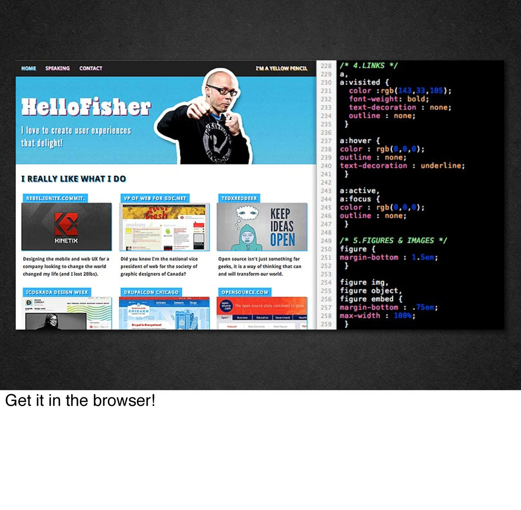
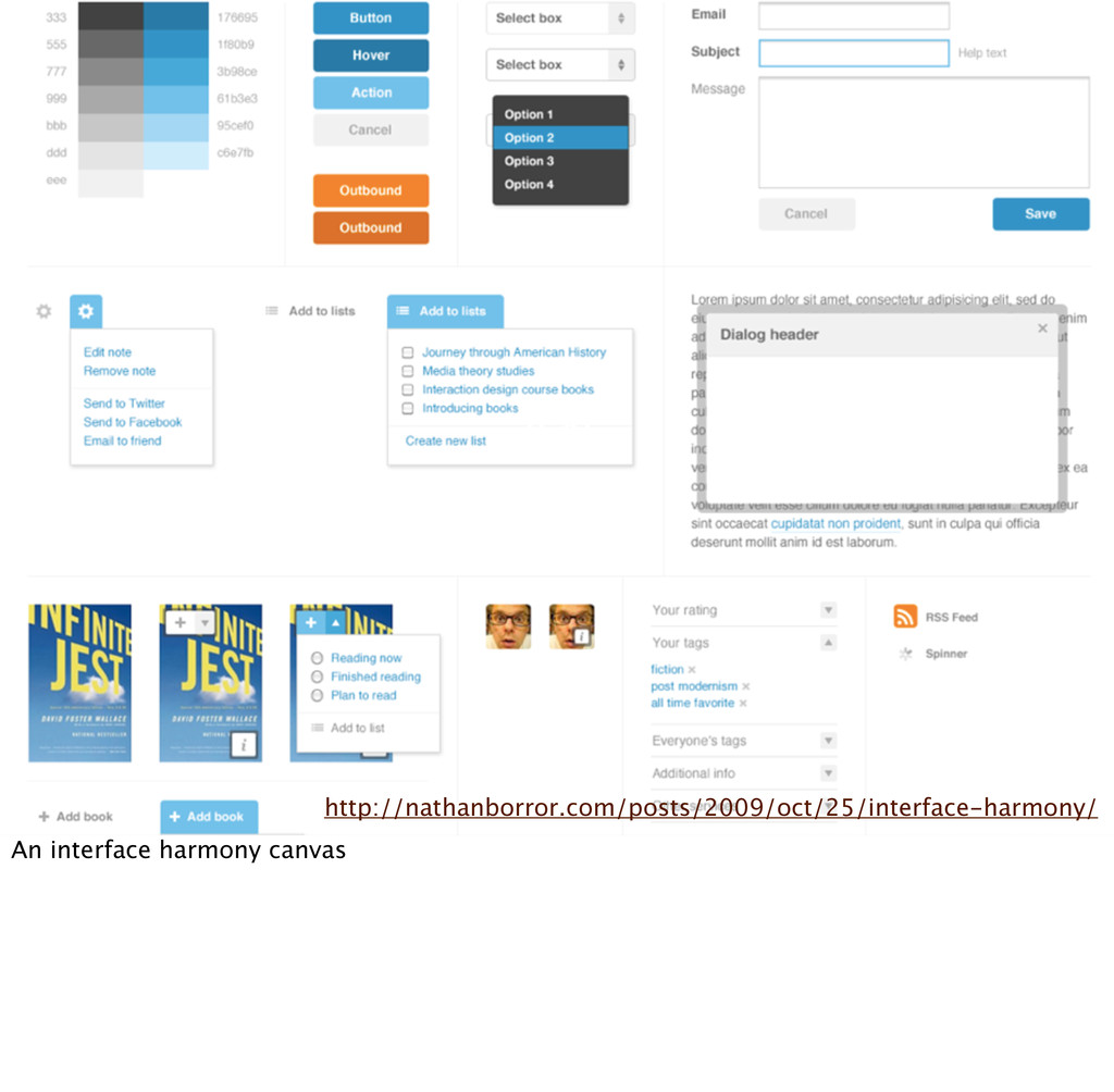
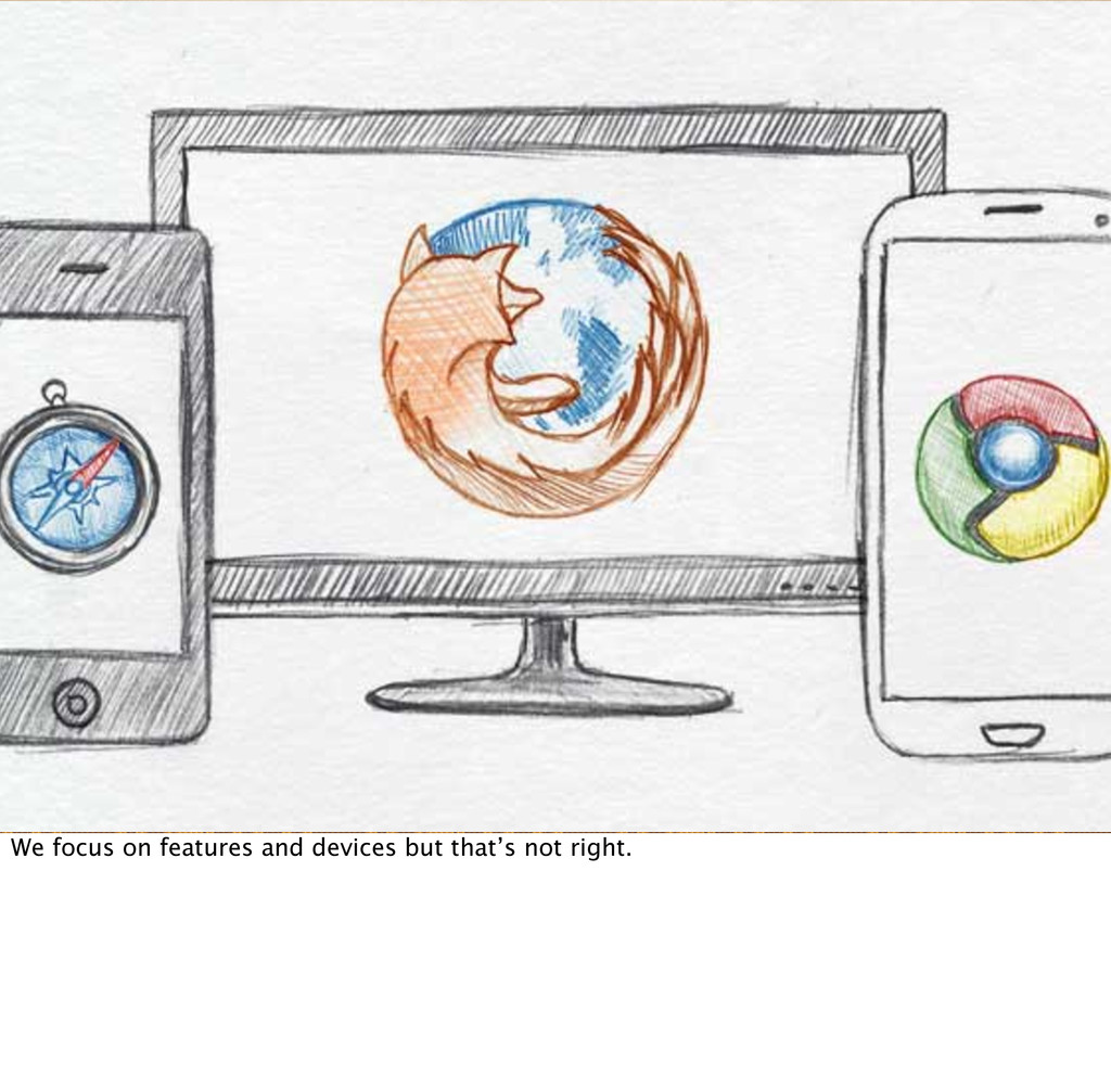
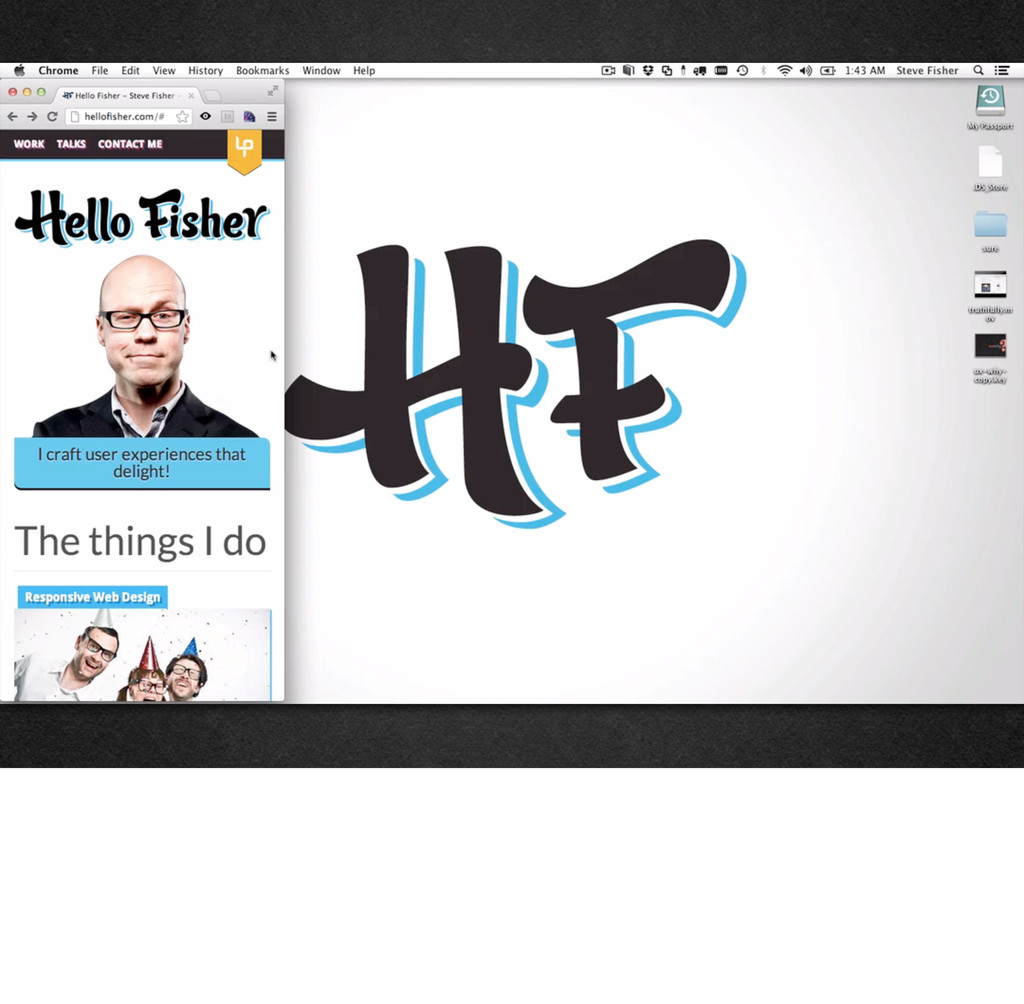
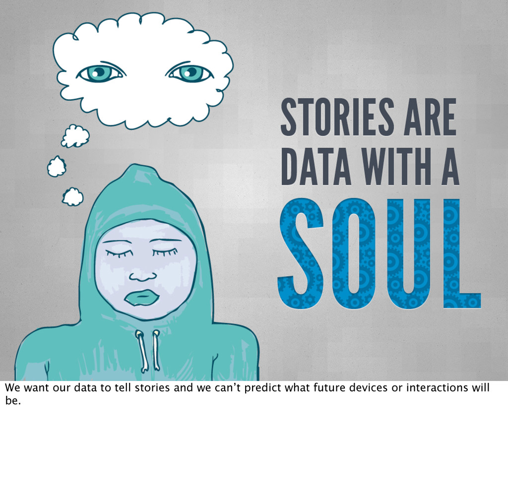
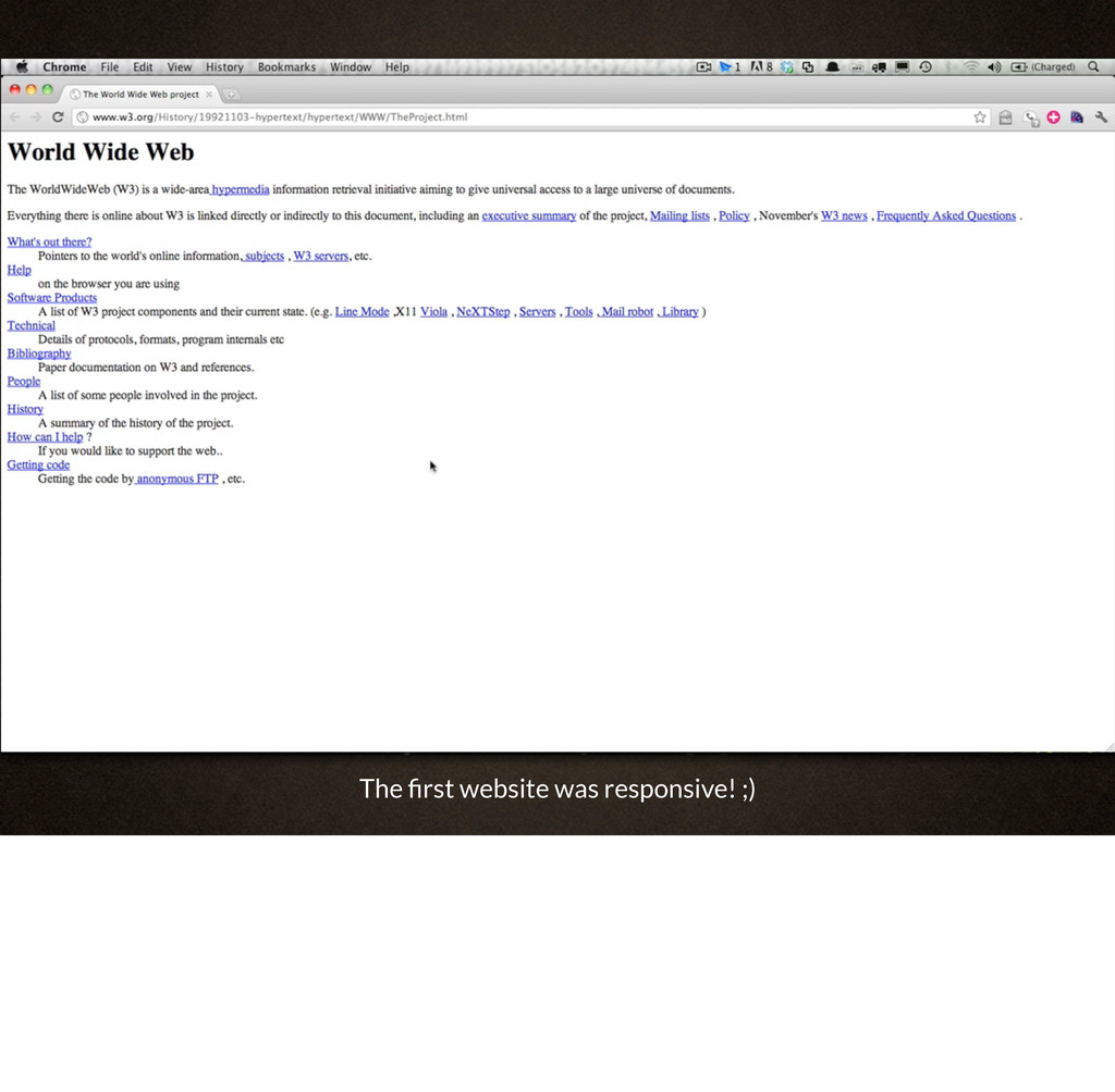
The web is not a fixed width. So if the medium is fluid, should the process be fixed? Open source evangelist Steve Fisher prefers designing within the browser, especially when responsive design is a requirement since Fireworks and Photoshop are not flexible enough to demonstrate media queries, button and menu states, HTML5 and JavaScript behaviors, dynamic resizing of elements and navigation flow.

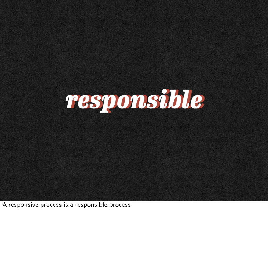
Learn how to develop a fluid process to match the fluidity of interactive design as Steve shows you why a responsive process is a responsible process. He’ll explore some of his recent work helping clients transform their processes to fit a responsive workflow and share some of the tips, techniques and processes he’s developed. One web to rule them all!

Steve Fisher

September 29, 2012
Tweet

Other Decks in Design

Transcript

  1. Web standards is not the old busted hotness. It is

    part of the new hotness of RWD.
  2. First things first: let’s meet up and get to know

    each other. From our early meetings and research, we'll establish communication protocols, milestones and timelines, deliverables and scope, roles and expectations.
  3. First things first: let’s meet up and get to know

    each other. From our early meetings and research, we'll establish communication protocols, milestones and timelines, deliverables and scope, roles and expectations.
  4. Project analysis. We will work with you to help determine

    the requirements of the project, from a technical, creative, and organizational perspective. We’ll analyze content, writing style, visual design, and interface design, and make sure we understand everything there is to know about your industry. Our project analysis will guide us in understanding where your organization has been, what it is currently doing, and where it wants to go in the future. This guides us in tailoring a solution that is effective and sustainable. We will also spend time getting to really understand your brand by analyzing past and present marketing materials, discussing future marketing strategies, and aligning them with your web project.
  5. Project Analysis We will work with you to help determine

    the requirements of the project, from a technical, creative, and organizational perspective. We’ll analyze content, writing style, visual design, and interface design, and make sure we understand everything there is to know about your industry. Our project analysis will guide us in understanding where your organization has been, what it is currently doing, and where it wants to go in the future. This guides us in tailoring a solution that is effective and sustainable. We will also spend time getting to really understand your brand by analyzing past and present marketing materials, discussing future marketing strategies, and aligning them with your web project.
  6. Using the knowledge gained from our discovery conversations, we will

    audit existing content both quantitatively and qualitatively. What exists on your current site? And, more importantly, is it doing what you need it to do? We'll create a site map for your project and show where everything belongs. This process will inform what and how we communicate, and establish the features your users need. Well-planned, well-structured content will help us create both the interaction and visual design systems.
  7. www.gathercontent.com • Quantitative audit • Qualitative audit • Card sort

    • High level site map • Gap analysis • User stories
  8. Headed down the right track. All of the information found

    during the discovery phase will be complied into a concise document that outlines the search, content, technical, and creative strategies. This document will act as the project map, keeping all team members in line with a focused strategy.
  9. We will work with you through an iterative process to

    create rough wireframes, or UX sketches, for key views. This will help establish the design system, while communicating a sense of the functionality. This is also where we decide on the break points for the responsive design.
  10. We will work with you through an iterative process to

    create rough wireframes, or UX sketches, for key views. This will help establish the design system, while communicating a sense of the functionality. This is also where we decide on the break points for the responsive design.
  11. One of our main goals is to keep content independent

    from design or presentation. Your content should never be dependent on a layout to work properly. So, along with wireframes, you will receive a set of page tables for key content pages. Page tables identify each content area in priority order, and identify the most important messages to communicate in each area.
  12. One of our main goals is to keep content independent

    from design or presentation. Your content should never be dependent on a layout to work properly. So, along with wireframes, you will receive a set of page tables for key content pages. Page tables identify each content area in priority order, and identify the most important messages to communicate in each area.
  13. Once we all agree on where we’re headed, we’ll wireframe

    and document the remaining views, with the functionalities established by the page tables and feature list. Each and every view scenario will be documented to visualize all the content and features we’ve planned. Along with that we’ll create rough greybox HTML prototypes to demonstrate responsive interaction patterns.
  14. With functionality fully documented in the wireframes, we’ll layer in

    the branding elements, colour palettes, and typography that give each site its unique look and feel. Through an iterative process between our team and yours, we’ll make all the big decisions about typographic hierarchy, vertical rhythm, and interface details. We can create static visual mockups, browser-based prototypes, or both.
  15. Next, we’ll create a styleguide that will document the design

    system so that they can be properly implemented. All the details from the grid to hover/touch states to typography styles to content messaging will be detailed. This guide will demonstrate the design thinking and personality of the system. Depending on the complexity of the site, this could be created in an interface harmony canvas.
  16. Now it’s time to get down to business and build

    HTML/CSS/JavaScript themes: functional, browser-tested, HTML pages ready for testing. We’ll make sure all content is governed by CSS and meets W3C standards. We’ll use JavaScript for interactive elements, rather than Flash or Silverlight. We’ll also help you adhere to best practices for online readability, and include a print CSS for readers that want to print out your content.
  17. At this stage, the technical architecture will be built out

    on a system like Open Text Web Site Management or Drupal 7, depending on your organization’s needs. We’ll build out all of the site’s modular elements and e-commerce components, and set up a workflow process that will help you maintain your content over the long term. This process goes hand-in-hand with the CMS Template Implementation, which will integrate the HTML templates into the design or theme layer. By the time we’re done, everything will be looking good and working great!
  18. Here's where we test and demonstrate how page templates will

    render in major web browsers and mobile devices (i.e. iPad, iPhone, Blackberry, Android, etc). It is important to understand that the design will be appropriate for each device, but may be slightly different due to device specs and experience. It’s not about making everything look the same, it’s about creating a coherent experience across all devices.
  19. Here's where we test and demonstrate how page templates will

    render in major web browsers and mobile devices (i.e. iPad, iPhone, Blackberry, Android, etc). It is important to understand that the design will be appropriate for each device, but may be slightly different due to device specs and experience. It’s not about making everything look the same, it’s about creating a coherent experience across all devices.
  20. At Yellow Pencil we love to provide support and training

    for content authors during content migration. We believe in helping our clients create and maintain useful, usable content. Depending on your organization’s needs, and our audit of your current website, we’ll help you define the scope of the content migration phase. As we all know, a website without content is a black hole of sadness. Content #FTW!
  21. At Yellow Pencil we love to provide support and training

    for content authors during content migration. We believe in helping our clients create and maintain useful, usable content. Depending on your organization’s needs, and our audit of your current website, we’ll help you define the scope of the content migration phase. As we all know, a website without content is a black hole of sadness. Content #FTW!
  22. User Acceptance Testing (UAT) helps us confirm that your new

    site meets the objectives and requirements we defined early in the project. It's like moving into a new house – you need time to discover how everything works and get comfortable with living there. You’ll need time to come to terms with how your content fits into the design and workflow, and make any adjustments and edits you need.
  23. http://youtu.be/yfDUv3ZjH2k Sometimes things don’t turn out how you think they

    will. http://youtu.be/ yfDUv3ZjH2k (that’s not exactly like 28 Days Later)
  24. Where is it being hosted? Level of support? Who will

    know about this? How will you communicate with current users?
  25. This is where the web project really starts its life.

    Celebrate the birth and plan to celebrate every milestone as it lives.
  26. Brings me to the question of what drives us? Extrinsic

    vs intrinsic. Is it a motivation 2.0 or 3.0 thing? People don’t believe in what you do, they believe in why you do it. These were just some examples. What will your aha! moment be?
  27. We need to remember that each connection on the web

    is a connection with another human. We are trying to become wholehearted
  28. This is why I love RWD. It is about helping

    people connect on the web.
  29. It is about good content. It means rethinking content creation.

    Moving from fragmentation to unification!
  30. We want our data to tell stories and we can’t

    predict what future devices or interactions will be.