Upgrade to Pro — share decks privately, control downloads, hide ads and more …

Rapid designing with Tailwind CSS

Rapid designing with Tailwind CSS

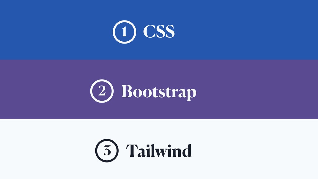
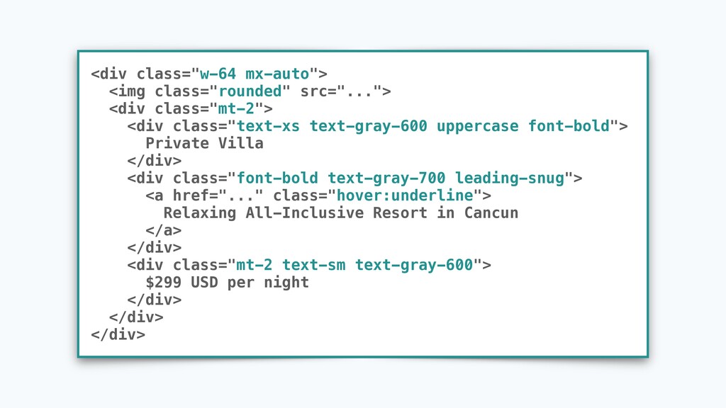
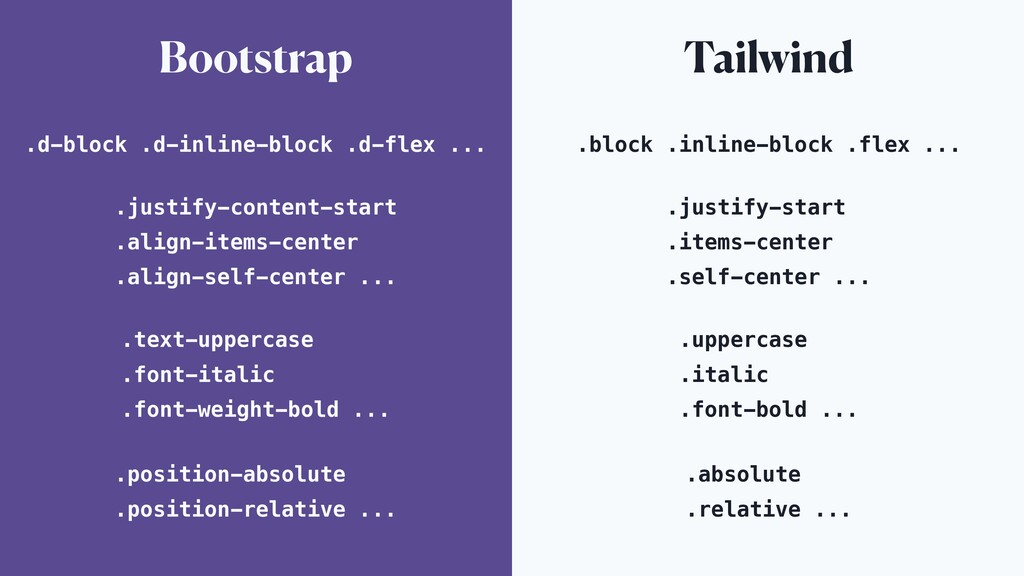
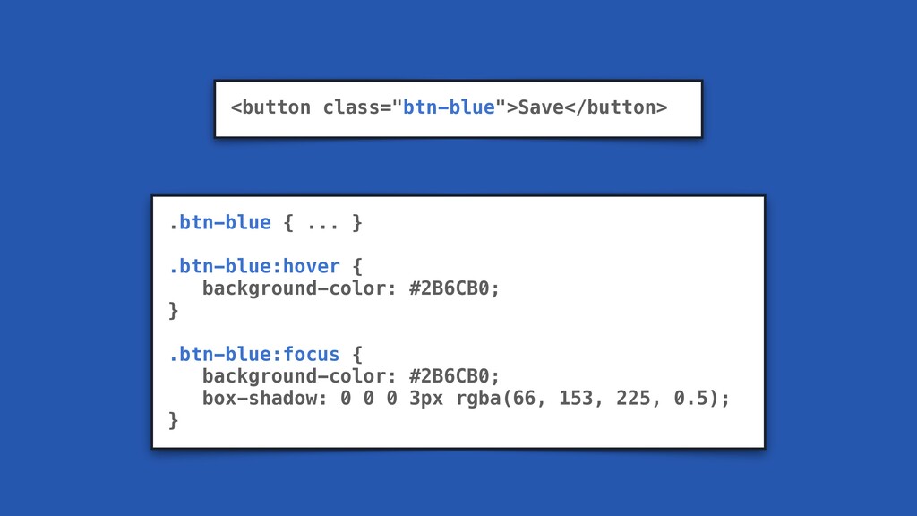
Component-focused CSS frameworks such as Bootstrap get you up and running quickly, but often lack the tools necessary for designing custom interfaces. For this people usually just use plain (S)CSS, which gets the job done but can become difficult to maintain in the long run.

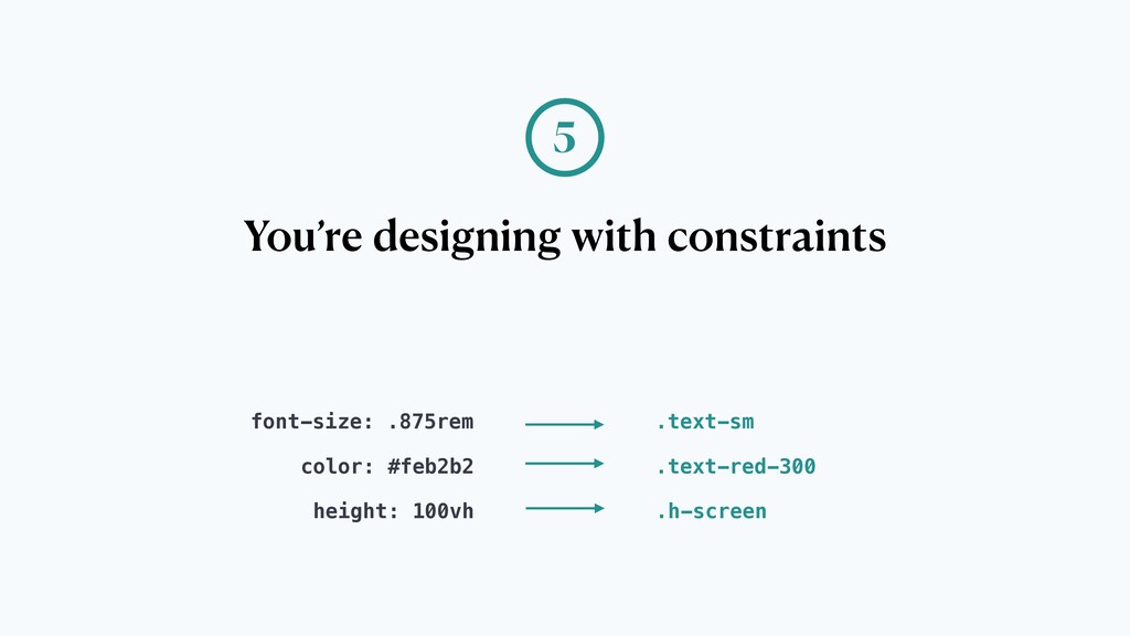
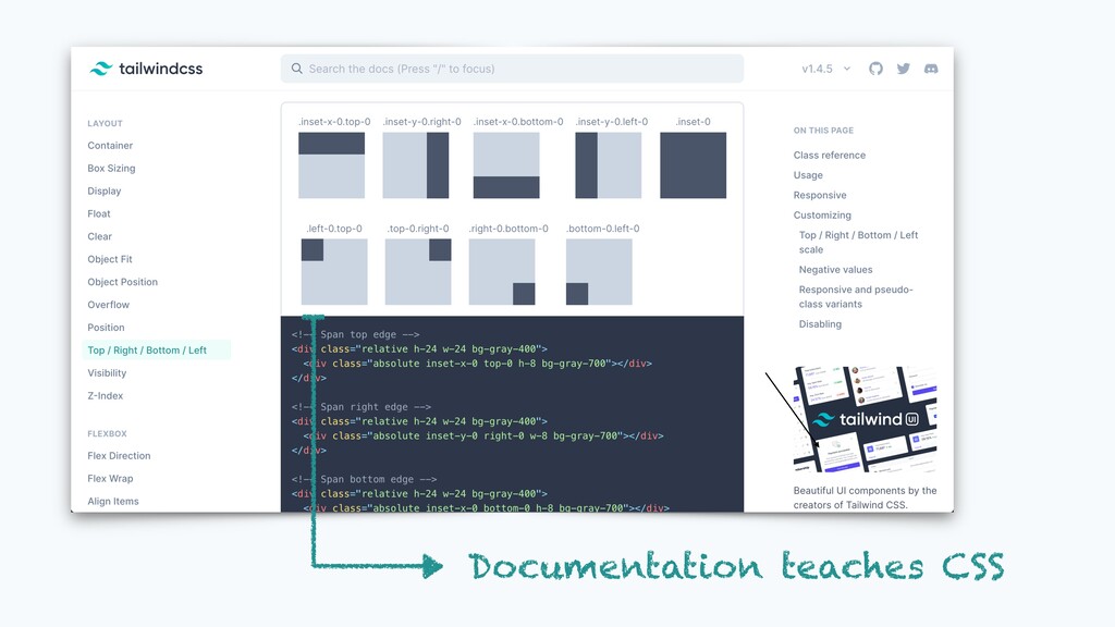
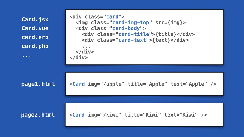
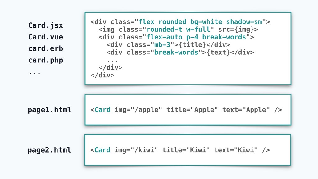
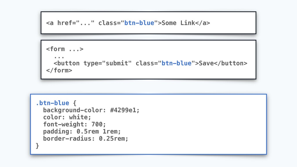
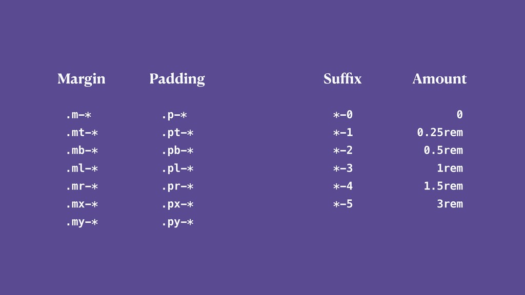
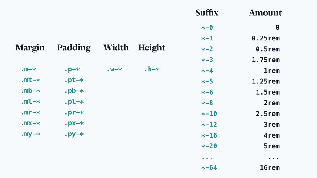
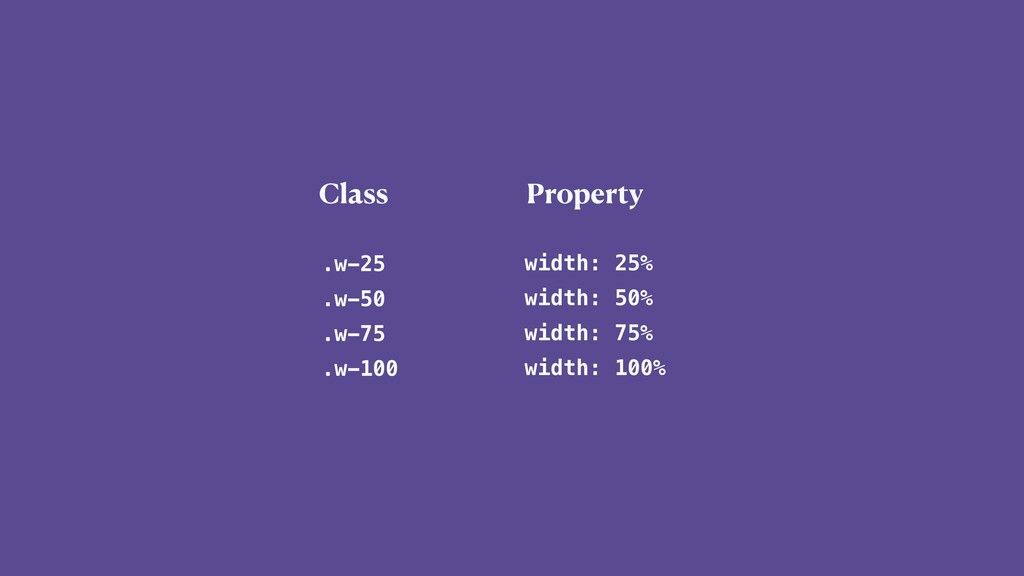
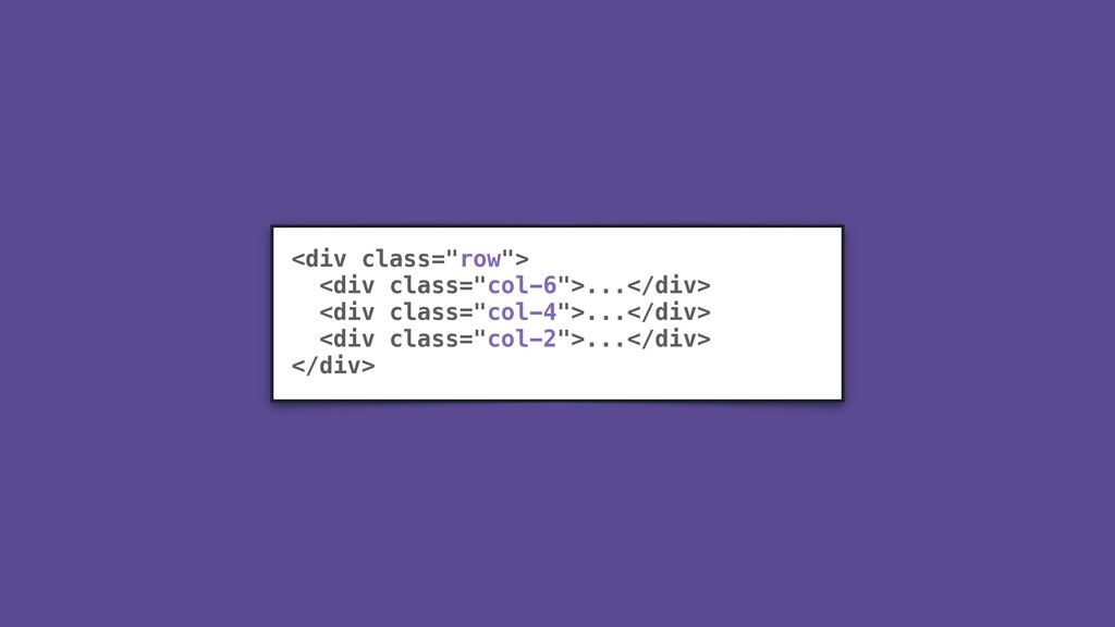
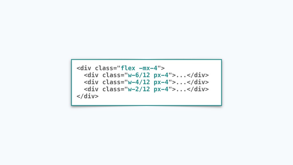
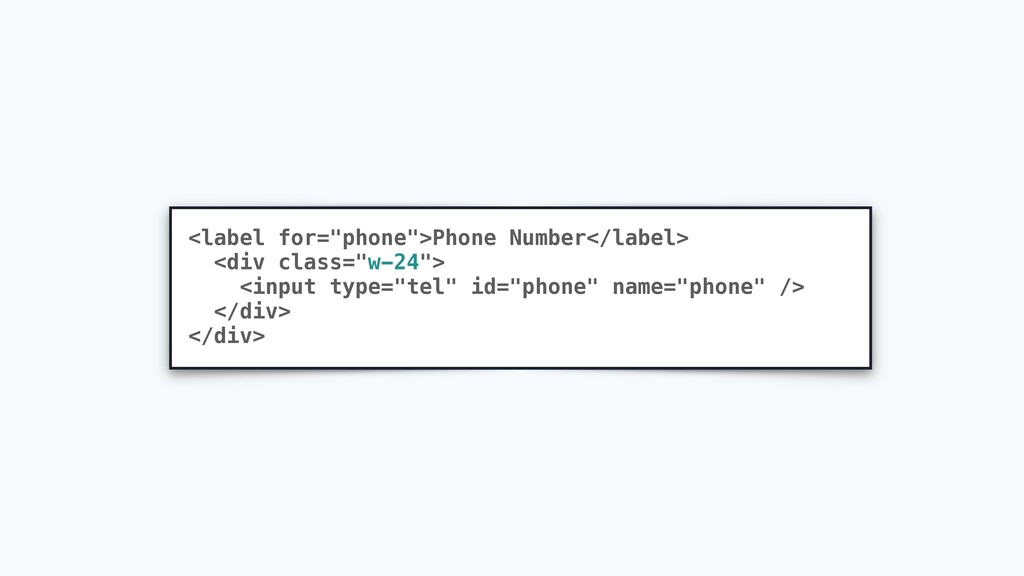
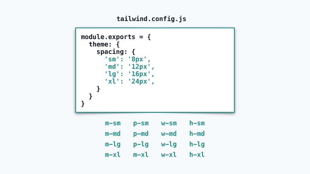
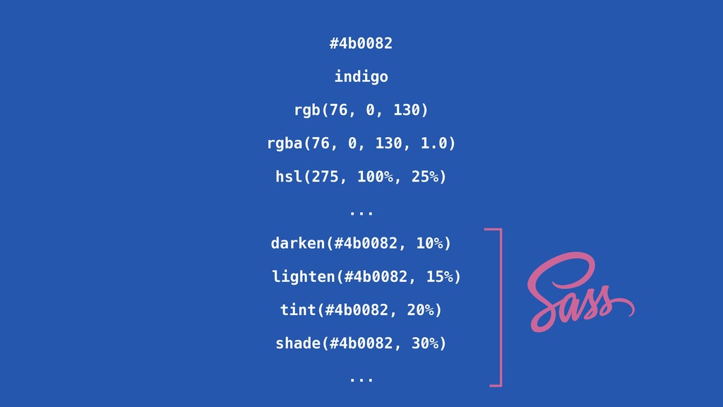
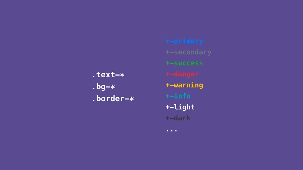
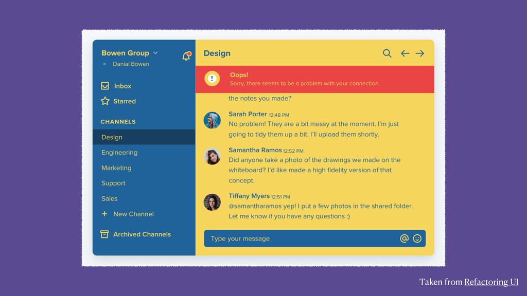
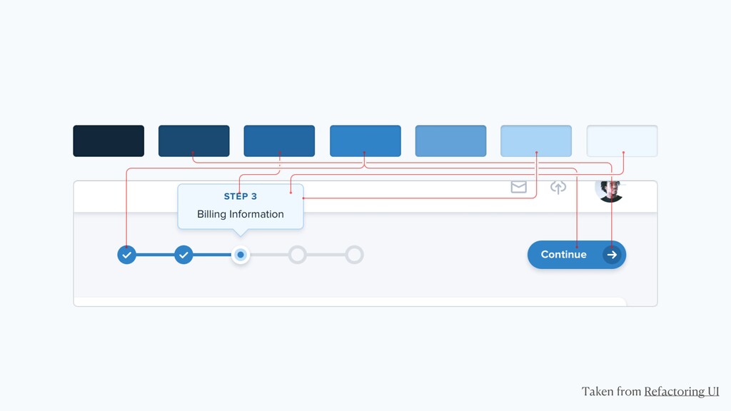
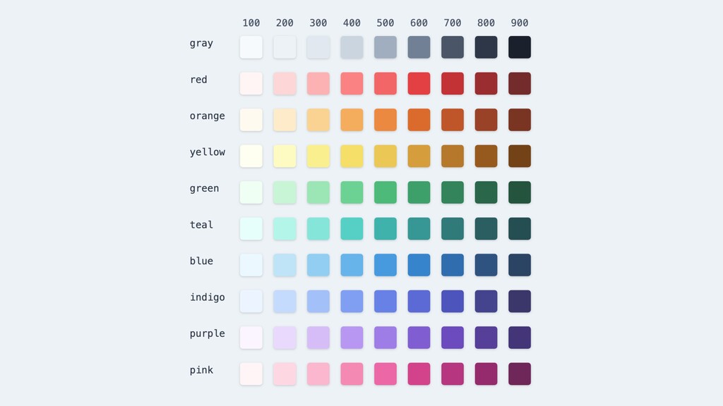
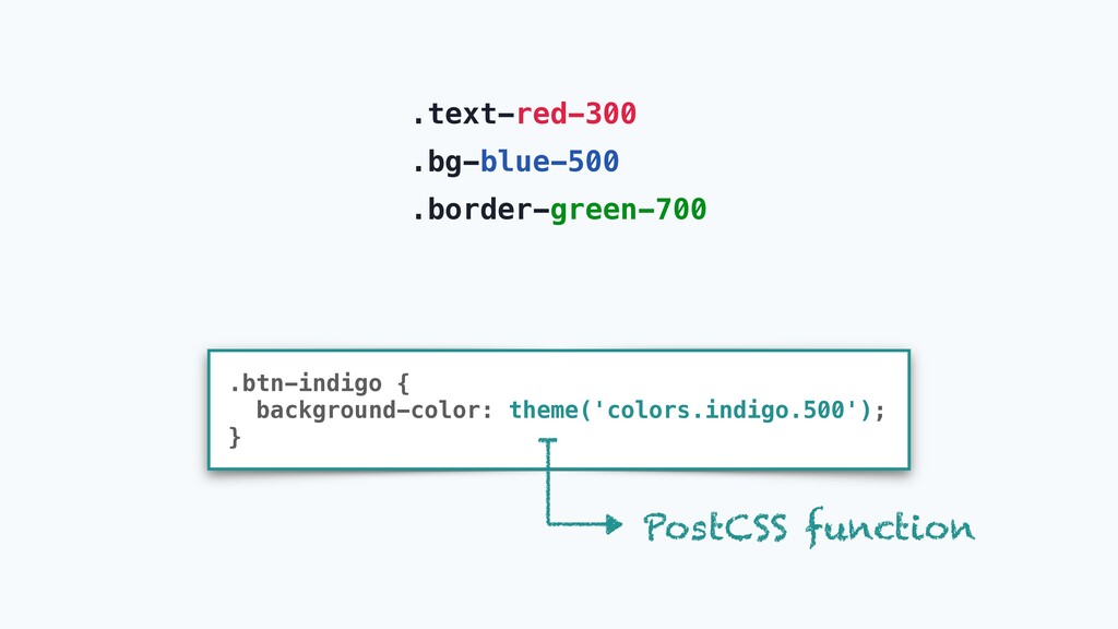
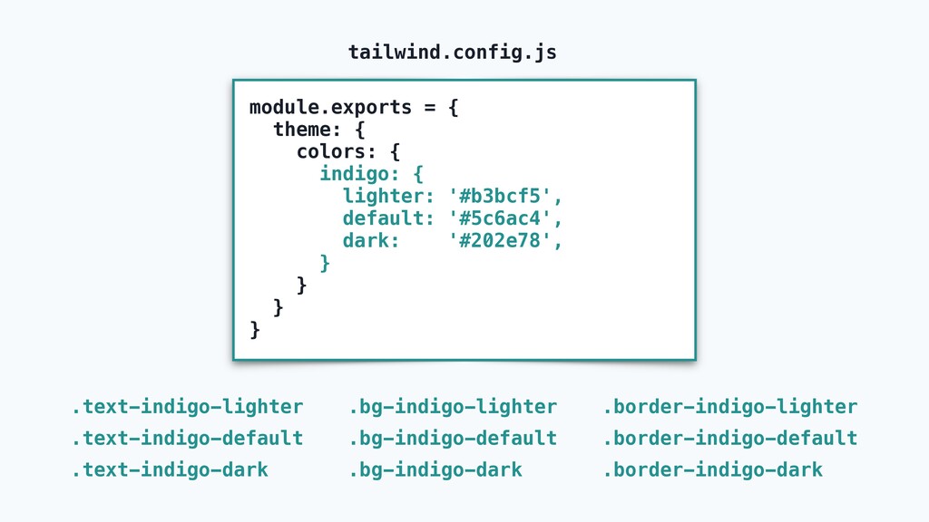
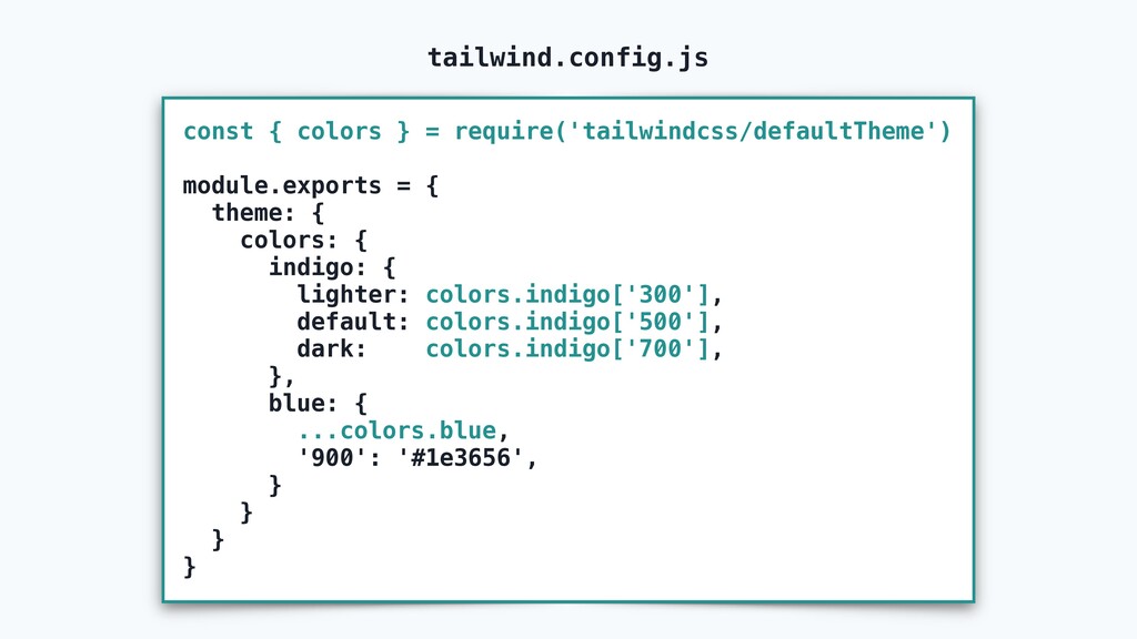
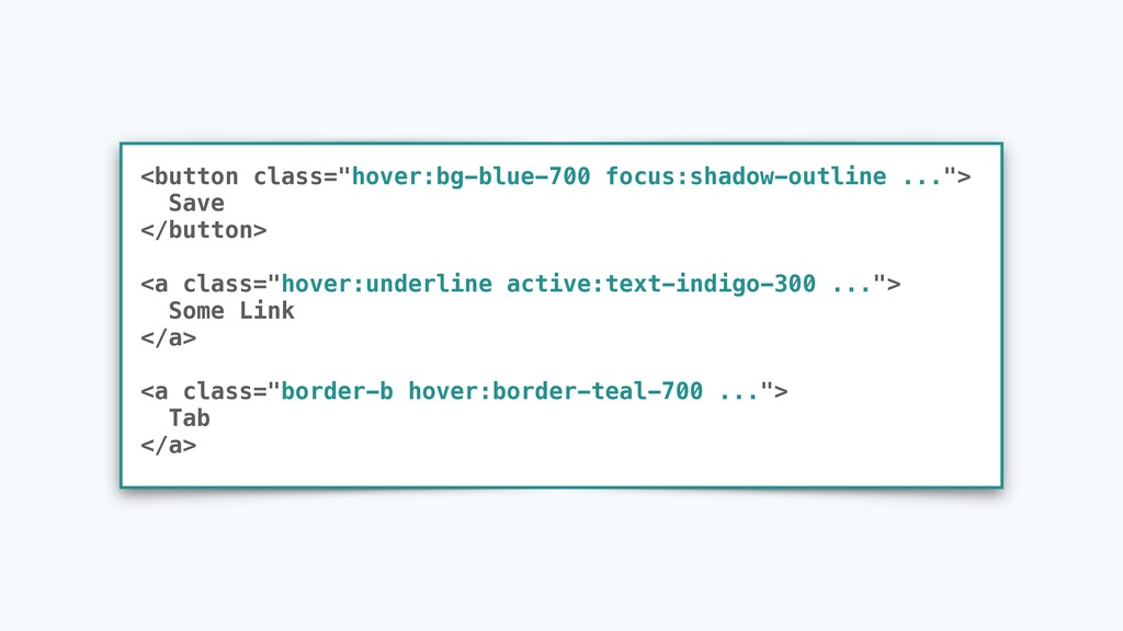
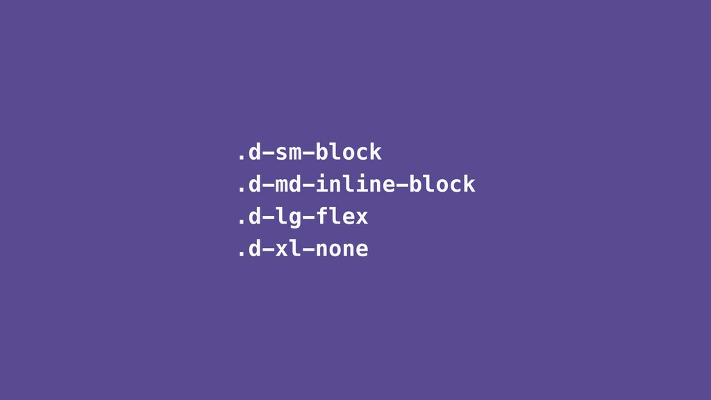
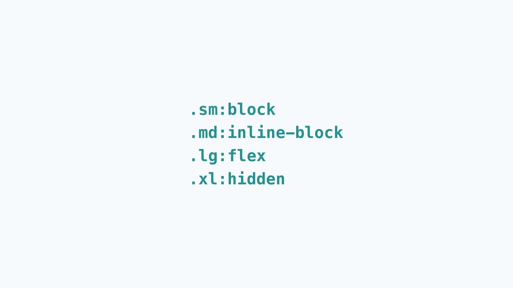
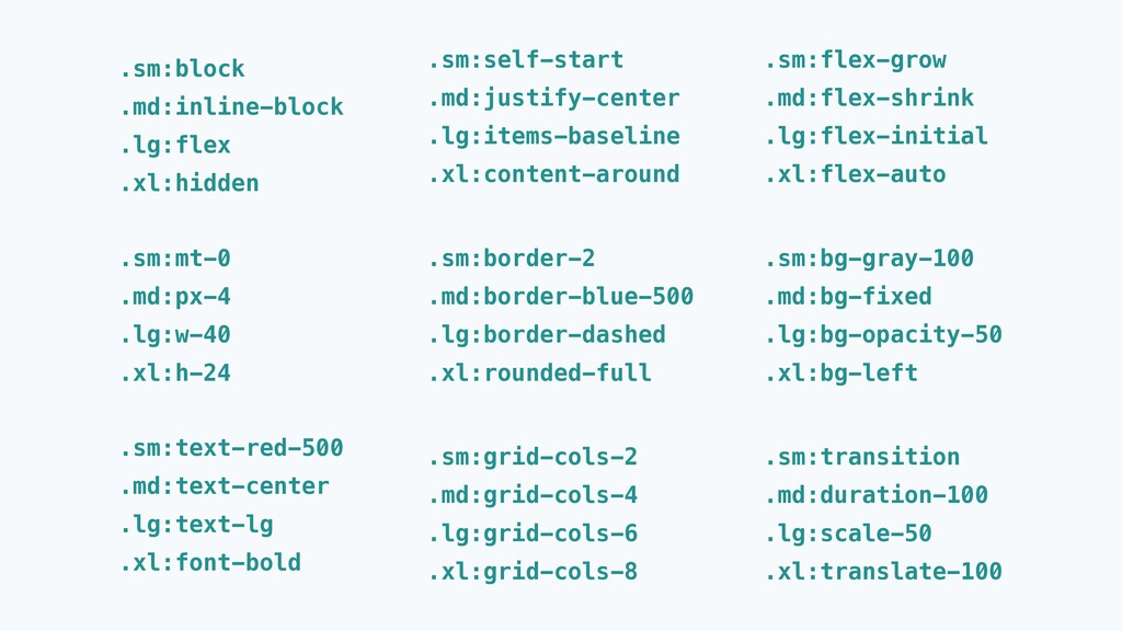
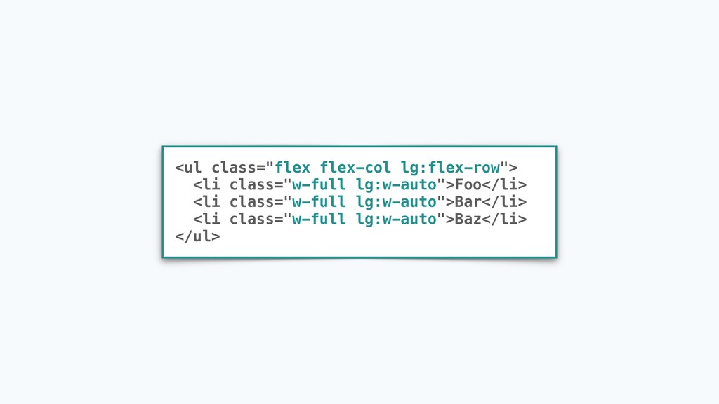
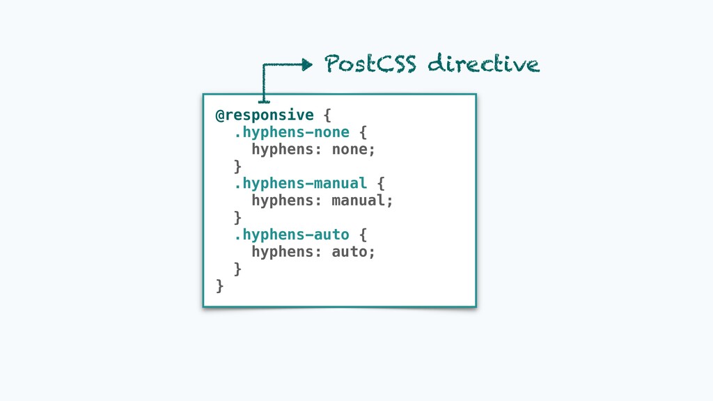
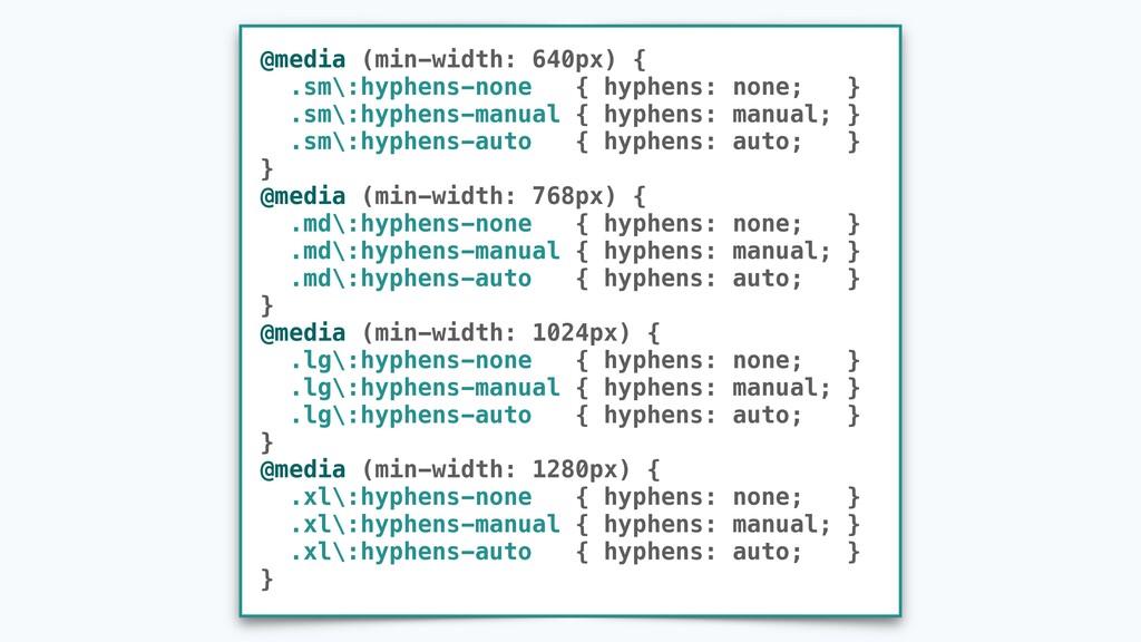
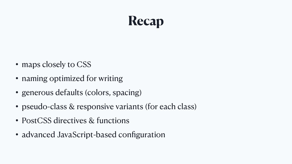
Enter Tailwind, a utility-first CSS framework that approaches building complex components from a constrained set of primitive utilities. What sets Tailwind apart is the vast range of CSS properties it covers, a powerful PostCSS-backed configuration API and excellent documentation that explains CSS along the way. This talk will show Tailwind's unique approach to various aspects of design (spacing, colors, pseudo-classes, responsive design and more) and compare it with existing solutions.

Janko Marohnić

May 29, 2020
Tweet

More Decks by Janko Marohnić

Other Decks in Programming

Transcript

  1. Janko Marohnić • Ruby developer • open source contributor •

    inexperienced in CSS • mainly used Bootstrap
  2. Tailwind CSS • utility-first CSS framework • maps closely to

    CSS properties • PostCSS plugin • created by Adam Wathan in 2017
  3. CSS

  4. <div class="vacation-card"> <img class="vacation-card-image" src="..."> <div class="vacation-card-info"> <div class="vacation-card-eyebrow"> Private

    Villa </div> <div class="vacation-card-title"> <a href="..." class="vacation-card-link"> Relaxing All-Inclusive Resort in Cancun </a> </div> <div class="vacation-card-price"> $299 USD per night </div> </div> </div>
  5. .vacation-card { width: 16rem; margin: 0 auto; } .vacation-card-info {

    margin-top: .5rem; } .vacation-card-image { border-radius: .25rem; } .vacation-card-title { font-weight: 700; color: #4a5568; line-height: 1.375; } .vacation-card-eyebrow { font-size: .75rem; color: #718096; text-transform: uppercase; font-weight: 700; } .vacation-card-link:hover { text-decoration: underline; } .vacation-card-price { margin-top: .5rem; font-size: .875rem; color: #718096; }
  6. <div class="vacation-card mx-auto"> <img class="rounded" src="..."> <div class="mt-2"> <div class="vacation-card-eyebrow

    text-uppercase font-weight-bold"> Private Villa </div> <div class="vacation-card-title font-weight-bold"> <a href="..." class="vacation-card-link"> Relaxing All-Inclusive Resort in Cancun </a> </div> <div class="vacation-card-price mt-2"> $299 USD per night </div> </div> </div>
  7. .vacation-card { width: 16rem; } .vacation-card-eyebrow { font-size: .75rem; color:

    #718096; } .vacation-card-title { color: #4a5568; line-height: 1.375; } .vacation-card-link:hover { text-decoration: underline; } .vacation-card-price { font-size: .875rem; color: #718096; }
  8. <div class="w-64 mx-auto"> <img class="rounded" src="..."> <div class="mt-2"> <div class="text-xs

    text-gray-600 uppercase font-bold"> Private Villa </div> <div class="font-bold text-gray-700 leading-snug"> <a href="..." class="hover:underline"> Relaxing All-Inclusive Resort in Cancun </a> </div> <div class="mt-2 text-sm text-gray-600"> $299 USD per night </div> </div> </div>
  9. No need to keep inventing new class names 2 .card-inner-outer-wrapper

    .container-wrapper-container .box-control-outer-container
  10. Bootstrap Tailwind .d-block .d-inline-block .d-flex ... .block .inline-block .flex ...

    .justify-content-start .align-items-center .align-self-center ... .justify-start .items-center .self-center ... .text-uppercase .font-italic .font-weight-bold ... .uppercase .italic .font-bold ... .position-absolute .position-relative ... .absolute .relative ...
  11. DRY

  12. <div class="card"> <img class="card-img-top" src="/apple"> <div class="card-body"> <div class="card-title">Apple</div> <div

    class="card-text">Apple</div> ... </div> </div> <div class="card"> <img class="card-img-top" src="/kiwi"> <div class="card-body"> <div class="card-title">Kiwi</div> <div class="card-text">Kiwi</div> ... </div> </div> page1.html page2.html
  13. <div class="card"> <img class="card-img-top" src={img}> <div class="card-body"> <div class="card-title">{title}</div> <div

    class="card-text">{text}</div> ... </div> </div> <Card img="/apple" title="Apple" text="Apple" /> Card.jsx Card.vue card.erb card.php ... page1.html <Card img="/kiwi" title="Kiwi" text="Kiwi" /> page2.html
  14. <div class="flex rounded bg-white shadow-sm"> <img class="rounded-t w-full" src={img}> <div

    class="flex-auto p-4 break-words"> <div class="mb-3">{title}</div> <div class="break-words">{text}</div> ... </div> </div> <Card img="/apple" title="Apple" text="Apple" /> Card.jsx Card.vue card.erb card.php ... page1.html <Card img="/kiwi" title="Kiwi" text="Kiwi" /> page2.html
  15. .btn-blue { background-color: #4299e1; color: white; font-weight: 700; padding: 0.5rem

    1rem; border-radius: 0.25rem; } <a href="..." class="btn-blue">Some Link</a> <form ...> ... <button type="submit" class="btn-blue">Save</button> </form>
  16. .btn-blue { @apply bg-blue-500 text-white font-bold py-2 px-4 rounded; }

    <a href="..." class="btn-blue">Some Link</a> <form ...> ... <button type="submit" class="btn-blue">Save</button> </form> PostCSS directive
  17. .m-* .mt-* .mb-* .ml-* .mr-* .mx-* .my-* Margin Padding .p-*

    .pt-* .pb-* .pl-* .pr-* .px-* .py-* Suffix Amount *-0 *-1 *-2 *-3 *-4 *-5 0 0.25rem 0.5rem 1rem 1.5rem 3rem
  18. .m-* .mt-* .mb-* .ml-* .mr-* .mx-* .my-* Margin Padding .p-*

    .pt-* .pb-* .pl-* .pr-* .px-* .py-* Suffix Amount *-0 *-1 *-2 *-3 *-4 *-5 *-6 *-8 *-10 *-12 *-16 *-20 ... *-64 0 0.25rem 0.5rem 1.75rem 1rem 1.25rem 1.5rem 2rem 2.5rem 3rem 4rem 5rem ... 16rem Width .w-* Height .h-*
  19. Class Property .w-1/2 .w-1/3 .w-2/3 .w-1/4 .w-2/4 .w-3/4 .w-1/5 .w-2/5

    .w-3/5 ... .w-11/12 .w-full width: 50% width: 33.333333% width: 66.666667% width: 25% width: 50% width: 75% width: 20% width: 40% width: 60% ... width: 91.66667% width: 100%
  20. module.exports = { theme: { extend: { spacing: { '18':

    '4.5rem', } } } } ... .m-16 .m-18 .m-20 ... ... .p-16 .p-18 .p-20 ... ... .w-16 .w-18 .w-20 ... ... .h-16 .h-18 .h-20 ... ... 4rem 4.5rem 5rem ... tailwind.config.js
  21. module.exports = { theme: { spacing: { 'sm': '8px', 'md':

    '12px', 'lg': '16px', 'xl': '24px', } } } tailwind.config.js m-sm m-md m-lg m-xl p-sm p-md p-lg m-xl w-sm w-md w-lg w-xl h-sm h-md h-lg h-xl
  22. #4b0082 indigo rgb(76, 0, 130) rgba(76, 0, 130, 1.0) hsl(275,

    100%, 25%) darken(#4b0082, 10%) lighten(#4b0082, 15%) tint(#4b0082, 20%) shade(#4b0082, 30%) ... ...
  23. module.exports = { theme: { colors: { indigo: { lighter:

    '#b3bcf5', default: '#5c6ac4', dark: '#202e78', } } } } tailwind.config.js .text-indigo-lighter .text-indigo-default .text-indigo-dark .bg-indigo-lighter .bg-indigo-default .bg-indigo-dark .border-indigo-lighter .border-indigo-default .border-indigo-dark
  24. const { colors } = require('tailwindcss/defaultTheme') module.exports = { theme:

    { colors: { indigo: { lighter: colors.indigo['300'], default: colors.indigo['500'], dark: colors.indigo['700'], }, blue: { ...colors.blue, '900': '#1e3656', } } } } tailwind.config.js
  25. <button class="btn-blue">Save</button> .btn-blue { ... } .btn-blue:hover { background-color: #2B6CB0;

    } .btn-blue:focus { background-color: #2B6CB0; box-shadow: 0 0 0 3px rgba(66, 153, 225, 0.5); }
  26. .hover\:bg-blue-500:hover { background-color: #4299e1; } .focus\:shadow-outline:focus { box-shadow: 0 0

    0 3px rgba(66, 153, 225, 0.5); } .active\:text-indigo-300:active { color: #a3bffa; }
  27. @variants hover, focus { .hyphens-none { hyphens: none; } .hyphens-manual

    { hyphens: manual; } .hyphens-auto { hyphens: auto; } } PostCSS directive
  28. .hyphens-none { hyphens: none; } .hover\:hyphens-none:hover { hyphens: none; }

    .focus\:hyphens-none:focus { hyphens: none; } .hyphens-manual { hyphens: manual; } .hover\:hyphens-manual:hover { hyphens: manual; } .focus\:hyphens-manual:focus { hyphens: manual; } .hyphens-auto { hyphens: auto; } .hover\:hyphens-auto:hover { hyphens: auto; } .focus\:hyphens-auto:focus { hyphens: auto; }
  29. @media (min-width: 640px) { ... } @media (min-width: 768px) {

    ... } @media (min-width: 1024px) { ... } @media (min-width: 1280px) { ... }
  30. .col-sm-8 .col-md-6 .col-lg-4 .col-xl-2 .d-sm-block .d-md-inline-block .d-lg-flex .d-xl-none .flex-sm-row .justify-content-md-center

    .align-items-lg-baseline .align-self-xl-end .row-cols-sm-8 .row-cols-md-6 .row-cols-lg-4 .row-cols-xl-2
  31. .sm:text-red-500 .md:text-center .lg:text-lg .xl:font-bold .sm:mt-0 .md:px-4 .lg:w-40 .xl:h-24 .sm:self-start .md:justify-center

    .lg:items-baseline .xl:content-around .sm:border-2 .md:border-blue-500 .lg:border-dashed .xl:rounded-full .sm:grid-cols-2 .md:grid-cols-4 .lg:grid-cols-6 .xl:grid-cols-8 .sm:flex-grow .md:flex-shrink .lg:flex-initial .xl:flex-auto .sm:bg-gray-100 .md:bg-fixed .lg:bg-opacity-50 .xl:bg-left .sm:transition .md:duration-100 .lg:scale-50 .xl:translate-100 .sm:block .md:inline-block .lg:flex .xl:hidden
  32. @responsive { .hyphens-none { hyphens: none; } .hyphens-manual { hyphens:

    manual; } .hyphens-auto { hyphens: auto; } } PostCSS directive
  33. @media (min-width: 640px) { .sm\:hyphens-none { hyphens: none; } .sm\:hyphens-manual

    { hyphens: manual; } .sm\:hyphens-auto { hyphens: auto; } } @media (min-width: 768px) { .md\:hyphens-none { hyphens: none; } .md\:hyphens-manual { hyphens: manual; } .md\:hyphens-auto { hyphens: auto; } } @media (min-width: 1024px) { .lg\:hyphens-none { hyphens: none; } .lg\:hyphens-manual { hyphens: manual; } .lg\:hyphens-auto { hyphens: auto; } } @media (min-width: 1280px) { .xl\:hyphens-none { hyphens: none; } .xl\:hyphens-manual { hyphens: manual; } .xl\:hyphens-auto { hyphens: auto; } }
  34. You must list all files in your project that reference

    any of Tailwind class names ! You must not use string concatenation to create class names ! ✕ <div class="text-{error ? 'red' : 'green'}-600"></div> <div class="{error ? 'text-red-600' : 'text-green-600'}"></div> ✓
  35. module.exports = { theme: { borderColor: theme => ({ 'green':

    theme('colors.green.300') }), divideColor: theme => ({ 'green': theme('colors.green.300') }), translate: { '1': '0.25rem' }, }, corePlugins: [ 'placeholderColor', 'placeholderOpacity', 'textOpacity', 'skew', 'scale', 'rotate', 'gap', 'gridColumn', 'gridColumnStart', 'gridColumnEnd', 'gridRow', 'gridRowStart', 'gridRowEnd', ].reduce((list, plugin) => ({ [plugin]: false, ...list }), {}), variants: { textColor: ['hover', 'focus'], backgroundColor: ['hover', 'focus'], borderRadius: [], borderOpacity: ['hover', 'focus'], transitionDuration: [], transitionDelay: [], }, } tailwind.config.js
  36. Recap • maps closely to CSS • naming optimized for

    writing • generous defaults (colors, spacing) • pseudo-class & responsive variants (for each class) • PostCSS directives & functions • advanced JavaScript-based configuration
  37. Resources • https://tailwindcss.com/docs • https://tailwindcss.com/screencasts • https://tailwindcss-custom-forms.netlify.app/ • https://marketplace.visualstudio.com/items?itemName=bradlc.vscode- tailwindcss

    • https://github.com/aniftyco/awesome-tailwindcss • https://adamwathan.me/css-utility-classes-and-separation-of-concerns/ • Adam Wathan’s YouTube channel • Steve Schoger's design tips