Upgrade to Pro — share decks privately, control downloads, hide ads and more …

Building Better Experiences with Responsive JavaScript

Building Better Experiences with Responsive JavaScript

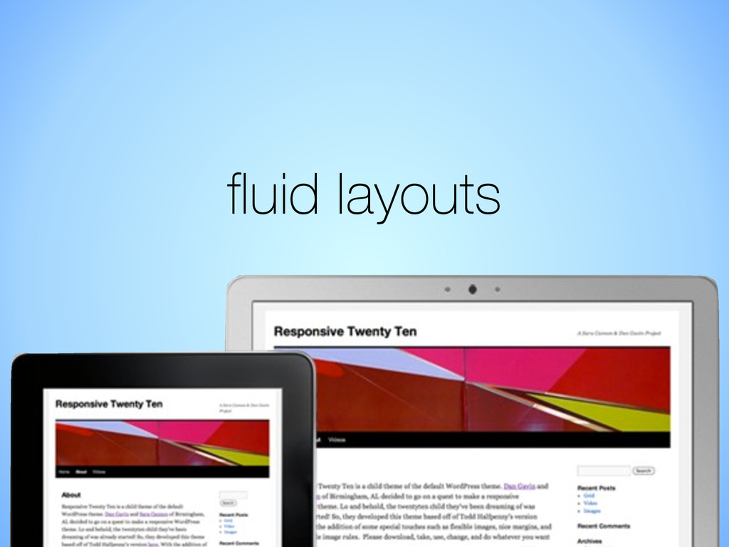
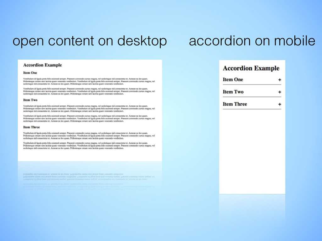
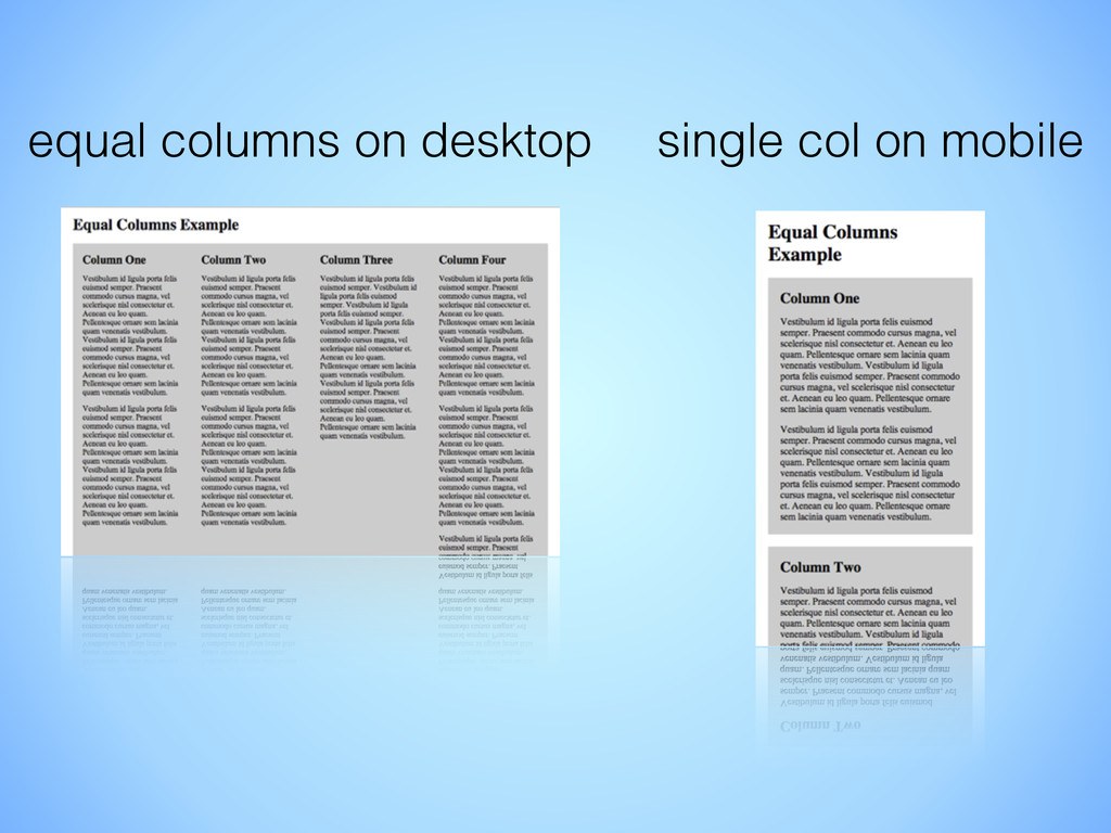
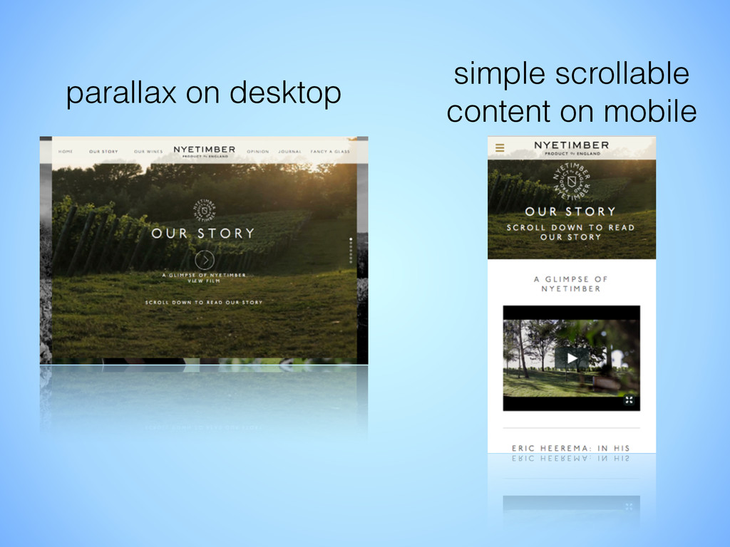
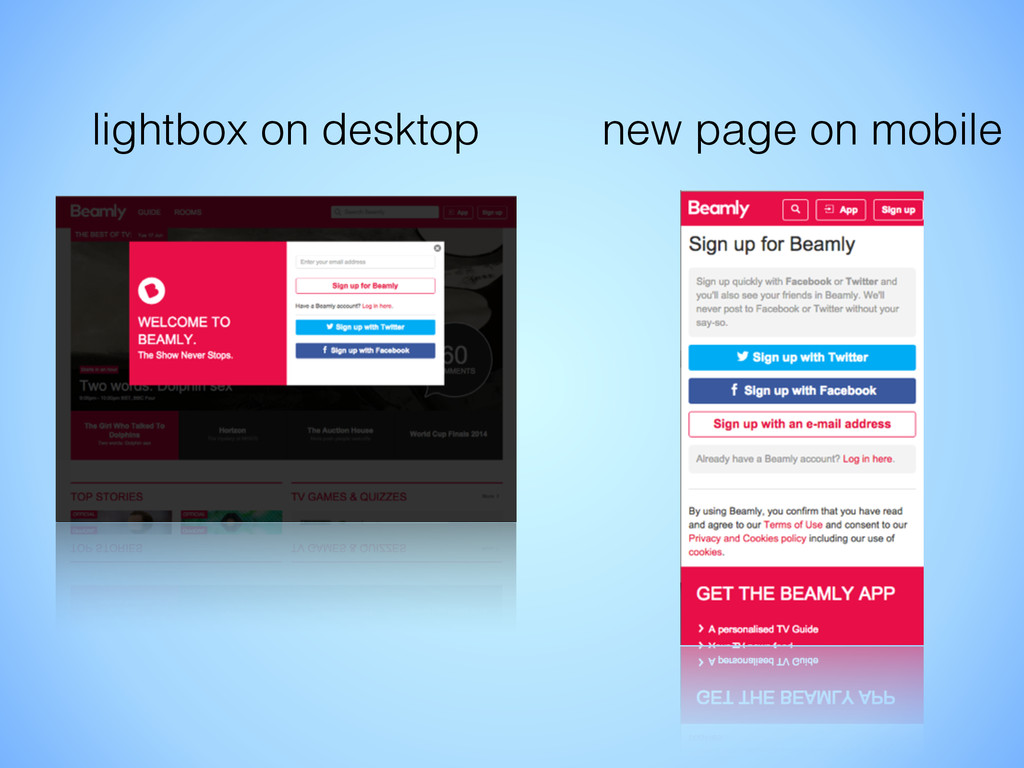
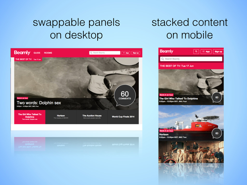
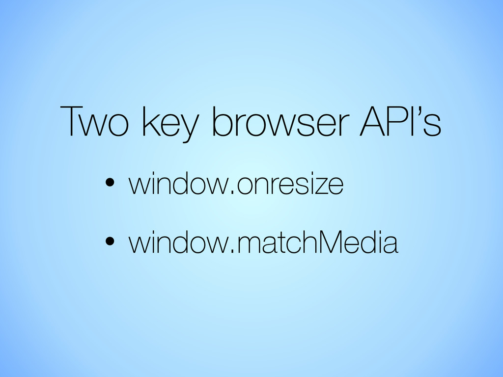
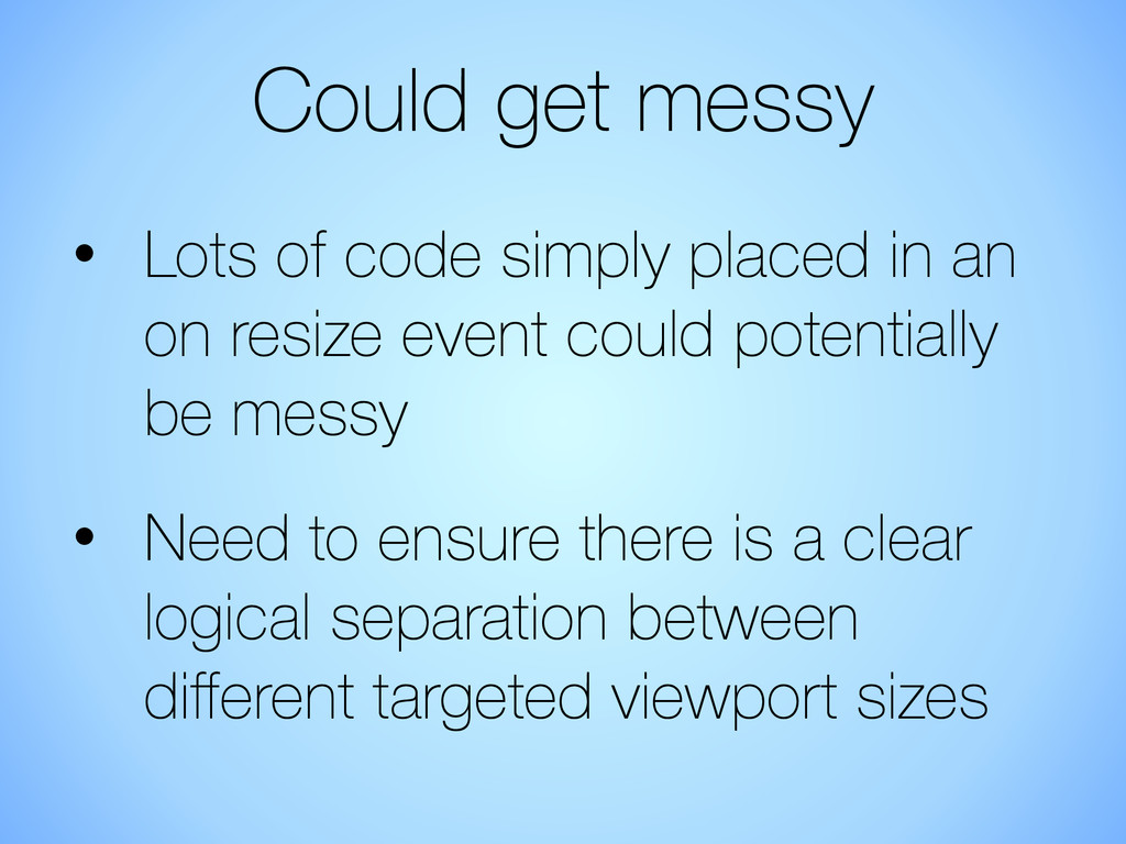
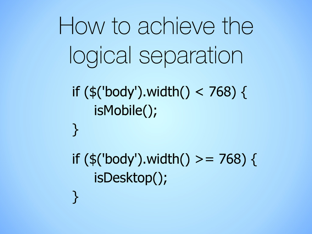
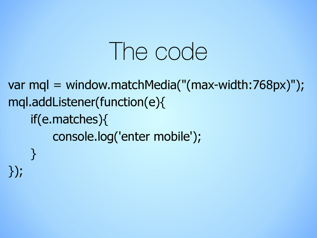
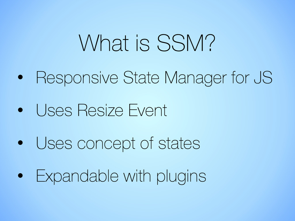
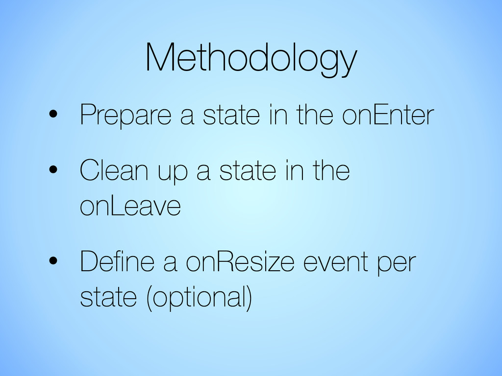
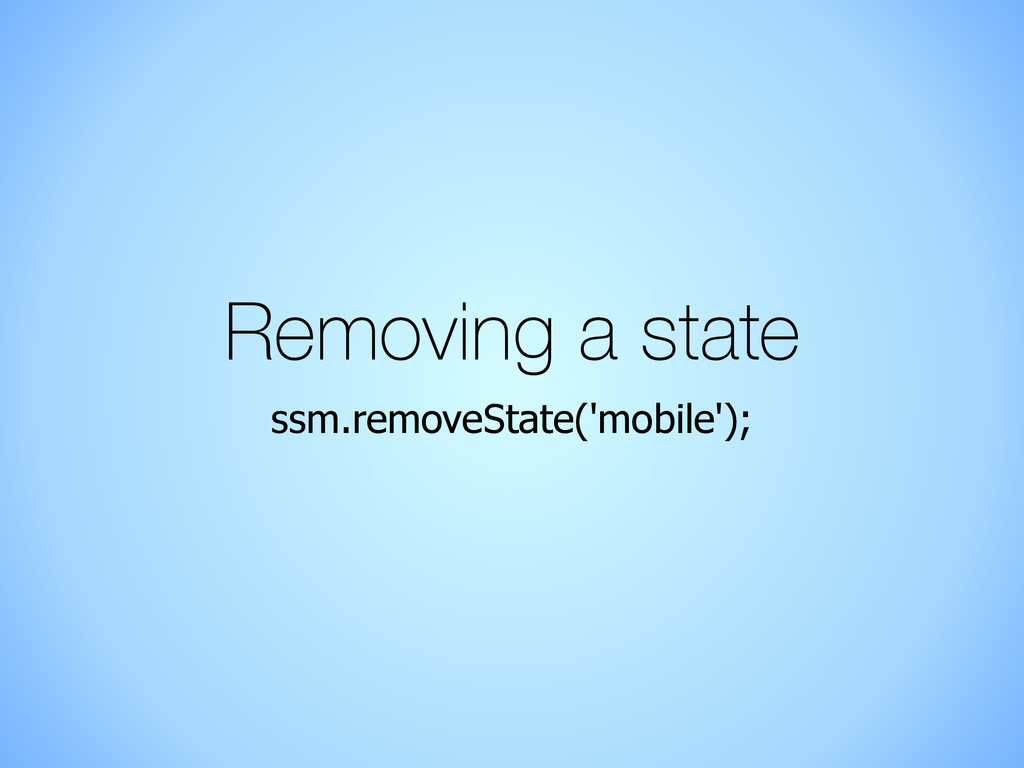
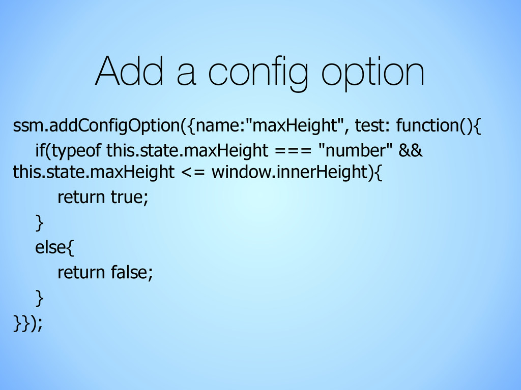
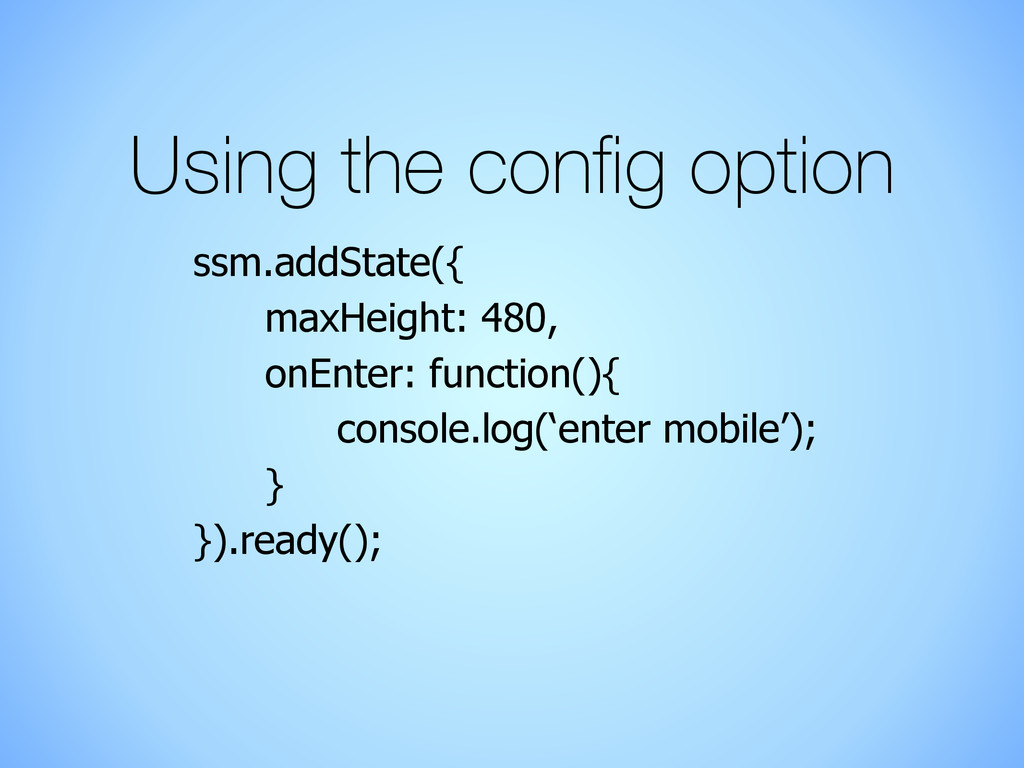
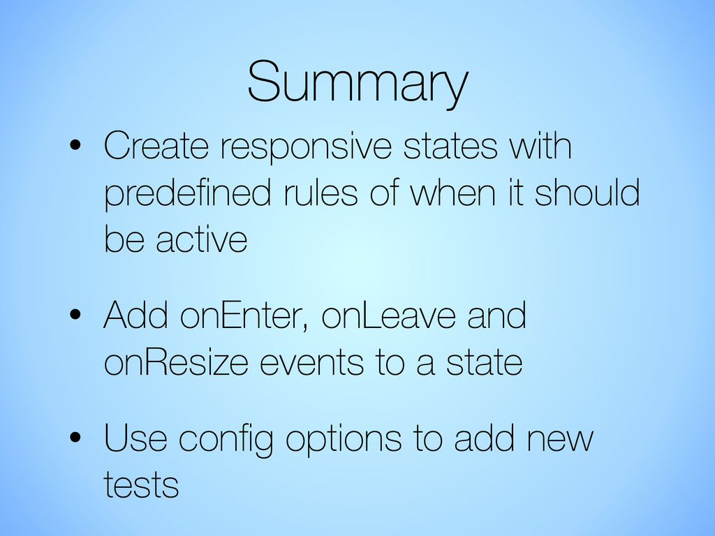
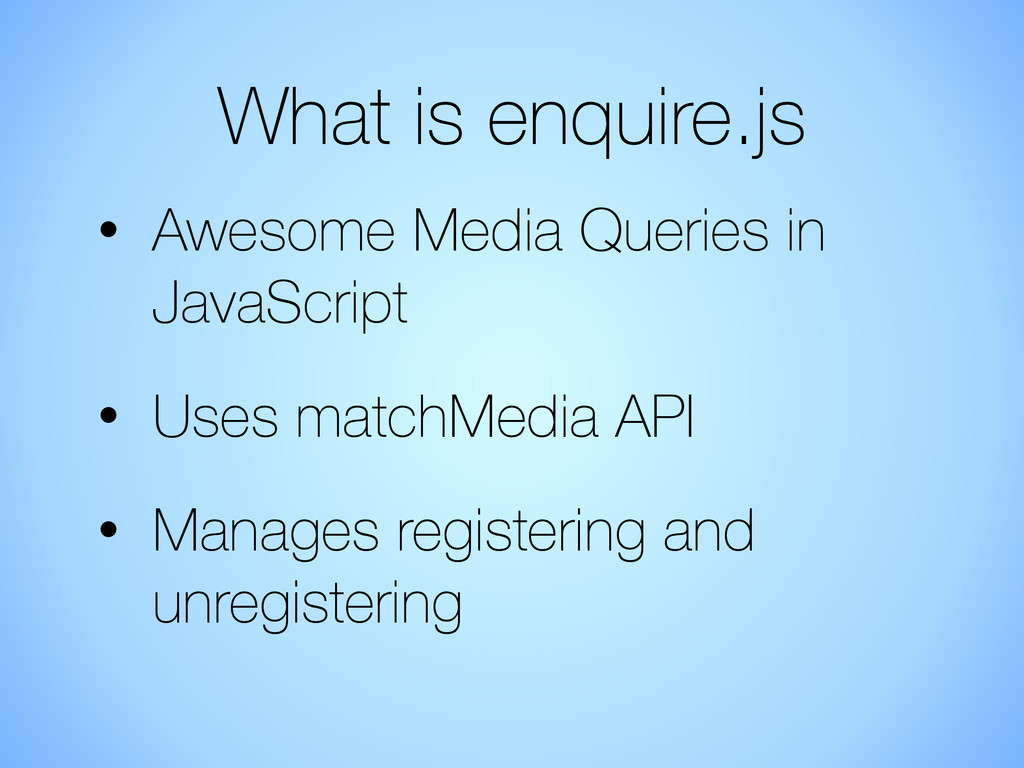
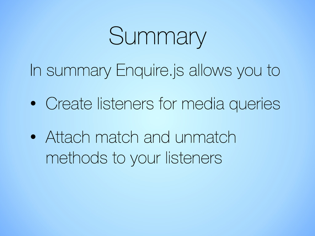
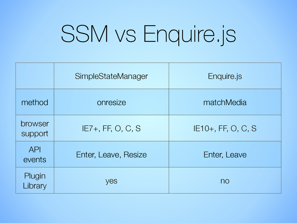
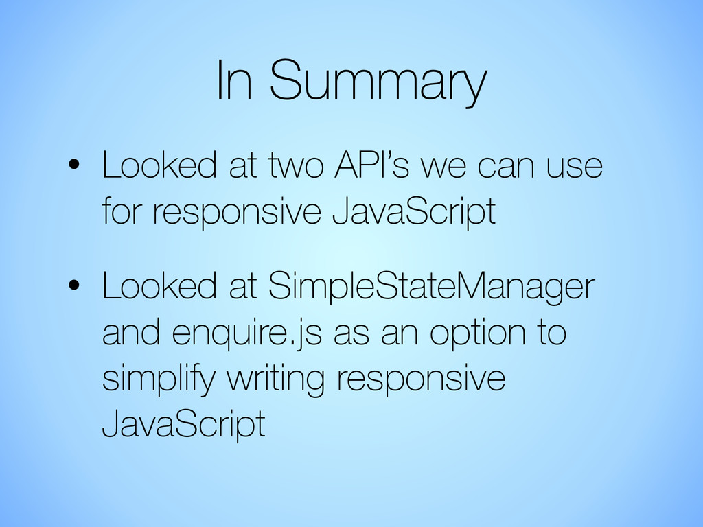
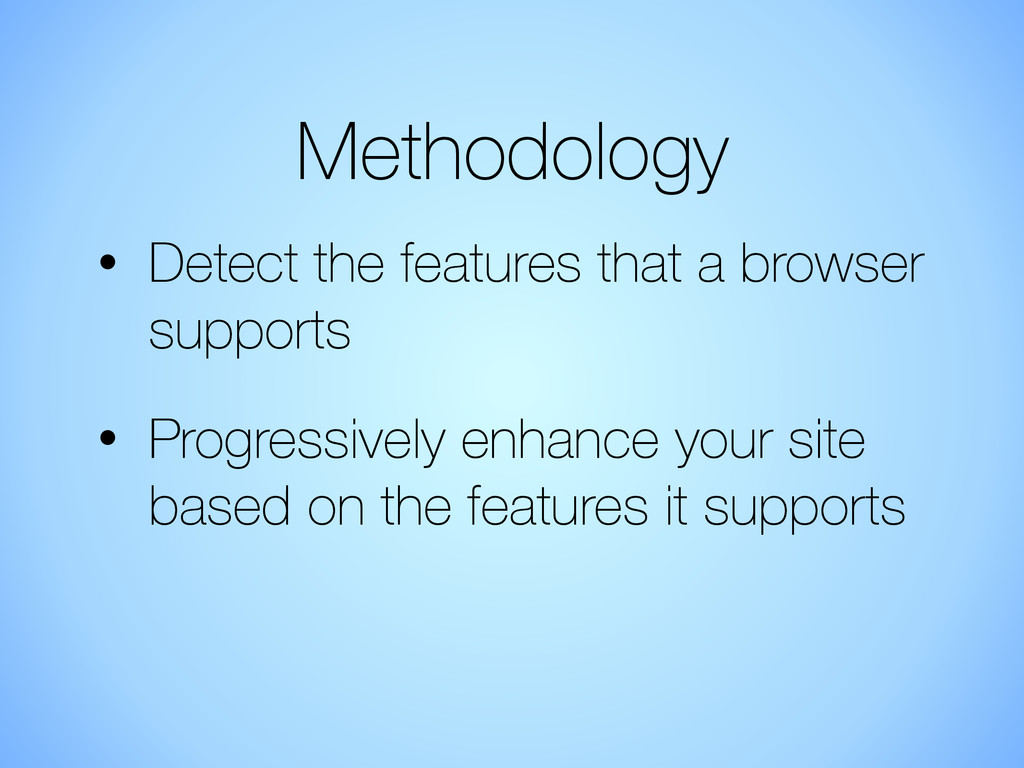
Responsive design has thus far focused on using media queries to alter the way our site looks using CSS. The next step is to look at how we can progressively enhance our site based on the the features of the device. This is going beyond what CSS can offer and moving into the realms of responsive javascript. There are already new browser API’s are arriving to enables this, with the matchMedia API we can target specific functionality based on whether a media query matches.

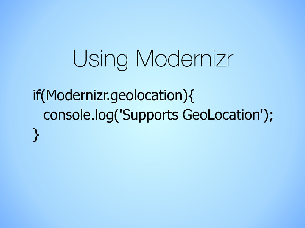
Similarly we can add extra functionality and loads additional assets based upon features like geolocation and the camera. This is not building separate sites, its just changing the functionality of a single site based on the users device to optimise their experience.
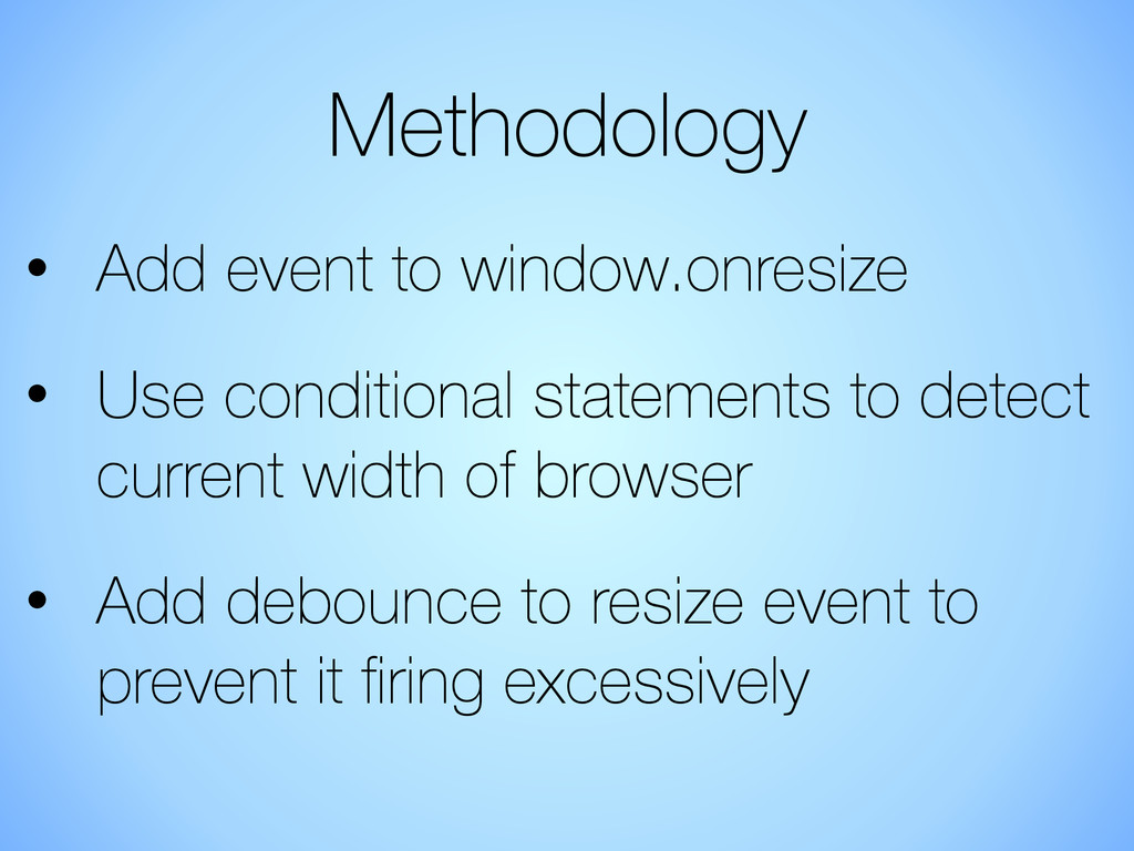
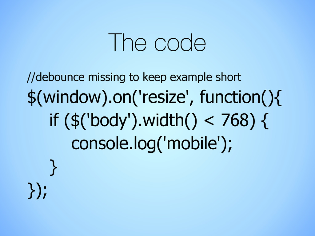
The aim of this talk is to help you learn about what you can do with responsive javascript. You will learn about how you can target specific functionality to different types of devices which enable you to optimise your user experience.

Jonathan Fielding

June 19, 2014
Tweet

More Decks by Jonathan Fielding

Other Decks in Programming

Transcript

  1. Building Better
    Experiences with
    Responsive JavaScript
    Jonathan Fielding
    @jonthanfielding

    View Slide

  2. About me
    • Full stack developer
    • Been building responsively for

    over 3 years
    • Creator of SimpleStateManager

    View Slide

  3. I asked some developers
    about what responsive design
    meant to them

    View Slide

  4. targeting different devices

    View Slide

  5. @media screen and (max-width: 767px){
    media queries

    View Slide

  6. responsive grids

    View Slide

  7. fluid layouts

    View Slide

  8. These all focus on one thing

    View Slide

  9. How the site looks

    View Slide

  10. There is more to building a
    great responsive site than
    simply how it looks

    View Slide

  11. We also need to consider
    how the site functions

    View Slide

  12. Why change functionality
    • Devices come in all shapes 

    and sizes
    • Input methods vary between 

    devices
    • Device functionality ranges

    View Slide

  13. Examples

    View Slide

  14. accordion on mobile
    open content on desktop

    View Slide

  15. single col on mobile
    equal columns on desktop

    View Slide

  16. simple scrollable
    content on mobile
    parallax on desktop

    View Slide

  17. new page on mobile
    lightbox on desktop

    View Slide

  18. stacked content
    on mobile
    swappable panels
    on desktop

    View Slide

  19. What do these
    examples tell us

    View Slide

  20. It’s ok to have different
    journeys for different
    devices on a responsive
    site

    View Slide

  21. Desktop journey

    View Slide

  22. Mobile journey

    View Slide

  23. Two ways to change
    functionality
    • Based on viewport size
    • Based on the features the 

    device supports

    View Slide

  24. x
    How to change
    functionality based
    on the viewport

    View Slide

  25. Two key browser API’s
    • window.onresize
    • window.matchMedia

    View Slide

  26. window.resize

    View Slide

  27. Methodology
    • Add event to window.onresize
    • Use conditional statements to detect
    current width of browser
    • Add debounce to resize event to 

    prevent it firing excessively

    View Slide

  28. The code
    //debounce missing to keep example short
    $(window).on('resize', function(){
    if ($('body').width() < 768) {
    console.log('mobile');
    }
    });

    View Slide

  29. Could get messy
    • Lots of code simply placed in an
    on resize event could potentially
    be messy
    • Need to ensure there is a clear
    logical separation between
    different targeted viewport sizes

    View Slide

  30. How to achieve the 

    logical separation
    if ($('body').width() < 768) {
    isMobile();
    }
    !
    if ($('body').width() >= 768) {
    isDesktop();
    }

    View Slide

  31. Browser Support
    IE
    Chrome
    Firefox Safari Android

    View Slide

  32. window.matchMedia

    View Slide

  33. Methodology
    • Prepare a MediaQueryList by using a
    media query with
    window.matchMedia
    • Add listener to MediaQueryList
    • When listener fires check if its a
    match or unmatch

    View Slide

  34. The code
    var mql = window.matchMedia("(max-width:768px)");
    mql.addListener(function(e){
    if(e.matches){
    console.log('enter mobile');
    }
    });

    View Slide

  35. Browser Support
    IE 10+
    Chrome 9+
    Firefox 6+ Safari 5.1+ Android 3.0+

    View Slide

  36. Real World Usage
    80.63%
    of users have a browser
    that supports
    matchMedia

    View Slide

  37. Libraries

    View Slide

  38. Two popular libraries

    View Slide

  39. SimpleStateManager
    (aka SSM)

    View Slide

  40. What is SSM?
    • Responsive State Manager for JS
    • Uses Resize Event
    • Uses concept of states
    • Expandable with plugins

    View Slide

  41. Setting up SSM
    Two methods to setup SSM
    • Download from Github
    • bower install SimpleStateManager

    View Slide

  42. The API
    • addState - Add Responsive
    states
    • removeState - Remove
    Responsive states
    • ready - tell SSM the states are
    added and you are ready

    View Slide

  43. Methodology
    • Prepare a state in the onEnter
    • Clean up a state in the
    onLeave
    • Define a onResize event per
    state (optional)

    View Slide

  44. Adding a state
    ssm.addState({
    id: “mobile”,
    maxWidth: 767,
    onEnter: function(){
    console.log(‘enter mobile’);
    }
    }).ready();

    View Slide

  45. Removing a state
    ssm.removeState('mobile');

    View Slide

  46. Demo

    View Slide

  47. Extending SSM
    SSM Plugins allow you to:
    • Extend the available state
    options
    • Wrap jQuery Plugins to add
    responsive functionality

    View Slide

  48. Plugin Methodology
    • Add a custom config option
    • Use it like any other config option
    in your states

    View Slide

  49. Add a config option
    ssm.addConfigOption({name:"maxHeight", test: function(){
    if(typeof this.state.maxHeight === "number" &&
    this.state.maxHeight <= window.innerHeight){
    return true;
    }
    else{
    return false;
    }
    }});

    View Slide

  50. Using the config option
    ssm.addState({
    maxHeight: 480,
    onEnter: function(){
    console.log(‘enter mobile’);
    }
    }).ready();

    View Slide

  51. Summary
    • Create responsive states with
    predefined rules of when it should
    be active
    • Add onEnter, onLeave and
    onResize events to a state
    • Use config options to add new
    tests

    View Slide

  52. View Slide

  53. What is enquire.js
    • Awesome Media Queries in
    JavaScript
    • Uses matchMedia API
    • Manages registering and
    unregistering

    View Slide

  54. Setting up enquire.js
    Two methods to setup enquire.js
    • Download from Github
    • bower install enquire

    View Slide

  55. The API
    • register - registers a media
    query attaching it to a handler
    • unregister - unregisters a
    media query

    View Slide

  56. Methodology
    • Register a media query with a
    handler
    • Handler will fire when media
    query matches
    • Unregister unneeded handlers

    View Slide

  57. Registering a query
    enquire.register("(max-width: 767px)", {
    match : function() {
    console.log("enter mobile");
    },
    });

    View Slide

  58. Unregistering a query
    enquire.unregister("(max-width: 767px)");

    View Slide

  59. Demo

    View Slide

  60. Summary
    In summary Enquire.js allows you to
    • Create listeners for media queries
    • Attach match and unmatch
    methods to your listeners

    View Slide

  61. SSM vs Enquire.js
    SimpleStateManager Enquire.js
    method onresize matchMedia
    browser
    support
    IE7+, FF, O, C, S IE10+, FF, O, C, S
    API
    events
    Enter, Leave, Resize Enter, Leave
    Plugin
    Library
    yes no

    View Slide

  62. In Summary
    • Looked at two API’s we can use
    for responsive JavaScript
    • Looked at SimpleStateManager
    and enquire.js as an option to
    simplify writing responsive
    JavaScript

    View Slide

  63. x
    How to change
    functionality based
    device features

    View Slide

  64. x

    View Slide

  65. Methodology
    • Detect the features that a browser
    supports
    • Progressively enhance your site
    based on the features it supports

    View Slide

  66. Using Modernizr
    if(Modernizr.geolocation){
    console.log('Supports GeoLocation');
    }

    View Slide

  67. Use in conjunction with SSM
    • Create a SSM config option using
    Modernizr for the test

    View Slide

  68. Add a config option
    ssm.addConfigOption({name:"touch", test: function(){
    if(typeof this.state.touch === "boolean" &&
    this.state.touch === Modernizr.touch){
    return true;
    }
    else{
    return false;
    }
    }});

    View Slide

  69. Using the config option
    ssm.addState({
    touch: true,
    maxWidth: 767,
    onEnter: function(){
    console.log(‘is mobile device
    that supports touch events’);
    }
    }).ready();

    View Slide

  70. So how do we build better
    experiences using
    Responsive JavaScript?

    View Slide

  71. By targeting functionality
    based on the characteristics
    of a device

    View Slide

  72. Optimising the journey our
    user follows to best suit the
    device

    View Slide

  73. Demo code from this talk at
    !
    https://github.com/jonathan-fielding/
    ResponsiveJavaScriptTalkExamples

    View Slide

  74. • Learn how to make your
    sites responsive
    • Chapter on Responsive
    JavaScript
    • http://bitly.com/NXusZn
    • 35% off eBook discount
    code: B3GW3B
    • 4 eBooks to give away
    today

    View Slide

  75. Any Questions

    View Slide

  76. Further Resources
    MDN - Testing Media Queries - mzl.la/18r5yGi
    MDN – MediaQueryList - mzl.la/1bxbbZJ
    MDN – Window.matchMedia - mzl.la/19qc3Yk
    SimpleStateManager – simplestatemanager.com
    Enquire.js - wicky.nillia.ms/enquire.js/
    MatchMedia Polyfill - github.com/paulirish/matchMedia.js/
    Jonathan Fielding’s Blog - jonathanfielding.com
    !
    Demo code from this talk at
    !
    https://github.com/jonathan-fielding/
    ResponsiveJavaScriptTalkExamples

    View Slide