Upgrade to Pro — share decks privately, control downloads, hide ads and more …

Exploratory Seminar #47 - Survey Data Analysis Part 1 - PCA, Clustering, & NPS

Exploratory Seminar #47 - Survey Data Analysis Part 1 - PCA, Clustering, & NPS

Doing a survey is easy, but getting values out of the survey result data is a different story.

In this seminar, Kan will present a few analytics and data wrangling techniques to gain more value from your survey data.

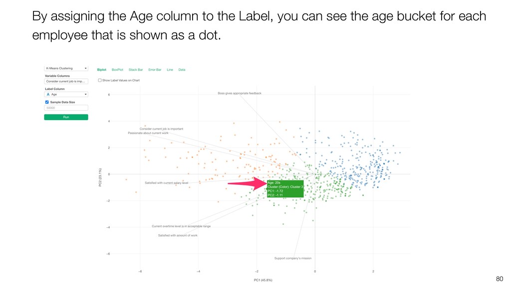
* Understanding Correlation among Questions with PCA (Principal Component Analysis)
* Segmenting Customers based on Answers with Clustering
* Evaluating Customer Satisfaction with NPS (Net Promoter Score)

Subscribe ↓
https://www.youtube.com/channel/UCOVfLaSQBvMRwZCyiccq4Iw

Twitter ↓
https://twitter.com/ExploratoryData

UI Tool: Exploratory(https://exploratory.io/)
Exploratory Online Seminar: https://exploratory.io/online-seminar

Kan Nishida

June 03, 2021
Tweet

More Decks by Kan Nishida

Other Decks in Technology

Transcript

  1. Kan Nishida CEO/co-founder Exploratory Summary In Spring 2016, launched Exploratory,

    Inc. to democratize Data Science. Prior to Exploratory, Kan was a director of product development at Oracle leading teams to build various Data Science products in areas including Machine Learning, BI, Data Visualization, Mobile Analytics, Big Data, etc. While at Oracle, Kan also provided training and consulting services to help organizations transform with data. @KanAugust Speaker
  2. 3 Data Science is not just for Engineers and Statisticians.

    Exploratory makes it possible for Everyone to do Data Science. The Third Wave
  3. 5 Questions Communication (Dashboard, Note, Slides) Data Access Data Wrangling

    Visualization Analytics (Statistics / Machine Learning) ExploratoryɹModern & Simple UI
  4. 9

  5. 10

  6. 11

  7. 12

  8. 13 • Get as many responses as you can •

    Get high quality answers When you do survey you want to …
  9. 16 We can’t remove these questions because some people want

    them to be asked. How about using Amazon Gift card? We already have too many questions, it will take more than 20 minutes to answer them all.
  10. 17 I know, but this is a great opportunity to

    know them better. I don’t want to miss anything potentially important. We should keep them minimal so that they can be all answered under 5 minutes.
  11. 18 We want to have our questions answered with high

    quality from as many customers as possible. How can we ask fewer questions without losing important information?
  12. Name Passionate about my work Consider my work is important

    Support company’s mission John 5 5 2 Nancy 5 5 3 Yoko 5 4 3 Mike 4 5 5 Stephany 4 3 4 Mary 3 3 2 Ken 3 2 1 Sunil 2 2 4 Tom 2 1 3 Brenda 1 1 3 20 If the two questions have very similar answers, then you can guess how a given person would answer to one of the questions if you know how he/she answer to the other question.
  13. 23 The Correlation Coefficient is 0.84, which indicates a highly

    positive correlation between the two questions.
  14. Name Passionate about my work Consider my work is important

    Support company’s mission John 5 5 2 Nancy 5 5 3 Yoko 5 4 3 Mike 4 5 5 Stephany 4 3 4 Mary 3 3 2 Ken 3 2 1 Sunil 2 2 4 Tom 2 1 3 Brenda 1 1 3 24 If the two questions have very similar answers, then you can guess how a given person would answer to one of the questions if you know how he/she answer to the other question.
  15. Name Passionate about my work Consider my work is important

    Support company’s mission John 5 5 2 Nancy 5 5 3 Yoko 5 4 3 Mike 4 5 5 Stephany 4 3 4 Mary 3 3 2 Ken 3 2 1 Sunil 2 2 4 Tom 2 1 3 Brenda 1 1 3 26 Some questions are very different in terms of how they are answered.
  16. 27 The correlation coefficient is 0.019, which means there is

    almost no correlation between the two questions.
  17. Name Passionate about my work Consider my work is important

    Support company’s mission John 5 5 2 Nancy 5 5 3 Yoko 5 4 3 Mike 4 5 5 Stephany 4 3 4 Mary 3 3 2 Ken 3 2 1 Sunil 2 2 4 Tom 2 1 3 Brenda 1 1 3 28 This means that removing one of the questions will lose a significant part of information about the employees.
  18. You can use ‘Correlation’ under Analytics view to investigate the

    correlation between any given combinations of the variables.
  19. 32 You can see which pairs of the questions are

    correlated the highest among all.
  20. 34 ‘Correlation’ helps you understand how strong (or weak) the

    relationship between two variables. Using the Correlation Coefficient values you can compare which combinations are more correlated than the others. However, it doesn’t give you an overall picture of how all the questions are related to.
  21. Generates a new set of artificial dimensions (components) that are

    created in a way that they are not correlated to one another and that can carry as much information of the original data as possible with fewer dimensions. It is one of the ‘Dimensionality Reduction’ techniques. PCA (Principal Component Analysis)
  22. PCA • Find the directions (Components) in data that has

    high variance. • Find a few components with high variance that can explain the most variance of data. (Principal Components)
  23. How PCA finds the new dimensions? 1. Finds a center

    point of the whole data presented in the multi-dimensional space. 2. Finds the direction that has the highest variance. (The 1st Component) 3. Finds the direction that is orthogonal to the 1st component and has the highest variance. (The 2nd Component) 4. Finds the direction that is orthogonal to the 1st and the 2nd components and has the highest variance. (The 3rd component) 5. Repeat till the last Nth component. 1 2 3 4
  24. 38 PCA helps you understand which questions are similar to

    one another and how similar they are. And also, how different they are. You can grasp the overall relationship among all the questions. This helps you to understand which questions can be removed or should be kept. PCA for Survey Data Analysis
  25. Each row represents each employee. Each column represents each question.

    The cell is each survey answer (scaled 1 - 5). 42
  26. 46 You will see a chart called ‘Biplot’, which tries

    to present you all the variables in a 2- dimensional space and places all the rows (employees) as dots in related to the variables.
  27. 47 The variables that going into the similar direction are

    considered highly and positively correlated.
  28. 49 You can see these are highly correlated when you

    visualize them with Scatter chart.
  29. 51 You can see these are highly correlated when you

    visualize them with Scatter chart.
  30. 52 These two questions are diverged from each other with

    almost 90 degree. This means they are independent from each other in the context of all the variables.
  31. 53 You can see these are not correlated at all

    when you visualize them with Scatter chart.
  32. 54 These are the questions we can consider removing because

    removing them won’t lose out much information.
  33. 55 With Scatter chart, you can visualize the relationship between

    a given pair of questions intuitively. With Correlation under Analytics, you can investigate the strength of the correlation for every single combination of all the questions. With PCA under Analytics, you can visualize the relationship among all the questions and see which questions are similar or different in an overall view.
  34. 56 With these tools, you can investigate what are the

    minimal set of questions without losing much information. By reducing the number of questions, you will have more people complete your survey questions with high quality, which will help you understand your customers better.
  35. 58 Some people answer the questions the same way, but

    some don’t. Can we segment them based on how they answer the questions so that we can approach them differently in more optimized ways?
  36. Name Relationship is important for my work Salary is important

    for my work John 5 2 Nancy 5 1 Yoko 5 2 Mike 4 2 Stephany 4 1 Mary 4 1 Ken 1 4 Sunil 2 5 Tom 2 5 Brenda 1 5 For some people Relationship is more important, but for others Salary is more important.
  37. Name Relationship is important for my work Salary is important

    for my work John 5 2 Nancy 5 1 Yoko 5 2 Mike 4 2 Stephany 4 1 Mary 4 1 Ken 1 4 Sunil 2 5 Tom 2 5 Brenda 1 5 Relationship is more important Salary is more important We can segment them into 2 groups.
  38. We have more questions! Can we segment them based on

    how they answered all these questions automatically?
  39. • Detect the inherent structures in the data • Categorize

    the data into groups of maximum commonality Clustering
  40. 71 Once you run it, you will see the similar

    Biplot chart we saw with PCA.
  41. 72 People in the Cluster 1 are located at the

    opposite side of the satisfactory questions, which means that they score low on these questions. They are not happy!
  42. 73 On the other hand, people in the Cluster 2

    scored high on the satisfactory questions. We can consider this group as a ‘happy’ group.
  43. 74 The people in the Cluster 3 score high on

    the company mission and the work amount related questions.
  44. 75 Boxplot tab shows you the distribution of the scores

    on each question in each cluster. The Y-Axis values are the scores in the standardized scale.
  45. 77 People in the Cluster 2’s satisfaction levels are high

    overall, though their support on the mission is relatively low.
  46. 78 People in the Cluster 3 score high on the

    mission, the salary, and the amount of work related questions.
  47. 79 We can use the Label Column to see how

    that is related to each cluster.
  48. 80 By assigning the Age column to the Label, you

    can see the age bucket for each employee that is shown as a dot.
  49. 81 Under the Stack Bar tab, we can see the

    ratio of each age bucket in each cluster.
  50. 82 For example, the cluster 2 is the ‘happy’ group

    and we can see that it consists of mainly 40 something employees.
  51. 83 On the other hand, the cluster 3 is the

    group who support the company mission the most and it consists of mainly 20s and 30s employees.
  52. 84 With Clustering under Analytics, you can segment the respondents

    (customers, employees, etc.) of the survey questions into a few groups and understand the characteristics of each group. This type of insight will help you strategize how you can approach or communicate to your customers (or employees) in more optimized ways.
  53. 86 Often, we do surveys because we want to understand

    if / how customers are satisfied with our product or service in order to improve our product or service.
  54. 88 The problem with this question is that it is

    obscure and it tends to make many people end up scoring too high (or too low) without considering it too much.
  55. 89 This is where NPS comes in rescue. NPS is

    a measure of how much value the customers find in your product or service.
  56. 90 NPS asks a question to see how likely they

    want to recommend your product or service to other people.
  57. Because the question is more specific people don’t blindly score

    high unless they can see they would really do it. 91
  58. 92 According to Airbnb, 4% of the customers who scored

    10 have referred other customers within a year while 0% of customers who scored between 0 and 6 didn’t referred at all.
  59. 93 Now, we got 100 people answered the NPS, how

    should we calculate the overall NPS? Not average.
  60. First, the people who scored less than 6 are called

    ‘Detractors’. 95 1 2 3 4 5 6 0 7 8 9 10 Detractors
  61. Second, the ones who score 7 or 8 are called

    Passive. They are not disappointed but also don’t think your product is superb. 96 1 2 3 4 5 6 0 7 8 9 10 Passive
  62. Last, people who scored 9 or 10 are called Promotor.

    These are the people who are really satisfied and therefore will tell their friends good things about your product. 97 1 2 3 4 5 6 0 7 8 9 10 Promotor
  63. 98 1 2 3 4 5 6 0 7 8

    9 10 % of Promotors NPS − = % of Detractors Promotor Detractors
  64. 99 Let’s say we’ve got 10 people answered the NPS

    like the below. 0 1 2 3 4 5 6 7 8 9 10
  65. 100 We can segment them into the three groups. 0

    1 2 3 4 5 6 7 8 9 10 Detractors Promotor
  66. Detractors 30%ʢ3/10ʣ We calculate the % of Promotors and the

    % of Detractors. 101 0 1 2 3 4 5 6 7 8 9 10 Promotor 40%ʢ4/10ʣ
  67. We can subtract the % of detractors from the %

    of promotors. 102 0 1 2 3 4 5 6 7 8 9 10 10ʢNPSʣ = − % of Promotors 40% % of Detractors 30% Detractors 30%ʢ3/10ʣ Promotor 40%ʢ4/10ʣ
  68. 103 In general, if your NPS is greater than 50

    you are considered ‘Excellent’. If it is greater than 70 you are considered ‘World Class!’
  69. When the NPS goes beyond 70, a significant portion of

    people are scoring 9 or 10 and not many detractors. 106
  70. 110 ʁ We don’t have a column to indicate whether

    a given customers is Promoter, Passive, or Detractor so we need to create one.
  71. 111

  72. 112