Upgrade to Pro
— share decks privately, control downloads, hide ads and more …
Speaker Deck
Features
Speaker Deck
PRO
Sign in
Sign up for free
Search
Search
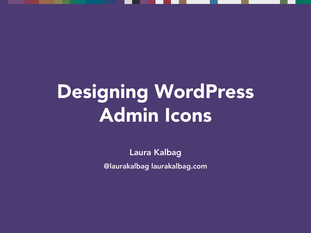
Designing Icons and WordPress Admin Icons
Search
Laura Kalbag
January 17, 2013
Design
1.2k
2
Share
Embed
Copy iframe code
Copy JS code
Copy link
Start on current slide
Designing Icons and WordPress Admin Icons
From a talk at WordPress London in January 2013
Laura Kalbag
January 17, 2013
More Decks by Laura Kalbag
See All by Laura Kalbag
Ethical Design
laurakalbag
1
140
Intro to UX
laurakalbag
1
200
Ethical Design
laurakalbag
1
3k
Accessibility By Design
laurakalbag
1
130
Designing For Accessibility
laurakalbag
2
180
Indie Design
laurakalbag
4
2.2k
WAI-ARIA in 10
laurakalbag
1
290
Designing for Accessibility
laurakalbag
0
100
Designing for Accessibility
laurakalbag
1
540
Other Decks in Design
See All in Design
結びながら、ひらく - にじむ境界のデザイン
hilokifigma
4
1.7k
言幹と言葉(Stems & Leaves)
kakukoki
0
130
図面資産×AI 眠れる資産を起こす挑戦
aonomasahiro
0
170
広い関与の可能性に どう向き合うのか? 私たちは。|Timee MarketingDesign 2026-06-18
bebe
0
250
JBUG大阪#9_登壇資料_引き継ぎで困らないためのBacklogWikiの整え方_ミスと属人化を防ぐために、 “次の人が動ける状態”をどう残すか
webnaut
1
190
設計と制作 意図を形に表す / Design and Making: Intent Made Form
usagimaru
3
2k
Mandalyn_DT5001_FinalAssignment.pdf
lynteo
0
240
「ツール」から「パートナー」へ。AI伴走時代のUXデザインとは?~操作を減らし、成果を最大にするための設計~
ncdc
1
690
root COMPANY DECK / We are hiring!
root_recruit
3
29k
Connpass-Xperia_Camera_App_by_HCD.pdf
sony
1
690
Saving_the_King_-_Storyboard.pdf
terencebasart
0
130
保育現場にAIを 〜人と技術に橋を架けるデザインで考えてきたこと〜 uiuxcamp2026-hoiku-ai-design
hiro93n
1
330
Featured
See All Featured
Design in an AI World
tapps
1
260
Everyday Curiosity
cassininazir
0
250
It's Worth the Effort
3n
188
29k
The Hidden Cost of Media on the Web [PixelPalooza 2025]
tammyeverts
2
340
実際に使うSQLの書き方 徹底解説 / pgcon21j-tutorial
soudai
PRO
201
75k
Stewardship and Sustainability of Urban and Community Forests
pwiseman
0
250
AI Search: Where Are We & What Can We Do About It?
aleyda
0
7.7k
Leading Effective Engineering Teams in the AI Era
addyosmani
9
2.1k
Keith and Marios Guide to Fast Websites
keithpitt
413
23k
Exploring anti-patterns in Rails
aemeredith
3
440
Visualization
eitanlees
152
17k
30 Presentation Tips
portentint
PRO
1
340
Transcript
Laura Kalbag @laurakalbag laurakalbag.com Designing WordPress Admin Icons
Why use icons?
“inform, translate and warn” — Jon Hicks The Icon Handbook
We use them as…
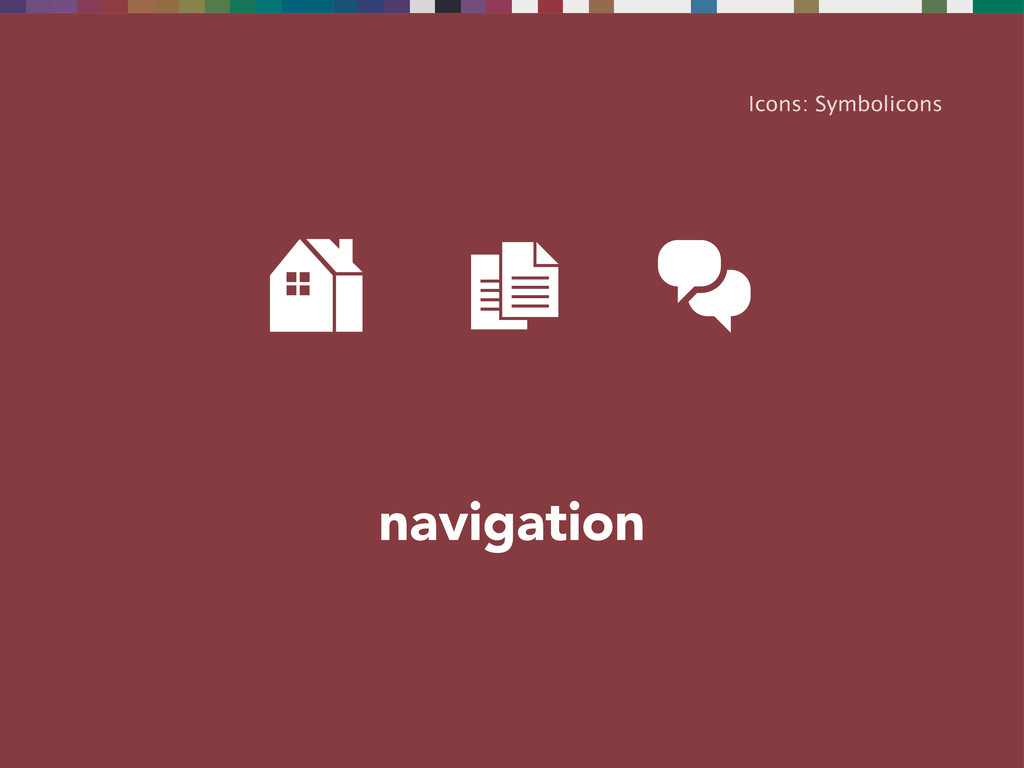
navigation Icons: Symbolicons
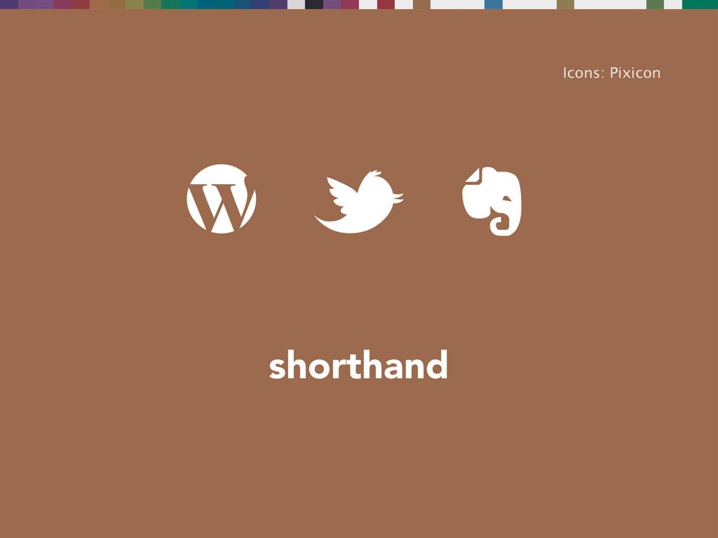
shorthand Icons: Pixicon
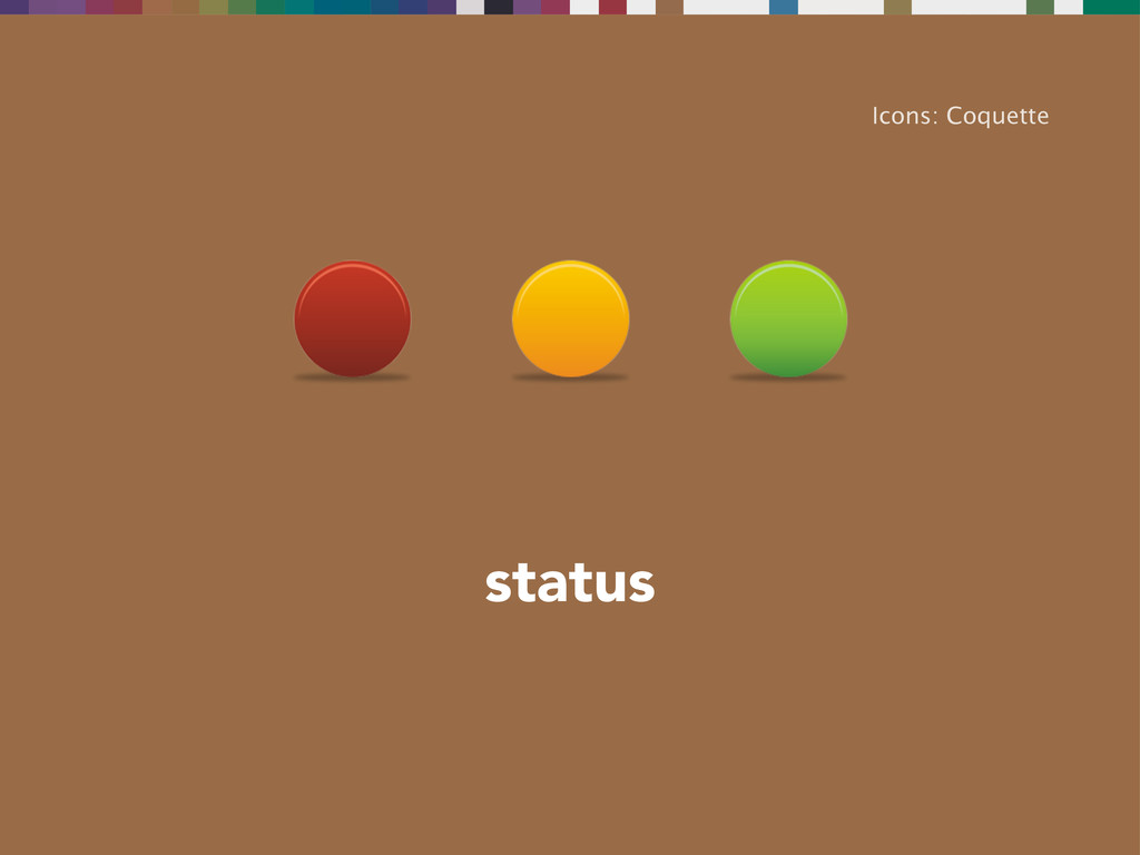
status Icons: Coquette
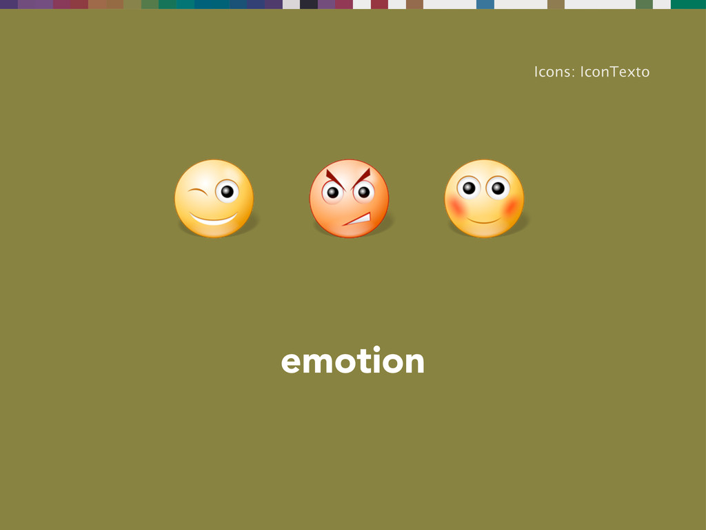
emotion Icons: IconTexto
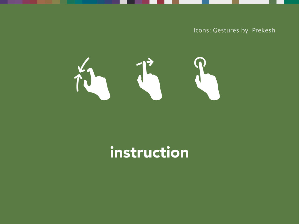
instruction Icons: Gestures by Prekesh
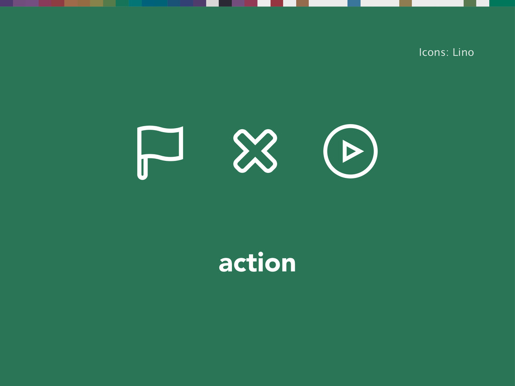
action Icons: Lino
And we’re most likely to come across them as…
favicons WordPress
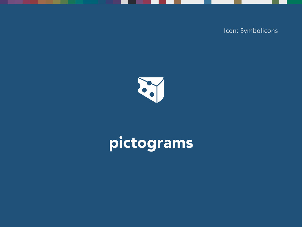
pictograms Icon: Symbolicons
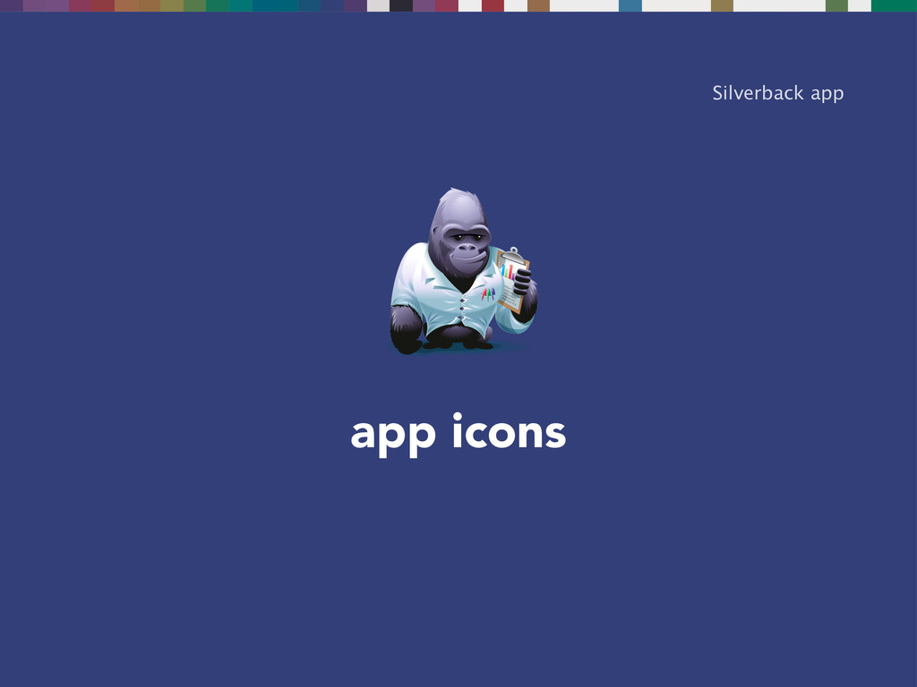
app icons Silverback app
What makes icons great?
None
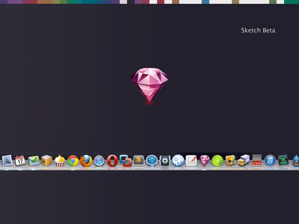
Sketch Beta
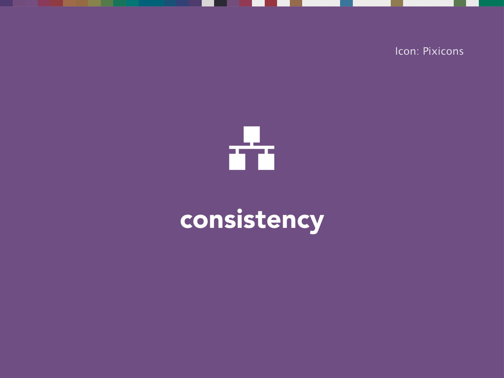
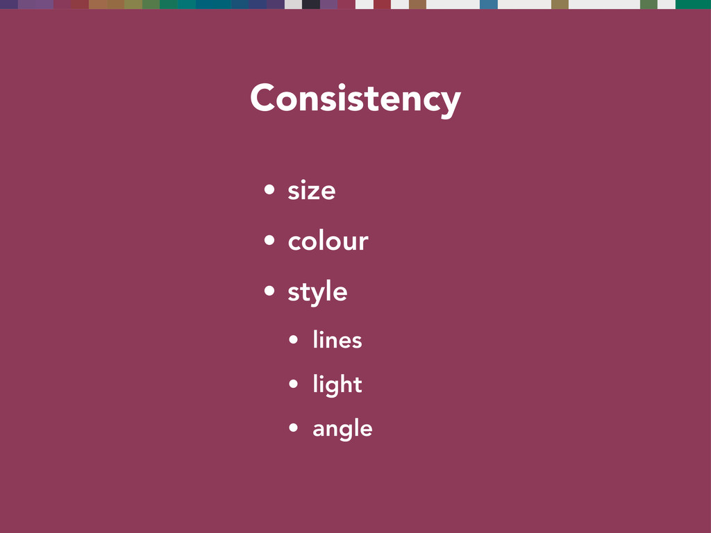
consistency Icon: Pixicons
Consistency • size • colour • style • lines •
light • angle
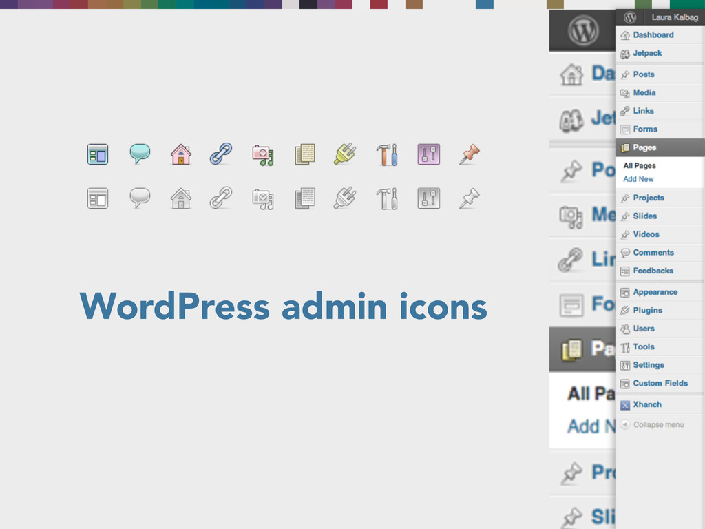
WordPress admin icons
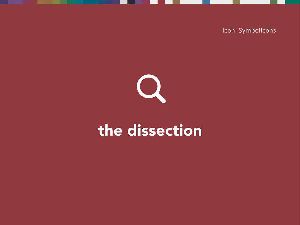
the dissection Icon: Symbolicons
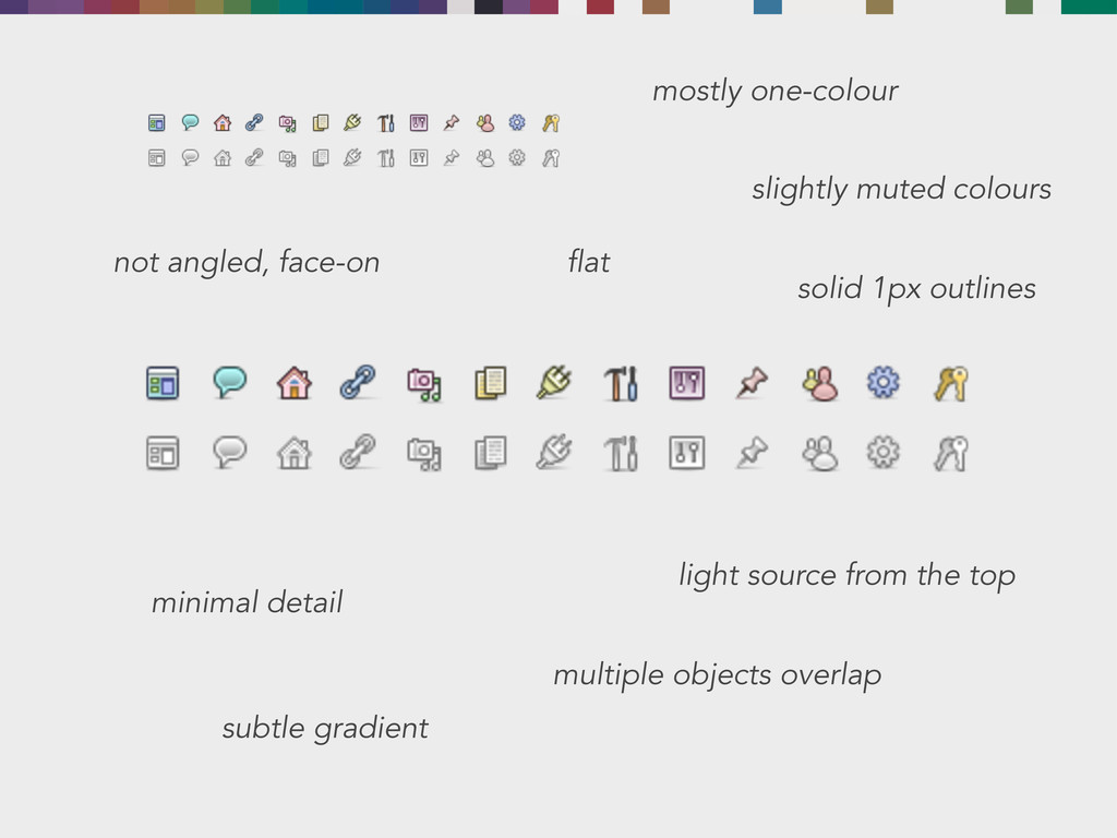
mostly one-colour slightly muted colours not angled, face-on flat solid
1px outlines minimal detail subtle gradient light source from the top multiple objects overlap
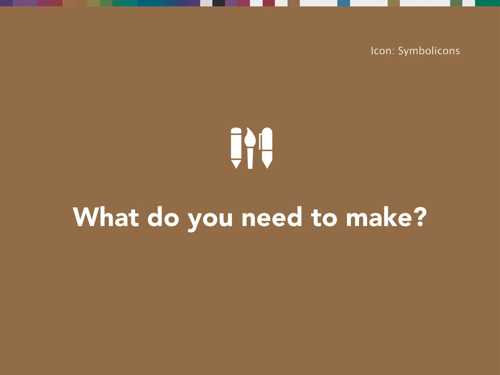
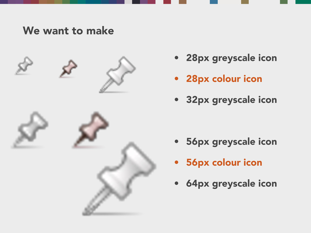
What do you need to make? Icon: Symbolicons
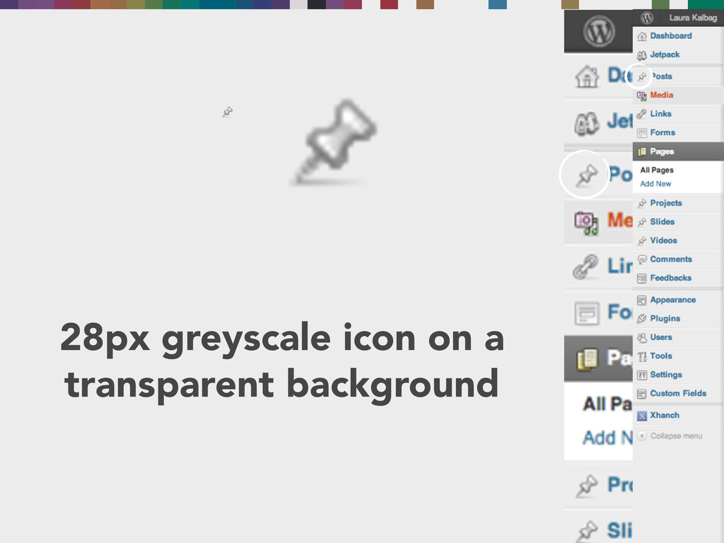
28px greyscale icon on a transparent background
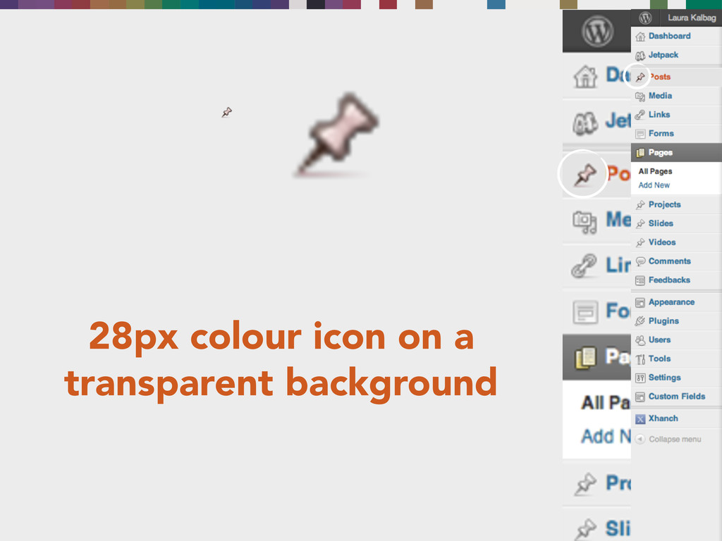
28px colour icon on a transparent background
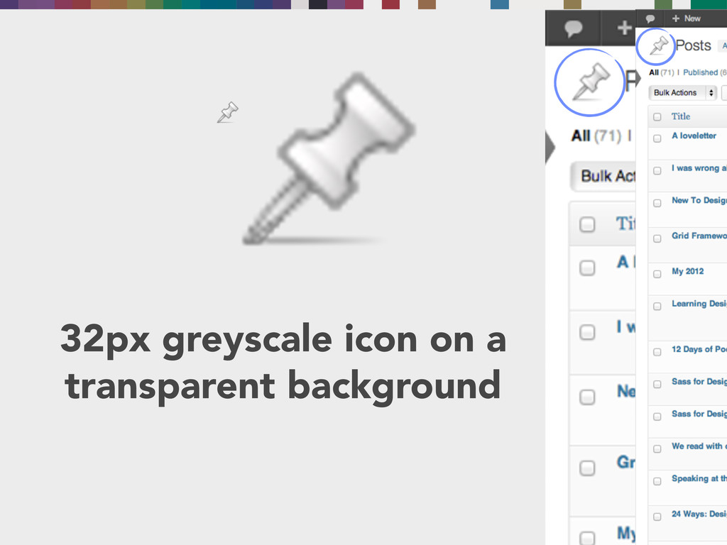
32px greyscale icon on a transparent background
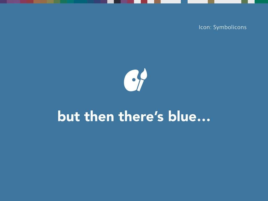
but then there’s blue… Icon: Symbolicons
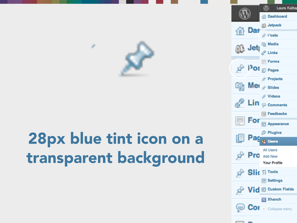
28px blue tint icon on a transparent background
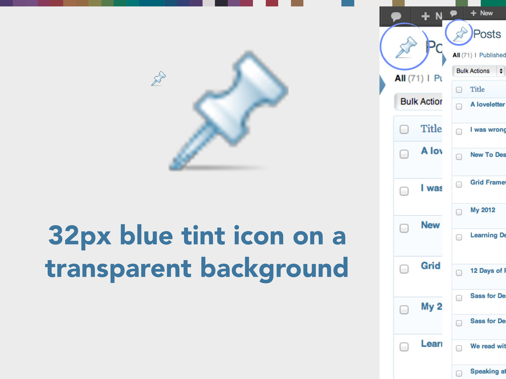
32px blue tint icon on a transparent background
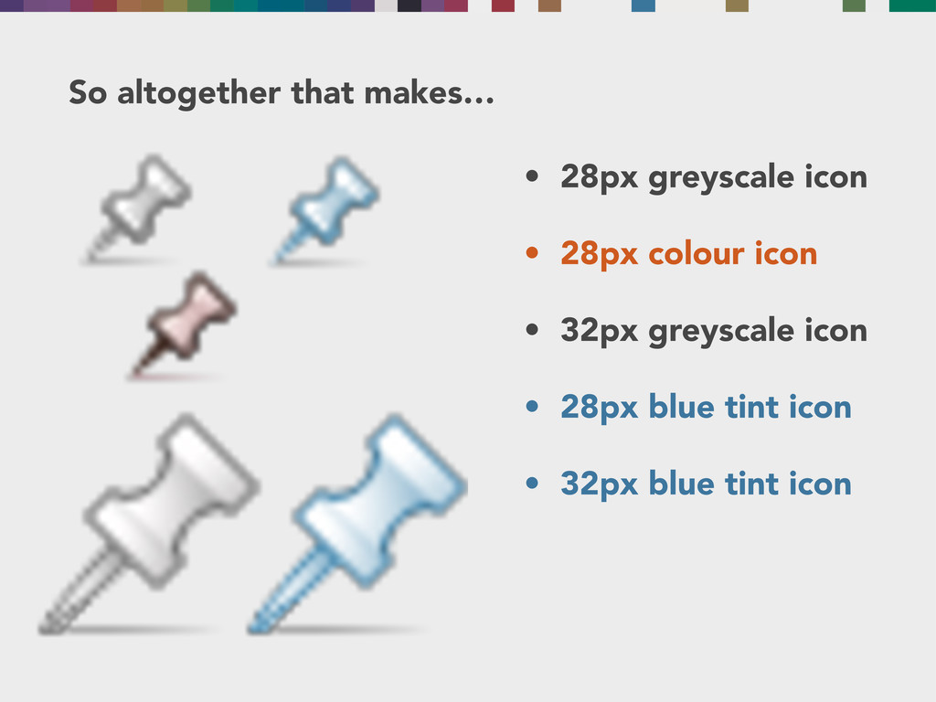
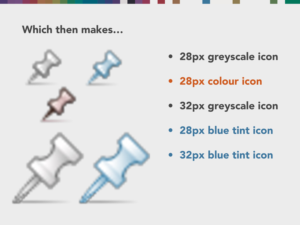
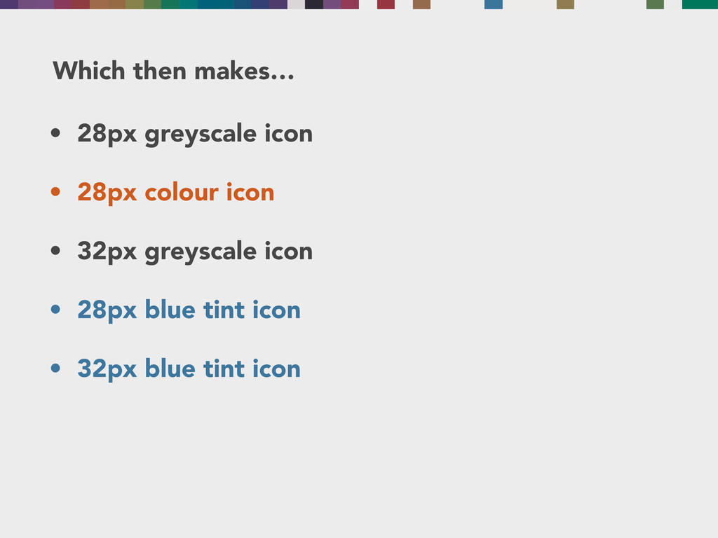
So altogether that makes… • 28px greyscale icon • 28px
colour icon • 32px greyscale icon • 28px blue tint icon • 32px blue tint icon
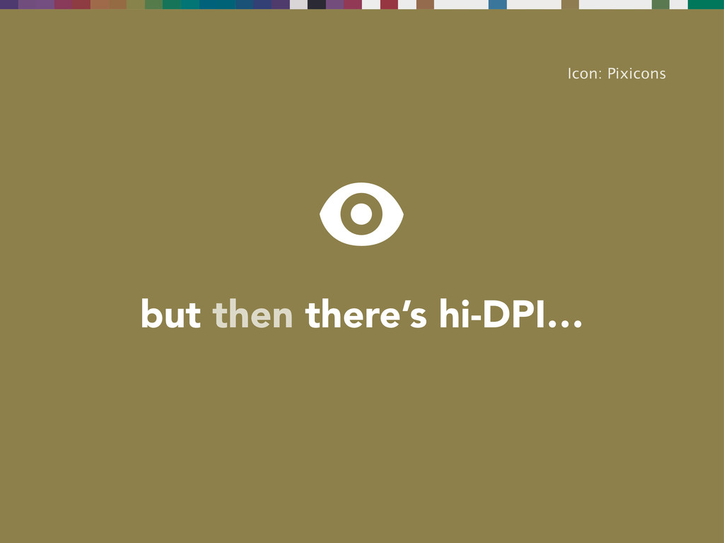
but then there’s hi-DPI… Icon: Pixicons
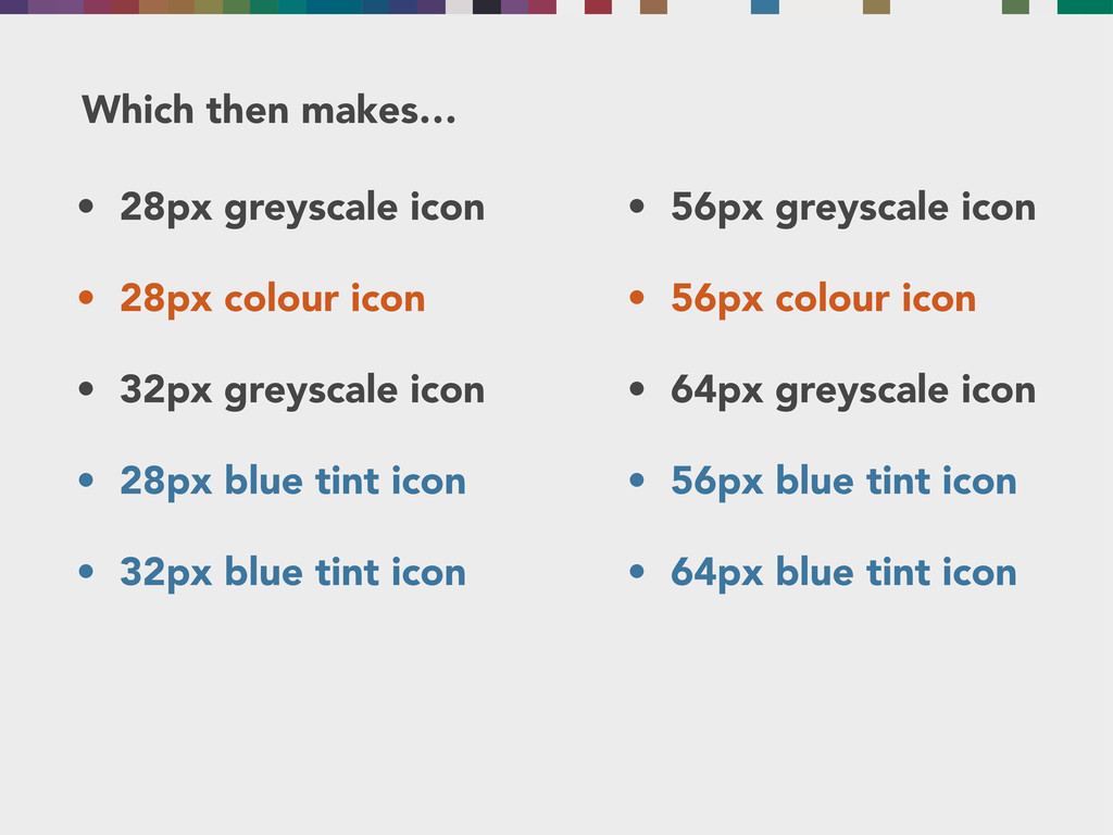
Which then makes… • 28px greyscale icon • 28px colour
icon • 32px greyscale icon • 28px blue tint icon • 32px blue tint icon
Which then makes… • 28px greyscale icon • 28px colour
icon • 32px greyscale icon • 28px blue tint icon • 32px blue tint icon
Which then makes… • 28px greyscale icon • 28px colour
icon • 32px greyscale icon • 28px blue tint icon • 32px blue tint icon
Which then makes… • 28px greyscale icon • 28px colour
icon • 32px greyscale icon • 28px blue tint icon • 32px blue tint icon • 56px greyscale icon • 56px colour icon • 64px greyscale icon • 56px blue tint icon • 64px blue tint icon
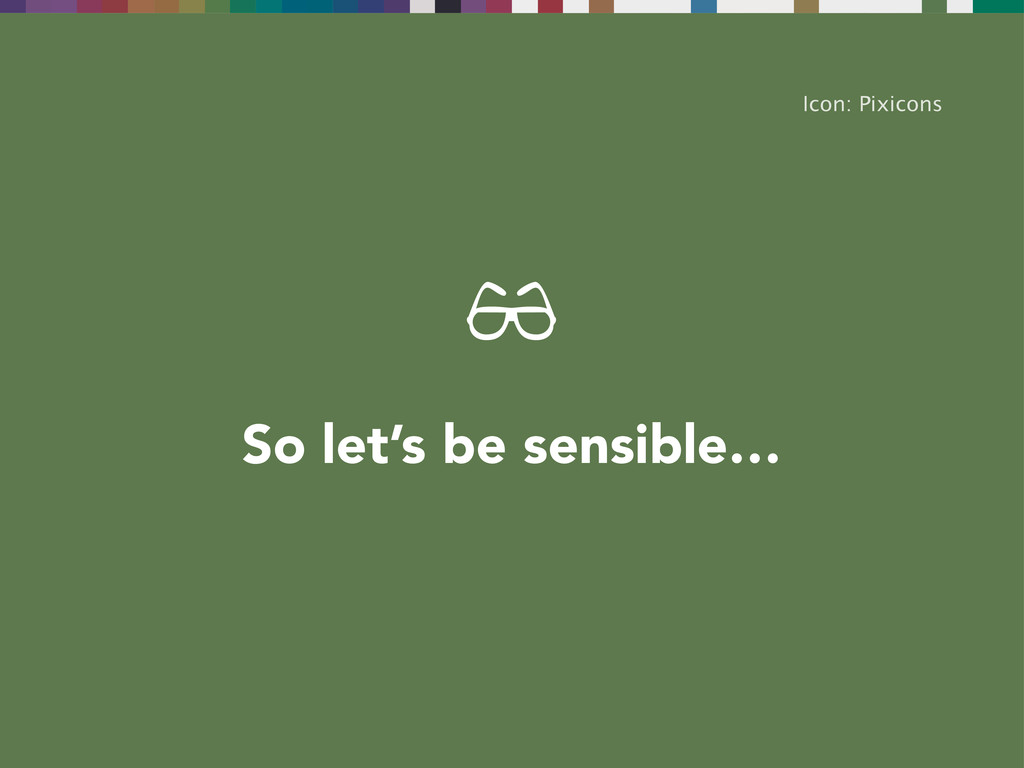
So let’s be sensible… Icon: Pixicons
We want to make • 28px greyscale icon • 28px
colour icon • 32px greyscale icon • 56px greyscale icon • 56px colour icon • 64px greyscale icon
Icon: Symbolicons Live WordPress admin icon
Icon: Pixicons Laura Kalbag @laurakalbag laurakalbag.com