$30 off During Our Annual Pro Sale. View Details »

Bringing a knife to a gunfight

Bringing a knife to a gunfight

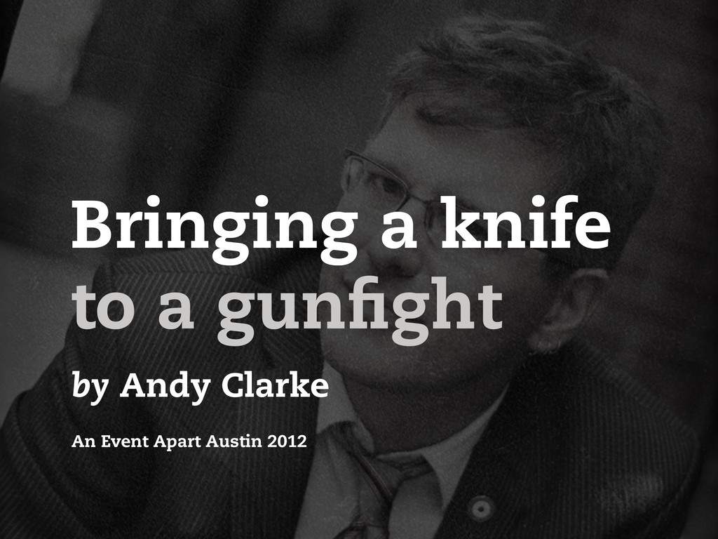
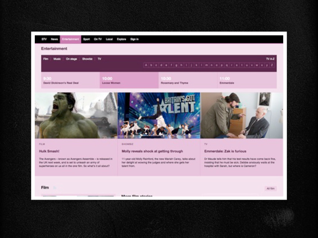
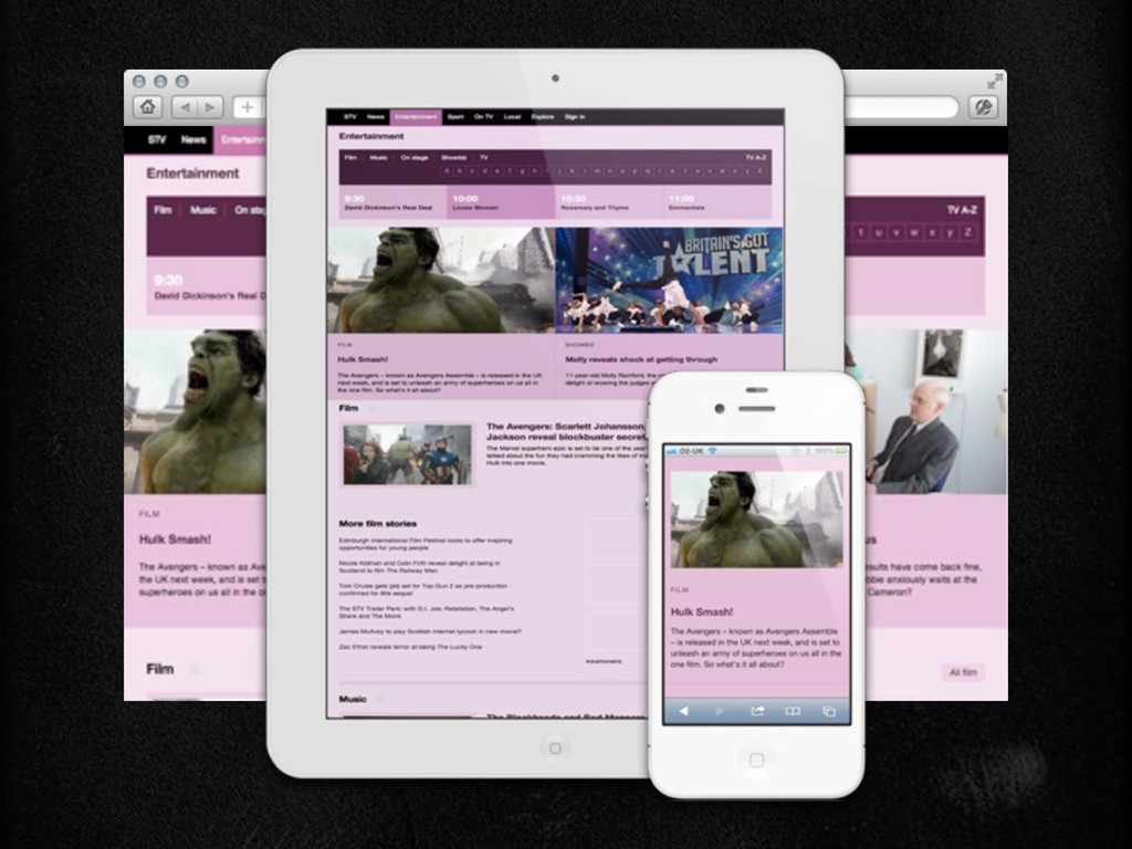
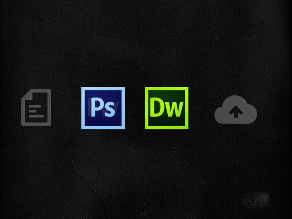
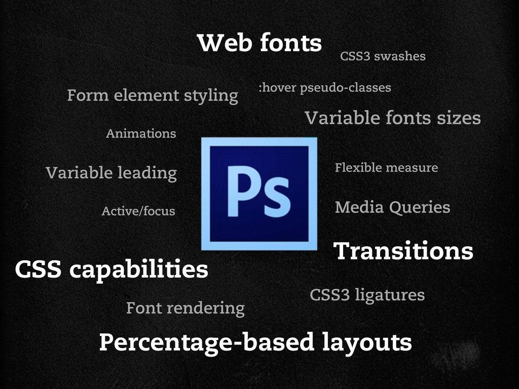
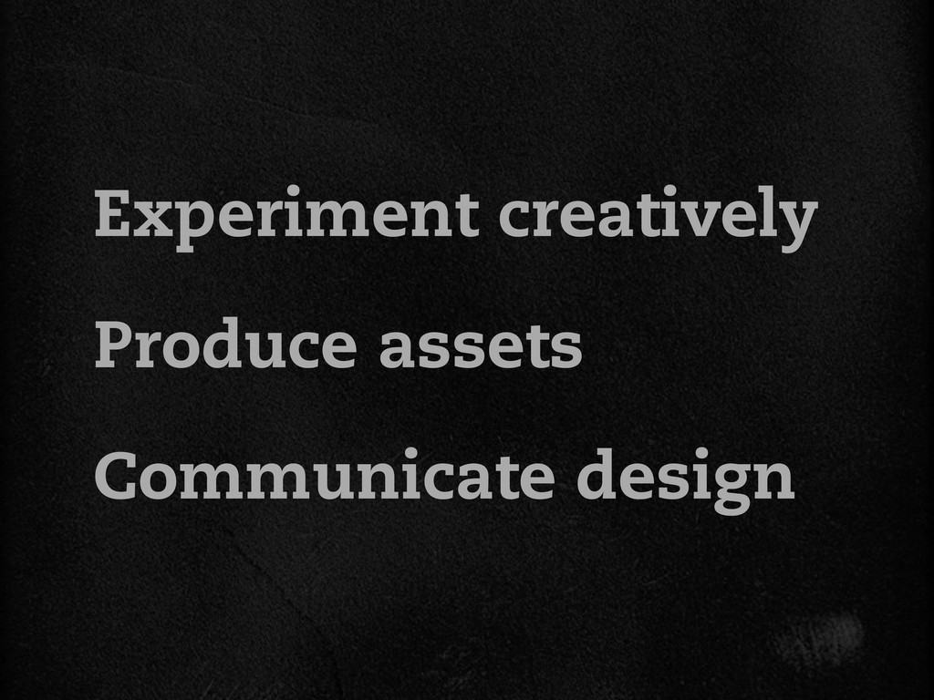
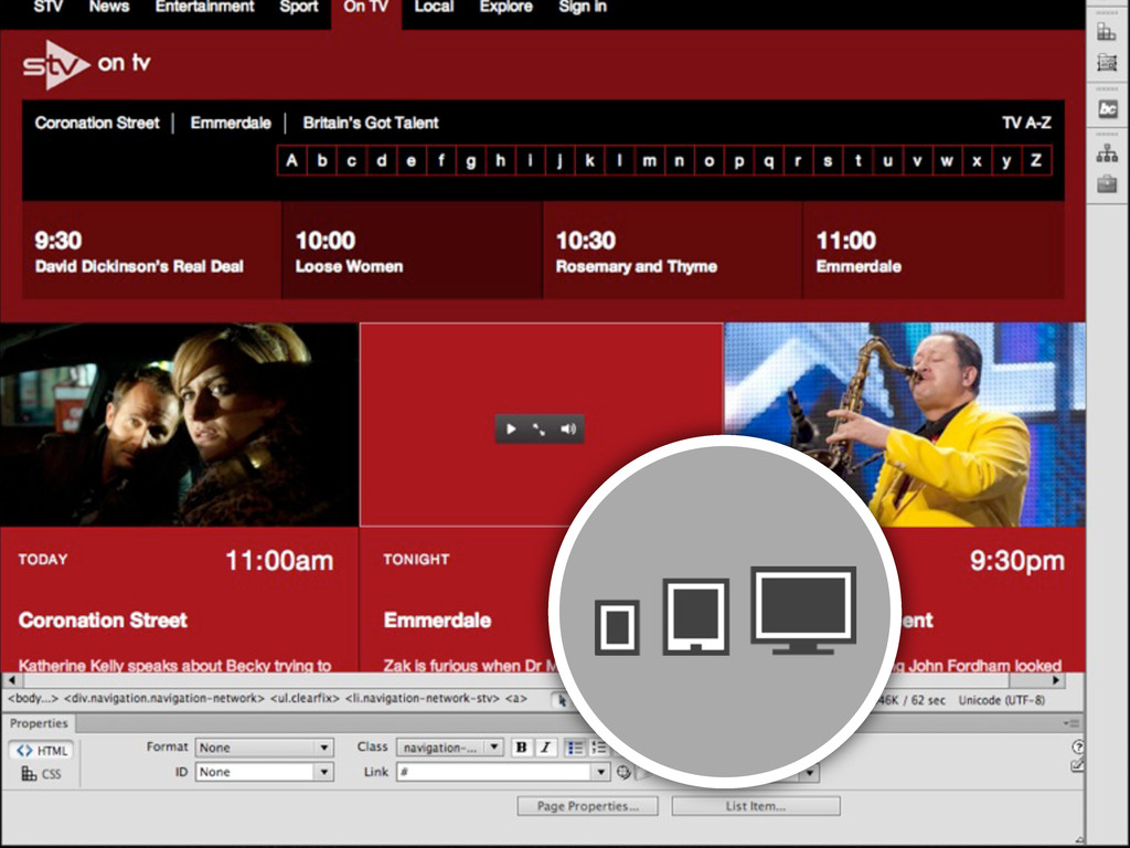
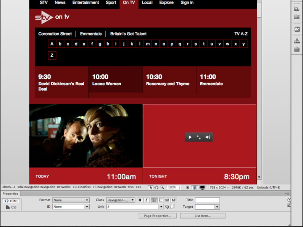
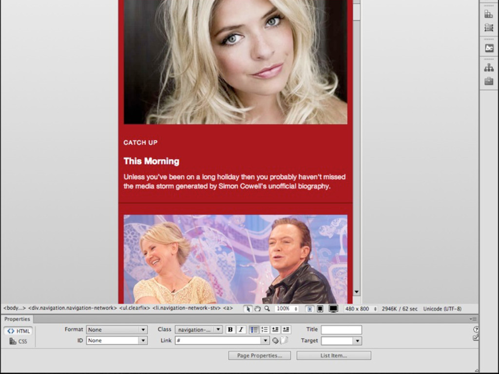
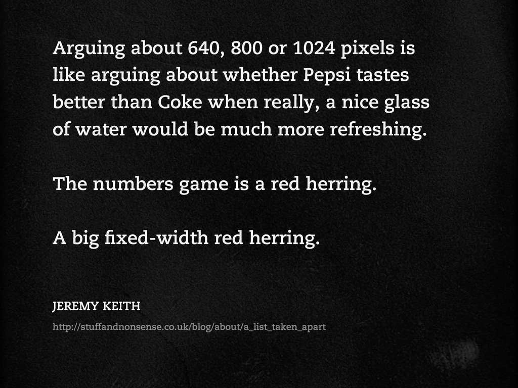
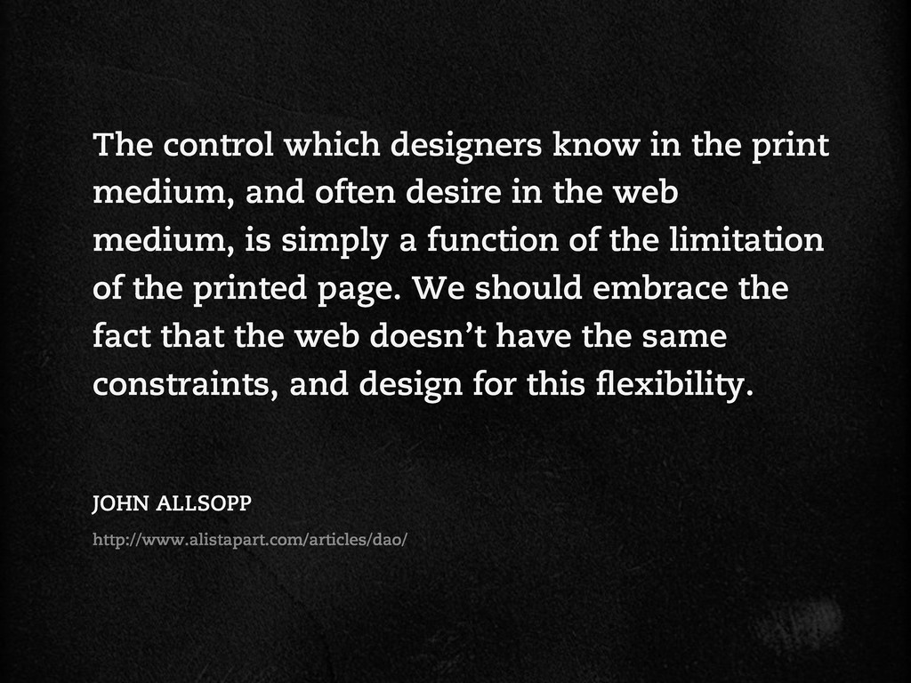
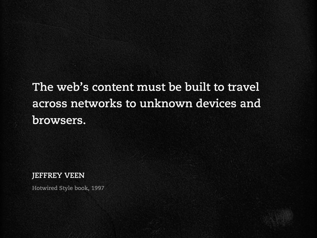
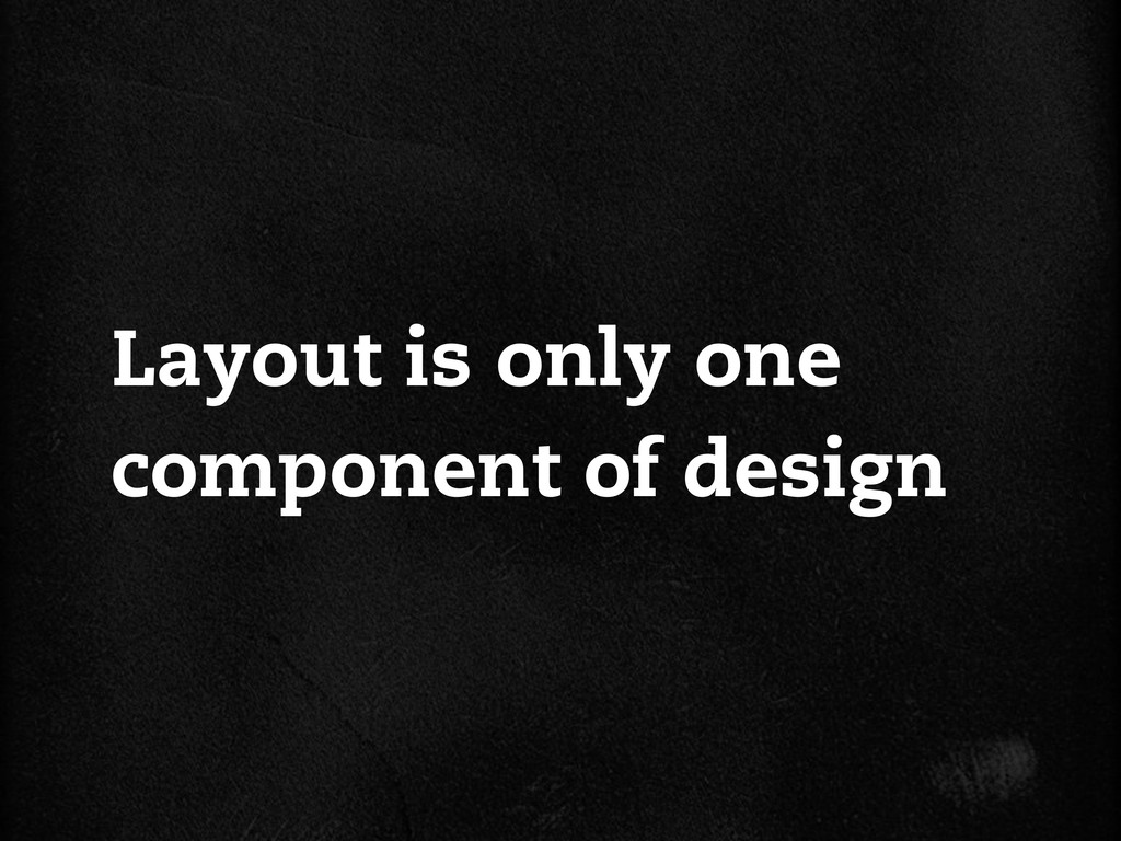
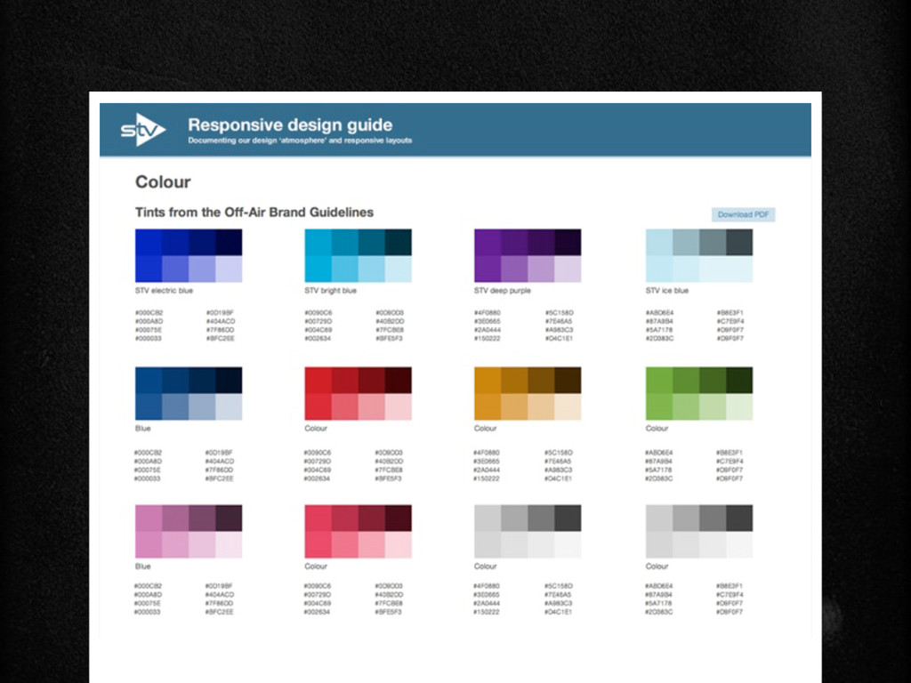
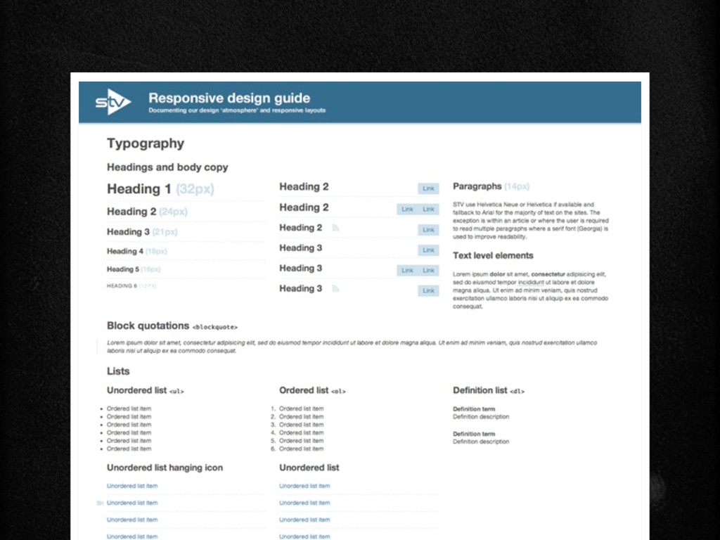
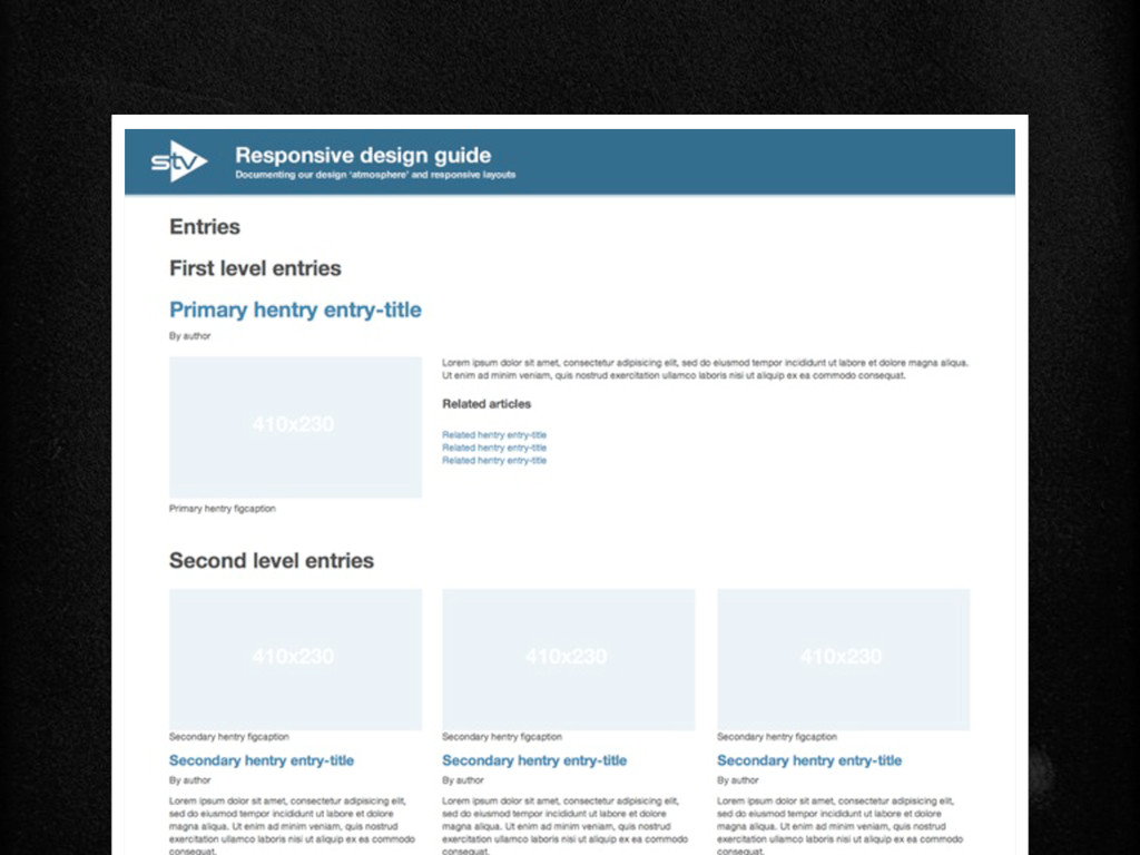
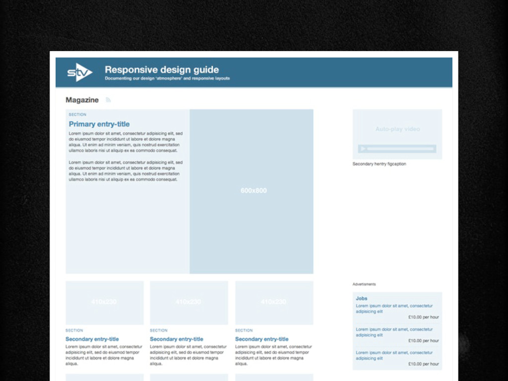
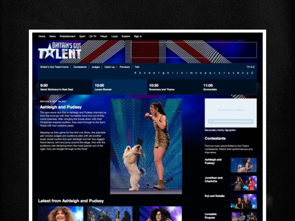
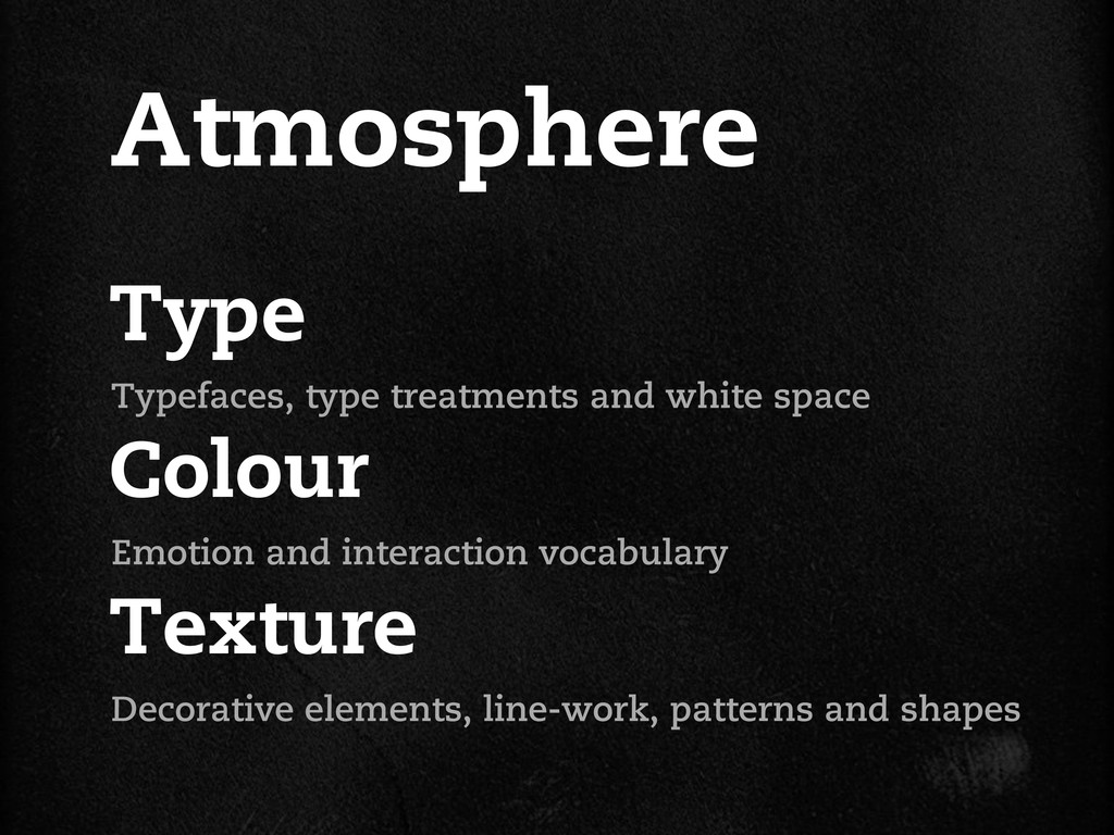
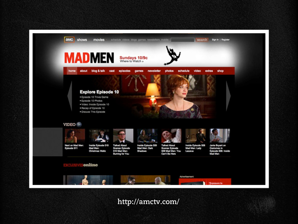
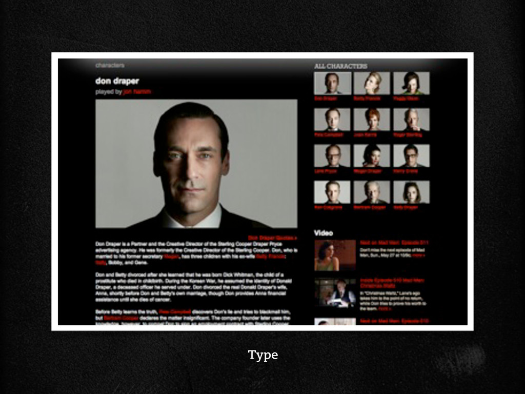
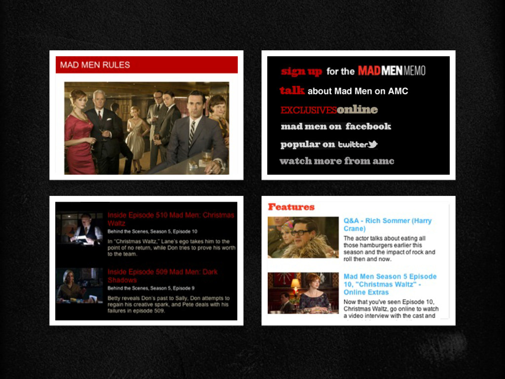
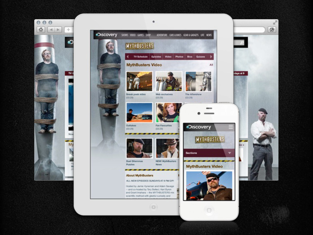
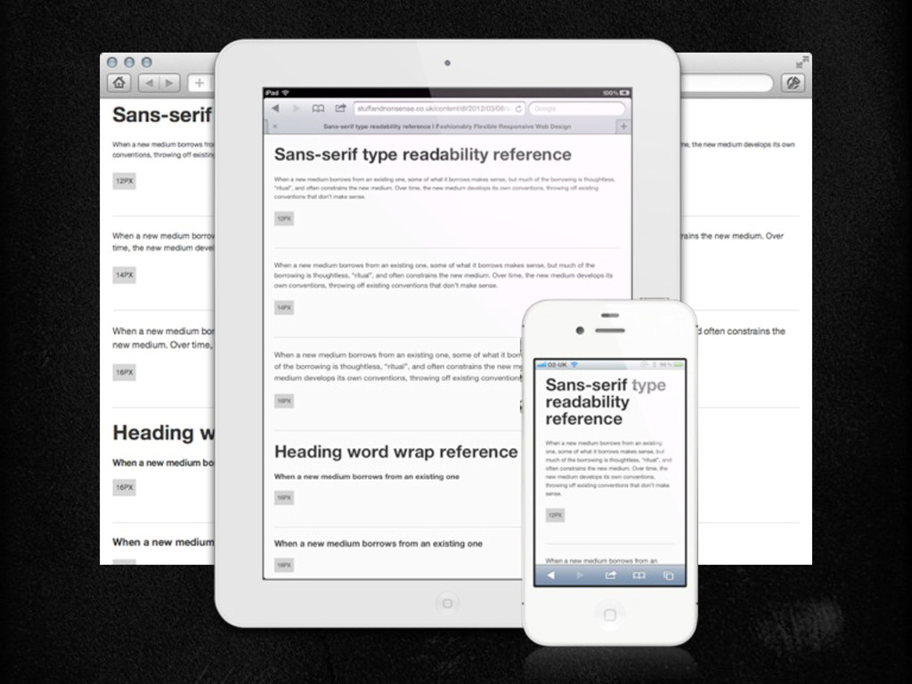
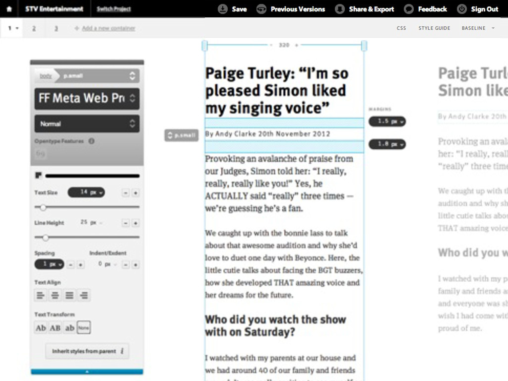
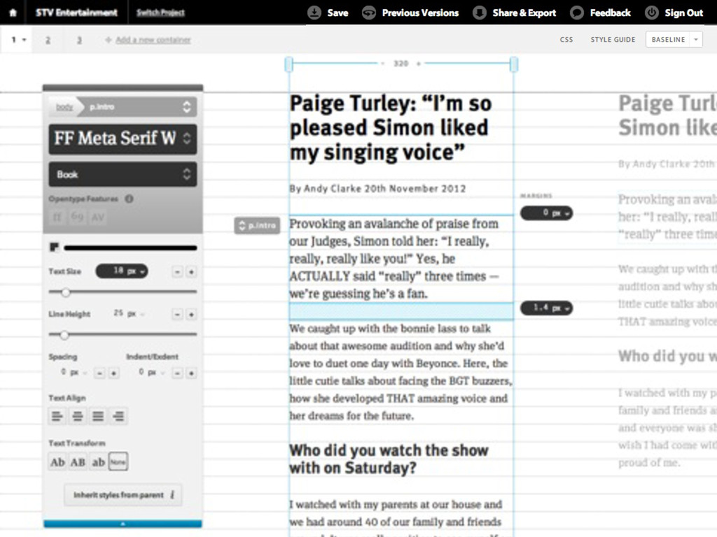
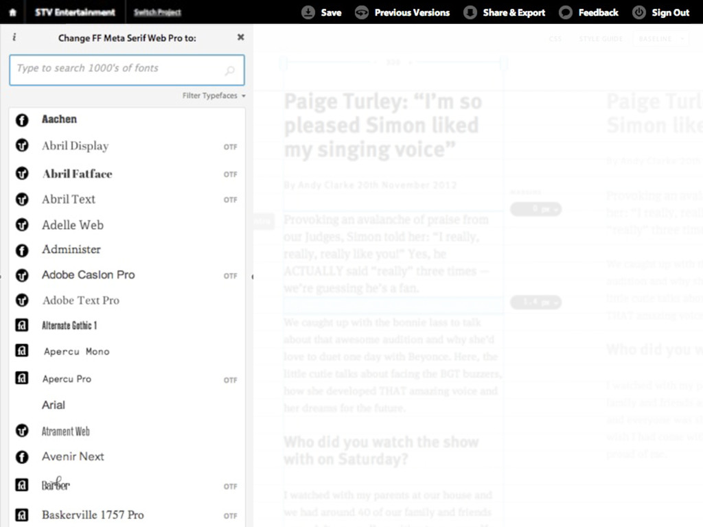
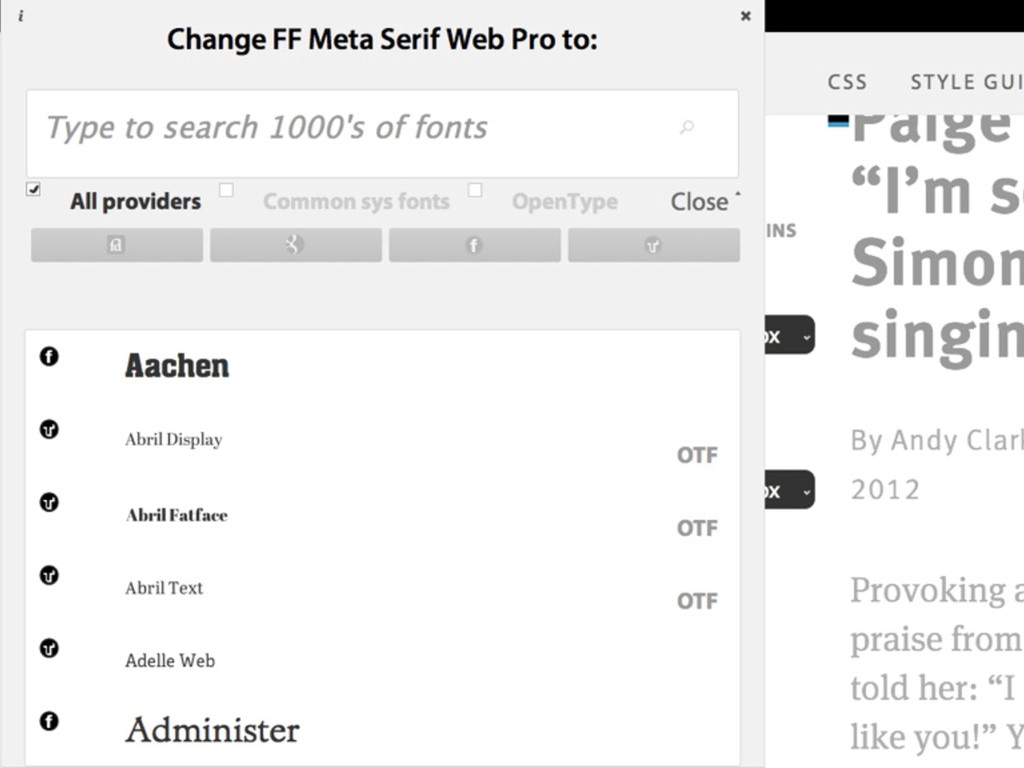
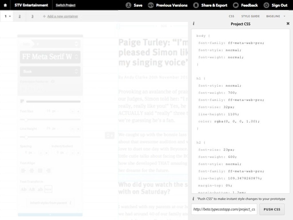
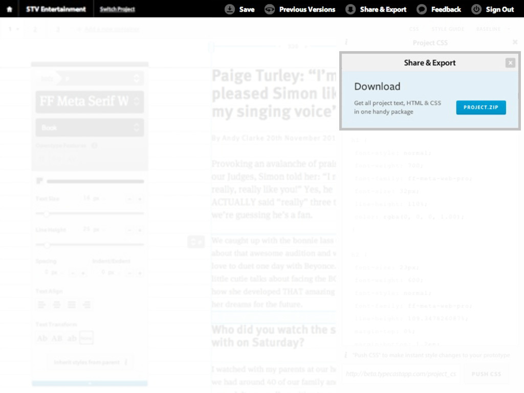
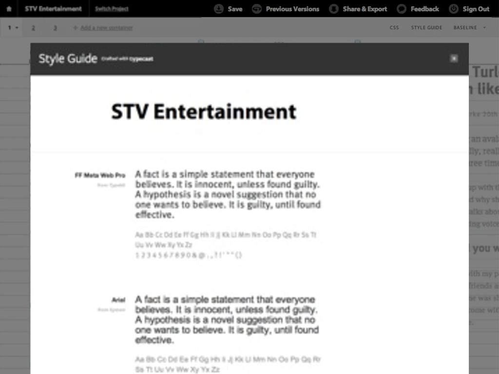
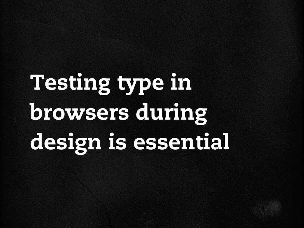
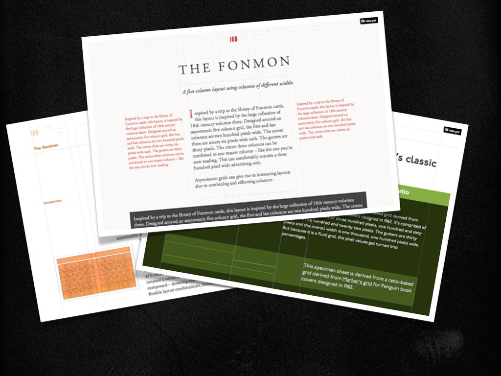
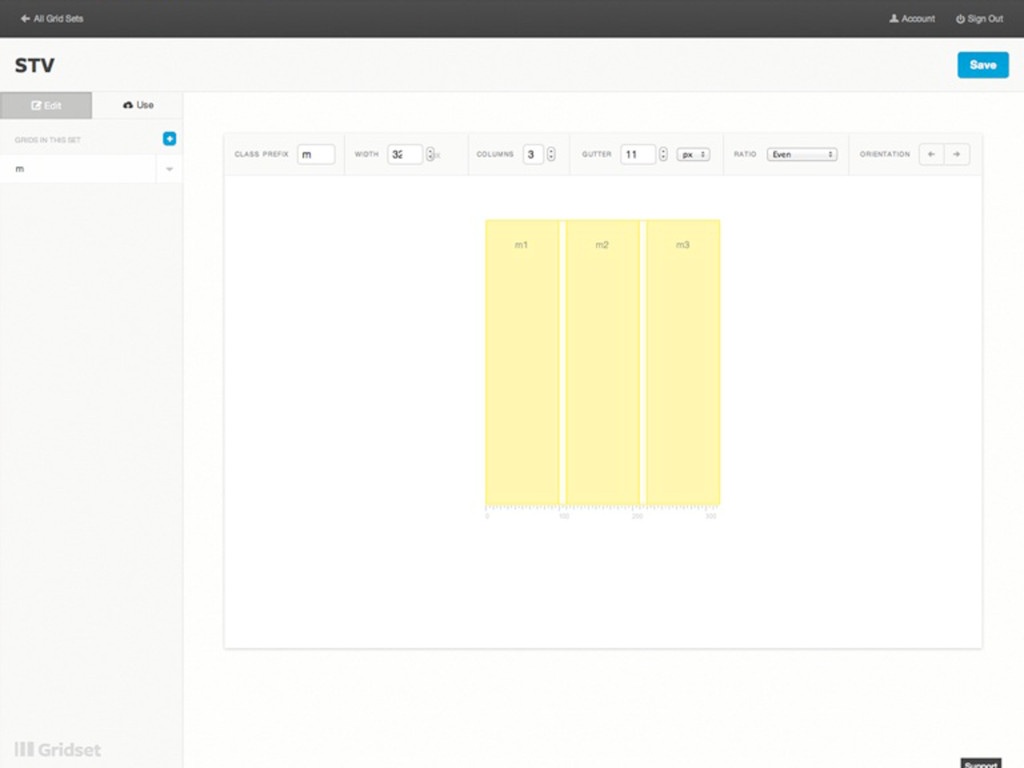
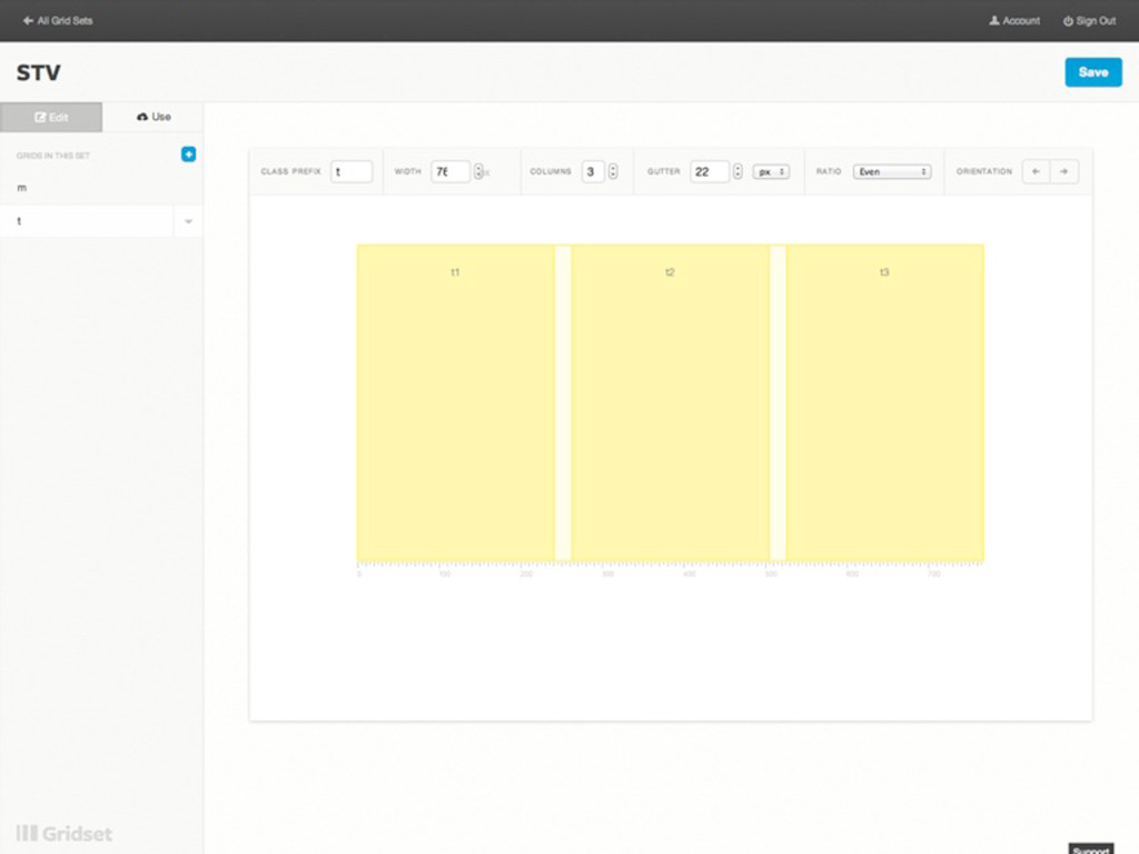
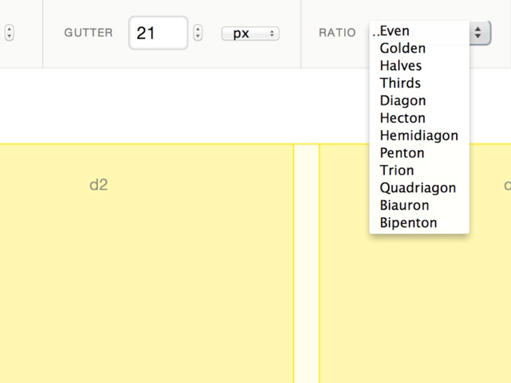
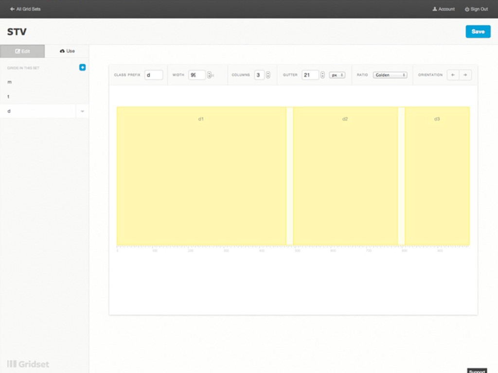
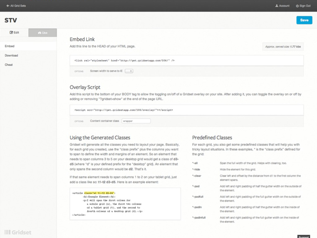
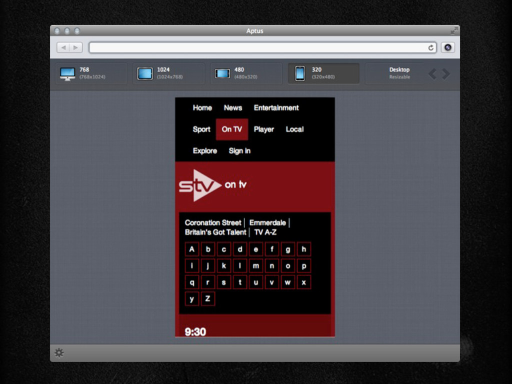
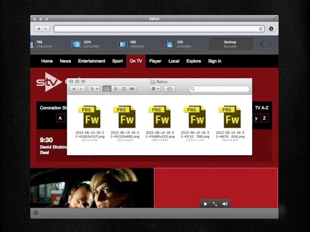
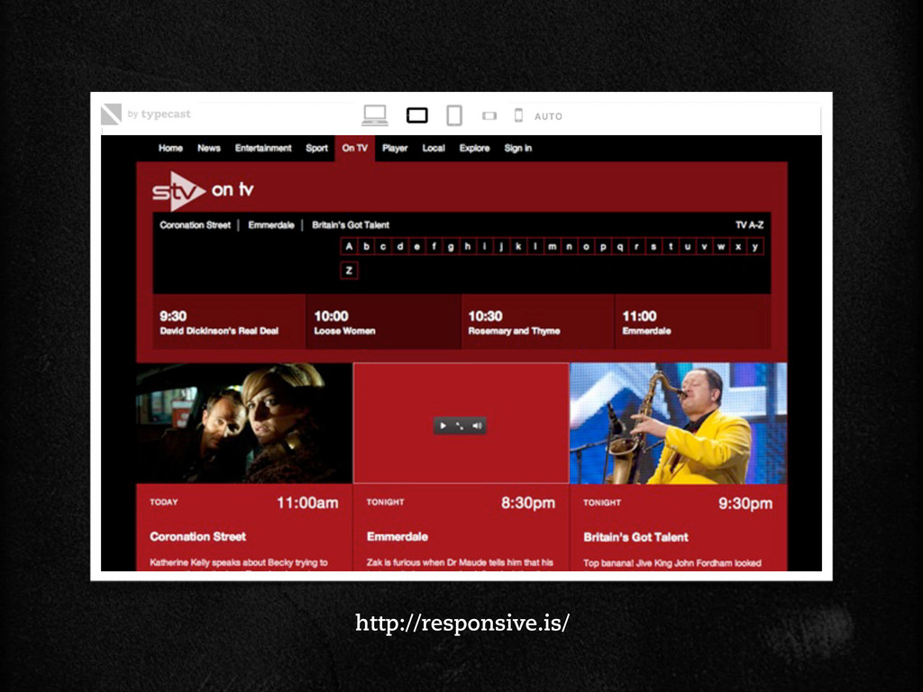
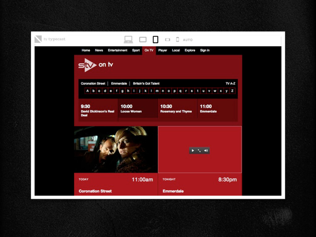
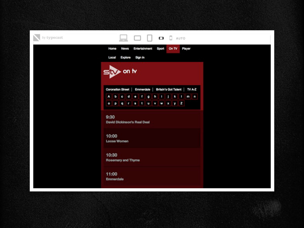
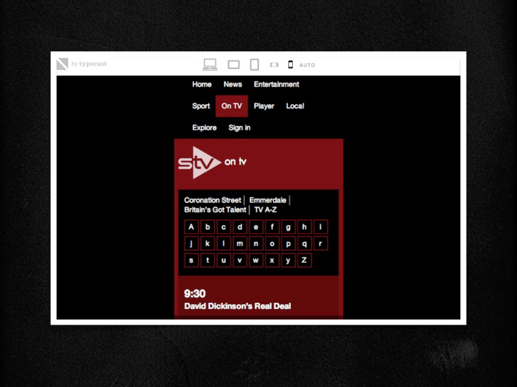
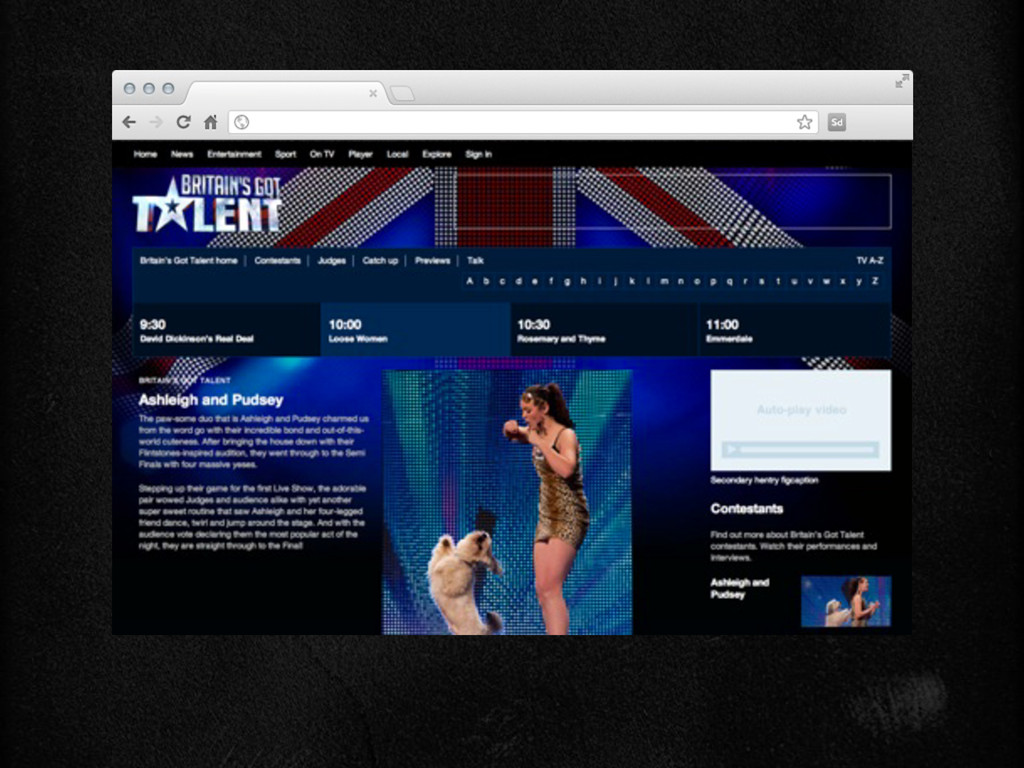
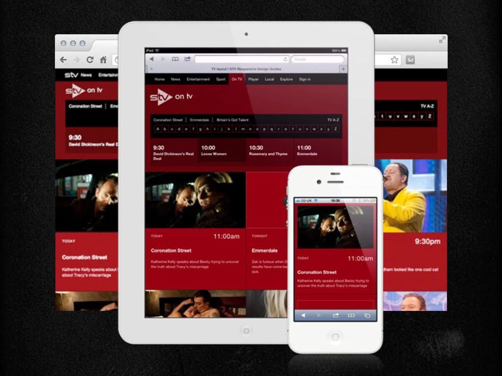
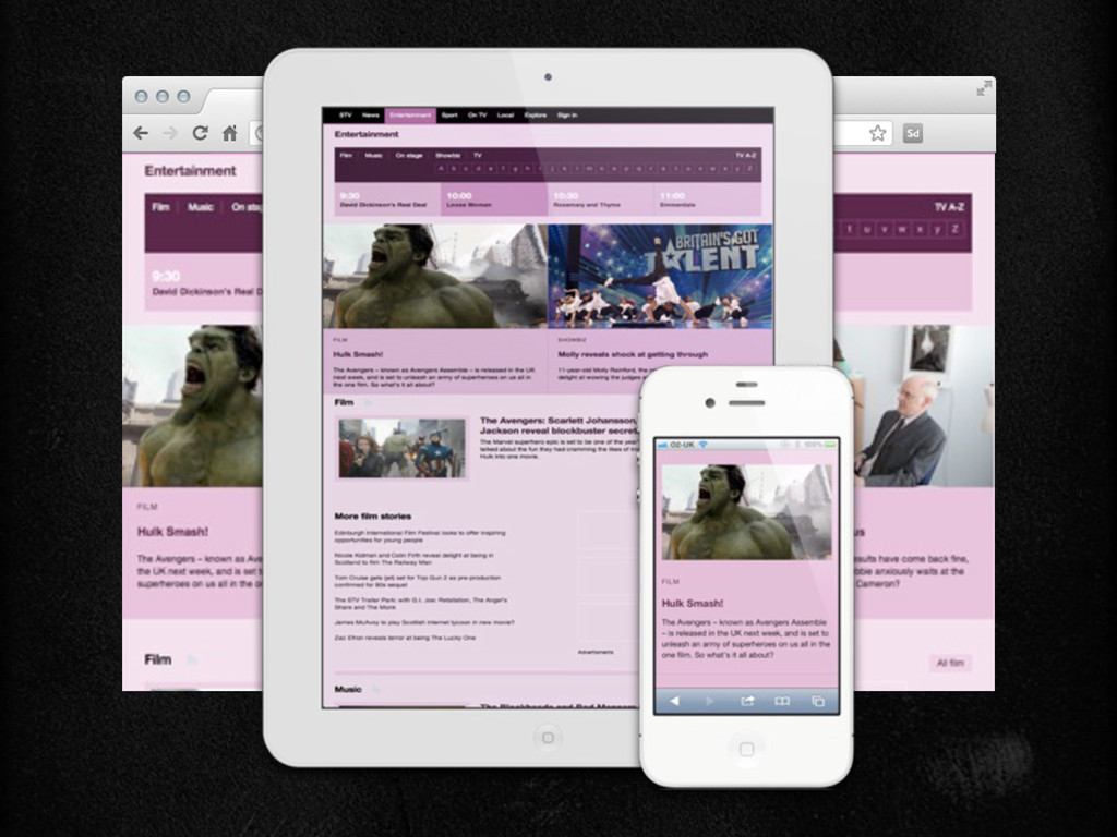
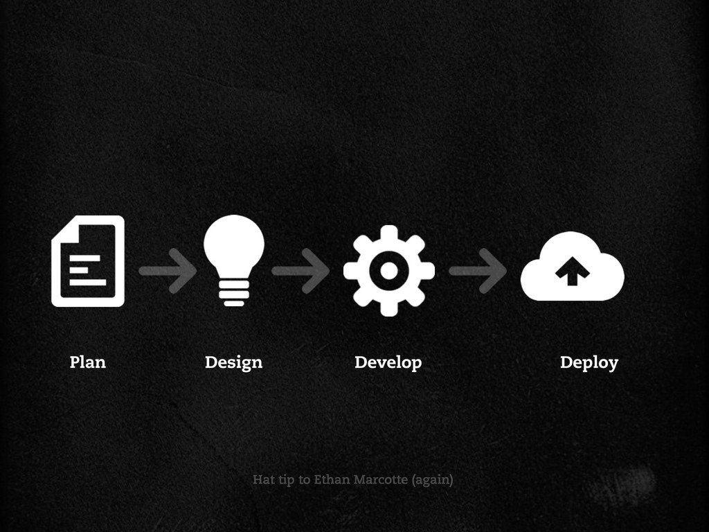
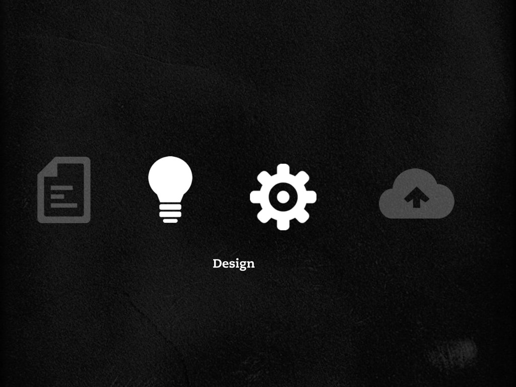
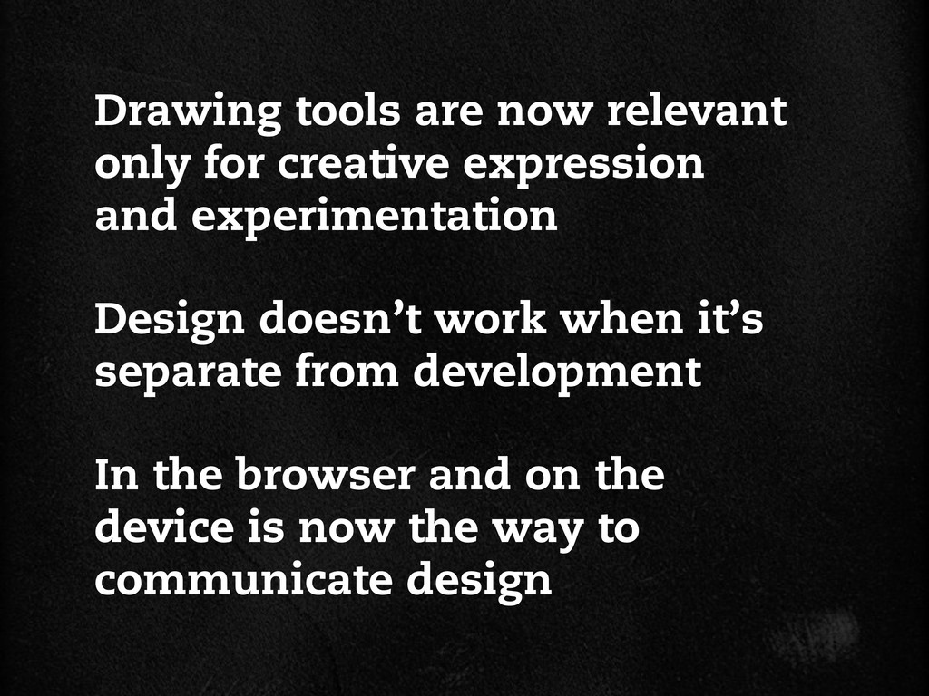
In the mid-nineties, when designers started making their mark on the web, they did it with software tools and processes that they’d brought with them from print. But the web’s a different place now than it was ten, five, even two years ago; the tools and processes we’ve relied on for years are no longer capable of properly designing today’s flexible, responsive web. In this session, we’ll find new ways to design that better serve the needs of today’s responsive web, and investigate better, alternative tools and approaches to design. We’ll learn too how new tools and approaches can improve communication between designers and developers and our clients.

Andy Clarke

July 11, 2012
Tweet

More Decks by Andy Clarke

Other Decks in Design

Transcript

  1. Bringing a knife
    to a gun ght
    by Andy Clarke
    An Event Apart Austin 2012

    View Slide

  2. Photo credit: Geri Coady

    View Slide

  3. http://stv.tv/

    View Slide

  4. View Slide

  5. View Slide

  6. View Slide

  7. View Slide

  8. View Slide

  9. View Slide

  10. Plan Design Develop Deploy
    Hat tip to Ethan Marcotte

    View Slide

  11. View Slide

  12. View Slide

  13. Variable leading
    Percentage-based layouts
    CSS capabilities
    Active/focus
    Animations
    Form element styling
    Font rendering
    Web fonts
    Transitions
    Variable fonts sizes
    Media Queries
    CSS3 ligatures
    Flexible measure
    :hover pseudo-classes
    CSS3 swashes

    View Slide

  14. They’re the wrong
    tool for the job

    View Slide

  15. What do we need
    design tools for?

    View Slide

  16. Experiment creatively
    Produce assets
    Communicate design

    View Slide

  17. ⌘N

    View Slide

  18. View Slide

  19. 640x480

    View Slide

  20. View Slide

  21. 800x600

    View Slide

  22. 1024x768

    View Slide

  23. http://www.alistapart.com/articles/ala40

    View Slide

  24. We don’t support 800 x 600 anymore,
    nor do we 640 x 480.
    Do you?
    JASON SANTA MARIA
    http://stuffandnonsense.co.uk/blog/about/a_list_taken_apart

    View Slide

  25. View Slide

  26. View Slide

  27. 320x420
    320x420

    View Slide

  28. 420x320

    View Slide

  29. 1024x768

    View Slide

  30. View Slide

  31. View Slide

  32. View Slide

  33. View Slide

  34. View Slide

  35. This kind of thing
    gives Jeremy Keith
    the willies

    View Slide

  36. Arguing about 640, 800 or 1024 pixels is
    like arguing about whether Pepsi tastes
    better than Coke when really, a nice glass
    of water would be much more refreshing.
    The numbers game is a red herring.
    A big xed-width red herring.
    JEREMY KEITH
    http://stuffandnonsense.co.uk/blog/about/a_list_taken_apart

    View Slide

  37. The control which designers know in the print
    medium, and often desire in the web
    medium, is simply a function of the limitation
    of the printed page. We should embrace the
    fact that the web doesn’t have the same
    constraints, and design for this exibility.
    JOHN ALLSOPP
    http://www.alistapart.com/articles/dao/

    View Slide

  38. The web’s content must be built to travel
    across networks to unknown devices and
    browsers.
    JEFFREY VEEN
    Hotwired Style book, 1997

    View Slide

  39. Layout is only one
    component of design

    View Slide

  40. Design

    View Slide

  41. Atmosphere
    Layout

    View Slide

  42. http:// ickr.com/photos/53831770@N03/5518688331

    View Slide

  43. http:// ickr.com/photos/25688037@N04/5511202367

    View Slide

  44. http:// ickr.com/photos/ohmystars/6163991574

    View Slide

  45. http://twitter.github.com/bootstrap/

    View Slide

  46. View Slide

  47. http://bbc.co.uk/gel/

    View Slide

  48. View Slide

  49. http://mailchimp.com/about/brand-assets/

    View Slide

  50. View Slide

  51. http://dribbble.com/trentwalton/

    View Slide

  52. View Slide

  53. Dribbblets

    View Slide

  54. View Slide

  55. View Slide

  56. View Slide

  57. View Slide

  58. View Slide

  59. View Slide

  60. View Slide

  61. View Slide

  62. Designing from the
    content out isn’t
    always possible

    View Slide

  63. View Slide

  64. Atmosphere
    Type
    Colour
    Texture

    View Slide

  65. Type
    Colour
    Texture
    Atmosphere
    Typefaces, type treatments and white space
    Emotion and interaction vocabulary
    Decorative elements, line-work, patterns and shapes

    View Slide

  66. http://amctv.com/

    View Slide

  67. Type

    View Slide

  68. View Slide

  69. Elements
    Styles inventory
    Captions
    Headings
    Labels
    Legends
    Lists
    Paragraphs
    Quotations
    Small
    Tables
    Classi cations
    Alerts
    Comments
    Copyright information
    Dates and times
    Form text (error, help)
    Pull quotes (marks)
    Intro paragraphs
    Related article summaries
    Related article titles

    View Slide

  70. View Slide

  71. http://cbs.com/

    View Slide

  72. View Slide

  73. Colour

    View Slide

  74. View Slide

  75. Texture
    Backgrounds
    Border treatments
    Iconography
    Patterns and textures

    View Slide

  76. http://dsc.discovery.com/tv/deadliest-catch/

    View Slide

  77. Texture

    View Slide

  78. http://dsc.discovery.com/tv/storm-chasers/

    View Slide

  79. http://dsc.discovery.com/tv/mythbusters/

    View Slide

  80. View Slide

  81. View Slide

  82. View Slide

  83. View Slide

  84. Setting web type in
    Photoshop is a
    waste of time

    View Slide

  85. http://informationarchitects.net/blog/responsive-typography-the-basics

    View Slide

  86. No ef cient way to
    simulate typography
    across breakpoints

    View Slide

  87. http://goo.gl/AqDiq

    View Slide

  88. View Slide

  89. Viewport-based
    percentage units

    View Slide

  90. http://trentwalton.com/2011/05/10/ t-to-scale/

    View Slide

  91. View Slide

  92. h1 {
    font-size : 6vw; }
    h2 {
    font-size : 3vh; }
    p {
    font-size : 2vmin; }

    View Slide

  93. vw
    vh
    vmin
    vmax
    Equal to 1% of the width of the viewport
    Equal to 1% of the height of the viewport
    Equal to either vw or vh, whichever is smaller
    http://www.w3.org/TR/css3-values/#viewport-relative-lengths
    New. The opposite behaviour to vmin

    View Slide

  94. View Slide

  95. View Slide

  96. View Slide

  97. View Slide

  98. Current browser support
    Chrome 20+
    Internet Explorer 10+

    View Slide

  99. h1 {
    font-size : 32px;
    font-size : 6vw; }
    h2 {
    font-size : 24px;
    font-size : 3vh; }
    p {
    font-size : 16px;
    font-size : 2vmin; }

    View Slide

  100. View Slide

  101. Why can’t we preview
    Typekits in Photoshop
    or Fireworks?

    View Slide

  102. http://beta.typecastapp.com/

    View Slide

  103. View Slide

  104. View Slide

  105. View Slide

  106. View Slide

  107. View Slide

  108. View Slide

  109. View Slide

  110. View Slide

  111. View Slide

  112. Testing type in
    browsers during
    design is essential

    View Slide

  113. Advanced typography
    Ligatures
    Numerals
    Kerning
    Common ligatures and discretionary ligatures
    Lining, old style and fractions

    View Slide

  114. http://elliotjaystocks.com/blog/the- ne- ourish-of-the-ligature/

    View Slide

  115. View Slide

  116. http://beta.typecastapp.com/blog/help-us-pick-our-1st-opentypefaces/

    View Slide

  117. Type design informs
    other decisions,
    including layout

    View Slide

  118. But not every designer
    can write code

    View Slide

  119. View Slide

  120. View Slide

  121. http://mattstow.com/css-professionalzr.html

    View Slide

  122. background-color:rgb(75,13,13);
    border-color:rgb(0,0,0);
    border-width:1px;
    border-style:solid;
    /* Firefox v3.5+ */
    -moz-box-shadow:0px 0px 10px rgba(0,0,0,0.65);
    /* Safari v3.0+ and by Chrome v0.2+ */
    -webkit-box-shadow:0px 0px 10px rgba(0,0,0,0.65);
    /* Firefox v4.0+ , Safari v5.1+ ,
    Chrome v10.0+, IE v10+ and by Opera v10.5+ */
    box-shadow:0px 0px 10px rgba(0,0,0,0.65);
    background-color: #4b0d0d;
    border: 1px solid #000;
    -moz-box-shadow: 0 0 10px rgba(0,0,0,0.65);
    -webkit-box-shadow: 0 0 10px rgba(0,0,0,0.65);
    box-shadow: 0 0 10px rgba(0,0,0,0.65);
    Before
    After

    View Slide

  123. CSS3
    Toolkit
    http://itunes.apple.com/us/app/css3-toolkit/id479856901

    View Slide

  124. View Slide

  125. View Slide

  126. Web designers will have to look beyond the
    layout in front of them to envision how its
    elements will re ow & lockup at various
    widths while maintaining form & hierarchy.
    TRENT WALTON
    http://trentwalton.com/2011/07/14/content-choreography

    View Slide

  127. http://framelessgrid.com/

    View Slide

  128. http://responsivepx.com/

    View Slide

  129. View Slide

  130. View Slide

  131. View Slide

  132. http://izilla.com.au/git/izilla.mq.debugger.bookmarklet.html

    View Slide

  133. http://gridpak.com/

    View Slide

  134. View Slide

  135. View Slide

  136. View Slide

  137. View Slide

  138. View Slide

  139. @media screen
    and (min-width : 0px)
    and (max-width : 319px) {
    .row {
    margin-left : -25px; }
    .col {
    border-left-width : 25px;
    padding : 0; }
    .span_1 { width : 33.3333333333%; }
    .span_2 { width : 66.6666666667%; }
    .span_3 {
    margin-left : 0;
    width : 100%; }
    }

    View Slide

  140. @media screen
    and (min-width: 0px)
    and (max-width: 319px) {
    /* styles */
    }
    @media screen
    and (min-width: 320px)
    and (max-width: 479px) {
    /* styles */
    }
    @media screen
    and (min-width: 480px)
    and (max-width: 599px) {
    /* styles */
    }

    View Slide

  141. @media screen
    and (min-width: 600px)
    and (max-width: 758px) {
    /* styles */
    }
    @media screen
    and (min-width: 759px)
    and (max-width: 958px) {
    /* styles */
    }
    @media screen
    and (min-width: 959px) {
    /* styles */
    }

    View Slide

  142. View Slide

  143. g

    View Slide

  144. View Slide

  145. View Slide

  146. Good riddence
    http://960.gs/

    View Slide

  147. http://gridsetapp.com/

    View Slide

  148. View Slide

  149. View Slide

  150. View Slide

  151. View Slide

  152. View Slide

  153. View Slide

  154. View Slide

  155. View Slide

  156. View Slide

  157. View Slide

  158. View Slide

  159. View Slide

  160. View Slide

  161. View Slide

  162. View Slide

  163. View Slide

  164. Static visuals are the
    currency of web design

    View Slide

  165. Aptus
    http://itunes.apple.com/us/app/aptus/id510487565
    (Terrible name)
    *

    View Slide

  166. View Slide

  167. View Slide

  168. View Slide

  169. View Slide

  170. View Slide

  171. View Slide

  172. If clients only see at images of their
    website, there is a danger that they are
    surprised by the outcome when seen in a
    browser.
    JOSH EMERSON
    http://joshemerson.co.uk/blog/responsive-process/

    View Slide

  173. http://responsive.is/

    View Slide

  174. View Slide

  175. View Slide

  176. View Slide

  177. The more time we’ve spent working
    on responsive websites, the clearer it’s
    become that mock-ups aren’t very good
    representations of the nal product.
    BEARDED
    http://blog.bearded.com/post/21447195970/mocking-up-is-hard-to-do

    View Slide

  178. Adobe
    Shadow
    http://labs.adobe.com/technologies/shadow/

    View Slide

  179. View Slide

  180. View Slide

  181. View Slide

  182. View Slide

  183. View Slide

  184. View Slide

  185. What do we use our
    design tools for?

    View Slide

  186. Experiment creatively
    Produce assets
    Communicate design

    View Slide

  187. Plan Design Develop Deploy
    Hat tip to Ethan Marcotte (again)

    View Slide

  188. Design

    View Slide

  189. Design doesn’t work when it’s
    separate from development
    Drawing tools are now relevant
    only for creative expression
    and experimentation
    In the browser and on the
    device is now the way to
    communicate design

    View Slide

  190. stuffandnonsense.co.uk
    @malarkey
    Thanks

    View Slide