Upgrade to Pro — share decks privately, control downloads, hide ads and more …

Visualization of cancer disease data

Miodrag
September 19, 2018

Visualization of cancer disease data

Miodrag

September 19, 2018
Tweet

More Decks by Miodrag

Other Decks in Science

Transcript

  1. Visualization of cancer disease data Authors: Miodrag Cekikj Suzana Loshkovska

    Slobodan Kalajdzhiski Antonio Antovski - 10th ICT Innovations Conference 2018 -
  2. Agenda 2  Progressive technological trend phenomenon  Research subject

    and expected results  Pre - processing reference point  Real data model design and organization  Data visualization techniques implementation  Conclusion and further guidance
  3. 1. Progressive technological trend phenomenon 4  Past  Preservation

    and publishing of data sets as main problems  Today  Graphic expression and representation of information becomes an industry standard Past Today
  4. 2. Research subject and expected results 5  Data visualization

    techniques  Overview and practical implementation  Interactive software system development  Processing a large data set consisting of real data  Software tool for analysis and knowledge discovery of medical data Graphical data representation Identify main entities, links and domain of values Collecting Structuring Processing
  5. 3. Pre - processing reference point 6  CI5 -

    Cancer Incidence in five continents project  International Agency for Research on Cancer and the International Association of Cancer Registries  Data is collected and processed by a network of over 5 800 members of the National Cancer Registrar Association (NCRA)  Source: http://www.ci5.iarc.fr/
  6. 3. Pre - processing reference point 7  Initial publicized

    data format  Acquisition of an unstructured set of publicly available data
  7. 3. Pre - processing reference point 8  Processing and

    data systematization stages  Creating an appropriate .csv file for each region separately  Changing the domain of attributes  Refactoring the identification number of the regions and the type of cancer disease for all data  Generation of the final data set  10 802 184 entries
  8. 4. Real data model design and organization 9  Initial

    data set ER diagram  Key parameters identifying  Appropriate grouping in the domain of values
  9. 4. Real data model design and organization 10  Initial

    data set DB diagram  The overall appearance and value of the graphic display is closely related to the DB schema  The ultimate goal is to extract key data parameters and visualize them in a way to enable a simple process of statistical and comparative analysis  Tool: Microsoft SQL Server Management Studio 2017
  10. 5. Data visualization techniques implementation 11  Processing and organizing

    the data is an indispensable process when it comes to application of visual representation techniques  Visual display is directly dependent on the format, structure, and constraints defined by the data attributes and their values  Tool: amCharts as non-commercial and academically targeted JS library
  11. 5. Data visualization techniques implementation 12  Zooming to Countries

    Map  Common technique when it comes to comparative visualization of data related to different geographic regions  Implemented interactions enable the possibility of user interaction in the context of instantaneous analysis of data related to one or more different regions  Tool: Microsoft ASP.NET MVC 5 / C# programming language
  12. 5. Data visualization techniques implementation 13  Pie Chart Legend

    with selection feature  2D pie chart with legend as a visualization technique provides a clear overview of the percentage distribution of the number of registered cancer diseases in a particular region  Concept that enables a general overview of sublimated values whose conceptual character is defined in each region separately
  13. 5. Data visualization techniques implementation 14  3D Bar Chart

     Data is structured and grouped by the time period in which the registered cases are sublimed  Enables detailed analysis of the quantity proportions of a particular type of cancer in different regions
  14. 5. Data visualization techniques implementation 15  100% stacked column

    chart  Represents the process of specific specification and grouping of data  General overview of the status of interest, but in this case with the possibility of segmented visual representation of the aggregation of statistical parameters formatted in percentages
  15. 5. Data visualization techniques implementation 16  Trend Lines 

    Allows comparative visualization with the possibility of segmenting and grouping according to several criteria or elements  The time range in this case is configurable, so that the library enables monitoring and comparison of the increasing or decreasing trend on a daily, monthly or annual basis
  16. 6. Conclusion and further guidance 17  The appropriate visual

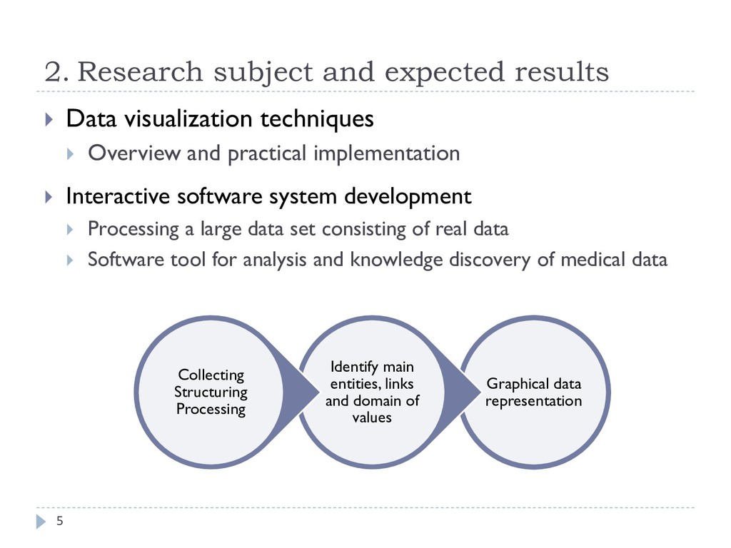
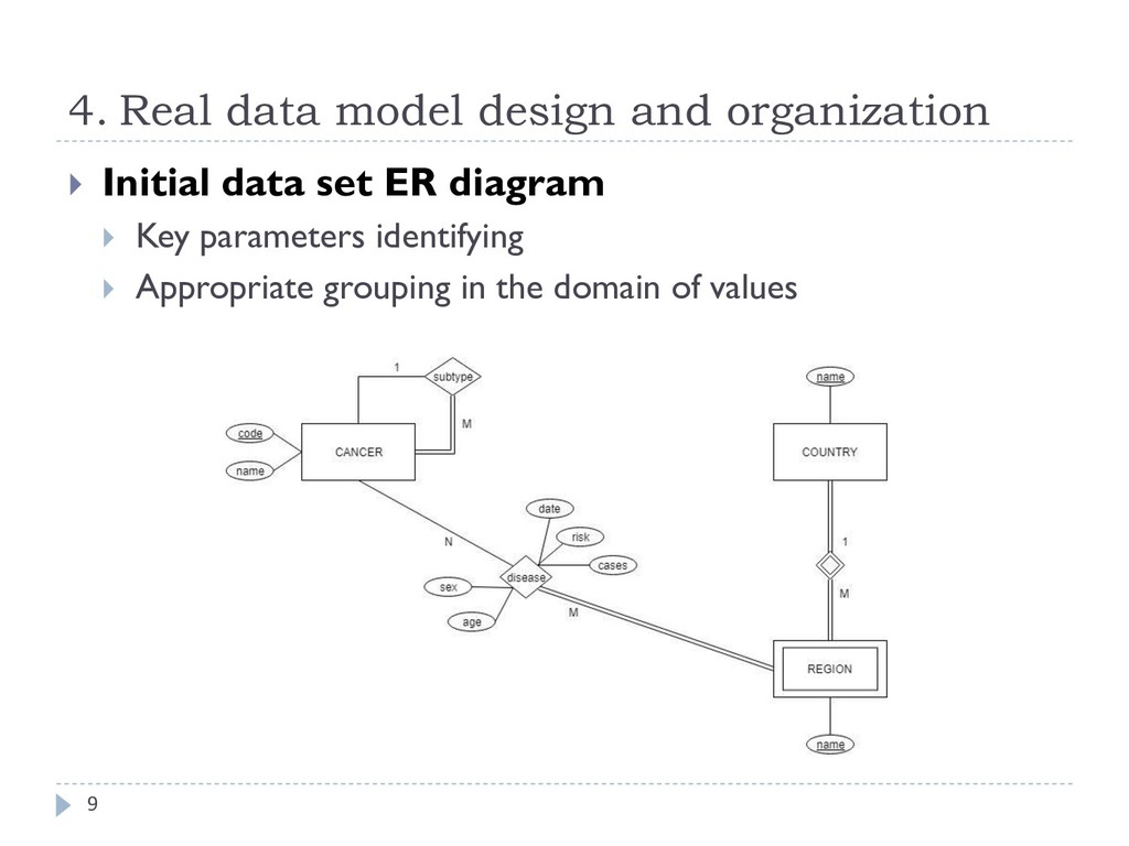
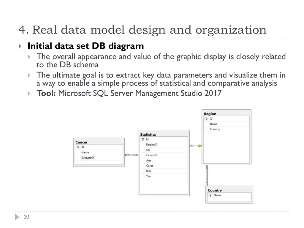
    representation of a given data set is the basis for a precise and consistent interpretation, analysis and adoption of empirical conclusions related to the semantic meaning of information.  The software tool allows to emphasize the semantic value and significance of the data that are graphically presented, which enables a detailed and systematic review of the process of development of diseases of this type.  Basis for further related scientific research where graphic interpretation and interdependence of larger data sets is of great importance.