Upgrade to Pro
— share decks privately, control downloads, hide ads and more …
Speaker Deck
Features
Speaker Deck
PRO
Sign in
Sign up for free
Search
Search
Building a Responsive Website - Best Practices ...
Search
Michael Cheng
December 06, 2013
Programming
270
2
Share
Embed
Copy iframe code
Copy JS code
Copy link
Start on current slide
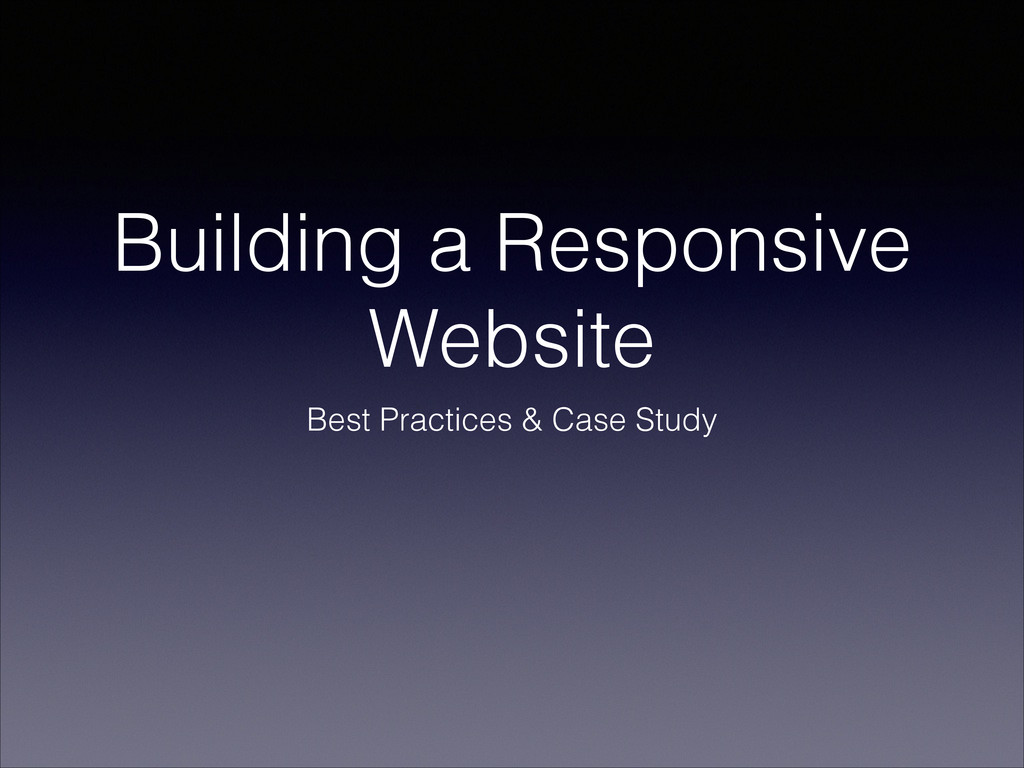
Building a Responsive Website - Best Practices & Case Study
Presented at Hackers and Painters on 6 December 2013
Michael Cheng
December 06, 2013
More Decks by Michael Cheng
See All by Michael Cheng
Intro to GraphQL Workshop
miccheng
0
160
Prioritizing Technical Debt
miccheng
0
200
JuniorDevSG - Intro to Coding Dojo
miccheng
0
190
Intro to Web Development with PHP - Lesson 1
miccheng
0
160
Engineers.SG Volunteers Training (4 Aug 2018)
miccheng
0
110
Introduction to PHPConf.Asia 2018
miccheng
0
790
What about Ruby on Rails?... from a PHP Guy
miccheng
0
170
Engineers.SG Volunteers Training (July 2017)
miccheng
0
130
Concourse CI in the Wild
miccheng
0
270
Other Decks in Programming
See All in Programming
エンジニアにデザインハーネスを 〜デザインプロセスを規定するためのハーネス〜 / Design harness from an engineer's perspective
rkaga
1
130
AIで効率化できた業務・日常
ochtum
0
160
Datadog LLM Observabilityで実現する 安全なLLM Usage 管理
3150
0
130
AI がコードを書く時代における新卒エンジニアの仕事風景 (2026) / New Graduate Engineers in the Era of AI Coding (2026)
sushichan044
0
180
Developing with AI Agents — Codex, Claude Code & Cowork Practical Guide
x5gtrn
PRO
0
1.3k
軽量Java基盤の設計 DIコンテナに頼らない、長期保守と1秒起動の実現 JJUG CCC 2026 Spring
macha64
0
620
Contextとはなにか
chiroruxx
1
390
技術的負債解消で開発者の未来を開く- AIの力でコード刷新
kmd2kmd
0
130
Vue × Nuxt × Oxc どこまで使える?実運用の現在地
andpad
0
330
気づいたらRubyで100作品 ー クリエイティブコーディングが生活の一部になるまで / 100 Ruby Sketches Later: How Creative Coding Became Part of My Life
chobishiba
3
630
エージェンティックRAGにAWSで入門しよう!
har1101
9
1.9k
ローカルLLMを使ってB2Bサービスを作っていての学び
yaotti
0
230
Featured
See All Featured
Mind Mapping
helmedeiros
PRO
1
270
Deep Space Network (abreviated)
tonyrice
0
220
How to optimise 3,500 product descriptions for ecommerce in one day using ChatGPT
katarinadahlin
PRO
1
3.6k
Conquering PDFs: document understanding beyond plain text
inesmontani
PRO
4
2.9k
Building Applications with DynamoDB
mza
96
7.1k
Evolving SEO for Evolving Search Engines
ryanjones
0
230
CoffeeScript is Beautiful & I Never Want to Write Plain JavaScript Again
sstephenson
162
16k
Un-Boring Meetings
codingconduct
0
330
Automating Front-end Workflow
addyosmani
1370
210k
How to train your dragon (web standard)
notwaldorf
97
6.7k
sira's awesome portfolio website redesign presentation
elsirapls
0
290
Sam Torres - BigQuery for SEOs
techseoconnect
PRO
0
290
Transcript
Building a Responsive Website Best Practices & Case Study
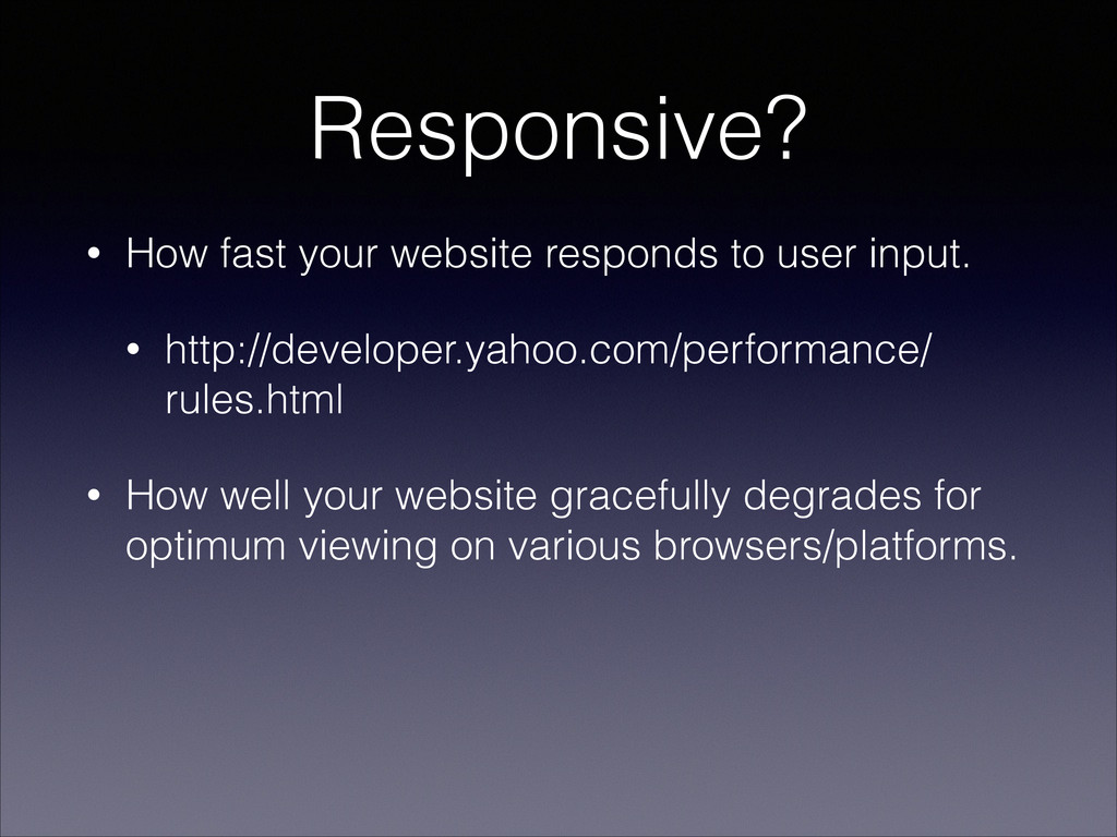
Responsive? • How fast your website responds to user input.
• http://developer.yahoo.com/performance/ rules.html • How well your website gracefully degrades for optimum viewing on various browsers/platforms.
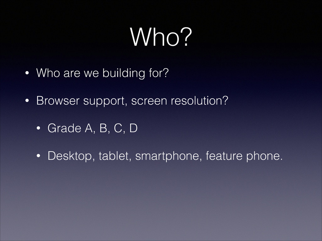
Who? • Who are we building for? • Browser support,
screen resolution? • Grade A, B, C, D • Desktop, tablet, smartphone, feature phone.
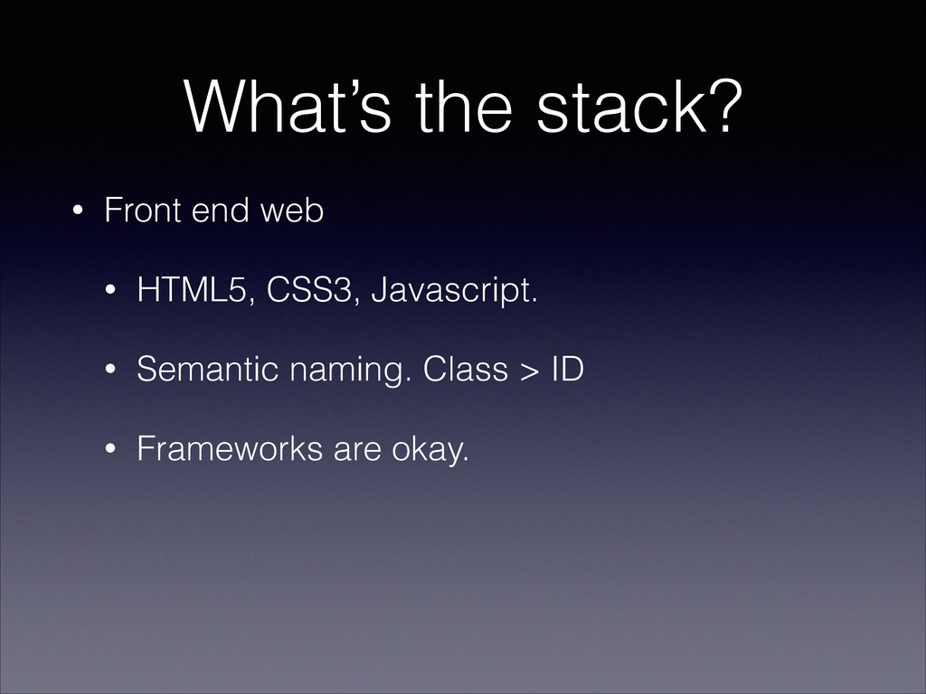
What’s the stack? • Front end web • HTML5, CSS3,
Javascript. • Semantic naming. Class > ID • Frameworks are okay.
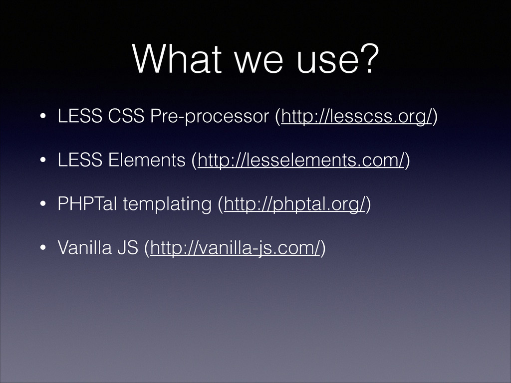
What we use? • LESS CSS Pre-processor (http://lesscss.org/) • LESS
Elements (http://lesselements.com/) • PHPTal templating (http://phptal.org/) • Vanilla JS (http://vanilla-js.com/)
Best Practices • Media Queries are your friend. Resolution depends
on your design. • Build for the smallest device first. Then layer up. • Load assets as you need it. • Style a tag instead of adding a div class. Solve DIV-itis / CLASS-itis.
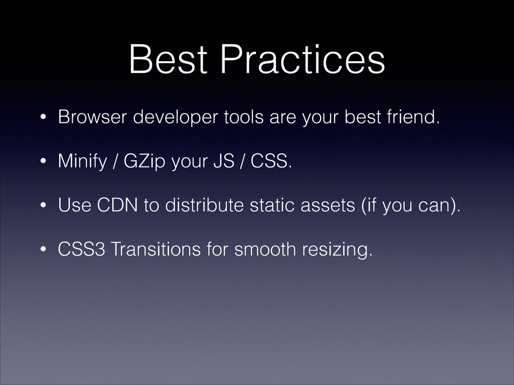
Best Practices • Browser developer tools are your best friend.
• Minify / GZip your JS / CSS. • Use CDN to distribute static assets (if you can). • CSS3 Transitions for smooth resizing.
Demo
 miccheng
 rkaga
rkaga
 ochtum
 3150
3150
 sushichan044
 x5gtrn
 macha64
 chiroruxx
 kmd2kmd
 andpad
 chobishiba
 har1101
 yaotti
 helmedeiros
 tonyrice
 katarinadahlin
 inesmontani
 mza
mza
 ryanjones
 sstephenson
 codingconduct
 addyosmani
 notwaldorf
 elsirapls
 techseoconnect