Upgrade to Pro
— share decks privately, control downloads, hide ads and more …
Speaker Deck
Features
Speaker Deck
PRO
Sign in
Sign up for free
Search
Search
Responsive Design
Search
Michael Jovel
November 13, 2013
Design
170
1
Share
Embed
Copy iframe code
Copy JS code
Copy link
Start on current slide
Responsive Design
Tips & Tricks talk at Production Club of Baltimore
Michael Jovel
November 13, 2013
More Decks by Michael Jovel
See All by Michael Jovel
Building & Maintaining A Living Style Guide for a Post Apocalyptic Web
mjovel
0
80
People Over Process: Turning Assumptions into shared understanding
mjovel
0
100
Iterating Awesomeness: Designing Value Through Shared Understanding
mjovel
1
130
Other Decks in Design
See All in Design
Build for the Web, Build on the Web, Build With the Web
csswizardry
0
480
エンジニアがAI活用してスライドデザインできる世界が来たよ!
kaikou
1
340
タイル紹介サイト「タイルだもんで」
calpin
0
160
Debiasing Your Software Design Decision-Making @ Flowcon '26
baasie
1
120
Saving_the_King_-_Storyboard.pdf
terencebasart
0
150
広い関与の可能性に どう向き合うのか? 私たちは。|Timee MarketingDesign 2026-06-18
bebe
0
260
AIネイティブスタートアップにおけるプロダクト開発の新常識 / Product Development Tips in AI-Native Startups
saka2jp
2
1.3k
AIスライドデザインを生成する仕組みを社内共有する
kenichiota0711
7
5.7k
AI時代、デザイナーの価値はどこに?
tararira
2
1.7k
AI時代に必要な アイデアの形
uxman
0
230
研修担当者が一番伸びた 熊本市役所✕AI『泥臭いAI研修』のワークショップ設計について
garyuten
2
440
kintone開発におけるライターの役割の変化〜AI活用を添えて〜 / Changes in the Role of Writers in Kintone Development
keroyama
0
140
Featured
See All Featured
Measuring Dark Social's Impact On Conversion and Attribution
stephenakadiri
2
240
Designing for humans not robots
tammielis
254
26k
What the history of the web can teach us about the future of AI
inesmontani
PRO
1
630
How Software Deployment tools have changed in the past 20 years
geshan
0
34k
エンジニアに許された特別な時間の終わり
watany
108
250k
How to build an LLM SEO readiness audit: a practical framework
nmsamuel
1
800
HU Berlin: Industrial-Strength Natural Language Processing with spaCy and Prodigy
inesmontani
PRO
0
520
Future Trends and Review - Lecture 12 - Web Technologies (1019888BNR)
signer
PRO
0
3.6k
Color Theory Basics | Prateek | Gurzu
gurzu
0
390
Claude Code どこまでも/ Claude Code Everywhere
nwiizo
65
56k
Leading Effective Engineering Teams in the AI Era
addyosmani
9
2.1k
Efficient Content Optimization with Google Search Console & Apps Script
katarinadahlin
PRO
1
720
Transcript
HELLO
None
The opinions expressed here are those of the Presenter and
do not necessarily reflect the positions of the U.S. Department of Defense. ! Despite his statements to the contrary he does not have the authority or capability to order a drone strike based on the geolocation data of your snarky tweets.
None
None
http://www.comicvine.com/ forums/battles-7/bugs-bunny- vs-popeye-the-sailor- man-757492/
None
None
None
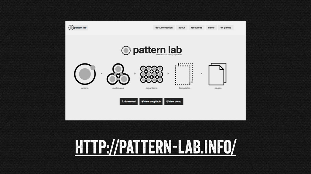
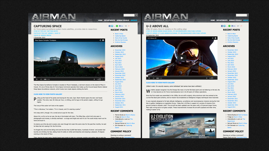
From Page Designs to Design Systems
http://pattern-lab.info/
Performance
Keep Javascript libraries to a minimum or conditionally load them
Instead of Social Media plugins use links
<a class="entypo-facebook share-icon" href="http://www.facebook.com/sharer.php?u=http:// airman.dodlive.mil" title=“">Facebook</a>! ! <a class="entypo-twitter share-icon"
href="http://twitter.com/share?text=An%20Awesome %20Link&url=http://airman.dodlive.mil" title=“">Twitter</a>! ! ! <a class="entypo-gplus share-icon" href="https://plus.google.com/share?url=http%3A%2F %2Fairman.dodlive.mil" title="">Google+</a>
Average website is 1.614 MB 61% are images
http://mobitest.akamai.com/
https://github.com/scottjehl/picturefill
<span data-picture data-alt="A giant stone face at The Bayon temple
in Angkor Thom, Cambodia">! <span data-src="small.jpg"></span>! <span data-src="medium.jpg" data-media="(min-width: 400px)"></span>! <span data-src="large.jpg" data-media="(min-width: 800px)"></span>! <span data-src="extralarge.jpg" data-media="(min-width: 1000px)"></span>! ! <!--[if (lt IE 9) & (!IEMobile)]>! <span data-src="medium.jpg"></span>! <![endif]--> ! ! ! <noscript>! <img src="external/imgs/small.jpg" alt="A giant stone face at The Bayon temple in Angkor Thom, Cambodia">! </noscript>! </span>
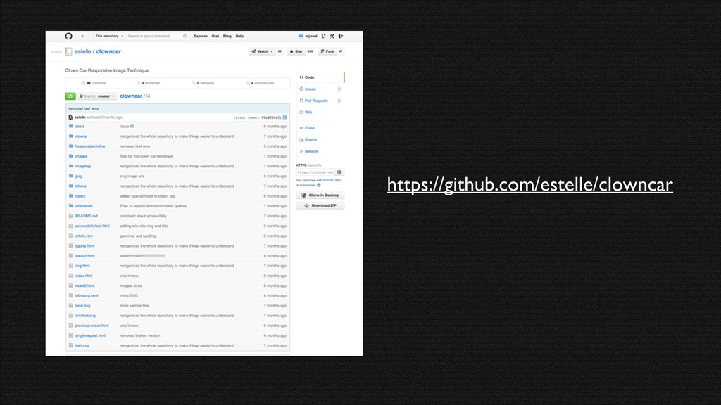
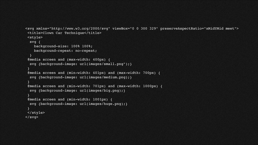
https://github.com/estelle/clowncar
<svg xmlns="http://www.w3.org/2000/svg" viewBox="0 0 300 329" preserveAspectRatio="xMidYMid meet">! <title>Clown Car
Technique</title>! <style>! svg {! background-size: 100% 100%;! background-repeat: no-repeat;! }! @media screen and (max-width: 400px) {! svg {background-image: url(images/small.png");}! }! @media screen and (min-width: 401px) and (max-width: 700px) {! svg {background-image: url(images/medium.png);}! }! @media screen and (min-width: 701px) and (max-width: 1000px) {! svg {background-image: url(images/big.png);}! }! @media screen and (min-width: 1001px) {! svg {background-image: url(images/huge.png);}! }! </style>! </svg>
None
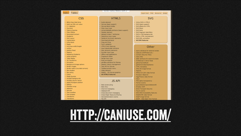
http://caniuse.com/
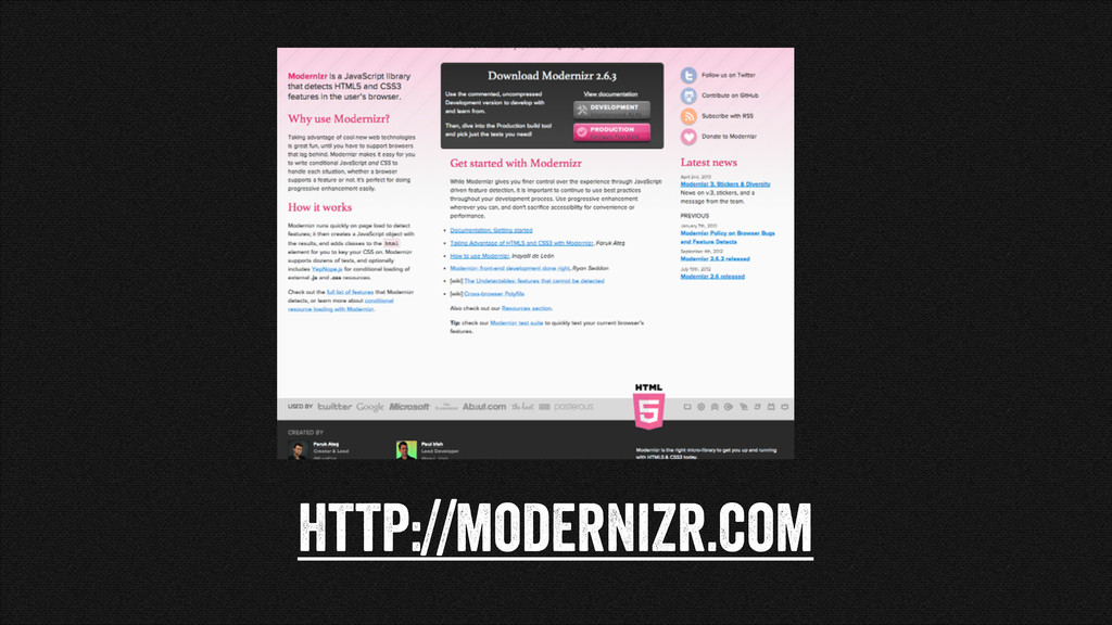
http://modernizr.com
None
None
http://dcdevicelab.com/
http://www.browserstack.com/
None
None
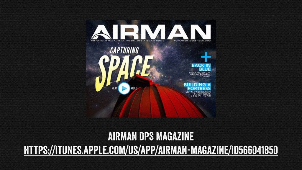
Airman DPS Magazine https://itunes.apple.com/us/app/airman-magazine/id566041850
None
None
None
None
None
None
None
It's easier to ask forgiveness than it is to get
permission
None
Questions? Michael Jovel- @mjovel
[email protected]
 mjovel
 csswizardry
 kaikou
 calpin
 baasie
 terencebasart
 bebe
bebe
 saka2jp
 kenichiota0711
 tararira
 uxman
uxman
 garyuten
 keroyama
 stephenakadiri
 tammielis
 inesmontani
 geshan
 watany
 nmsamuel
 signer
 gurzu
gurzu
 nwiizo
 addyosmani
 katarinadahlin
![Questions? Michael Jovel- @mjovel [email protected]](https://files.speakerdeck.com/presentations/5865f7d02f6f0131fbe2764e4acd703a/slide_40.jpg)