Upgrade to Pro — share decks privately, control downloads, hide ads and more …

A Content First Approach to Designing Responsive Drupal Layouts using Twitter Bootstrap

Morgan Miller
November 04, 2012

A Content First Approach to Designing Responsive Drupal Layouts using Twitter Bootstrap

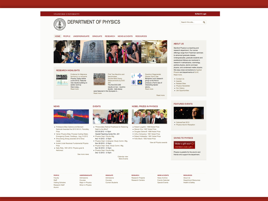
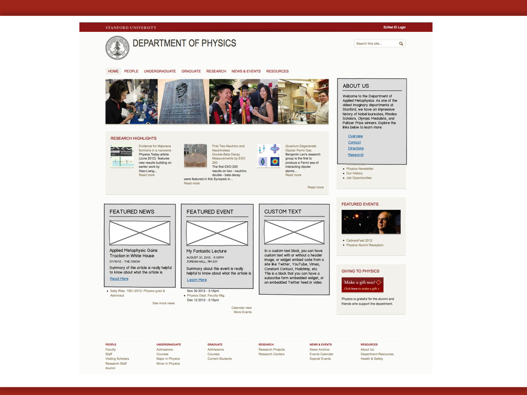
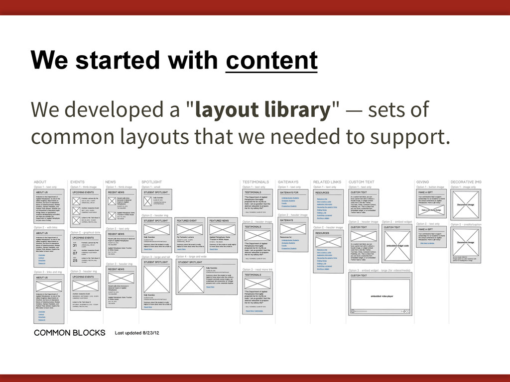
Introducing the responsive Drupal 7 theme, Open Framework, which was developed by myself and Brian Young at Stanford University. In this presentation we share our methodology and process for developing the theme.

Watch the video of this presentation online at http://2012.badcamp.net/program/sessions/%E2%80%9Ccontent-first%E2%80%9D-approach-designing-responsive-drupal-layouts-using-twitter-bootstra

Morgan Miller

November 04, 2012
Tweet

More Decks by Morgan Miller

Other Decks in Design

Transcript

  1. A "content-first" approach to designing responsive Drupal layouts using Twitter

    Bootstrap Megan Miller & Brian Young Stanford University BAD Camp 2012 — November 4, 2012
  2. Brian Young Web Designer & Developer Documentation, Design, & Development

    Stanford University @auracreations [email protected] Megan Miller Web Designer Stanford Web Services Stanford University @meganerinmiller [email protected]
  3. Device diversity We can't predict the device of the future.

    How can we know what size of device we are designing for?
  4. "Mobile" Trends 35% of American adults own a smartphone 25%

    of smartphone users say they only use their phone to browse the web Source: Pew Internet & American Life Project – http://www.pewinternet.org/Reports/2011/Smartphones.aspx
  5. We go responsive. same content reused for each screen size

    Sparkbox website at different browser sizes (from http://mediaqueri.es)
  6. "Responsive" A design that responds to the size of the

    browser or device. Let's take a look at an example… Microso# website at different browser sizes (from http://mediaqueri.es)
  7. A single code base Creating one website, and displaying it

    in different ways. Atlanta Ballet website at different browser sizes (from http://mediaqueri.es)
  8. Embrace Flexibility RWD is a philosophy and a practice. By

    embracing the inherent flexibility of the web, we can design for the future.
  9. Flexible Media Flexible containers constrain proportions of images and media

    by using width:100%;   image fills width of container
  10. Media Queries Detect your device screen width, then load different

    styles. @media  screen  and  (max-­‐width:  480px)  {   .mything  {   width:100%;   }   }   @media  screen  and  (max-­‐width:  1200px)  {   .mything  {   width:30%;   }   }  
  11. Preserve legibility An even better solution... Build a responsive theme

    that never requires a drastic size adjustment of micro-layouts. desktop size... ~ same size on mobile!
  12. We started with content We developed a "layout library" —

    sets of common layouts that we needed to support.
  13. This is complicated! Can we find a way to support

    all this sophisticated behavior in a theme? Can we make it easy to implement for site builders and content creators?
  14. Where do we start? Use an existing Drupal theme? • 

    Zen 5 •  Omega •  AdaptiveTheme Build off of a responsive framework? •  Twitter Bootstrap •  Zurb •  Skeleton
  15. What we were looking for: •  Preserving content hierarchy and

    legibility •  Easy to implement •  Scalability and flexibility of layout options •  Support for complex layouts •  Consideration for Drupal core features and common layout implementation strategies •  Consideration of Stanford community context and technologies
  16. Build off Twitter Bootstrap We decided to build our own

    theme off of Twitter Bootstrap, which would provide us with base styles and basic responsive behaviors. twitter.github.com/bootstrap
  17. Default styles + responsive behavior Drupal Theme Base code that

    provides •  Styles and UI elements •  “Starter” responsive behavior
  18. and also: Open source o  Apache License v2.0 o  Documentation

    licensed under CC BY 3.0 Community engagement o  Git: 39,000 stars and 9,000 forks Handles fixed and fluid layouts o  12-column grid system o  Grid can be nested - infinite grid
  19. Sophisticated responsive behaviors Open Framework provides support for two conflicting

    responsive patterns: • Row preference • Column preference
  20. Row Preference Row preference forces elements to bump other elements

    down when the screen gets smaller. We call these "flow" regions.
  21. A combination approach Through a combination of stacked and flow

    region behaviors, we can create complex layouts that respond well at every breakpoint.
  22. New responsive regions New set of responsive regions that support

    "flow" and "stacked" behavior. Content placed in specific block regions will respond based on that region’s pre-defined behavior.
  23. Drupal-specific styles support Open Framework takes the basics of Twitter

    Bootstrap and adds in Drupal-friendly, semantic styles. Some examples:      .more-­‐link        .descriptor        .border-­‐simple  
  24. Support for common micro-layouts We have developed a set of

    styles and implementation strategies for common micro- layouts we refer to as "postcard" layouts.
  25. Support for common micro-layouts We have developed a set of

    styles and implementation strategies for common micro- layouts we refer to as "postcard" layouts. <div  class="postcard-­‐left">    <div>left</div>    <div>right</div>   </div>  
  26. Responsive order overlay Responsive order overlay toggle that shows how

    content hierarchy will be handled on small screens.
  27. Stanford Framework Stanford Framework is a subtheme of Open Framework,

    providing branding and default styles for units at Stanford to use or subtheme.
  28. First blocks, then the world! Region behaviors can be applied

    to panels regions, display suite layout regions, or even hand- coded regions.
  29. Using Open Framework Download version 7.x-2.x on github github.com/SU-SWS/open_framework Visit

    the Open Framework website at openframework.stanford.edu If you want to participate, contact us to join the contribution team on Github.
  30. Places to learn more about RWD: •  “Responsive Web Design”

    by Ethan Marcotte (a book apart) http://www.abookapart.com/products/responsive-web-design •  LukeW — Multidevice Layout Patterns http://www.lukew.com and http://www.lukew.com/ff/entry.asp?1514 •  Jeffrey Zeldman — Content First http://www.zeldman.com/category/content-first/ •  A List Apart — Responsive Web Design http://www.alistapart.com/articles/responsive-web-design/ •  Ben Callahan — Responsive Retrofitting http://bencallahan.com/ and https://github.com/bencallahan/rwd-retrofitting