Zealand n Have been working in the website and design industry for over 8 years n Currently working for a small UK/US agency called LBDesign based in London n Design and build websites on a daily basis
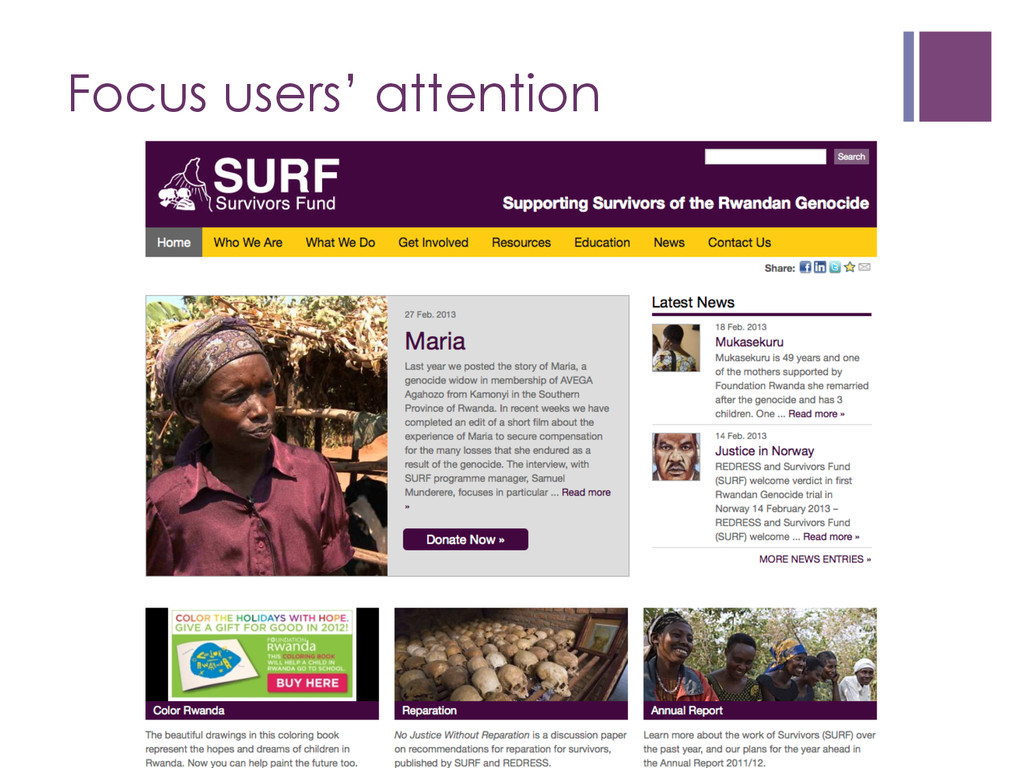
what your target audience likes/ doesn’t like and what they need n Don’t make users think n Strive for simplicity n Don’t be afraid of white space n Focus users’ attention
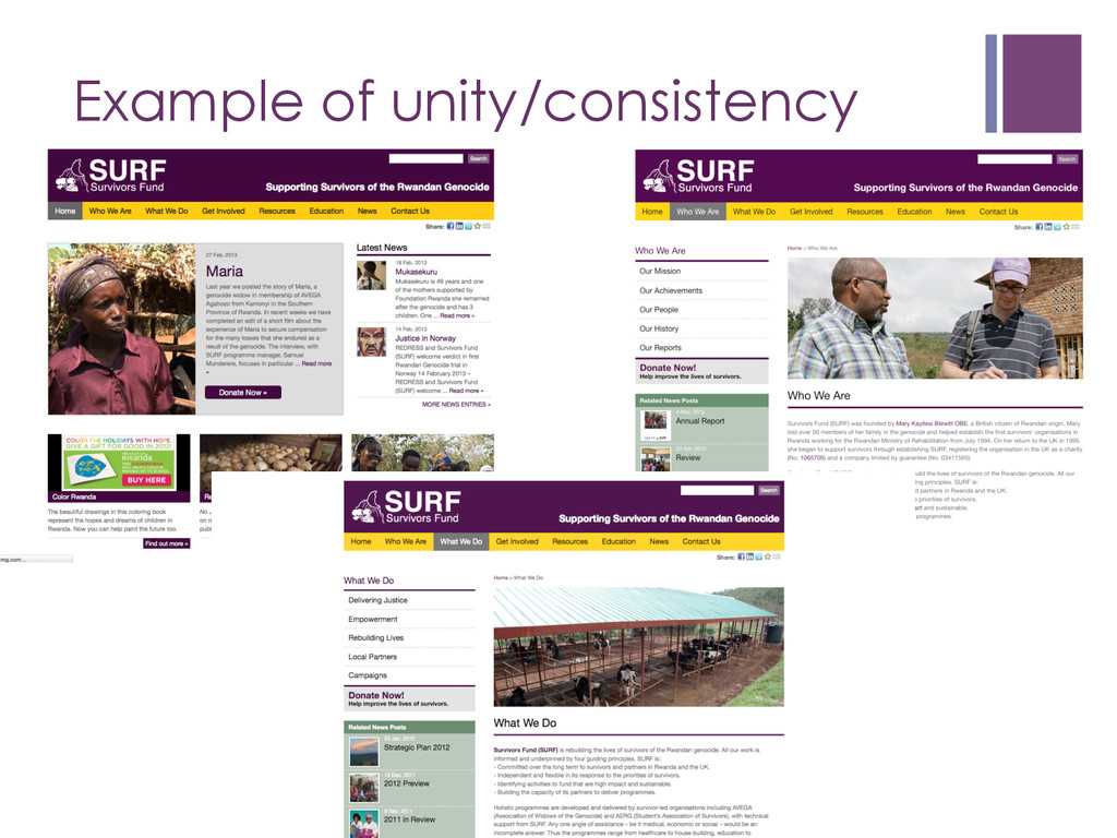
email. They lower the professional appeal of an organisation. Unity/Consistency n Making website elements relate and work well together n Written content/message should also be consistent
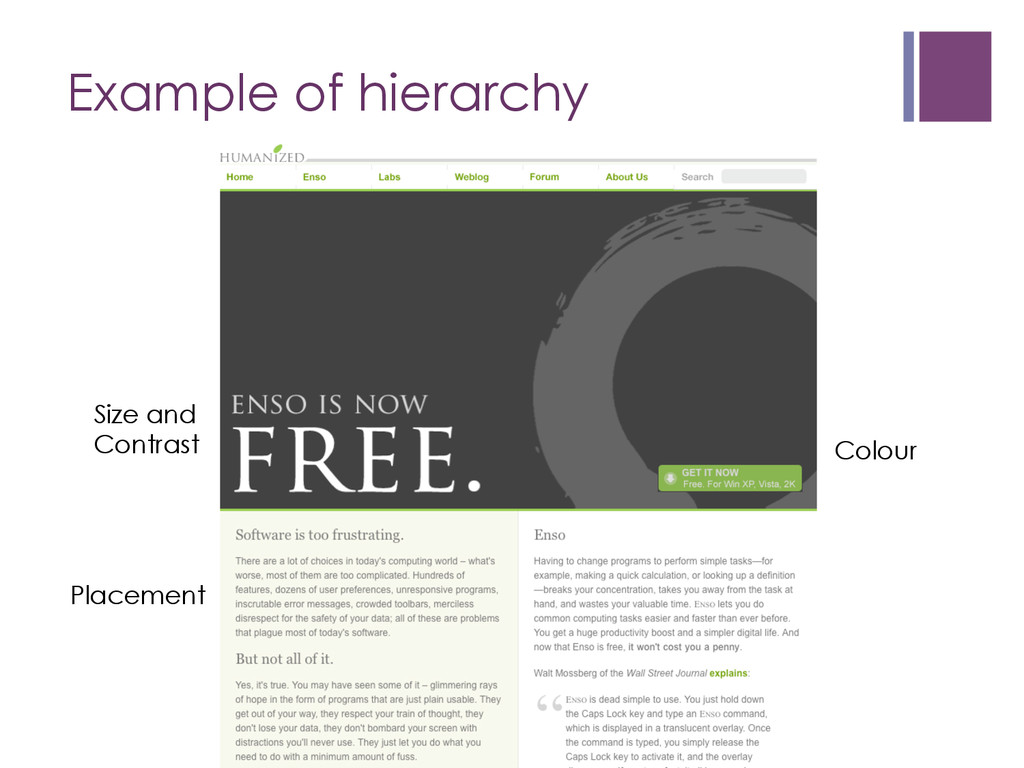
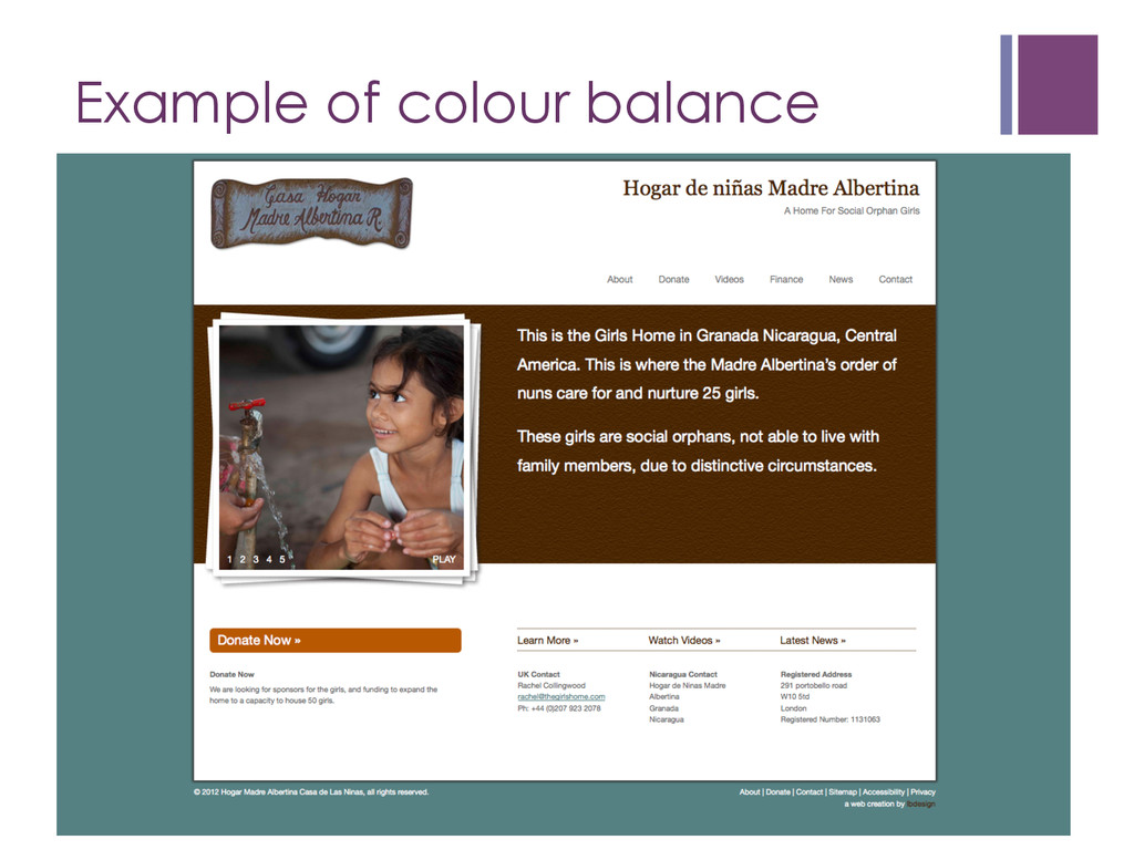
colours with one-two less bold colours to help guide the eye through the hierarchy of content n Let images bring more colour into the site if it looks bland
n Darker areas and saturated colours are heavier than lighter areas and unsaturated colours n Borders and stroke add weight n Texture creates more weight, the more dense it is
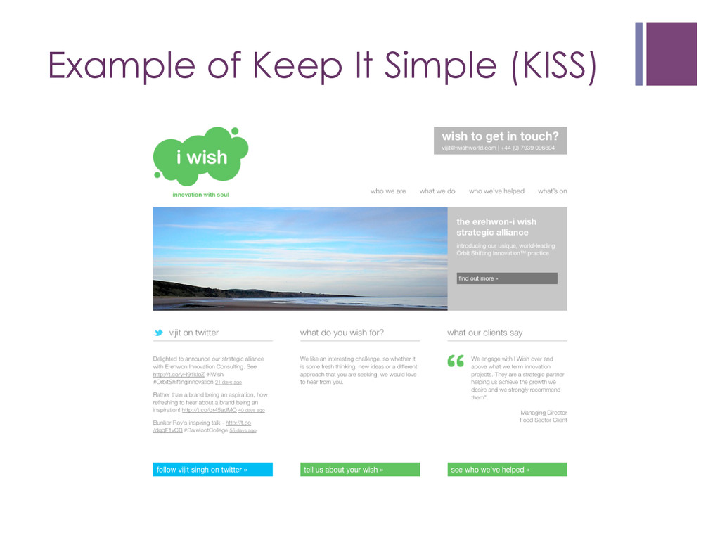
design at its most basic, stripped of superfluous elements, colours, shapes and textures. Its purpose is to make the content stand out and be the focal point. From a visual standpoint, minimalist design is meant to be calming and to bring the mind down to the basics.” - Smashing Magazine
on a page n Slideshow n Testimonial n Heading / Call to Action n Images n Put yourself in the user’s position – are you giving them the information they need? n Content is king – keep it fresh
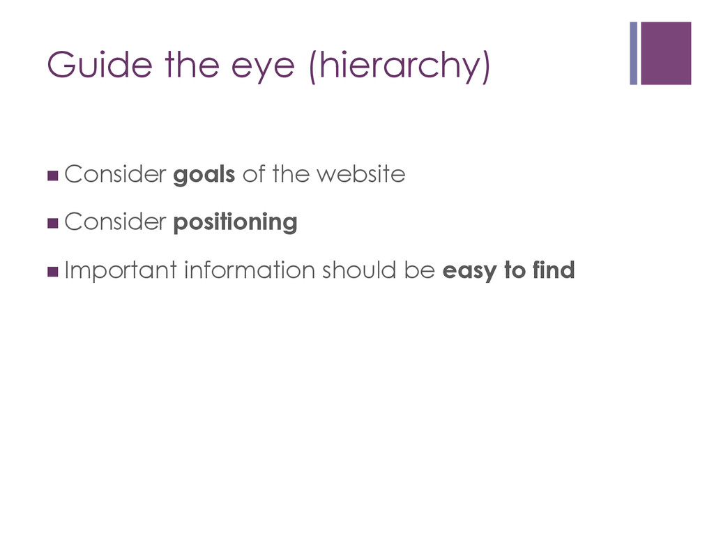
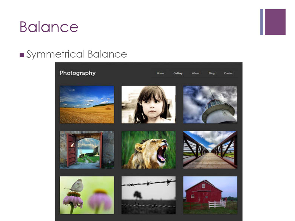
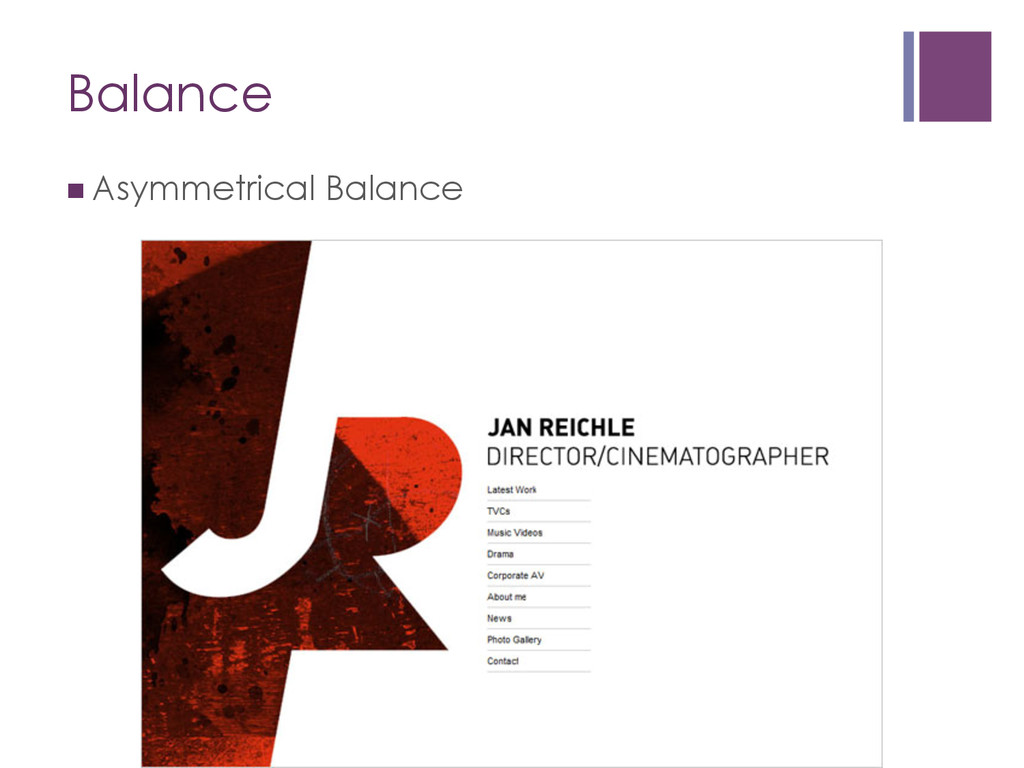
drive content and hierarchy within a page layout n Consider everything in moderation n Is your page balanced? n Minimise content n Appreciate white space and keeping the design clean and organised
More http://www.webdesignerdepot.com/2009/12/minimalist-web-design- when-less-is-more/ n How Limitations Improve Design http://www.webdesignerdepot.com/2010/08/how-limitations-improve- design/ n The Invisible Side of Design by Vitaly Friedman https://speakerdeck.com/smashingmag/the-invisible-side-of-design n Understanding Visual Hierarchy in Web Design http://webdesign.tutsplus.com/articles/design-theory/understanding- visual-hierarchy-in-web-design/ n Colour scheme tools http://www.colorsontheweb.com/colorwizard.asp http://colorschemedesigner.com/ https://kuler.adobe.com/