Part of Melon Media's fourth instalment of their Breakfast Seminar Series. Held on Monday 20 April 2015.
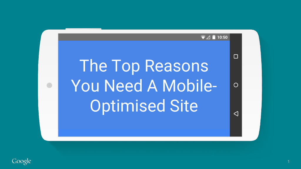
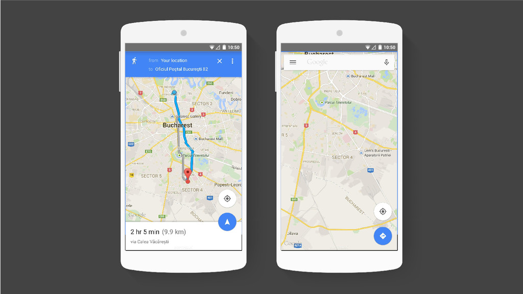
As part of the Google Maps design team, how has our UX evolved to keep up with changes in technology and user behaviour?
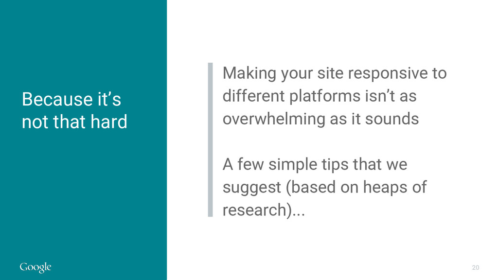
Let's have a quick look at how far we've come, what we've learned, and share some common-sense usability tips for mobile optimisation.
 moco1013
 mottox2
 kenichiota0711
 videlvequio
 base
base
 sevendex
 yuri_ohashi
 saki822
 kspace
 hypebeans
 uxman
uxman
 usagimaru
 geshan
 jmmastey
 tammyeverts
 reverentgeek
 jonoalderson
 rasmusluckow
 rkendrick25
 orderedlist
 seathinner
 oripsolob
 jdejongh
 schlessera