Upgrade to Pro — share decks privately, control downloads, hide ads and more …

Data Analysis

Data Analysis

Sabrina Smai

May 24, 2016
Tweet

More Decks by Sabrina Smai

Other Decks in Education

Transcript

  1. The Researchers Randy Calvan 1001913771: Supporting Research Assistant Jahsai Ashley

    1001858420: Primary Research contributor Anna Kostoglod 100820294: Research Primary Contributor Sabrina Smai 1000014879: Lead Director of Research providing support for analytics and data aggregation
  2. Introduction & Hypothesis The Reflectors want to ensure financial security

    for all graduate students, where household income is not the determining factor for being admitted into university in Ontario but rather the student’s qualifications. Unfortunately, today with the increasing costs of university tuitions, household income has become a determining factor whether a university education is possible.(Bailey and Dynarski, 2011; Belley and Lochner, 2007). Likewise, the determining factor of academic success has an increasing importance on household income (Reordon, 2011). If we ignore this problem we see evidence of disproportionate outcomes of university graduates such as: economic returns, financial security, unemployment risk, personal savings, health/longevity, ability to pass down cultural capital etc. (Douglass, 2009; ESDC, 2015). We propose to examine whether household income level correlates with university admission levels in Ontario, to determine whether class segregation is the determining factor with university enrolment patterns.
  3. Where is the Data from? Data: The Reflectors used the

    data from the survey called “Canadian financial capability survey” (2014). The survey could be found in SDA data base with the following link: http://sda.chass.utoronto.ca/cgi-bin/sda/hsda?harcsda+cfcs2014 Format: Tables, histograms and bar charts were used to display a graphical representation of the data extracted from SDA (two Excel tables). By using the “analysing” tab, creating graphic representations of the information was possible. Variables: household income, geographical characteristics (ON and QB), saving for child’s postsecondary education and employment status.
  4. Ontario and Quebec population samples Before we examining the data

    to determine if there was a correlation between income level and the affordability of postsecondary education, understanding what a post secondary education is going to cost is vital to attending; which is why the rates compared in this study, will examine the average cost of education within Ontario. Ontario, the subject in regards to our questions will be juxtaposed by a province similar the the structure; which is why we chose Quebec for consideration. There were some inconsistencies within the variables within the population, although, the number of cases which were measured where the same. Comparing these two provinces there were some similarities and slight variations on all the characteristics measured. One thing that was consistent between both provinces, was the population samples in terms of size.
  5. Our Variables The Reflectors chose four variables for conducting our

    analysis. Geographical Region “ON” and “QB”, household income level, ability to support a child’s postsecondary education and employment status. SDA codes for the mentioned variables are “gregion”, “lf_go1, ef_02”, and “hincquin”. The Reflectors will explain how each variable code will be used in the following slides.
  6. Ontario or Quebec: gregion Variable “gregion” means the region that

    we’re focusing on. The table shows all regions of Canada, coded in numbers from 1 to 5. However, in this study, The Reflectors take into consideration only two regions: Quebec (coded as 2) and Ontario, (coded as 3). Number of participants from each region is included, as well as their percentages.
  7. Region The number of cases being measured within the provinces,

    Ontario and Quebec in 2014, are displayed in a bar graph.
  8. Employment Status: lf_g01 In the top part of this table

    you can find an exact question that each participant of the questionnaire was asked to answer. The options of the answers were coded in numbers from 1 to 8, and 97, 98. Numbers of participants (as well as their percentages) that answered each question are shown in separate columns to the right side of the code numbers.
  9. Have you saved to support the cost of children’s post-secondary

    education? ef_02 The participants response to this question (here is shown a short form of it) analyzed in this study as the third variable. SDA code is ef_02. Next slide presents a table from the SDA website where the samples are asked questions by the researchers, to provide the statistics presented. In addition to researchers explaining a Pre Question Text, to better inform a participant on what is meant by the main question. Each answer option is coded in number from 1 to 9 ( note that 3, 4, 5 are skipped) and the participants numbers and percentages are stated as in previous tables. Please refer to the next slide
  10. Income Quintile - Household level: hincquin The last variable, The

    Reflectors include in the data analysis, is coded as “hincquin” and means the household income level of the participants. What is interesting to note here is this variable captures the actual numeric values in the options of the answers, while three previous variables provided only qualitative data (the answers to the survey questions). The class width (the difference between income levels in the answers option) is not equal between each income level. However, each income level is coded very straightforward in numbers from 1 to 5 what makes the data set easier to read. (I.E the higher the code number, the higher the household income.)
  11. So how do these four variables help us to support

    our hypothesis? Hypothesis: Our study attempts to support (or to refute) that there is a correlation between two main variables we discussed. So The Reflectors are looking for the positive relationship between household income (hincquin) and obligation for saving money for the children’s postsecondary education (ef_02). The term “positive relationship” is used to describe the following pattern in relationship: the lower the household income, the less chances that the household should save money for the tuition of a child (children in some cases).
  12. How about two other variables? “Gregion”, our region indicator is

    used to filter the data in order to be able to compare Ontario and Quebec. Geographical filter helps the information to be more organized, precise and, as a result, more helpful in the end if someone is using this research for the problem solving. And the last variable - employment status (lf_g01) - is a helpful criteria that allows The Reflectors to better understand one of ours main variables - household income. We suppose that level of household income could be significantly affected by the employment status of the participant. Before we present how lf_g02 and hincquin are interconnected, we would like to illustrate some information about each of these two variables separately. Also we should note that the data is presented for two provinces in order to conduct a comparison.
  13. Household Income - Ontario The table illustrates the Frequency Distribution

    and Percent Frequency Distribution data of the Households Income levels coded in the SDA data base as “hincquin”. It should be noted, that the data includes only Ontario in 2014 sample. The class width in this distribution table is not equal, which means that the income levels are divided with different intervals. However, the distribution represents approximately same percentages and sample sizes (the biggest gap between distributions in percentages is 7.6%).
  14. Household Income - Ontario in 2014 The following histogram illustrates

    same data from the table in the previous slide. Classes of income level are encoded in a specific color and each value is labeled on the top of the bars. The legend has been provided to better understand the histogram. There seems to be a slight increase of percentage as the income level increases. This suggests that Ontario in 2014 has more people in the higher income bracket.
  15. Household Income - Quebec in 2014 The following data illustrates

    household income levels for Quebec in 2014. In comparison to the data from Ontario samples in 2014, few correlations could be observed: • In Quebec, the lower income level tier is higher than Ontario’s. (19% versus 14%, respectively) • In Quebec, the highest income tier is less than Ontario’s (16% versus 22%, respectively) • The three middle classes (from $32,001 to $119,999) stays approximately the same In general, Ontario samples obtain higher income levels in comparison to Quebec’s income levels.
  16. Employment Status Ontario in 2014 The frequency distribution looks at

    8 different values, however these variables can be defined into two categories; first is earning income and the second is not earning income. An example of items displayed on the pie chart earning income would be; employed and self- employed. The values falling into the unpaid portion of the pie chart would be; the not working and looking for work, not working and not looking for work, retired, student (including work programs),doing unpaid household work, and other (MTCU, 2015). Employment Statistics 2014- Even though the graphic (on the next page) provides the statistical inference of all the values it is still important to express them as the understanding of who can and cannot afford a post secondary education. Given that you would have to make a household income in order to save to afford a post secondary education, it should be stated, that only subjects making an income would be able to do this (it is important to consider categorizes the earning and non earning classes).
  17. Ontario in 2014 • Working Class: 60.9% (Cumulative 1st and

    2nd column. • Non-working Class: 39.1% (Cumulative 3rd column to 6th column) • Total of participants: 10,807,785.8 (total number for allocation for cases 6,685) * Values were rounded within graph)
  18. Quebec in 2014 • Working Class: 58.3% (Cumulative 1st and

    2nd column. • Non-working Class: 41.7% (Cumulative 3rd column to 6th column) • Total of participants: 6,461,066.5 (total number for allocation for cases 6,685) (* Values were rounded within graph)
  19. Recoded Variable - Employment Status As was mentioned in previous

    slide, the best way to analyze this variable is to split it into two categories. SDA toolbox allows us to recode lf_g02 as it is shown on the capture. The new variable is called Employment and it has two outcomes possible: 0 - unemployed, and 1 - employed. In the column titled Var 1 we stated that values 1-2 correspond to employed option because both Employed and Self-employed options provide household income. On the other side, options 3-7 capture situations when a participant is unemployed, what is being coded into the new Employment variable.
  20. Recoded Employment Status = Employment This capture shows us more

    accurate information about employed and unemployed participants. We can see the percentage split of those two categories: 43.2% are unemployed and 56.8% are employed. For now we can use this new Employment variable instead lf_g01 in our analysis on how Employment correlates with household income level (hincquin). It should be noted that employment status is a categorical variable, which means there is no sense to analyze it in terms of means. The new recoded variable is still categorical, however we coded it that way that there is only two outcome options. As a result, mean values of this Employment will show us a proportion ration between employed and unemployed participants.
  21. How we used recoded variable? By applying Comparison of Means

    Program The Reflectors managed to show standard errors, standard deviations, means and weighing in one piece of data illustrated on the next slides. Selection filter was also applied to the building tool, in this case screen capture shows gregion(2) what means that the information considers only Quebec participants.
  22. Frequency Distribution of the Mean of Employment BY Household Income

    level - Quebec Cells in the frequency distribution table are colored and history of colors’ meanings are included above the bar chart on the next slide. Also a box Main Statistics tells us what those cells contain and we could see that the information is the same as we requested on the screen capture from the previous slide. Let us explain what those means actually mean.
  23. Means of Employment for each Income Level - Quebec The

    histogram to the right is an interesting information combination that refers to the proportion between employed and unemployed participants discussed before. Here we see the data divided into 5 stradas according to the participants’ income levels stated below each strada. The number on the top of each column is a proportion of employed people. For example, you can see 0.42 on the top of the strada that captures $32,001 - $54,999 incomes, This means that 42% of those participants who belong to this category are employed. Based on this understanding of the chart, we clearly see the correlation between the employment and household income: the higher level of the income household has, the bigger proportion of employed people belongs to the corresponding strada: $55,000 - $79,999: proportion is 0.72 $80,000 - $119,999: proportion is 0.76 $120,000 and over: proportion is 0.79
  24. Frequency Distribution of the Mean of Employment BY Household Income

    level - Ontario The histogram that displays statistics from Ontario province looks very similar to one we just presented for the Quebec province. Let us do the comparison of the results from the two provinces on the next slide. Similar data for Ontario is shown here. Frequency Distribution table is created the same way, but the Selection Filtering was changed to consider another province this time.
  25. Proportions of employed for income levels in two provinces There

    is several slight differences in this statistics. Ontario (0.35) households with the lowest income levels have considerably more (10%) employed in their category than Quebec (0.25) participants. As initial point of employed is larger in Ontario statistics, this allows the distribution grow slower (trend line is not as steep), while Quebec statistics has few steep jumps of the means. (proportions go from 0.25 to 0.42 and up to 0.72 when for Ontario numbers grow slower: 0.35 to 0.46 and up to 0.63) The overall trend lines for both provinces are extremely similar. The relationship follows the same pattern: the less household income level, the less employed people belong to the category with low income level. This correlation reflects the common sense and is confirmed by our research. Ontario => <= Quebec
  26. Do you have to support your child’s postsecondary education? So

    The Reflectors analysed and determined the relationship between one main variable, household income, and one helpful variable. Now we understand how the household income is affected by employment and how it is distributed between different participants categories. The research can move onto to the primary research question about correlations between levels of income and necessity to save funds for the education of the children. Do you have to support your child’s postsecondary education? Following data represents only two main information categories: “YES” or “NO” answers for the question stated above. So there are some people that do save money for the child’s postsecondary education and people who do not. However, there are some other options of answers that were included into the survey questionnaire. Samples were given the options to refuse to answer the question, to say “Don’t know” or they have a “Valid skip” option. The Reflectors want to demonstrate one of the full data representation (including all options of the answers) in the following Frequency Distributions table.
  27. Savings for School Quebec Vs. Ontario. The difference between Ontario

    and Quebec were not as significant as originally suspected. We assumed a difference in culture and location would have a significant impact on the way people would behave in regards to saving for education. However, the information was pretty much similar with one notable key difference in the population. Ontario did have a substantially larger amount of participants in the study then Quebec. The following Pie Charts illustrate this: → Infographics on next slide...
  28. Ontario in 2014 Quebec in 2014 Quebec Savings, participants responded:

    • Yes: 72% • No: 28% • Total of participants: 1,560,300.1 (total number for allocation for cases 6,685) Ontario Savings, participants responded: • Yes: 72% • No: 28% • Total of participants: 2,884,108.7 (total number for allocation for cases 6,685) In this example of the data piece, we illustrate only two possible outcomes: do people save money for child’s education or they do not. Further slides will include an example of the full information available in the SDA. COMPARISON OF BOTH PROVINCES
  29. Frequency Distribution Relative Frequency Distribution Percent Frequency Distribution Yes 226

    Yes 0.17 Yes 17% No 98 No 0.07 No 7% Valid Skip 991 Valid Skip 0.73 Valid Skip 73% Don't know 1 Don't know 0.0007 Don't know 0% Refusal 0 Refusal 0 Refusal 0% Not Stated 41 Not Stated 0.03 Not Stated 3% Frequency Distribution Table - Ontario in 2014 This table was done by The Reflectors in the Excel based on the data downloaded from SDA website to illustrate the relationship between the numeric variables and categorical variables.
  30. Household Income level VS Funds Saving Necessity - Quebec “YES”

    data: This chunk of data seems to be structured statistics. The lower the income level, the less percents of samples saving. For example only 6% save money for education if their household income level is less that $32,001. And on the other hand, up to 33% save funds if their income level is over $120,000. Everything that is in between these income levels grows smoothly and distribution spread is without evenly. “NO” data: At the same time, 27% of people with low income level do not have to save funds due to various policies and regulations provided to support them. The percentage numbers decrease according to the income level respectively, till it is only 13% of those who do not save from their high income level. However, the distribution of these percentages is not as smooth as in previous data chunk. For some reasons, 15% of people with $32,002 - $54,999 does not follow the general distribution pattern.
  31. Household Income level VS Funds Saving Necessity - Ontario Statistics

    for Ontario show very similar percent distribution for the data presenting “YES” answer option. The distribution is almost linear, without any elements falling out of general pattern of positive relationship: the the higher income level, the higher percentage of participants save funds. Distribution based on answers of the samples who answered “NO” to the survey question could be called approximately normally distributed. Note, that there is considerable difference in percentages of participants who belong to lower income level. Only 15% from Ontario does not have to save funds if they has low income, while in Quebec this number is 27%. Moreover, 10% from Ontario low income samples have to save funds when in it is only 6% low income households have to care about that in Quebec. This provides different conditions in two provinces for the obtaining postsecondary education.
  32. Research Relationship: The level of the household income affects the

    household’s ability to save funds for the child’s post-secondary education support. Results: Higher income households were more likely to save for their child’s post-secondary education than households with a lower income level.
  33. Possible Options Student Loans (OSAP) - Students that are not

    able to afford an education by traditional means can also use a government enabled program which is open to Ontario citizens. The purpose of this program is enable students which would not have had the financial backing to pursue a post-secondary education. There are some stipulations in terms of who can receive OSAP and who cannot; some of the limitations regard household income, debt, residency, and fraud to name a few. Student Loans (Banks) - Student loans can also be taken from a financial institution however there are some limitations, taken into account similar reasons from the osap explanation.
  34. Defaults OSAP Below is a financial statement provided by the

    Ministry of Education, explaining the number of students financing their education through the use Ontario Student Assistance Program (OSAP). The statement further details the number of students which have defaulted on their loans over a distributed period of time. Defaults take into account failure to pay the student loan(s) on time.
  35. Defaults OSAP Relationship: The general pattern seen though the findings

    show that most students which attend University, have a significantly lower chance of defaulting on their students loans, and students which attend Private, and Colleges institutions have a higher likelihood to defaulting on their loans. Interestingly Universities have a higher tuition rate and Colleges lower. Which may prove that students with wealthier families are able to attend University more oven then families which do not have the means. Relationship ii: Private schools have the highest amount in terms of defaults when compared to university,due to the small number of recipiantants.
  36. Conclusion These graphs clearly illustrate that wealthier people in both

    provinces have to support their children’s education more than other samples. Relationship: The general pattern seen through the statistics analyzed is that the higher income levels households participants reflect the higher percentage of people who save funds for children’s postsecondary education tuition. However, for some reasons participants who belong to the lowest household income level tier considered in this research get different treatment in two discussed provincies. 12% more low income Quebec participants have to save funds in order to support child’s education. This leads to the conclusion, that the conditions for the child from the low income household to obtain postsecondary education are worse in Ontario than in Quebec.
  37. Post-Secondary and “Affordability” • By evaluating the rate of OSAP

    loans being taken out, we can understand the correlation between inability to save and household income(Canadian Federation of Student- Ontario. (2010). This isn’t considered in our study. • The graph, made on Excel, represents the OSAP loans taken out in 2013 Stats from OSAP website. Chart was designed in Excel (2013)
  38. Appendix Working information The Reflectors borrowed concepts around design and

    displaying statistical information from a plethora of different sources. Websites like Pinterest provided our team with the concepts of displaying statistical data analysis. Further, borrowing from academic sources like “Designing Science Presentations”, we were able to provide clarity in terms terms of writing and presenting statistical data (colours, layout, etc). Pinpointing and applying these concepts creates understanding around our statistical data analysis, which ties into our goal in designing this document; to provide an aesthetically pleasing document which is also engaging and informational.
  39. Designing Cues Goals Our goal for making this poster is

    to foster discussion around the affordability of postsecondary education. We want our readers to understand the correlation between income level and the saving for school, to paint an accurate picture of what is happening in Ontario. Information should be clear concise and easy to understand. Typography In terms of the writing style information should be simple, concise and easy to understand. Final poster designs will use either Arial or Helvetica Neue
  40. Designing Cues Colour The product created (poster) will use the

    Analogous Colour Scheme method. What this means for our poster is that we will use colours which compliment each other, and add to the overall feel and aesthetic of the document. See Examples below: Graphical Representation In terms of graphical representation data will have a simple and clean structure. Clean lines and straightforward. Whereas we can omit explanation for graphical representation we will take all perceived opportunities . I.E. Explaining sample sizes opposed to well labeled graph.
  41. Bibliography Canadian Federation of Student-Ontario. (2010). Ontario Student Assistance Program.

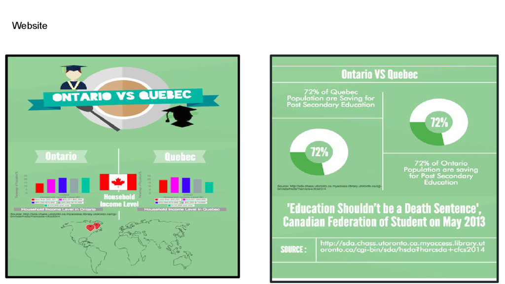
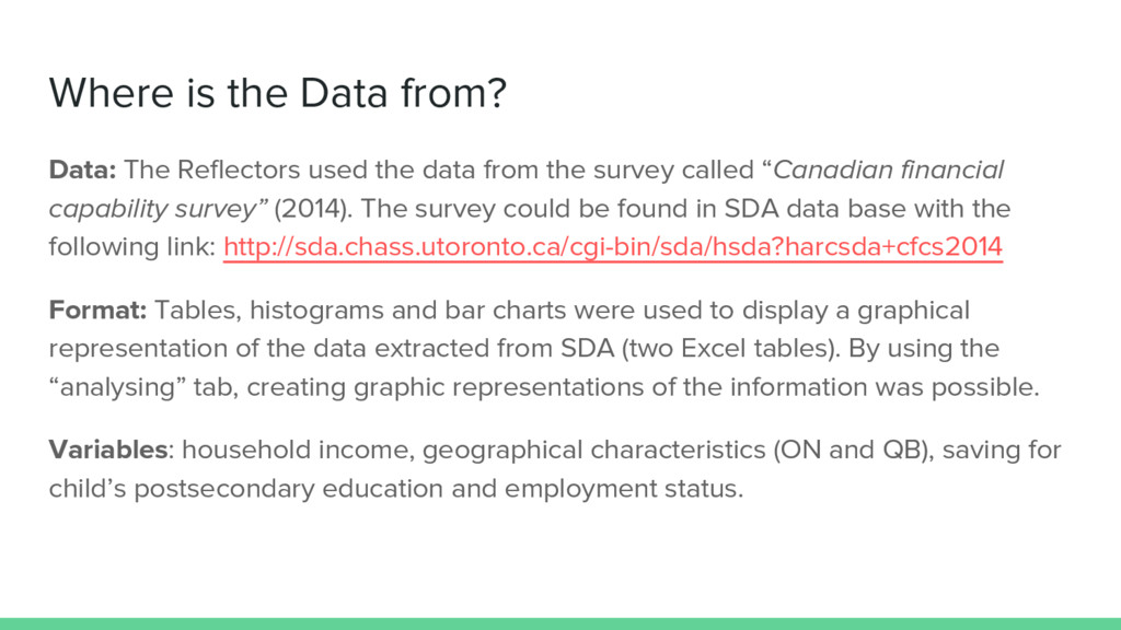
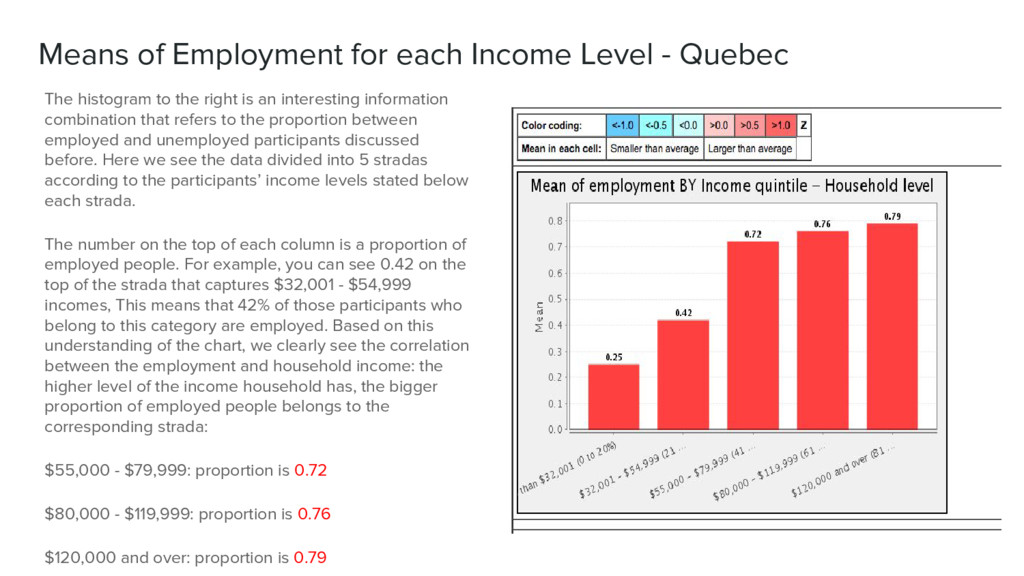
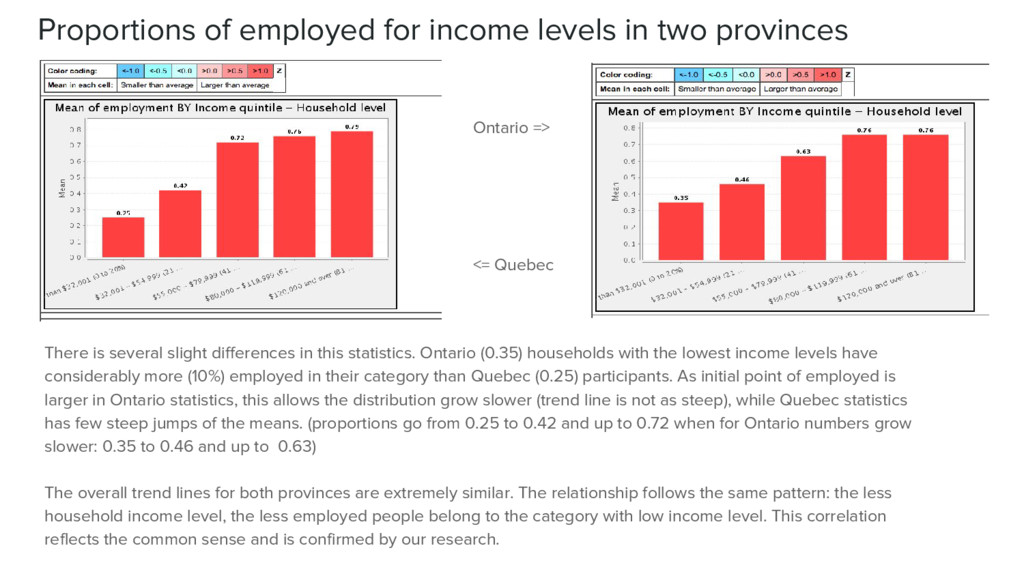
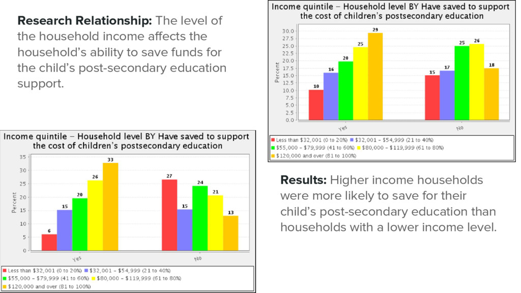
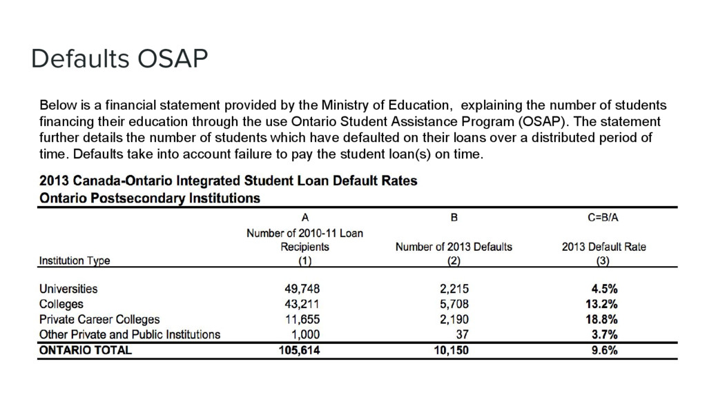
    Retrieved from http://cfsontario.ca/en/section/105 Canadian Federation of Student-Ontario. (2010). The Facts. Retrieved from http://cfsontario.ca/en/section/182 Color harmonies: Complementary, analogous, triadic color schemes Retrieved fromt: http://www.tigercolor.com/color-lab/color-theory/color-harmonies.htm Matt Carter. (2013), 2 - Design Goals for Different Presentation Formats, In Designing Science Presentations, edited by Matt Carter, Academic Press, San Diego, Pages 15-20, ISBN 9780123859693, Retrieved from http://dx.doi.org/10.1016/B978-0-12-385969-3.00002-7. Matt Carter. (2013). 8 - Charts, In Designing Science Presentations, edited by Matt Carter, Academic Press, San Diego, Pages 95-116, ISBN 9780123859693, http://dx.doi.org/10.1016/B978-0-12-385969-3.00008-8. OECD. (2014).
  42. Bibliography cont. Financial and human resources invested in education. Education

    at a Glance 2014 (Chpt B). Retrieved from http://www.oecd. org/edu/Education-at-a-Glance-2014.pdf Hennessy, T. (2012). Ontario tuition’s problem. Retrieved from http://behindthenumbers.ca/2012/09/11/ontario-tuition-problem/Ontario Ministry of Finance. (2014). Ontario’s long-term report on the economy: the changing shape of Ontario’s economy. Retrieved from http://www.fin.gov.on.ca/en/economy/ltr/2014/ch3.html Ontario Ministry of Training, Colleges and Universities. (2015). Ontario Labour Market Statistics for January 2015. Retrieved from http: //www.tcu.gov.on.ca/eng/employmentontario/youthfund ICEF Monitor. (2014). Pricing education in an era of increasing competitiveness and student expectations. Retrieved from http://monitor. icef.com/2014/11/pricing-education-era-increasing-competitiveness-student-expectations/ Ontario Ministry of Training, Colleges and Universities. (2015). Youth Employment Fund. Retrieved from http://www.tcu.gov.on. ca/eng/employmentontario/youthfund/
  43. Bibliography cont. Ontario Ministry of Training, Colleges and Universities. (2013).

    Canada-Ontario Integrated Student Loan Default Rates. Retrived from https: //osap.gov.on.ca/prodconsum/groups/osap_web_contents/documents/osap_web_contents/prdr012276.pdf Microdata Analysis and Subsetting with SDA. (2015). Canadian FinancialCapability Survey.(Data file). Retrieved from http://sda.chass.utoronto.ca.myaccess.library.utoronto.ca/sdaweb/dli3/cfcs/2014/more_doc/index.htm Ontario, G. of, Training, M. of and Colleges (2014) Welcome to the Ontario student assistance program: 2013 Loan Default rates. Retrieved from https://osap.gov.on.ca/OSAPPortal/en/PlanYourEducation/ChooseaCareerSchoolProgram/PRDR012287.html