Upgrade to Pro
— share decks privately, control downloads, hide ads and more …
Speaker Deck
Features
Speaker Deck
PRO
Sign in
Sign up for free
Search
Search
Responsive Web Design
Search
Sayanee
May 15, 2012
Technology
310
3
Share
Embed
Copy iframe code
Copy JS code
Copy link
Start on current slide
Responsive Web Design
Sayanee
May 15, 2012
More Decks by Sayanee
See All by Sayanee
Podcasting with Jekyll
sayanee
1
1k
Rails API
sayanee
5
570
Learning with Open Source
sayanee
3
320
ECMAScript 6 - part 1
sayanee
3
430
ECMAScript 6 - part 2
sayanee
1
300
Minimalist Designer behind the curious Developer
sayanee
8
450
Responsive Web Design for Beginners
sayanee
9
990
Travel to Balkans + Hungary
sayanee
2
240
Styling with SASS
sayanee
9
650
Other Decks in Technology
See All in Technology
「守りたい体験」を渡すだけで E2E を生成させられるようになった話
hinac0
0
170
型は壁、Rustでもバグを直すな、表現できなくせよ
nwiizo
14
2.1k
非定型なドキュメントを効率よくリファクタする 〜えぇ!?仕様書27本の移行が1日で終わったって!?〜
subroh0508
2
550
AIと共生する開発者プラットフォーム:バクラクのモノレポ×マイクロサービス基盤
sakajunquality
2
3.7k
DMM.com 購入改善推進チーム におけるCodeRabbitを用いた レビューフロー改善の一例
ysknsid25
2
660
AI時代のPlaywright活用(システムテストを自動化する ー 実行エンジンにPla ywrightを選んだ理由)
ynisqa1988
0
130
穢れた技術選定について
watany
17
5.4k
発表と総括 / Presentations and Summary
ks91
PRO
0
140
[2026-07-15] AI Ready なはずだったアーキテクチャと、見えてきた課題・次に目指す状態
wxyzzz
9
4k
AI、CDK と協働する Full TypeScript アプリケーション開発 / Full TypeScript Application with AI and CDK
geekplus_tech
2
360
SREとQA 二人三脚で進めるSLO運用/sre-qa-slo
sugitak
0
820
はじめてのWDM
miyukichi_ospf
1
150
Featured
See All Featured
How to audit for AI Accessibility on your Front & Back End
davetheseo
0
470
Responsive Adventures: Dirty Tricks From The Dark Corners of Front-End
smashingmag
254
22k
Building Applications with DynamoDB
mza
96
7.1k
Into the Great Unknown - MozCon
thekraken
41
2.6k
Mozcon NYC 2025: Stop Losing SEO Traffic
samtorres
1
370
4 Signs Your Business is Dying
shpigford
187
22k
Stop Working from a Prison Cell
hatefulcrawdad
274
21k
The Invisible Side of Design
smashingmag
301
52k
A Modern Web Designer's Workflow
chriscoyier
698
190k
Information Architects: The Missing Link in Design Systems
soysaucechin
0
1k
What does AI have to do with Human Rights?
axbom
PRO
1
2.2k
The MySQL Ecosystem @ GitHub 2015
samlambert
251
13k
Transcript
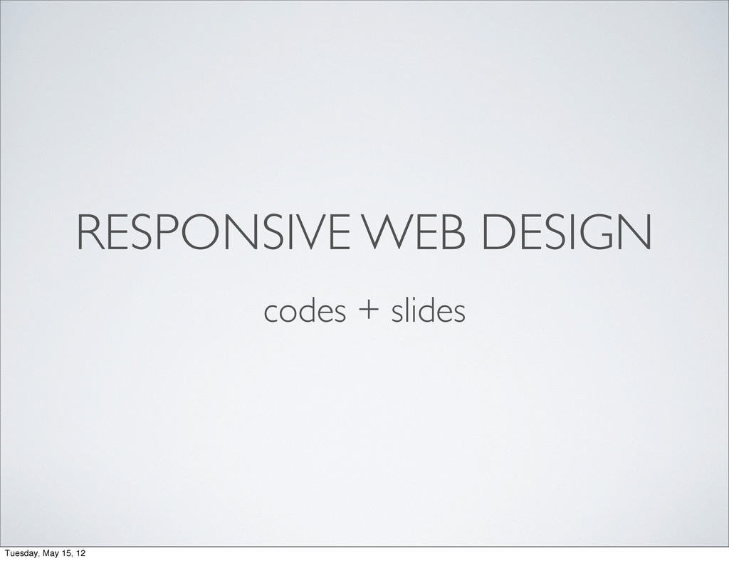
RESPONSIVE WEB DESIGN codes + slides Tuesday, May 15, 12
@sayanee_ Tuesday, May 15, 12
RESPONSIVE WEB DESIGN Tuesday, May 15, 12
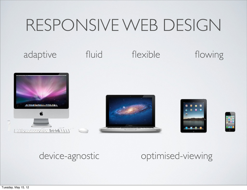
RESPONSIVE WEB DESIGN adaptive fluid flexible flowing Tuesday, May 15,
12
RESPONSIVE WEB DESIGN adaptive fluid flexible flowing device-agnostic optimised-viewing Tuesday,
May 15, 12
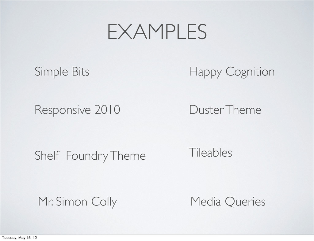
EXAMPLES Media Queries Happy Cognition Simple Bits Responsive 2010 Duster
Theme Shelf Foundry Theme Tileables Mr. Simon Colly Tuesday, May 15, 12
TOOLS Tuesday, May 15, 12
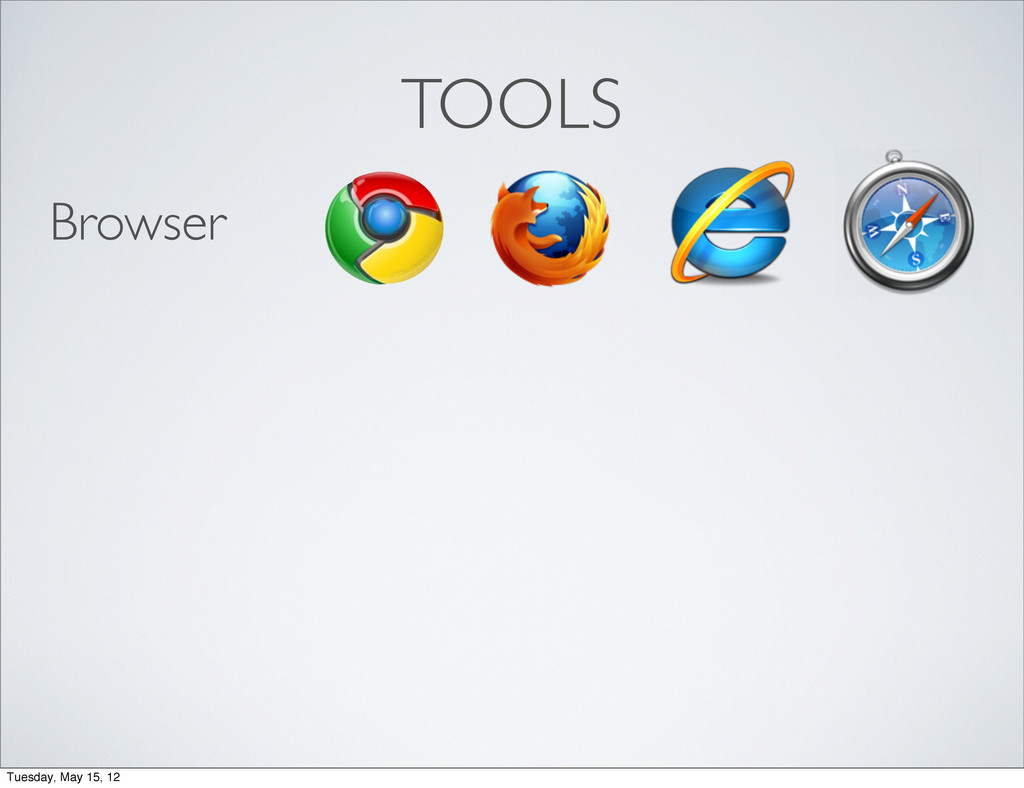
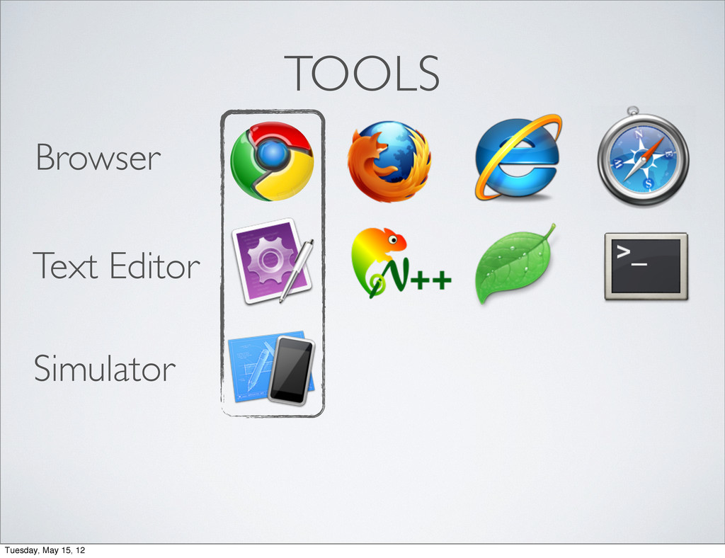
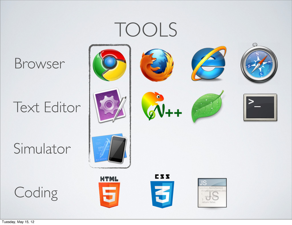
TOOLS Browser Tuesday, May 15, 12
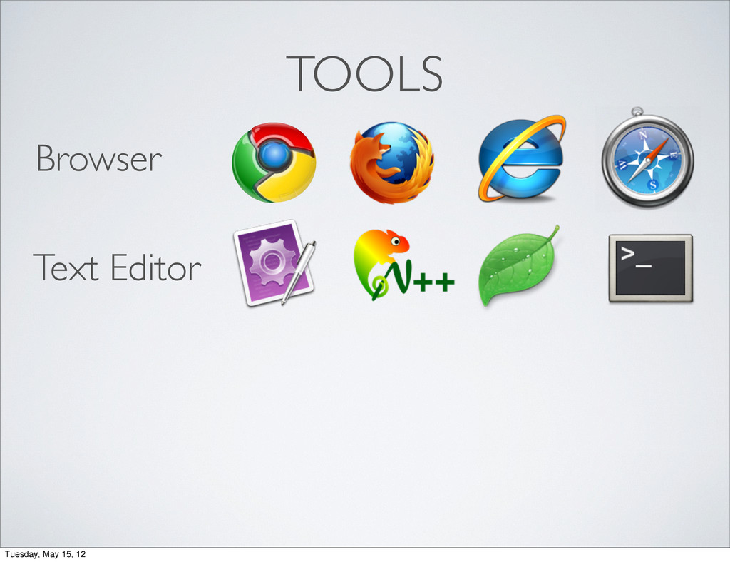
TOOLS Browser Text Editor Tuesday, May 15, 12
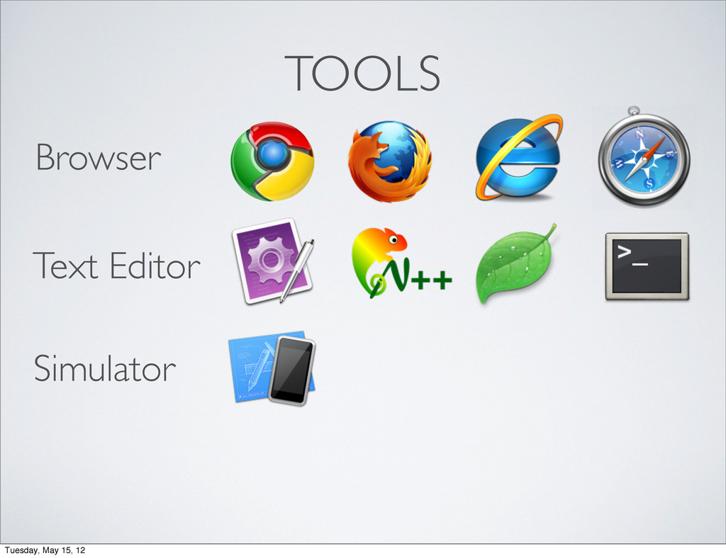
TOOLS Browser Text Editor Simulator Tuesday, May 15, 12
TOOLS Browser Text Editor Simulator Tuesday, May 15, 12
TOOLS Browser Text Editor Simulator Coding Tuesday, May 15, 12
#1 fluid layout #2 media queries #3 flexible media Tuesday,
May 15, 12
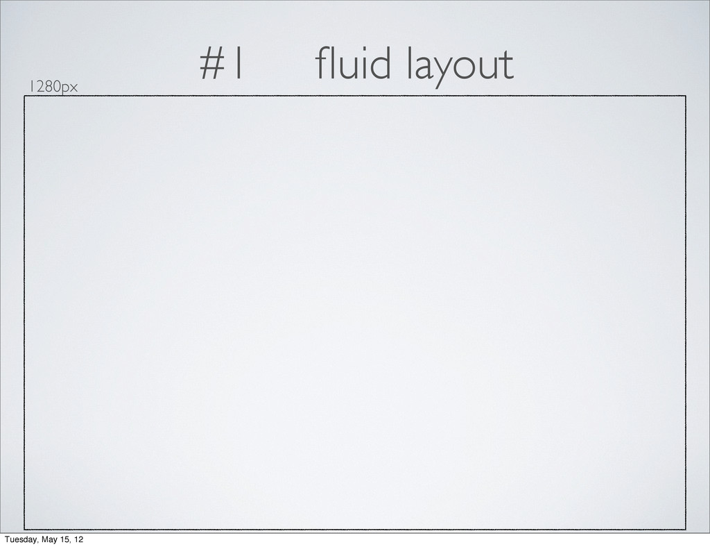
#1 fluid layout Tuesday, May 15, 12
#1 fluid layout 1280px Tuesday, May 15, 12
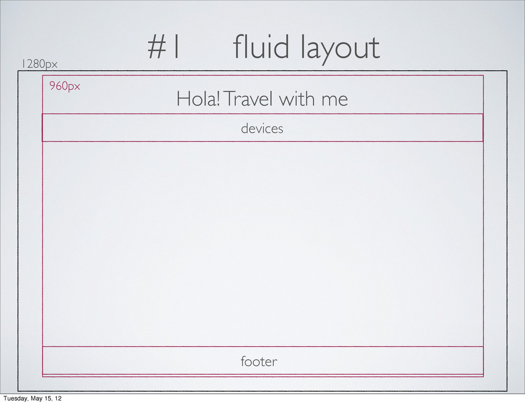
#1 fluid layout 1280px 960px Hola! Travel with me devices
footer Tuesday, May 15, 12
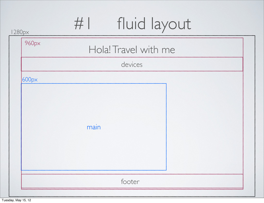
#1 fluid layout 1280px 960px Hola! Travel with me 600px
devices main footer Tuesday, May 15, 12
#1 fluid layout 1280px 960px Hola! Travel with me 600px
300px devices main sidebar footer Tuesday, May 15, 12
#1 fluid layout think in pixels percentages target / context
= result Tuesday, May 15, 12
#1 fluid layout 1280px 960px Hola! Travel with me 600px
300px devices main sidebar footer Tuesday, May 15, 12
#1 fluid layout 1280px 960px Hola! Travel with me 600px
300px devices main sidebar footer /1280px = 75% / 960px= 62.5% /960px = 31.25% 960px / 960px = 100% 960px / 960px = 100% Tuesday, May 15, 12
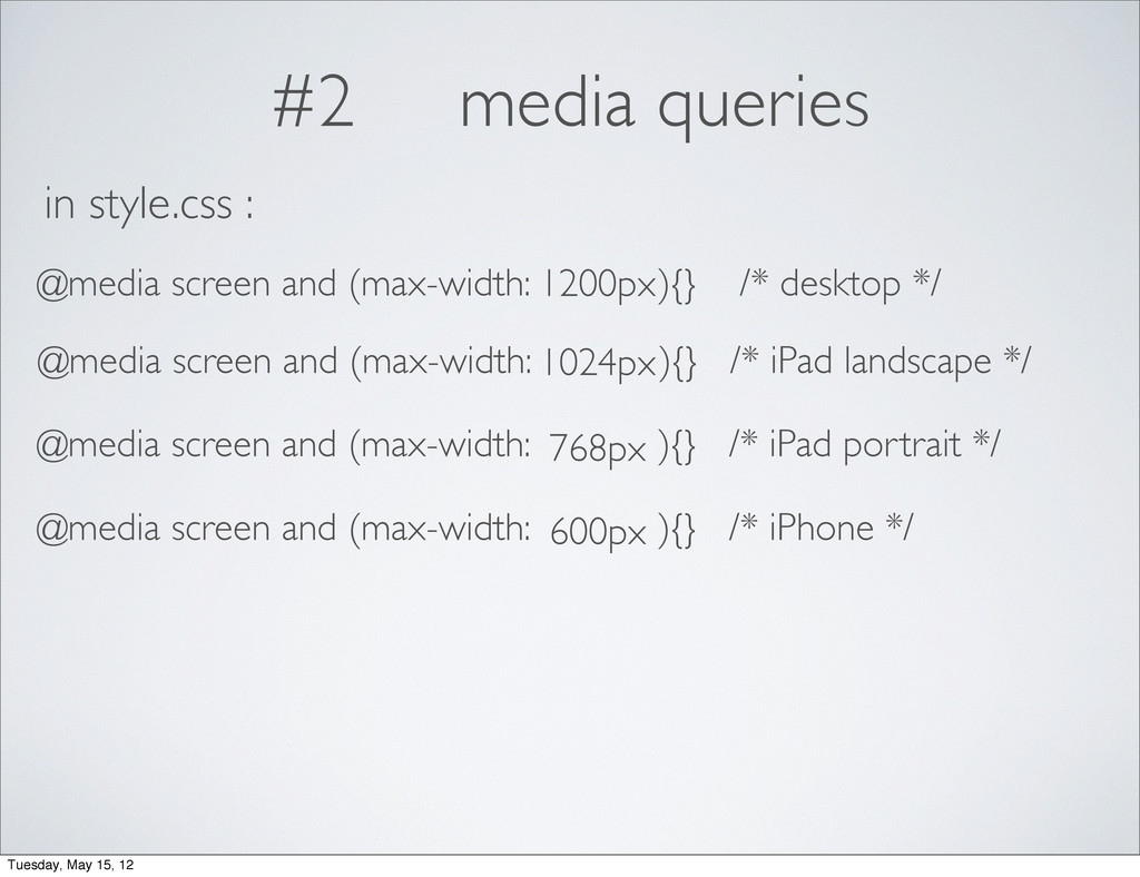
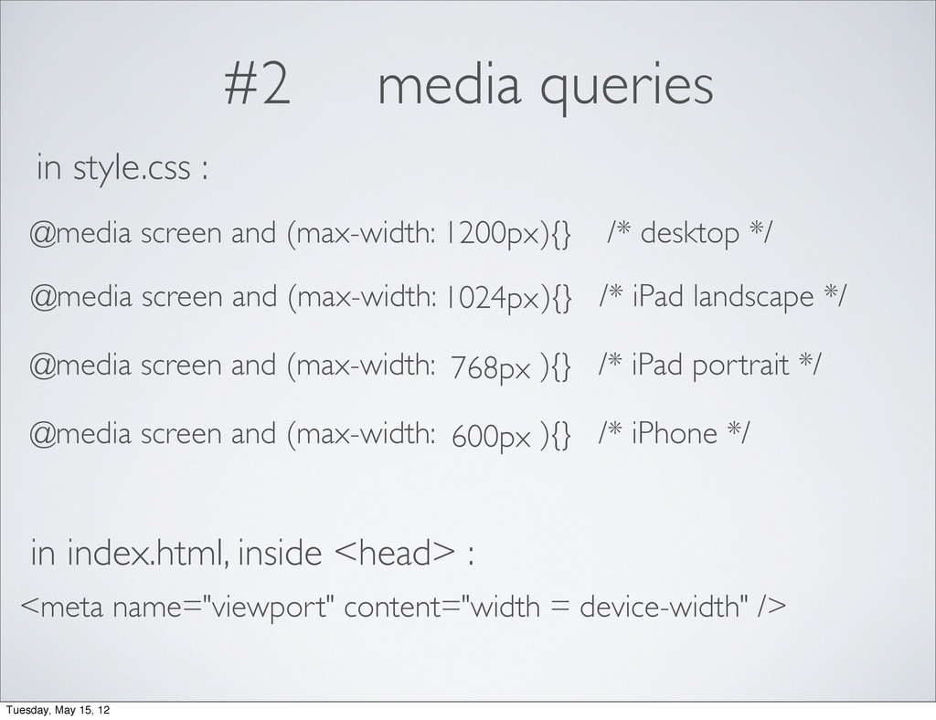
#2 media queries min-width landscape 1024px portrait 768px 1280px landscape
960px portrait 640px four layouts 1200px 1024px 768px 600px Tuesday, May 15, 12
#2 media queries 1200px 1024px 768px 600px Tuesday, May 15,
12
#2 media queries 1200px 1024px 768px 600px @media screen and
(max-width: ){} /* desktop */ in style.css : @media screen and (max-width: ){} /* iPad landscape */ @media screen and (max-width: ){} /* iPad portrait */ @media screen and (max-width: ){} /* iPhone */ Tuesday, May 15, 12
#2 media queries 1200px 1024px 768px 600px @media screen and
(max-width: ){} /* desktop */ in style.css : @media screen and (max-width: ){} /* iPad landscape */ @media screen and (max-width: ){} /* iPad portrait */ @media screen and (max-width: ){} /* iPhone */ in index.html, inside <head> : <meta name="viewport" content="width = device-width" /> Tuesday, May 15, 12
#3 flexible media img, embed, object, video { max-width:100% }
Tuesday, May 15, 12
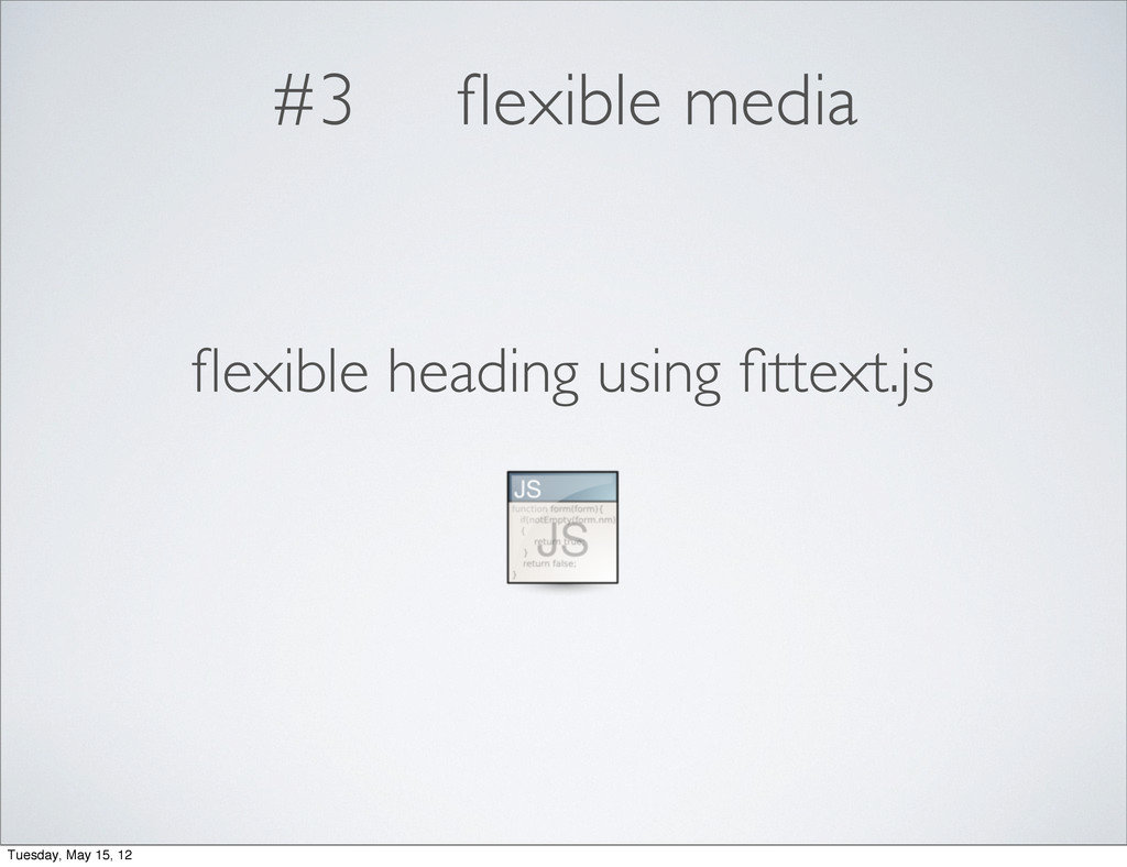
#3 flexible media flexible heading using fittext.js Tuesday, May 15,
12
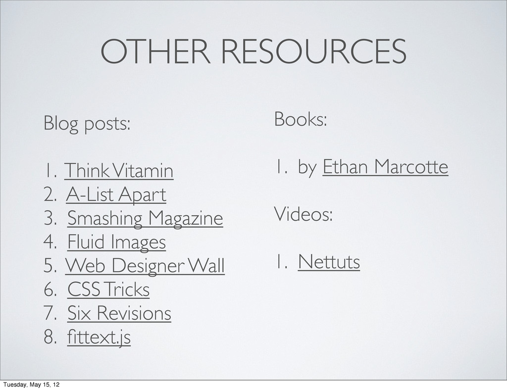
OTHER RESOURCES Blog posts: 1. Think Vitamin 2. A-List Apart
3. Smashing Magazine 4. Fluid Images 5. Web Designer Wall 6. CSS Tricks 7. Six Revisions 8. fittext.js Books: 1. by Ethan Marcotte Videos: 1. Nettuts Tuesday, May 15, 12
codes + slides Tuesday, May 15, 12
@sayanee_ Tuesday, May 15, 12
 sayanee
 hinac0
 nwiizo
 subroh0508
 sakajunquality
 ysknsid25
 ynisqa1988
 watany
 ks91
ks91
 wxyzzz
 geekplus_tech
 sugitak
 miyukichi_ospf
 davetheseo
 smashingmag
 mza
mza
 thekraken
 samtorres
 shpigford
 hatefulcrawdad
 chriscoyier
 soysaucechin
 axbom
axbom
 samlambert