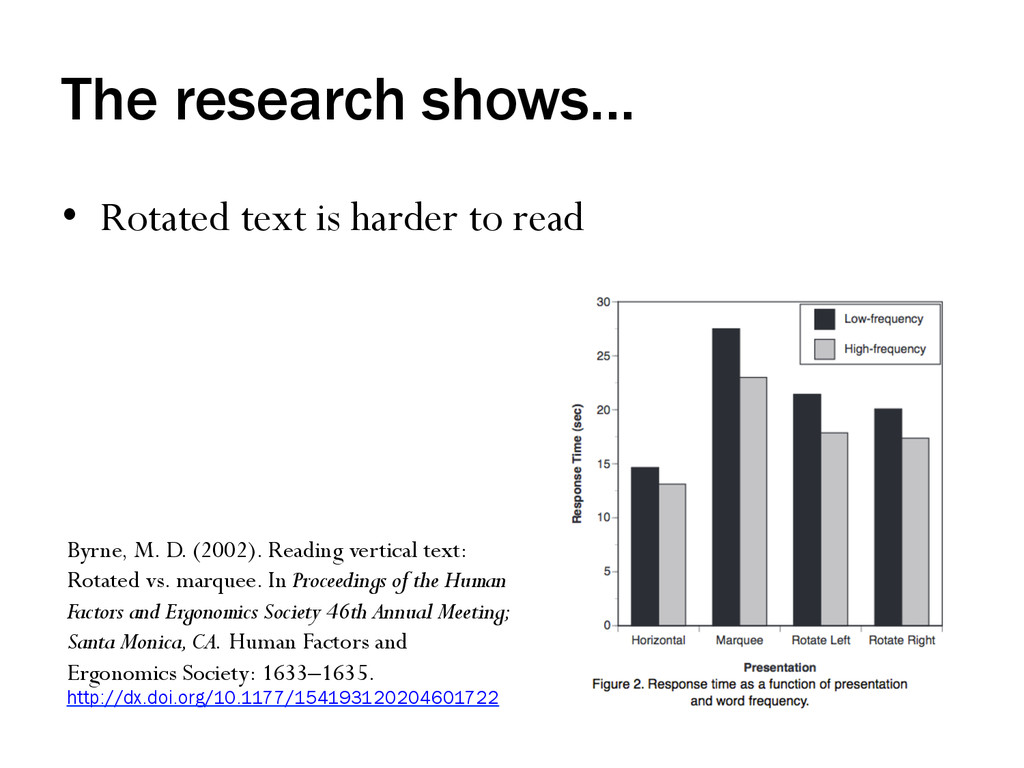
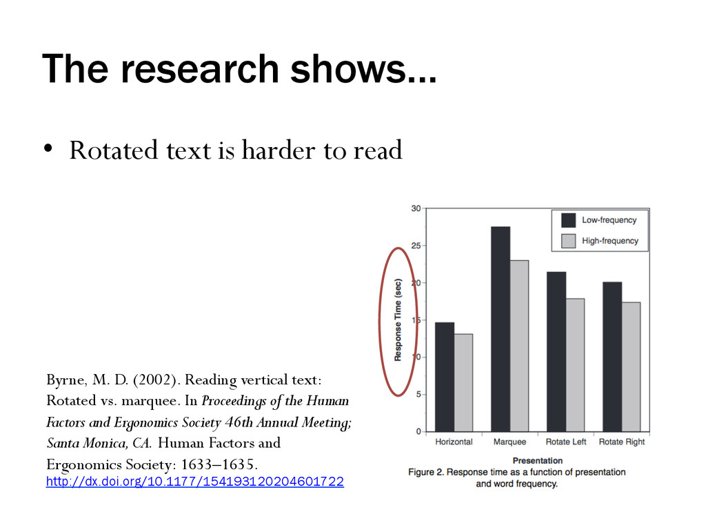
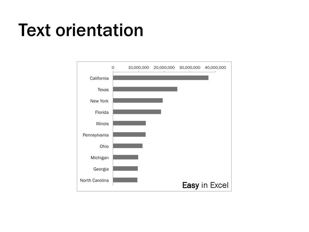
Byrne, M. D. (2002). Reading vertical text: Rotated vs. marquee. In Proceedings of the Human Factors and Ergonomics Society 46th Annual Meeting; Santa Monica, CA. Human Factors and Ergonomics Society: 1633–1635. http://dx.doi.org/10.1177/154193120204601722
Byrne, M. D. (2002). Reading vertical text: Rotated vs. marquee. In Proceedings of the Human Factors and Ergonomics Society 46th Annual Meeting; Santa Monica, CA. Human Factors and Ergonomics Society: 1633–1635. http://dx.doi.org/10.1177/154193120204601722
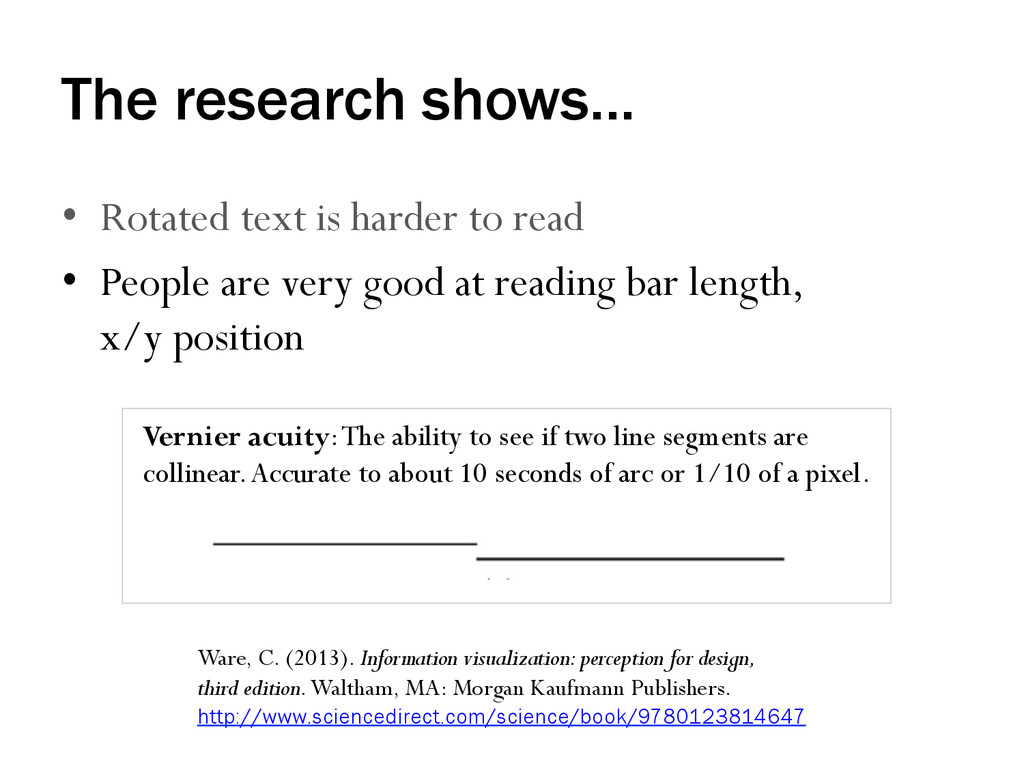
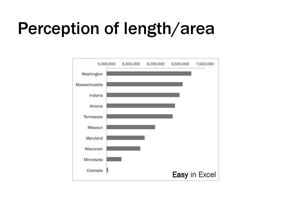
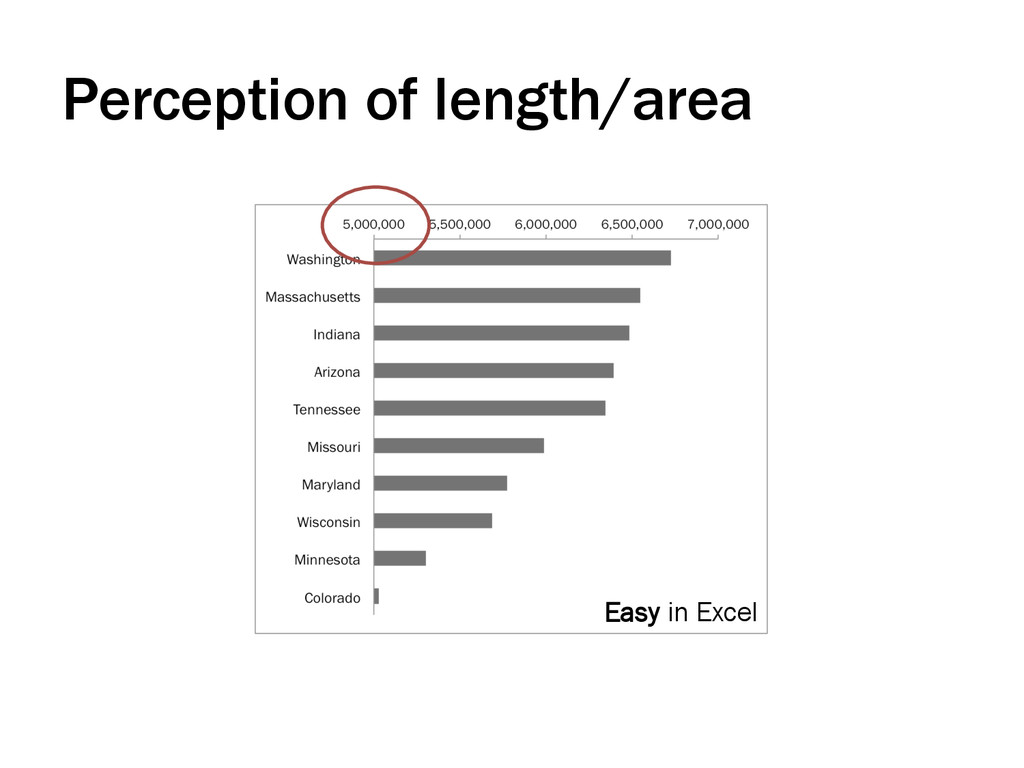
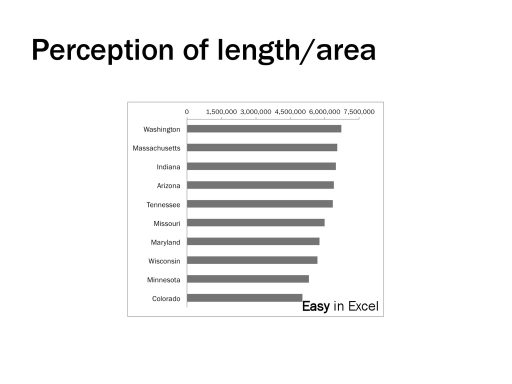
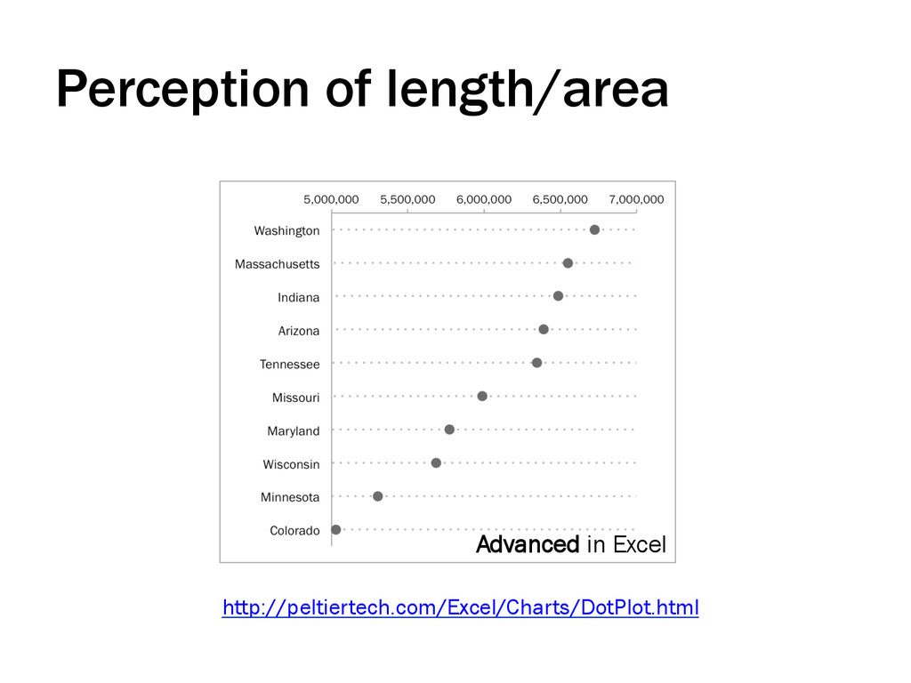
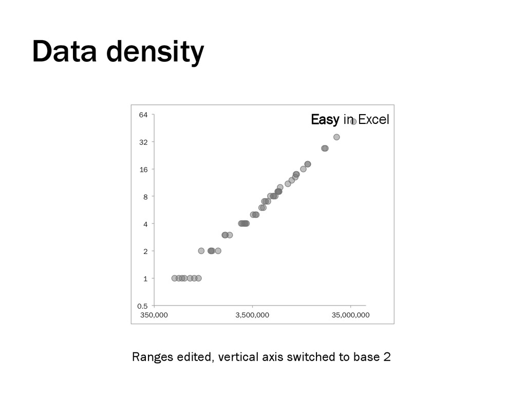
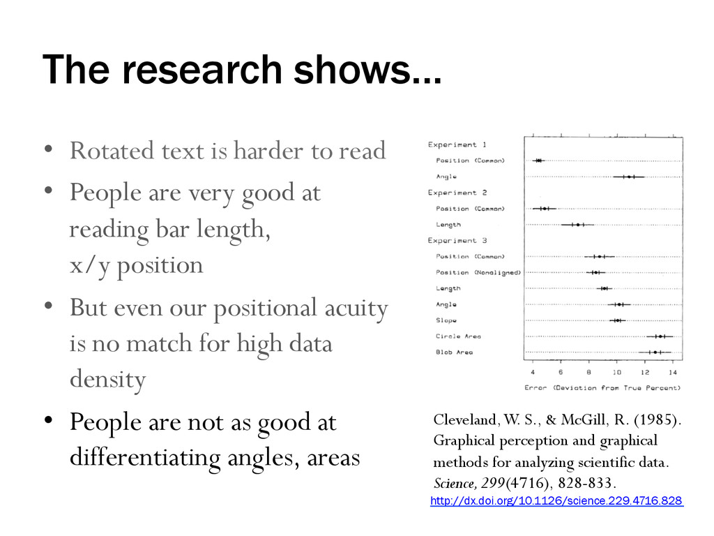
• People are very good at reading bar length, x/y position Vernier acuity: The ability to see if two line segments are collinear. Accurate to about 10 seconds of arc or 1/10 of a pixel. Ware, C. (2013). Information visualization: perception for design, third edition. Waltham, MA: Morgan Kaufmann Publishers. http://www.sciencedirect.com/science/book/9780123814647
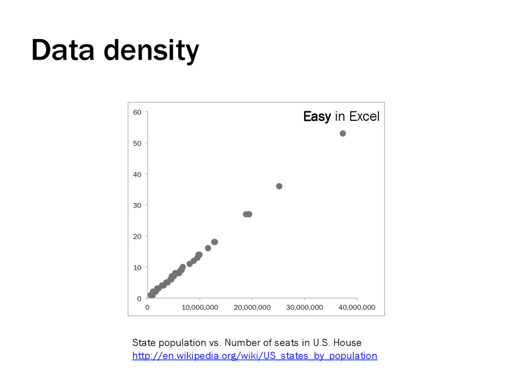
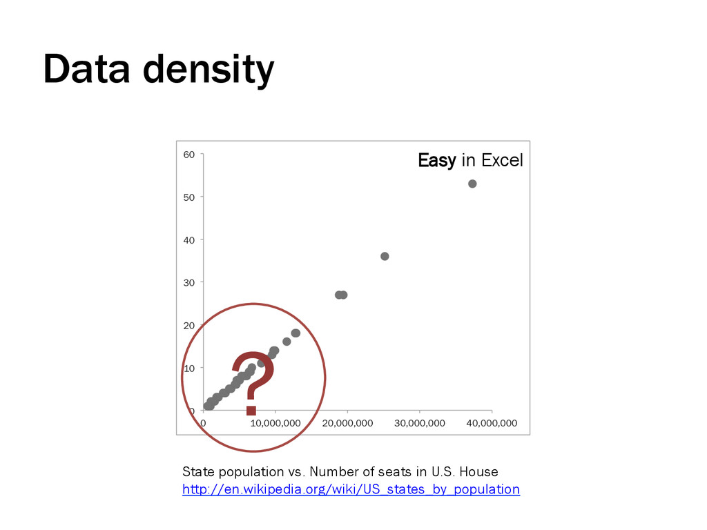
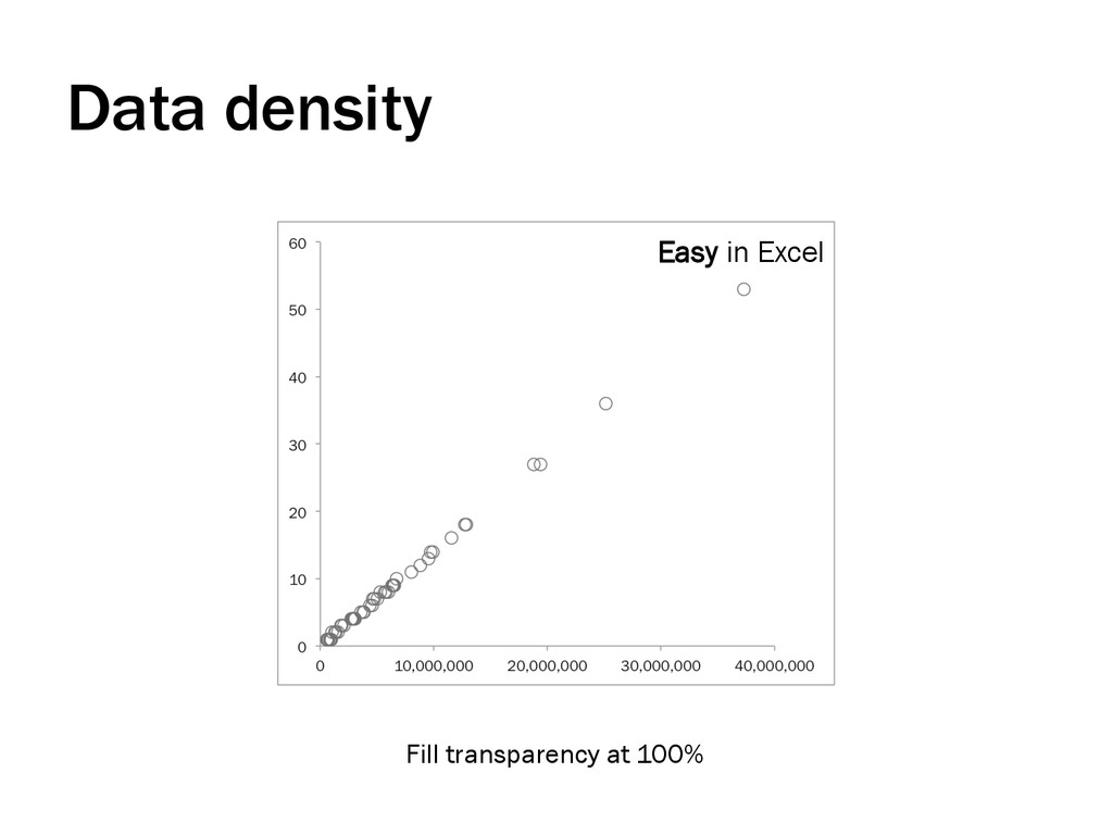
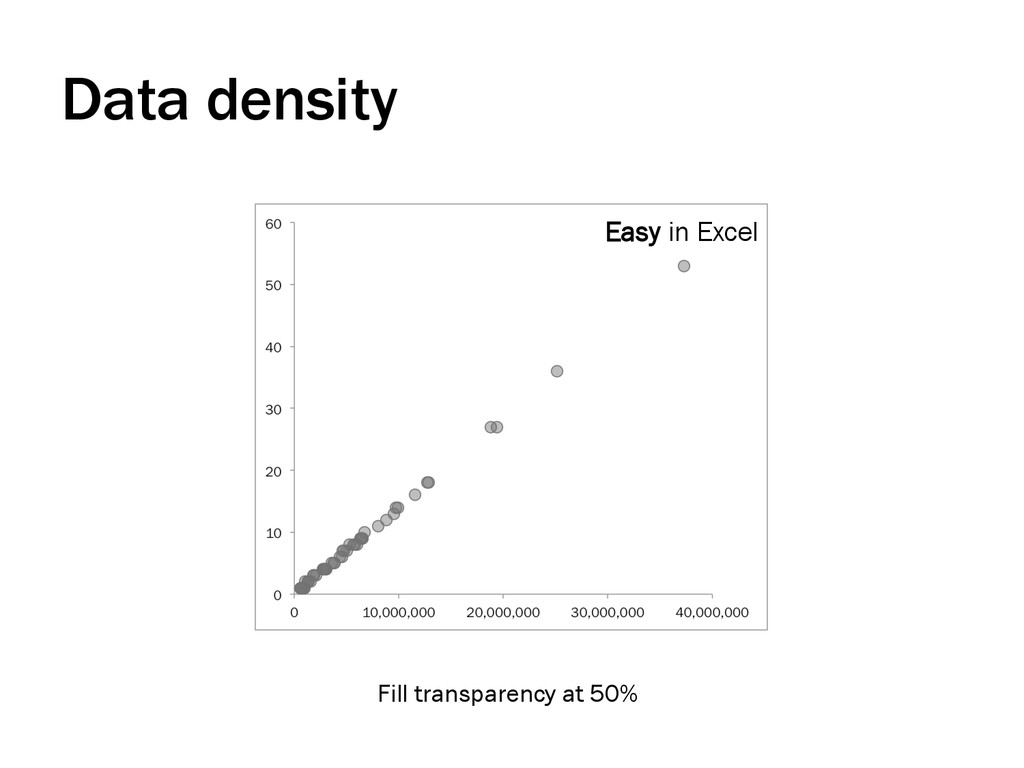
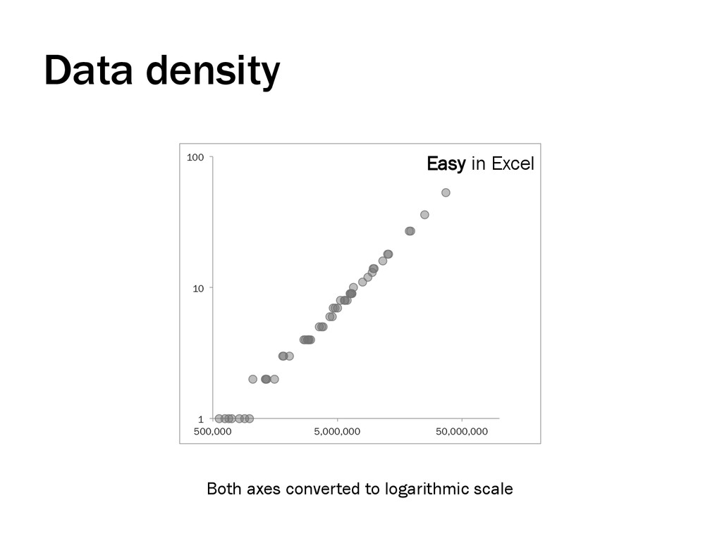
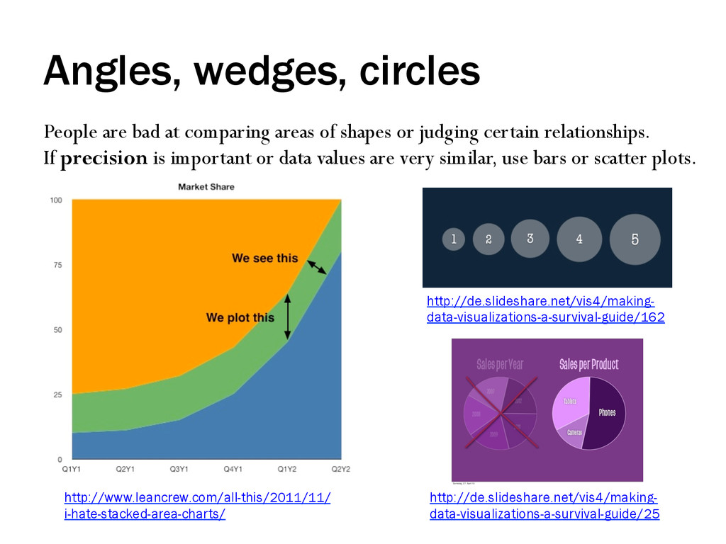
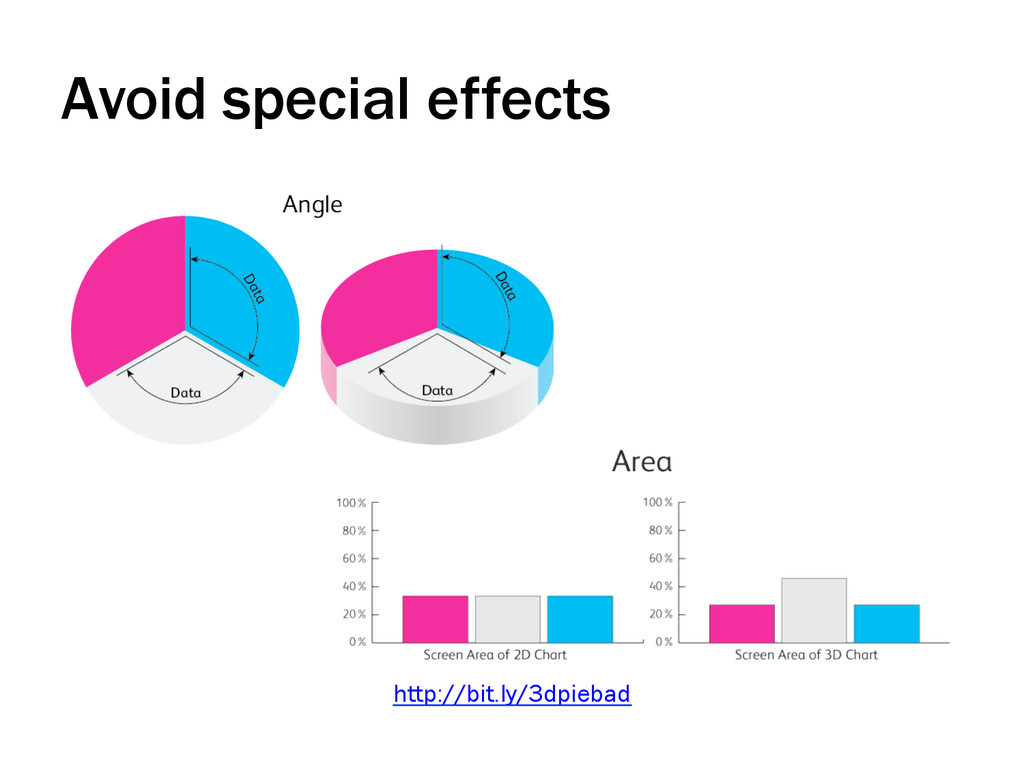
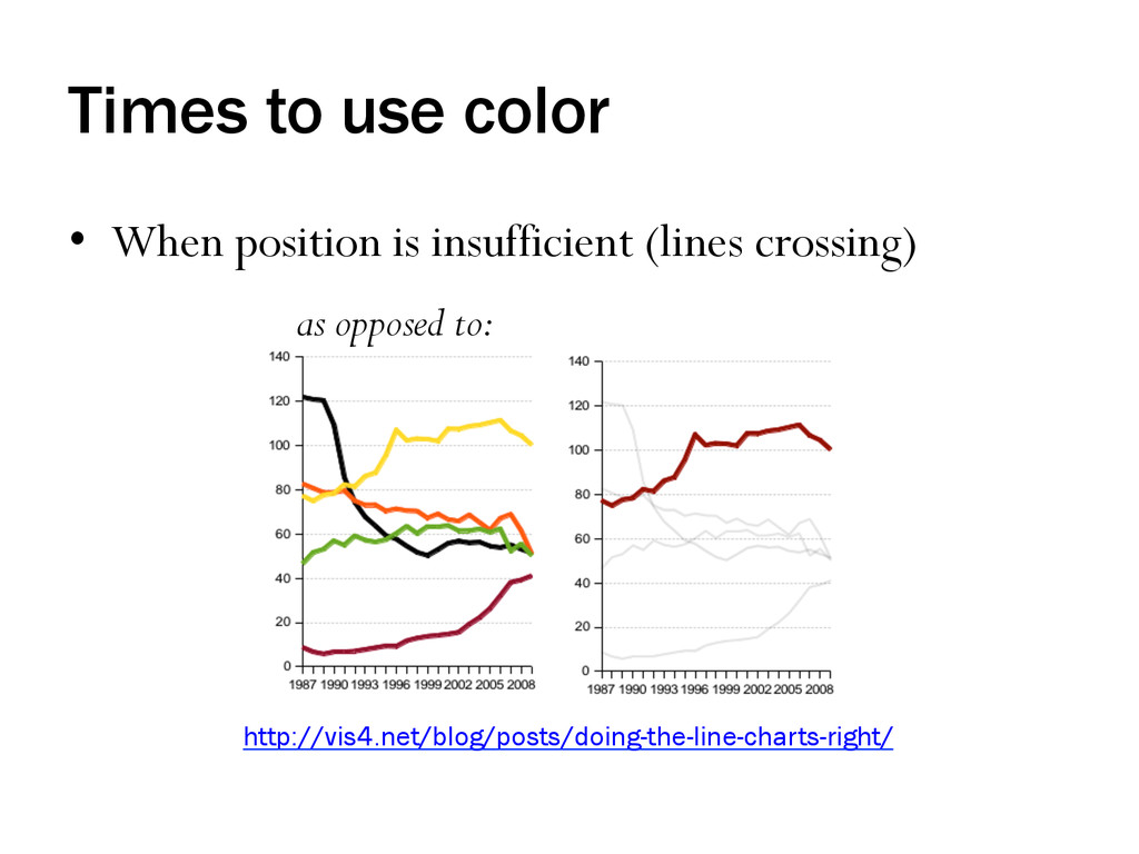
• People are very good at reading bar length, x/y position • But even our positional acuity is no match for high data density • People are not as good at differentiating angles, areas Cleveland, W. S., & McGill, R. (1985). Graphical perception and graphical methods for analyzing scientific data. Science, 299(4716), 828-833. http://dx.doi.org/10.1126/science.229.4716.828
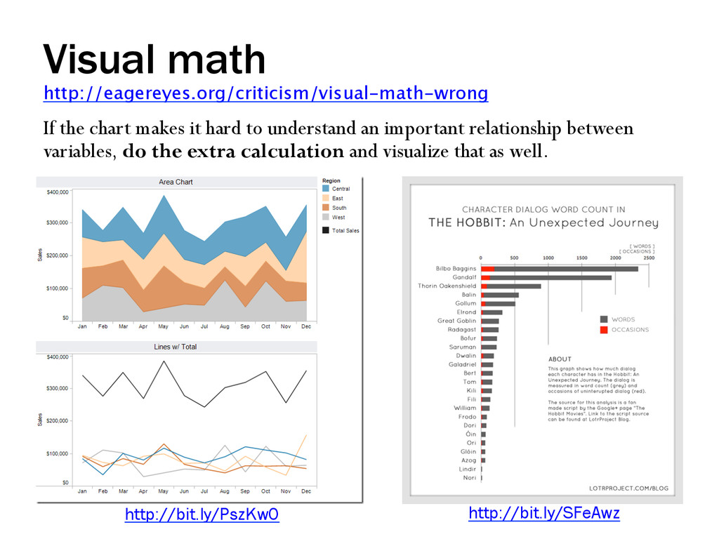
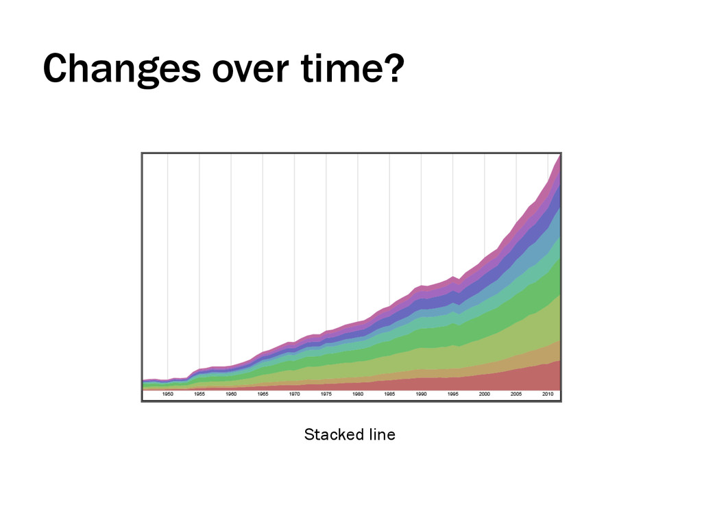
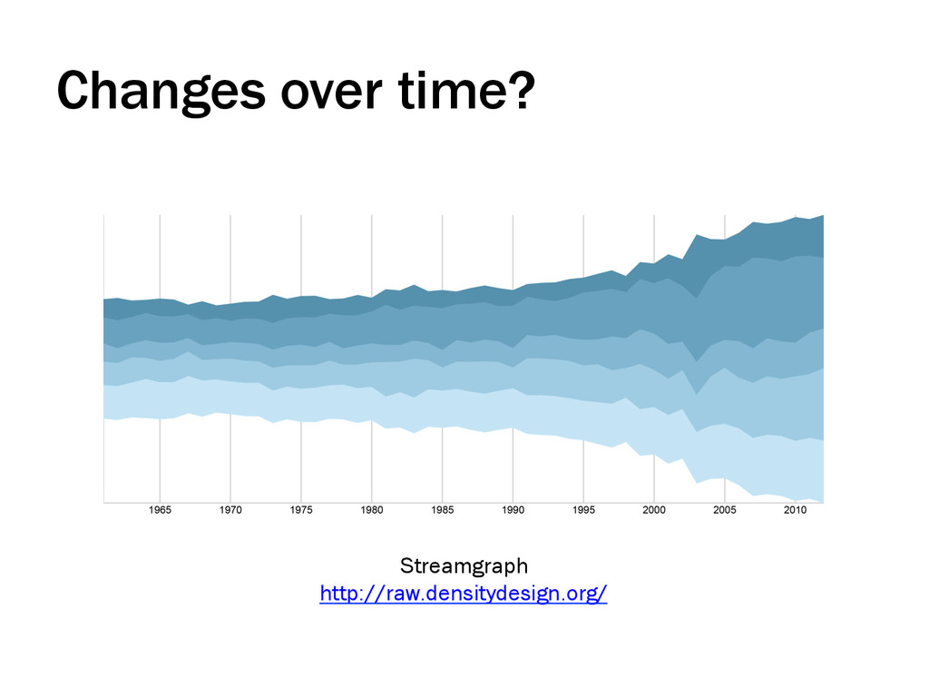
shapes or judging certain relationships. If precision is important or data values are very similar, use bars or scatter plots. http://de.slideshare.net/vis4/making- data-visualizations-a-survival-guide/25 http://de.slideshare.net/vis4/making- data-visualizations-a-survival-guide/162 http://www.leancrew.com/all-this/2011/11/ i-hate-stacked-area-charts/
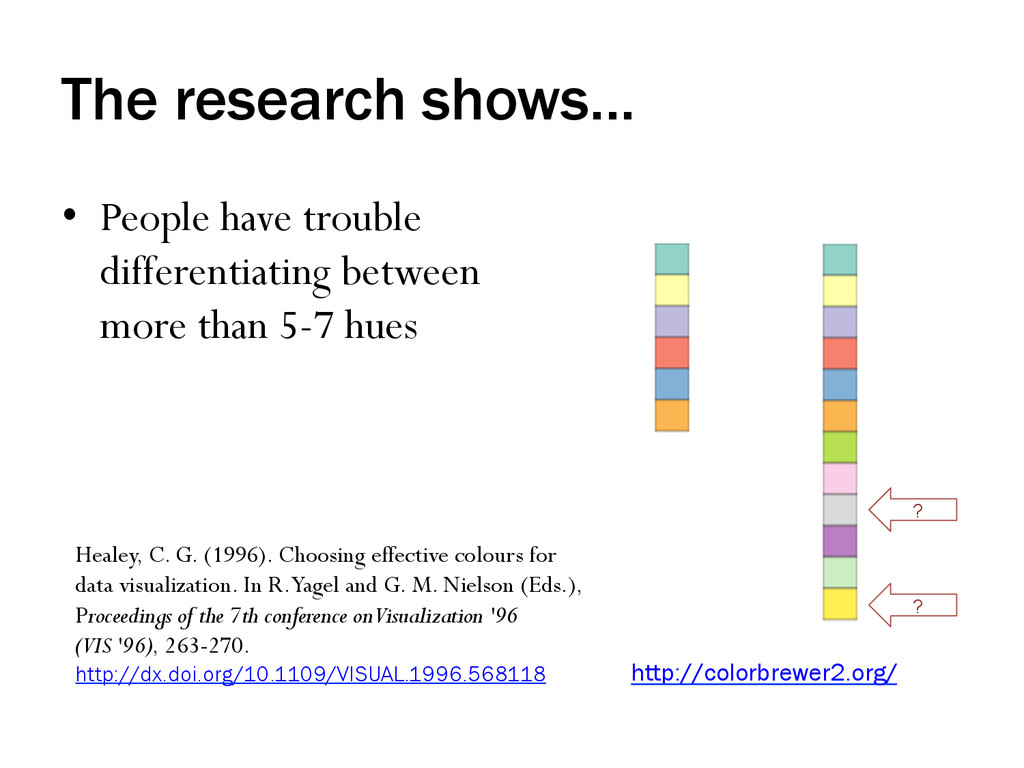
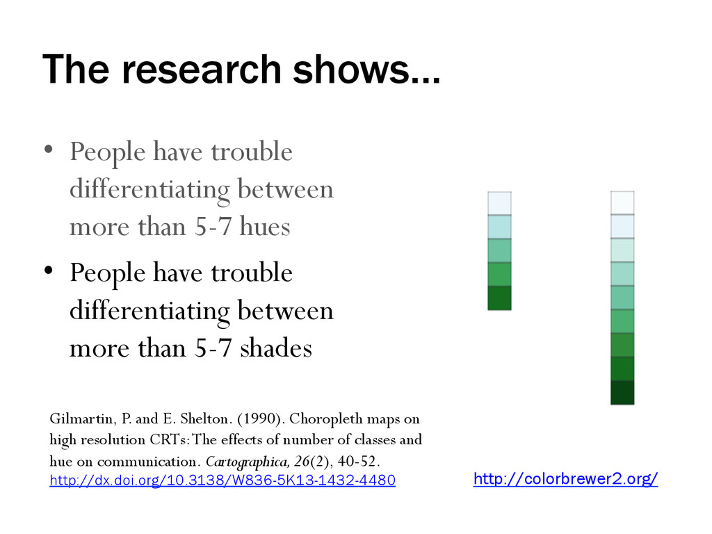
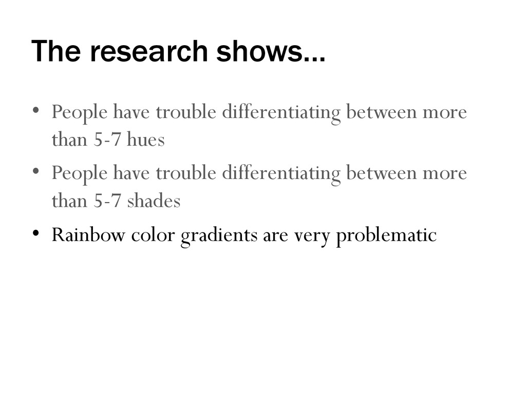
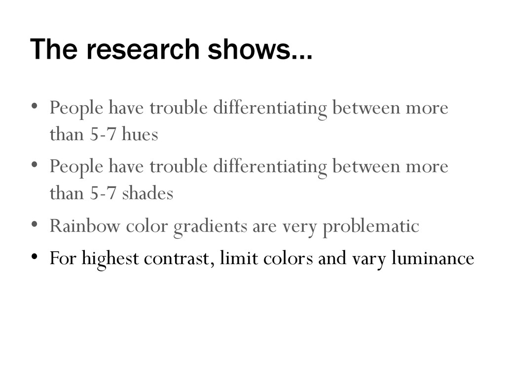
than 5-7 hues ? ? http://colorbrewer2.org/ Healey, C. G. (1996). Choosing effective colours for data visualization. In R. Yagel and G. M. Nielson (Eds.), Proceedings of the 7th conference on Visualization '96 (VIS '96), 263-270. http://dx.doi.org/10.1109/VISUAL.1996.568118
than 5-7 hues • People have trouble differentiating between more than 5-7 shades http://colorbrewer2.org/ Gilmartin, P. and E. Shelton. (1990). Choropleth maps on high resolution CRTs: The effects of number of classes and hue on communication. Cartographica, 26(2), 40-52. http://dx.doi.org/10.3138/W836-5K13-1432-4480
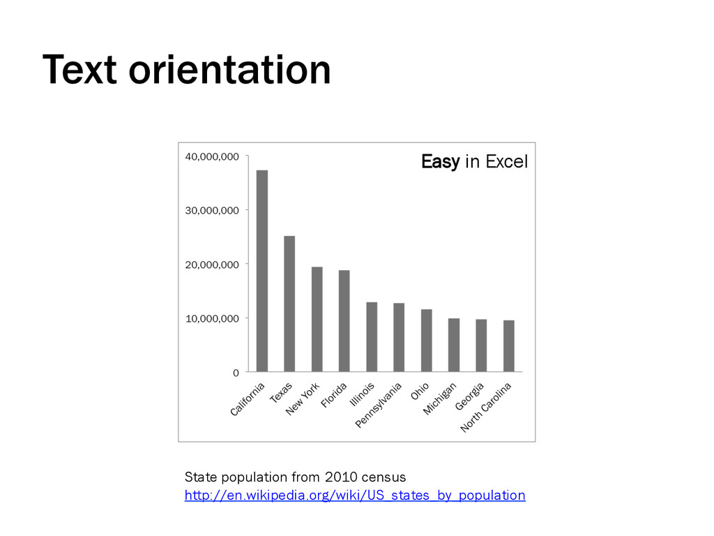
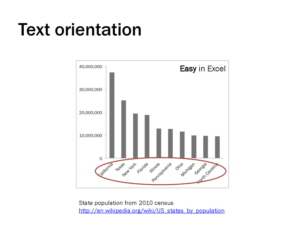
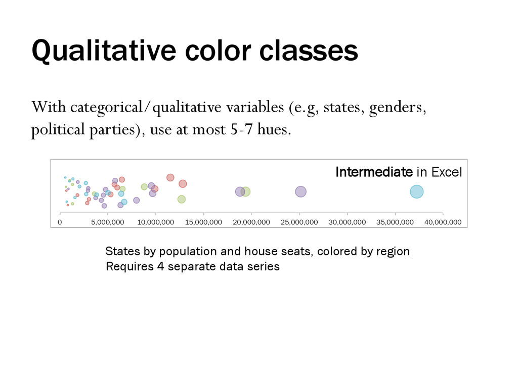
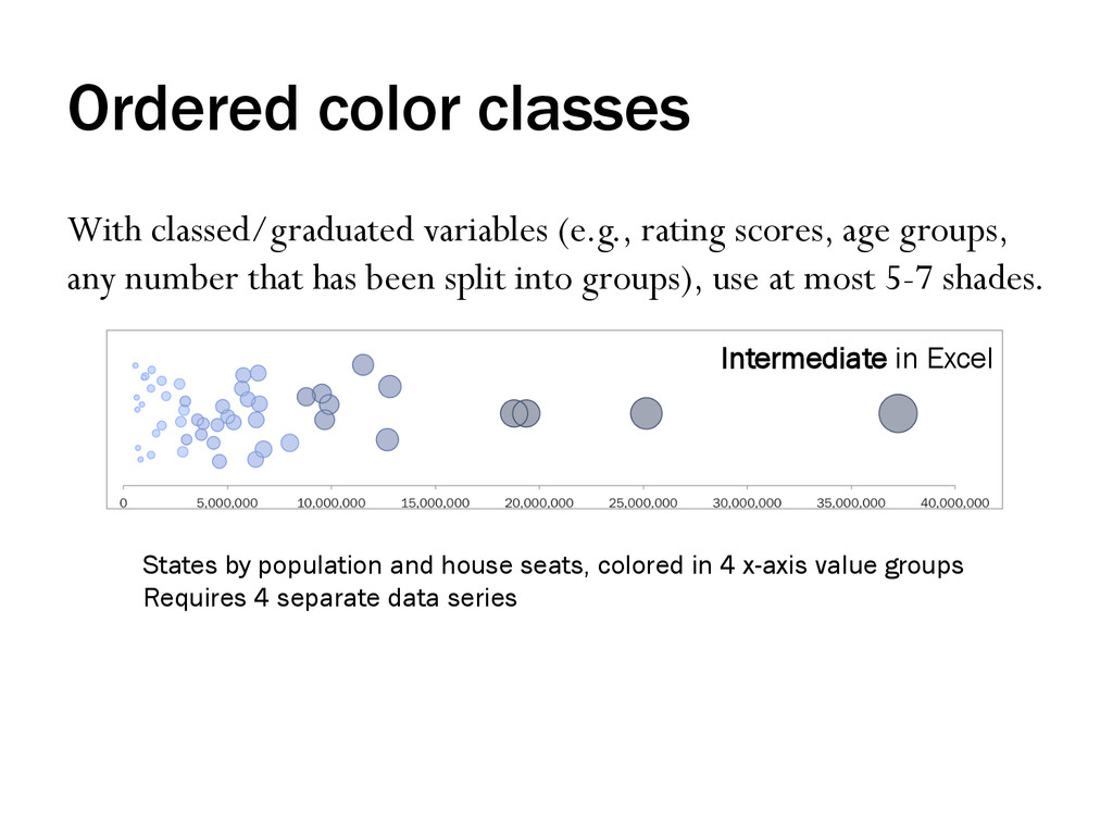
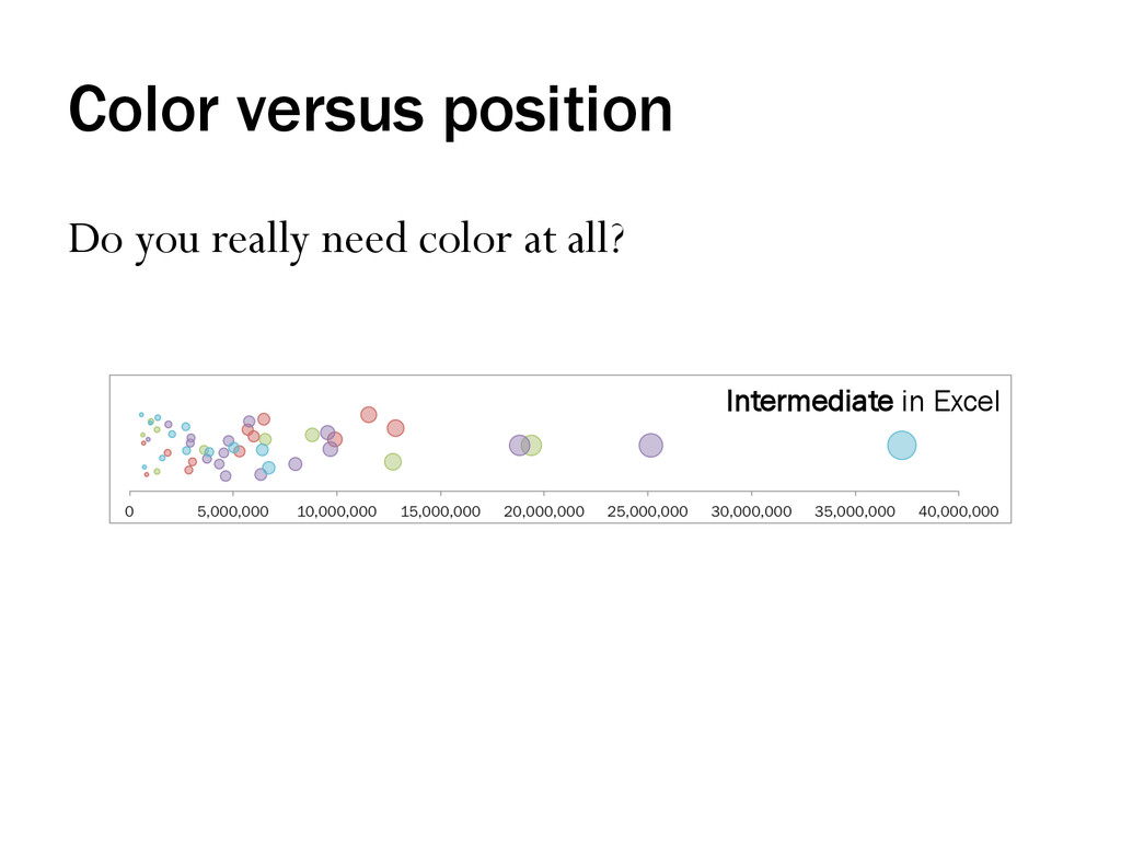
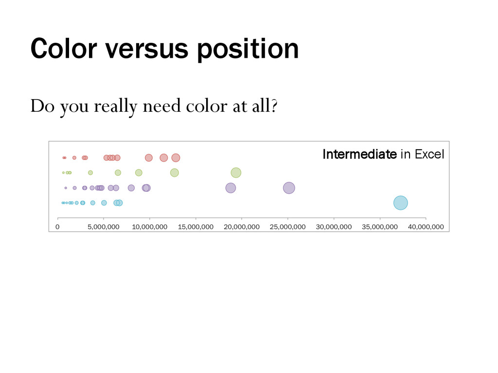
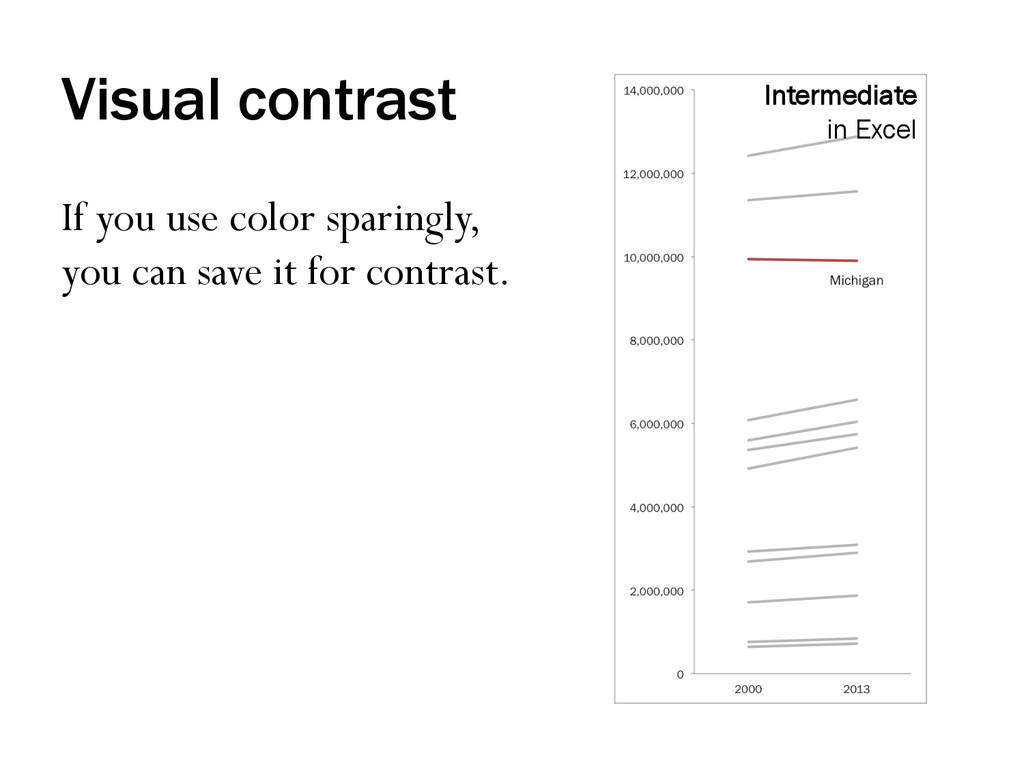
groups, any number that has been split into groups), use at most 5-7 shades. States by population and house seats, colored in 4 x-axis value groups Requires 4 separate data series Intermediate in Excel
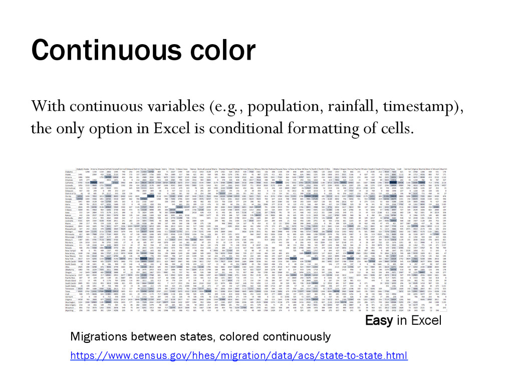
only option in Excel is conditional formatting of cells. https://www.census.gov/hhes/migration/data/acs/state-to-state.html Migrations between states, colored continuously Easy in Excel
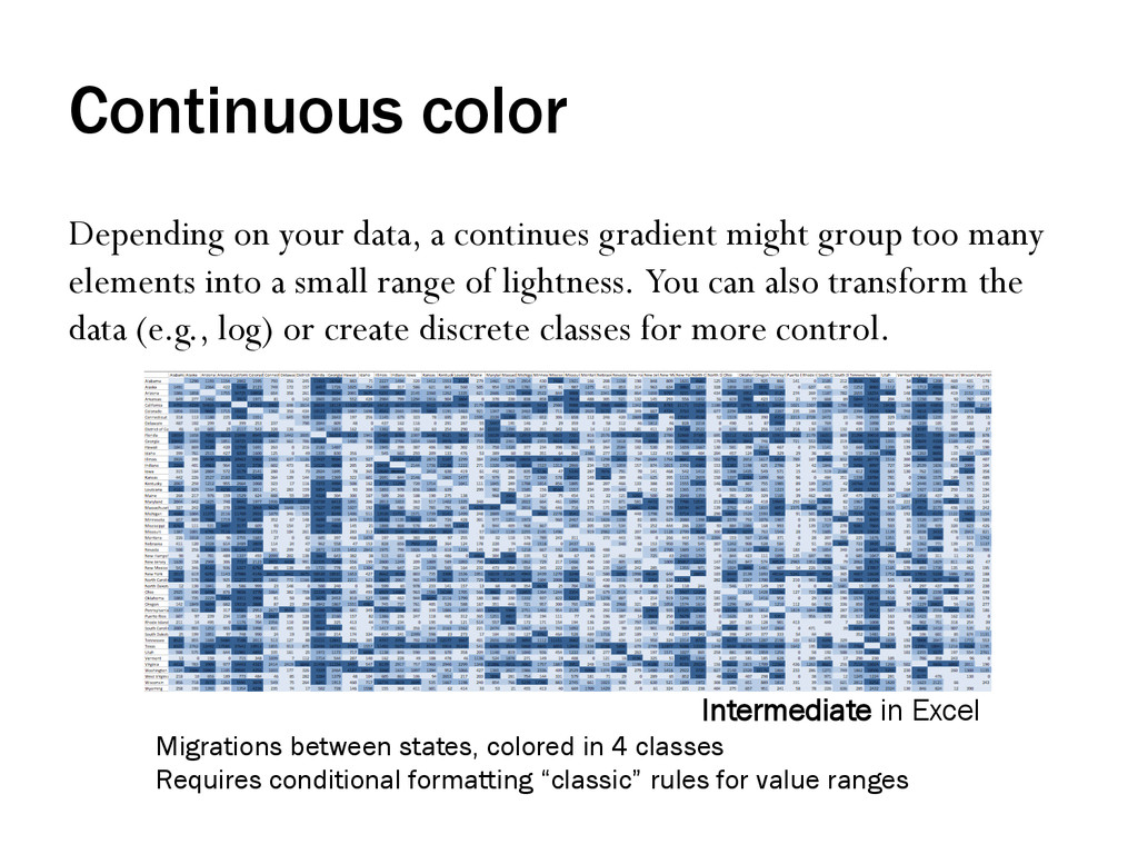
group too many elements into a small range of lightness. You can also transform the data (e.g., log) or create discrete classes for more control. Migrations between states, colored in 4 classes Requires conditional formatting “classic” rules for value ranges Intermediate in Excel
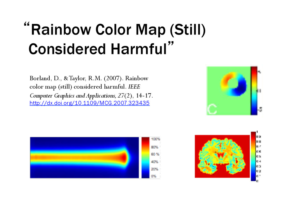
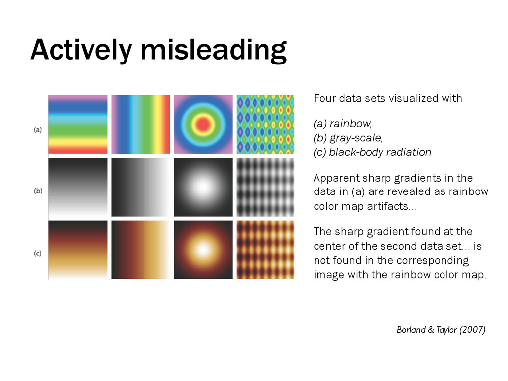
black-body radiation Apparent sharp gradients in the data in (a) are revealed as rainbow color map artifacts... The sharp gradient found at the center of the second data set... is not found in the corresponding image with the rainbow color map. Borland & Taylor (2007) Actively misleading
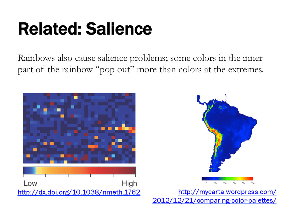
the inner part of the rainbow “pop out” more than colors at the extremes. http://dx.doi.org/10.1038/nmeth.1762 http://mycarta.wordpress.com/ 2012/12/21/comparing-color-palettes/
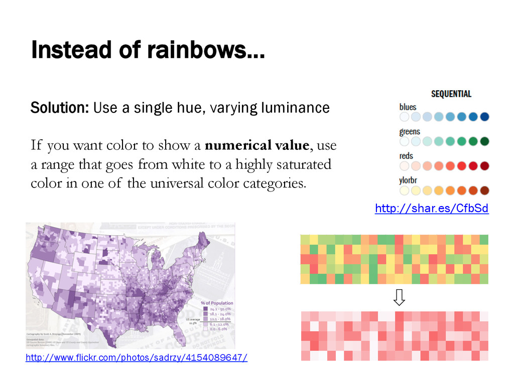
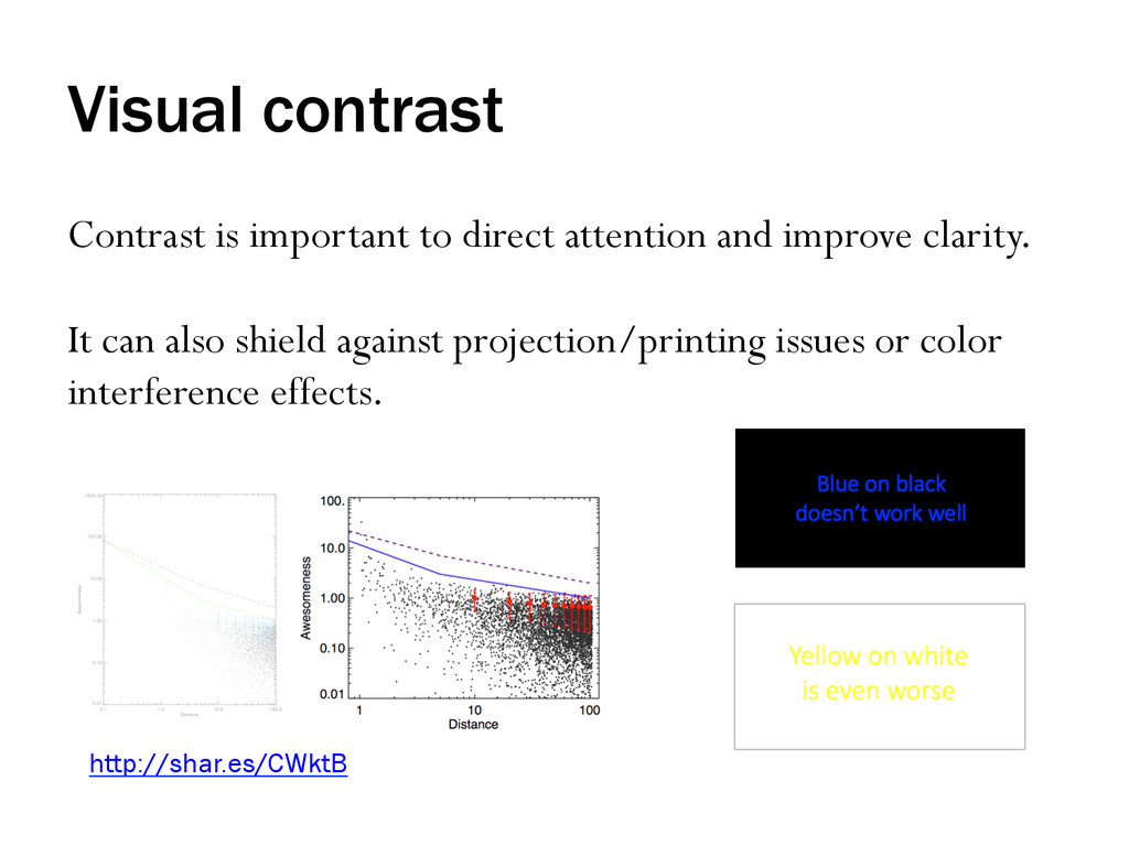
If you want color to show a numerical value, use a range that goes from white to a highly saturated color in one of the universal color categories. http://shar.es/CfbSd http://www.flickr.com/photos/sadrzy/4154089647/
than 5-7 hues • People have trouble differentiating between more than 5-7 shades • Rainbow color gradients are very problematic • For highest contrast, limit colors and vary luminance
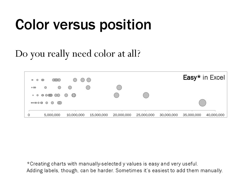
Easy* in Excel *Creating charts with manually-selected y values is easy and very useful. Adding labels, though, can be harder. Sometimes it’s easiest to add them manually.
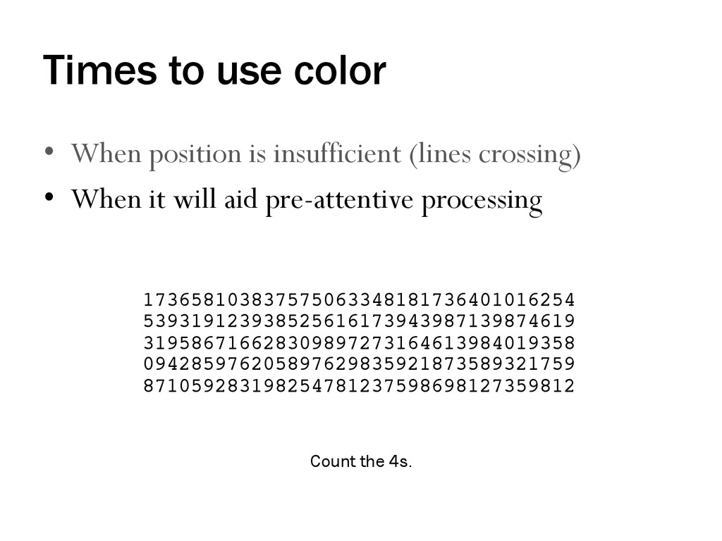
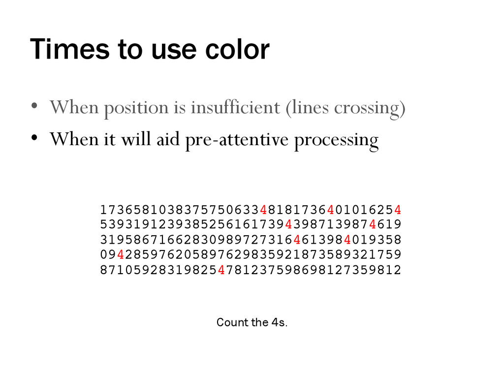
crossing) • When it will aid pre-attentive processing Count the 4s. 173658103837575063348181736401016254 539319123938525616173943987139874619 319586716628309897273164613984019358 094285976205897629835921873589321759 871059283198254781237598698127359812!
crossing) • When it will aid pre-attentive processing 173658103837575063348181736401016254 539319123938525616173943987139874619 319586716628309897273164613984019358 094285976205897629835921873589321759 871059283198254781237598698127359812! Count the 4s.
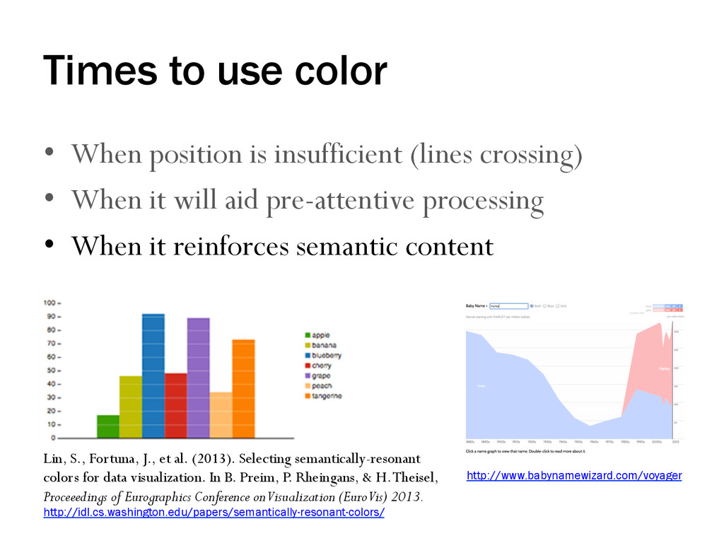
crossing) • When it will aid pre-attentive processing • When it reinforces semantic content Lin, S., Fortuna, J., et al. (2013). Selecting semantically-resonant colors for data visualization. In B. Preim, P. Rheingans, & H. Theisel, Proceeedings of Eurographics Conference on Visualization (EuroVis) 2013. http://idl.cs.washington.edu/papers/semantically-resonant-colors/ http://www.babynamewizard.com/voyager
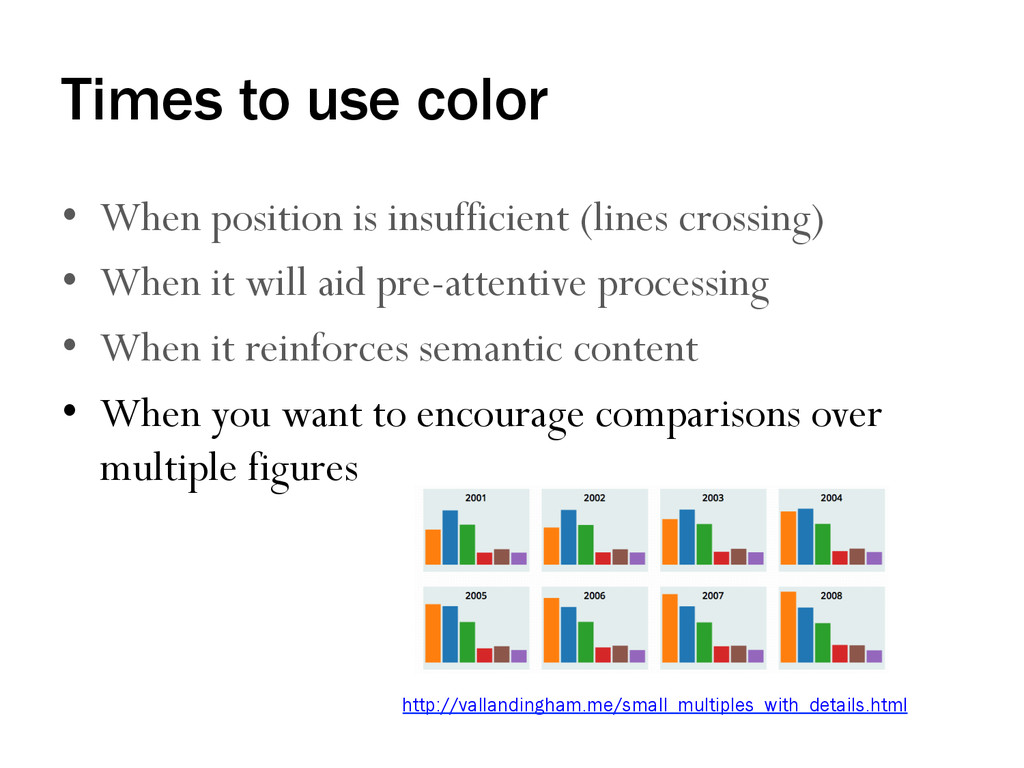
crossing) • When it will aid pre-attentive processing • When it reinforces semantic content • When you want to encourage comparisons over multiple figures http://vallandingham.me/small_multiples_with_details.html
http://guides.library.duke.edu/vis_types • Top 10 dos and don’ts for charts and graphs: http://guides.library.duke.edu/topten • Visual communication: http://guides.library.duke.edu/visualcomm
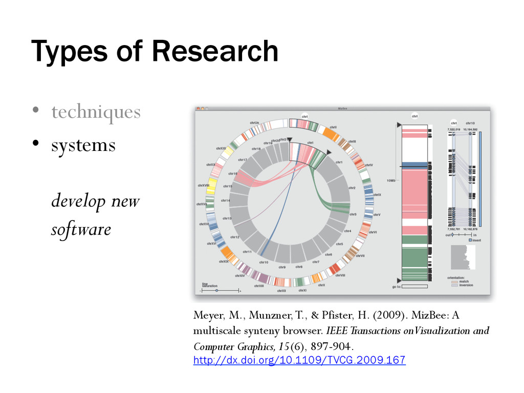
Meyer, M., Munzner, T., & Pfister, H. (2009). MizBee: A multiscale synteny browser. IEEE Transactions on Visualization and Computer Graphics, 15(6), 897-904. http://dx.doi.org/10.1109/TVCG.2009.167
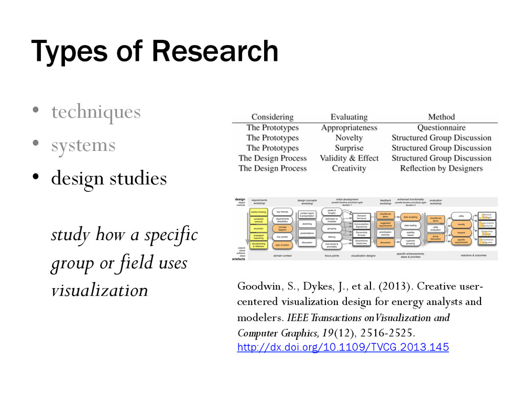
study how a specific group or field uses visualization Goodwin, S., Dykes, J., et al. (2013). Creative user- centered visualization design for energy analysts and modelers. IEEE Transactions on Visualization and Computer Graphics, 19(12), 2516-2525. http://dx.doi.org/10.1109/TVCG.2013.145
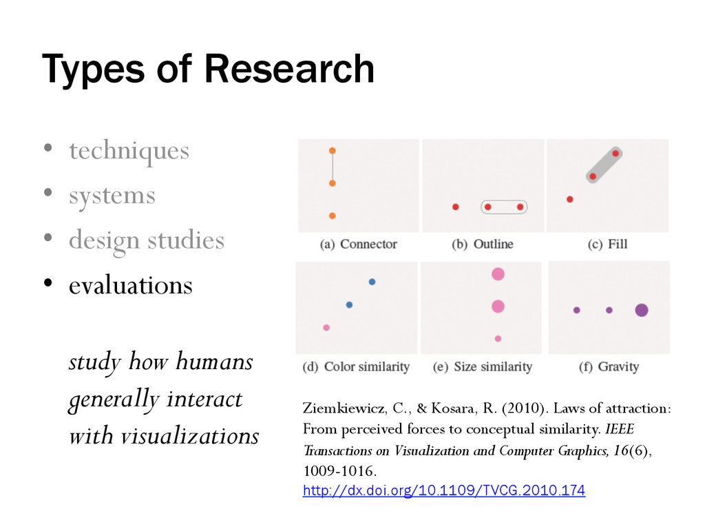
• evaluations study how humans generally interact with visualizations Ziemkiewicz, C., & Kosara, R. (2010). Laws of attraction: From perceived forces to conceptual similarity. IEEE Transactions on Visualization and Computer Graphics, 16(6), 1009-1016. http://dx.doi.org/10.1109/TVCG.2010.174
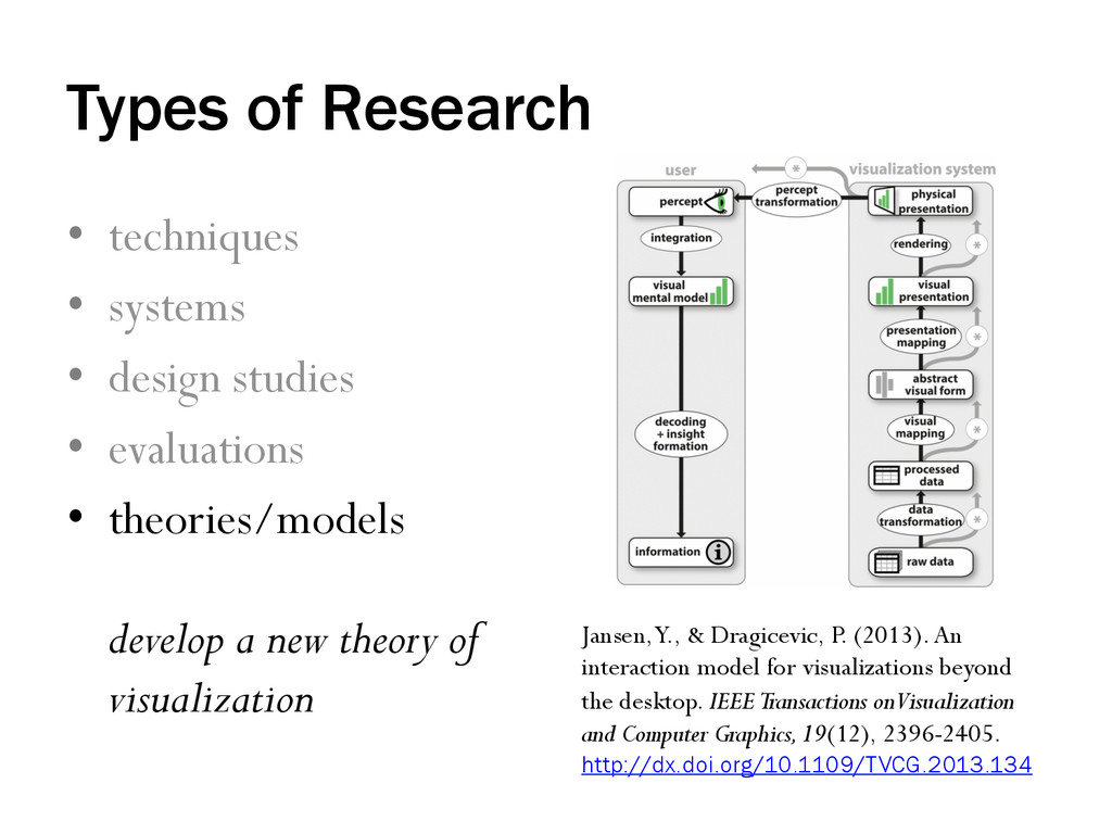
• evaluations • theories/models develop a new theory of visualization Jansen, Y., & Dragicevic, P. (2013). An interaction model for visualizations beyond the desktop. IEEE Transactions on Visualization and Computer Graphics, 19(12), 2396-2405. http://dx.doi.org/10.1109/TVCG.2013.134
![QUESTIONS? SUGGESTIONS? [email protected] twitter.com/duke_vis](https://files.speakerdeck.com/presentations/528e9610f3340131312c5a3c5b87e874/slide_64.jpg)