COURSE TO BASIC DATA VISUALIZATION – Using free, publicly available tools (Google Docs) – Learn the core principles of “dataviz” – Learn how to understand a dataset – Learn how to tell a visual story
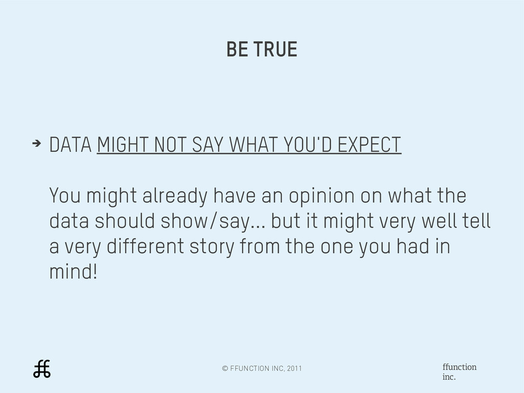
MIGHT NOT SAY WHAT YOU'D EXPECT You might already have an opinion on what the data should show/say... but it might very well tell a very different story from the one you had in mind!
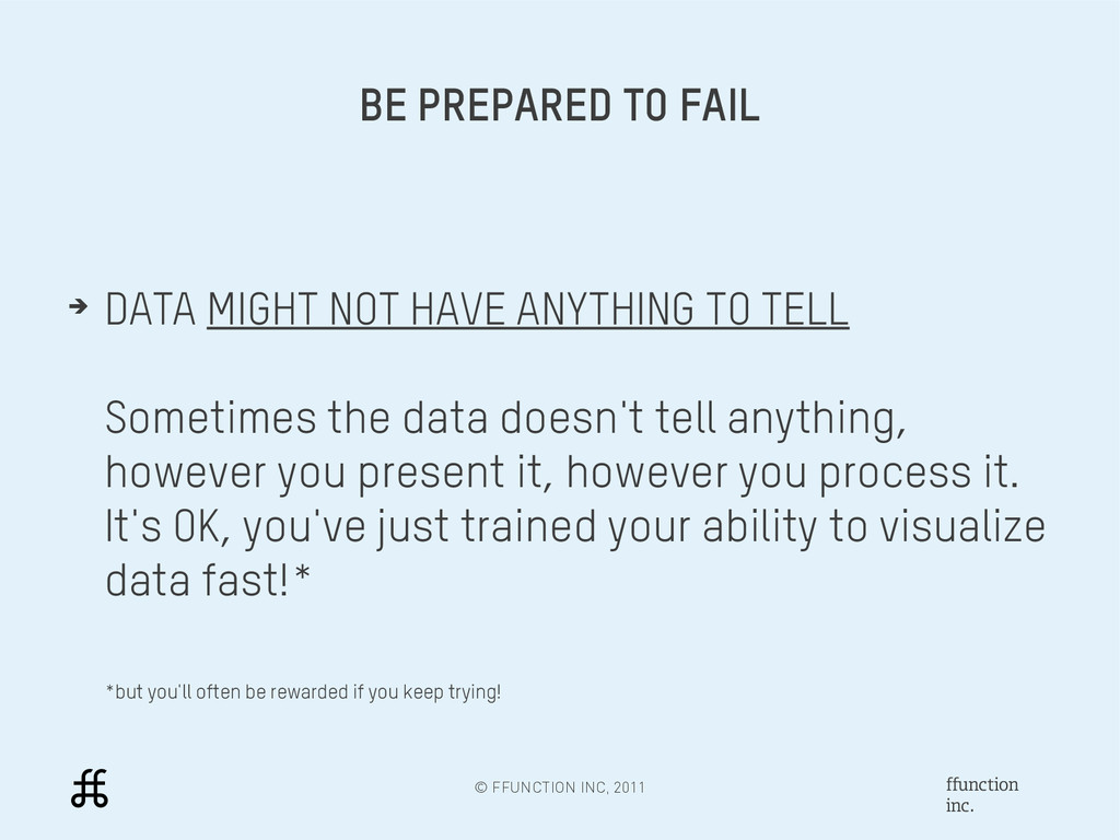
➔ DATA MIGHT NOT HAVE ANYTHING TO TELL Sometimes the data doesn't tell anything, however you present it, however you process it. It's OK, you've just trained your ability to visualize data fast!* *but you'll often be rewarded if you keep trying!
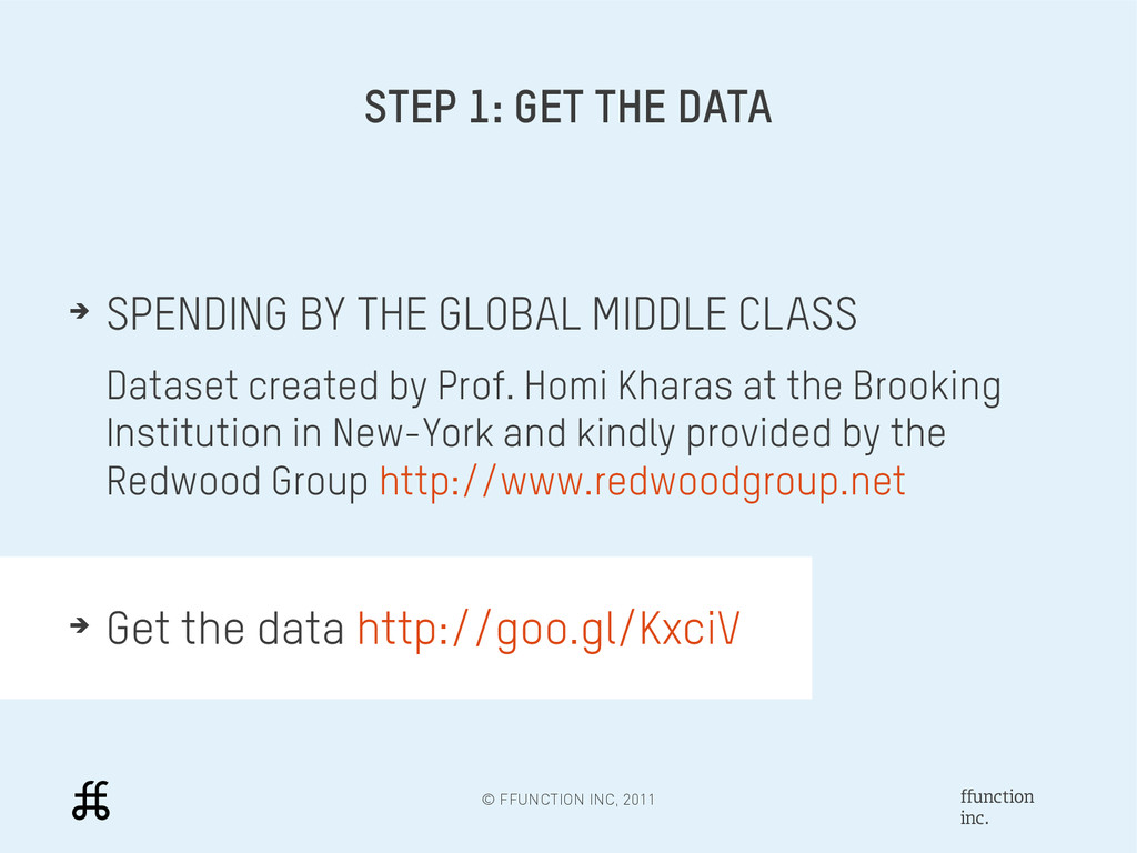
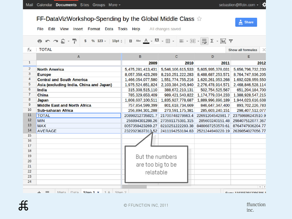
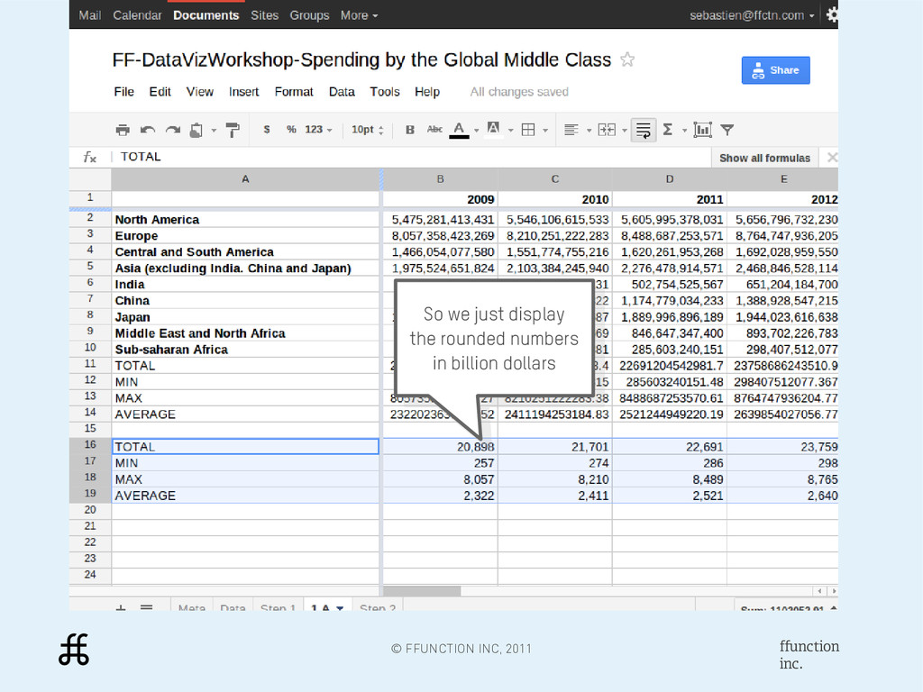
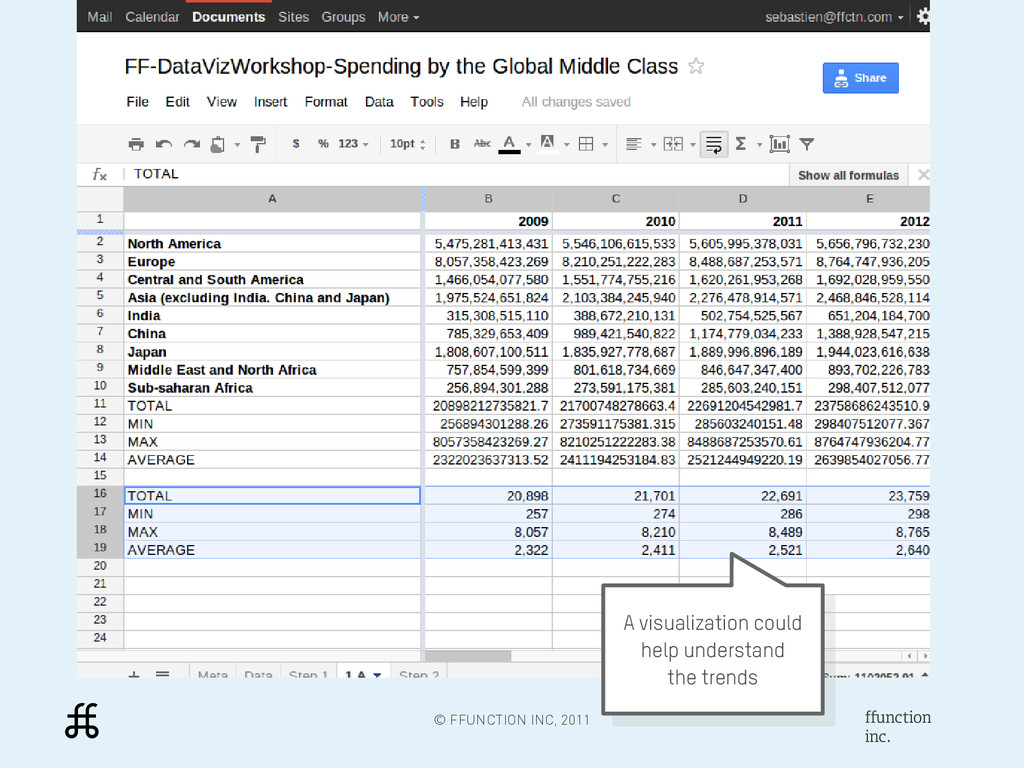
DATA ➔ SPENDING BY THE GLOBAL MIDDLE CLASS Dataset created by Prof. Homi Kharas at the Brooking Institution in New-York and kindly provided by the Redwood Group http://www.redwoodgroup.net ➔ Get the data http://goo.gl/KxciV
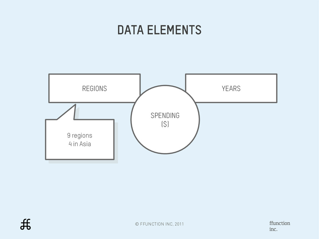
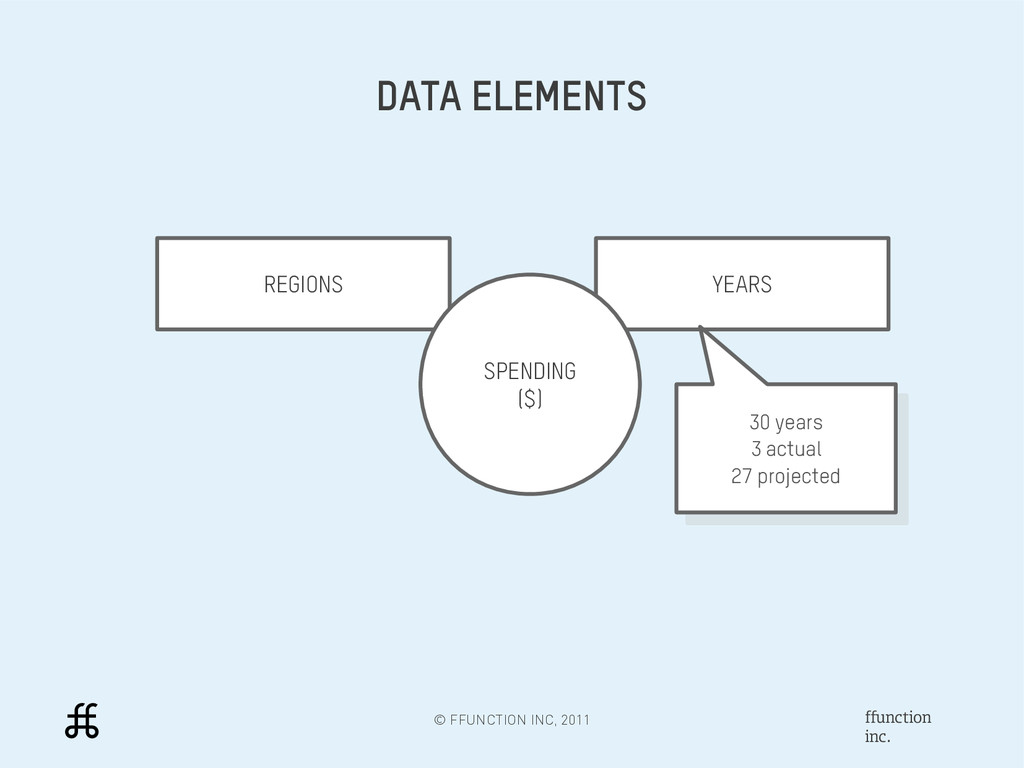
KNOW THE DATA ➔ WHAT IS REPRESENTED? Identify the variables used in the data ➔ WHAT ARE THE DIMENSIONS? Measure the span of the variables ➔ CAN WE SPOT TRENDS? Try to spot interesting changes or patterns
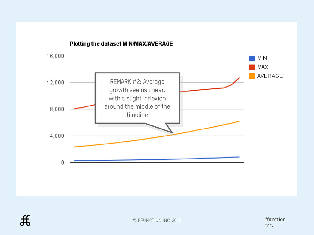
seems linear, with a slight inflexion around the middle of the timeline REMARK #2: Average growth seems linear, with a slight inflexion around the middle of the timeline
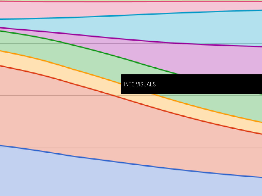
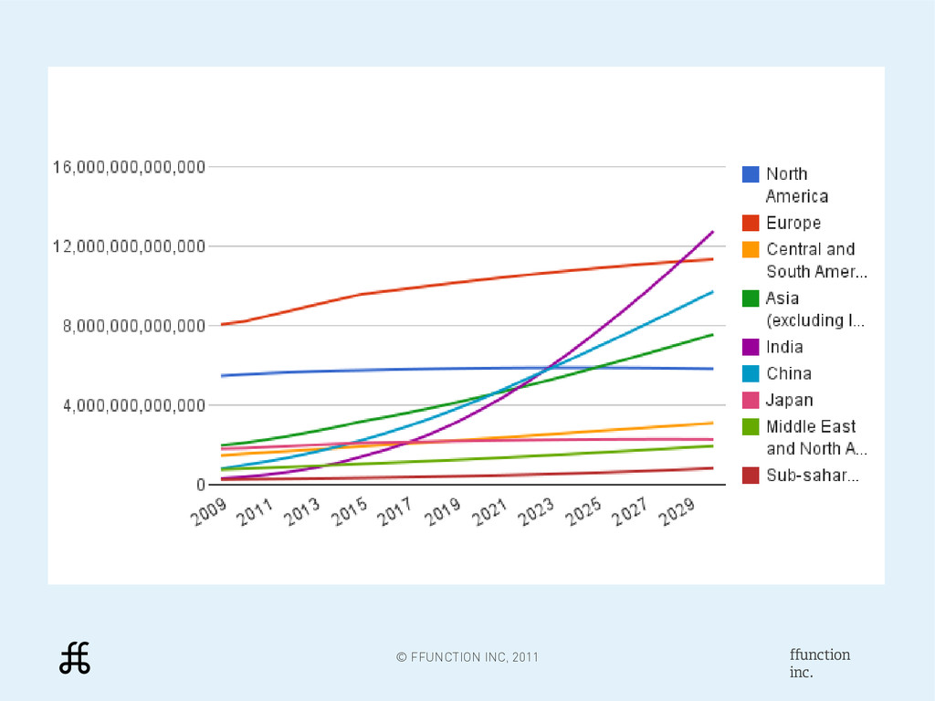
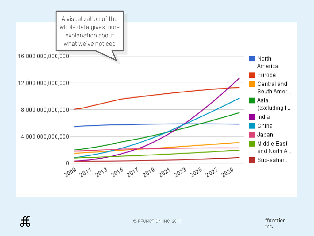
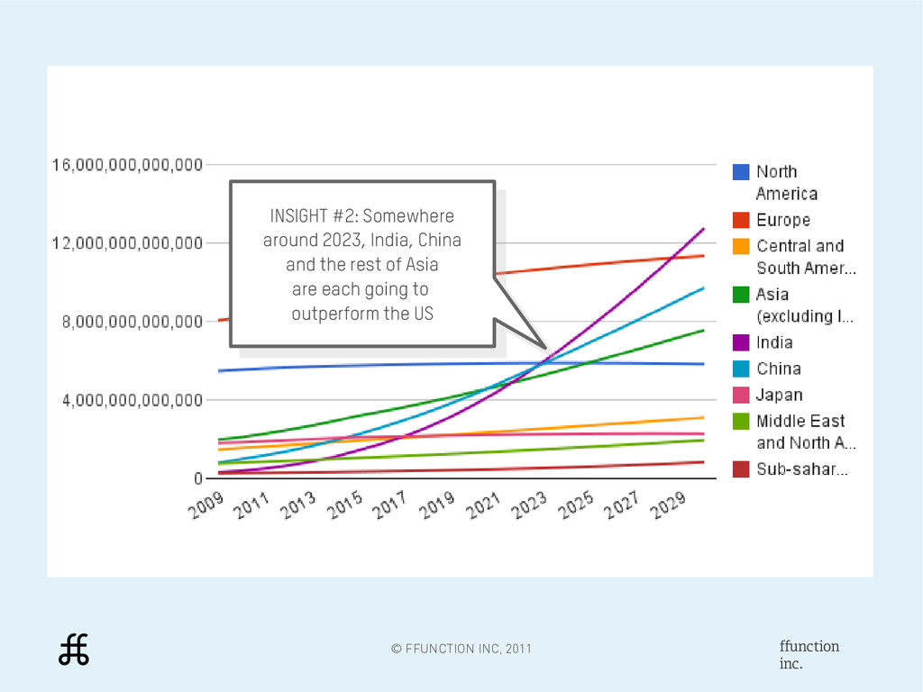
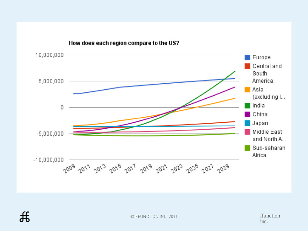
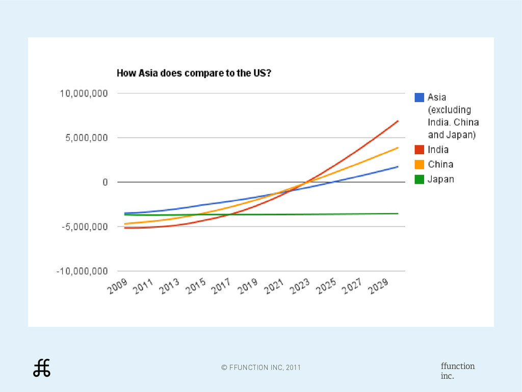
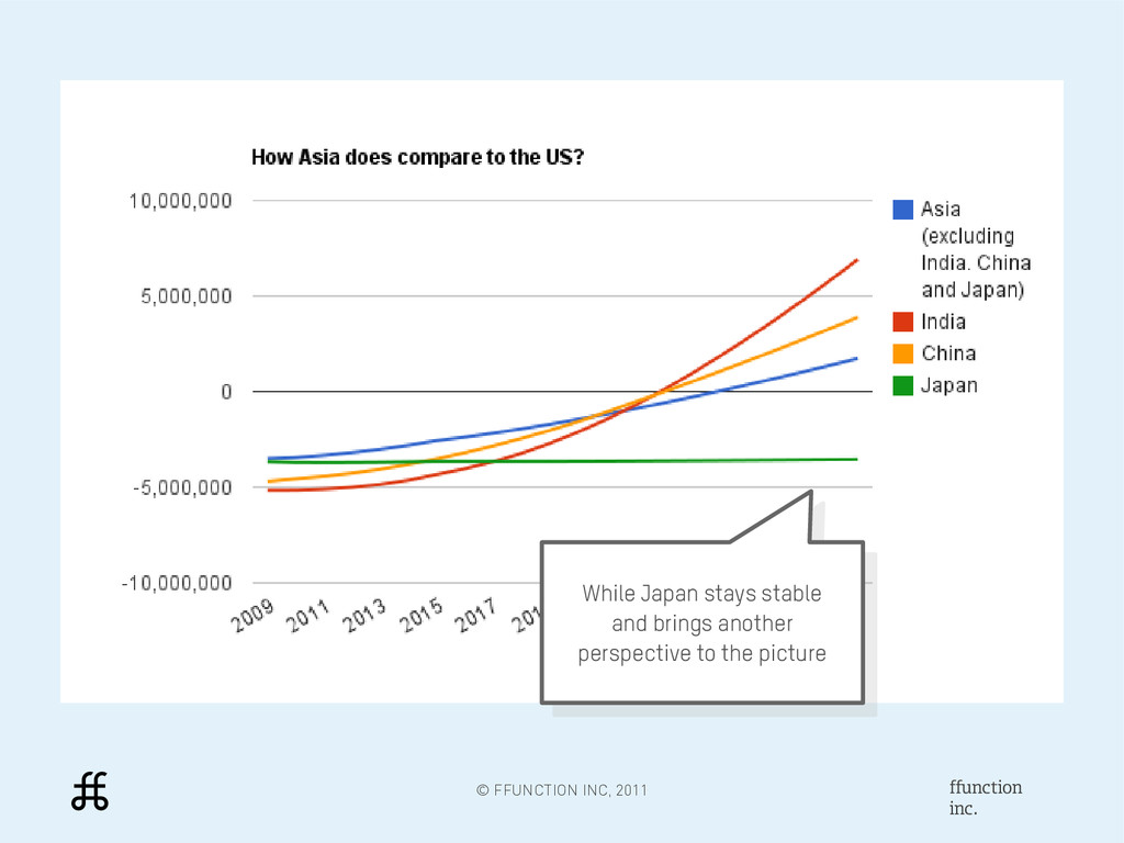
2023, India, China and the rest of Asia are each going to outperform the US INSIGHT #2: Somewhere around 2023, India, China and the rest of Asia are each going to outperform the US
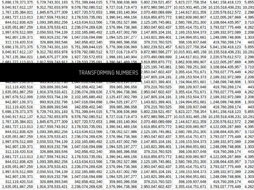
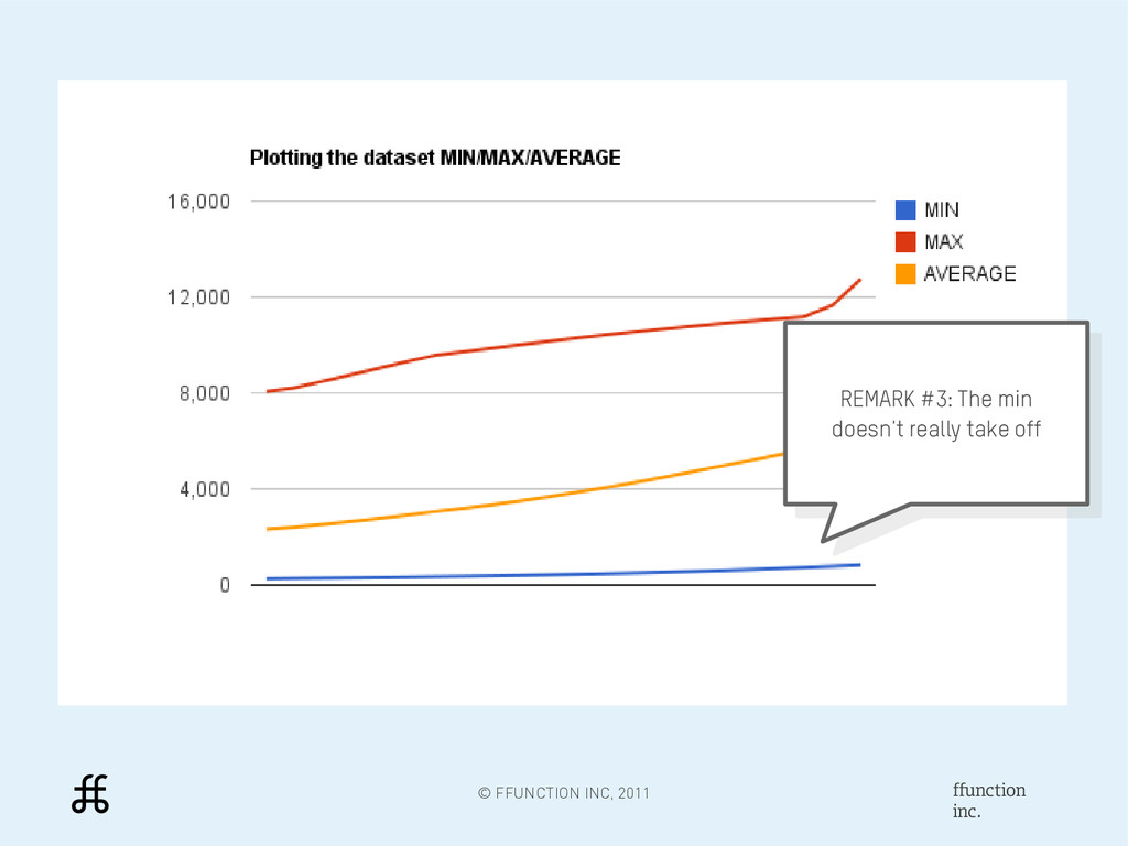
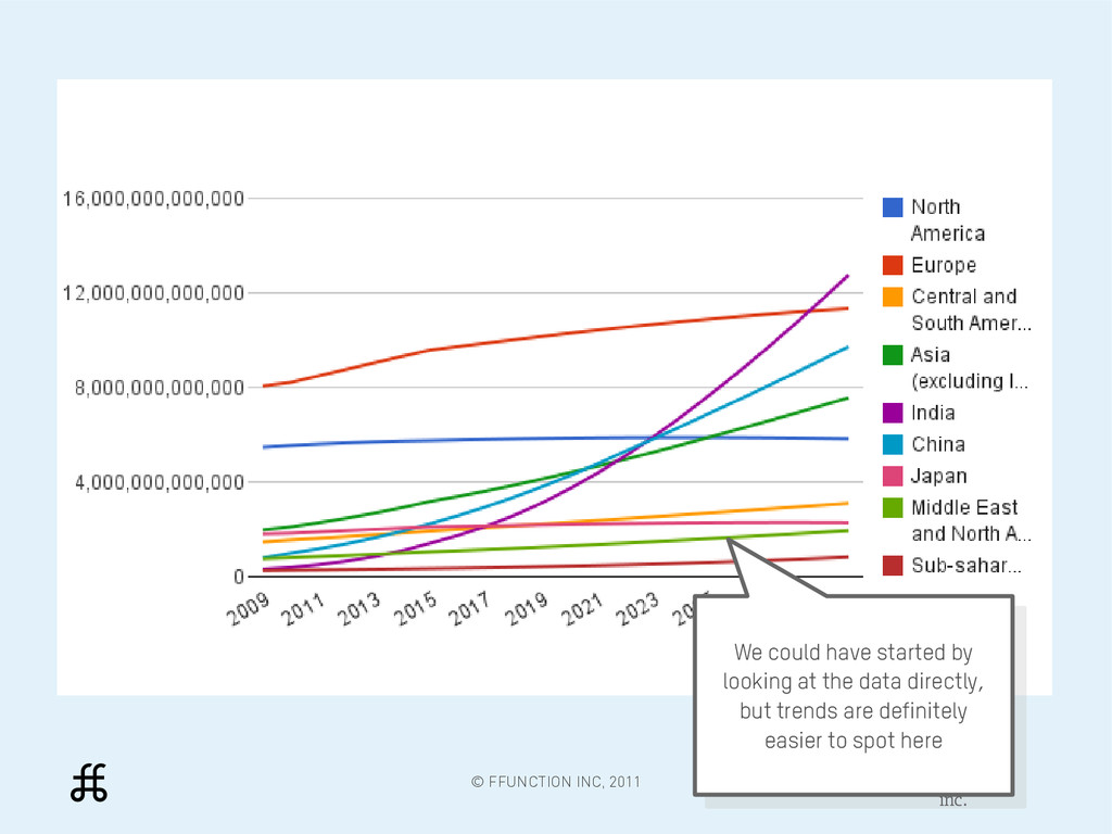
by looking at the data directly, but trends are definitely easier to spot here We could have started by looking at the data directly, but trends are definitely easier to spot here
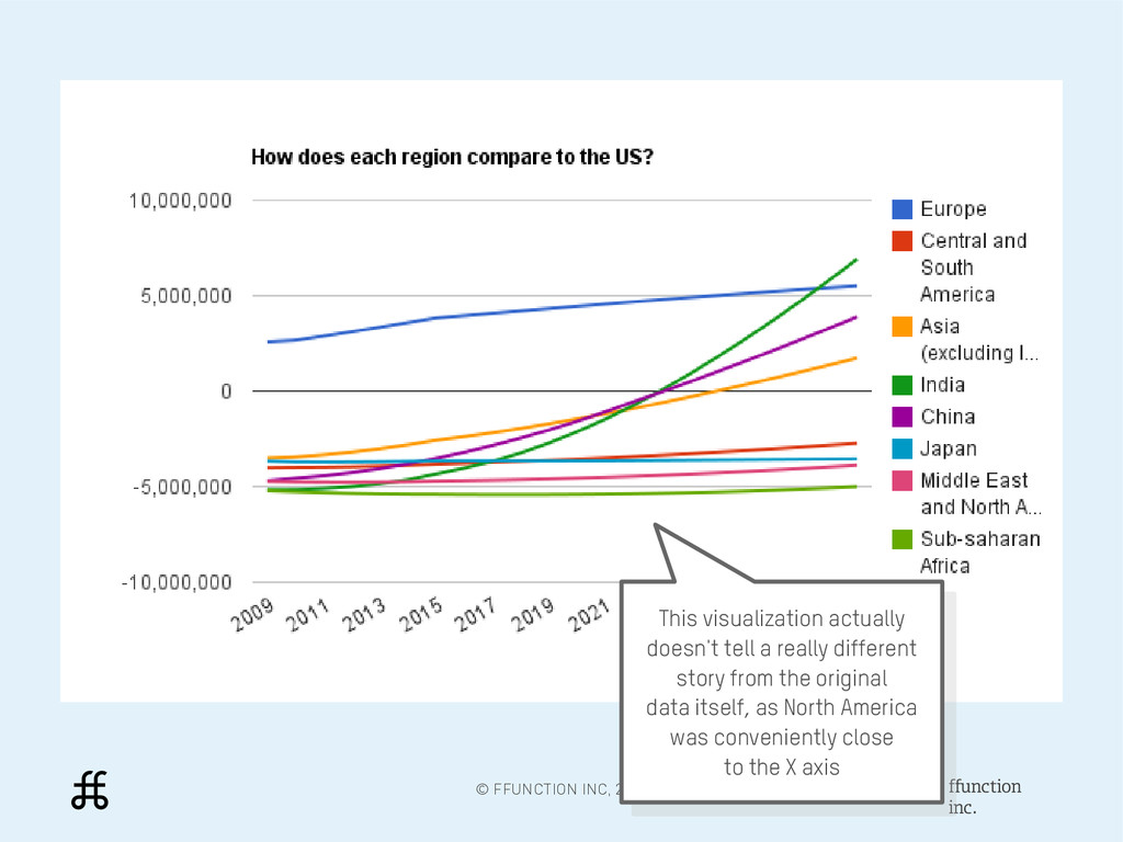
tell a really different story from the original data itself, as North America was conveniently close to the X axis This visualization actually doesn't tell a really different story from the original data itself, as North America was conveniently close to the X axis
we put the highlight on 2023, where India, China, and the rest of India lead the way Focusing on just Asia, we put the highlight on 2023, where India, China, and the rest of India lead the way
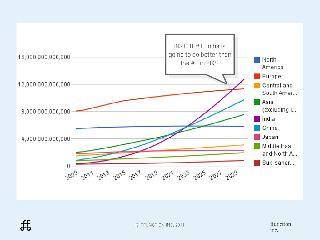
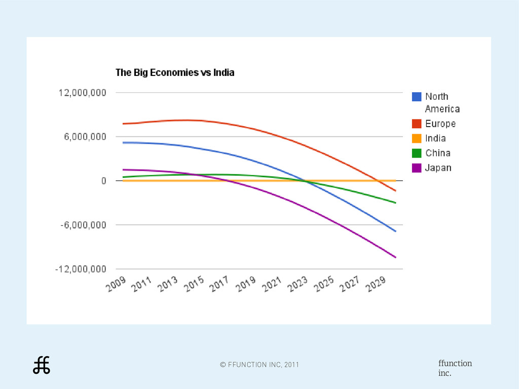
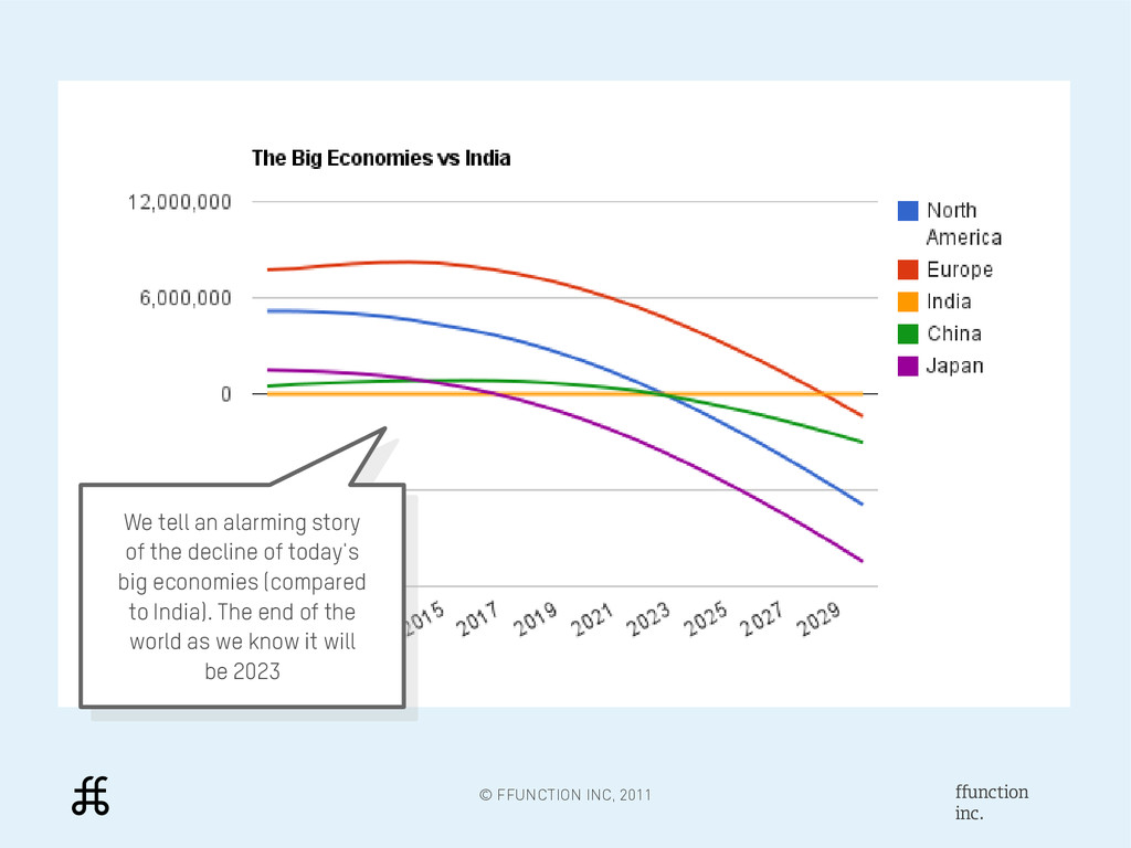
story of the decline of today's big economies (compared to India). The end of the world as we know it will be 2023 We tell an alarming story of the decline of today's big economies (compared to India). The end of the world as we know it will be 2023
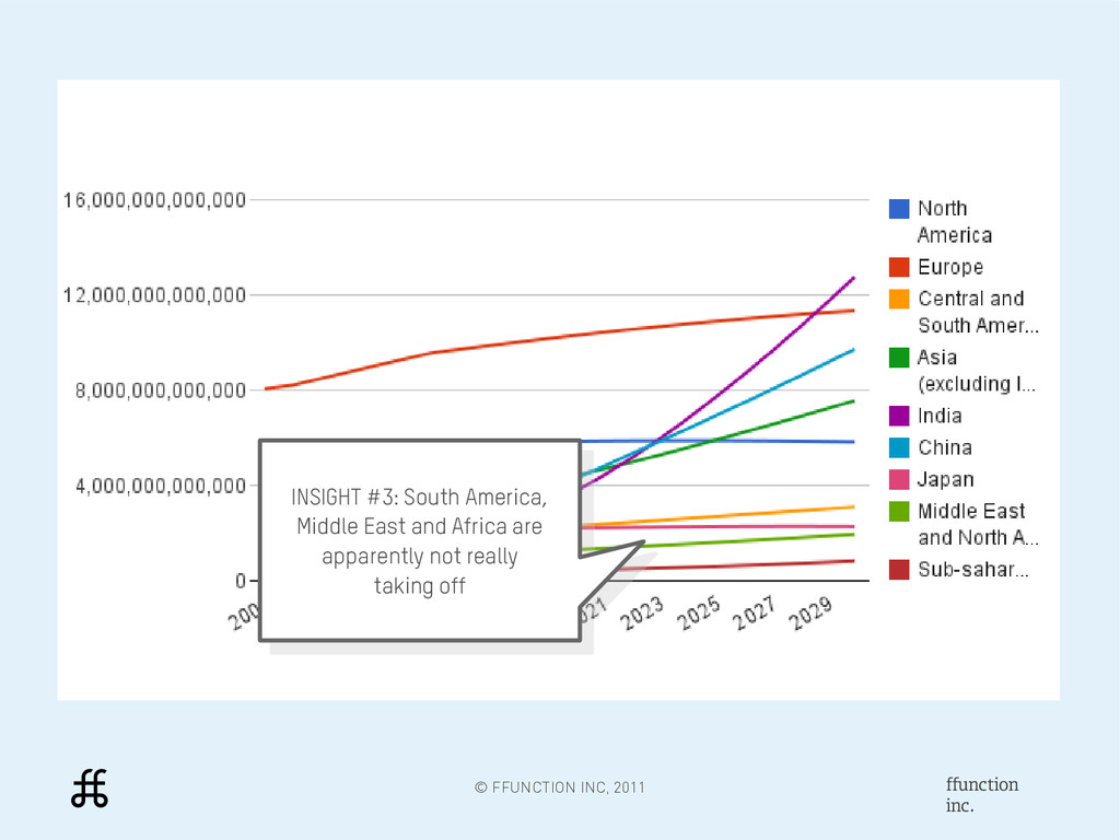
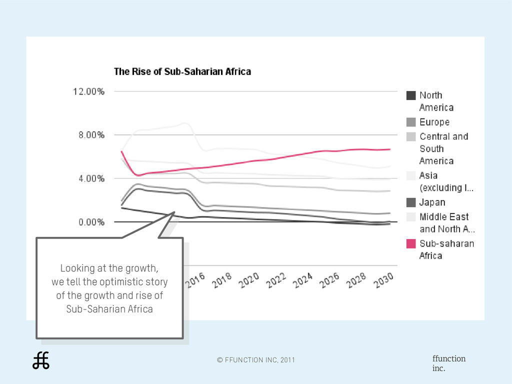
we tell the optimistic story of the growth and rise of Sub-Saharian Africa Looking at the growth, we tell the optimistic story of the growth and rise of Sub-Saharian Africa
TRENDS & PATTERNS Although the numbers will give you hints, basic visualizations will help you quickly see the overall trends as well as spot points of interests in the data.
OBJECTIVE VISUALIZATION A visualization is always a perspective on the data, and different visualizations will tell different things with the same data.* * Note that visualizations also often have more authority than illustrations in the reader's mind.
MORE You can use simple, free tools to do data- visualization. You don't need to be a programmer, designer or journalist to get started – but you'll learn to be all of these along the way!