Share
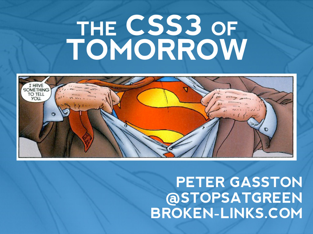
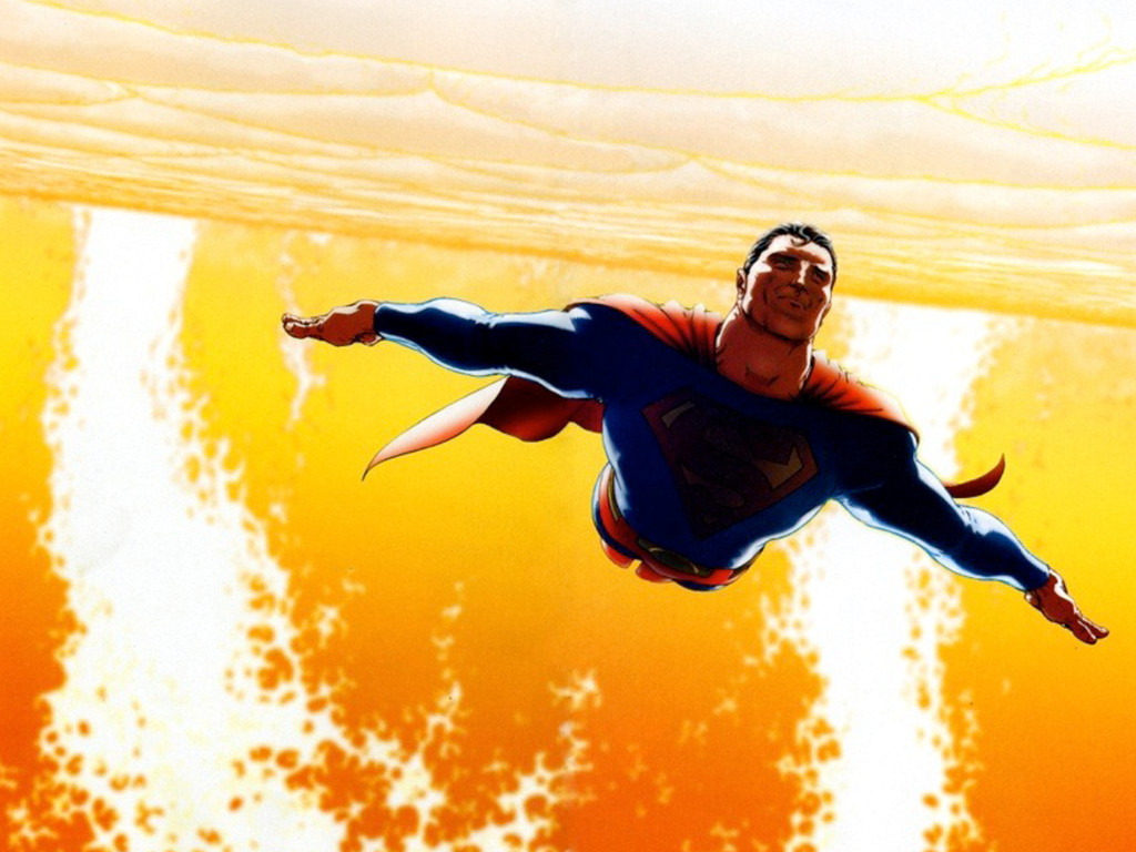
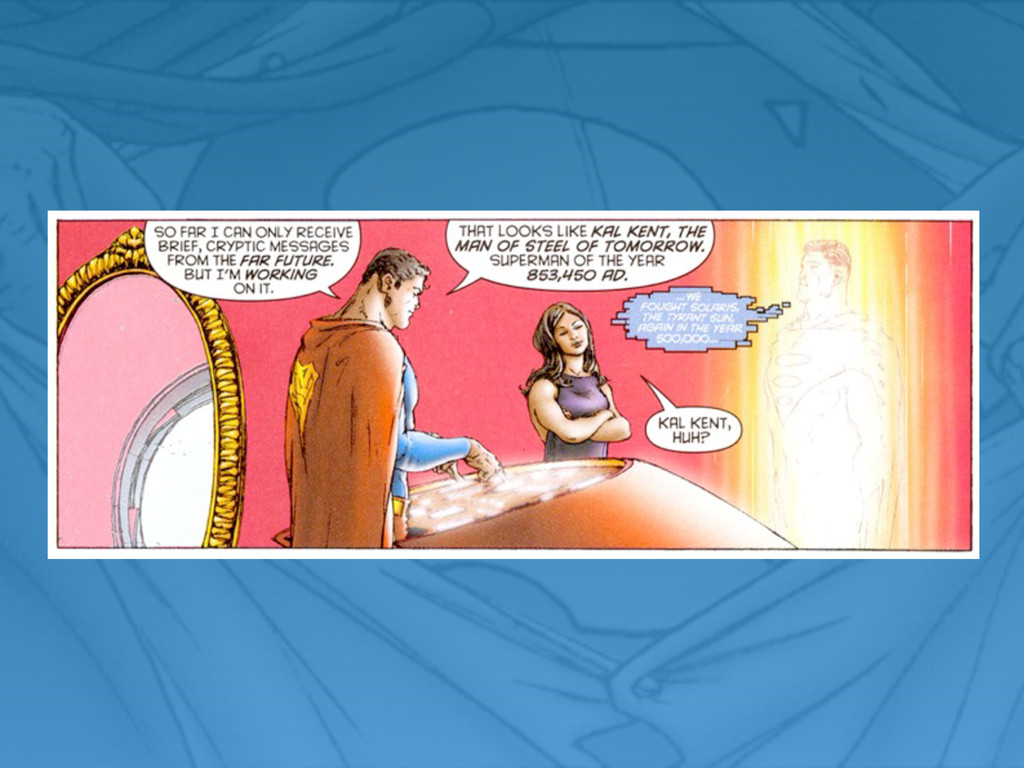
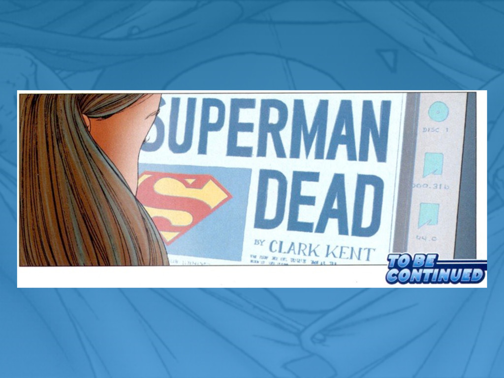
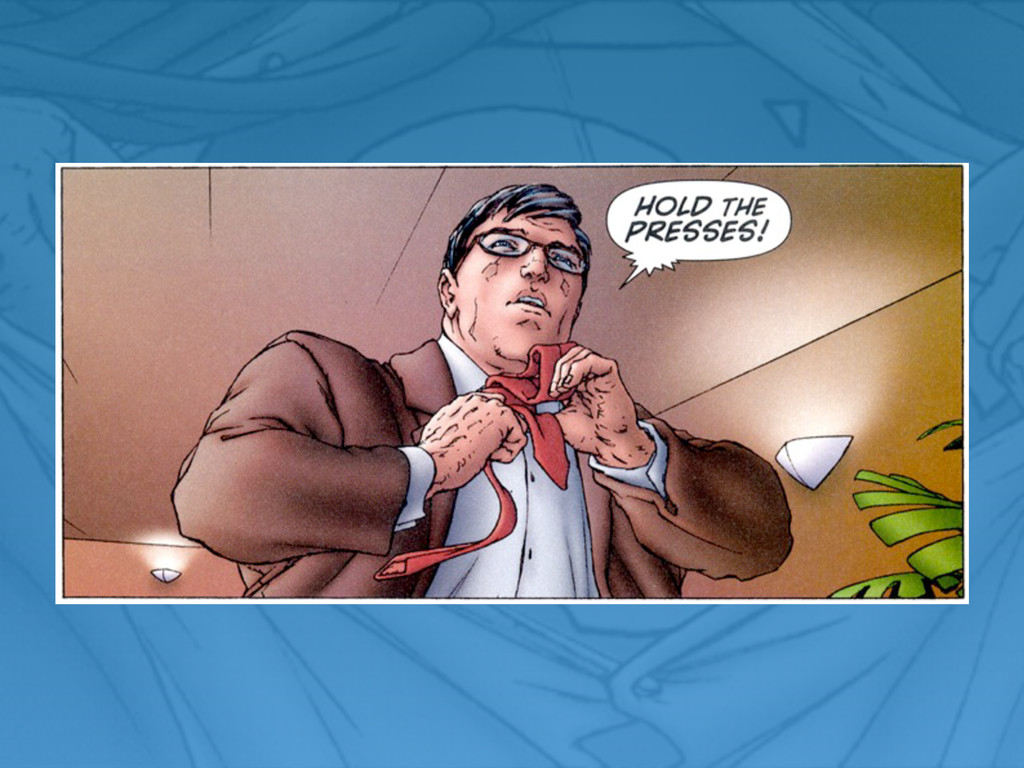
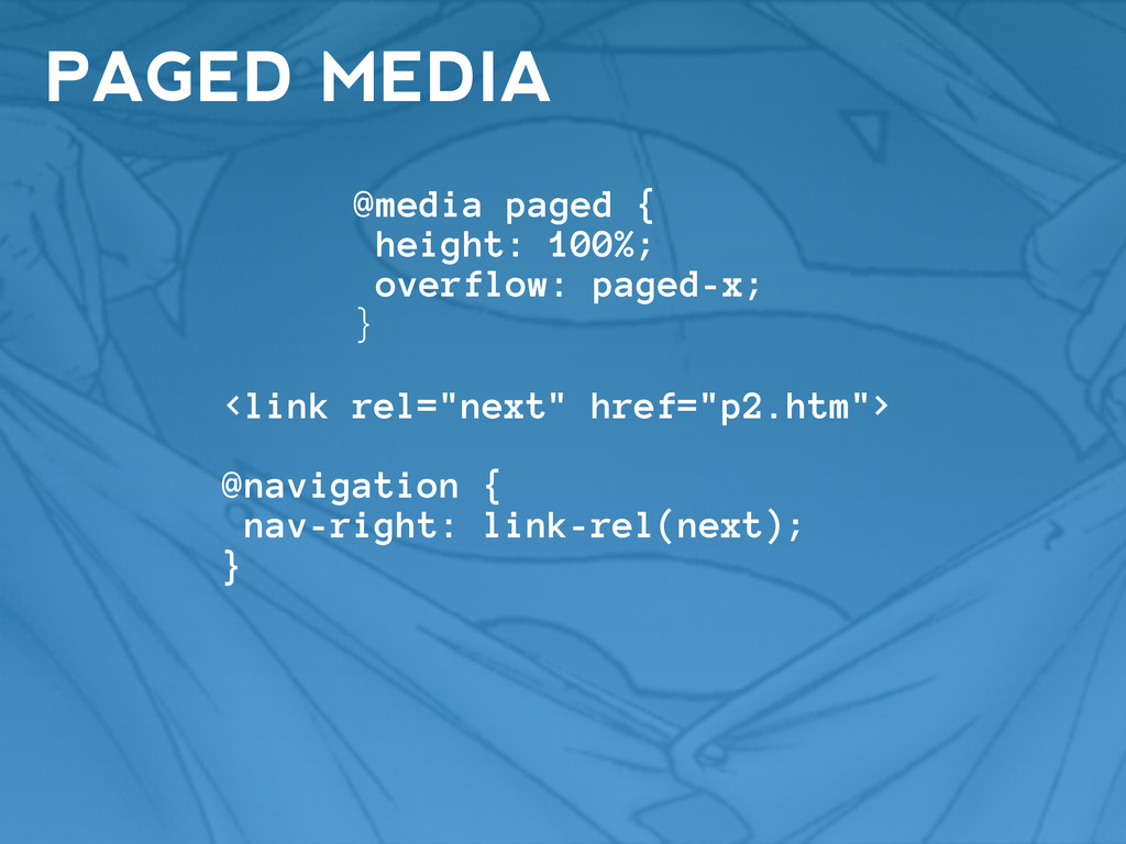
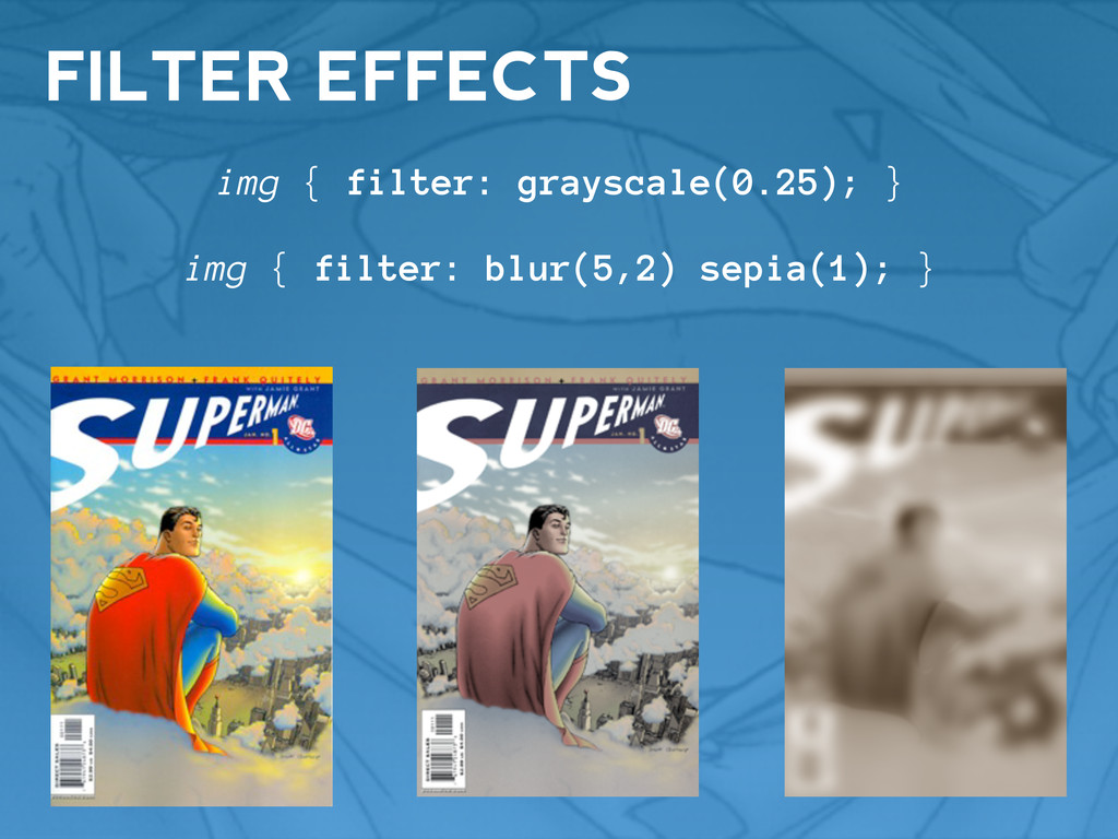
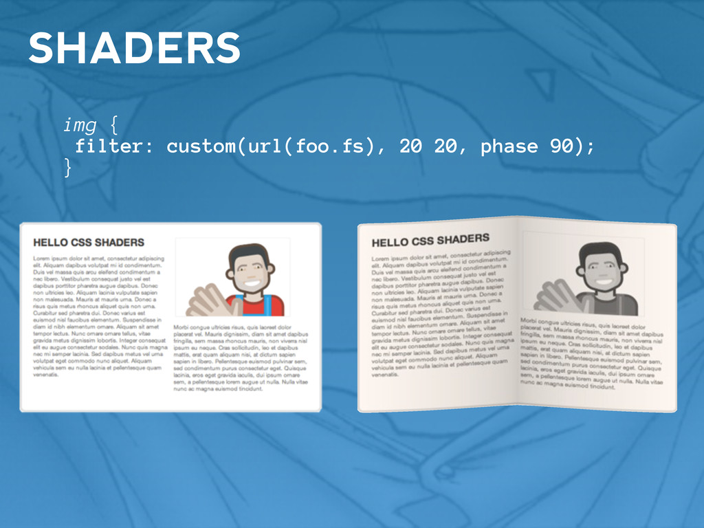
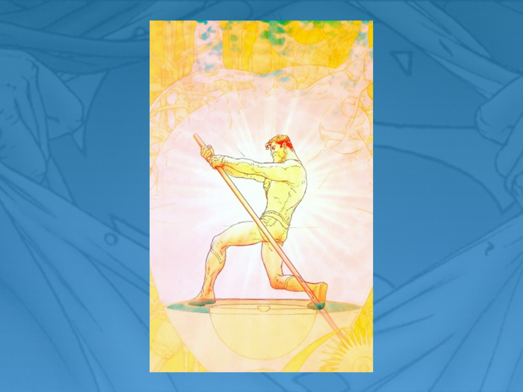
A look into the longer-term future of CSS; rich layouts and a programmatic syntax. Guest starring Superman!
 stopsatgreen
 jame2408
 nrslib
 minodriven
 manfredsteyer
 broadleaf
 utgwkk
 mizchi
 danielsogl
 simas
simas
 oniak3ibm
 kajitack
 satohjohn
 thoeni
 tomoyanonymous
 addyosmani
 smashingmag
 aleyda
 orderedlist
 marktimemedia
 davidcarrasco
 techseoconnect
 csswizardry
 tamaranovitovic
 sonatard