Upgrade to Pro
— share decks privately, control downloads, hide ads and more …
Speaker Deck
Features
Speaker Deck
PRO
Sign in
Sign up for free
Search
Search
The Home of the Future
Search
Sponsored
·
Ship Features Fearlessly
Turn features on and off without deploys. Used by thousands of Ruby developers.
→
Peter Gasston
May 28, 2011
Technology
100
1
Share
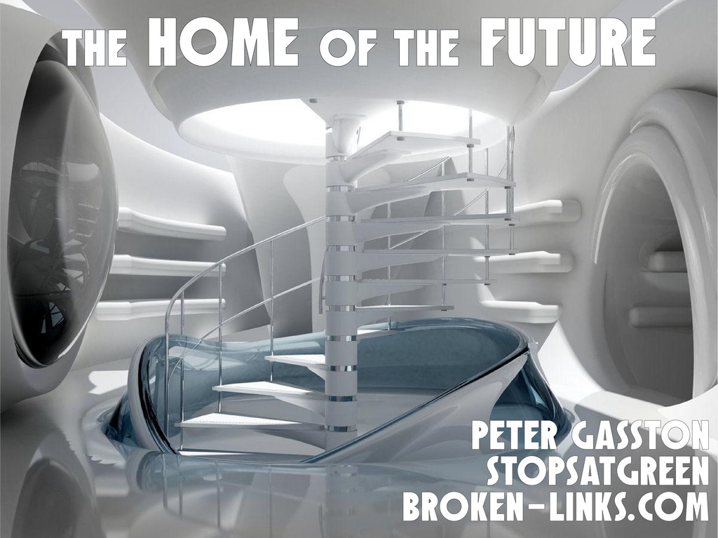
The Home of the Future
CSS layout methods now and tomorrow, through the somewhat spurious lens of architecture.
Peter Gasston
May 28, 2011
More Decks by Peter Gasston
See All by Peter Gasston
People Don’t Change
stopsatgreen
0
210
Your Reality Here
stopsatgreen
0
130
Growing Up, Getting Serious - #SotB6
stopsatgreen
1
380
Growing Up, Getting Serious
stopsatgreen
0
120
Surveying the Landscape — November 2016
stopsatgreen
1
200
Surveying the Landscape - Fronteers
stopsatgreen
2
530
The Web vs. The Browser
stopsatgreen
0
230
Surveying the Landscape Sept. 2016
stopsatgreen
1
470
Surveying the Landscape
stopsatgreen
4
910
Other Decks in Technology
See All in Technology
Chart.js が簡単に使えるようになっていたので OGP 画像生成に使った話
kamekyame
0
140
イベントストーミングとKiroの仕様駆動開発で実現する要件の認識合わせプロセス
syobochim
7
1.1k
探して_入れて_作って_使う_Agent_Skills___LT.pdf
peintangos
2
160
Oracle AI Database@AWS:サービス概要のご紹介
oracle4engineer
PRO
4
2.8k
ChatworkとBPaaS 異なる特性で学んだAI機能開発の ベストプラクティス
kubell_hr
2
2.5k
「速く作る」から「正しく作る」へ ─ 生成AI時代の開発フロー改革の ロードマップと実行 ─
starfish719
0
6.6k
サプライチェーンセキュリティの空白地帯 - 信頼できる”依存性”の未来を考える
rung
PRO
2
670
MIERUNE JCT 発表資料「宇宙から伊能忠敬ごっこ」
syuchimu
0
170
新規ゲーム開発におけるAI駆動開発のリアル
202409e2
0
2.3k
OCI Oracle AI Database Services新機能アップデート(2026/03-2026/05)
oracle4engineer
PRO
0
190
形式手法特論:公平性制約の位相的特徴づけ #kernelvm / Kernel VM Study Kansai 12th
ytaka23
1
710
ポケモンの型をTypeScriptの型システムで表現してみた
subroh0508
0
260
Featured
See All Featured
Information Architects: The Missing Link in Design Systems
soysaucechin
0
960
We Are The Robots
honzajavorek
0
240
Unsuck your backbone
ammeep
672
58k
Cheating the UX When There Is Nothing More to Optimize - PixelPioneers
stephaniewalter
287
14k
Test your architecture with Archunit
thirion
1
2.3k
Lightning talk: Run Django tests with GitHub Actions
sabderemane
0
190
What’s in a name? Adding method to the madness
productmarketing
PRO
24
4.1k
The SEO identity crisis: Don't let AI make you average
varn
0
480
The State of eCommerce SEO: How to Win in Today's Products SERPs - #SEOweek
aleyda
2
11k
RailsConf 2023
tenderlove
30
1.5k
Between Models and Reality
mayunak
4
320
The Anti-SEO Checklist Checklist. Pubcon Cyber Week
ryanjones
0
150
Transcript
THE HOME OF THE FUTURE PETER GASSTON STOPSATGREEN broken-links.com
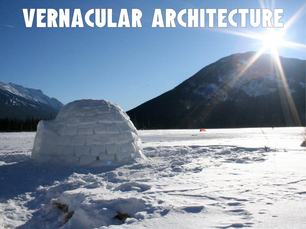
Vernacular architecture
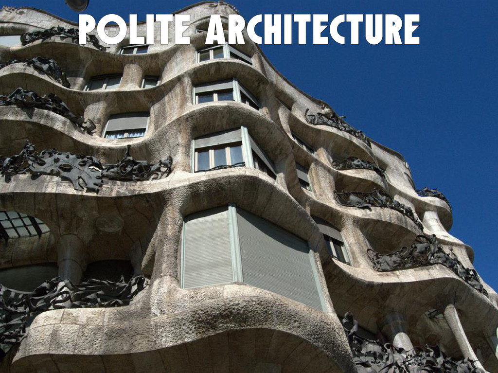
POLiTE architecture
None
None
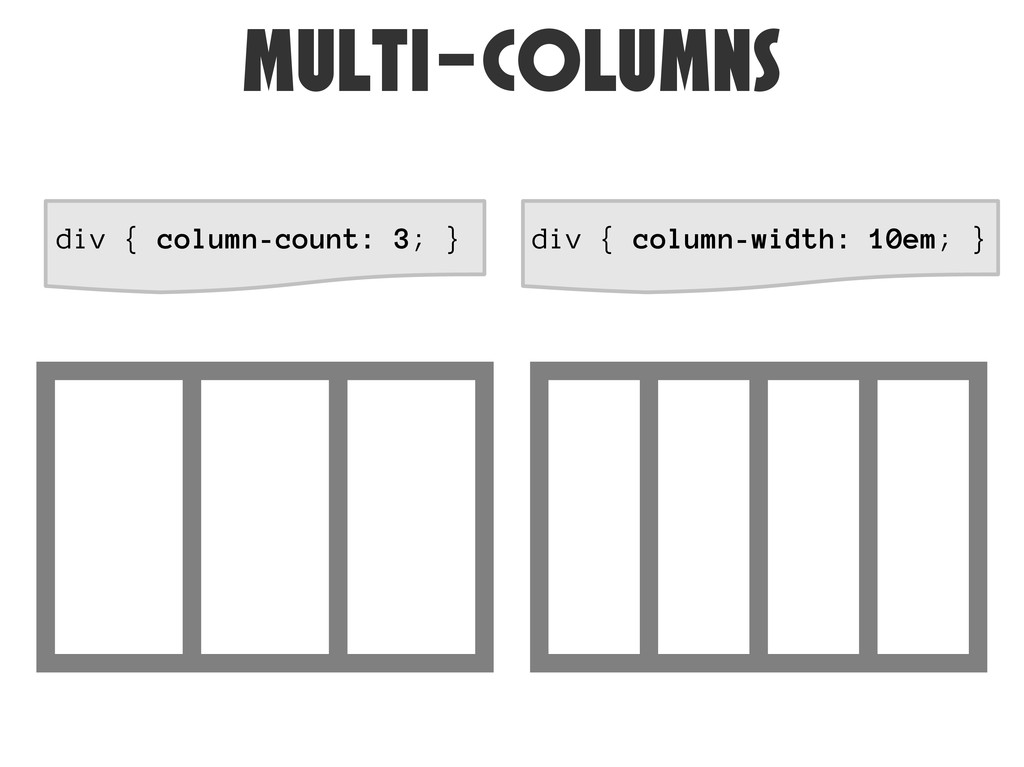
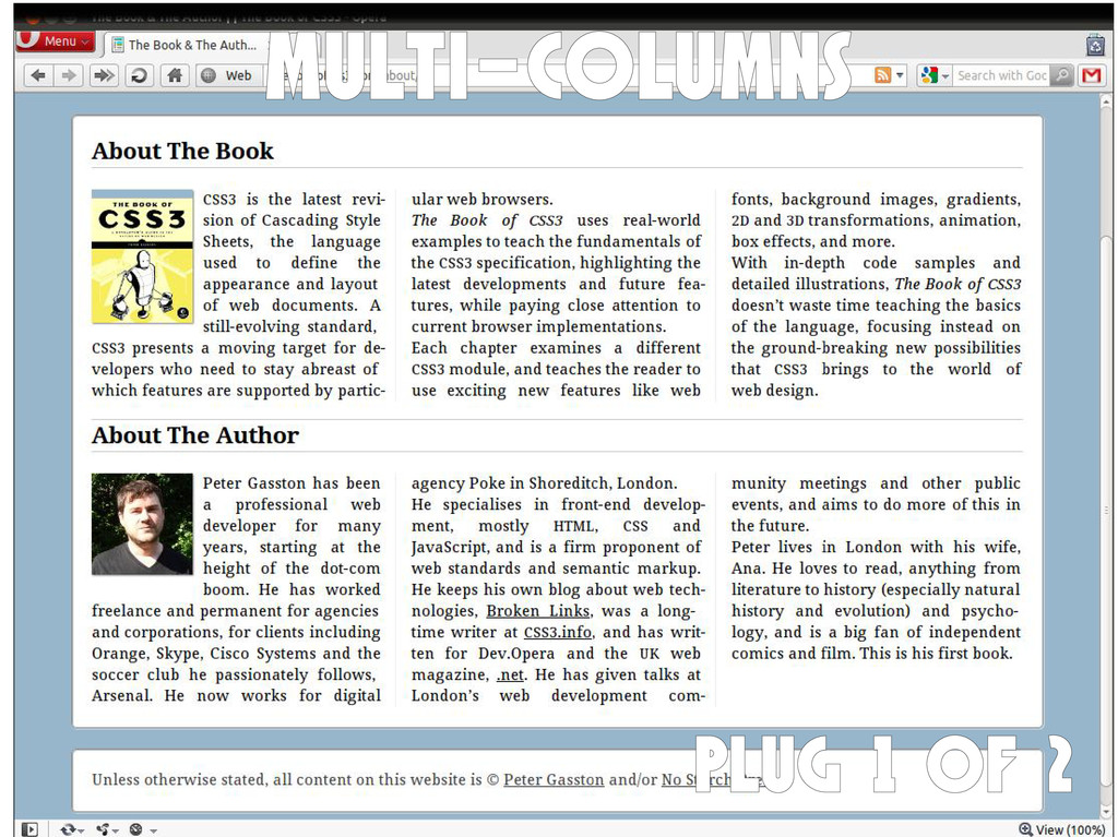
Multi-columns
Multi-columns div { column-width: 10em; } div { column-count: 3;
}
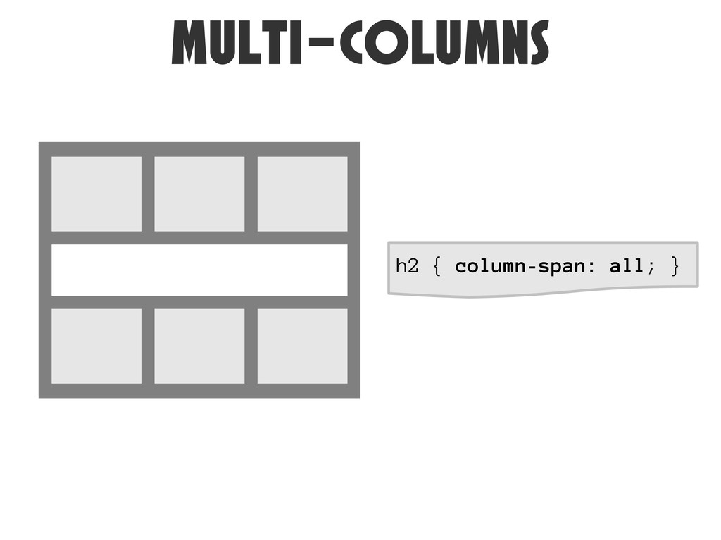
Multi-columns h2 { column-span: all; }
multi-columns
Multi-columns PLUG 1 of 2
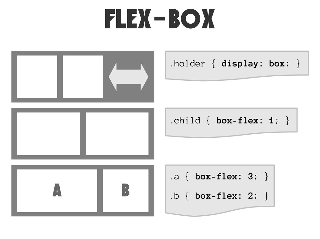
Flex-box
Flex-box .holder { display: box; } .child { box-flex: 1;
} A B .a { box-flex: 3; } .b { box-flex: 2; }
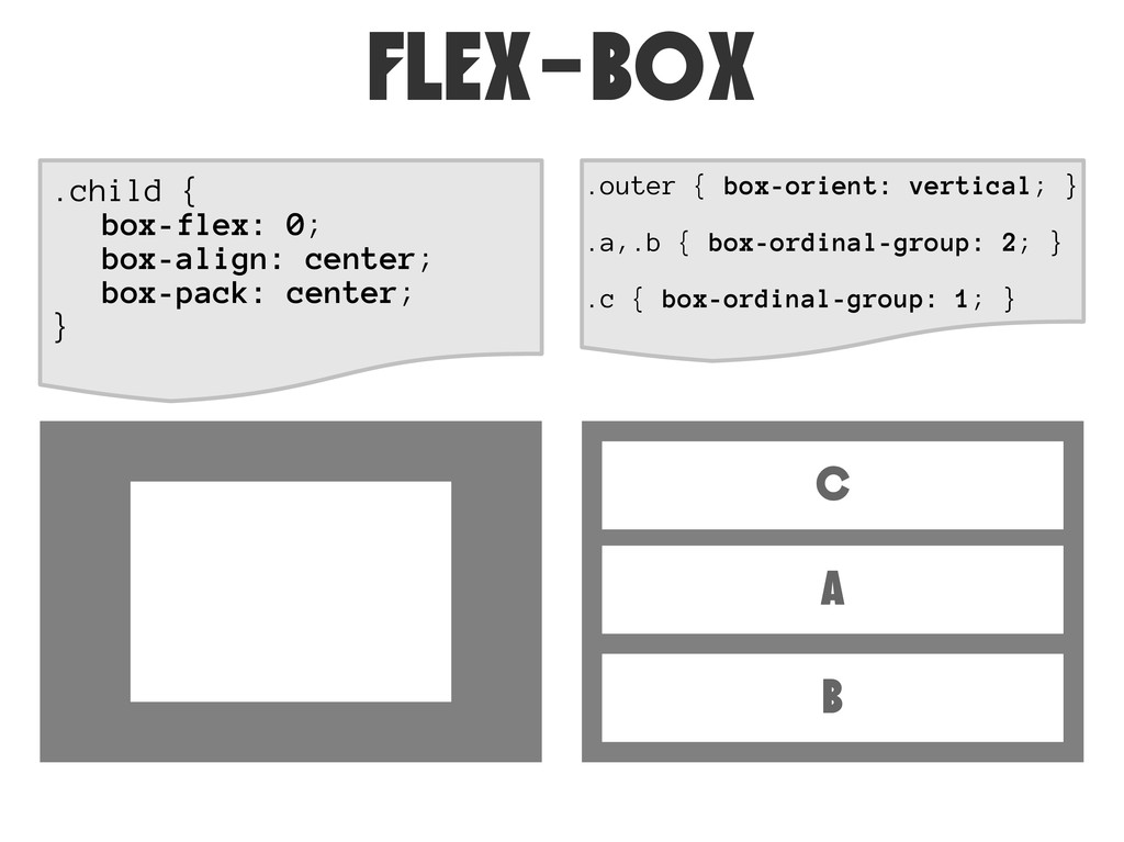
Flex-box .child { box-flex: 0; box-align: center; box-pack: center; }
.outer { box-orient: vertical; } .a,.b { box-ordinal-group: 2; } .c { box-ordinal-group: 1; } C A B
Flex-box JS Shim: https://github.com/doctyper/flexie
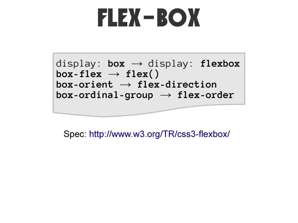
Flex-box display: box → display: flexbox box-flex → flex() box-orient
→ flex-direction box-ordinal-group → flex-order Spec: http://www.w3.org/TR/css3-flexbox/
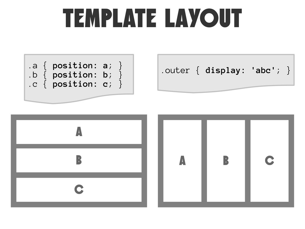
Template Layout
TEMPLATE LAYOUT .a { position: a; } .b { position:
b; } .c { position: c; } .outer { display: 'abc'; } A B C A B C
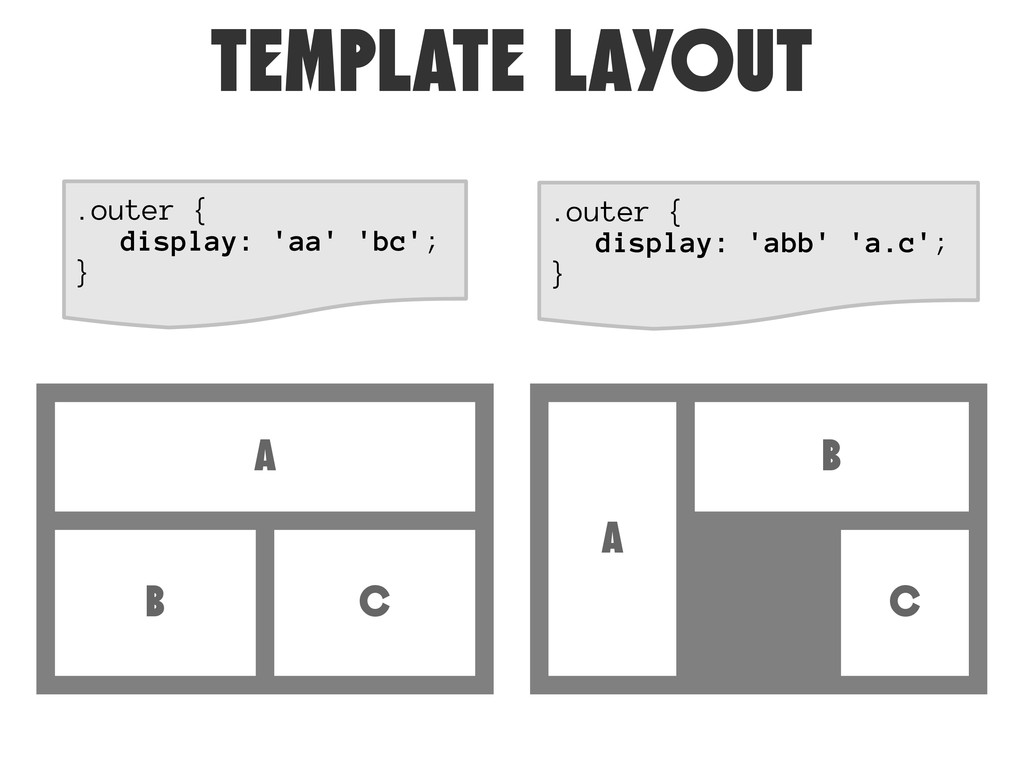
TEMPLATE LAYOUT .outer { display: 'abb' 'a.c'; } A B
C A B C .outer { display: 'aa' 'bc'; }
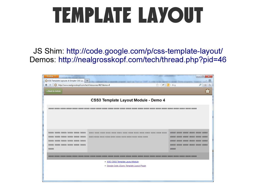
TEMPLATE LAYOUT JS Shim: http://code.google.com/p/css-template-layout/ Demos: http://nealgrosskopf.com/tech/thread.php?pid=46
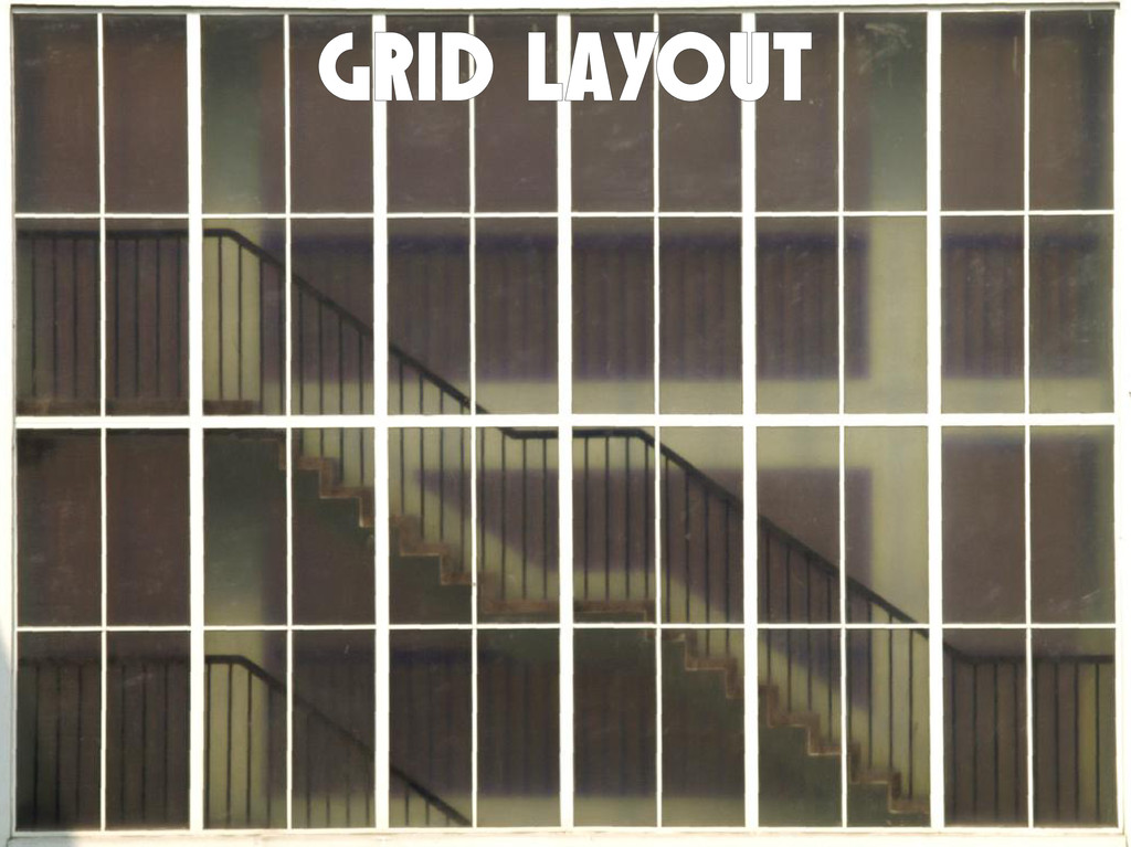
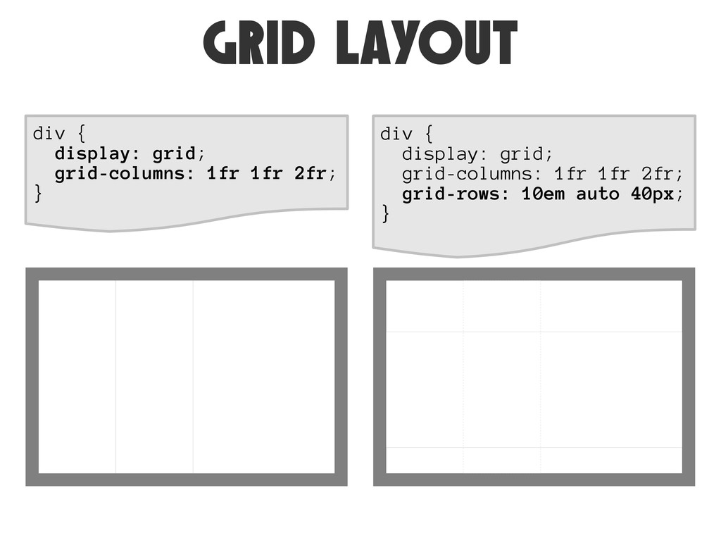
Grid Layout
grid LAYOUT div { display: grid; grid-columns: 1fr 1fr 2fr;
} div { display: grid; grid-columns: 1fr 1fr 2fr; grid-rows: 10em auto 40px; }
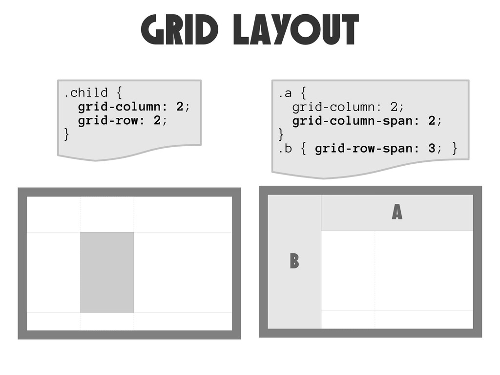
grid LAYOUT .child { grid-column: 2; grid-row: 2; } .a
{ grid-column: 2; grid-column-span: 2; } .b { grid-row-span: 3; } A B
grid LAYOUT Spec: http://www.w3.org/TR/css3-grid-layout/ Blog post: http://j.mp/kul0H1 http://blogs.msdn.com/b/ie/archive/2011/04/14/ie10-platform-preview-and-css-features-for-adaptive-layouts.aspx
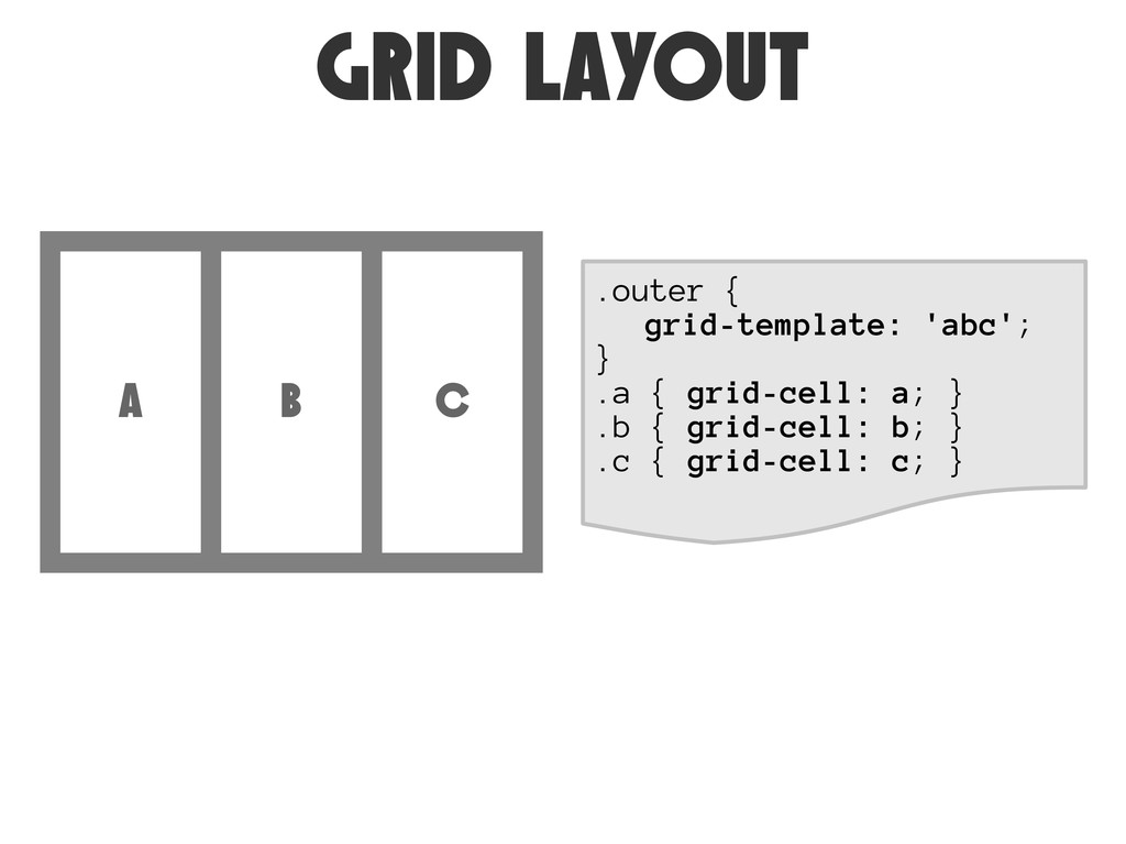
GRiD LAYOUT .outer { grid-template: 'abc'; } .a { grid-cell:
a; } .b { grid-cell: b; } .c { grid-cell: c; } A B C
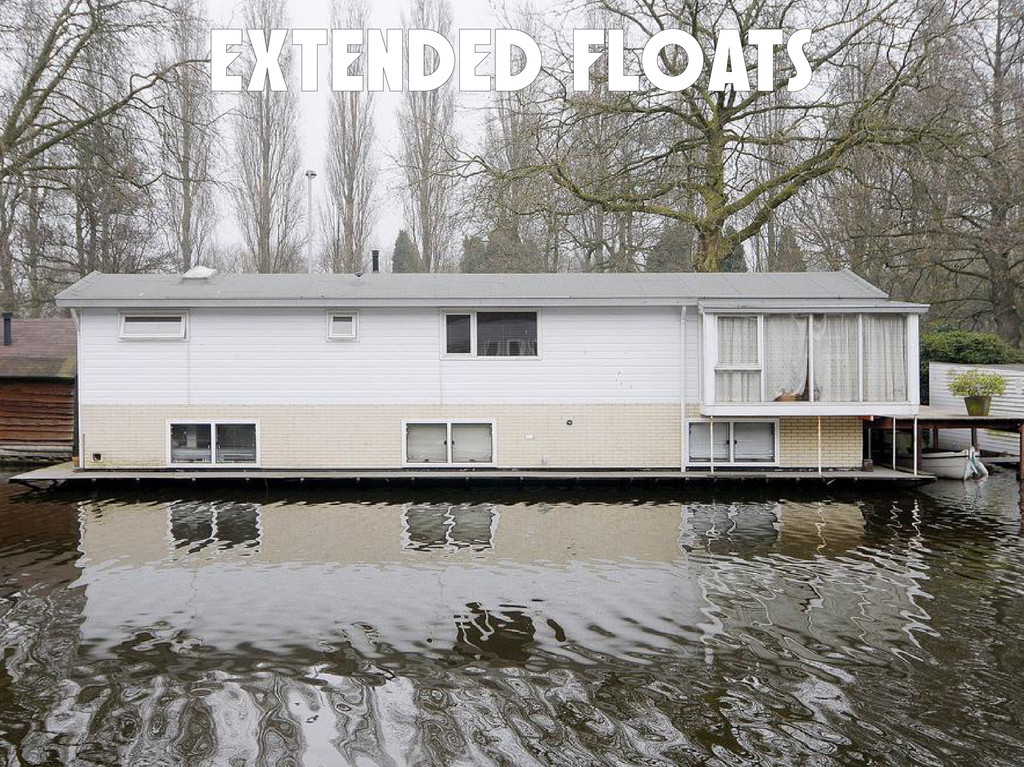
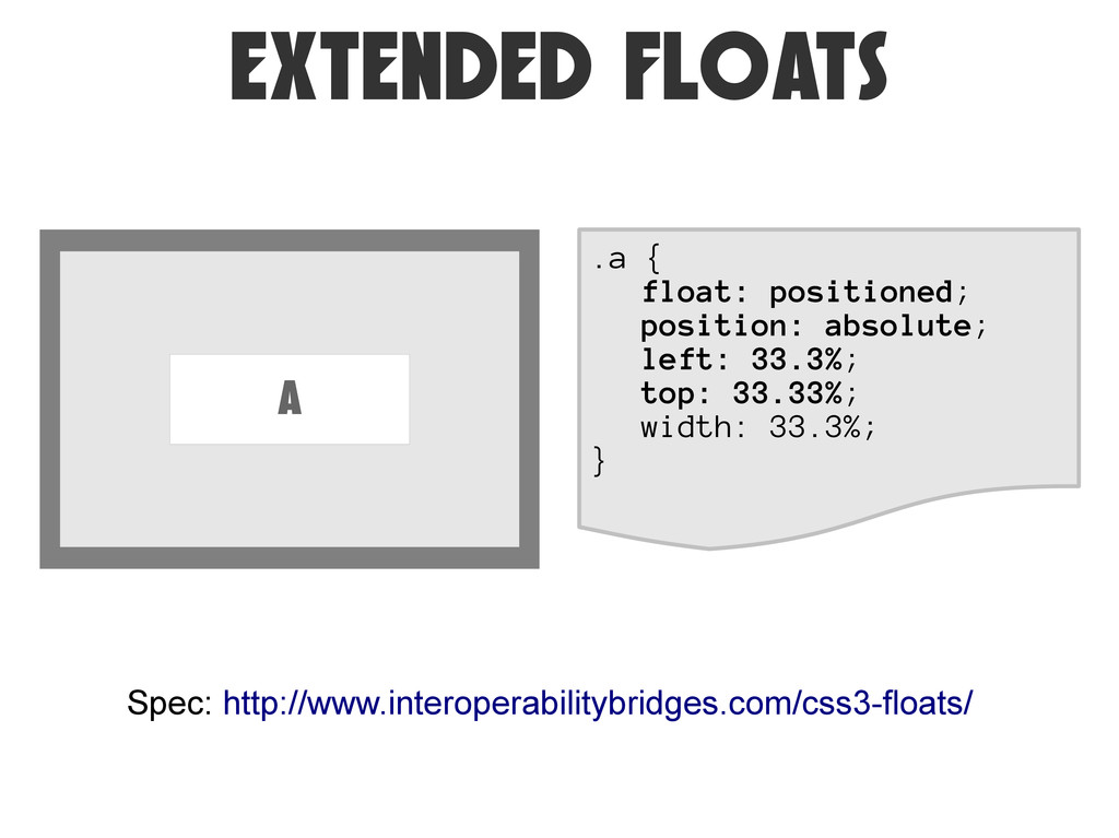
Extended Floats
EXTENDED FLOATS .a { float: positioned; position: absolute; left: 33.3%;
top: 33.33%; width: 33.3%; } Spec: http://www.interoperabilitybridges.com/css3-floats/ A
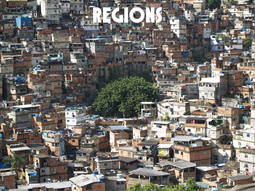
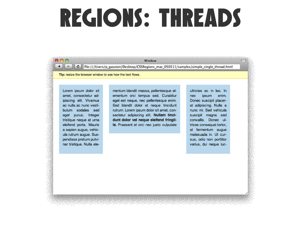
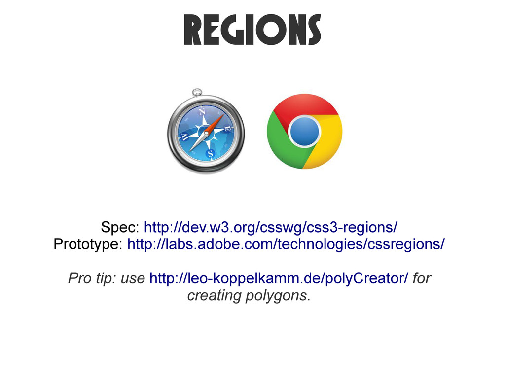
Regions
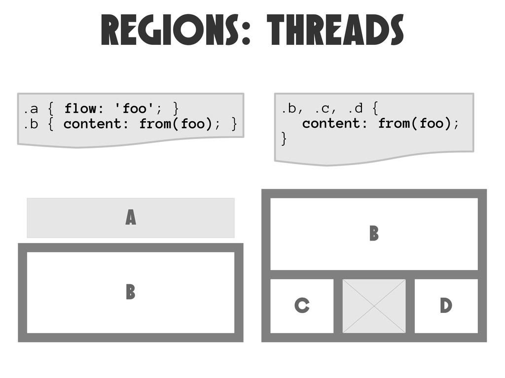
REGiONS: THREADS A B .a { flow: 'foo'; } .b
{ content: from(foo); } B C D .b, .c, .d { content: from(foo); }
REGiONS: THREADS
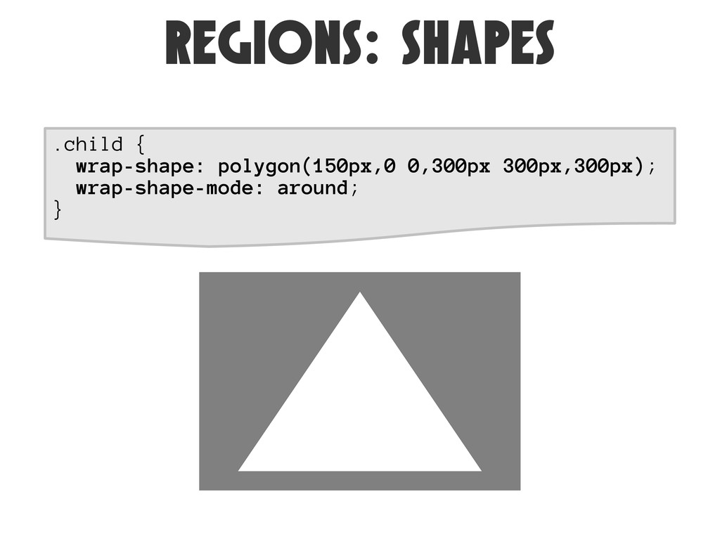
REGiONS: SHAPES .child { wrap-shape: polygon(150px,0 0,300px 300px,300px); wrap-shape-mode: around;
}
REGiONS: SHAPES
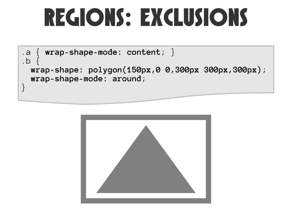
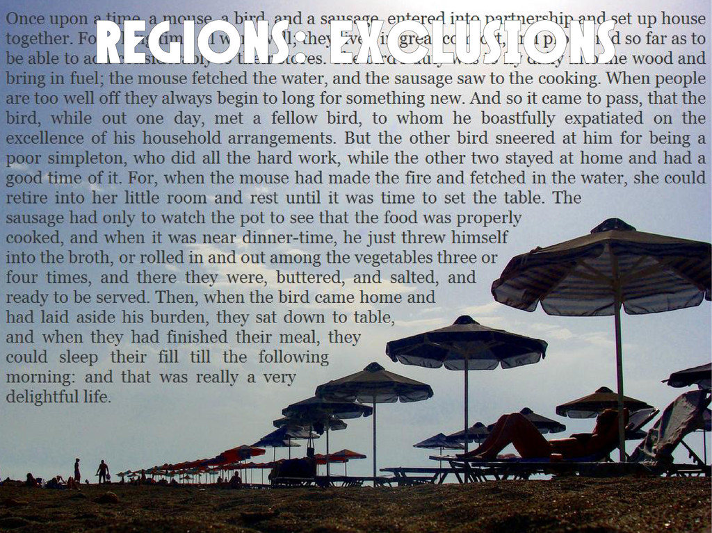
REGiONS: exclusions .a { wrap-shape-mode: content; } .b { wrap-shape:
polygon(150px,0 0,300px 300px,300px); wrap-shape-mode: around; }
REGiONS: EXCLUSIONS
regions Spec: http://dev.w3.org/csswg/css3-regions/ Prototype: http://labs.adobe.com/technologies/cssregions/ Pro tip: use http://leo-koppelkamm.de/polyCreator/ for
creating polygons.
None
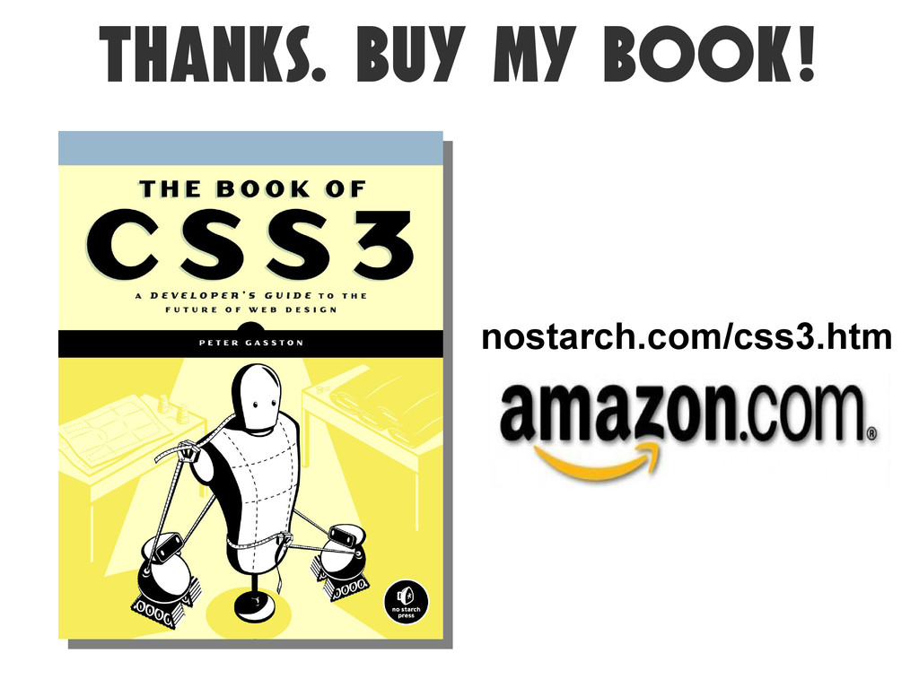
thanks. Buy my book! nostarch.com/css3.htm
http://brittbell.blogspot.com/ http://www.flickr.com/photos/banfflakelouise/2274619237/ http://www.flickr.com/photos/el_momento_i_sitio_apropiados/5634431702/ http://www.flickr.com/photos/chanc/3869133751/ http://www.flickr.com/photos/gullevek/580672409/ http://www.flickr.com/photos/instantjefferson/2231405/ http://www.flickr.com/photos/moritzbernoully/3412093432/ http://www.flickr.com/photos/paulaofessel/335809741/ http://www.flickr.com/photos/opacity/617608495/ IMAGE
CREDITS
 stopsatgreen
 kamekyame
 syobochim
 peintangos
 oracle4engineer
 kubell_hr
 starfish719
 rung
rung
 syuchimu
 202409e2
 ytaka23
 subroh0508
 soysaucechin
 honzajavorek
 ammeep
 stephaniewalter
 thirion
 sabderemane
 productmarketing
 varn
varn
 aleyda
 tenderlove
 mayunak
 ryanjones