Upgrade to Pro — share decks privately, control downloads, hide ads and more …

Demystifying Styles and Themes

Demystifying Styles and Themes

Subhrajyoti Sen

January 23, 2021
Tweet

More Decks by Subhrajyoti Sen

Other Decks in Programming

Transcript

  1. Styles A set of key-values pairs where the key is

    a View attribute Speci c to a single view
  2. Styles A set of key-values pairs where the key is

    a View attribute Speci c to a single view Can't be changed once applied
  3. Styles <com.google.android.material.button.MaterialButton android:layout_width="wrap_content" android:layout_height="wrap_content" android:insetBottom="0dp" android:insetTop="0dp" android:text="Hello"/> <com.google.android.material.button.MaterialButton android:layout_width="100dp" android:layout_height="wrap_content"

    android:insetBottom="0dp" android:insetTop="0dp" android:text="Make Payment"/> <style name="ButtonStyle" parent="Widget.MaterialComponents.Button"> <item name="android:insetTop">0dp</item> <item name="android:insetBottom">0dp</item> </style>
  4. TextAppearance A set of key-values pairs speci c to TextView

    or it's subclasses. Can include only character level styling
  5. TextAppearance A set of key-values pairs speci c to TextView

    or it's subclasses. Can include only character level styling Can be changed once applied
  6. Theme A set of key-values pairs where the key is

    a Theme attribute Applies to a view hierarchy
  7. Theme A set of key-values pairs where the key is

    a Theme attribute Applies to a view hierarchy Can't be changed once applied
  8. Theme <LinearLayout android:layout_width="wrap_content" android:layout_height="wrap_content" android:theme="@style/Theme.BlrDroidThemes" app:layout_constraintTop_toTopOf="parent" app:layout_constraintStart_toStartOf="parent"> <style name="AppTheme" parent="Theme.MaterialComponents.DayNight.NoActionBar">

    <item name="colorPrimary">@color/colorPrimary</item> <item name="colorPrimaryDark">@color/colorPrimaryDark</item> <item name="colorSurface">@color/colorSurface</item> <item name="colorOnSurface">@color/colorOnSurface</item> </style>
  9. ThemeOverlay * <p>For filled buttons, this class uses your theme's

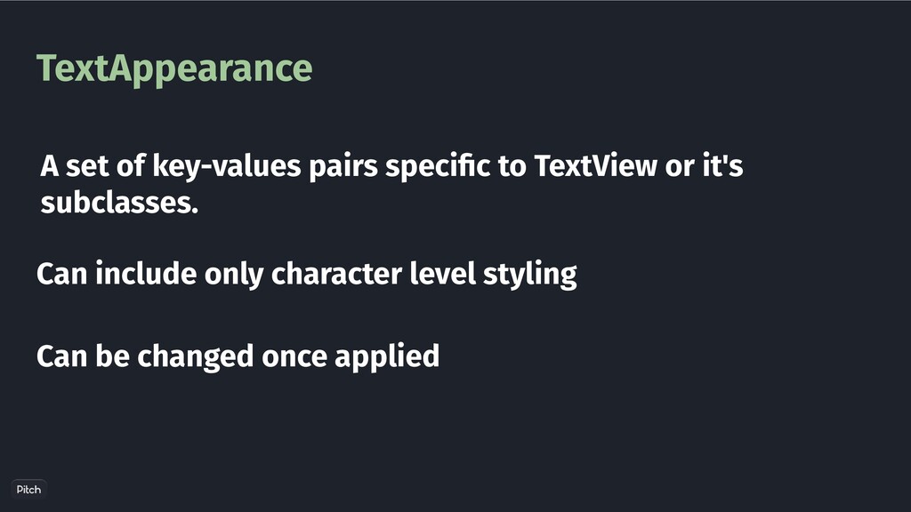
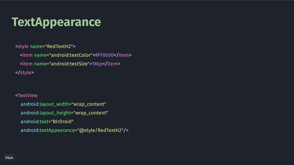
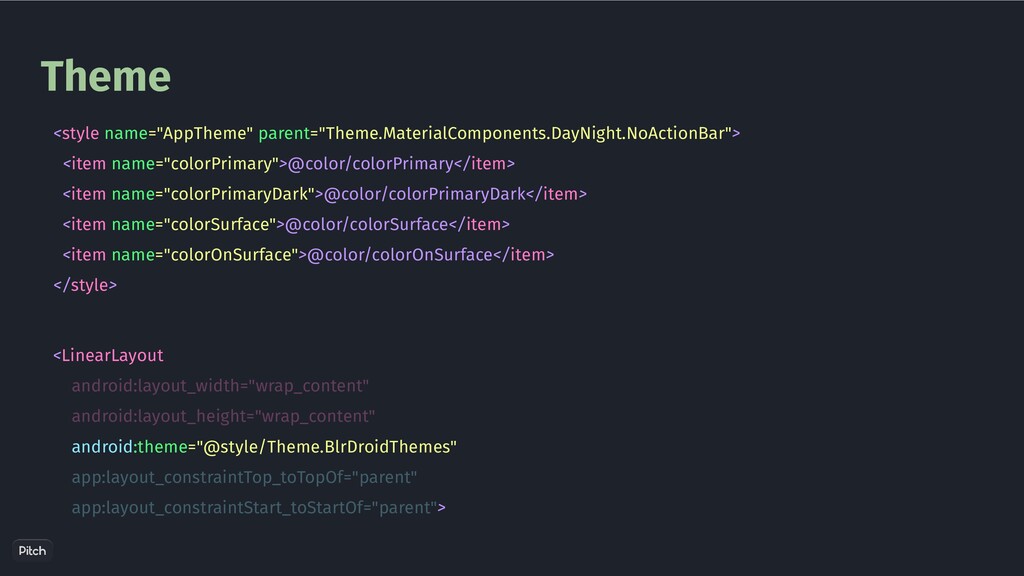
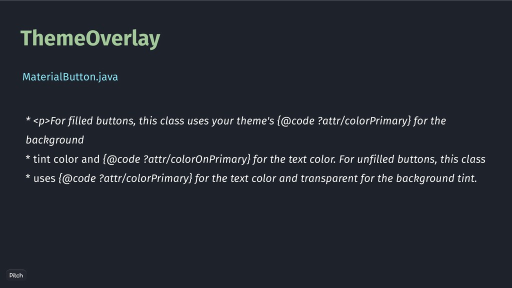
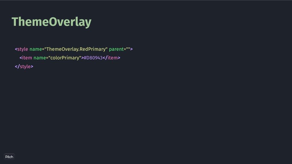
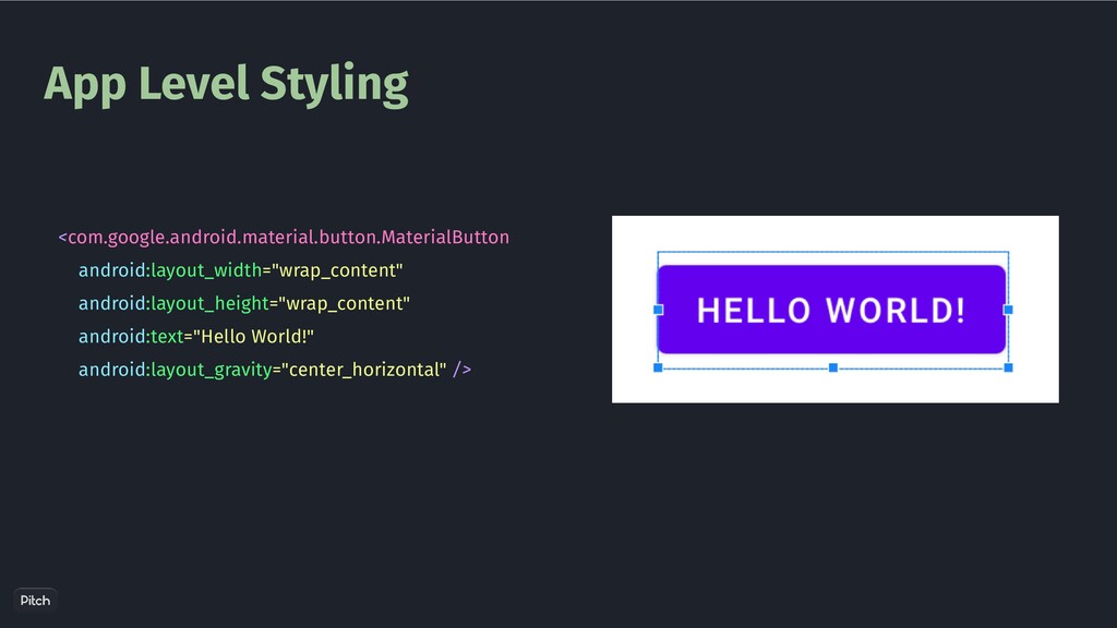
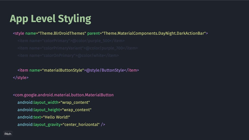
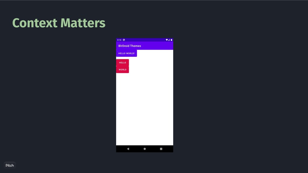
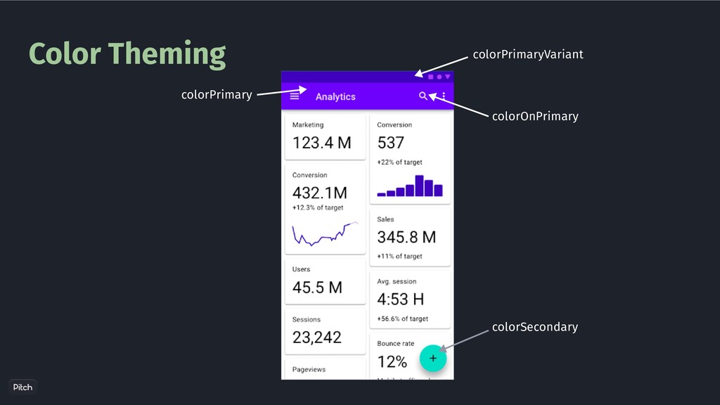
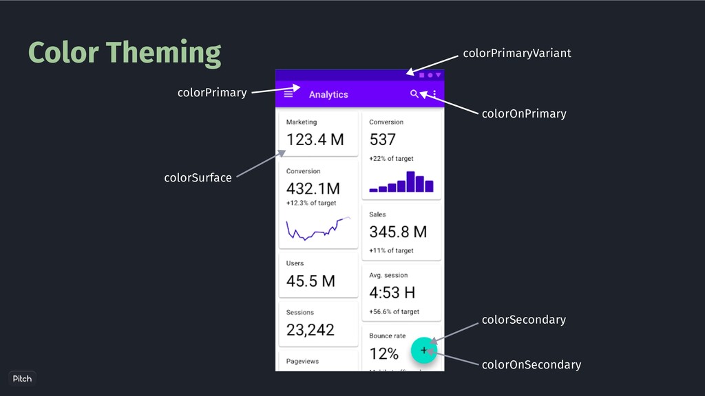
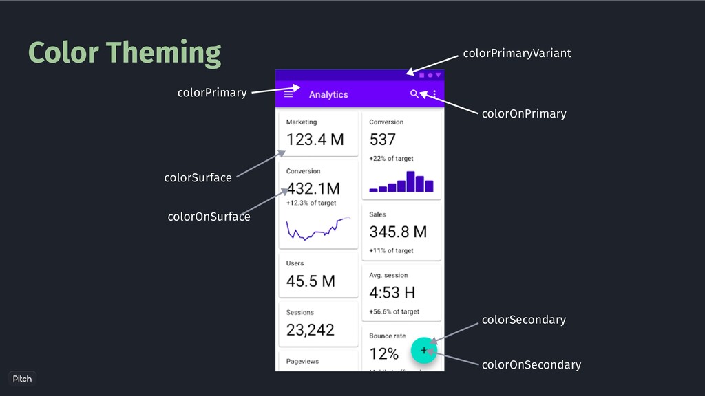
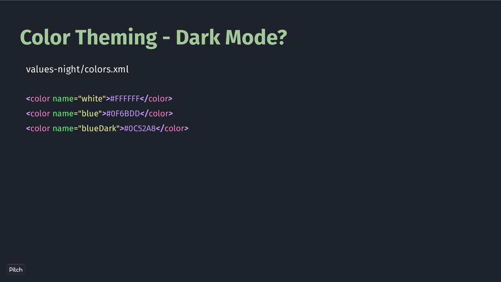
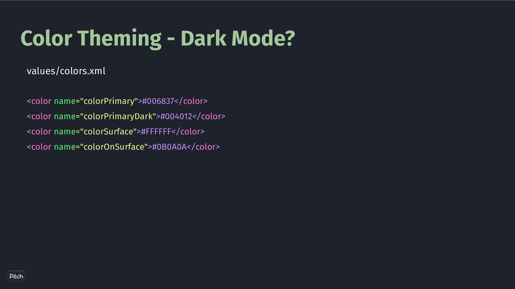
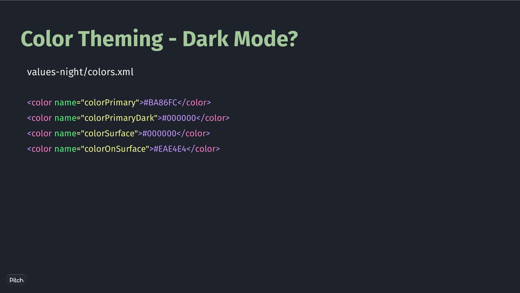
    {@code ?attr/colorPrimary} for the background * tint color and {@code ?attr/colorOnPrimary} for the text color. For unfilled buttons, this class * uses {@code ?attr/colorPrimary} for the text color and transparent for the background tint. MaterialButton.java
  10. App Level Styling <style name="ButtonStyle" parent="Widget.MaterialComponents.Button"> <item name="android:insetTop">0dp</item> <item name="android:insetBottom">0dp</item>

    </style> <com.google.android.material.button.MaterialButton android:layout_width="wrap_content" android:layout_height="wrap_content" android:text="Hello World!" style="@style/ButtonStyle" android:layout_gravity="center_horizontal" />
  11. App Level Styling <style name="Theme.BlrDroidThemes" parent="Theme.MaterialComponents.DayNight.DarkActionBar"> <item name="colorPrimary">@color/purple_500</item> <item name="colorPrimaryVariant">@color/purple_700</item>

    <item name="colorOnPrimary">@color/white</item> <item name="materialButtonStyle">@style/ButtonStyle</item> </style> <com.google.android.material.button.MaterialButton android:layout_width="wrap_content" android:layout_height="wrap_content" android:text="Hello World!" android:layout_gravity="center_horizontal" />
  12. Context Matters A context will be tied to a theme

    This theme can be different from the Activity/App theme
  13. Context Matters val contextThemeWrapper = ContextThemeWrapper( this, R.style.ThemeOverlay_RedPrimary ) val

    materialButton = MaterialButton(contextThemeWrapper) materialButton.text = "World" binding.linearLayout.addView(materialButton) Option - 1
  14. Context Matters public MaterialButton(@NonNull Context context, @Nullable AttributeSet attrs, int

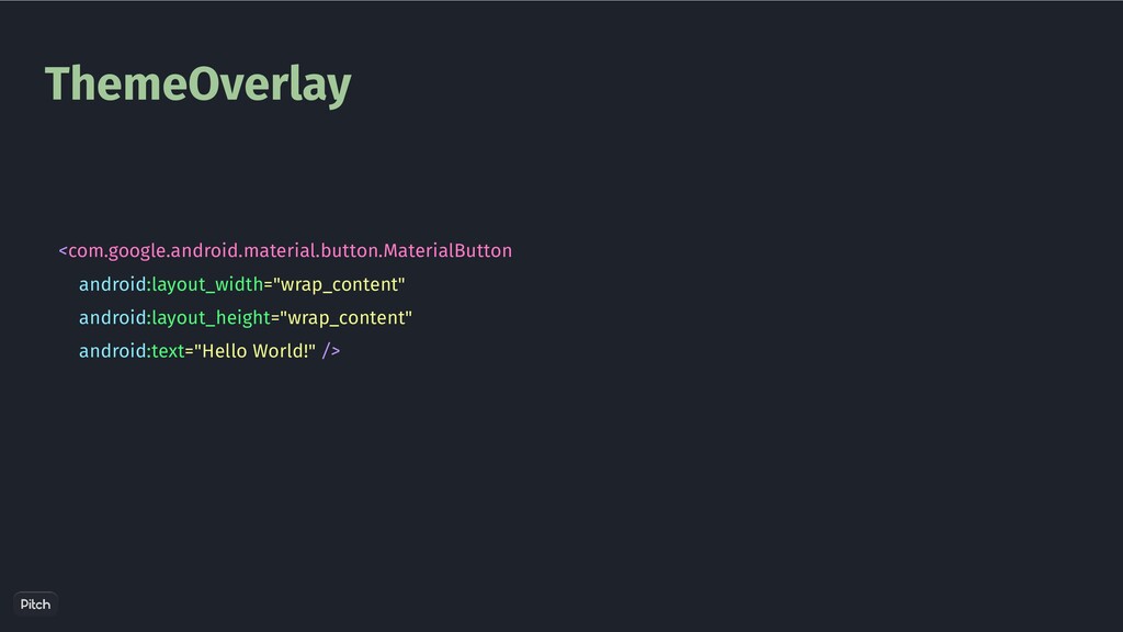
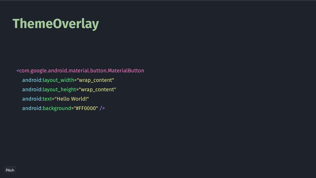
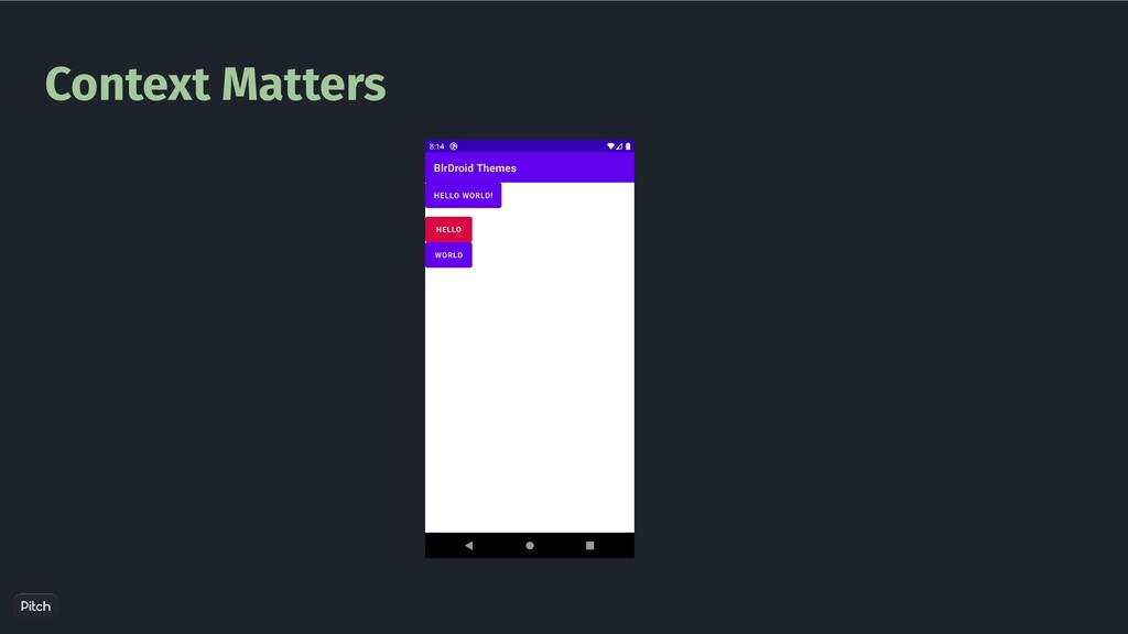
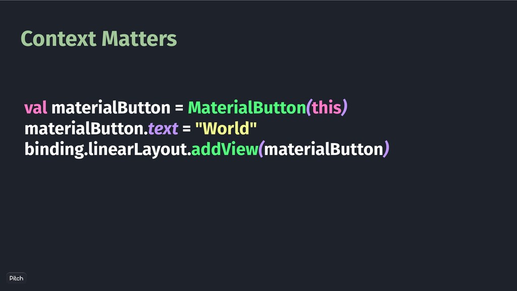
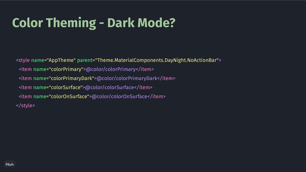
    defStyleAttr) { super(wrap(context, attrs, defStyleAttr, DEF_STYLE_RES), attrs, defStyleAttr); // Ensure we are using the correctly themed context rather than the context that was passed in. context = getContext(); } MaterilButton.java
  15. Context Matters public static Context wrap(//params ) { int materialThemeOverlayId

    = obtainMaterialThemeOverlayId(context, attrs, defStyleAttr, defStyleRes); boolean contextHasOverlay = context instanceof ContextThemeWrapper && ((ContextThemeWrapper) context).getThemeResId() == materialThemeOverlayId; //.. Context contextThemeWrapper = new ContextThemeWrapper(context, materialThemeOverlayId); // .. return contextThemeWrapper; } MaterialButton.java
  16. Custom View Styling class ProgressButton @JvmOverloads constructor( context: Context, attrs:

    AttributeSet? = null, defStyleAttr: Int = 0 ) : View(context, attrs, defStyleAttr)
  17. Custom View Styling class ProgressButton @JvmOverloads constructor( context: Context, attrs:

    AttributeSet? = null, defStyleAttr: Int = 0, defStyleRes: Int = 0 ) : View(context, attrs, defStyleAttr, defStyleRes) {
  18. Custom View Styling class ProgressButton @JvmOverloads constructor( context: Context, attrs:

    AttributeSet? = null, defStyleAttr: Int = R.attr.progressButtonStyle, defStyleRes: Int = R.style.ProgressButtonStyle ) : View(context, attrs, defStyleAttr, defStyleRes) {
  19. Custom View Styling class ProgressButton @JvmOverloads constructor( context: Context, attrs:

    AttributeSet? = null, defStyleAttr: Int = R.attr.progressButtonStyle, defStyleRes: Int = R.style.ProgressButtonStyle ) : View(context, attrs, defStyleAttr, defStyleRes) { val typedArray = context.obtainStyledAttributes(attrs, R.styleable.ProgressButton, defStyleAttr, defStyleRes)
  20. Custom View Styling <resources> <attr name="progressButtonStyle" format="reference"/> </resources> defStyleAttr <style

    name="AppTheme" parent="Theme.MaterialComponents.DayNight.NoActionBar"> <item name="colorPrimary">@color/colorPrimary</item> <item name="colorPrimaryDark">@color/colorPrimaryDark</item> <item name="progressButtonStyle">@style/ProgressButtonStyle</item> </style>
  21. Color Theming <color name="white">#FFFFFF</color> <color name="blue">#0F6BDD</color> <color name="blueDark">#0C52A8</color> <style name="AppTheme"

    parent="Theme.MaterialComponents.DayNight.NoActionBar"> <item name="colorPrimary">@color/blue</item> <item name="colorPrimaryDark">@color/blueDark</item> <item name="android:colorBackground">@color/white</item> </style>
  22. Color Theming - Dark Mode? <color name="colorPrimary">#006837</color> <color name="colorPrimaryDark">#004012</color> <color

    name="colorSurface">#FFFFFF</color> <color name="colorOnSurface">#0B0A0A</color> values/colors.xml
  23. Color Theming - Dark Mode? <color name="colorPrimary">#BA86FC</color> <color name="colorPrimaryDark">#000000</color> <color

    name="colorSurface">#000000</color> <color name="colorOnSurface">#EAE4E4</color> values-night/colors.xml
  24. Color Theming - Dark Mode? <style name="AppTheme" parent="Theme.MaterialComponents.DayNight.NoActionBar"> <item name="colorPrimary">@color/colorPrimary</item>

    <item name="colorPrimaryDark">@color/colorPrimaryDark</item> <item name="colorSurface">@color/colorSurface</item> <item name="colorOnSurface">@color/colorOnSurface</item> </style>
  25. Shape Theming <?xml version="1.0" encoding="utf-8"?> <shape xmlns:android="http://schemas.android.com/apk/res/android" android:shape="rectangle"> <solid android:color="#00ffffff"

    /> <padding android:left="6dp" android:top="6dp" android:right="6dp" android:bottom="6dp" /> <corners android:radius="12dp" /> <stroke android:width="6dp" android:color="#ffffffff" /> </shape>