Upgrade to Pro
— share decks privately, control downloads, hide ads and more …
Speaker Deck
Features
Speaker Deck
PRO
Sign in
Sign up for free
Search
Search
Responsive Web Design - Reinventando la web
Search
Swwweet
April 27, 2012
Technology
4.7k
15
Share
Embed
Copy iframe code
Copy JS code
Copy link
Start on current slide
Responsive Web Design - Reinventando la web
Presentación de Javier Usobiaga en el Ideateca HTML5 DevUp 2012.
Swwweet
April 27, 2012
More Decks by Swwweet
See All by Swwweet
Wonders from the Full Stack Fest website
swwweet
1
390
How to be the best web designer in the world.
swwweet
6
1.3k
Design for loading
swwweet
5
590
Mobile First: as difficult as doing things right
swwweet
225
10k
One Size Fits None
swwweet
12
920
One Size Fits None - From the Front 2013
swwweet
2
770
Responsively Responsive
swwweet
23
1.7k
La letra con píxel entra
swwweet
0
1.2k
The future of code
swwweet
4
660
Other Decks in Technology
See All in Technology
NDIAS CTF 2026 問題解説会資料
bata_24
0
160
“全部コピーしない”ファイルデータの活用 : — FSx for ONTAP × S3 Tables × Icebergで作るメタデータカタログ
yoshiki0705
0
190
打造你的 AI 工作流:Agent Skill + MCP 實戰工作坊
appleboy
0
310
「軸足」は 固定しなくていい - 熱量と強みで描く、しなやかなキャリアの形
kakehashi
PRO
1
310
IaC コードを資産へ:AWS CDK 社内ライブラリと横断展開 / aws-summit-japan-2026
gotok365
10
1.7k
Microsoft のサポートとフィードバック総まとめ
murachiakira
PRO
0
130
クラウドファンディング版StackChan 3体(4体)をインタラクティブな体験型作品にして展示もした話 / スタックチャンお誕生日会2026
you
PRO
0
270
RAGの精度向上とエージェント活用
kintotechdev
2
110
AIをフル活用してオンコール機能のプロトタイプを2日で作った話 / Building an AI-Powered On-Call Prototype in Just Two Days
nari_ex
0
160
Agile and AI Redmine Japan 2026
hiranabe
4
570
GitHub Copilot運用のリアル ~AI Credit時代にどう向き合うか~
takafumisu2uk1
0
590
起点・思考・出力で分解する 〜PM業務の自動化設計〜
kazu_kichi_67
2
1.2k
Featured
See All Featured
Visualization
eitanlees
152
17k
The SEO Collaboration Effect
kristinabergwall1
1
500
SERP Conf. Vienna - Web Accessibility: Optimizing for Inclusivity and SEO
sarafernandez
2
1.5k
The innovator’s Mindset - Leading Through an Era of Exponential Change - McGill University 2025
jdejongh
PRO
1
210
XXLCSS - How to scale CSS and keep your sanity
sugarenia
250
1.3M
職位にかかわらず全員がリーダーシップを発揮するチーム作り / Building a team where everyone can demonstrate leadership regardless of position
madoxten
62
55k
The Curse of the Amulet
leimatthew05
2
13k
The Hidden Cost of Media on the Web [PixelPalooza 2025]
tammyeverts
2
340
Odyssey Design
rkendrick25
PRO
2
710
The Art of Delivering Value - GDevCon NA Keynote
reverentgeek
16
2k
Why Our Code Smells
bkeepers
PRO
340
58k
Why Mistakes Are the Best Teachers: Turning Failure into a Pathway for Growth
auna
0
170
Transcript
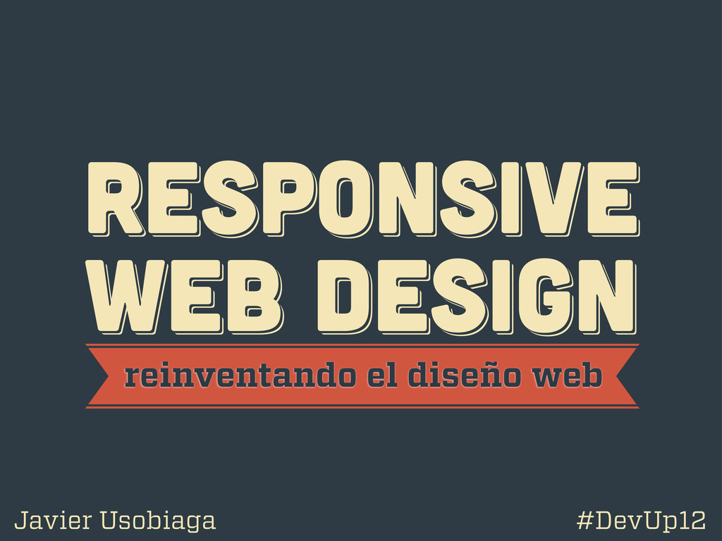
RESPoNSIVE WEB DESIGN RESPoNSIVE WEB DESIGN RESPoNSIVE WEB DESIGN reinventando
el diseño web Javier Usobiaga #DevUp12
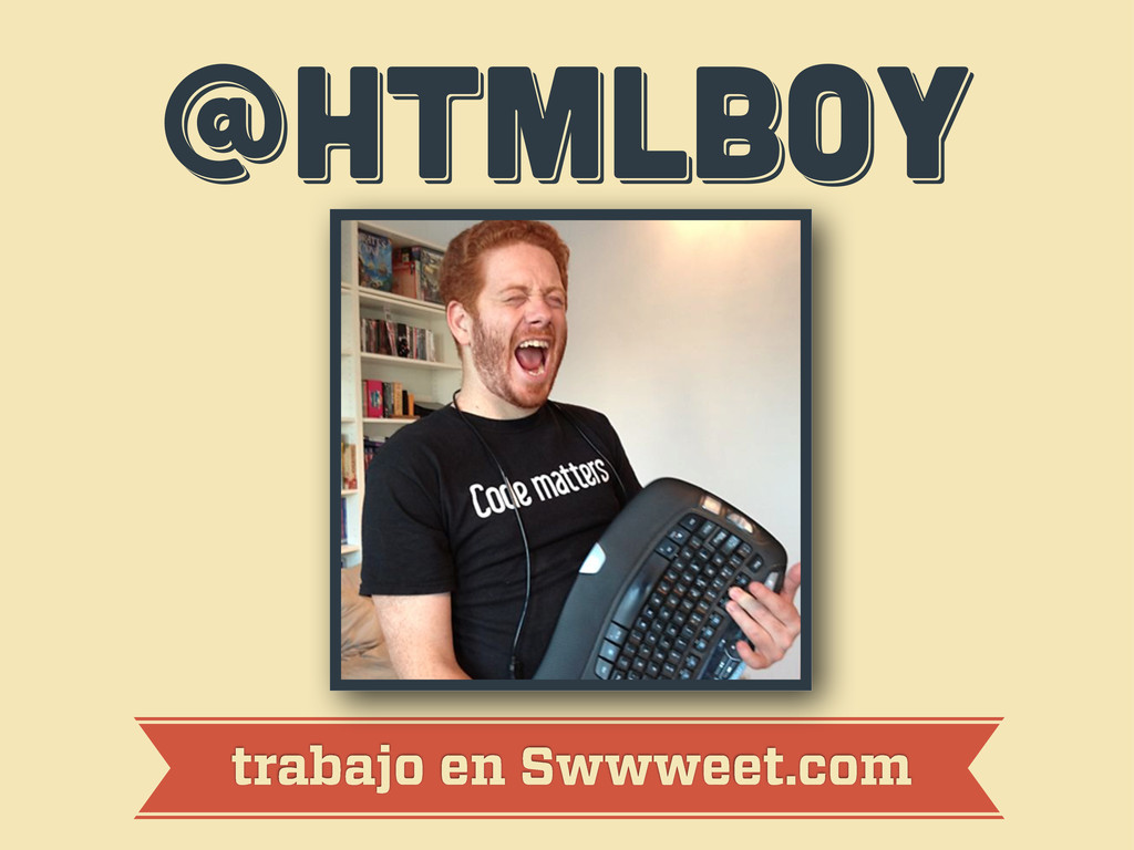
@htmlboy @htmlboy @htmlboy trabajo en Swwweet.com
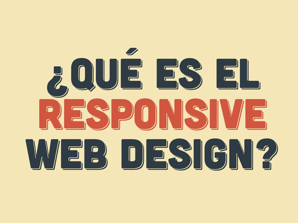
¿Qué es el responsive web design? ¿Qué es el responsive
web design? ¿Qué es el respoNsive web design?
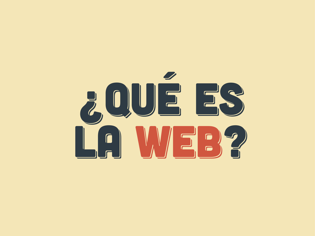
¿Qué es LA web? ¿Qué es LA web? ¿Qué es
LA web?
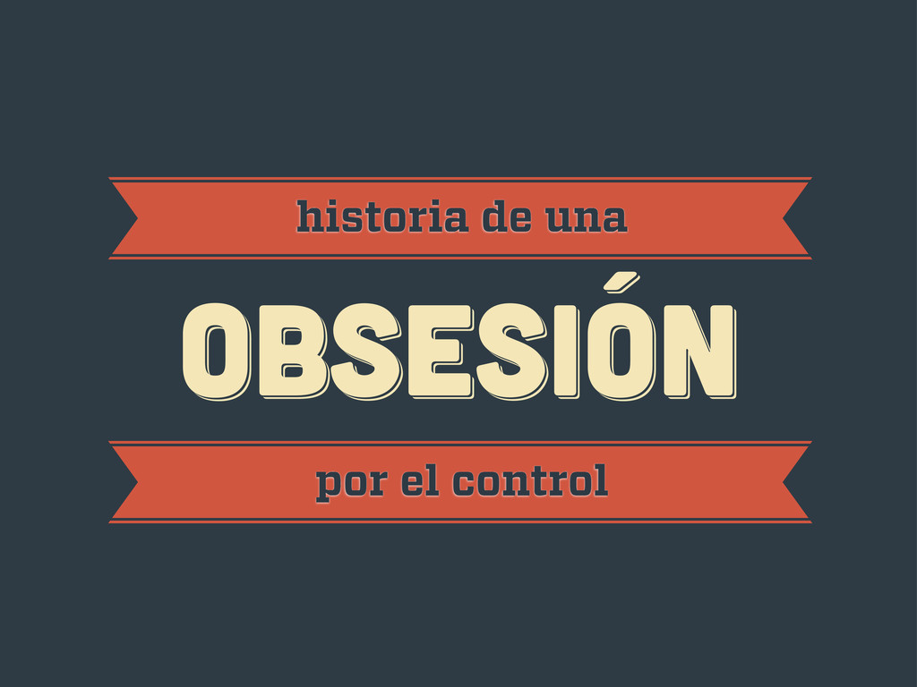
obsesión obsesión historia de una obsesión por el control
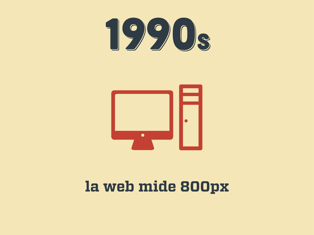
1990s 1990s 1990s la web mide 800px
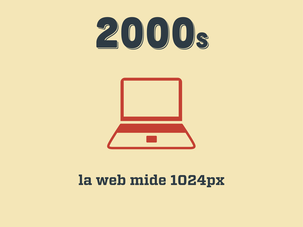
2000s 2000s 2000s la web mide 1024px
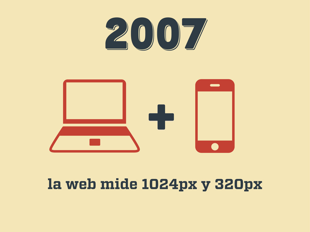
2007 2007 2007 + la web mide 1024px y 320px
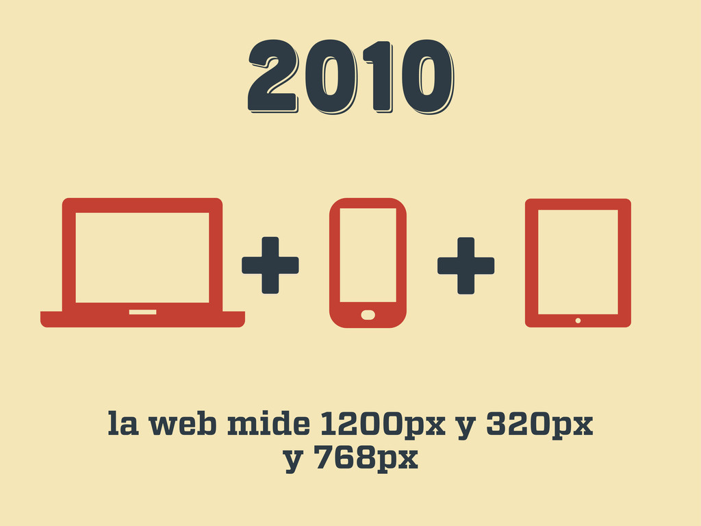
2010 2010 2010 + + la web mide 1200px y
320px y 768px
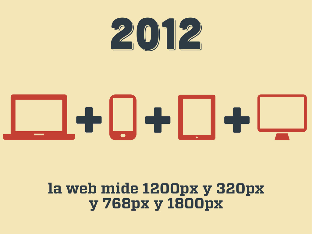
2012 2012 2012 + + la web mide 1200px y
320px y 768px y 1800px +
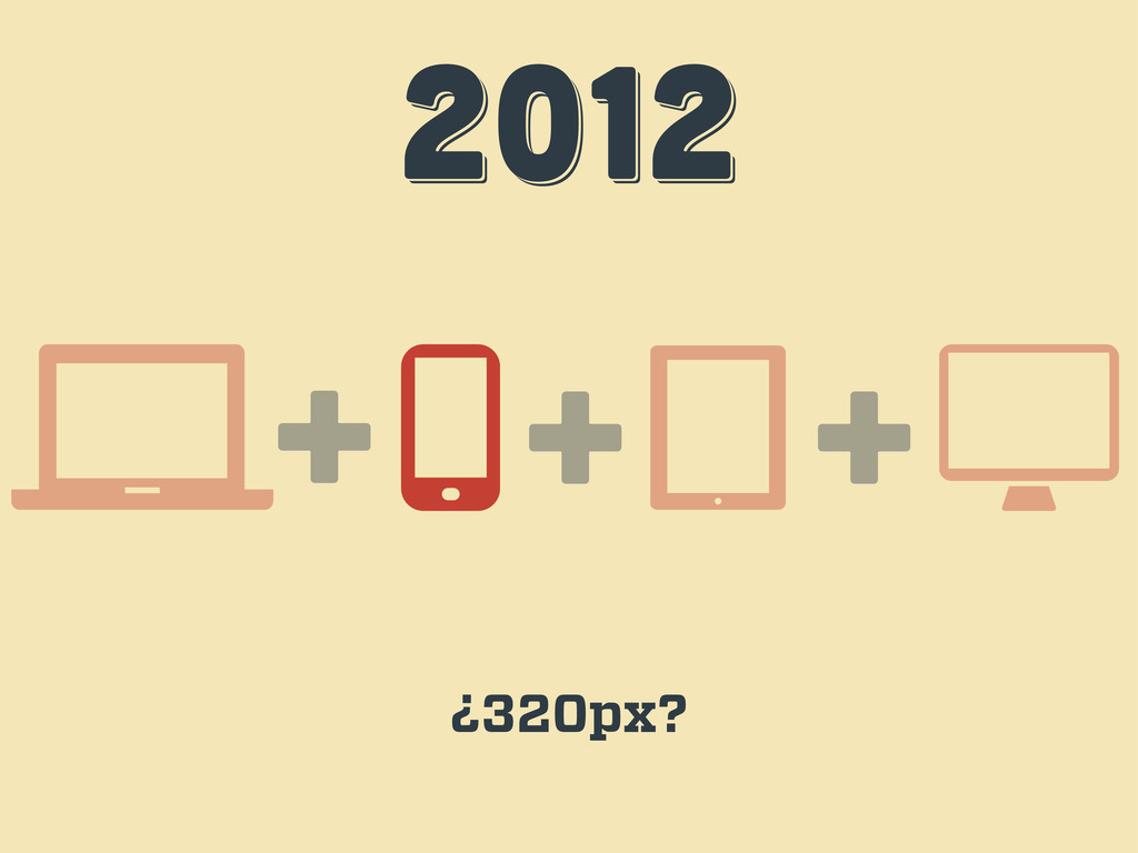
2012 2012 2012 + + ¿320px? +
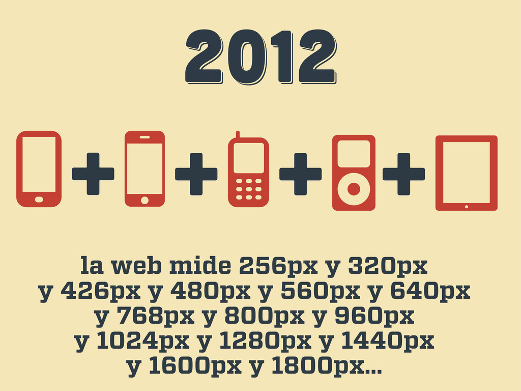
2012 2012 2012 la web mide 256px y 320px y
426px y 480px y 560px y 640px y 768px y 800px y 960px y 1024px y 1280px y 1440px y 1600px y 1800px… + + + +
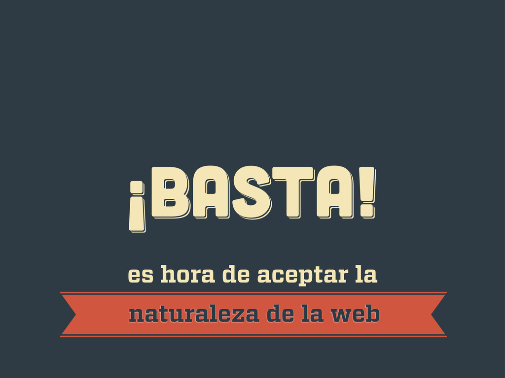
¡BASTA! ¡BASTA! ¡BASTA! es hora de aceptar la naturaleza de
la web
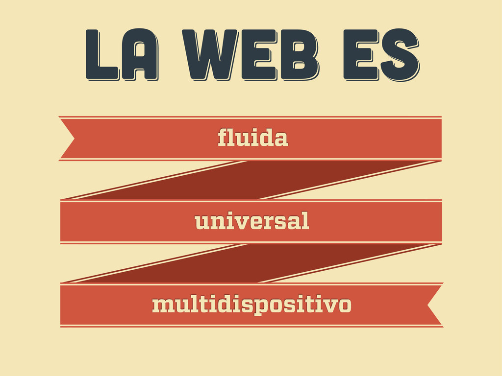
LA WEB ES LA WEB ES LA WEB ES fluida
universal multidispositivo
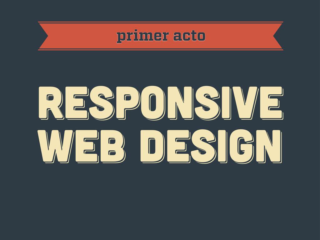
primer acto RESPoNSIVE WEB DESIGN RESPoNSIVE WEB DESIGN RESPoNSIVE WEB
DESIGN
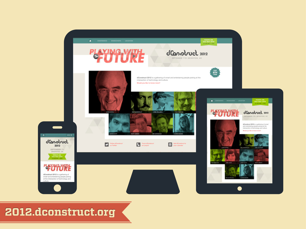
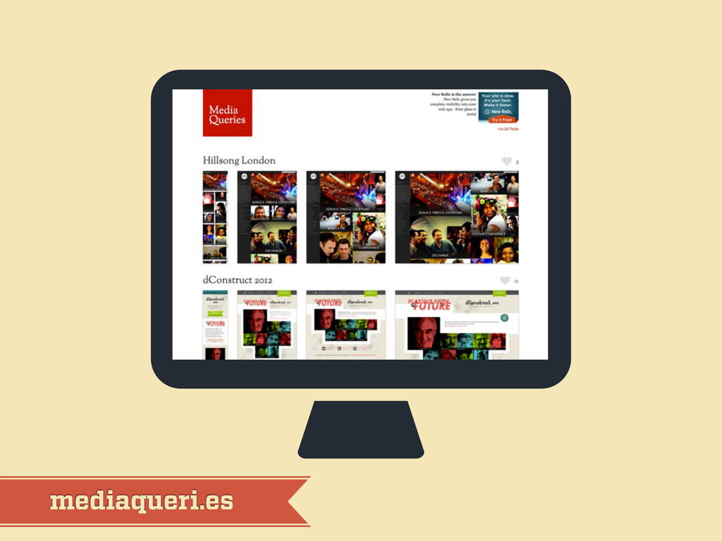
2012.dconstruct.org
mediaqueri.es
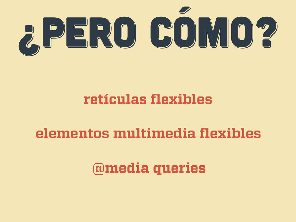
¿PERO CÓMO? ¿PERO CÓMO? ¿PERO CÓMO? retículas flexibles elementos multimedia
flexibles @media queries
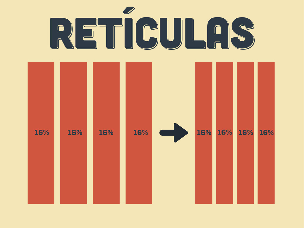
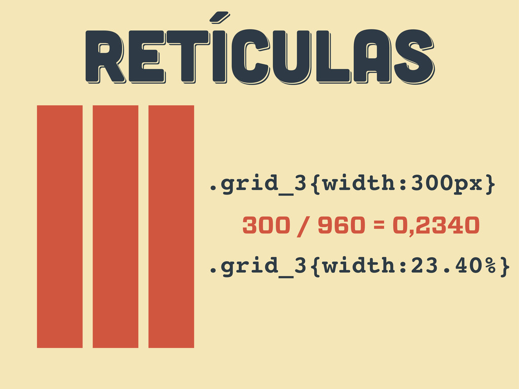
RETÍCULAS RETÍCULAS RETÍCULAS 16% 16% 16% 16% 16% 16% 16%
16%
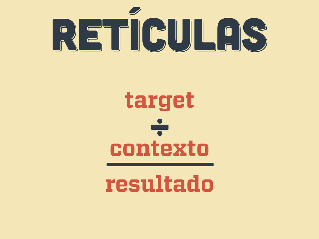
RETÍCULAS RETÍCULAS RETÍCULAS target contexto ÷ resultado
RETÍCULAS RETÍCULAS RETÍCULAS .grid_3{width:300px} 300 / 960 = 0,2340 .grid_3{width:23.40%}
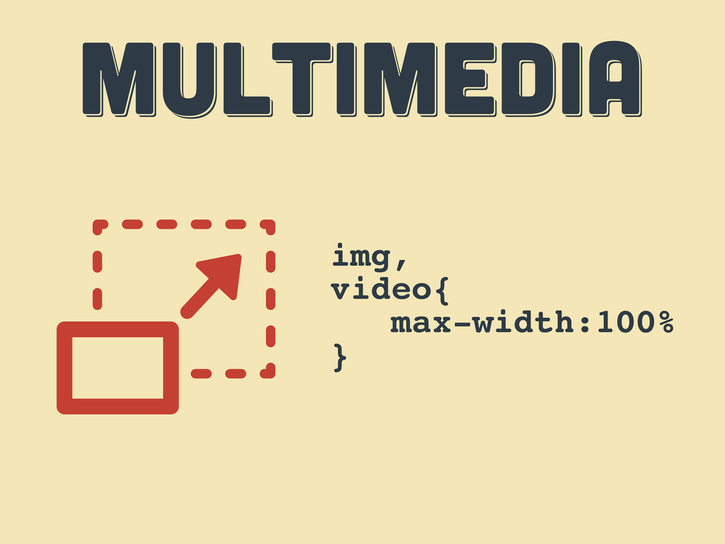
MULTIMEDIA MULTIMEDIA MULTIMEDIA img, video{ max-width:100% }
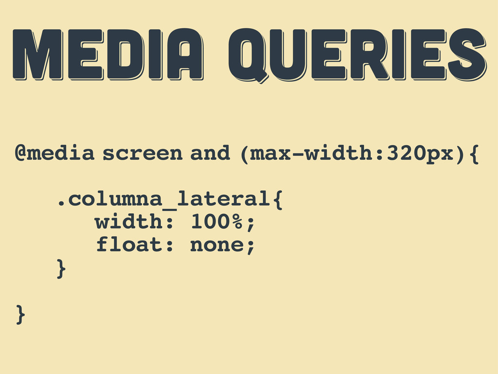
MEDIA QUERIES MEDIA QUERIES MEDIA QUERIES @media screen and (max-width:320px){
.columna_lateral{ width: 100%; float: none; } }
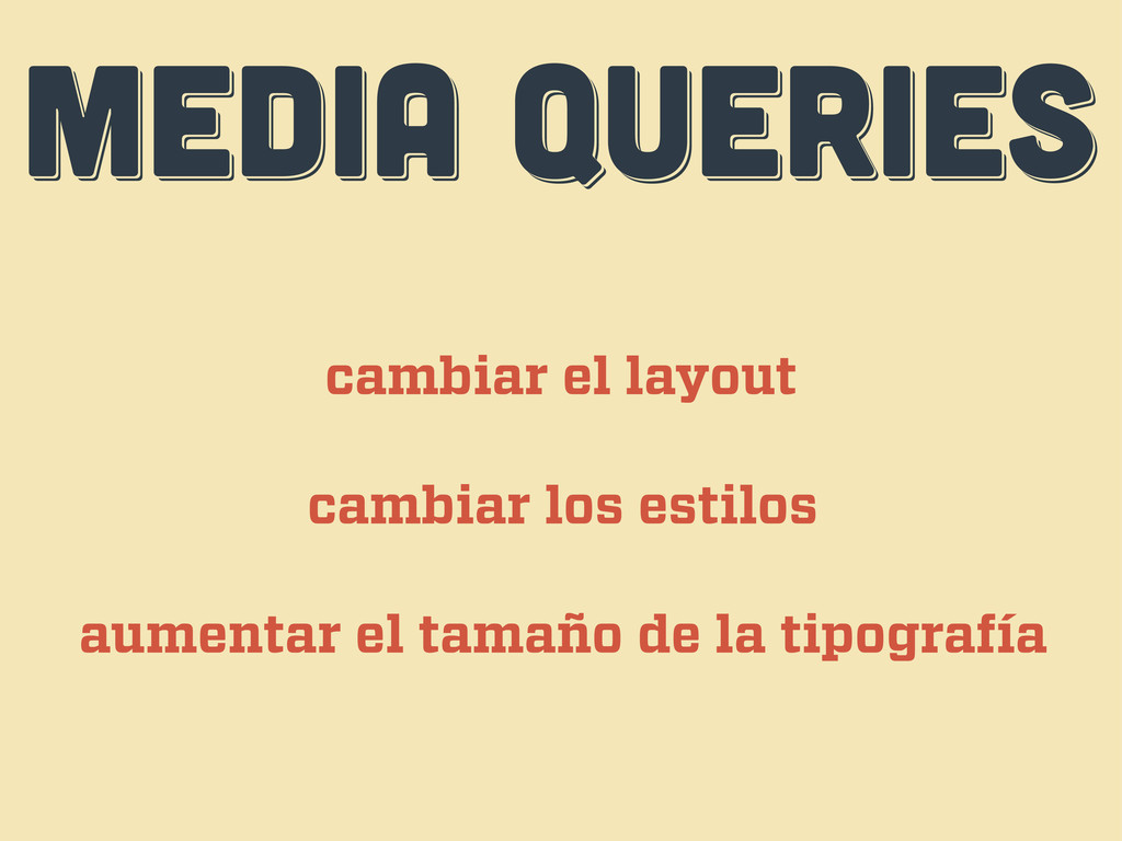
MEDIA QUERIES MEDIA QUERIES MEDIA QUERIES cambiar el layout cambiar
los estilos aumentar el tamaño de la tipografía
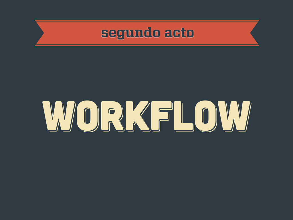
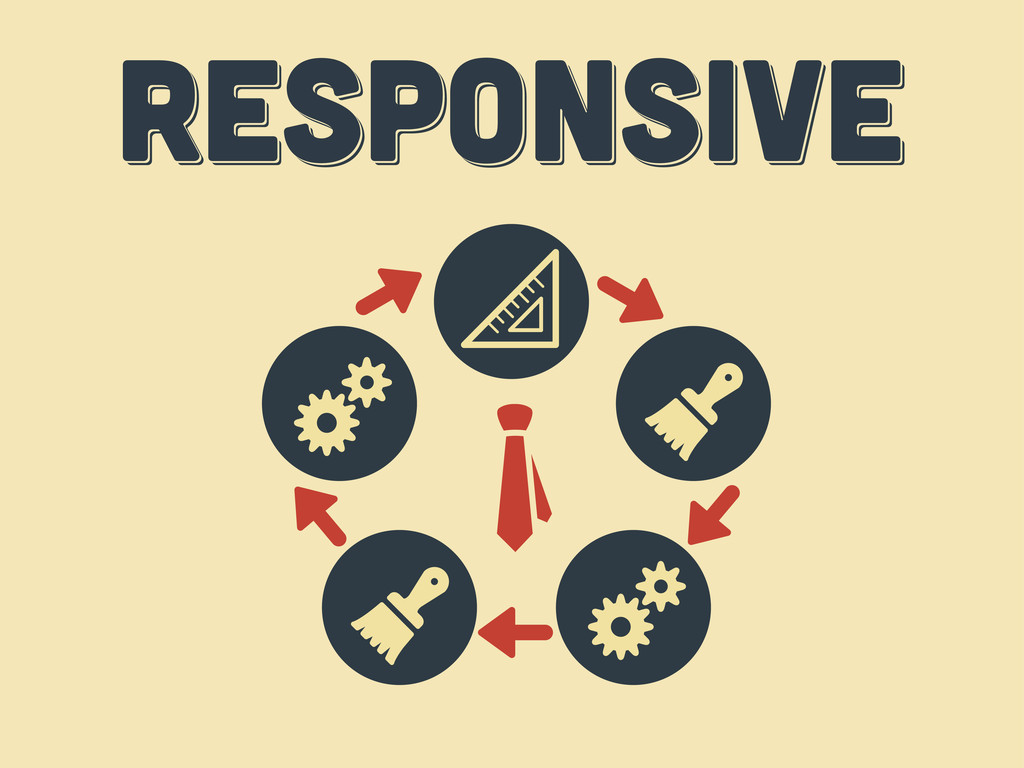
workflow workflow workflow segundo acto
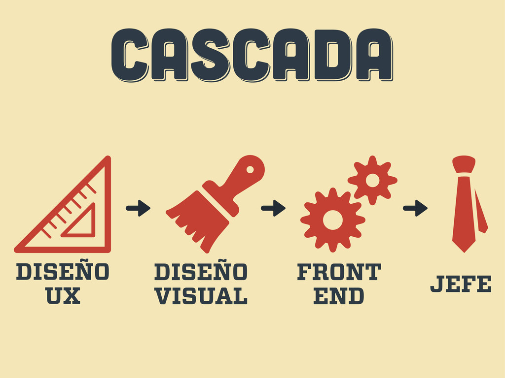
CASCADA CASCADA CASCADA DISEÑO UX DISEÑO VISUAL FRONT END JEFE
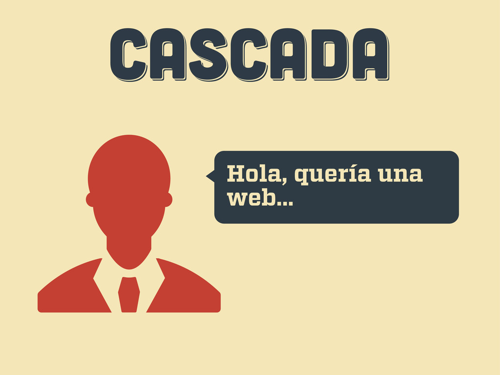
CASCADA CASCADA CASCADA Hola, quería una web...
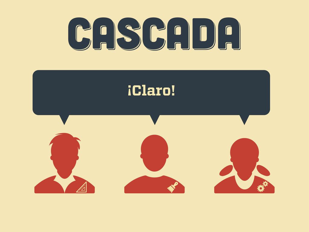
CASCADA CASCADA CASCADA ¡Claro!
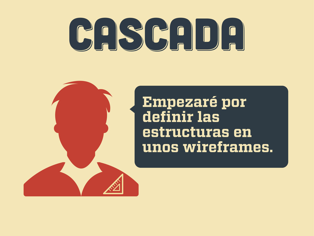
CASCADA CASCADA CASCADA Empezaré por definir las estructuras en unos
wireframes.
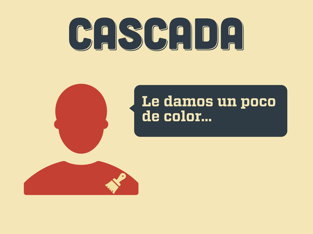
CASCADA CASCADA CASCADA Le damos un poco de color...
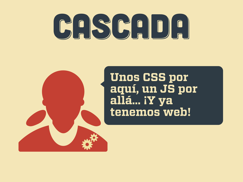
CASCADA CASCADA CASCADA Unos CSS por aquí, un JS por
allá... ¡Y ya tenemos web!
CASCADA CASCADA CASCADA Uh... esto...
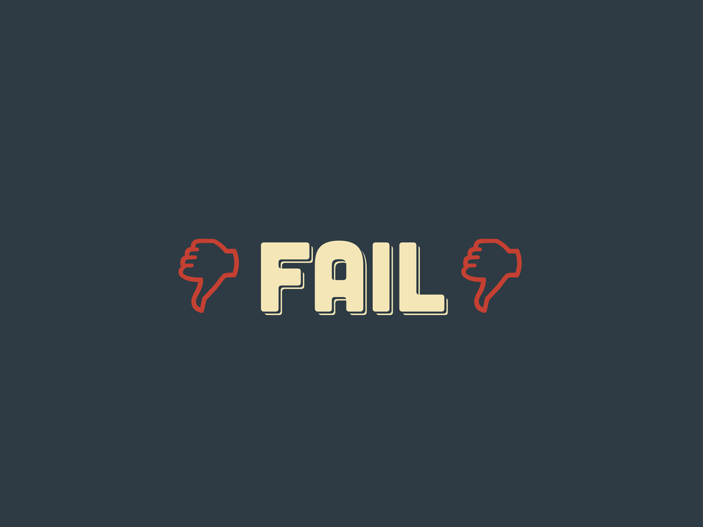
FAIL fail Fail
responsive responsive Responsive
diez consejos diez consejos diez consejos tercer acto
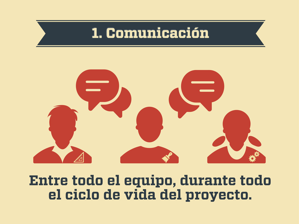
1. Comunicación Entre todo el equipo, durante todo el ciclo
de vida del proyecto.
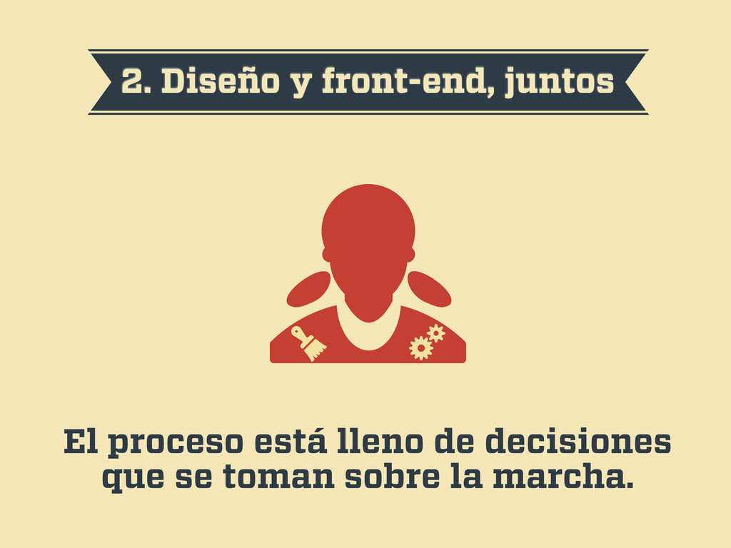
2. Diseño y front-end, juntos El proceso está lleno de
decisiones que se toman sobre la marcha.
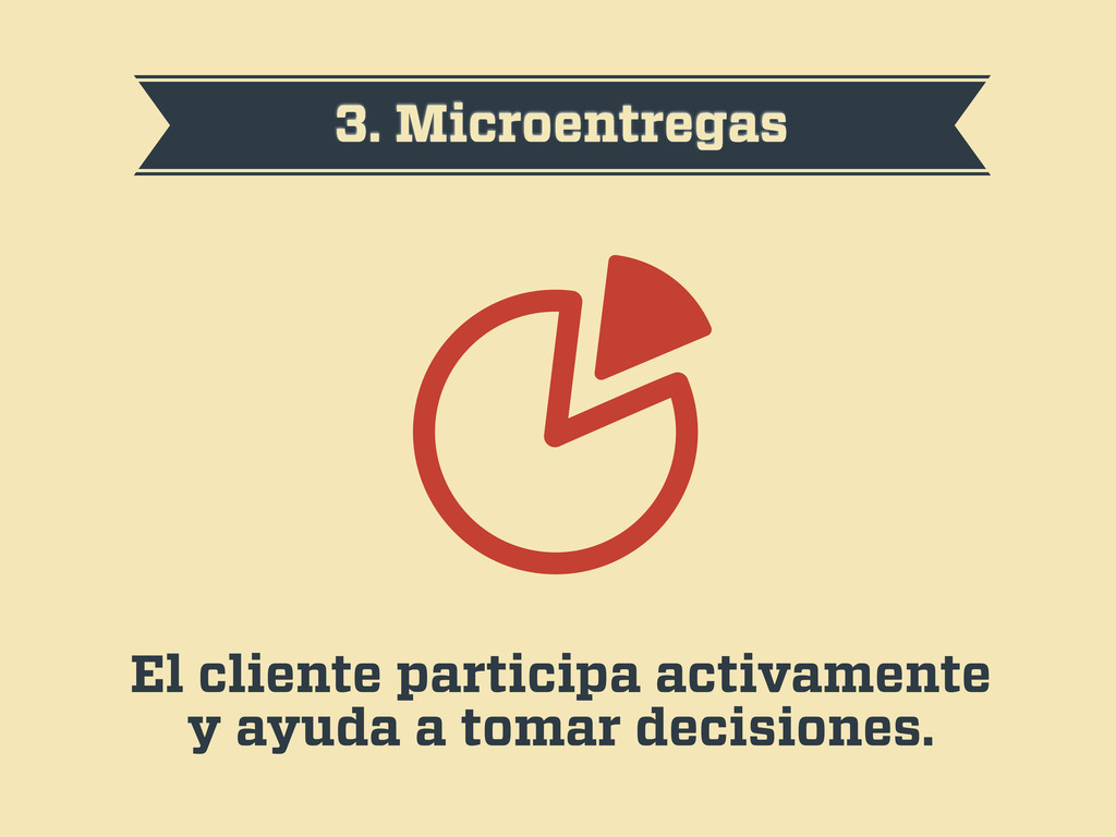
3. Microentregas El cliente participa activamente y ayuda a tomar
decisiones.
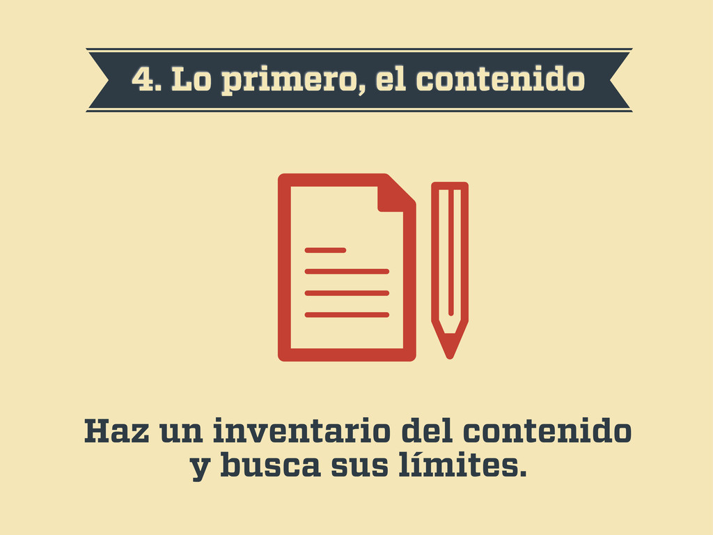
4. Lo primero, el contenido Haz un inventario del contenido
y busca sus límites.
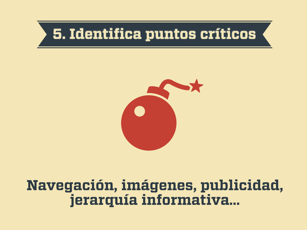
5. Identifica puntos críticos Navegación, imágenes, publicidad, jerarquía informativa…
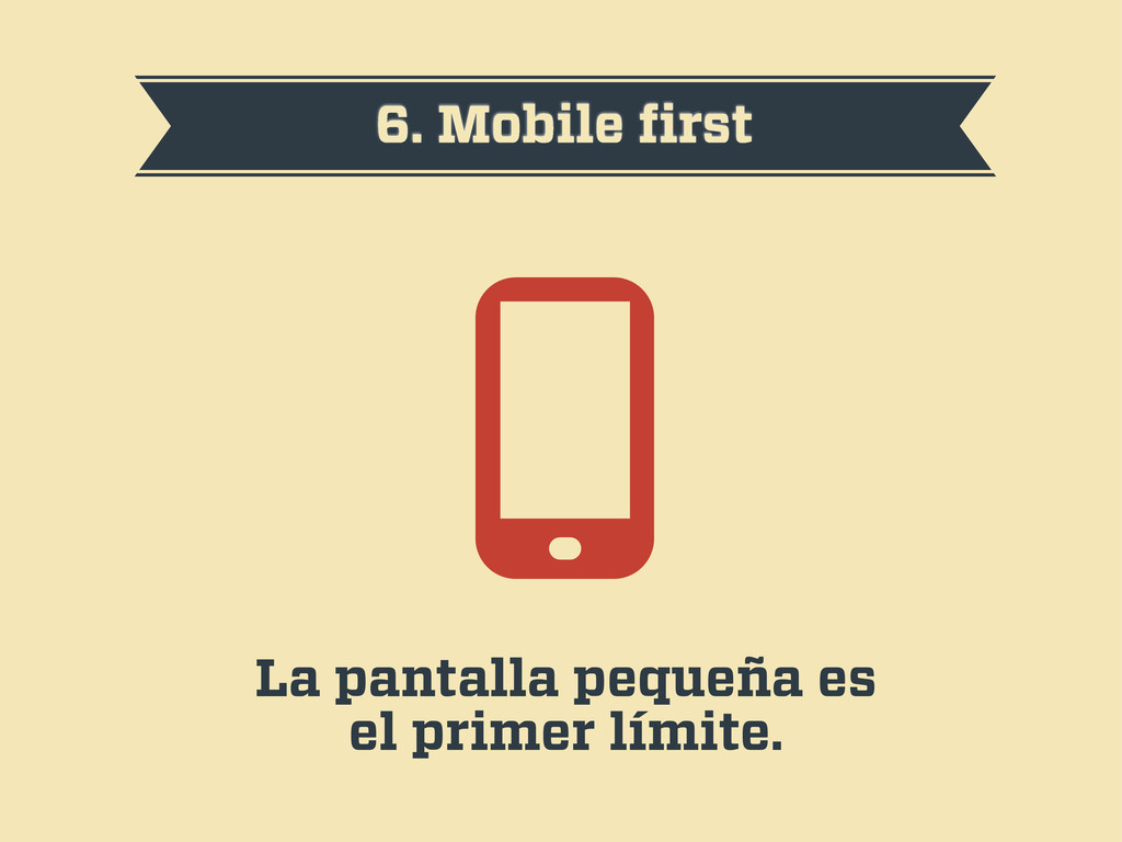
6. Mobile first La pantalla pequeña es el primer límite.
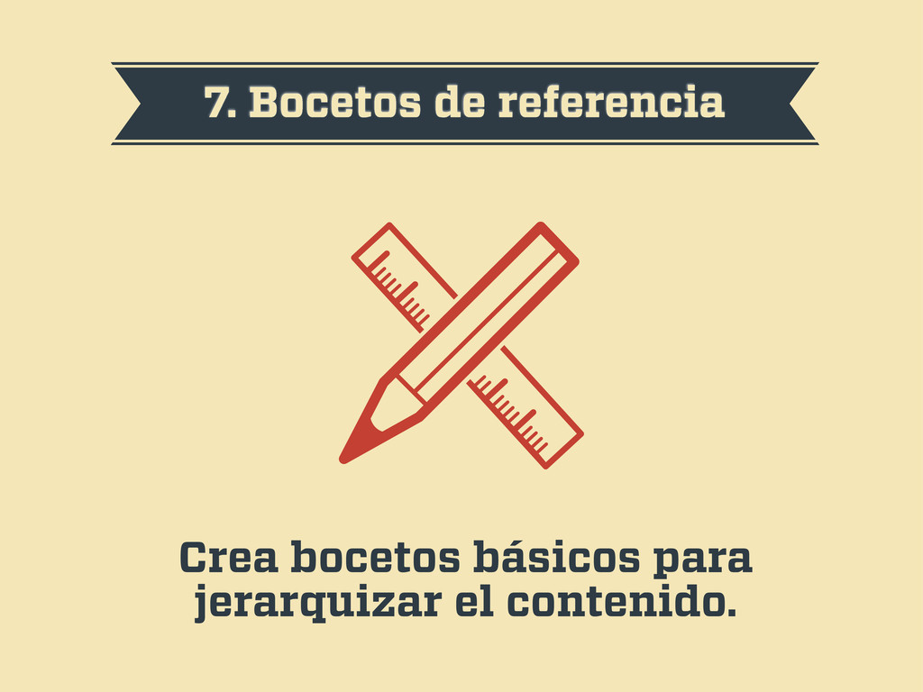
7. Bocetos de referencia Crea bocetos básicos para jerarquizar el
contenido.
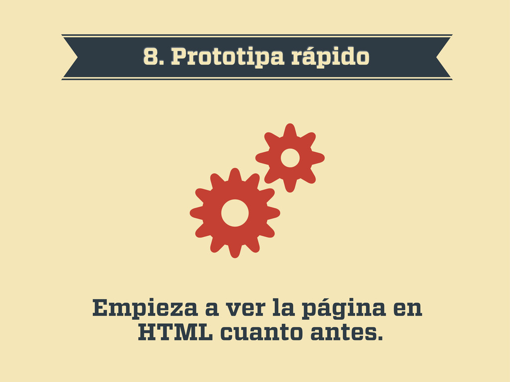
8. Prototipa rápido Empieza a ver la página en HTML
cuanto antes.
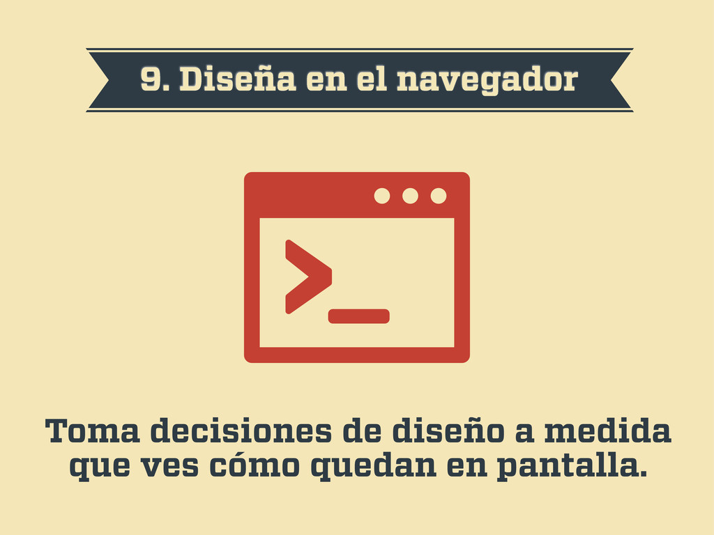
9. Diseña en el navegador Toma decisiones de diseño a
medida que ves cómo quedan en pantalla.
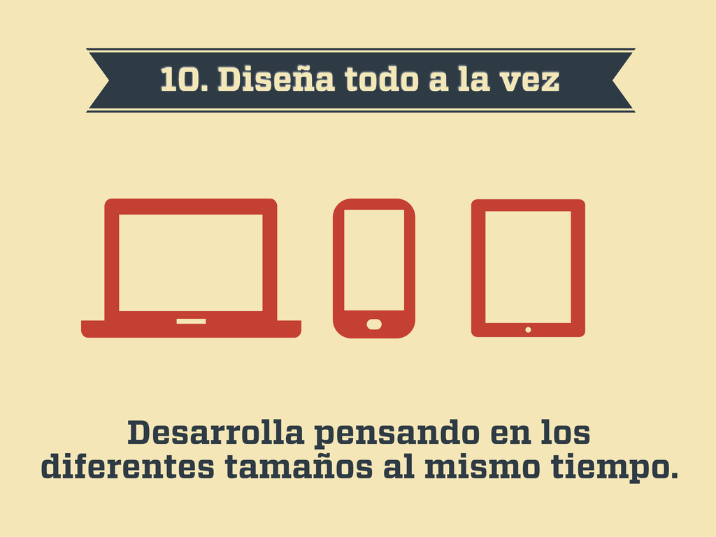
10. Diseña todo a la vez Desarrolla pensando en los
diferentes tamaños al mismo tiempo.
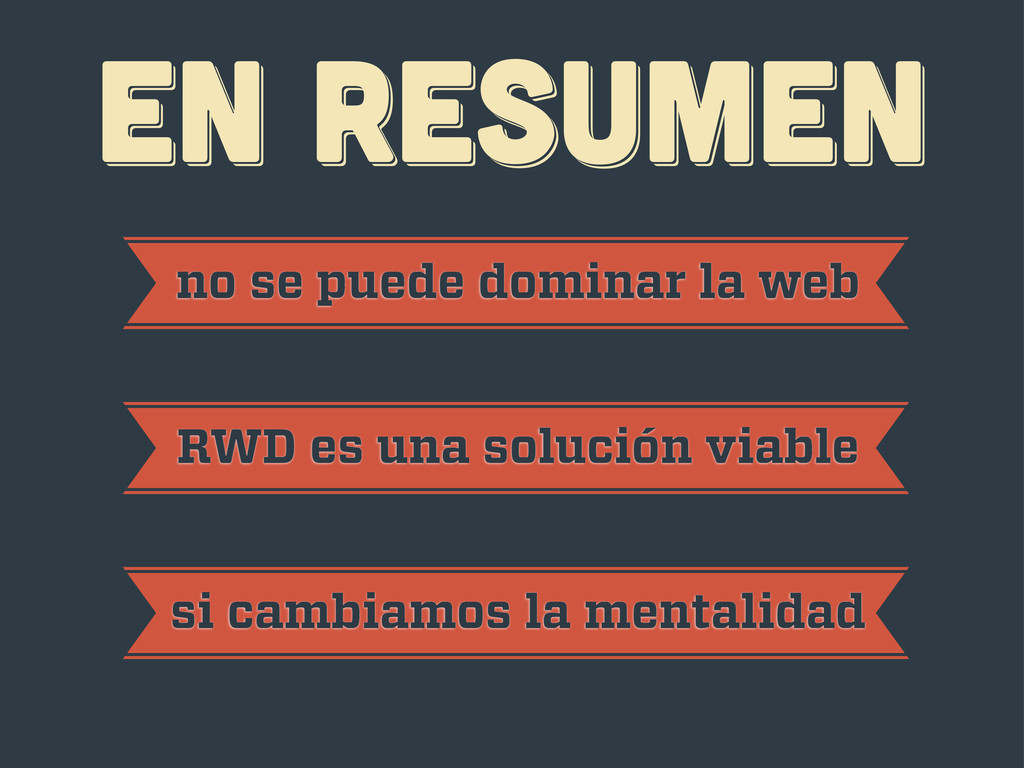
EN RESUMEN EN RESUMEN EN RESUMEN no se puede dominar
la web RWD es una solución viable si cambiamos la mentalidad
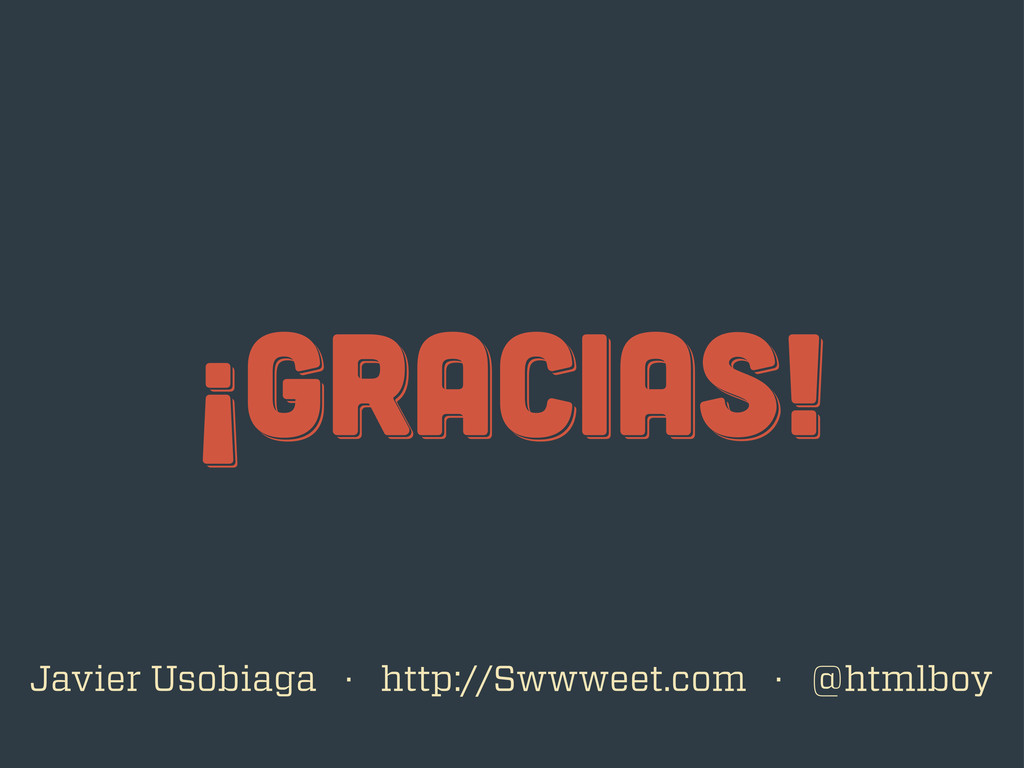
¡gracias! ¡gracias! ¡gracias! Javier Usobiaga · http://Swwweet.com · @htmlboy
 swwweet
 bata_24
 yoshiki0705
 appleboy
 kakehashi
 gotok365
 murachiakira
 you
you
 kintotechdev
 nari_ex
 hiranabe
 takafumisu2uk1
 kazu_kichi_67
 eitanlees
 kristinabergwall1
 sarafernandez
 jdejongh
 sugarenia
 madoxten
 leimatthew05
 tammyeverts
 rkendrick25
 reverentgeek
 bkeepers
 auna
auna