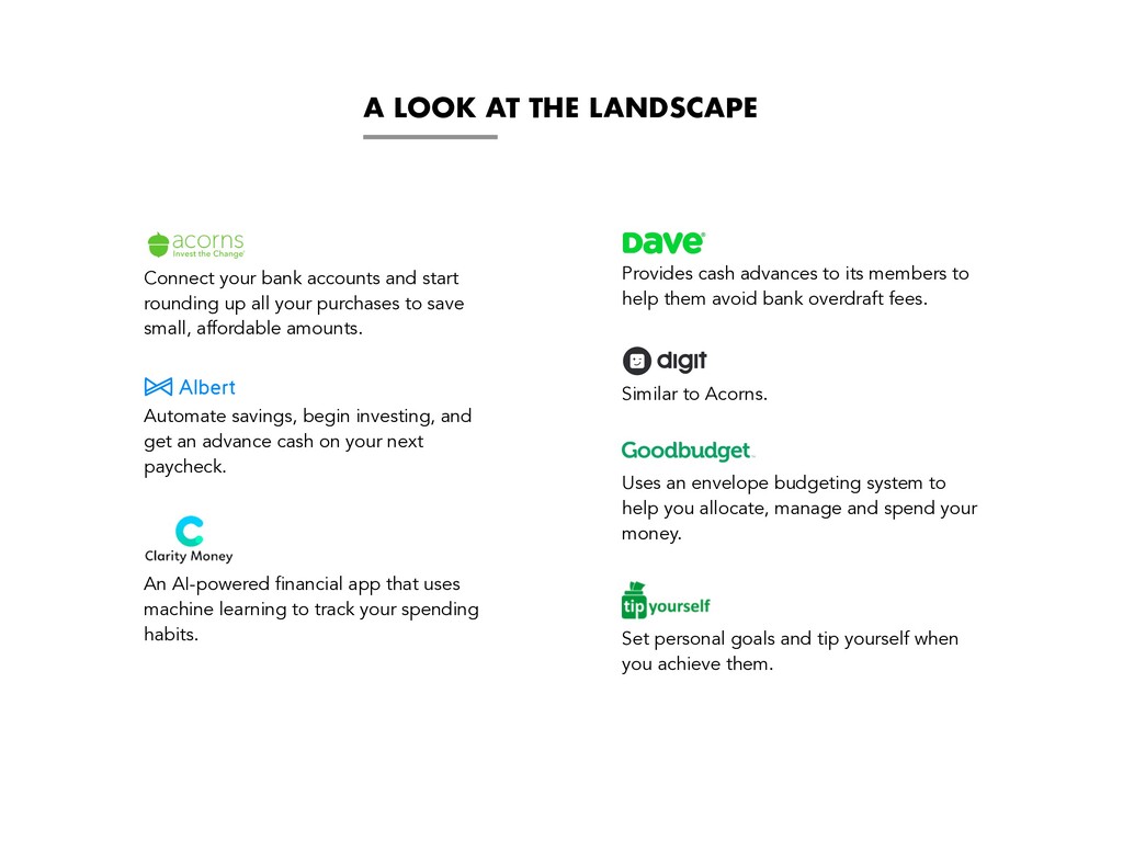
start rounding up all your purchases to save small, affordable amounts. Automate savings, begin investing, and get an advance cash on your next paycheck. An AI-powered financial app that uses machine learning to track your spending habits. Provides cash advances to its members to help them avoid bank overdraft fees. Similar to Acorns. Uses an envelope budgeting system to help you allocate, manage and spend your money. Set personal goals and tip yourself when you achieve them.
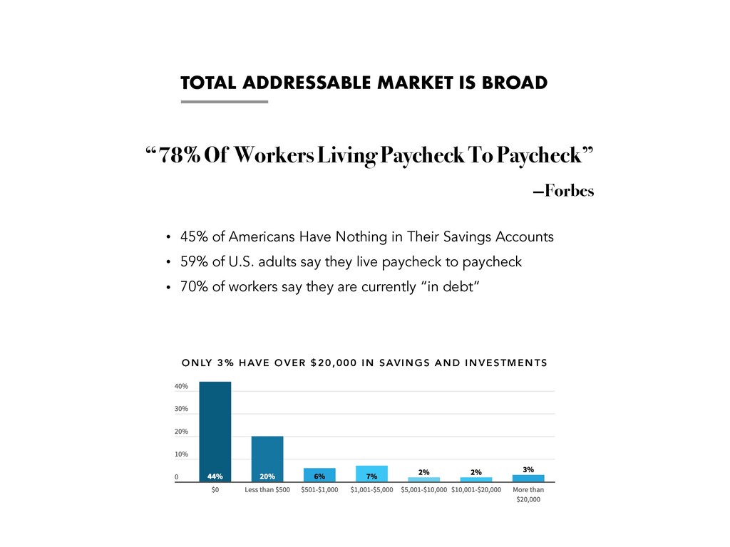
Nothing in Their Savings Accounts • 59% of U.S. adults say they live paycheck to paycheck • 70% of workers say they are currently “in debt” “78% Of Workers Living Paycheck To Paycheck” —Forbes ONLY 3% HAVE OVER $20,000 IN SAVINGS AND INVESTMENTS
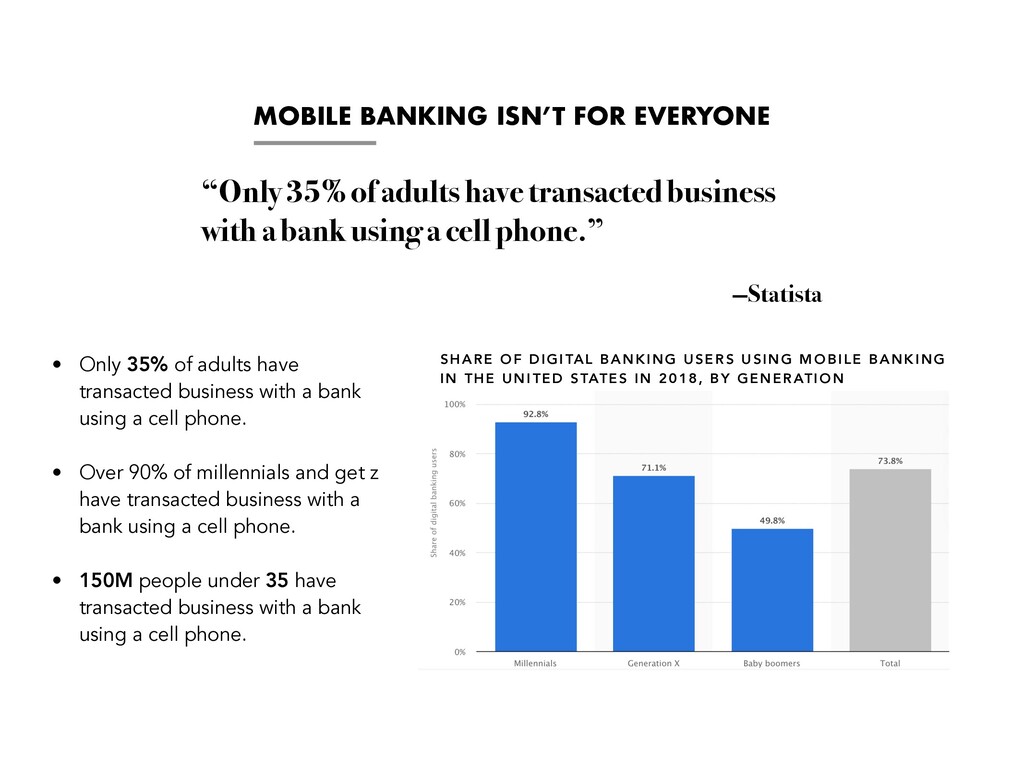
have transacted business with a bank using a cell phone. • Over 90% of millennials and get z have transacted business with a bank using a cell phone. • 150M people under 35 have transacted business with a bank using a cell phone. “Only 35% of adults have transacted business with a bank using a cell phone.” —Statista SHARE OF DIGITAL BANKING USERS USING MOBILE BANKING IN THE UNITED STATES IN 2018, BY GENERATION
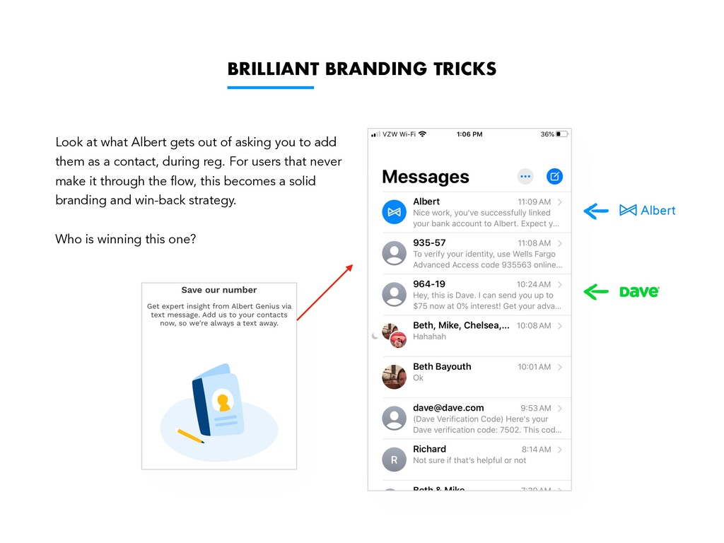
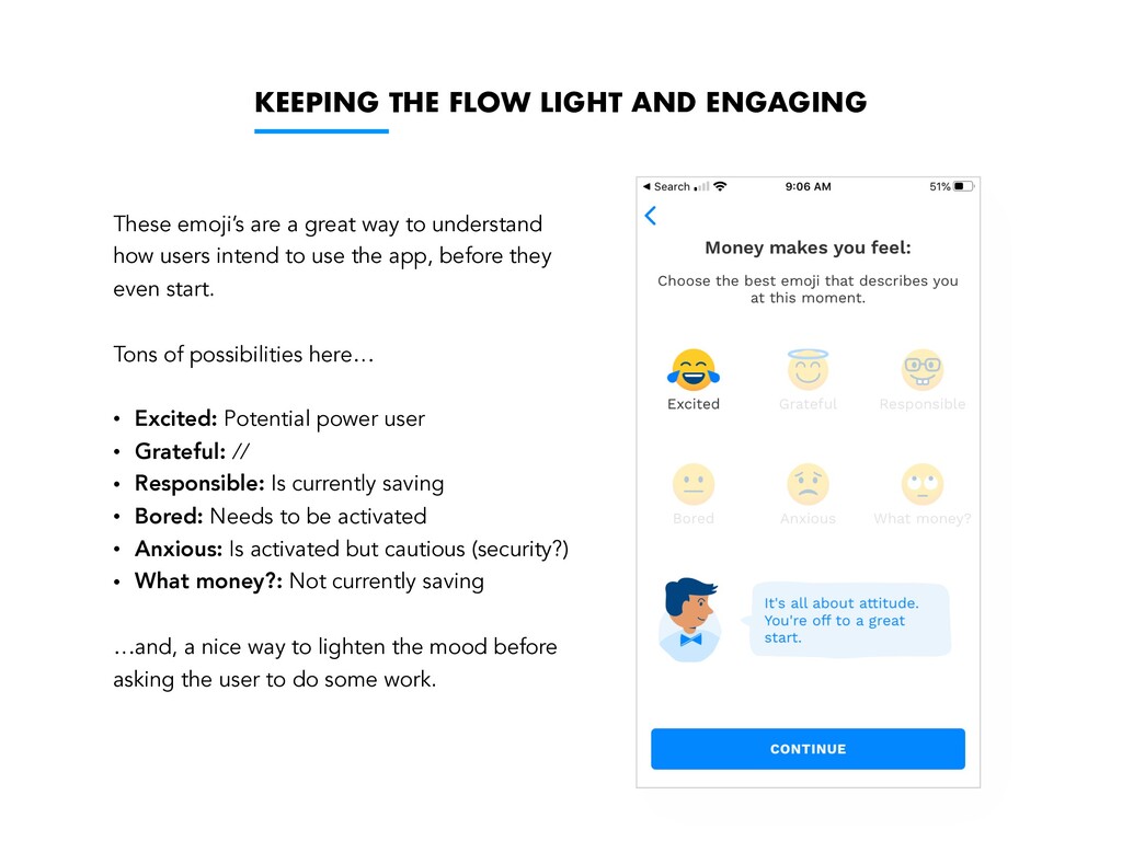
to gen z — their product marketing feels advanced — while at the same time underscoring trust and security. • "Invest with just $1.” Is a great piece of copy with a clear value proposition and and a well-defined target audience. • UI/UX • Cannot understate the importance of guided onboarding experience for apps that ultimately ask for the keys to the castle — Albert does this well. • More attention on pre- reg flow that Dave. However, Dave’s tutorial mode continues well into the post-reg UX. PAID FEATURES • Albert Genius provides a straightforward path to paid membership. However, I question the value of its hallmark feature — “giving you access to expert financial guidance whenever you need it”. Is this audience looking for investment advice or do they simply need an easier way to save? • Looks like billing is done via ACH since they don't appear to be using Apple Subscriptions. How does Apple take their share? And if they don’t, how did Albert get around this? ONBOARDING • Brilliantly incorporates the contact book into the reg flow so future sms communications become branded. • “How does money makes you feel?” emoji selector is a smart way to further commit the user to the flow — before they start asking the tough questions (like “what is your banking credentials?”)
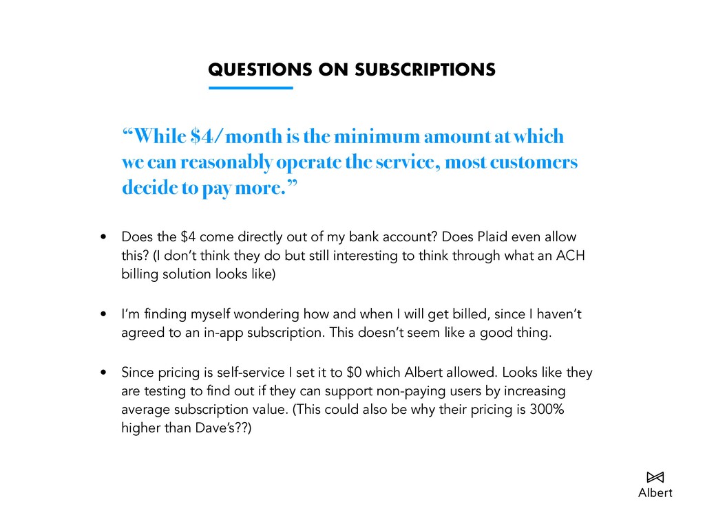
which we can reasonably operate the service, most customers decide to pay more.” • Does the $4 come directly out of my bank account? Does Plaid even allow this? (I don’t think they do but still interesting to think through what an ACH billing solution looks like) • I’m finding myself wondering how and when I will get billed, since I haven’t agreed to an in-app subscription. This doesn’t seem like a good thing. • Since pricing is self-service I set it to $0 which Albert allowed. Looks like they are testing to find out if they can support non-paying users by increasing average subscription value. (This could also be why their pricing is 300% higher than Dave’s??)
asking you to add them as a contact, during reg. For users that never make it through the flow, this becomes a solid branding and win-back strategy. Who is winning this one?
great way to understand how users intend to use the app, before they even start. Tons of possibilities here… • Excited: Potential power user • Grateful: // • Responsible: Is currently saving • Bored: Needs to be activated • Anxious: Is activated but cautious (security?) • What money?: Not currently saving …and, a nice way to lighten the mood before asking the user to do some work.
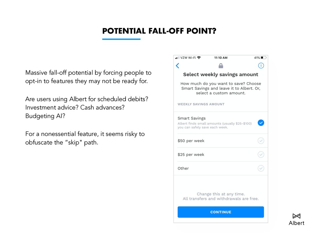
opt-in to features they may not be ready for. Are users using Albert for scheduled debits? Investment advice? Cash advances? Budgeting AI? For a nonessential feature, it seems risky to obfuscate the “skip" path.
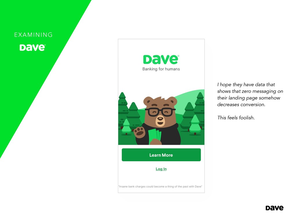
Albert and Dave lies in its user targeting. However, Dave’s playful “ducky doggy horsey” branding strategy may be setting the bar too low, thereby saturating a targeted audience with people who will likely be difficult to monetize. • "Get the only ‘No Overdraft’ checking account…”, is a great piece of copy. • I question whether the “Join over 4,000,000+ members” CTA is working, or not. UI/UX • Again, Dave’s UI is at constant risk of being “too cute”. And for such a deliberate cartooned approach, the artwork is regrettably mediocre. • Interface feels generic and clumsy. There is a broader appeal here — what Cash App is to Venmo — which may appeal to gen z’era but likely not security nuts. • Fails to convey a sense of trust and security, when contrasted against companies such as Acorns, Coin Base, Venmo, and PayPal. PAID FEATURES • The primary way Dave makes money: • $1 memberships • Get an advance • Get a Dave checking account/credit card • Would be interesting to test a subscriptionless model, since the services (checking accounts/loans) are relatively high-margin. • Not competing with Albert’s white glove “investment advisement” offering. ONBOARDING • Like Albert, Dave aims to make the onboarding flow central to the user experience. However, unlike Albert, Dave extends these guardrails well into the app itself, which is likely doing a better job at mitigating retention. • Does well at explaining how everything will work without talking down to the user or stating the obvious.
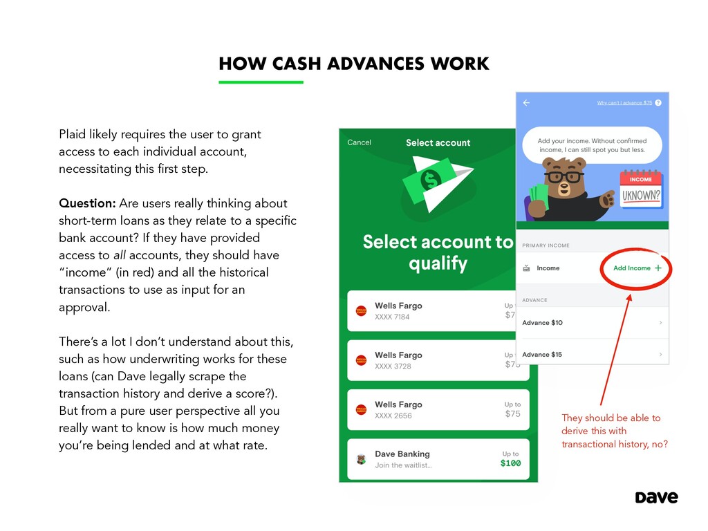
grant access to each individual account, necessitating this first step. Question: Are users really thinking about short-term loans as they relate to a specific bank account? If they have provided access to all accounts, they should have “income” (in red) and all the historical transactions to use as input for an approval. There’s a lot I don’t understand about this, such as how underwriting works for these loans (can Dave legally scrape the transaction history and derive a score?). But from a pure user perspective all you really want to know is how much money you’re being lended and at what rate. They should be able to derive this with transactional history, no?
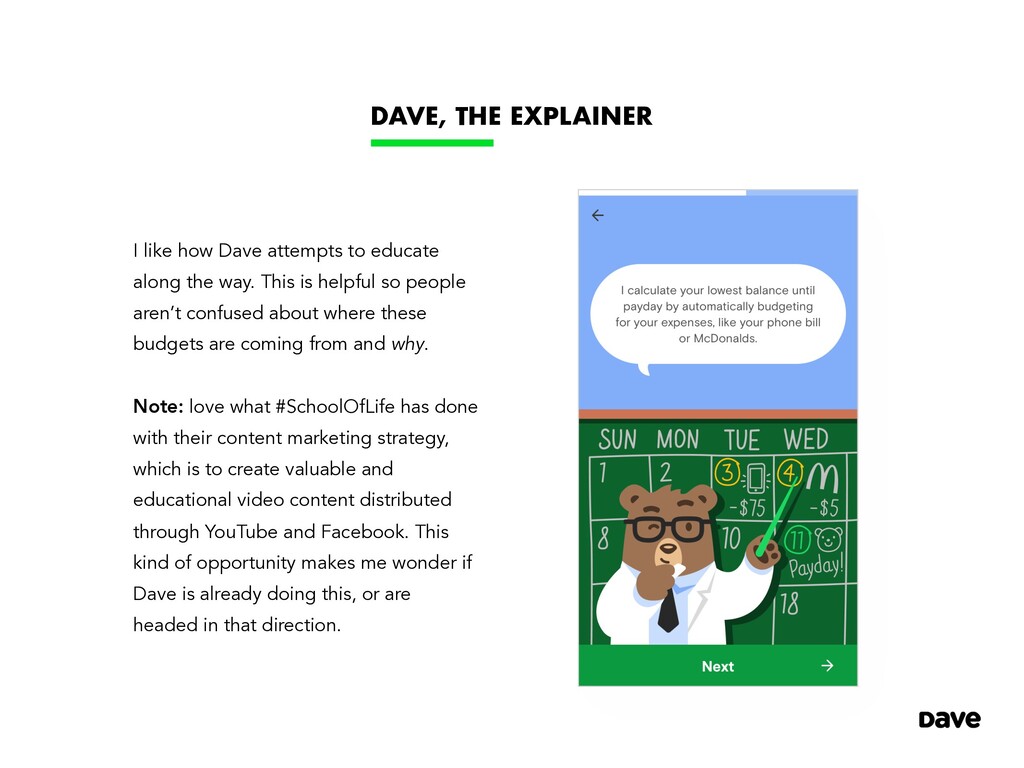
along the way. This is helpful so people aren’t confused about where these budgets are coming from and why. Note: love what #SchoolOfLife has done with their content marketing strategy, which is to create valuable and educational video content distributed through YouTube and Facebook. This kind of opportunity makes me wonder if Dave is already doing this, or are headed in that direction.
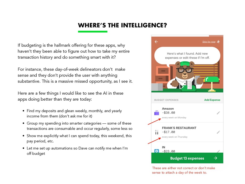
attach a day of the week to. If budgeting is the hallmark offering for these apps, why haven’t they been able to figure out how to take my entire transaction history and do something smart with it? For instance, these day-of-week delineators don’t make sense and they don’t provide the user with anything substantive. This is a massive missed opportunity, as I see it. Here are a few things I would like to see the AI in these apps doing better than they are today: • Find my deposits and glean weekly, monthly, and yearly income from them (don’t ask me for it) • Group my spending into smarter categories — some of these transactions are consumable and occur regularly, some less so • Show me explicitly what I can spend today, this weekend, this pay period, etc. • Let me set up automations so Dave can notify me when I’m off budget WHERE’S THE INTELLIGENCE?
towards mitigating cancellations. This says a lot about how much the $4/$1 month, respective membership costs, contribute to the size of these businesses and the lifetime value a single membership brings. DAVE’S “CANCELLATION” FLOW SAYS A LOT…
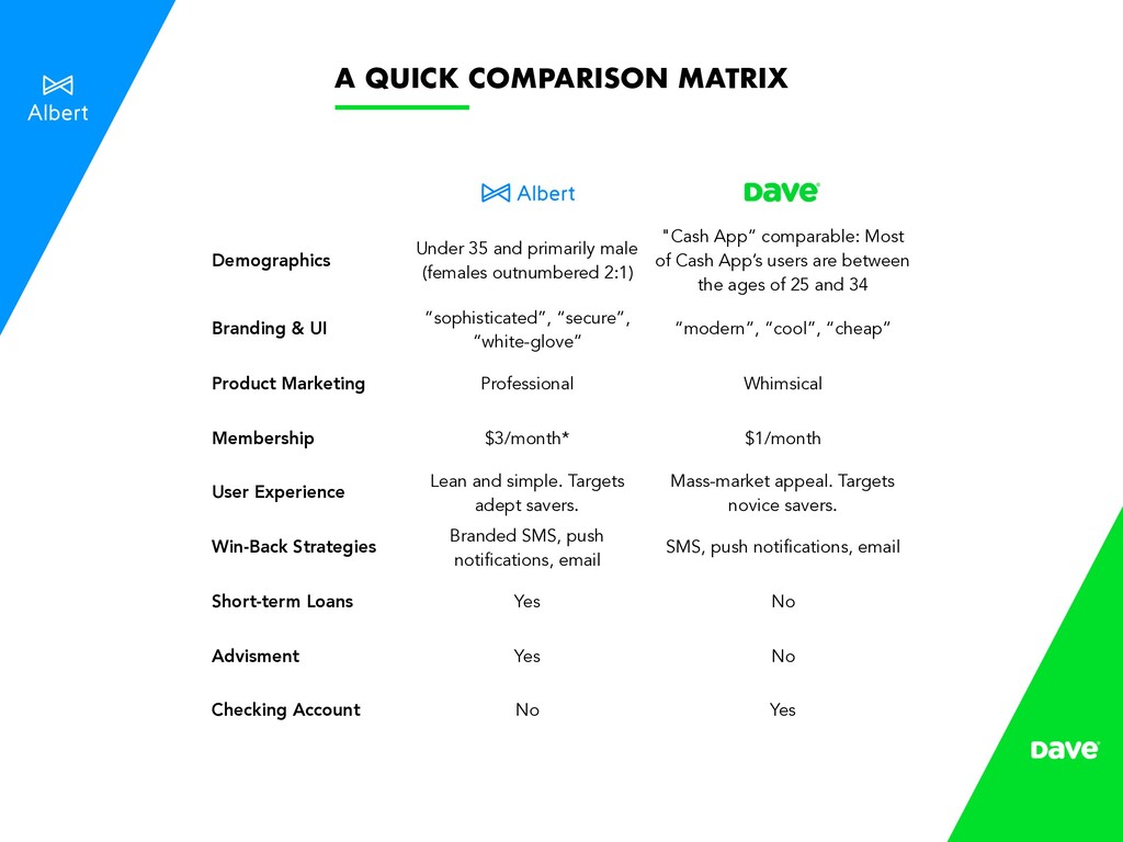
App” comparable: Most of Cash App’s users are between the ages of 25 and 34 Branding & UI “sophisticated”, “secure”, “white-glove” “modern”, “cool”, “cheap” Product Marketing Professional Whimsical Membership $3/month* $1/month User Experience Lean and simple. Targets adept savers. Mass-market appeal. Targets novice savers. Win-Back Strategies Branded SMS, push notifications, email SMS, push notifications, email Short-term Loans Yes No Advisment Yes No Checking Account No Yes A QUICK COMPARISON MATRIX