Upgrade to Pro — share decks privately, control downloads, hide ads and more …

Styling React Applications @jogjajs

Styling React Applications @jogjajs

File presentasi di acara meetup JogjaJS ke 11.

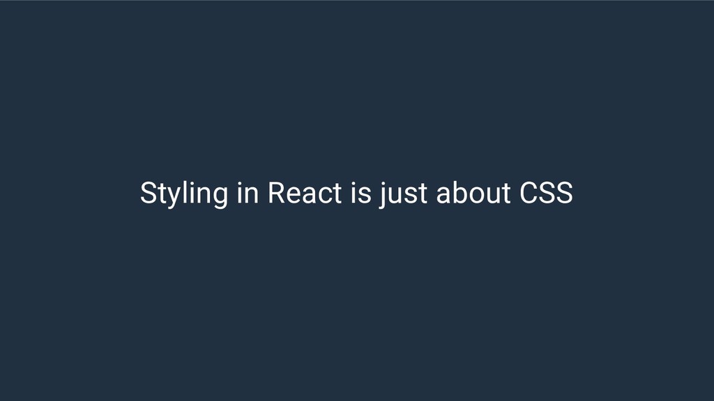
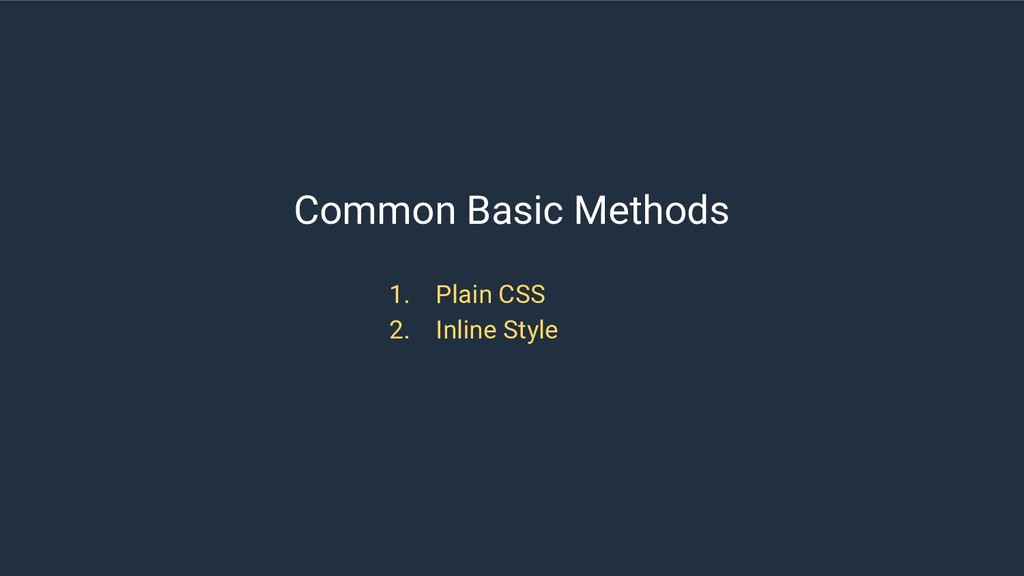
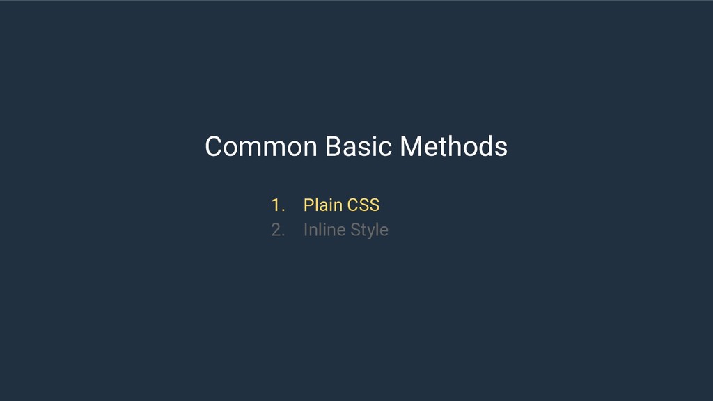
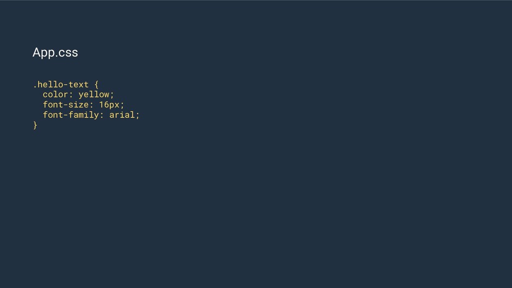
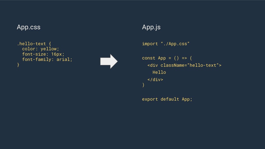
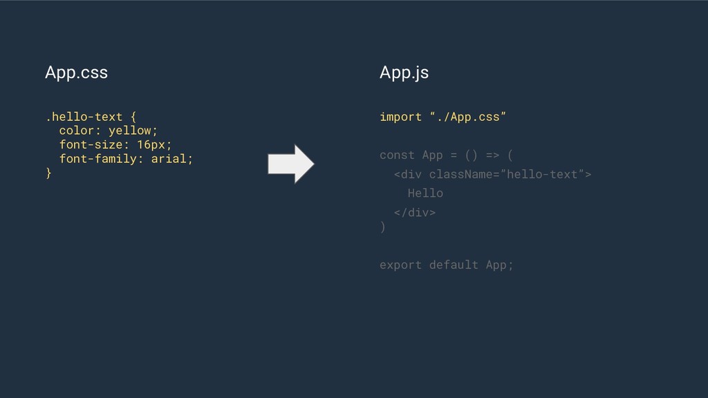
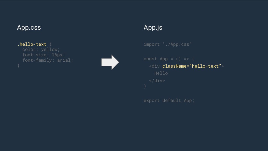
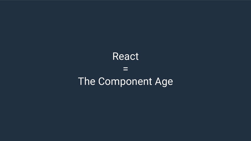
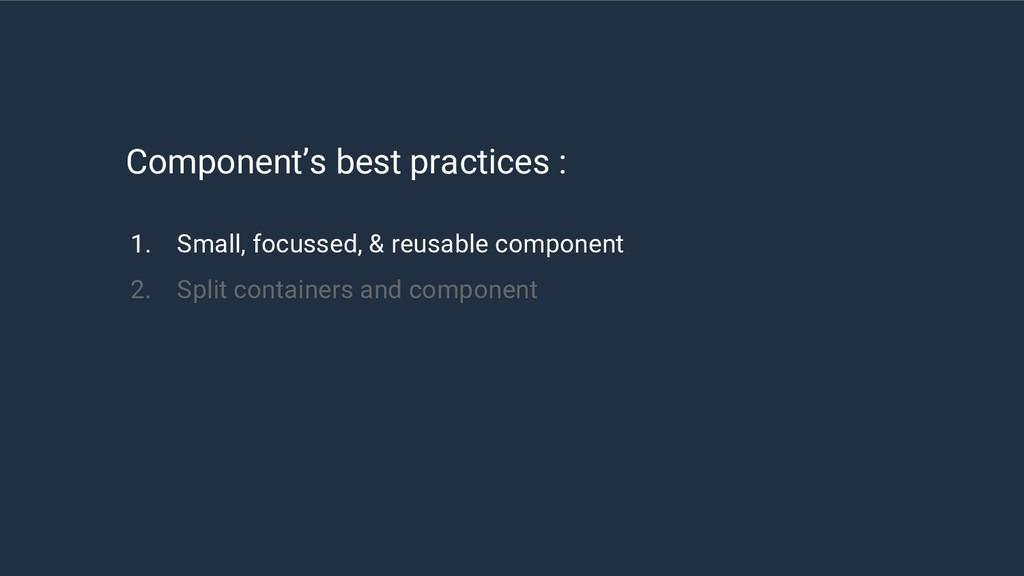
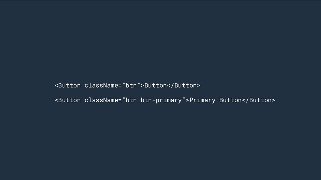
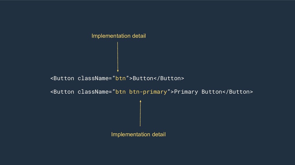
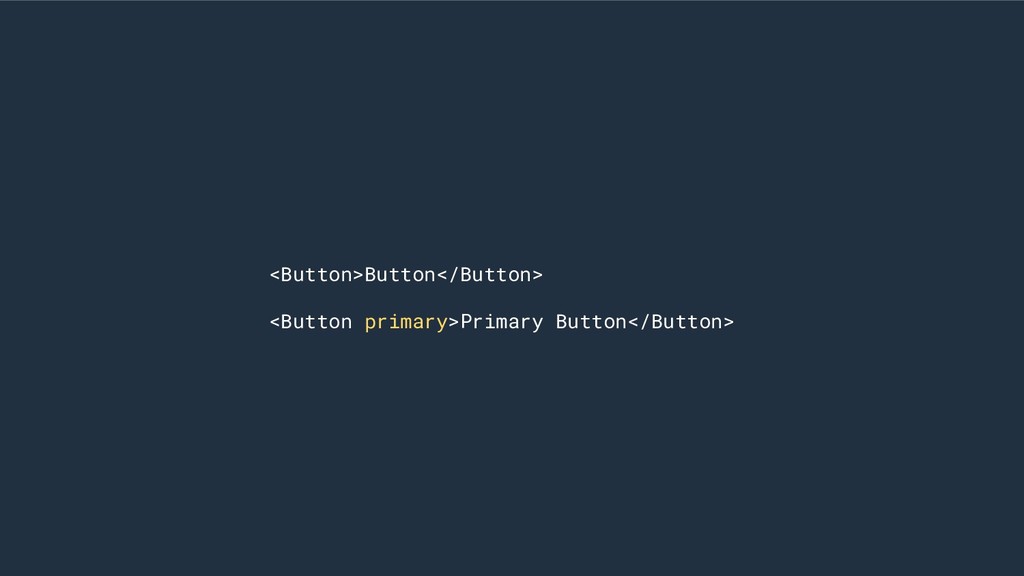
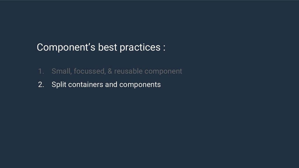
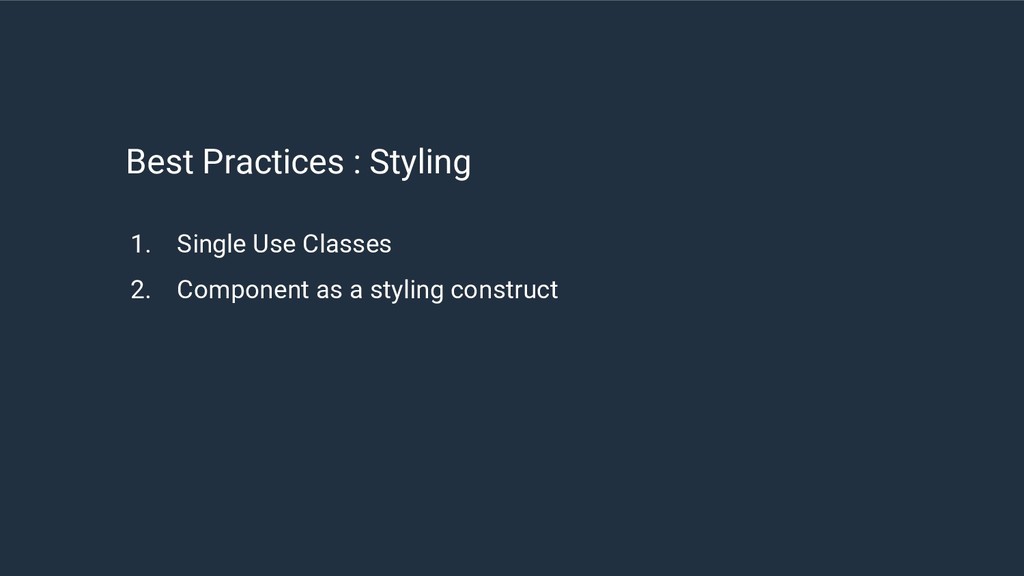
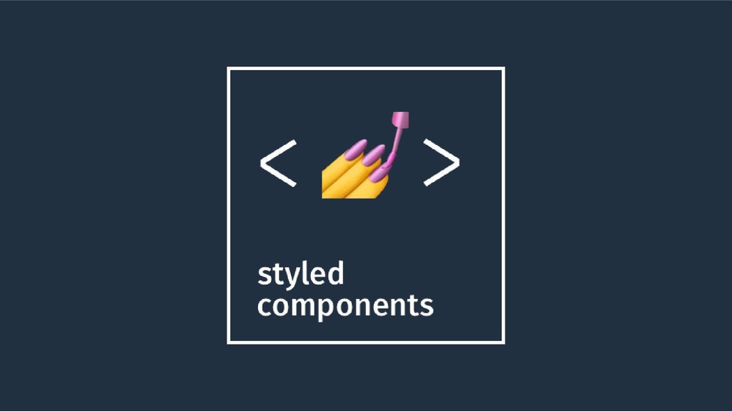
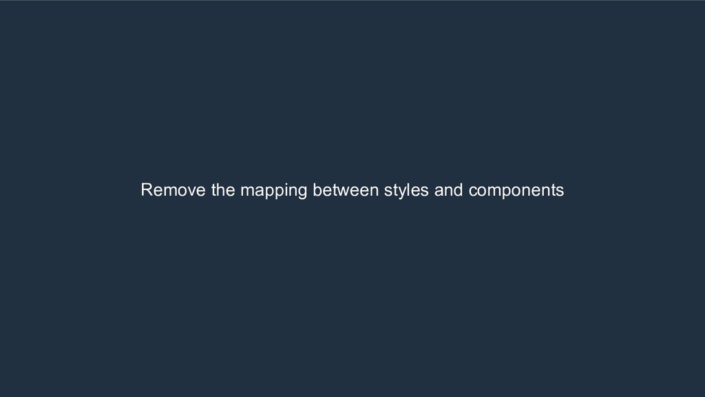
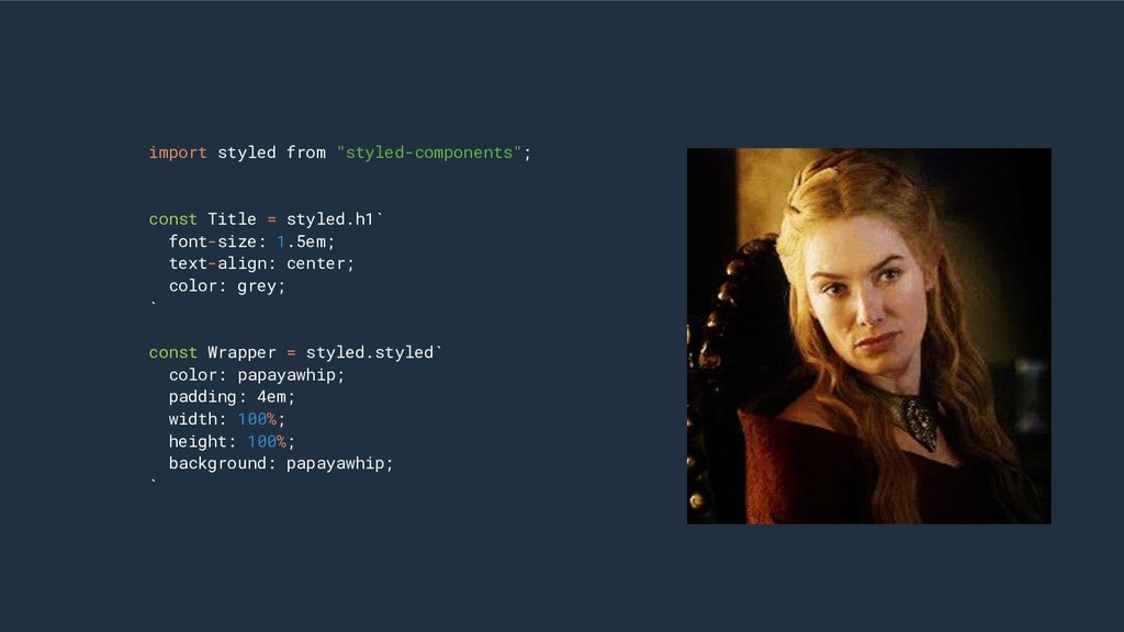
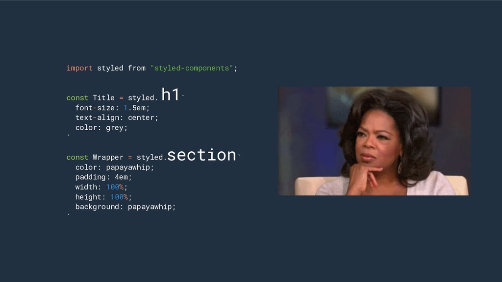
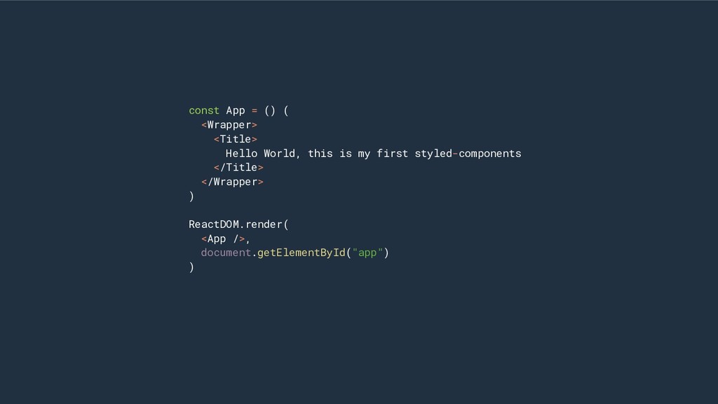
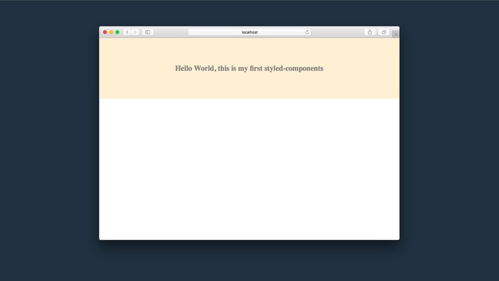
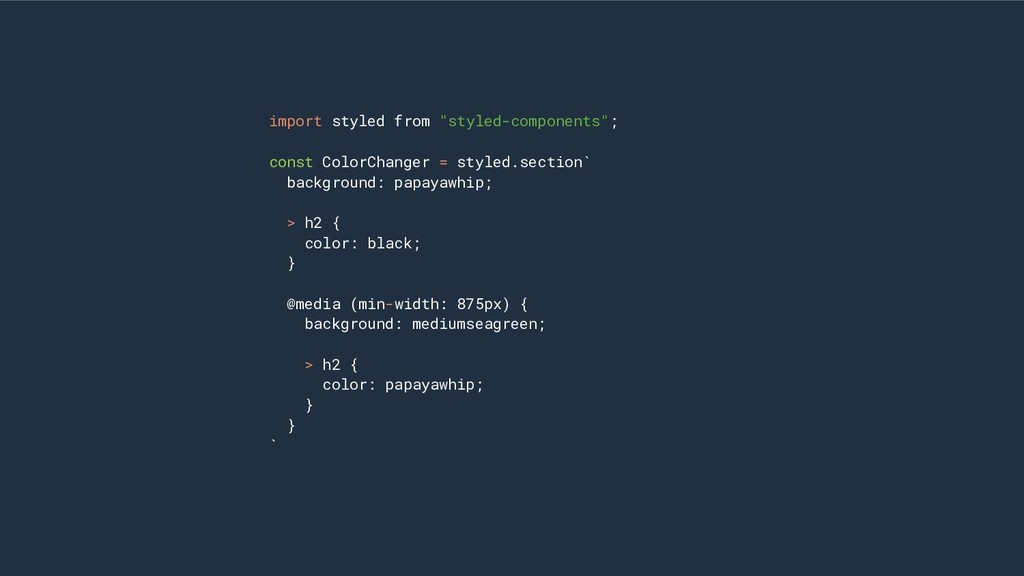
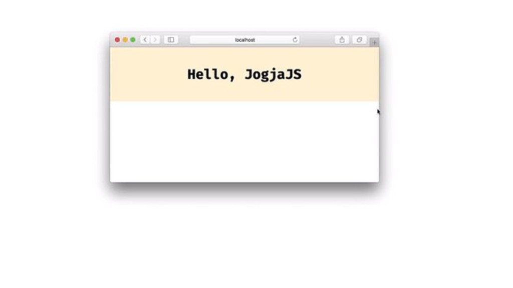
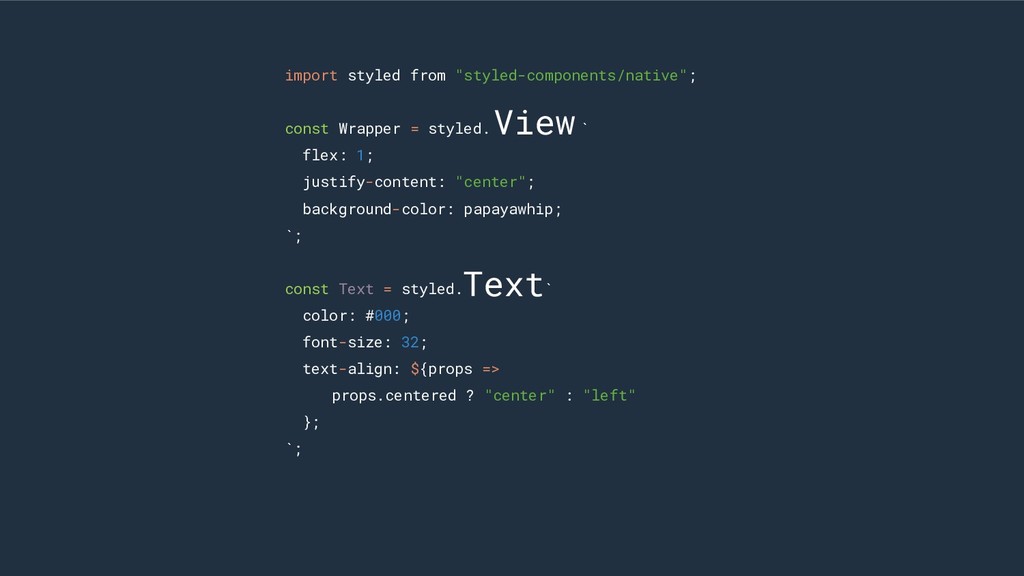
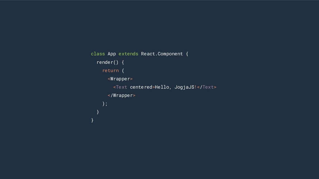
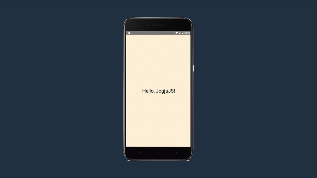
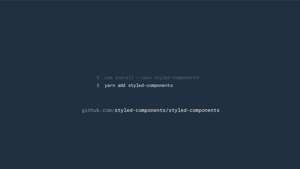
Menjelaskan tentang teknik styling pada aplikasi React, dan mengenalkan styled-components sebagai salah satu library javascript yang dapat digunakan.

Tri Hargianto

April 21, 2018
Tweet

More Decks by Tri Hargianto

Other Decks in Programming

Transcript

  1. .hello-text { color: yellow; font-size: 16px; font-family: arial; } App.css

    import “./App.css” const App = () => ( <div className=”hello-text”> Hello </div> ) export default App; App.js
  2. .hello-text { color: yellow; font-size: 16px; font-family: arial; } App.css

    import “./App.css” const App = () => ( <div className=”hello-text”> Hello </div> ) export default App; App.js
  3. .hello-text { color: yellow; font-size: 16px; font-family: arial; } App.css

    import “./App.css” const App = () => ( <div className=”hello-text”> Hello </div> ) export default App; App.js
  4. Styles will not be localized to your component, It will

    be attached to your DOM elements as Globals. GLOBALS CAN BE A PROBLEM
  5. const Content = ({ title, text, imageURL }) => {

    <div> <h1 style={{ fontSize: “20px”, marginBottom: “10px” }}> {title} </h1> <img src={imageURL} alt={title} style={{ display: “block”, width: “100%” }} /> <p style={{ fontSize: “14px”, fontWeight: “normal”, margin: 0 }} dangerouslySetInnerHTML={{ _html: text }} /> </div> }
  6. const Content = ({ title, text, imageURL }) => {

    <div> <h1 style={{ fontSize: “20px”, marginBottom: “10px” }}> {title} </h1> <img src={imageURL} alt={title} style={{ display: “block”, width: “100%” }} /> <p style={{ fontSize: “14px”, fontWeight: “normal”, margin: 0 }} dangerouslySetInnerHTML={{ _html: text }} /> </div> }
  7. const content = ({ title, text, imageURL }) => {

    <div> <h1 style={styles.title}> {title} </h1> <img src={imageURL} alt={title} style={styles.image} /> <p style={styles.text} dangerouslySetInnerHTML={{ _html: text }} /> </div> } const styles = { title: { fontSize: “20px”, marginBottom: “10px” }, image: { display: “block”, width: “100%” }, text: { fontSize: “14px”, fontWeight: “normal”, margin: 0 } }
  8. const content = ({ title, text, imageURL }) => {

    <div> <h1 style={styles.title}> {title} </h1> <img src={imageURL} alt={title} style={styles.image} /> <p style={styles.text} dangerouslySetInnerHTML={{ _html: text }} /> </div> } Camel Case No pseudo-classes No CSS Animations const styles = { title: { fontSize: “20px”, marginBottom: “10px” }, image: { display: “block”, width: “100%” }, text: { fontSize: “14px”, fontWeight: “normal”, margin: 0 } }
  9. class Sidebar extends Component { state = { items: []

    } componentDidMount() { fetch("/api.com/sidebar") .then(res => { this.setState({ items: res.items }) }) } render() { return ( <div className="sidebar"> {this.state.items.map(item => ( <div className="sidebar__item"> {item} </div> ))} </div> ); } }
  10. class Sidebar extends Component { state = { items: []

    } componentDidMount() { fetch("/api.com/sidebar") .then(res => { this.setState({ items: res.items }) }) } render() { return ( <Sidebar> {this.state.items.map(item => ( <SidebarItem item={item} /> ))} </Sidebar> ); } }
  11. class Sidebar extends Component { state = { items: []

    } componentDidMount() { fetch("/api.com/sidebar") .then(res => { this.setState({ items: res.items }) }) } render() { return ( <Sidebar> {this.state.items.map(item => ( <SidebarItem item={item} /> ))} </Sidebar> ); } }
  12. import styled from "styled-components"; const Title = styled.h1` font-size: 1.5em;

    text-align: center; color: grey; ` const Wrapper = styled.styled` color: papayawhip; padding: 4em; width: 100%; height: 100%; background: papayawhip; `
  13. import styled from "styled-components"; const Title = styled. ` font-size:

    1.5em; text-align: center; color: grey; ` const Wrapper = styled. ` color: papayawhip; padding: 4em; width: 100%; height: 100%; background: papayawhip; ` h1 section
  14. const App = () ( <Wrapper> <Title> Hello World, this

    is my first styled-components </Title> </Wrapper> ) ReactDOM.render( <App />, document.getElementById("app") )
  15. import styled from "styled-components"; const ColorChanger = styled.section` background: papayawhip;

    > h2 { color: black; } @media (min-width: 875px) { background: mediumseagreen; > h2 { color: papayawhip; } } `
  16. const Button = styled.button` /* Adapt the colors based on

    primary props */ background: ${props => props.primary ? 'papayawhip' : 'white' }; color: ${props => props.primary ? 'white' : ‘papayawhip’ }; font-size: 1em; margin: 1em; padding: 0.25em 1em; border: 2px solid palevioletred; border-radius: 3px; ` export default Button;
  17. import { ThemeProvider } from "styled-compoenents"; const redTheme = {

    primary: 'red' }; const App = () => ( <ThemeProvider theme={redTheme}> <Button>Press Me Please</Button> </ThemeProvider> )
  18. import styled from "styled-compoenents"; const Button = styled.button` /* Adjust

    background on the theme */ background: ${props => props.theme.primary}; color: white; padding: 10px; `
  19. const redTheme = { primary: "red" } <ThemeProvider theme={redTheme}> <Button>Press

    Me Please</Button> </ThemeProvider> const blueTheme = { primary: "blue" } <ThemeProvider theme={blueTheme}> <Button>Press Me Please</Button> </ThemeProvider>
  20. import styled from "styled-components/native"; const Wrapper = styled.View` flex: 1;

    justify-content: "center"; background-color: papayawhip; `; const Text = styled.Text` color: #000; font-size: 32; text-align: ${props => props.centered ? "center" : "left" }; `;
  21. import styled from "styled-components/native"; const Wrapper = styled. ` flex:

    1; justify-content: "center"; background-color: papayawhip; `; const Text = styled. ` color: #000; font-size: 32; text-align: ${props => props.centered ? "center" : "left" }; `; View Text
  22. class App extends React.Component { render() { return ( <Wrapper>

    <Text centered>Hello, JogjaJS!</Text> </Wrapper> ); } }