Upgrade to Pro — share decks privately, control downloads, hide ads and more …

Responsive Design & Development

maxshelley
October 03, 2012

Responsive Design & Development

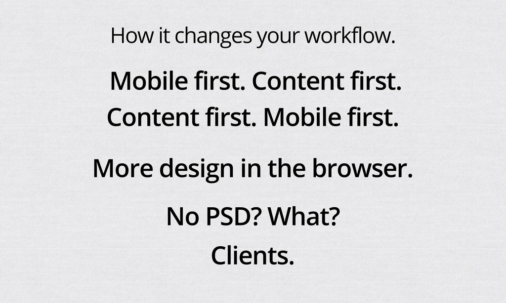
A short talk I gave at IPRUG, a development-orientated group which aimed to be an introduction to responsive layouts, provide some links to useful resources and highlight some of the pro's and con's with this approach to mobile development.

I've tried to provide attribution and links to everything, but if I've missed anything please let me know at twitter.com/maxshelley

maxshelley

October 03, 2012
Tweet

More Decks by maxshelley

Other Decks in Design

Transcript

  1. “an approach to web design in which a designer intends

    to provide an optimal viewing experience—easy reading and navigation with a minimum of resizing, panning, and scrolling—across a wide range of devices (from desktop computer monitors to mobile phones)” - Wikipedia “Use CSS media queries to make layout changes based on viewport size, pixel density and orientation.” - Me
  2. @media only screen and (max-width:599px) { .class_name { border-color: red;

    } } @media only screen and (min-width:600px) and (max-width:767px) { .class_name { border-color: red; } } @media (min-width: 768px) and (max-width: 979px) { .row-fluid .span12 { width: 99.999999993%; *width: 99.9468085036383%; } .row-fluid .span11 { width: 91.436464082%; *width: 91.38327259263829%; } .row-fluid .span10 { width: 82.87292817100001%; *width: 82.8197366816383%; } .row-fluid .span9 { width: 74.30939226%; *width: 74.25620077063829%; } .row-fluid .span8 { width: 65.74585634900001%; *width: 65.6926648596383%; } .row-fluid .span7 { width: 57.182320438000005%; *width: 57.129128948638304%; } .row-fluid .span6 { width: 48.618784527%; *width: 48.5655930376383%; } .row-fluid .span5 { width: 40.055248616%; *width: 40.0020571266383%; } .row-fluid .span4 { width: 31.491712705%; *width: 31.4385212156383%; } .row-fluid .span3 { width: 22.928176794%; *width: 22.874985304638297%; } .row-fluid .span2 { width: 14.364640883%; *width: 14.311449393638298%; } .row-fluid .span1 { width: 5.801104972%; *width: 5.747913482638298%; } }
  3. • Sites with a high (or rising) percentage of mobile

    traffic. • Sites that represent other mobile content e.g. websites for apps, web apps etc. • Lightweight eCommerce. • Content-based sites. • Landing pages. • Anyone (if they’re willing to do the legwork and check that it’s doing what they need it to do).
  4. • Web-apps (although you can use elements of it). •

    Fully-targeted/tested content i.e. If you want mobile users to see mobile-only content. • Heavily optimised sites (there’s a trade-off there). • Image-heavy content (again, unless you’re willing to put in the legwork). • You’ll probably know if it’s not right...
  5. How it changes your workflow. Content first. Mobile first. Mobile

    first. Content first. More design in the browser. Clients. No PSD? What?
  6. http://www.netmagazine.com/features/top-responsive-web-design-problems-and-how-avoid-them • Explaining RWD to clients • The lack of

    a static design phase • Navigation • Images • Tables • Converting old fixed-width sites • What to serve users of old versions of IE • Testing time and cost
  7. Responsive Navigation Patterns http://bradfrostweb.com/blog/web/responsive-nav-patterns/ • Top Nav or “Do Nothing”

    Approach • The Footer Anchor • The Select Menu • The Toggle • The Left Nav Flyout • The Footer Only • The “Hide and Cry”
  8. Responsive Navigation Patterns http://bradfrostweb.com/blog/web/responsive-nav-patterns/ • Top Nav or “Do Nothing”

    Approach • The Footer Anchor • The Select Menu • The Toggle • The Left Nav Flyout • The Footer Only • The “Hide and Cry”
  9. Responsive Navigation Patterns http://bradfrostweb.com/blog/web/responsive-nav-patterns/ • Top Nav or “Do Nothing”

    Approach • The Footer Anchor • The Select Menu • The Toggle • The Left Nav Flyout • The Footer Only • The “Hide and Cry”
  10. Responsive Navigation Patterns http://bradfrostweb.com/blog/web/responsive-nav-patterns/ • Top Nav or “Do Nothing”

    Approach • The Footer Anchor • The Select Menu • The Toggle • The Left Nav Flyout • The Footer Only • The “Hide and Cry”
  11. Responsive Navigation Patterns http://bradfrostweb.com/blog/web/responsive-nav-patterns/ • Top Nav or “Do Nothing”

    Approach • The Footer Anchor • The Select Menu • The Toggle • The Left Nav Flyout • The Footer Only • The “Hide and Cry”
  12. Responsive Navigation Patterns http://bradfrostweb.com/blog/web/responsive-nav-patterns/ • Top Nav or “Do Nothing”

    Approach • The Footer Anchor • The Select Menu • The Toggle • The Left Nav Flyout • The Footer Only • The “Hide and Cry”
  13. Images http://css-tricks.com/which-responsive-images-solution-should-you-use/ • Do I have legacy content? • Do

    I care about special markup? • Do I care about semantics? • Do I care about validity? • Do I care about art direction? • Do I care about JavaScript? • Do I care about Server Side Components? • Do I care about bandwidth testing? • Do I care about relying on third parties? • Is there a specific CMS with specific CMS powers involved? • Can I wait for the future?