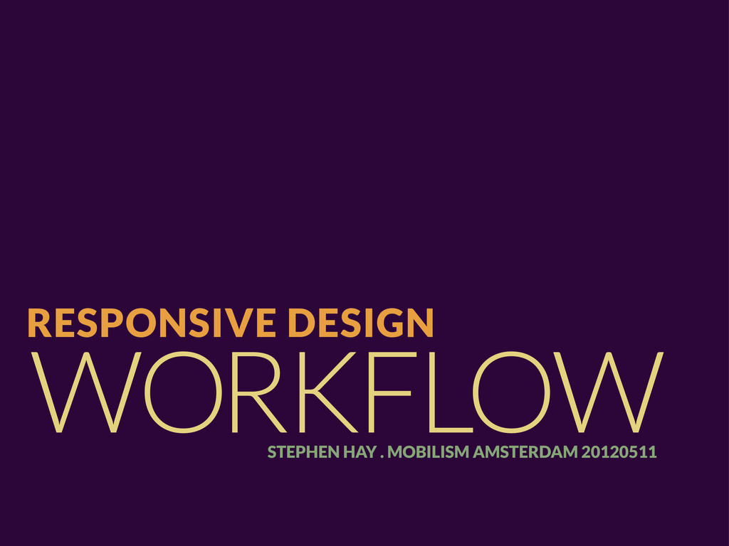
Slides for my talk at Mobilism 2012, which are practically identical to the slides from BDConf, but some might find it useful to see the exact slides from Mobilism.
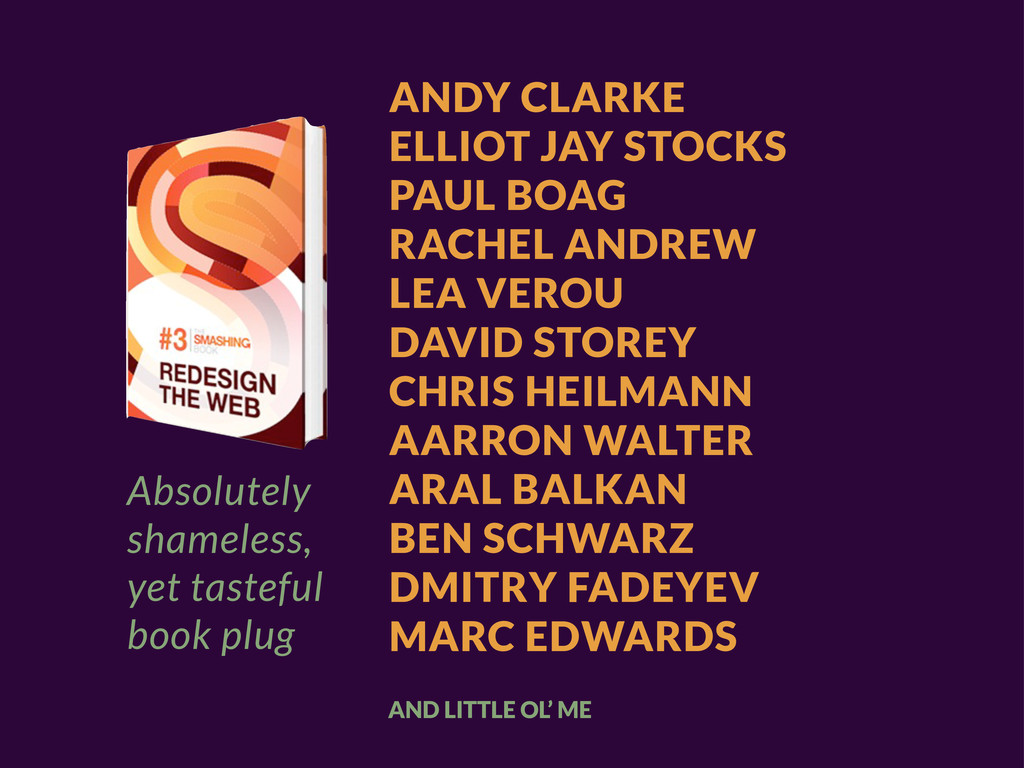
VEROU DAVID STOREY CHRIS HEILMANN AARRON WALTER ARAL BALKAN BEN SCHWARZ DMITRY FADEYEV MARC EDWARDS AND LITTLE OL’ ME Absolutely shameless, yet tasteful book plug
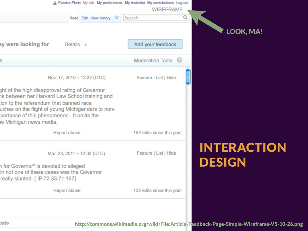
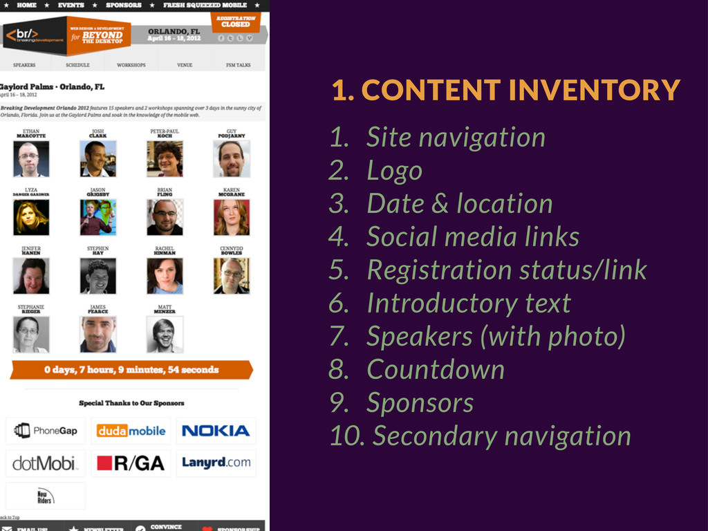
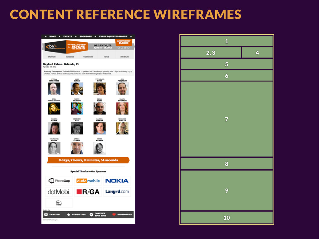
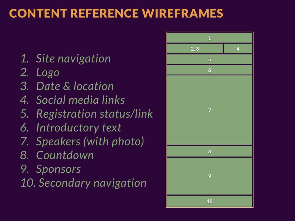
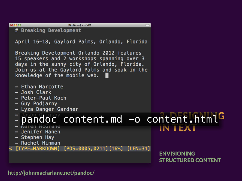
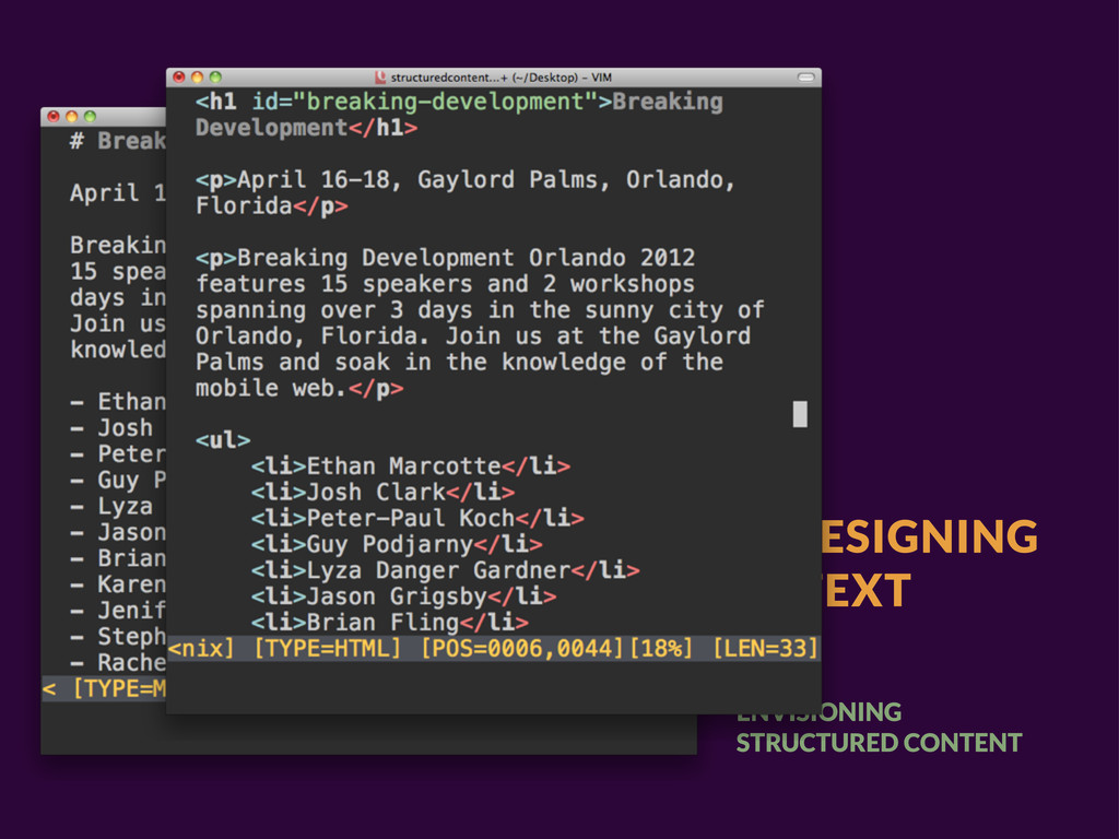
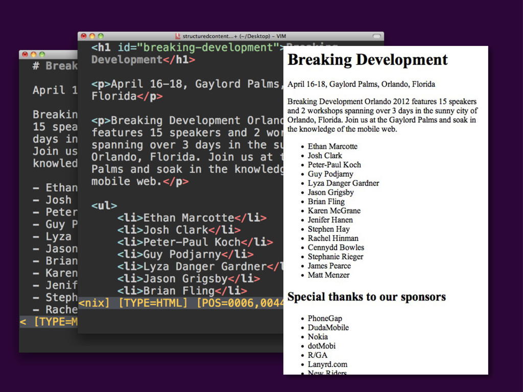
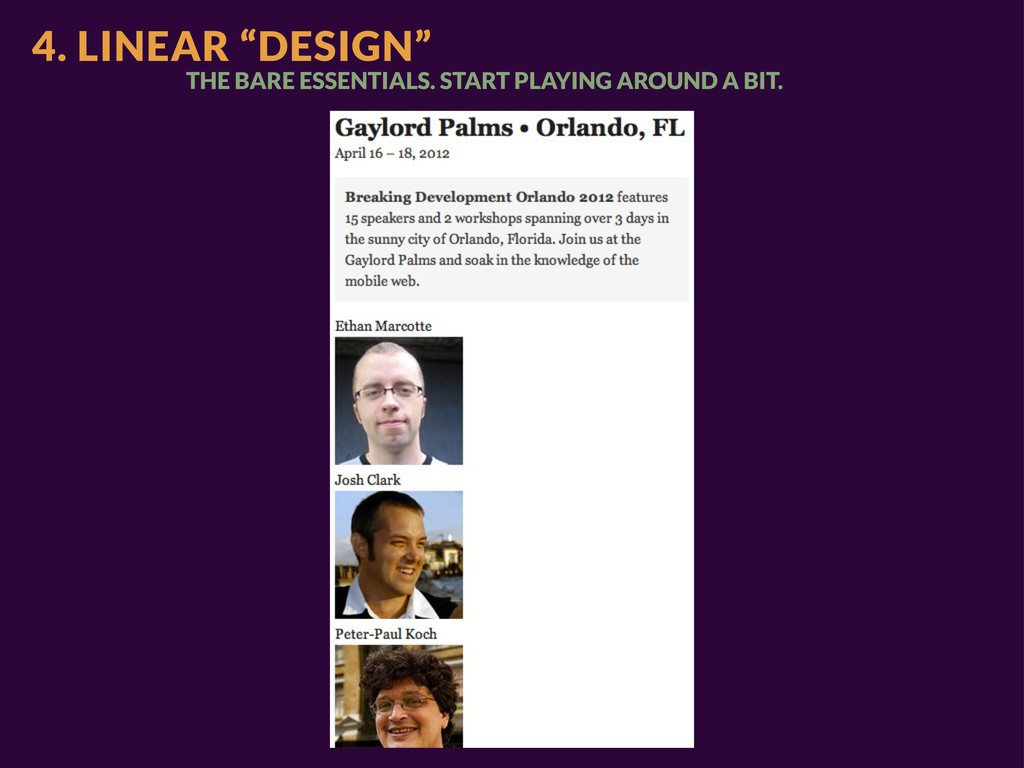
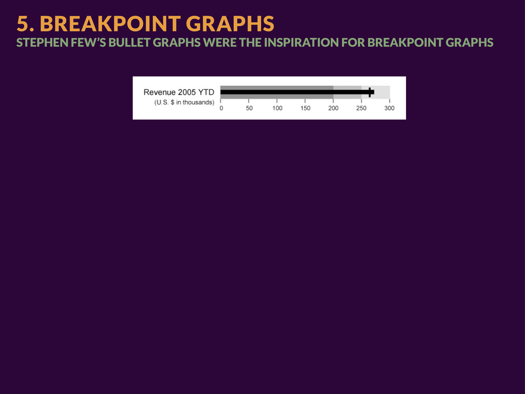
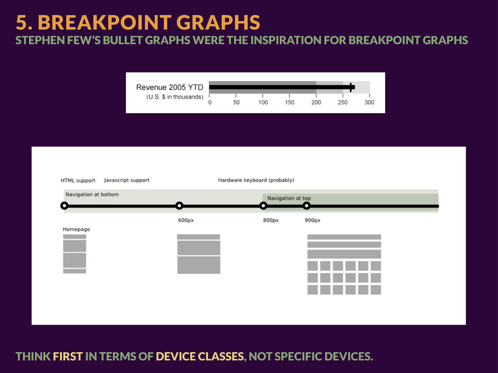
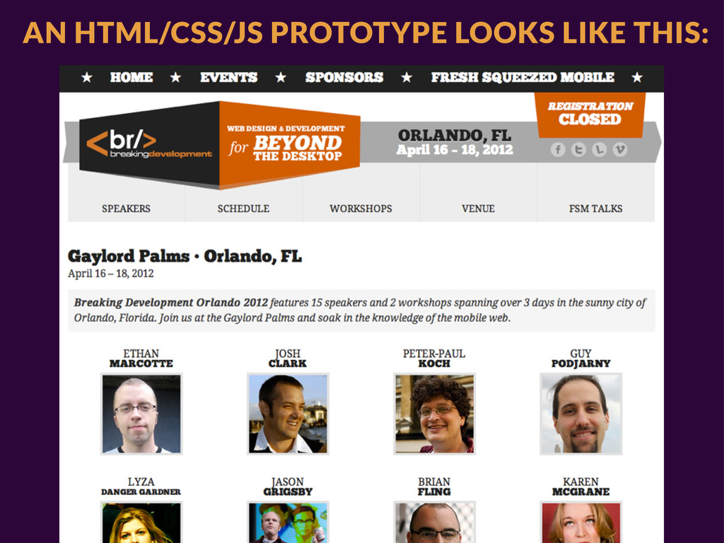
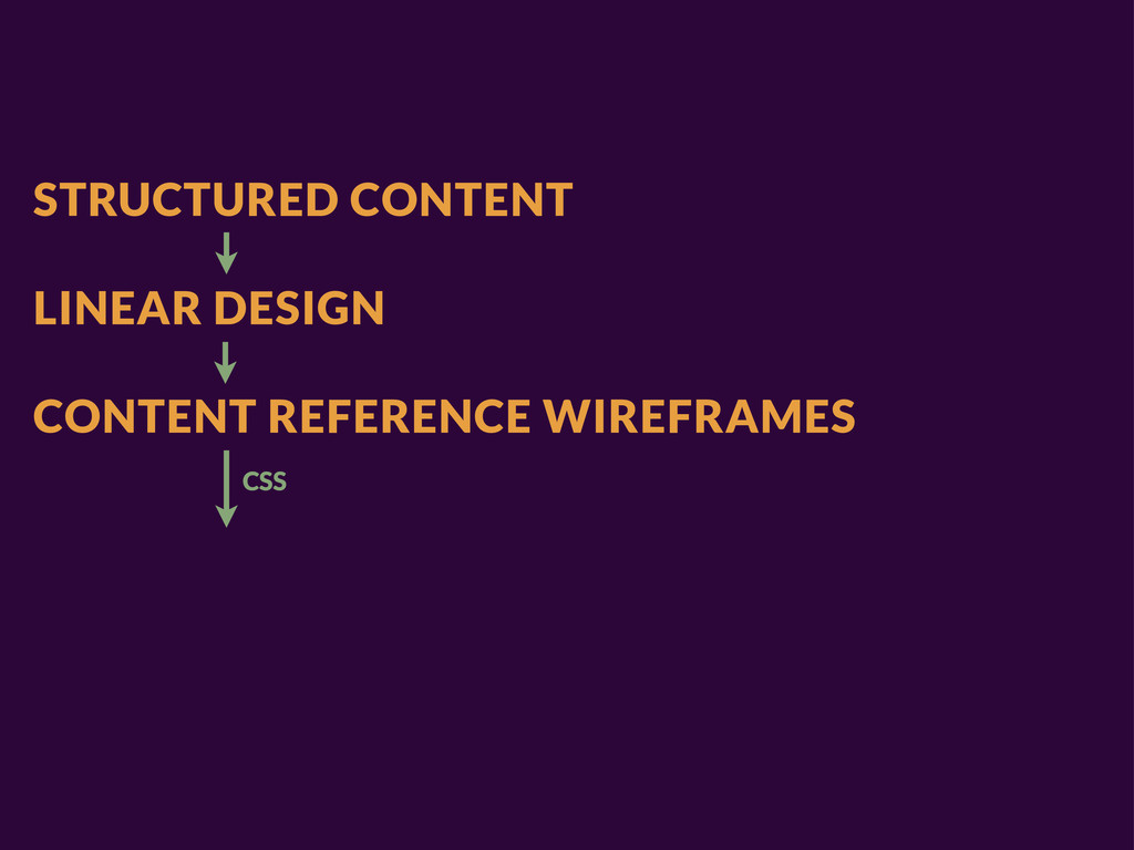
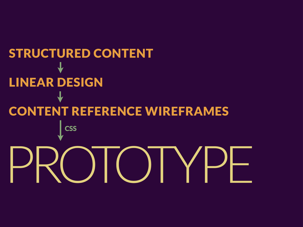
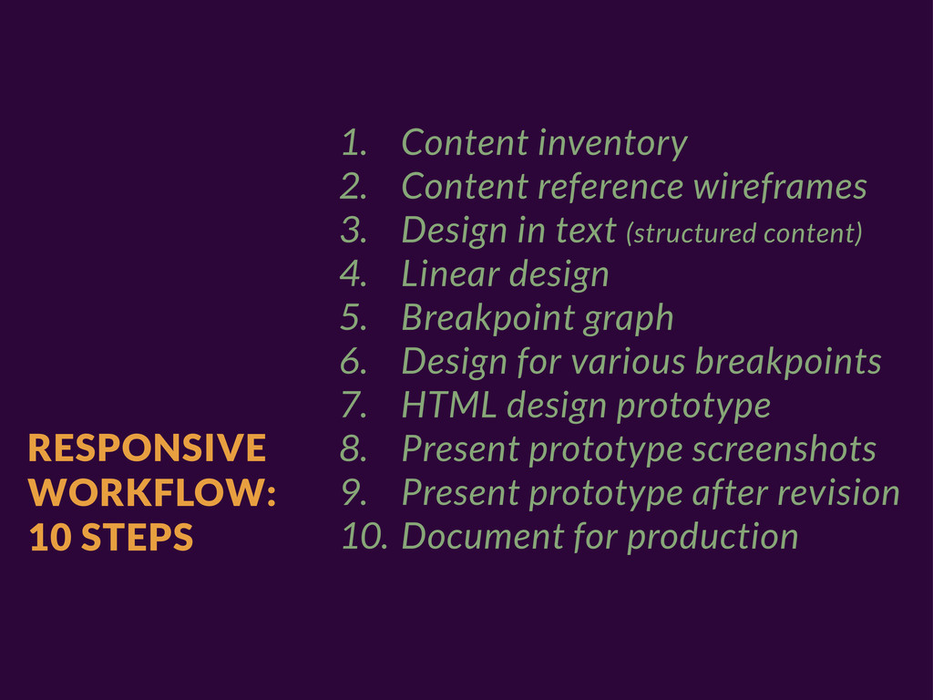
wireframes 3. Design in text (structured content) 4. Linear design 5. Breakpoint graph 6. Design for various breakpoints 7. HTML design prototype 8. Present prototype screenshots 9. Present prototype after revision 10. Document for production
wireframes 3. Design in text (structured content) 4. Linear design 5. Breakpoint graph 6. Design for various breakpoints 7. HTML design prototype 8. Present prototype screenshots 9. Present prototype after revision 10. Document for production
 stephenhay
 stmn
stmn
 kenichiota0711
 karad
karad
 payatsusan213
 nbkouhou
 hikarutakase
 kumanoayumi
 chorkaichan
 kaminashi
 lynteo
 usagimaru
 jonoalderson
 frankvandijk
 holman
 honzajavorek
 notwaldorf
 mlcsv
mlcsv
 tamaranovitovic
 wjessup
 addyosmani
 sarafernandez
 marktimemedia
 katiecoart